By

String Ring: A Creative Way to Manually Create Physical Images with String

As our lives become increasingly digital, more and more people are seeking to create tangible things with their hands. It’s no wonder that LEGO, gardening and tool purchases are all on the rise.

We’ll probably start to see more objects like this String Ring, a creative way to turn digital images into handcrafted art.

It was invented by an Atlanta-based group of creatives called Heartistry. “Our journey started when we first discovered this art form and spent a full day building a makeshift loom with wood and nails. It was beautiful, but also stressful, time-consuming, and expensive. We knew there had to be a better way to let people enjoy the creativity of stringing without the hassle of building their own ring.

“After dozens of prototypes, we developed unique pin shapes that let your mind flow through the loom twice as quickly as with nails.”

The way it works is, you upload a photo to their website. Their software then generates a string-by-number sequence, which it announces (audibly) through your phone; you can dial in the pace at which the sequence is announced.

Then it’s a matter of connecting the dots, so to speak.

The process, they say, is meditative and soothing.

The $54 String Ring kits have been successfully Kickstarted, with 28 days left to pledge at press time. Units are slated to ship this December.

By

IKEA ÖDLEBLAD Lamp Puts a Twist on Flatpack Lighting and the Allen Key

The IKEA Allen key has become an unlikely icon of modern DIY culture, synonymous with flatpack furniture assembly and the satisfying challenge of building your own furniture. For decades, this humble hexagonal tool has been the bridge between a box of parts and a finished piece of furniture. Yet despite its essential role in IKEA’s success, the Allen key often represents the barrier between customers and their completed projects.

The ÖDLEBLAD lamp flips this relationship on its head in the most delightfully ironic way possible. This new pendant light draws direct inspiration from the Allen key’s form and function, but eliminates the need for any tools whatsoever during assembly. The lamp celebrates the tool that made IKEA famous while proving that sometimes the best design solutions come from making things simpler rather than more complex.

Designer: David Wahl (IKEA)

The assembly experience feels almost magical in its simplicity. The birch veneer shade arrives as a flat bundle of wooden slats, each piece designed with integrated twist-and-lock mechanisms that mirror the action of an Allen key. You simply twist the pieces into place, creating a layered, sculptural shade without fumbling for tools or hunting for missing screws.

The irony isn’t lost on anyone familiar with IKEA’s assembly process. Here’s a lamp inspired by the very tool that has challenged countless customers, yet it assembles without requiring that tool at all. This playful contradiction makes the ÖDLEBLAD feel like both a celebration of and a gentle joke about IKEA’s flatpack heritage.

Of course, the lighting quality matches the clever assembly method. The layered birch veneer slats create beautiful patterns of light and shadow, casting warm, organic textures across walls and surfaces. The white inner shade ensures even light distribution, while the natural wood adds warmth and character that works beautifully in dining areas, bedrooms, or living spaces.

The sustainable material choices reinforce IKEA’s environmental commitments. The renewable birch veneer and minimal packaging reduce environmental impact, while the tool-free assembly means fewer metal components and simpler manufacturing processes. The flatpack efficiency also reduces shipping costs and storage requirements, making the entire product lifecycle more sustainable.

That said, the real genius lies in how the ÖDLEBLAD democratizes good lighting design. By eliminating tools and complicated assembly steps, IKEA makes quality pendant lighting accessible to anyone, regardless of their DIY confidence or tool collection. The lamp assembles in minutes and can be just as easily disassembled for moving or storage.

You’ll notice how this approach reflects IKEA’s broader design philosophy of removing barriers between people and good design. The ÖDLEBLAD lamp demonstrates how even the most familiar design challenges can inspire fresh thinking. You can appreciate both the clever engineering and the gentle humor of a product that honors the Allen key by making it completely unnecessary.

The post IKEA ÖDLEBLAD Lamp Puts a Twist on Flatpack Lighting and the Allen Key first appeared on Yanko Design.

By

NODE ATOM loudspeakers blend art and audio for the modern home

NODE Audio, based in Cambridge, UK, has introduced a striking new range that challenges the conventional idea of what a loudspeaker can be. The NODE ATOM series is not just about delivering exceptional sound; it’s about bringing sculptural beauty into the heart of the living space. Designed in collaboration with Studio17 Design, these loudspeakers are carefully crafted as objects of desire and performance.

The ATOM range debuts with two models: the ATOM 525 standmount, which comes with its own custom stand, and the larger ATOM 650 floorstander. Both models are built upon NODE’s patented Helical Transmission Line (HTL) technology. HTL is a unique internal architecture that directs the woofer’s energy through a central chamber and a precisely shaped helical path. This innovation enables these relatively compact speakers to deliver rich, extended bass that feels full and controlled, defying expectations set by their size.

Designer Name: Node Audio Research, Studio17 Design

What makes the ATOM series stand out is the introduction of MonoCell damping. This new lattice structure is created using advanced additive manufacturing, replacing traditional fibrous damping materials. MonoCell isn’t just for sound; it also serves as structural bracing, forming a monocoque shell of impressive strength. With this approach, the cabinet itself becomes almost resonance-free, allowing the music to emerge with remarkable clarity and purity.

The tactile experience is enhanced by the custom textile wrap that covers each loudspeaker. This is no ordinary fabric. Instead, it’s a multi-layered composition of felt, foam, and woven material that not only feels unique to the touch but also serves to control vibrations. The result is a speaker that looks and feels as refined as the sound it produces.

NODE ATOM speakers are visually distinctive. Their flowing, sculpted forms are free from sharp corners or flat surfaces, making them feel as much a piece of contemporary art as a piece of audio equipment. Each cabinet features structural elements machined from solid billet aluminum, then hand-polished to a flawless finish. The attention to detail is evident in every aspect, from the shimmering surfaces to the seamless curves.

NODE Audio’s vision for the ATOM series is clear: to create a loudspeaker that is as emotionally compelling as it is technically advanced. Designed and made in the UK, the ATOM range will be available in January 2026, offered in a curated selection of finishes to complement any modern interior. Unveiled at the UK HiFi Show Live at Ascot, the ATOM series received strong praise from both the public and industry experts, signaling a new era where loudspeakers can be both functional and beautiful.

The post NODE ATOM loudspeakers blend art and audio for the modern home first appeared on Yanko Design.

By

Clothing With Extreme Pockets Trend Continues

“On average, we touch around 600 objects a day,” Karim Rashid told us ID students, decades ago, at Pratt. (He still cites the stat in interviews.)

What’s strange is that today, we seem to be carrying many of those objects around with us. Last year we looked at Storm Labs’ Storm Jacket, which had an absurd 18 pockets:

The approach had precedent: A year earlier, a company called Minimal Organised Wear (MOW) released this Isola jacket. It has 20 pockets and was Kickstarted to the tune of $330,919.

Now MOW is back with the Nomade 58, a waterproof zip-up hoodie with 58 different “features.”

The $117 Nomade 58 has also been successfully Kickstarted, with 24 days left to pledge at press time.

Given our current product landscape, we expect this trend—where people walk around carrying more gear than a paratrooper preparing for a mission—to continue.

It’s kind of weird, if you think about it. Cargo pants came from the military. Now the civilian sector is creating clothing with way more pockets than what guys who jumped into Normandy had.

By

Remarkable Romani—Astonishing Works By and About the Community

The post Remarkable Romani—Astonishing Works By and About the Community appeared first on DailyArt Magazine.

By

Rabbithole brings Bradford’s “defiant beauty” into Turner Prize identity

This year, the Turner Prize – Britain’s best-known modern art award (and regular tabloid fodder) – has travelled to Bradford, the UK’s 2025 City of Culture.

The Turner Prize headlines the city’s year-long programme of cultural events.

The identity for the latest edition of the prize was developed by Rabbithole, the Leeds-based studio which also created the wider Bradford 2025 brand.

As the award is always accompanied by a major exhibition of the shortlisted artists, the identity had to work on two levels.

“We wanted a brand bold enough to turn heads in the city, but subtle enough in the exhibition to let the art speak,” says Harriet Hudson, head of marketing at Bradford 2025.

Rabbithole’s brand for the Turner Prize 2025

For Bradford 2025, the studio had already navigated the city’s complexities and dualities to deliver a brand that speaks to its soul, meeting a demanding brief with clarity.

“From the very beginning, they demonstrated that they could respond to challenging, even contradictory briefs,” says Shanaz Gulzar, creative director of Bradford 2025.

The identity for the award had to reflect the prestige and the purpose of the Turner Prize while also capturing the character and richness of Bradford as the host city.

“In an early workshop, someone described Bradford as a flower growing out of an overlooked patch of pavement – beautiful despite the cracks around it. That image of defiant beauty became our north star for crafting the identity,” says Mark Martin, strategy director of Rabbithole.

The cut-outs as seen on the brochure

This analogy led the team to the central idea of “fragmented beauty,” expressed visually through layers of scattered circular cut-outs that reveal glimpses of what lies beneath – a burst of colour, artworks, a piece of text.

“We took up a simple piece of paper, punched holes through it and layered it. Every cut-out creates a moment of unexpected discovery for those who linger and take a closer look,” says Tim Dee, creative director of Rabbithole.

The idea of a “second glance” also resonated with the spirit of the Turner Prize itself.

As an award that recognises artists pushing boundaries and offering new perspectives, it often asks audiences to look beyond first impressions. By unveiling only fragments at first, the identity encourages visitors to slow down and spend time with work that reveals itself gradually.

The Turner Prize 2025 Family Guide

Beyond anchoring the concept, the cut-out circles also become a flexible device. In nearby Lister Park, they became wayfinding markers for a community trail, guiding visitors with bite-sized introductions to the Turner Prize as they approach Cartwright Hall, the venue for the exhibition.

In the Family Guide, the cut-outs were turned into a pair of playful, bespectacled eyes that children could pop out – an interactive detail that makes the identity feel hands-on and inclusive.

“There are audiences engaging with the Turner Prize in Bradford who might never have set foot in Tate – not because of distance, but because it never felt accessible to them. This brand helps bring the prize into their world,” says Gulzar.

This democratic sensibility was also important for Rabbithole.

Rabbithole’s brand for the Turner Prize 2025

“The prestige of the Turner Prize could easily have led to something austere and serious,” says Martin. “What’s refreshing here is that the identity doesn’t take itself too seriously.”

Visually, the identity builds on the bones of Bradford 2025’s brand – the pink, green, and gold colours have been brightened and expanded into a broader palette. The team retained Displaay Type Foundry’s Denim INK, choosing a cleaner cut for the Turner Prize.

The wordmark, which is stacked to form a ‘T’ shape, benefits from the sturdiness of Denim INK’s letterforms. The ‘2025,’ which forms the stalk of the ‘T,’ gave the team more room to experiment. “Pulling the ‘2025’ apart from ‘Turner Prize’ allowed us to stretch things, draw elements, and even place things in the middle, opening up more space for play,” says Dee.

Rabbithole’s brand for the Turner Prize 2025

The resulting identity confidently bridges the worlds of Bradford and the Turner Prize. “The identity feels like Bradford 2025 presenting the Turner Prize, not being overshadowed by it – and that balance was crucial,” says Gulzar.

By tying the Turner Prize 2025 identity so closely to the Bradford 2025 system, Rabbithole created a brand that carries the prestige of the prize while remaining an unmistakable part of the City of Culture year.

That shared DNA means the prize benefits from the same recognition and resonance Bradford’s brand has already built at home and abroad, and across touchpoints.

As Gulzar puts it, “Even something as small as a pin badge stands out. When someone wears it, they can be on the other side of the world, and people will still ask, ‘What’s that?’ That’s when you know you’ve got a great brand, and great design.”

The Turner Prize pin badge
The Family Guide
Rabbithole’s brand for the Turner Prize 2025
The brand as seen at the box office and cloakroom

Source

By

The Surprising Way Airplanes Attach Advertising Banners After Takeoff

Aerial advertising banners are a kitschy, eye-catching way for companies to get their message out.

I always thought they were an American thing, but I was wrong.

Anyways: Did you ever wonder how they attach the banners? The airplanes can’t take off with them; dragging the banner down the runway would foul or destroy the banners, as well as provide unwelcome drag.

Chance Mitchell, a/k/a Chance the Pilot, demonstrates how it’s done. The plane takes off without the banner, which is on the ground, attached to a rope that’s slung between two poles. The pilot makes a dive run towards the banner, throws a freaking grappling hook, then pulls up:

This might be a tough watch for desk-bound office workers. This is Chance’s daily view at work:

And you thought “industrial designer” was an unusual job to explain to strangers.

By

Top 5 Ways E Ink Displays Are Transforming Modern Design

Traditional screens have become the digital equivalent of energy vampires, constantly draining batteries while bombarding our eyes with harsh blue light that leaves us squinting and tired. LCD and OLED displays demand constant power to maintain their bright, flashy visuals, creating a world where we’re always hunting for charging cables and dealing with screens that become unreadable the moment we step into sunlight.

E Ink displays offer a refreshingly different approach to this screen fatigue problem. By mimicking the look and feel of actual ink on paper, this technology flips the script on what we expect from digital displays. E Ink dominates the ePaper market, though other electronic paper technologies exist alongside it. The result feels like reading a book instead of staring at a glowing rectangle.

What Makes E Ink Different

Unlike traditional displays that blast light at your face, E Ink reflects ambient light just like a printed page would. The technology uses tiny microcapsules filled with charged particles that rearrange themselves to form text and images. Once an image appears, it stays there without using any power at all, which explains why e-readers can last for weeks on a single charge.

The benefits extend far beyond just battery life. E Ink displays remain perfectly readable in bright sunlight, where your smartphone screen would become a useless mirror. The flexible nature of the technology means displays can bend, curve, and even fold without breaking. For designers tired of working around the rigid constraints of glass screens, E Ink opens up entirely new possibilities.

Designer: Montblanc

The Current Limitations

E Ink comes with certain trade-offs that designers need to understand. Colors remain somewhat muted compared to the vibrant displays we’re used to, though recent advances have brought more life to ePaper screens. Refresh rates are slower, so you won’t be watching Netflix on an E Ink display anytime soon. Large panels can still be pricey, though costs keep dropping as production scales up.

These constraints haven’t stopped designers from finding creative ways to harness E Ink’s strengths. Smart product teams have learned to work within these limitations, focusing on applications where the technology’s benefits far outweigh its drawbacks. The results often surprise people with their elegance and practicality, proving that constraints can spark innovation.

Designer: BOOX

Five Industries Embracing E Ink Innovation

The real magic happens when you see E Ink displays in action across different industries. Each sector has found unique ways to leverage the technology’s strengths, creating products that simply wouldn’t be possible with traditional screens. Here are five concrete examples that show how E Ink is changing the design game.

Laptops: Your Lid Becomes a Canvas

Designer: ASUS

Laptop lids have been boring black rectangles for decades, but E Ink is changing that in fascinating ways. ASUS’s Project Dali concept turns the back of your laptop into a customizable display where you can showcase artwork, display your calendar, or show off your company logo during meetings. It’s like having a digital tattoo for your computer that changes whenever you want it to.

Designer: Lenovo

Lenovo took this concept to market with their ThinkBook 13x Gen 4 SPE, which features an actual E Ink display built into the lid. You can switch between personal artwork during coffee breaks and professional branding during client presentations. The display sips so little power that it barely affects battery life, yet it transforms your laptop from anonymous tech into a personal statement piece.

Transportation: Solar-Powered Information That Actually Works

Public transit signs have always been a nightmare to power and maintain, especially at remote bus stops without electrical connections. Boston’s MBTA solved this problem elegantly by deploying solar-powered E Ink signs throughout the city’s bus stops and Green Line stations. These displays show real-time arrival information, service alerts, and schedules without requiring a single wire to be run.

Designer: MBTA, E Ink

The beauty of these installations becomes obvious during New England winters, when the signs keep working despite snow, ice, and sub-zero temperatures. Solar panels provide enough juice to keep the displays running continuously, while the E Ink technology ensures perfect readability whether you’re squinting through morning glare or trying to read in dim evening light.

Makers: DIY Dreams Made Accessible

The maker community has embraced E Ink displays with the enthusiasm typically reserved for new Arduino boards or 3D printing breakthroughs. Waveshare offers dozens of different E Ink modules that work seamlessly with Raspberry Pi, Arduino, and other popular platforms. Suddenly, creating a custom weather station or smart home dashboard doesn’t require a computer science degree or a massive budget.

Designer: Waveshare

Hobbyists use these displays to build everything from digital art installations to battery-powered information kiosks that can run for months without maintenance. The paper-like appearance means these creations blend naturally into homes and offices, avoiding the harsh, obviously digital look of traditional screens. It’s democratized display technology in ways that would have seemed impossible just a few years ago.

Fashion: Accessories That Change With Your Mood

Fashion has always been about self-expression, but E Ink takes personalization to an entirely new level. The Tago Arc bracelet demonstrates this beautifully, featuring a flexible E Ink display that lets you cycle through hundreds of different patterns using your smartphone. One moment you’re wearing geometric shapes, the next you’re sporting flowing organic patterns that match your outfit perfectly.

Designer: LIBR8TECH

The bracelet never needs charging because it draws power through NFC only when changing patterns. This means you get infinite customization without the hassle of yet another device to plug in every night. It’s the kind of accessory that makes people do double-takes, wondering how your jewelry just changed designs right before their eyes.

Consumer Electronics: Devices That Respect Your Attention

Designer: reMarkable

E Ink device like the BOOX Note Max and reMarkable Paper Pro Move have created an entirely new category of devices focused on thoughtful interaction. These tablets feel remarkably similar to writing on paper, making them favorites among designers, writers, and anyone who takes handwritten notes seriously. The screens don’t strain your eyes during long reading sessions, unlike their LCD counterparts.

The BOOX Palma takes this concept in a different direction by creating a phone-sized E Ink device that looks and feels like a smartphone but focuses entirely on reading and productivity. This pocket-sized e-reader runs Android, giving you access to reading apps, note-taking tools, and basic communication functions without the distracting elements that make regular smartphones so addictive. It’s like carrying a digital book that happens to connect to the internet, perfect for people who want to stay connected without getting sucked into endless social media scrolling.

Accessibility Revolution

E Ink technology has become surprisingly accessible to individual designers and small companies over the past few years. Development kits and reference designs are readily available from multiple suppliers, while costs have dropped to levels that make experimentation feasible for creative projects and startup ventures. You no longer need deep pockets or specialized engineering knowledge to explore ePaper possibilities.

This democratization has accelerated innovation across multiple industries. Designers can prototype E Ink applications quickly and affordably, leading to creative solutions that might never have emerged from traditional corporate research and development cycles. The growing ecosystem of compatible components and software libraries continues to lower barriers while expanding creative possibilities for everyone.

Designer: Pedro Luraschi

Designer: Ashtf

Technical Progress Continues

Recent advances have addressed many of E Ink’s early limitations while opening up new application areas. Color reproduction has improved dramatically, though it still requires thoughtful design consideration. Refresh rates have increased enough to support interactive applications, while manufacturing improvements have reduced costs and increased reliability across the board.

Research into advanced ePaper technologies continues at a rapid pace. Flexible displays that can fold, roll, or stretch are becoming practical for commercial applications. Integration with touch sensors and other interactive elements keeps improving, making E Ink displays suitable for sophisticated user interface design that goes beyond simple text and images.

Designer: Sony (FES U Watch)

A Different Design Philosophy

E Ink represents a fundamentally different approach to digital interaction, one that prioritizes sustainability, comfort, and thoughtful engagement over flashy visuals and constant stimulation. This philosophy resonates with designers who want to create products that enhance human experience without competing aggressively for attention. The technology encourages restraint and purposefulness in ways that feel refreshing in our cluttered digital landscape.

Products built around E Ink often exhibit a deliberate, focused quality that stands out from the noise. The constraints imposed by the technology force designers to think carefully about essential functions and user needs, often resulting in elegant solutions. The influence of E Ink thinking extends beyond products that actually use the technology, shaping broader conversations about conscious design practices.

As E Ink continues to mature, these ideas will likely influence how we think about digital interaction across many different product categories and industries. The technology has already proven that displays don’t need to be bright, fast, and power-hungry to be effective. Sometimes the best solution involves stepping back from the latest and greatest to focus on what actually serves people well.

Designer: E Ink

The post Top 5 Ways E Ink Displays Are Transforming Modern Design first appeared on Yanko Design.

By

dutch design week turns eindhoven into a living lab with more than 2,500 designers

This month, Dutch Design Week celebrates a quarter century of imagination and collaboration in Eindhoven. Co-founder Miriam van der Lubbe reflects on how a small local initiative became a global stage for design’s evolving role in shaping the future.

Dutch Design Week’s first 25 years have shown that imagination can be infrastructure. The next 25 will show how the possible becomes the plan. Photo: © Nick Bookelaar


Eindhoven has never been afraid of transformation. Once an industrial powerhouse humming with Philips factories, the small city in the south Netherlands has reinvented itself as a beacon for ideas in motion – the kind that take shape, question themselves and reshape the world in the process. Every October, Dutch Design Week (DDW) turns the town into a living lab, and this year marks a particularly luminous milestone: its 25th edition. From 18 to 26 October 2025, more than 2,500 designers will fill 120 venues with a single shared brief: to explore the ‘Past. Present. Possible.’


The scale alone is impressive, with 350,000 visitors expected and a line-up that ranges from emerging graduates to international names such as HEMA, Hydro and Vattenfall. Yet what truly defines DDW is its energy. It has always blurred the boundaries between exhibition and experiment, turning Eindhoven from a backdrop into a stage where ideas are constantly tested and reimagined. Here, concepts become prototypes and prototypes become provocations.


At Dutch Design Week, concepts become prototypes and prototypes become provocations


As DDW 2025 celebrates its silver anniversary, the event feels anything but nostalgic. Instead, it doubles down on curiosity – on what happens when you mix generations, disciplines and ambitions across a city and call it collaboration. Between ‘Grand Projects’ towering outdoor installations, ‘Forward Furniture’’s exploration of collectible design and the next generation’s debut in ‘Class of 25’, among other highlights, this edition promises to be both retrospective and refreshingly restless.


To understand how the annual gathering of minds has evolved into one of the world’s most influential design events, Architonic sat down with Miriam van der Lubbe, DDW’s co-founder and curator of this year’s central exhibition ‘Bridging Minds’ at the Van Abbemuseum. Over coffee, she spoke about reflection, responsibility and the kind of courage design still needs to cultivate.

Miriam van der Lubbe. Photo: © Lisa Klappe


Claire Brodka: ‘Past. Present. Possible’ feels like an open-ended invitation. How does this anniversary theme shape the week?


Miriam van der Lubbe: It’s our 25th edition, so naturally there’s a moment of reflection. Designers are wired to look forward; we rarely stop to see how far we’ve come. This year is about recognising that collective effort, seeing what design has already achieved for society and realising how much more potential there still is. It’s a celebration, but also a call to action.


How are you marking the anniversary?


We’ll start with a special opening that will be memorable, although I can’t reveal too much yet. We’ve also built a pavilion on Ketelhuisplein dedicated to everyone who has helped make DDW what it is: designers, partners, volunteers and the people who keep Eindhoven running every day. It’s a way to acknowledge the ecosystem behind the creativity.

Visitors finding their way around and Miriam van der Lubbe at DDW 24’s official opening. Photos: © Max Kneefel & Lotte Dale


One of the headline shows is ‘Bridging Minds’ at the Van Abbemuseum. What can visitors expect?


The exhibition focuses on the connecting power of design. We’ve gathered around a hundred works by designers such as Hella Jongerius, Formafantasma, Klarenbeek & Dros and Maarten Baas. These projects don’t just comment on the world, they act within it. The exhibition is arranged around ten themes, from empowerment to care and from innovation to our relationship with nature. Each piece shows how design can contribute to progress, sometimes through modest or even poetic steps.


Ketelhuisplein once again takes literal centre stage at DDW 25 (top). Vattenfall will also join the programme once again (bottom). Photos: © Max Kneefel & Cleo Goossens


You’ve spoken before about design deserving a place ‘at the decision table’. What does that look like in practice?


It means that design thinking should be a structural part of decision-making in every sector, from government to business. In the Netherlands, ministries have pledged to establish design departments within ten years, which is a great start. The next step is proving design’s impact in measurable ways. We need strong examples that demonstrate how creativity changes outcomes and improves lives.


Eindhoven itself is evolving quickly. How does the city protect its creative pulse as it grows?


That’s one of the key challenges. Eindhoven is part of the Brainport region, which will add about 70,000 homes in the next decade. Expansion brings pressure on space and affordability. During DDW we’ll launch Design Development Eindhoven, an initiative to ensure that designers can continue living and working here rather than being pushed out by the tech boom. The city understands that creativity adds quality of life; it’s not decorative, it’s essential.


Designers Kiki & Joost will open their studio (top) on the outskirts of Eindhoven and spaces like cultural centre Sectie-C (bottom) will activate countless other sites throughout the city. Photos: © Anwyn Howarth & Almicheal Fraay


DDW has always mixed established names with newcomers. How important is that cross-generational dialogue?


It’s vital. Design has changed dramatically in 25 years, and with that diversity we risk losing clarity about what design really is. I sometimes joke that we must be careful not to become ‘Dutch Everything Week’. We need to preserve the profession’s core skills while staying open to new disciplines. Collaboration between generations is essential; younger designers bring urgency and experimentation, while older ones bring context and continuity.


Those of us who have been around longer have a duty to open doors, share networks and give others a platform


You also seem deeply committed to mentoring younger designers.


I remember starting out when there was generous funding and plenty of room to explore. Today, opportunities are thinner, and young designers face information overload and economic uncertainty. Those of us who have been around longer have a duty to open doors, share networks and give others a platform. If someone approaches three weeks before the festival with a strong idea, I’d rather say yes and find a way to make it work. That spontaneity keeps DDW alive.

‘Class of 2025’ returns as a standout exhibition (top), with materials and prototypes that inspire discussions of the future. Photos: © Max Kneefel


Looking back, what stands out as the most transformative shift over the last quarter century?


Two things come to mind. The first is the expansion of design’s role, from crafting objects to shaping systems, policies and public life. The second is the need to make the impact of design visible. Ideas have to be embodied. If we want others to join us in creating change, they need to be able to see and touch it.


Discussion is valuable, but prototypes, installations and physical experiences are what move people. The Netherlands has plenty of process and planning, but sometimes lacks courage. We need more bold gestures that show creativity in action, not only on paper. Bridging Minds aims to do just that: to demonstrate the next small but crucial steps in connecting design with real life.


What do you hope visitors take away from this year’s edition?


I hope they leave with a sense that possibility belongs to everyone. Whether you’re a policymaker, a student or simply curious, DDW is an open invitation to imagine the future together. If it works, people will leave Eindhoven thinking differently about how the world could be, because they’ve seen it and experienced it first-hand.


Guest Feature by Claire Brodka / Architonic

The post dutch design week turns eindhoven into a living lab with more than 2,500 designers appeared first on designboom | architecture & design magazine.

By

Accessible make-up packaging wins top Pentawards prize

Ergonomic make-up packaging which blends elegance and accessibility has won the top prize at this year’s Pentawards.

At the awards show in Amsterdam this weekend, New York-based studio Established won the Diamond Award for its work on Tilt Beauty, a project the studio says, “required us to rethink the way beauty products are packaged from the ground up.”

It’s the second time Established has scooped the top Pentwards prize, after winning the 2015 Diamond Award for its work on the Marc Jacobs Beauty range. Established was also named design agency of the year at Saturday’s ceremony.

Established’s work for Tilt Beauty

The brief for Tilt, was to create packaging that was, “accessible to those with various physical challenges, from chronic pain to low vision, but still be coveted by all.”

For people suffering with chronic pain, existing make-up packaging can be impossible to use. Established says consumers are forced to find hacky workarounds, using sticky tape or rubber bands, or they end up avoiding make-up altogether.

The primary packaging is coated with silicone, which along with the curvy shapes are designed to help people with lower grip strength. The mascara wand is shorter than standard, as research showed people whose hands shake struggle with the longer design, and the refill system is easy to replace with a simple push mechanism.

The casing includes magnets to reduce the force required to open and close the products. The secondary packaging has large tearable strips to make it easy to open, while text is set in the Braille Institute of America’s Atkinson Hyper-Legible font to make it easy to read. There are also Braille product descriptions.

Crucially, the team was determined not to sacrifice aesthetics in a bid to make a more accessible product. “In creating Tilt, we wanted to make products that were both ‘seriously comfy’ and beautiful to look at,” they explain. “The vegan, cruelty-free makeup is easy to open, hold, read and apply, and the packaging is bold, playful and gorgeous.”

Established’s work for Tilt Beauty

The packaging is the first make-up line to get an Ease of Use certification from the Arthritis Foundation, with whom the designers collaborated on the project.

“This project really showcased the art of accessibility,” says Marc Powell, Unilever’s global accessibility centre of excellence lead, and one of the Pentwards judges.

“Not only does it feel stylish, desirable and modern, it’s just really cool that accessibility and inclusive design have been embedded into this product from start to end.”

And Established co-founder Sam O’Donahue said it was “an incredible honour” to win the top prize for the second time.

“Creating Tilt Beauty has been a labour of love and one of the most important projects we have taken on in the past 20 years,” he said. “We hope that its pioneering approach to making beauty accessible will have ripple effects throughout the industry.”

This year’s platinum winners recognised an eclectic mix of projects across the different categories.

Beverages

Diageo’s Johnnie Walker Blue Label Ultra – the lightest 70cl whisky bottle ever made – topped the beverages category.

Johnnie Walker Blue Label Ultra by Johnnie Walker

“This design does more than trim weight: it redefines what luxury in spirits packaging can mean. For decades, heft has been equated with prestige, but Blue Label Ultra proves that true refinement lies in balance; elegance without excess – a bold statement for the premium drinks sector.”

Food

Spain’s Simple Packaging Studio won platinum in the food category for its work on Pueblo charcuterie. The studio was also named best newcomer.

Simple Packaging Studio’s designs for Pueblo cold meats

“Inspired by the cultural resonance of Spanish village life, the design elevates what was once seen as humble or provincial into a point of pride. Pueblo is a design manifesto that restores dignity to ‘village’ origins and reconnects consumers with provenance through clarity and simplicity.”

Body, health and beauty

The eye-catching perfume packaging for L’ENTROPISTE by French studio Centdegres took platinum in the body, health and beauty category.

L’ENTROPISTE – Master of Disorder by Centdegres

“Centdegres imagined a radical fragrance house that celebrates chaos as its creative currency, producing a visual and structural identity that fractures traditional perfumery tropes.

“Every detail works to destabilise expectations: from layered, deconstructed graphics to asymmetry that suggests both disorder and liberation.”

Brand identity and connected packaging

The top award for brand identity and connected packaging went to the Stella McCartney x Veuve Cliquot collaboration.

Stella McCartney x Veuve Clicquot by Veuve Clicquot Ponsardin

“The identity centres on a next-gen, 100% vegan leather made from grape stems, translating vineyard by-products into a premium tactile signature. It’s a statement of values as much as aesthetics: craftsmanship, circularity, and brand storytelling aligned in one confidently modern system.”

Home, leisure and other markets

Zenpack’s Dwell Dripper for Verve Coffee Roasters won platinum in the home, leisure and other markets category.

Zenpack’s Dwell Dripper for Verve Coffee Roasters

“Designed to travel as well as it brews, the Dwell Dripper’s packaging takes cues from paper-bag lunches and accessory bags to create a friendly, take-anywhere unboxing.

“A single-part dieline streamlines production and reduces waste, while the range launches in seven colours with a matching coffee scoop engineered as an extension of the brewer itself – mirroring its angles and radii for a cohesive, durable, and easy-to-use system.”

Professional concepts

Italian studio Gentlebrand won the professional concepts platinum award for AVANCE, its limited-edition perfume collections inspired by a chess set.

Gentlebrand’s limited edition chess-inspired perfume design for AVANCE

“The concept translates strategy and symbolism into form and finish, giving each fragrance a distinctive presence while inviting the wearer into a more enigmatic, cerebral world of scent – a visual and tactile code for decoding emotion.”

Sustainable design

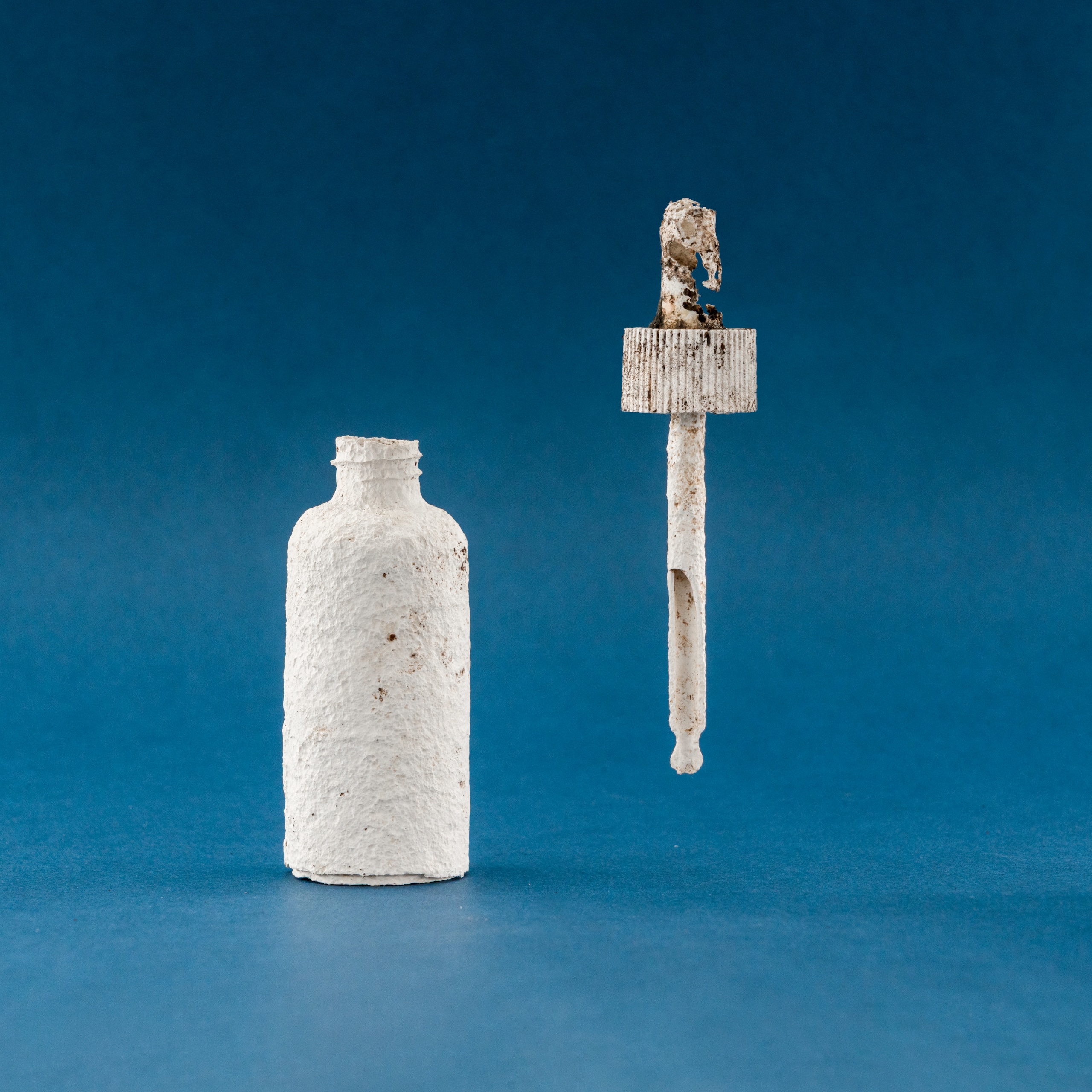
London-based Shellworks won the sustainable design award for its Vivomer Dropper – a “home-compostable” version of the cosmetics staple that, “performs like plastic in use but breaks down within 52 weeks, leaving no trace.”


‘Not only was this project considering innovation, end of life and a full packaging scale, it was really looking at a groundbreaking innovative way to penetrate an already saturated market,” says Pentawards judge and sustainability expert Sebba Alqetrani.

“It’s changing the way we look at consumption, it’s changing the way consumers look at usage and how we package products.”

Next-Gen award

Glasgow-based designer Morgan Hastie, aka The Logo Lassie, won the next-gen award for her Calentón Hot Sauce concept, while University of the Arts London was named educator of the year.

Calentón Hot Sauce by The Logo Lassie

Adam Ryan, head of Pentawards, said this diverse year’s winners show the power of great packaging design.

“What shines through this year is how packaging design touches lives – whether by making beauty more accessible, cutting waste in everyday products, or telling cultural stories through design,” he said.

“It’s proof that innovation can be practical, responsible and visually unforgettable.”

Source