By

Top 5 Ways E Ink Displays Are Transforming Modern Design

Traditional screens have become the digital equivalent of energy vampires, constantly draining batteries while bombarding our eyes with harsh blue light that leaves us squinting and tired. LCD and OLED displays demand constant power to maintain their bright, flashy visuals, creating a world where we’re always hunting for charging cables and dealing with screens that become unreadable the moment we step into sunlight.

E Ink displays offer a refreshingly different approach to this screen fatigue problem. By mimicking the look and feel of actual ink on paper, this technology flips the script on what we expect from digital displays. E Ink dominates the ePaper market, though other electronic paper technologies exist alongside it. The result feels like reading a book instead of staring at a glowing rectangle.

What Makes E Ink Different

Unlike traditional displays that blast light at your face, E Ink reflects ambient light just like a printed page would. The technology uses tiny microcapsules filled with charged particles that rearrange themselves to form text and images. Once an image appears, it stays there without using any power at all, which explains why e-readers can last for weeks on a single charge.

The benefits extend far beyond just battery life. E Ink displays remain perfectly readable in bright sunlight, where your smartphone screen would become a useless mirror. The flexible nature of the technology means displays can bend, curve, and even fold without breaking. For designers tired of working around the rigid constraints of glass screens, E Ink opens up entirely new possibilities.

Designer: Montblanc

The Current Limitations

E Ink comes with certain trade-offs that designers need to understand. Colors remain somewhat muted compared to the vibrant displays we’re used to, though recent advances have brought more life to ePaper screens. Refresh rates are slower, so you won’t be watching Netflix on an E Ink display anytime soon. Large panels can still be pricey, though costs keep dropping as production scales up.

These constraints haven’t stopped designers from finding creative ways to harness E Ink’s strengths. Smart product teams have learned to work within these limitations, focusing on applications where the technology’s benefits far outweigh its drawbacks. The results often surprise people with their elegance and practicality, proving that constraints can spark innovation.

Designer: BOOX

Five Industries Embracing E Ink Innovation

The real magic happens when you see E Ink displays in action across different industries. Each sector has found unique ways to leverage the technology’s strengths, creating products that simply wouldn’t be possible with traditional screens. Here are five concrete examples that show how E Ink is changing the design game.

Laptops: Your Lid Becomes a Canvas

Designer: ASUS

Laptop lids have been boring black rectangles for decades, but E Ink is changing that in fascinating ways. ASUS’s Project Dali concept turns the back of your laptop into a customizable display where you can showcase artwork, display your calendar, or show off your company logo during meetings. It’s like having a digital tattoo for your computer that changes whenever you want it to.

Designer: Lenovo

Lenovo took this concept to market with their ThinkBook 13x Gen 4 SPE, which features an actual E Ink display built into the lid. You can switch between personal artwork during coffee breaks and professional branding during client presentations. The display sips so little power that it barely affects battery life, yet it transforms your laptop from anonymous tech into a personal statement piece.

Transportation: Solar-Powered Information That Actually Works

Public transit signs have always been a nightmare to power and maintain, especially at remote bus stops without electrical connections. Boston’s MBTA solved this problem elegantly by deploying solar-powered E Ink signs throughout the city’s bus stops and Green Line stations. These displays show real-time arrival information, service alerts, and schedules without requiring a single wire to be run.

Designer: MBTA, E Ink

The beauty of these installations becomes obvious during New England winters, when the signs keep working despite snow, ice, and sub-zero temperatures. Solar panels provide enough juice to keep the displays running continuously, while the E Ink technology ensures perfect readability whether you’re squinting through morning glare or trying to read in dim evening light.

Makers: DIY Dreams Made Accessible

The maker community has embraced E Ink displays with the enthusiasm typically reserved for new Arduino boards or 3D printing breakthroughs. Waveshare offers dozens of different E Ink modules that work seamlessly with Raspberry Pi, Arduino, and other popular platforms. Suddenly, creating a custom weather station or smart home dashboard doesn’t require a computer science degree or a massive budget.

Designer: Waveshare

Hobbyists use these displays to build everything from digital art installations to battery-powered information kiosks that can run for months without maintenance. The paper-like appearance means these creations blend naturally into homes and offices, avoiding the harsh, obviously digital look of traditional screens. It’s democratized display technology in ways that would have seemed impossible just a few years ago.

Fashion: Accessories That Change With Your Mood

Fashion has always been about self-expression, but E Ink takes personalization to an entirely new level. The Tago Arc bracelet demonstrates this beautifully, featuring a flexible E Ink display that lets you cycle through hundreds of different patterns using your smartphone. One moment you’re wearing geometric shapes, the next you’re sporting flowing organic patterns that match your outfit perfectly.

Designer: LIBR8TECH

The bracelet never needs charging because it draws power through NFC only when changing patterns. This means you get infinite customization without the hassle of yet another device to plug in every night. It’s the kind of accessory that makes people do double-takes, wondering how your jewelry just changed designs right before their eyes.

Consumer Electronics: Devices That Respect Your Attention

Designer: reMarkable

E Ink device like the BOOX Note Max and reMarkable Paper Pro Move have created an entirely new category of devices focused on thoughtful interaction. These tablets feel remarkably similar to writing on paper, making them favorites among designers, writers, and anyone who takes handwritten notes seriously. The screens don’t strain your eyes during long reading sessions, unlike their LCD counterparts.

The BOOX Palma takes this concept in a different direction by creating a phone-sized E Ink device that looks and feels like a smartphone but focuses entirely on reading and productivity. This pocket-sized e-reader runs Android, giving you access to reading apps, note-taking tools, and basic communication functions without the distracting elements that make regular smartphones so addictive. It’s like carrying a digital book that happens to connect to the internet, perfect for people who want to stay connected without getting sucked into endless social media scrolling.

Accessibility Revolution

E Ink technology has become surprisingly accessible to individual designers and small companies over the past few years. Development kits and reference designs are readily available from multiple suppliers, while costs have dropped to levels that make experimentation feasible for creative projects and startup ventures. You no longer need deep pockets or specialized engineering knowledge to explore ePaper possibilities.

This democratization has accelerated innovation across multiple industries. Designers can prototype E Ink applications quickly and affordably, leading to creative solutions that might never have emerged from traditional corporate research and development cycles. The growing ecosystem of compatible components and software libraries continues to lower barriers while expanding creative possibilities for everyone.

Designer: Pedro Luraschi

Designer: Ashtf

Technical Progress Continues

Recent advances have addressed many of E Ink’s early limitations while opening up new application areas. Color reproduction has improved dramatically, though it still requires thoughtful design consideration. Refresh rates have increased enough to support interactive applications, while manufacturing improvements have reduced costs and increased reliability across the board.

Research into advanced ePaper technologies continues at a rapid pace. Flexible displays that can fold, roll, or stretch are becoming practical for commercial applications. Integration with touch sensors and other interactive elements keeps improving, making E Ink displays suitable for sophisticated user interface design that goes beyond simple text and images.

Designer: Sony (FES U Watch)

A Different Design Philosophy

E Ink represents a fundamentally different approach to digital interaction, one that prioritizes sustainability, comfort, and thoughtful engagement over flashy visuals and constant stimulation. This philosophy resonates with designers who want to create products that enhance human experience without competing aggressively for attention. The technology encourages restraint and purposefulness in ways that feel refreshing in our cluttered digital landscape.

Products built around E Ink often exhibit a deliberate, focused quality that stands out from the noise. The constraints imposed by the technology force designers to think carefully about essential functions and user needs, often resulting in elegant solutions. The influence of E Ink thinking extends beyond products that actually use the technology, shaping broader conversations about conscious design practices.

As E Ink continues to mature, these ideas will likely influence how we think about digital interaction across many different product categories and industries. The technology has already proven that displays don’t need to be bright, fast, and power-hungry to be effective. Sometimes the best solution involves stepping back from the latest and greatest to focus on what actually serves people well.

Designer: E Ink

The post Top 5 Ways E Ink Displays Are Transforming Modern Design first appeared on Yanko Design.


By

dutch design week turns eindhoven into a living lab with more than 2,500 designers

This month, Dutch Design Week celebrates a quarter century of imagination and collaboration in Eindhoven. Co-founder Miriam van der Lubbe reflects on how a small local initiative became a global stage for design’s evolving role in shaping the future.

Dutch Design Week’s first 25 years have shown that imagination can be infrastructure. The next 25 will show how the possible becomes the plan. Photo: © Nick Bookelaar


Eindhoven has never been afraid of transformation. Once an industrial powerhouse humming with Philips factories, the small city in the south Netherlands has reinvented itself as a beacon for ideas in motion – the kind that take shape, question themselves and reshape the world in the process. Every October, Dutch Design Week (DDW) turns the town into a living lab, and this year marks a particularly luminous milestone: its 25th edition. From 18 to 26 October 2025, more than 2,500 designers will fill 120 venues with a single shared brief: to explore the ‘Past. Present. Possible.’


The scale alone is impressive, with 350,000 visitors expected and a line-up that ranges from emerging graduates to international names such as HEMA, Hydro and Vattenfall. Yet what truly defines DDW is its energy. It has always blurred the boundaries between exhibition and experiment, turning Eindhoven from a backdrop into a stage where ideas are constantly tested and reimagined. Here, concepts become prototypes and prototypes become provocations.


At Dutch Design Week, concepts become prototypes and prototypes become provocations


As DDW 2025 celebrates its silver anniversary, the event feels anything but nostalgic. Instead, it doubles down on curiosity – on what happens when you mix generations, disciplines and ambitions across a city and call it collaboration. Between ‘Grand Projects’ towering outdoor installations, ‘Forward Furniture’’s exploration of collectible design and the next generation’s debut in ‘Class of 25’, among other highlights, this edition promises to be both retrospective and refreshingly restless.


To understand how the annual gathering of minds has evolved into one of the world’s most influential design events, Architonic sat down with Miriam van der Lubbe, DDW’s co-founder and curator of this year’s central exhibition ‘Bridging Minds’ at the Van Abbemuseum. Over coffee, she spoke about reflection, responsibility and the kind of courage design still needs to cultivate.

Miriam van der Lubbe. Photo: © Lisa Klappe


Claire Brodka: ‘Past. Present. Possible’ feels like an open-ended invitation. How does this anniversary theme shape the week?


Miriam van der Lubbe: It’s our 25th edition, so naturally there’s a moment of reflection. Designers are wired to look forward; we rarely stop to see how far we’ve come. This year is about recognising that collective effort, seeing what design has already achieved for society and realising how much more potential there still is. It’s a celebration, but also a call to action.


How are you marking the anniversary?


We’ll start with a special opening that will be memorable, although I can’t reveal too much yet. We’ve also built a pavilion on Ketelhuisplein dedicated to everyone who has helped make DDW what it is: designers, partners, volunteers and the people who keep Eindhoven running every day. It’s a way to acknowledge the ecosystem behind the creativity.

Visitors finding their way around and Miriam van der Lubbe at DDW 24’s official opening. Photos: © Max Kneefel & Lotte Dale


One of the headline shows is ‘Bridging Minds’ at the Van Abbemuseum. What can visitors expect?


The exhibition focuses on the connecting power of design. We’ve gathered around a hundred works by designers such as Hella Jongerius, Formafantasma, Klarenbeek & Dros and Maarten Baas. These projects don’t just comment on the world, they act within it. The exhibition is arranged around ten themes, from empowerment to care and from innovation to our relationship with nature. Each piece shows how design can contribute to progress, sometimes through modest or even poetic steps.


Ketelhuisplein once again takes literal centre stage at DDW 25 (top). Vattenfall will also join the programme once again (bottom). Photos: © Max Kneefel & Cleo Goossens


You’ve spoken before about design deserving a place ‘at the decision table’. What does that look like in practice?


It means that design thinking should be a structural part of decision-making in every sector, from government to business. In the Netherlands, ministries have pledged to establish design departments within ten years, which is a great start. The next step is proving design’s impact in measurable ways. We need strong examples that demonstrate how creativity changes outcomes and improves lives.


Eindhoven itself is evolving quickly. How does the city protect its creative pulse as it grows?


That’s one of the key challenges. Eindhoven is part of the Brainport region, which will add about 70,000 homes in the next decade. Expansion brings pressure on space and affordability. During DDW we’ll launch Design Development Eindhoven, an initiative to ensure that designers can continue living and working here rather than being pushed out by the tech boom. The city understands that creativity adds quality of life; it’s not decorative, it’s essential.


Designers Kiki & Joost will open their studio (top) on the outskirts of Eindhoven and spaces like cultural centre Sectie-C (bottom) will activate countless other sites throughout the city. Photos: © Anwyn Howarth & Almicheal Fraay


DDW has always mixed established names with newcomers. How important is that cross-generational dialogue?


It’s vital. Design has changed dramatically in 25 years, and with that diversity we risk losing clarity about what design really is. I sometimes joke that we must be careful not to become ‘Dutch Everything Week’. We need to preserve the profession’s core skills while staying open to new disciplines. Collaboration between generations is essential; younger designers bring urgency and experimentation, while older ones bring context and continuity.


Those of us who have been around longer have a duty to open doors, share networks and give others a platform


You also seem deeply committed to mentoring younger designers.


I remember starting out when there was generous funding and plenty of room to explore. Today, opportunities are thinner, and young designers face information overload and economic uncertainty. Those of us who have been around longer have a duty to open doors, share networks and give others a platform. If someone approaches three weeks before the festival with a strong idea, I’d rather say yes and find a way to make it work. That spontaneity keeps DDW alive.

‘Class of 2025’ returns as a standout exhibition (top), with materials and prototypes that inspire discussions of the future. Photos: © Max Kneefel


Looking back, what stands out as the most transformative shift over the last quarter century?


Two things come to mind. The first is the expansion of design’s role, from crafting objects to shaping systems, policies and public life. The second is the need to make the impact of design visible. Ideas have to be embodied. If we want others to join us in creating change, they need to be able to see and touch it.


Discussion is valuable, but prototypes, installations and physical experiences are what move people. The Netherlands has plenty of process and planning, but sometimes lacks courage. We need more bold gestures that show creativity in action, not only on paper. Bridging Minds aims to do just that: to demonstrate the next small but crucial steps in connecting design with real life.


What do you hope visitors take away from this year’s edition?


I hope they leave with a sense that possibility belongs to everyone. Whether you’re a policymaker, a student or simply curious, DDW is an open invitation to imagine the future together. If it works, people will leave Eindhoven thinking differently about how the world could be, because they’ve seen it and experienced it first-hand.


Guest Feature by Claire Brodka / Architonic

The post dutch design week turns eindhoven into a living lab with more than 2,500 designers appeared first on designboom | architecture & design magazine.

By

Accessible make-up packaging wins top Pentawards prize

Ergonomic make-up packaging which blends elegance and accessibility has won the top prize at this year’s Pentawards.

At the awards show in Amsterdam this weekend, New York-based studio Established won the Diamond Award for its work on Tilt Beauty, a project the studio says, “required us to rethink the way beauty products are packaged from the ground up.”

It’s the second time Established has scooped the top Pentwards prize, after winning the 2015 Diamond Award for its work on the Marc Jacobs Beauty range. Established was also named design agency of the year at Saturday’s ceremony.

Established’s work for Tilt Beauty

The brief for Tilt, was to create packaging that was, “accessible to those with various physical challenges, from chronic pain to low vision, but still be coveted by all.”

For people suffering with chronic pain, existing make-up packaging can be impossible to use. Established says consumers are forced to find hacky workarounds, using sticky tape or rubber bands, or they end up avoiding make-up altogether.

The primary packaging is coated with silicone, which along with the curvy shapes are designed to help people with lower grip strength. The mascara wand is shorter than standard, as research showed people whose hands shake struggle with the longer design, and the refill system is easy to replace with a simple push mechanism.

The casing includes magnets to reduce the force required to open and close the products. The secondary packaging has large tearable strips to make it easy to open, while text is set in the Braille Institute of America’s Atkinson Hyper-Legible font to make it easy to read. There are also Braille product descriptions.

Crucially, the team was determined not to sacrifice aesthetics in a bid to make a more accessible product. “In creating Tilt, we wanted to make products that were both ‘seriously comfy’ and beautiful to look at,” they explain. “The vegan, cruelty-free makeup is easy to open, hold, read and apply, and the packaging is bold, playful and gorgeous.”

Established’s work for Tilt Beauty

The packaging is the first make-up line to get an Ease of Use certification from the Arthritis Foundation, with whom the designers collaborated on the project.

“This project really showcased the art of accessibility,” says Marc Powell, Unilever’s global accessibility centre of excellence lead, and one of the Pentwards judges.

“Not only does it feel stylish, desirable and modern, it’s just really cool that accessibility and inclusive design have been embedded into this product from start to end.”

And Established co-founder Sam O’Donahue said it was “an incredible honour” to win the top prize for the second time.

“Creating Tilt Beauty has been a labour of love and one of the most important projects we have taken on in the past 20 years,” he said. “We hope that its pioneering approach to making beauty accessible will have ripple effects throughout the industry.”

This year’s platinum winners recognised an eclectic mix of projects across the different categories.

Beverages

Diageo’s Johnnie Walker Blue Label Ultra – the lightest 70cl whisky bottle ever made – topped the beverages category.

Johnnie Walker Blue Label Ultra by Johnnie Walker

“This design does more than trim weight: it redefines what luxury in spirits packaging can mean. For decades, heft has been equated with prestige, but Blue Label Ultra proves that true refinement lies in balance; elegance without excess – a bold statement for the premium drinks sector.”

Food

Spain’s Simple Packaging Studio won platinum in the food category for its work on Pueblo charcuterie. The studio was also named best newcomer.

Simple Packaging Studio’s designs for Pueblo cold meats

“Inspired by the cultural resonance of Spanish village life, the design elevates what was once seen as humble or provincial into a point of pride. Pueblo is a design manifesto that restores dignity to ‘village’ origins and reconnects consumers with provenance through clarity and simplicity.”

Body, health and beauty

The eye-catching perfume packaging for L’ENTROPISTE by French studio Centdegres took platinum in the body, health and beauty category.

L’ENTROPISTE – Master of Disorder by Centdegres

“Centdegres imagined a radical fragrance house that celebrates chaos as its creative currency, producing a visual and structural identity that fractures traditional perfumery tropes.

“Every detail works to destabilise expectations: from layered, deconstructed graphics to asymmetry that suggests both disorder and liberation.”

Brand identity and connected packaging

The top award for brand identity and connected packaging went to the Stella McCartney x Veuve Cliquot collaboration.

Stella McCartney x Veuve Clicquot by Veuve Clicquot Ponsardin

“The identity centres on a next-gen, 100% vegan leather made from grape stems, translating vineyard by-products into a premium tactile signature. It’s a statement of values as much as aesthetics: craftsmanship, circularity, and brand storytelling aligned in one confidently modern system.”

Home, leisure and other markets

Zenpack’s Dwell Dripper for Verve Coffee Roasters won platinum in the home, leisure and other markets category.

Zenpack’s Dwell Dripper for Verve Coffee Roasters

“Designed to travel as well as it brews, the Dwell Dripper’s packaging takes cues from paper-bag lunches and accessory bags to create a friendly, take-anywhere unboxing.

“A single-part dieline streamlines production and reduces waste, while the range launches in seven colours with a matching coffee scoop engineered as an extension of the brewer itself – mirroring its angles and radii for a cohesive, durable, and easy-to-use system.”

Professional concepts

Italian studio Gentlebrand won the professional concepts platinum award for AVANCE, its limited-edition perfume collections inspired by a chess set.

Gentlebrand’s limited edition chess-inspired perfume design for AVANCE

“The concept translates strategy and symbolism into form and finish, giving each fragrance a distinctive presence while inviting the wearer into a more enigmatic, cerebral world of scent – a visual and tactile code for decoding emotion.”

Sustainable design

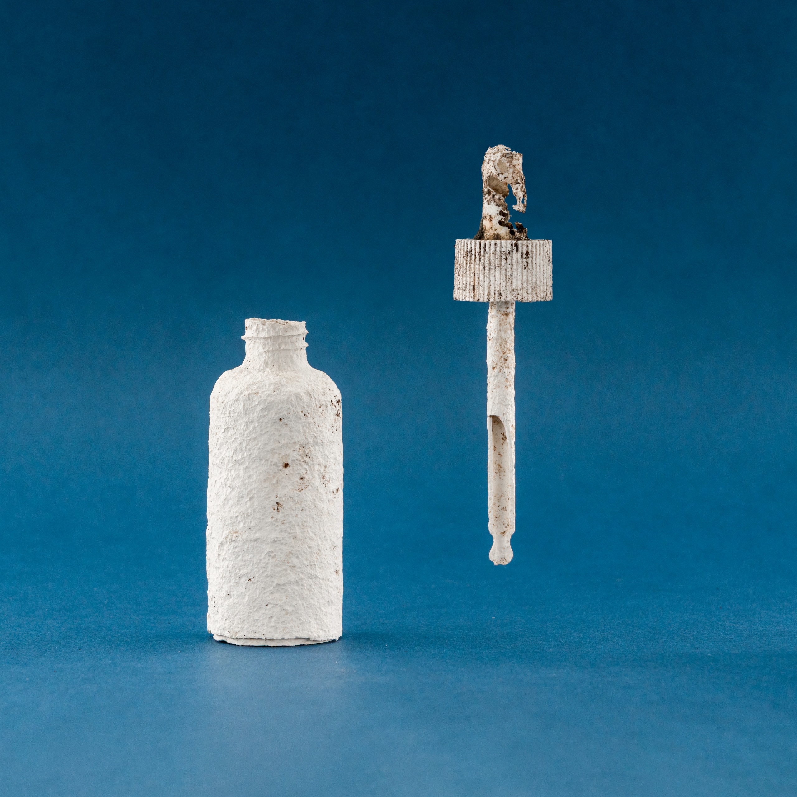
London-based Shellworks won the sustainable design award for its Vivomer Dropper – a “home-compostable” version of the cosmetics staple that, “performs like plastic in use but breaks down within 52 weeks, leaving no trace.”


‘Not only was this project considering innovation, end of life and a full packaging scale, it was really looking at a groundbreaking innovative way to penetrate an already saturated market,” says Pentawards judge and sustainability expert Sebba Alqetrani.

“It’s changing the way we look at consumption, it’s changing the way consumers look at usage and how we package products.”

Next-Gen award

Glasgow-based designer Morgan Hastie, aka The Logo Lassie, won the next-gen award for her Calentón Hot Sauce concept, while University of the Arts London was named educator of the year.

Calentón Hot Sauce by The Logo Lassie

Adam Ryan, head of Pentawards, said this diverse year’s winners show the power of great packaging design.

“What shines through this year is how packaging design touches lives – whether by making beauty more accessible, cutting waste in everyday products, or telling cultural stories through design,” he said.

“It’s proof that innovation can be practical, responsible and visually unforgettable.”

Source

By

DIY spinning coffee table turns into storage and ottoman

Simone Giertz, known for her inventive and often playful creations, has taken furniture design to a new level with her latest project: a spinning coffee table. This unique piece isn’t just a conversation starter; it’s a testament to the creativity and resourcefulness that fans have come to expect from the popular YouTuber and inventor. Inspired by the idea of making everyday objects more fun and functional, Simone’s spinning coffee table brings a dynamic twist to any living room.

The journey of creating the spinning coffee table is documented in a captivating YouTube video where Simone guides viewers through the process, from initial sketches to the final product. The entire project is infused with her signature humor and transparency, revealing not just the successes but also the challenges along the way. The idea stemmed from wanting to make a coffee table that was more than just a static piece of furniture. Simone envisioned a table that could rotate smoothly, allowing users to access items from any side without having to stretch or walk around it.

Designer Name: Simone Giertz

Simone started by designing the table’s structure. She opted for a rectangular tabletop, which naturally lends itself to rotation. The main challenge was figuring out how to make the table spin easily and safely, especially considering the weight of the materials. After exploring several mechanisms, she settled on using a large, industrial-grade lazy Susan bearing, which is typically used for heavy-duty applications. This choice allowed the table to rotate effortlessly while supporting the weight of books, drinks, and even the occasional curious pet.

The construction process was both educational and entertaining. Simone shared her experience with woodworking, metalwork, and problem-solving as she assembled the table. She even highlighted a few mistakes and how she fixed them, making the project feel approachable for DIY enthusiasts. The table’s aesthetic is sleek and modern, featuring a wooden top with a smooth finish and a sturdy metal base. The combination of materials ensures durability while maintaining a minimalist look that fits a variety of interior styles.

One of the most delightful features of the spinning coffee table is its playful functionality. Whether you’re hosting a game night or just relaxing with your favorite snacks, the rotating surface turns the table into an ottoman where you can put your feet up. It also acts as a storage so you can place some stuff that you want to be accessible to you. It has mini shelves and a space under the ottoman where you can put things. It’s a simple idea, but it adds a layer of interactivity that’s both practical and fun.

For those interested in making their own spinning coffee table, Simone’s detailed walkthrough provides plenty of tips and inspiration. She encourages viewers to experiment with their own designs and to embrace the trial-and-error process. The spinning coffee table stands as a shining example of how thoughtful design and a bit of ingenuity can transform ordinary objects into something truly special.

The post DIY spinning coffee table turns into storage and ottoman first appeared on Yanko Design.

By

Solar Winds Wine Tasting Pavilion Imagines Architecture and Energy Flowing Together

Renewable energy systems in commercial architecture often remain hidden behind facades or tucked away on rooftops, treated as necessary but unsightly additions to building design. This approach misses opportunities to celebrate sustainable technology as part of the architectural experience, particularly in industries like wine making, where connection to natural cycles and environmental stewardship could enhance rather than compromise the visitor experience.

The Solar Winds Wine Tasting Pavilion by Michael Jantzen takes a radically different approach to this challenge. This unbuilt concept transforms renewable energy gathering into the starring feature of a winery pavilion, creating a structure where solar panels and wind turbines become sculptural elements that enhance both the building’s beauty and its environmental mission.

Designer: Michael Jantzen

The pavilion’s form immediately captures attention with its flowing series of curved steel panels that sweep across the structure like frozen waves. These panels, formed with two different radii, create a dynamic, undulating canopy that echoes the rolling hills of wine country. The effect feels both organic and futuristic, as if grapevines themselves had inspired a piece of architectural sculpture.

The steel arches and horizontal supports underneath provide the structural framework, clad with glass panels that can automatically open and close for natural ventilation control. This adaptive system allows the pavilion to respond to changing weather conditions while maintaining the flowing aesthetic. An open-air version could eliminate the glass entirely, creating a purely shaded gathering space.

The renewable energy integration becomes part of the visual spectacle rather than hiding in the background. Many of the curved panels incorporate flexible photovoltaic material positioned for optimal sun exposure, generating electricity for both the pavilion and the main winery. Panels without solar cells are painted to match, maintaining the cohesive flowing appearance while providing essential shade for the interior spaces.

Of course, the vertical-axis wind turbine adjacent to the pavilion adds another layer of energy generation and visual drama. The turbine’s sleek profile complements the pavilion’s sculptural form, while the circular bench built around its base creates a contemplative spot for visitors to observe both the technology and the surrounding landscape.

The interior experience feels equally thoughtful, with the curved panels casting intricate, ever-changing shadow patterns across the floor. Visitors can enjoy wine tastings and special events while surrounded by the gentle play of light and shadow, creating an atmosphere that connects them directly to the natural forces powering the building.

That said, the symbolic inspiration runs deeper than mere aesthetics. The trellis-like structure references the fundamental relationship between grapevines and their supporting framework, suggesting that buildings, too, can grow and adapt in harmony with their environment and energy sources.

You’ll notice how this concept challenges conventional approaches to both winery architecture and sustainable design. Rather than treating energy systems as afterthoughts, Jantzen makes them central to the architectural experience, creating spaces where visitors can appreciate both fine wine and the elegant technology that powers their experience.

The Solar Winds Wine Tasting Pavilion invites us to imagine buildings that celebrate their energy sources as proudly as they display their contents. This approach suggests possibilities for architecture that educates, inspires, and delights while advancing environmental goals through visible, beautiful sustainability.

The post Solar Winds Wine Tasting Pavilion Imagines Architecture and Energy Flowing Together first appeared on Yanko Design.

By

inversion debuts arc, the first space delivery vehicle that transports materials to earth

space delivery vehicle arc transports materials anywhere


Inversion unveils Arc, the dubbed world’s first space delivery vehicle that can transport materials to Earth. Designed to send and deliver cargo from space to any place on Earth in less than one hour, the spacecraft can also be used for high-speed flight tests known as hypersonic testing. Arc uses an actively controlled parachute system that is able to steer, maneuver, redirect, and softly touch down to protect its frame and the goods it is shipping. It relies on the LA-based company’s custom-built processing core and is powered by AI and control algorithms.


The space delivery vehicle Arc starts its mission by being launched into low Earth orbit using a rocket. After it reaches orbit, it moves around the planet in space, and when a delivery is needed, the spacecraft receives a signal from Earth. Then it leaves orbit, enters the atmosphere, and travels through the air at very high speed. During reentry back to Earth, Arc can move sideways across long distances, allowing it to change its path while it comes down. When it reaches a lower altitude, it slows down and lands using parachutes. The full flight happens without a pilot and works through autonomous control systems. On October 2nd, 2025, the team conducted precision drop testing, showcasing that the space delivery vehicle Arc is able to land and ship goods on its own.

all images courtesy of Inversion


Reusable and modular spacecraft made of lightweight metals


Inversion’s Arc can carry payloads such as equipment, food, or other mission cargo. Its payload bay is designed to fit different shapes and sizes of materials. The company says that several Arc vehicles can be placed in orbit at the same time to form constellations, and each ‘constellation’ can serve a different region or customer depending on need. The space delivery vehicle is made from lightweight metals and heat-resistant composites that can survive extreme heat during reentry from space. Its body is shaped to control air pressure and reduce heat load. 


The spacecraft includes different main sections. The outer shell and internal frame hold all the parts together, while the payload bay in the middle stores the goods. There are layers of lightweight and heatproof materials on the surface to protect Arc when it enters again on Earth, and there’s also a small engine system used to adjust its position and speed in space. The vehicle’s thermal protection system is made with help from NASA, designed for high-temperature environments that occur when a spacecraft moves from space into the atmosphere.

Inversion unveils Arc, the dubbed world’s first space delivery vehicle that can transport materials to Earth


Vehicle that doubles as test platform for hypersonic flight


Besides delivering cargo, Arc can be used as a test platform for hypersonic flight, and the company believes that the dubbed first space delivery vehicle, Arc, can reach speeds above Mach 20 and can hold those speeds for long periods. So far, the spacecraft may also create and withstand high g-forces, which are the pressure forces that happen during fast movement. The team adds that the vehicle can land safely and be reused; each test can be repeated quickly. This helps reduce the cost of hypersonic experiments and speeds up development.


The spacecraft Arc can deliver cargo to ‘any place on Earth’ where normal transport systems are not possible, including remote regions, disaster zones, or military areas without airports or roads. Arc follows earlier work by Inversion’s first spacecraft called Ray, which was launched in January 2025. The Ray mission helped test important systems such as solar panels, propulsion, and separation technology. These systems became the foundation for the space delivery vehicle, and at the present time, the company plans Arc’s first flight mission for 2026.

the vehicle uses a parachute to land safely on land and protect its shipped goods

the space delivery vehicle Arc starts its mission by being launched into low Earth orbit using a rocket

during reentry back to Earth, the spacecraft can move sideways across long distances

the frame of the spacecraft is made of lightweight and heatproof materials

the vehicle’s thermal protection system is made with help from NASA

the company plans the spacecraft’s first flight mission for 2026


project info:


name: Arc

company: Inversion | @inversionspace

The post inversion debuts arc, the first space delivery vehicle that transports materials to earth appeared first on designboom | architecture & design magazine.

By

landscape roof tops besley & spresser’s pavilion in sydney, made from recycled oyster shells

Besley & Spresser unveils sculptural structure on Sydney Harbor


The Pier Pavilion, a permanent civic landmark designed by Besley & Spresser, made almost entirely from a bespoke terrazzo embedded with recycled rock oyster shells, opens on Sydney Harbor. The project, completed in 2025 after winning a national design competition in 2020, is the latest addition to the ongoing regeneration of the harbor along its western edge. Anchoring the pavilion, a freestanding timber volume accommodates a bar, storage, and service functions for events, while the rest of the space remains flexible for public use, whether for gatherings, performances, or simply pausing by the water. ‘We wanted the pavilion to have a distinctly civic feel; all are welcome here,’ says Peter Besley.


The sculptural structure draws on the layered identity of the site, where land, sea, and sky meet. Its plan takes cues from the distinctive coves and peninsulas of the harbor, unfolding as a series of open and enclosed spaces framed by a double colonnade. Eighty-six slender, moment-resisting columns hold up a landscape roof planted with native species, sandstone, and hollow logs to attract birds and insects. A circular oculus punctures the roof, allowing daylight and weather to pass through, projecting a shifting circle of light that moves across the terrazzo floor. The Pier Pavilion’s custom oyster terrazzo is crafted from recycled aggregates and thousands of reclaimed Sydney rock oyster shells.

all images by Rory Gardiner, unless stated otherwise


Oyster shells find new life as the pier pavilion’s defining material


The defining material of Pier Pavilion, oyster terrazzo, was developed specifically for the pavilion in collaboration with Terrazzo Australian Marble. Over a year of experimentation led to a mix combining whole Sydney rock oyster shells with various recycled aggregates. When polished, the terrazzo shows the detailed patterns of the shells, connecting the building to the area’s coastal environment and ancient oyster reefs. Nearly half a million shells, otherwise destined for landfill, were reused in the process. ‘The Pavilion references human gathering by the sea through its use of recycled Sydney Rock Oyster shells,’ explains the co-director of the Australian practice, Jessica Spresser. ‘We wanted to pay respect to the long history of oyster feasting in the area, and to celebrate the use of a unique material in the public realm.’

Besley & Spresser completes the Pier Pavilion in Sydney


turning structure into landscape


Structurally, Besley & Spresser’s pavilion achieves a long free span by concentrating its load at the perimeter, leaving the central space open and uninterrupted. The terrazzo is hung in panels from the ceiling, columns, and fascia in the manner of stone cladding, while the folded timber deck of the roof mirrors the geometry of surrounding headlands.


Selected through a design competition by Infrastructure NSW, the Pier Pavilion reflects the agency’s brief for a civic space that feels both monumental and welcoming. ‘Besley & Spresser’s design celebrates the defining elements of the site—land, sky, and sea—while creating a prominent visual landmark,’ the client notes. ‘The result is a stunning public space where people can shelter, meet, gather, and relax by the water.’

made almost entirely from a bespoke terrazzo embedded with recycled rock oyster shells

the latest addition to the ongoing regeneration of the harbor along its western edge

the folded timber deck of the roof mirrors the geometry of surrounding headlands

the space remains flexible for public use

a freestanding timber volume accommodates a bar, storage, and service functions for events

the terrazzo is hung in panels from the ceiling, columns, and fascia in the manner of stone cladding

the sculptural structure draws on the layered identity of the site

unfolding as a series of open and enclosed spaces framed by a double colonnade

eighty-six slender, moment-resisting columns hold up the landscape roof

a circular oculus punctures the roof

a shifting circle of light moves across the terrazzo floor

Besley & Spresser’s pavilion achieves a long free span by concentrating its load at the perimeter


project info:


name: Pier Pavilion

architect: Besley & Spresser | @besleyspresser

location: Sydney Harbour, Australia


client: Infrastructure NSW

builder: Stephen Edwards Constructions

structural engineer: SDA Structures

facade engineer: Ironbridge Engineering

lighting & services: Steensen Varming

landscape & hydraulics: CJ Arms

oyster terrazzo: Terrazzo Australian Marble

planning consultant: SJB Planning

BCA, access: Group DLA

crown certification: Philip Chun

marine engineer: AW Maritime

wind consultant: Windtech

concrete consultant: Mahaffey Associates

acoustics: Renzo Tonin

transport consultant: JMT Consulting

safety consultant: Safe Design Australia

photographer: Rory Gardiner

The post landscape roof tops besley & spresser’s pavilion in sydney, made from recycled oyster shells appeared first on designboom | architecture & design magazine.

By

UAE pavilion at expo 2025 osaka soars 16 meters high with 90 palm-made columns

uae pavilion at expo 2025 in osaka


The UAE Pavilion opened its doors at Expo 2025 in Osaka, Kansai, offering visitors an immersive celebration of Emirati heritage, sustainability, and innovation. Spearheaded by the UAE Expo Office and designed by the Earth to Ether Design Collective, the pavilion brings together Emirati, Japanese, and international expertise in architecture, design, and storytelling. Its iconic structure, inspired by the date palm, features 90 soaring rachis columns reaching up to 16 meters, while the interior invites guests on a multisensory journey highlighting the UAE’s contributions to space exploration, healthcare, and environmental stewardship.

The UAE Pavilion at Expo 2025 Osaka, Kansai is a testament to global collaboration, uniting Emirati, Japanese, and international expertise | all images courtesy of UAE Pavilion


traditional emirati architecture meets cutting-edge materials


The UAE Pavilion in Osaka builds on a rich history of global collaborations, tracing back to Expo ’70 and continuing with Expo 2020 Dubai. By combining traditional Emirati architecture with cutting-edge materials and cross-cultural design expertise, the pavilion embodies a forward-looking vision while honoring heritage. It stands as a testament to the enduring partnership between the UAE and Japan and demonstrates how design can serve as a bridge between cultures, traditions, and innovations.


At the heart of the Expo 2025 Osaka pavilion is the Earth to Ether Design Collective, an interdisciplinary team integrating architecture, engineering, technology, and craft. Emirati leadership from Mariam Almemari, Shaikha Al Ketbi, Shamma Al Bastaki, and Omar Al Suwaidi guided the project, collaborating with international partners such as Rimond from Milan, Japanese woodworking experts Process Iguchi and Shelter, German experience designers Atelier Brückner, UAE-based storytellers R/O/U/Y/A, and Danish-Norwegian landscape specialists SLA. This global network ensured the pavilion is not only visually striking but also culturally resonant and experientially engaging.

the entrance features Datecrete pavers, sustainable cement alternative, a pioneering Emirati innovation made from crushed date seeds


the pavilion’s pavers are made from crushed date seeds


The pavilion’s signature 90 rachis columns are crafted from agricultural date palm waste sourced through a novel supply chain co-developed with farmers across the UAE and MENA region. This approach mixes sustainable practices with traditional materials, reflecting a commitment to both heritage and environmental responsibility.


Meanwhile, the entrance features Datecrete pavers, sustainable cement alternative, a pioneering Emirati innovation made from crushed date seeds.

the UAE Pavilion’s signature feature is a striking forest of 90 rachis columns, soaring up to 16 metres


The outdoor spaces of the UAE Pavilion are designed as a cross-cultural conversation. Japanese satoyama woodlands, represented by oak and red pine, frame the pavilion, while a pergola of Japanese cedar intersects with Emirati khoos-patterned canopies. Outdoor furniture merges recycled date palm materials and Dateform, a pioneering UAE innovation, creating a harmonious landscape where nature, culture, and design converge.


Inside, visitors encounter a thoughtfully curated journey blending art, multimedia, and interior design. Atelier Brückner’s experience design guides guests through the UAE’s achievements and aspirations, from space exploration to healthcare innovation, offering a narrative that is both educational and emotionally resonant. Each element is purposefully integrated to create a holistic experience that mirrors the pavilion’s overarching themes of sustainability, heritage, and collaboration.

the pavilion integrates agricultural date palm waste with masterful Japanese woodworking expertise

to source agricultural date palm waste materials for the columns, the Earth to Ether Design Collective co-developed a supply chain in partnership with farmers from across the UAE and MENA region

inside, visitors embark on a multi-sensory journey that celebrates the UAE’s explorers of space  

the Stewards of Sustainability from left to right: Yousif Bin Saeed Al Lootah; HE. Dr. Nawal Al Hosany; Maryam Hassani and Hayk Vasilyan; Maryam Al Mazrouei; and Professors Martin Takáč and Samuel Horváth

UAE Pavilion’s Woven Legacies area

the project reaffirms the enduring partnership between the UAE and Japan

the Explorers of Space from left to right: Dr. Sultan Al Neyadi; Koichi Wakata; Mohsen Al Awadhi; Mouza Almualla; and Nora Al Matrooshi

this project builds on a legacy of global collaboration, from Expo ’70 to Expo 2020 Dubai

drawing inspiration from the iconic date palm, the UAE pavilion reinterprets areesh— traditional Emirati vernacular architecture

innovative material exploration lies at the heart of the pavilion’s 90 signature rachis columns


project info:


name: The UAE Pavilion | @uaeatexpo

program: Expo 2025 Osaka | @expo2025japan

design: Earth to Ether Design Collective

The post UAE pavilion at expo 2025 osaka soars 16 meters high with 90 palm-made columns appeared first on designboom | architecture & design magazine.

By

How is Base Design using AI?

Base Design is a global network of creative studios with outposts in New York, Brussels, Geneva and Melbourne. It works on strategy, design and technology projects for clients like 12 matcha, Bellerose and Théâtre du Châtelet.

Here Mirek Nisenbaum, partner and digital director at BaseNYC, explains how they use AI, and how he feels about it.

You can see all the articles in this series here.

Broadly speaking, are you excited for how AI will change the design industry, or nervous?

Excited, without hesitation. Design has always evolved alongside new tools, from the printing press to Photoshop to Figma, and AI is another chapter in that story.

What excites me most is its potential to push us into unexpected territories, to help us reframe what concept and craft can mean today.

Of course, there are risks–  homogenisation, over-reliance, ethical pitfalls, even skills atrophy. I see those as challenges to approach with eyes wide open.

Our job is to bring discernment, taste, and critical thinking to the table, ensuring AI pushes us beyond the common denominator rather than dragging us down to it.

Do you have an agreed policy around AI as a business?

Yes, and it was one of the first things we worked on when AI tools began entering creative workflows.

We wanted clarity for our teams and reassurance for our clients, so we built a policy around transparency, human oversight, and protecting client IP.

The process was collaborative – we convened leads from cross-functional teams, mapped out the risks and opportunities, and then tested the guidelines against real project scenarios.

The outcome is a living policy that sets guardrails around tool use, security, privacy, documentation, and contract language.

When did you realise AI was going to have an impact on design?

At first it was gradual, seeing designers and artists experiment with GenAI tools a few years back. Results were unexpected, mostly funny, sometimes uncanny, but it was becoming clear that something special was beginning to happen.

Our Brussels team used GenAI as the core concept and execution for a campaign, and we could see its creative potential, even in its rough early stage.

I saw designers begin experimenting with LLMs for language in decks, research, insights, and today some of our creatives are already “vibe coding” tools for design ideation and prototyping.

This progression is making it clear to me that we are starting to see a fundamental shift in how design is practiced.

Have you undergone any AI training, either as a studio or individuals?

We’ve approached training as a mix of structured workshops and bottom-up experimentation.

We kicked off the process by bringing together a cross-disciplinary group of AI champions, a few people from every Base studio, representing different areas of expertise. Some were advanced early adopters, while others were just coming on board with curiosity and an open mind.

This group was tasked with identifying needs and blockers, and with activating adoption and experimentation across studios and disciplines.

We ran internal sessions focused on mapping workflows and pinpointing where AI could accelerate work and where it risked making it generic, from admin to creative.

We partnered with several AI-focused companies to dig deeper into workflows and gain first-hand experience with tools, guided by the teams building them. We also invited outside facilitators to introduce prompting techniques and best practices, helping our teams approach AI as a true creative partner rather than just a set of new tools.

Our hope is that the impact will be cultural as much as practical – people feeling more confident, more critical, and more willing to experiment.

How do you use AI in the studio’s creative process?

It’s the challenge we are currently navigating.

I see AI’s real promise in exploration, helping us push our thinking, test ideas in multiple directions, simulate scenarios, and prototype quickly.

The easiest uses today are more basic – asset production or workflow assistance, they don’t challenge us conceptually.

We always felt that words are as important in our creative work as images. Now with AI, the function of language as a model of the world we are building has become both amplified and more accessible for everyone on the team.

We can think deeper, surface obvious ideas quickly, use them as bounce-off points, and uncover unexpected ones.

Do you think clients care if/how you use AI in your work?

Yes, but in different ways. Some clients are curious and want to understand how AI might accelerate their own processes, while others are primarily concerned about IP protection.

What’s consistent is that transparency helps. When we explain our policy, how AI supports but never replaces judgment, it builds trust, and in some cases even strengthens our advisory role.

Do you use AI for any non-creative aspects of running your business?

We have an integrated engineering group, Base Digital, and unsurprisingly that team has been among the most active and immediate users of AI as a coding assistant.

They’ve seen direct gains in productivity, while also becoming early experts in agentic workflows, systems we can now apply both to our internal processes and to client projects.

Beyond engineering, we’ve been piloting AI in business development, proposal drafting, and internal knowledge management. For example, we’ve connected our shared drives and Slack channels to a private GPT, allowing teams to quickly surface insights from precedents, case studies, and research materials.

It saves time, accelerates onboarding for new team members, and ensures knowledge doesn’t get lost.

Operationally, AI also streamlines meeting notes, summarises transcripts, and highlights insights we might otherwise miss. In this capacity, it’s already proving highly effective.

Beyond the best known tools, what is one AI tool that you would recommend to other design studios?

We’ve been testing and piloting a lot of tools.

A few of the favourites currently are – NotebookLM for research and learning, Granola for note taking, Node based tool Flora for design and multimodel experimentation, well-known ones Midjourney (be aware of image rights) and Adobe Firefly (when copyright is a must) for images, Runway for video.

We also use Flux Kontext, Fal, Krea and Cursor for coding, Magnifique and Topaz for image upscaling.

Each has its niche, but what keeps us on our toes is how quickly the ecosystem is evolving.

Source

By

“From rock bottom to rock solid” – one designer shares his story

Creative career paths aren’t always clean-cut. Go to uni, get a degree, get a job in your field – easy, right? Yeah… not quite.

Some people hit the ground running. Others, like me,  get stuck at the start line.

I always knew I wanted to work in design. But honestly? I wasn’t very good at it.

I landed an internship at an agency in my second year of uni – a chance to prove myself. But a few days in, I could feel it – they weren’t happy with my work. I was falling behind. Everything I delivered felt subpar.

I left that placement feeling useless. Questioning whether I’d made a huge mistake. Racking up student debt with nothing to show for it.

And at the same time, I was battling a drug addiction that started in second year, and escalated fast when life began spiralling.

Final year flew by, mostly thanks to a haze of benzos, painkillers and dissociation. Somehow, I scraped through and graduated. But I felt broken.

No jobs. No direction. No self-worth.

“It’s wild what happens when someone believes in you. And even wilder when you start believing in yourself.”

So I went where a lot of people go when they feel stuck – retail.

I bounced between stores for eight years. I was good with people, but felt like that skill would never get me anywhere. The work drained me, and my addiction worsened. But somehow, I stayed afloat.

Until one day during lockdown, I nearly overdosed.

I was just lucid enough to feel myself slipping – heart slowing, breath disappearing. And I pulled myself out. That was the day I got clean.

When the numbness wore off, I woke up. I wanted something more – something I could be proud of. Something I could own.

(It was around this time that I was also diagnosed with complex PTSD. Instead of seeing this as a setback, I used my new knowledge as additional fuel to my fire.)

By what still feels like fate, I messaged an old uni mate just as a role had opened at his studio. He saw value in the one thing I had – my people skills. The ability to build relationships, sell ideas, and get people excited about the work.

That message changed my life.

Suddenly, I was working in the creative industry – not as a designer, but as someone who could champion creativity, fuel the studio, and connect it to the right people.

And it clicked. I’d found the thing I was meant to do.

Four years on, I’m now helping to shape another studio with the amazing Jack Last.

We’ve built something I’m immensely proud of. We work with incredible brands, deliver quality motion graphics, and the inner designer in me still gets a kick every time I see a new project come to life.

I’ve travelled the world, met the most inspiring people, and finally feel like I’ve found my place.

If you’d told me five years ago this is where I’d be, I’d have told you to pull the other one. But grit and determination, paired with a bit of luck and support, can change everything.

It’s wild what happens when someone believes in you. And even wilder when you start believing in yourself.

So I guess my message ahead of World Mental Health Week is don’t give up on yourself. I was close once, but use that anguish and frustration as fuel. You never know where you might end up.

If you or someone you know is struggling with mental health issues, Mind has a guide to where you can find help. The charity also has a specific resource for those fighting drug or alcohol addiction.

Jimmy Gordon is head of partnerships at OK Social, and co-host of the Months in Motion podcast.

Source