[searchandfilter fields="search,category"]

By

New report looks to modernise “outdated” D&T education

A new report has laid out a series of recommendations to reverse the alarming slump in design and technology (D&T) education in England.

The government this week published its Curriculum and Assessment Review, which looked at how education in this country needs to evolve.

Led by Professor Becky Francis, the taskforce set out to ensure “the curriculum is fit for the future, addresses the rich knowledge and skills young people need to thrive in our fast-changing world, and encourages a love of learning.”

The section on D&T painted a grim picture of the state of the subject.

“The evidence gathered during the Review suggests that D&T in schools has long been in poor health,” the report states. They pointed to “a substantial decline in entries for GCSE D&T” which have fallen 68% in the past ten years.

In 2024/25, 57% of state schools entered students for GCSE D&T. But crucially, 17% of Key Stage 3 students who wanted to go on and study D&T were unable to, the highest percentage of any subject in the national curriculum.

This is party down to problems recruiting teachers – in 2023/24, only 27% of the target for training new D&T teachers was met, the report explains.

And the drop-off to A-level is pronounced – only 1% of A-levels taken in 2023/24 were in D&T.

All of this makes for worrying reading, especially given that the creative industries is one of the “highest potential sectors” which the government hopes will drive the UK economy.

And the report points out that access to D&T is “especially pronounced along lines of disadvantage.” 60% of the schools with the most disadvantaged students had no GCSE entries in D&T, compared to only 17% of the schools with the lowest proportion of disadvantaged students.

This finding echoes recent concerns about access to the creative industries.

The Sutton Trust’s A Class Act report highlighted how people from working class backgrounds are significantly underrepresented in creative fields. And writing for Design Week, Lawrence Lartey of Ravensbourne University London called on the industry to focus on addressing these disparities.

“AI will continue to evolve, but it’s human creativity that will determine the future,” he wrote.

“To meet the challenges ahead, we must first fix the pipeline. Only then can we build a more resilient, inclusive, and forward-looking creative economy – one that doesn’t just survive, but thrives.”

To help address the decline in D&T, the report made several recommendations, “to refresh the subject and make it more relevant and easier for schools to deliver.”

The D&T curriculum has become “outdated” and needs to evolve to “clarify the subject’s distinctive and practical nature.” In particular, the report wants more focus on creative and conceptual thinking, including “problem solving, iteration and testing.”
The curriculum should focus more on “social responsibility and inclusive design” to better equip students to meet the changing nature of the problems designers are being asked to solve. The report points out the current curriculum, “does not explicitly mention sustainability or the benefits of a circular economy.”
The report calls for more focus on materials, to give students a broader range of experience handling different materials and more understanding of how and why they are chosen. It said that in the current course, “pupils are simply required to memorise a list of materials and their properties in isolation.” More understanding of materiality would, the report suggests, “align the D&T curriculum better with modern, real-world design practice.”
The report calls for a clearer definition of what “final product” in a D&T context means, “alongside a clear emphasis on the full design process, including design content and theory.”

Taken together, the recommendations aim to make D&T more “aspirational” and modernise it in line with the UK’s thriving creative industries.

These changes, the report hopes, will help reposition D&T, “as an exciting and ambitious subject that can introduce students to skills in design and making, as well as prepare them for technical careers in design, creative and advanced manufacturing industries.”

Minnie Moll, chief executive of the Design Council, welcomed the recommendations.

“This is a landmark moment for design education,” she said.

“We are delighted to see the government embrace the importance of design thinking and sustainability in preparing the next generation with the skills our planet needs.

“The changes announced today are a testament to the collective efforts of the design and education community to ensure that design is recognised as a vital capability for solving the biggest challenges of our time.”

The government will introduce a new national curriculum in 2028.

Source

By

JDO refines Jameson’s brand and packaging

Founded in 1780, Jameson is the world’s best-selling Irish whiskey. With a legacy that runs deep, its green bottle, logomark and crest have become iconic over time.

Still, longevity brings its own pressure to stay relevant. Jameson’s new identity, created by JDO, looks to strengthen what people already know and love, while subtly modernising how it’s presented.

“It’s important for us to stay current and future-proof the brand,” says global marketing manager Claire Henry.

She says they spoke with whiskey drinkers, bartenders and retailers, “from dimly lit bars in New York to busy off-licences in Johannesburg,” and that highlighted “clear opportunities to make Jameson stand out more distinctly.”

In 2018, Jameson led a redesign centred on its flagship whiskey, the Original. This time, the scope was broader. JDO was tasked with creating visual harmony across the full portfolio, while subtly updating the Original.

JDO’s brand and packaging redesign for Jameson

The aim was twofold – to invite new drinkers in, and to give long-time fans clearer paths to explore and trade up within the Jameson family.

“We also realised the packs could do a better job of telling each whiskey’s story,” says Henry. “And we wanted to make it easier for people to see the differences between the products and understand how the range fits together.”

The team at JDO had to tread a fine line. On one hand, there was the heritage of the legacy brand, which called for careful, considered design decisions. On the other hand, there was the irreverent spirit of “the serious whiskey that does not take itself too seriously.” The two had to meet halfway.

Certain elements, such as the arched logo, the recognisable crest, and the seal (or the lollipop), were iconic in their own right, so “ensuring that they remained magnetic was really key to the brief we gave JDO,” says Henry.

The creative challenge was to take what already worked and sharpen it to reveal more of its character.

The updated wordmark

The crest was re-sculpted to stand taller on the pack, while the wordmark was given a taller cap height to lend it more presence. The team refined the serifs, tightened the drop shadows, and added a “nick” to the crossbar of the ‘A.’

Every detail was a question of restraint, knowing what to keep and how far to push change. “There’s so much equity in that logo around the world that throwing the baby out with the bathwater would’ve been a bit of a crime,” says JDO’s creative director Ben Ridley.

The tweaks to the typography, coupled with the introduction of a brighter colour palette, bring a touch of playfulness to the brand’s visual voice, as does the art direction.

“Introducing the bottle illustration gives us flexibility; we don’t need a flawless, high-gloss render every time,” says Ridley. “It can feel looser, more characterful.”

JDO introduced a bottle illustration, now used across the brand

While buffing the overarching identity, the team also built a shared system of visual codes that unites Jameson’s family of whiskeys, yet leaves room for each expression to show its own character.

“The idea is to bring people further into the Jameson world,” says Ridley. “You start with the Original, then ask – what feels a little more refined? What finishes feel more elevated? What’s more giftable, more desirable? Through a mix of design cues, we can speak to seasoned whiskey drinkers while still welcoming those just beginning their journey.”

The agency introduced refinements across every tier of the range – from the Original to the Reserve and Collectible series.

The ‘Proud Bottle,’ used for the Original, got an update. The shoulder of the bottle was elevated, and the neck shortened, which allowed the logo to be placed higher up on the pack, demanding more attention on the shelf.

The Reserve Series, with the expanded slip labels

The Reserve Series gained more storytelling through an expanded slip label that creates space for details about cask selection, ageing, and craft, turning each bottle into its own narrative. The use of two typefaces, Trade Gothic LT Pro and Sackers Gothic, gives the range both cohesion and distinction.

“When you’re designing a whiskey portfolio, you still want every bottle to feel part of the same family, but with a bit of its own personality,” says Ridley. “Each liquid has its own story – its own craft and character – and the design had to reflect that.”

The new identity, now being rolled out across every touchpoint, has, in Henry’s words, given the “brand a renewed sense of purpose.”

Across the portfolio, the team added premium print finishes

“Redesigning a brand like Jameson means walking a fine line,” says Ridley. “It’s not about starting over; it’s about understanding what already connects with people and drawing more of that character out, rather than sanding it down.”

Every change, as Ridley points out, no matter how minor, compounds quickly – small moves across the range can transform how the brand feels as a whole.

“It’s the quiet shifts that make the biggest impact,” he adds. “Carried through the full range, those refinements ripple outwards and build into something much bigger.”

The Jameson Original, with the updated ‘Proud Bottle’

Source

By

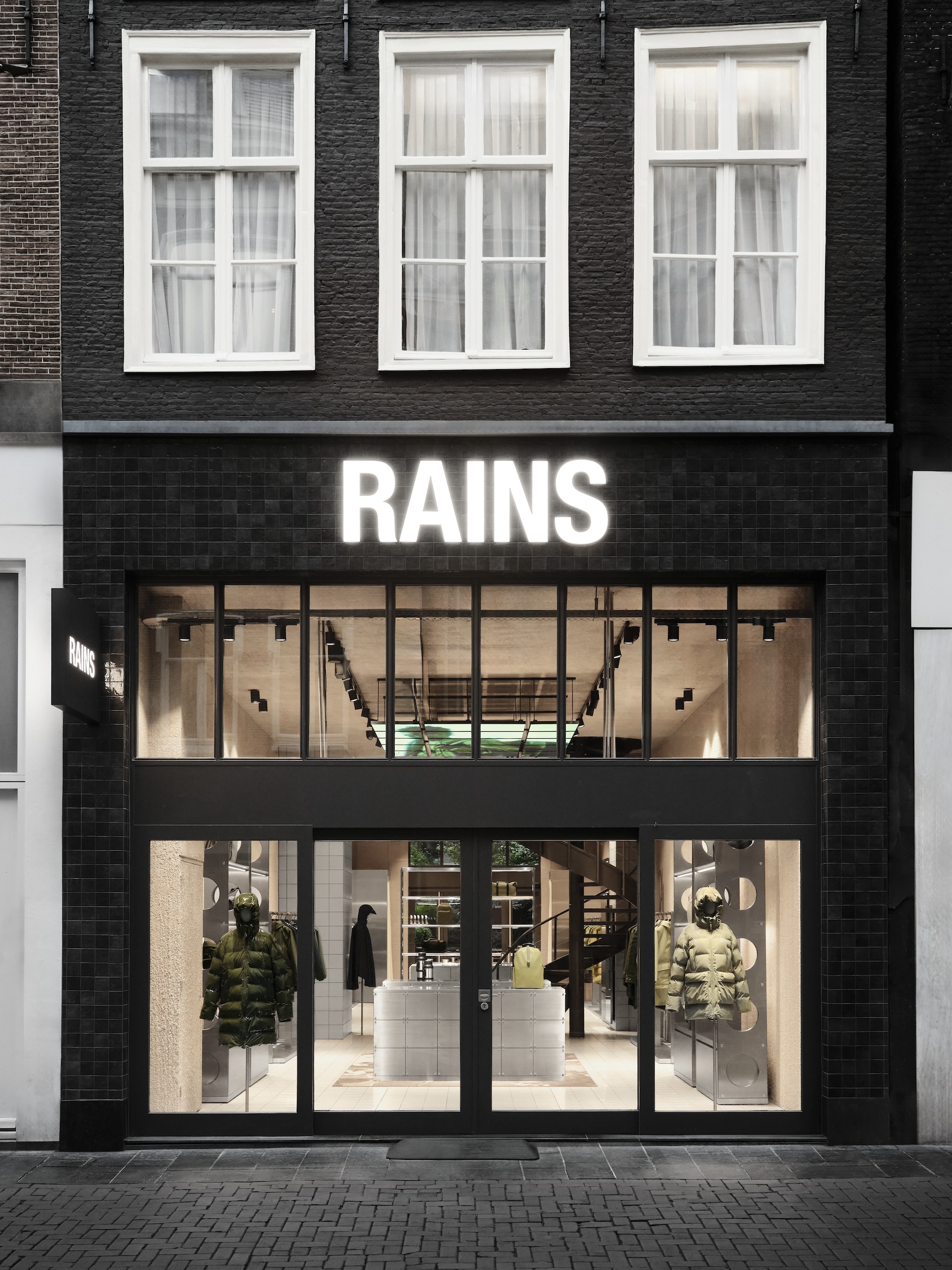
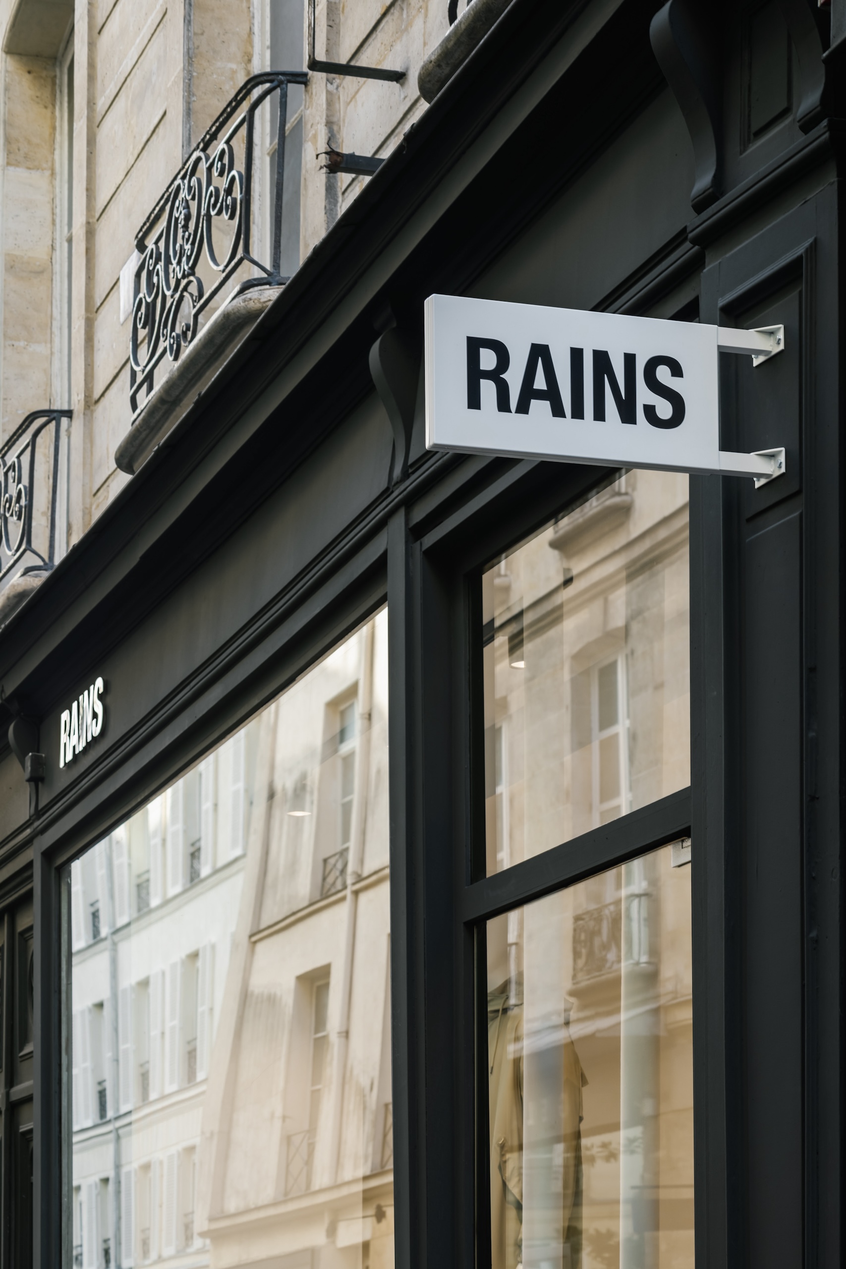
“Wet, urban, explorative” – How Rains shapes a cult brand through design

Whether you’re tuned into fashion or not, chances are you’ve seen the viral clip of an invite to the SS24 show by Rains, the Danish outerwear label that began its journey with a single poncho and has since transformed into a global cult brand for neo-Scandinavian rainwear.

In the clip, the invite seems blank at first, but once it’s held in the rain, its message appears – revealed only when drenched.


View this post on Instagram


A post shared by Rains (@rains)

The brand has come to be known for its material innovation, functional minimalism, and urban-outdoor sensibility. What’s perhaps less celebrated is its graphic voice – the quiet wit and visual precision that give form to how the brand speaks.

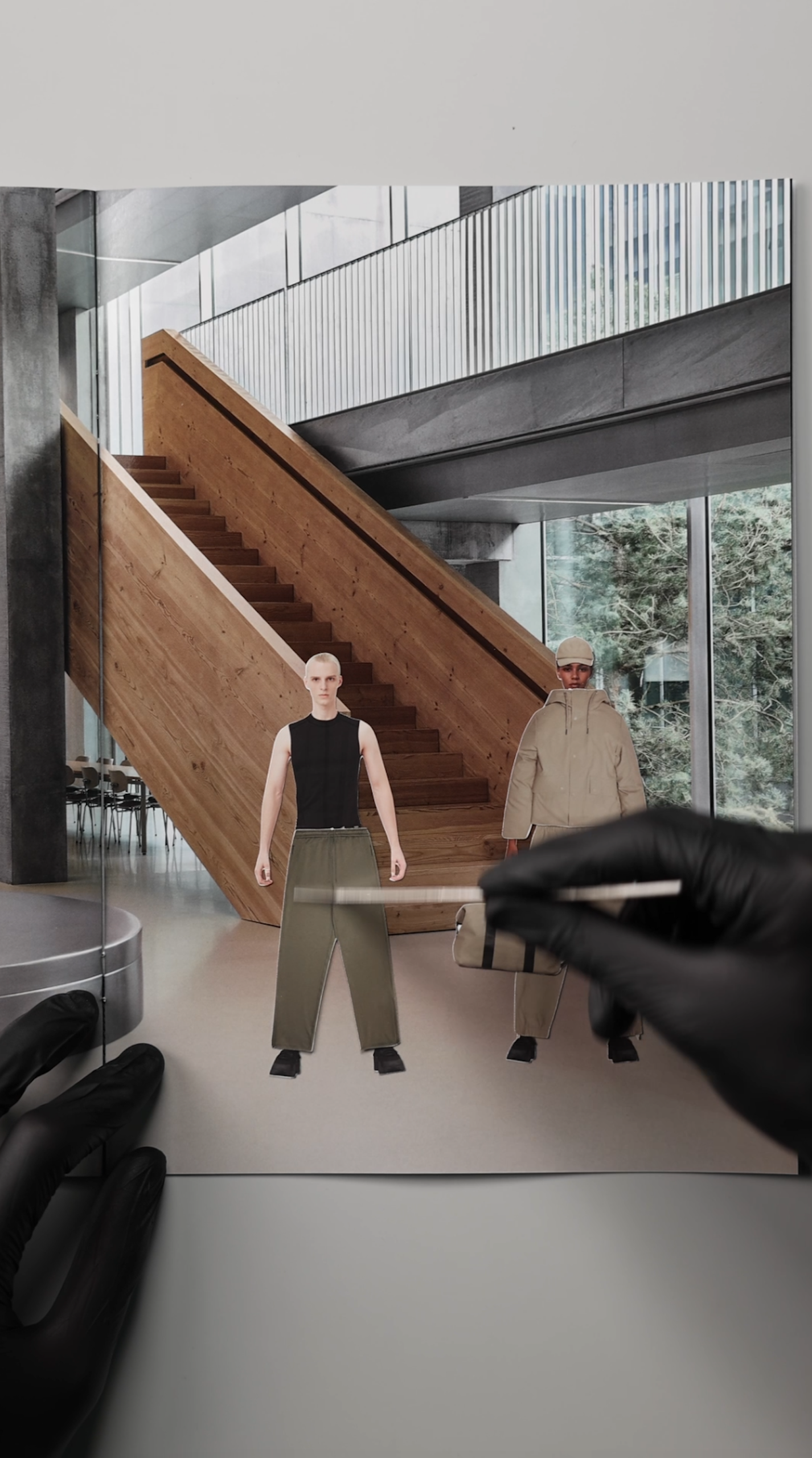
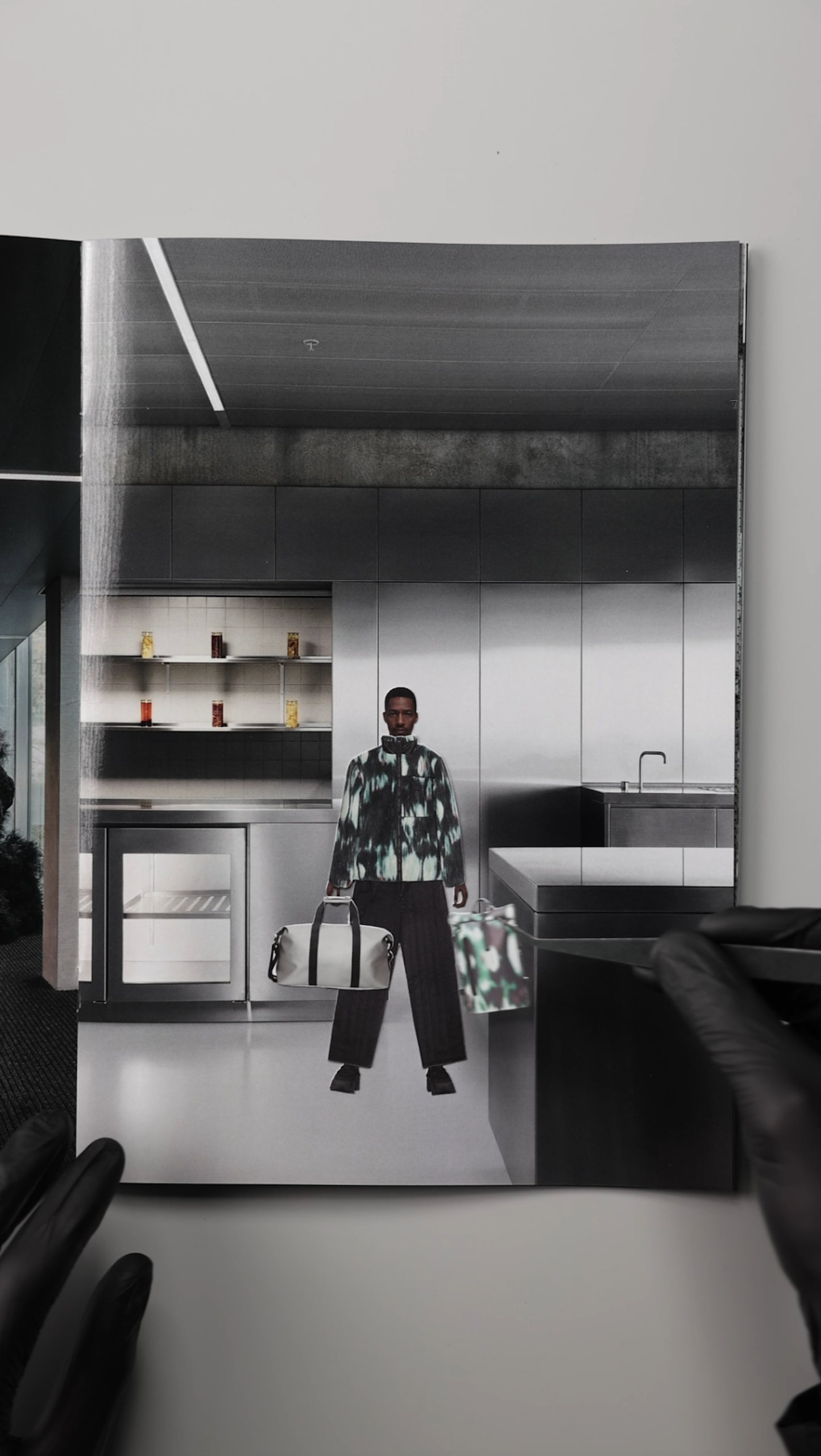
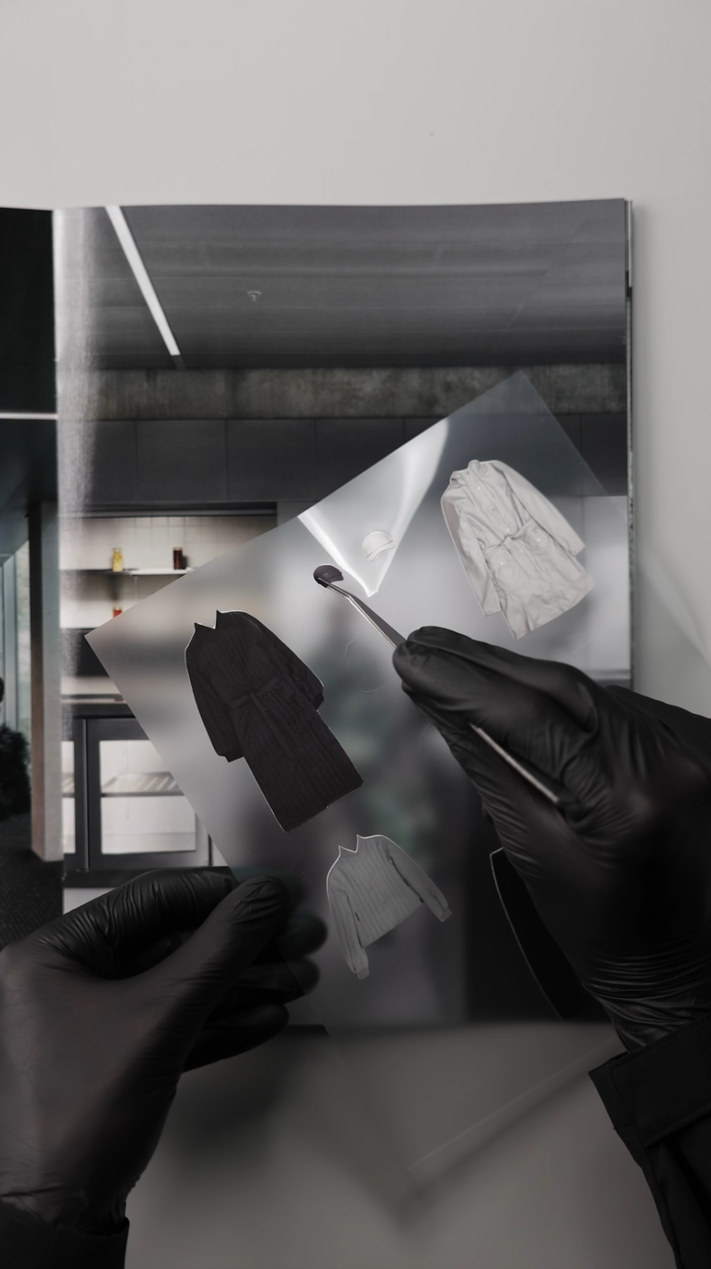
While the Rains aesthetic is rooted in Scandinavian minimalism, its design team continues to find subtle moments of surprise within that restraint. There’s a sense of play beneath the polish – whether it’s an invitation that comes to life in the rain, or a sticker book that playfully layers looks from the AW25 collection, each gesture expands the brand’s visual language without breaking its clarity.

To understand more, we spoke with brand marketing director Joshua Bredehoeft about the brand’s visual world, the joy of editing, and why, at Rains, design and marketing move as one.

What have been the pivotal moments of creative risk or reinvention that shaped how Rains expresses itself today?

I’d say there were three major moments.

First, digital shows. They made us imagine Rains through a digital lens – as this was the only way to communicate with our audience when we were in lockdown. It encouraged us to explore 360-degree storytelling from a digital POV, which has informed how we campaign today, where the concept funnels down across everything – social, web, product descriptions, packaging.

It forced us to think in “hooks” – creating something visually arresting and compelling, which makes people think differently about our brand.

Second, our Paris Fashion Week runway shows. Debuting on this calendar transformed the perception of Rains – internally and externally.

It evolved what Rains could be from a product level, which then gave us the green light to trickle this identity down into everything else.

We got to think about what a runway moment looks like for a brand like Rains in Paris. The contrast of an urban outdoor brand on a sophisticated runway gave us new tensions to explore. That has 100% informed so much of what we do today.

Each of our shows also has its own identity, allowing us to play and contrast our minimalist graphical universe. That pushed us outside of our comfort zone and gave us the courage to imagine ourselves through a new graphical lens.

Thirdly, the new identity. The former was very heritage-based. The new one (launched in 2022) was like a fresh haircut that made us feel like ourselves.

It gave us the courage to dare, to be more editorial whilst sticking to our roots of urban exploration. Some of the people who followed us from the beginning were very provoked by the change, but as time went on, they saw the vision.


Let’s talk about that identity. What made it the right time for a change, and what did that shift unlock for the brand?

The former was very heritage-focused and called for visuals that didn’t feel aligned with the new direction we wanted to take.

We had come to a place where we were quite serious about pursuing a runway version of Rains, speaking to a more conceptual universe that mixed an urban lifestyle with a sense of exploration.

The new logo gave us a base to be bolder with our concepts and seasonal storylines, whilst maintaining a clean expression to contrast any wild ideas.

Rains is often described as embodying Scandinavian minimalism, but minimalism can be restrictive. How do you work within that framework while leaving space for visual evolution?

To be Scandinavian is to edit, edit, edit – to take an idea to its core, its simplest place and work from there.

This means you really understand what you’re trying to do and why, which is always a great foundation for creative or graphic work because it doesn’t feel like restraint, but clarity.


Have there been any recent projects or experiments where you deliberately pushed that minimalist language?

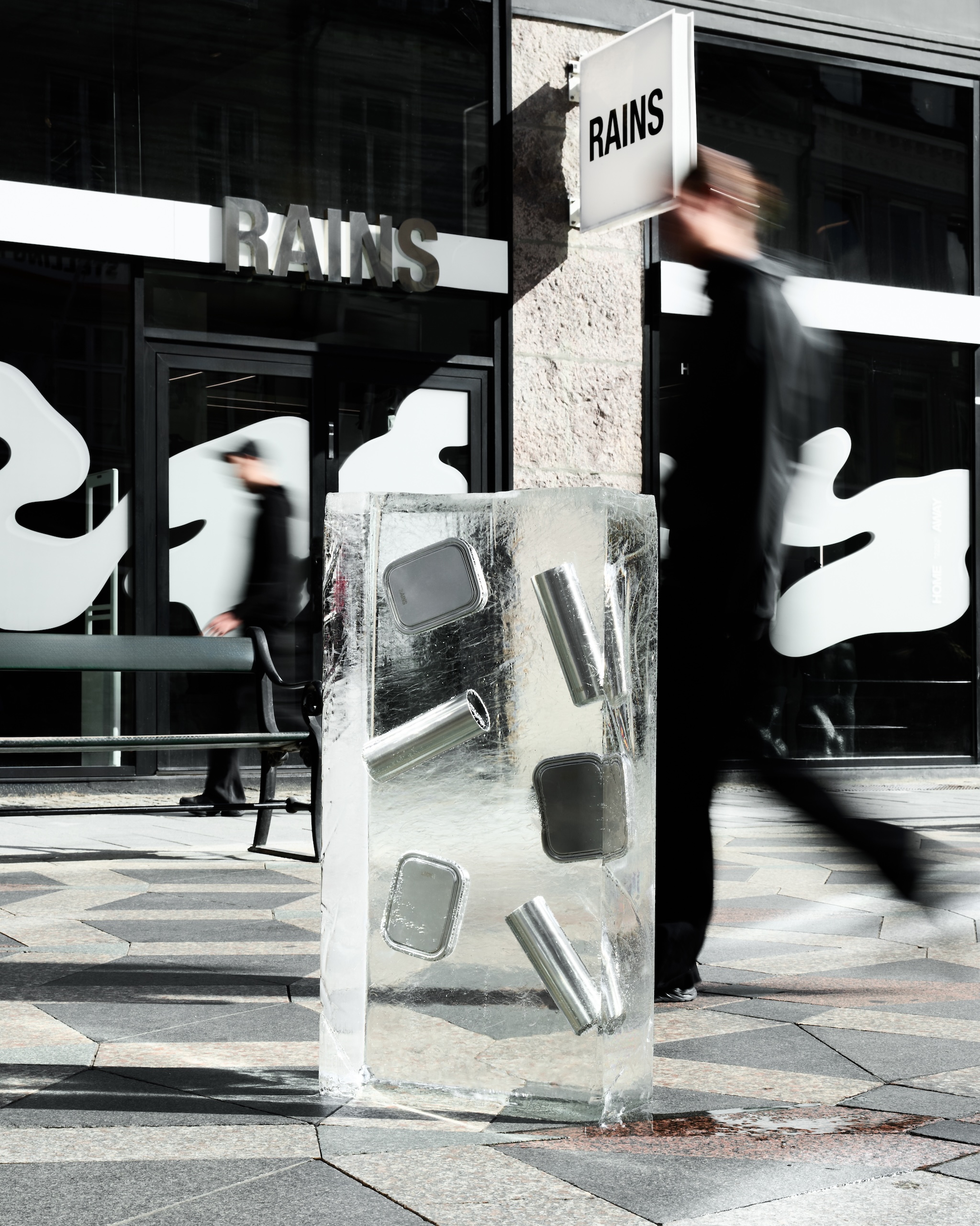
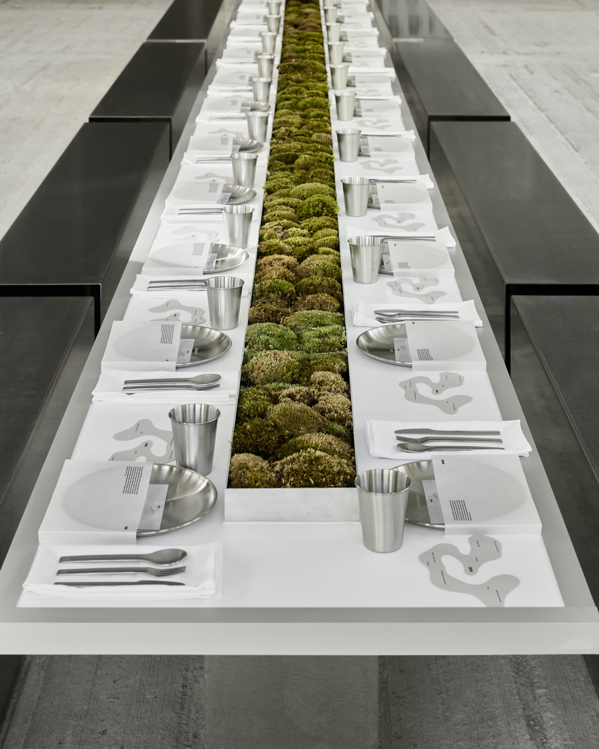
Actually, yes, the recent launch of our HOME AWAY collection is a great example.

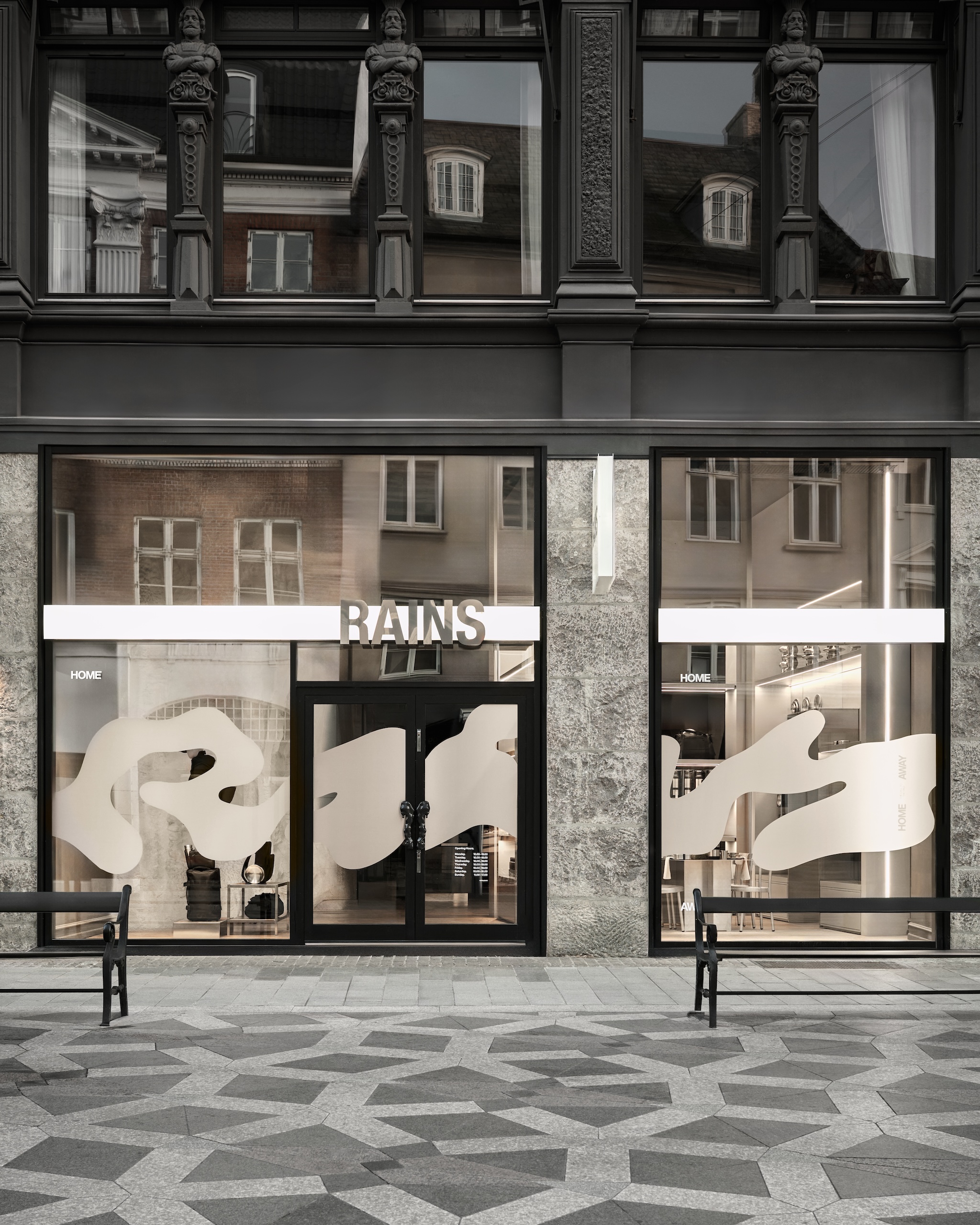
Homeware is a newer category for us, so the team decided that it needed a whole new graphic identity – one tied to both the brand and concept, which is about balancing the indoors and outdoors, brutalism and the softness of nature.

They came up with a beautiful, expressive take on the Rains logo, organic and inspired by blurred writing on rainy windows. This was contrasted with the minimalism of the HOME AWAY logo, which was clean yet smartly constructed to represent the hybrid uses for the actual designs.

We chose to keep this simple because we needed this logo to feel like part of our world, visually. It’s the contrast between the two that I believe is very strong.

Rains often builds intrigue through understated, yet viral gestures, like the rain-activated SS24 invite. How deliberate is that use of curiosity in your communication strategy?

Curiosity is one of the biggest strengths of our team. What’s amazing about the Rains universe is that it’s very clear. Wet, urban, and explorative.

Those creative confines are the very canvas that allows us to constantly ask – “How can we iterate? What story have we not told yet?”

We have yet to run out of ways to express ourselves, and I don’t see that stopping anytime soon.


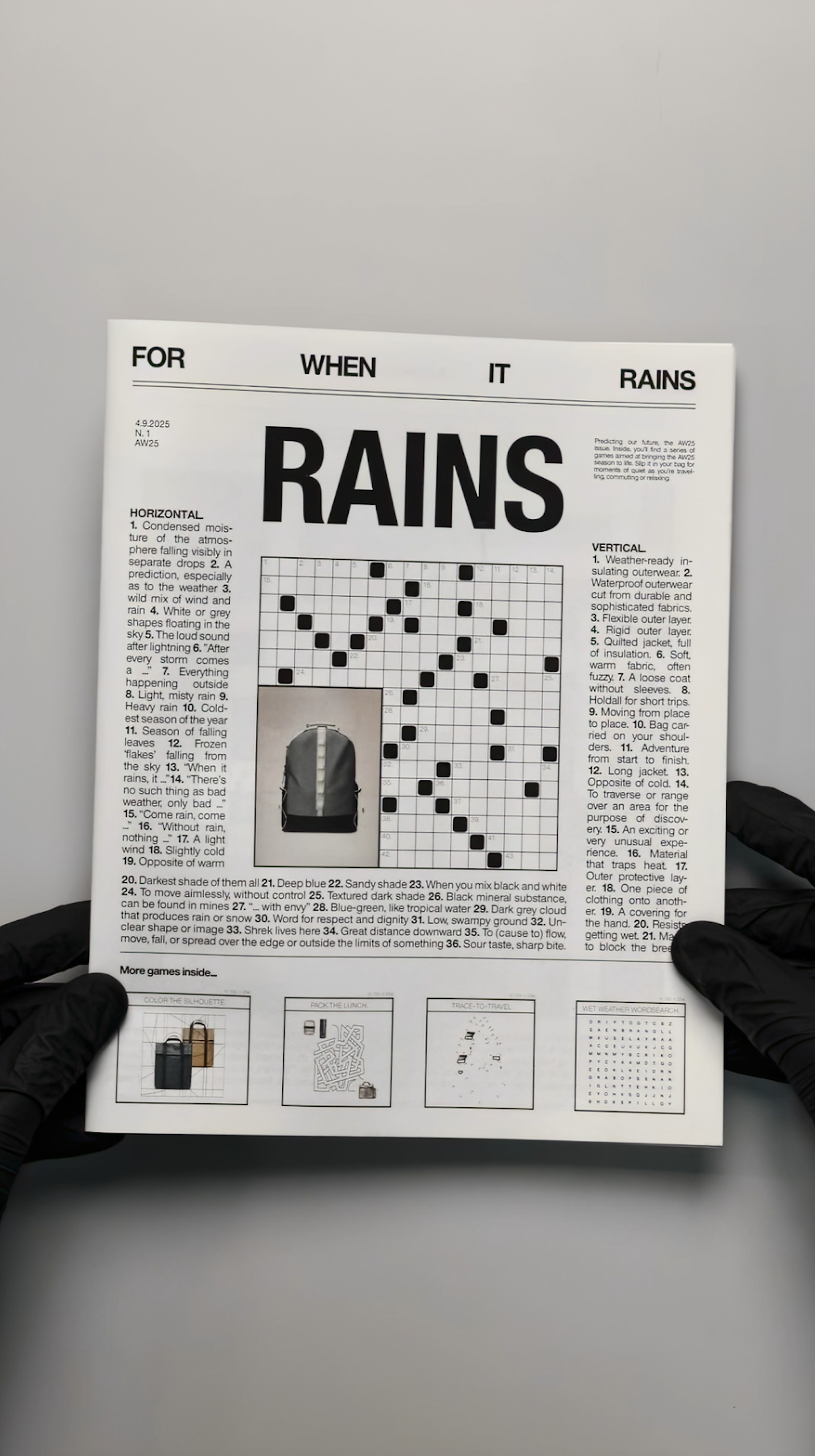
Rains’ print experiments – like the recent For When it Rains book and the sticker book – feel like cultural objects in themselves. Are they tools for storytelling, brand building, or creative play?

Honestly, the answer is a little bit of each. Take our Getting dressed should be fun sticker book, for example. While visually simple, it showed the breadth of our AW25 collection.

This season, we’ve introduced knitwear, and we have such beautiful layering options, so we needed to communicate this graphically. Using clean pack shots to create a nostalgic sticker format lets us layer pieces, subliminally visualising the brand’s evolution for our audience, and having some fun in the process.

And are these print experiments for customers, or are they intended more as internal creative artefacts and brand expressions?

They started as creative artefacts to feed social content, but they are growing into customer-facing activations. We recently created a small recipe book for our HOME AWAY launch that we gifted to customers when they purchased our homeware products.

This elevates the storytelling and allows customers to see the products in real-world scenarios. You’ll see a lot more of this in the future of Rains.


The design of the For When It Rains booklet is particularly striking. How did that come to life?

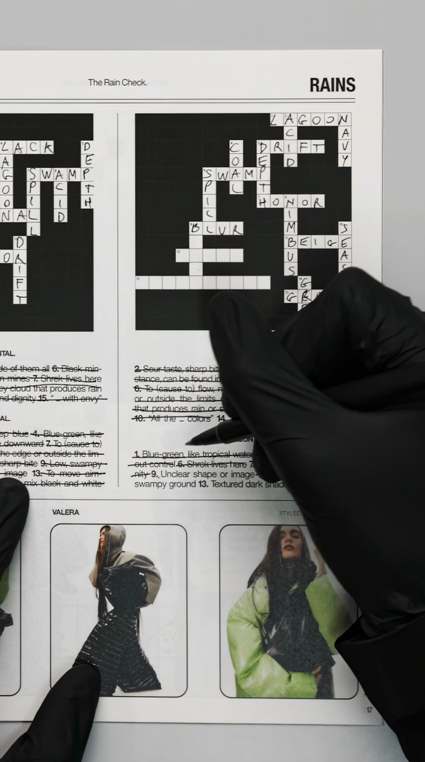
The booklet takes inspiration from classic printed crossword and quiz magazines. Its design is raw, simple, and direct.

We wanted it to evoke nostalgia and be something physical that can actually be interacted with. We see the booklet as a reminder that even rainy days can be transformed into moments of joy, relaxation and leisure.

It features various games – crosswords, word searches and join-the-dots – inspired by our brand, universe and collections, alongside visuals from our latest campaigns.

What does building a brand through design mean in practice at Rains? How do you make sure the storytelling carries through not just the big campaigns, but even the smaller design gestures?

We see everything as an opportunity to deepen the storytelling and narrative around our brand.

I actually think it’s the tiny details that our community notices most – and we take great care to bring the same stylistic and conceptual approach to all those “smaller” creations.

The logo for the Rains x Umbro collection

Rains has a strong internal creative culture. How is the relationship between marketing, design, and creative direction structured internally?

We’re a tight-knit and concise team, each with our own specialisms. We work closely on all projects, and our work is quite horizontal.

Instead of work being passed from art director to copywriter to designer, everyone is briefed together, creating a more collaborative way of working.

Collaboration is the foundation of Rains’ creativity. Graphic design and creative direction sit as part of the marketing team, joining in brainstorms and strategy meetings so that everyone has a solid overview of all activity, and their role within it.

How do you define taste within the brand? Are there guiding principles that help maintain Rains’ aesthetic consistency while still allowing experimentation?

Contrast. Duality. That’s always one of our guiding principles. If the imagery feels colder, how can we create warmth or “contrast” through our graphic touches? We see ourselves as a brand built around duality; we design for the urban outdoors – a contrast in itself.

To what extent do you see Rains’ graphic design as a differentiator in a crowded lifestyle market? Do you consciously design to stand apart from competitors?

We choose our aesthetic based on what works for us, what feels like us.

Innovation is part of our DNA – from our very first product – so pushing and reinventing our graphic language feels as natural to us as designing the pieces themselves.

It’s always nice to stand out, but I wouldn’t want us to do anything purely to stand out. It has to connect with what we’re saying and where we’re trying to go.

Source

By

How fertility branding evolved to show both science and soul

The fertility industry has long been aimed squarely at women, built on a narrative of urgency and fear around the biological clock. For decades, it’s been framed as a reactive experience – something to manage rather than take ownership of – leaving people trapped between anxiety and doubt.

The category’s branding hasn’t helped. Pastel pinks and clinical blues, sterile medical cues, and imagery of smiling parents and swaddled babies have long reduced a profoundly complex experience to its happiest possible ending.

The real story, full of nuance, hope, and heartbreak, has gone largely untold.

“The confusing mix of clichés, euphemisms and medical jargon that plagues this category only adds to the powerlessness people can feel when they’re trying to make a life,” says Fia Townshend, copy director at Ragged Edge.

When rebranding the IVF insurance brand Gaia, the team at Ragged Edge spent time dismantling the emotional and visual shorthand that had come to define fertility branding.

They wanted to give Gaia’s members something more grounded – a language that could hold the full complexity of IVF while still offering a sense of clarity and hope.

The studio deliberately stepped away from the familiar platitudes of the category – colour codes, photographs of picture-perfect families, and talk of “miracles.”

As Townshend points out, these ideas reduce something complex and unwieldy to a single outcome, the baby. And IVF is much more than its endpoint.

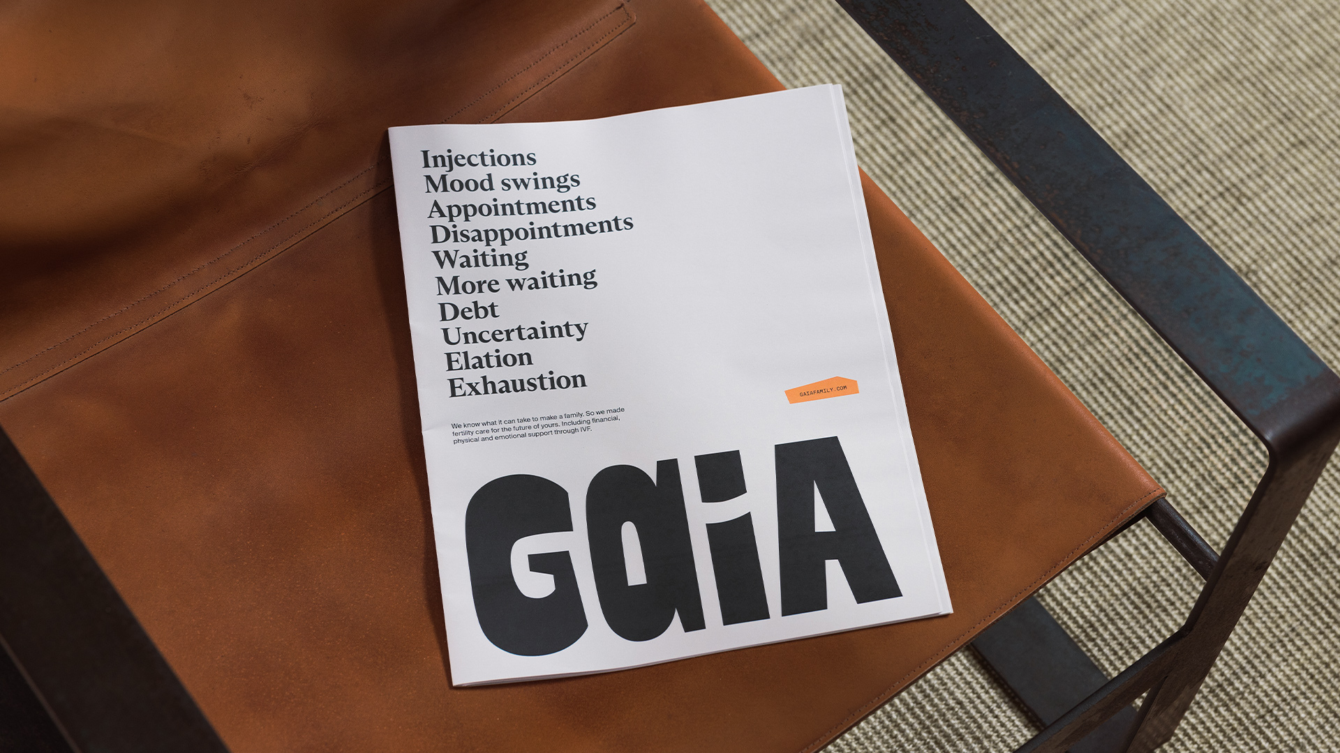
“For Gaia, we wanted to celebrate the process as much as the possibility,” she says. “We wanted to acknowledge the full emotional spectrum, the waiting, the mood swings, the doctor’s offices, the disappointment, the elation. So we avoided anything that suggested perfection or passivity.”

“The goal wasn’t to soften fertility or make it palatable. It was to make it more truthful, more varied, and more human.”

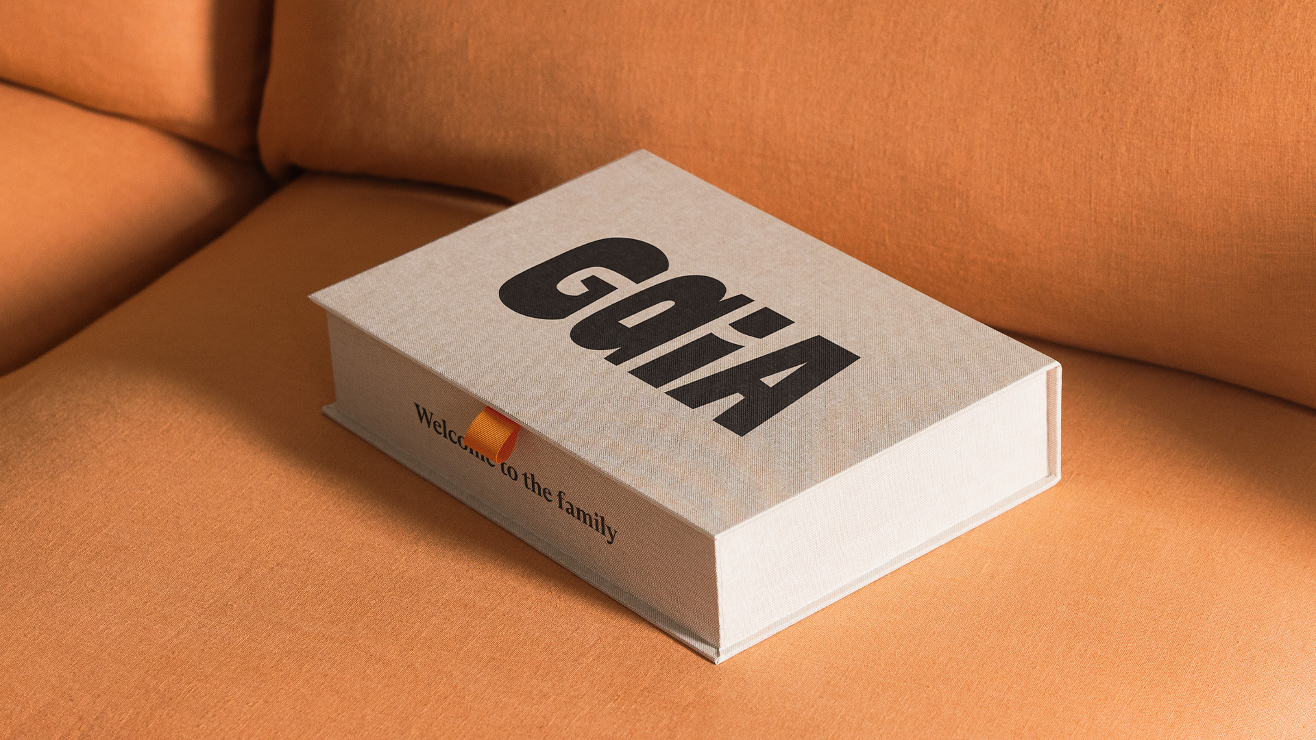
Ragged Edge’s work for Gaia

The challenge that Ragged Edge faced was as much cultural as it was creative. They had to reframe the entire conversation around fertility, and the emotions tied to it.

“Fertility has always been framed around luck and loss,” says co-founder Max Ottignon. “You’re at the mercy of biology, of fate, of whether treatment will work. Gaia reframes it around agency, helping people make active, informed choices about their path to parenthood.

“That shift reflects a broader evolution in healthcare, where trust comes not from clinical distance but from empathy and clarity.”

As Ottignon explains, design’s job in fertility branding is not only to simplify what’s complex, but also to help people feel capable within that complexity, giving them a sense of agency.

Gaia’s brand world had to feel accessible, but also credible. And Ragged Edge quickly established that credibility did not have to mean coldness.

The wordmark, with its hand-sculpted look, features two different ‘A’s, a nod to Gaia’s core belief that there isn’t one perfect way to make a family.

Elsewhere, the team wove in collages with torn edges, tactile materials and authentic imagery that show the full IVF journey through intimate crops, raw moments, and varied experiences.

“The collages themselves are deliberately asymmetrical and handmade. Nothing perfect, nothing sterile,” says Ottignon.

“Together, these elements build a sense of expertise that feels lived-in rather than institutional.”

Where older fertility brands equated authority with distance, Gaia redefines it through warmth. In shaping that shift, Ragged Edge proves that empathy and expertise aren’t opposites, but allies.

“Being emotionally intelligent doesn’t make you less scientific; it makes you more trustworthy,” Ottignon says. “Because in a category where people feel vulnerable and uncertain, understanding becomes the ultimate form of expertise.”


That realignment – finding expertise in empathy – goes beyond tone or aesthetics. It’s about changing the story people tell themselves. And that speaks to what design, at its best, can do.

“Design can change more than perception – it can change how people see themselves,” Ottognon says.

“For too long, the language of fertility has told people they’re broken or running out of time. Gaia set out to show a different truth – that seeking IVF is an active choice, not a failure, and that the process itself, messy and imperfect as it is, has dignity.”

That message is clearly resonating. In September 2024, Gaia marked the birth of its 100th baby, shortly followed by a $14million Series B funding round.

Building on the shifts that brands like Gaia have set in motion, there is a broader recalibration of the fertility landscape. It’s a move away from brands that once medicalised the experience or softened it with sentimentality, toward ones that speak with honesty and connection.

Super Keen’s work for Cofertility

That shift is evident in Cofertility, a company backed by tennis star Maria Sharapova which has pioneered a no-fee egg-freezing model. It enlisted the help of Super Keen to reimagine its visual identity and brand architecture.

In building Cofertility’s new look, Brooklyn-based studio sought to reset the brand’s relationship with its audience, a change that began deep within its visual and verbal foundations.

To reflect a truly inclusive idea of family-building, the team avoided heteronormative imagery and language that treated infertility as absence, or a lack of something.

The logomark, crafted to look like a sunburst or a blooming flower, amplifies the brand’s optimism. But warmth at Cofertility isn’t just teased visually – it’s embedded in how the brand approaches the subject itself.

Super Keen’s work for Cofertility

“The warmth doesn’t come from stripping away complexity – it comes from acknowledging it with care,” says creative director Gabby Lord.

“We focused on clarity, not reduction. Every touchpoint was designed to make a deeply emotional and sometimes clinical process feel more human, without ignoring the hard parts.

“The language, tone, and photography all balance honesty with optimism. It’s not about glossing over reality; it’s about meeting people with empathy, transparency, and of course, hope for what’s possible.”

Once a taboo topic, fertility is now entering a new era. As Lord puts it, branding is no longer about simply destigmatising the conversation, “it’s about celebrating incredible advances in technology, the fact that women can take control of their fertility earlier, and that there are options for all kinds of families.”

Super Keen’s work for Cofertility

That spirit of celebration comes through in one of the identity’s most deliberate design gestures – a confetti motif that appears across visuals and applications.

“It’s a nice reminder for our members to take a moment to stop and celebrate the major milestones along the journey,” says Meela Imperato, head of marketing at Cofertility. “And at the same time, it captures the joy and gratitude we feel in being part of them.”

Building the fertility brands of tomorrow calls for designers to set new precedents for what credibility, care, and connection can look like.

Much of the work in this space is about championing that new thinking – finding harmony between logic and feeling, structure and sensitivity, without tipping too far into either.

Holding those opposing forces in equilibrium was a challenge Universal Favourite mastered when designing the identity for WHEN, Australia’s first at-home egg-count testing service.

Universal Favourite’s work for WHEN

“‘When’ is both a question and an answer, allowing the brand to hold both science and emotion,” says founder and executive creative director Dari Israelstam.

“Visually, this duality informed the interplay between precision and softness. Verbally, it permitted us to speak through an inner monologue that acknowledges uncertainty while offering guidance.”

The tension between those ideas is felt in the construction of the wordmark – set in ABC Diatype that brings a scientific edge and clarity – and the pulsating, pliable cell shape that brings adaptability and life.

The colour palette, especially the hero yellow gives the brand levity and warmth.

Universal Favourite’s work for WHEN

That balance carries through to the tone of voice.

“Instead of dwelling on what might be ‘wrong,’ the brand language focuses on curiosity and understanding,” explains Israelstam.

“The storytelling approach gives space to questions – When might I want to know more? When might I act? – rather than guilt or urgency. That tone informs the visual system; calm colours and gentle motion that celebrates knowledge as empowerment.”

WHEN’s authority comes from its restraint. Here, clarity and craft replace the old signals of trust.

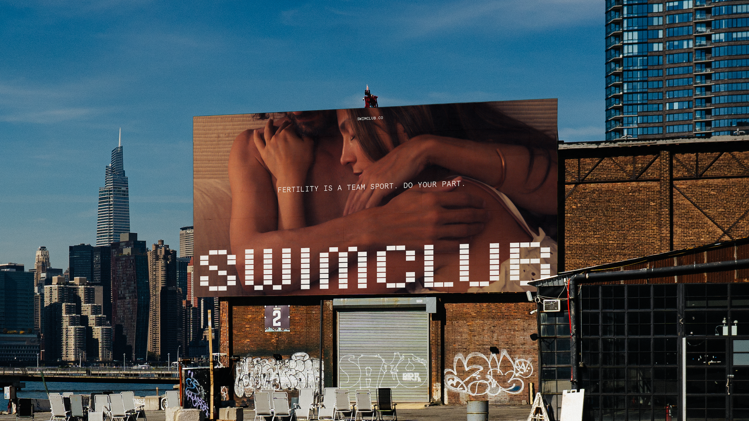
Center’s work for Swimclub

And across fertility branding, new beliefs are taking hold. Approachability has become the new language of trust.

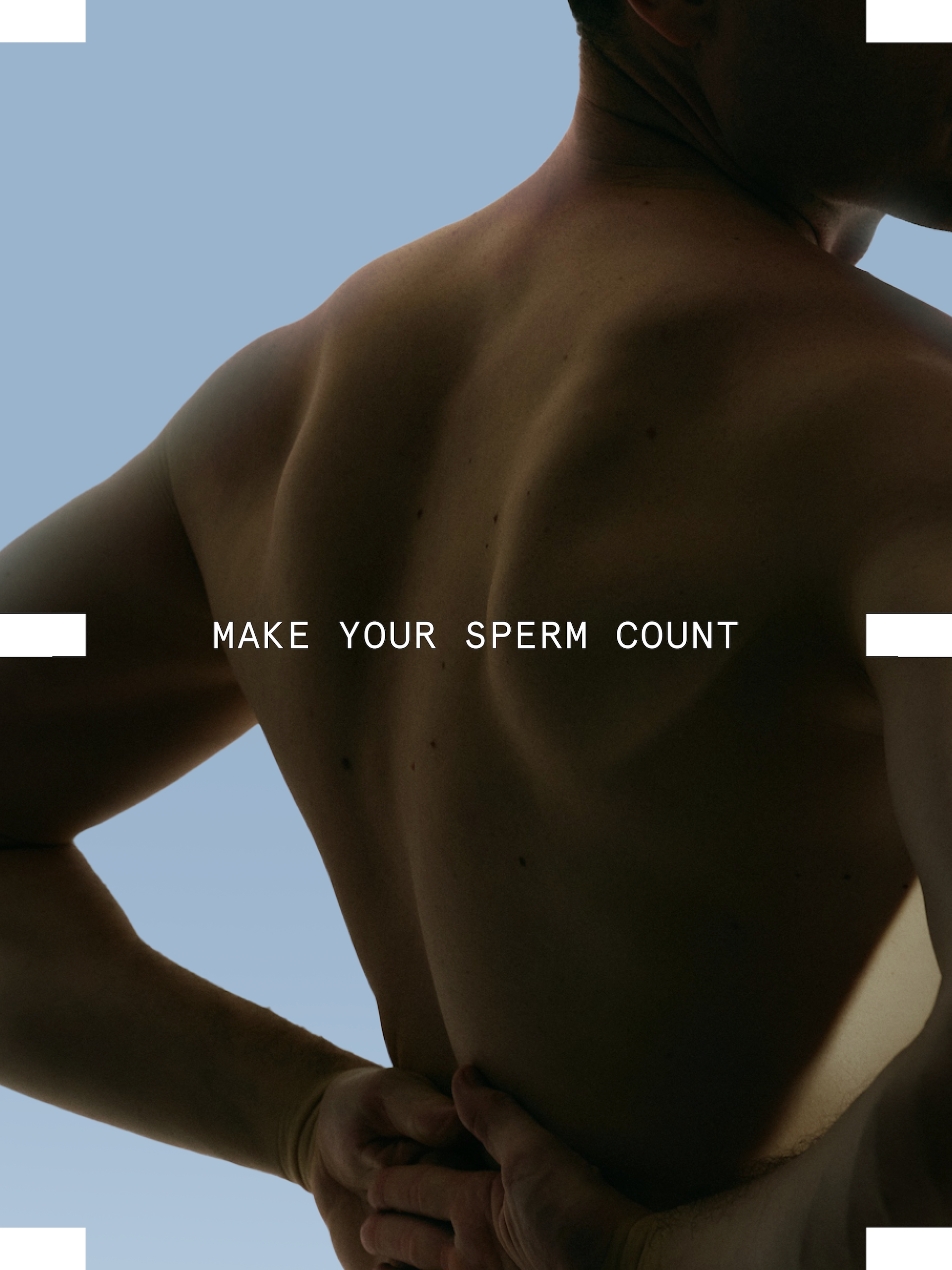
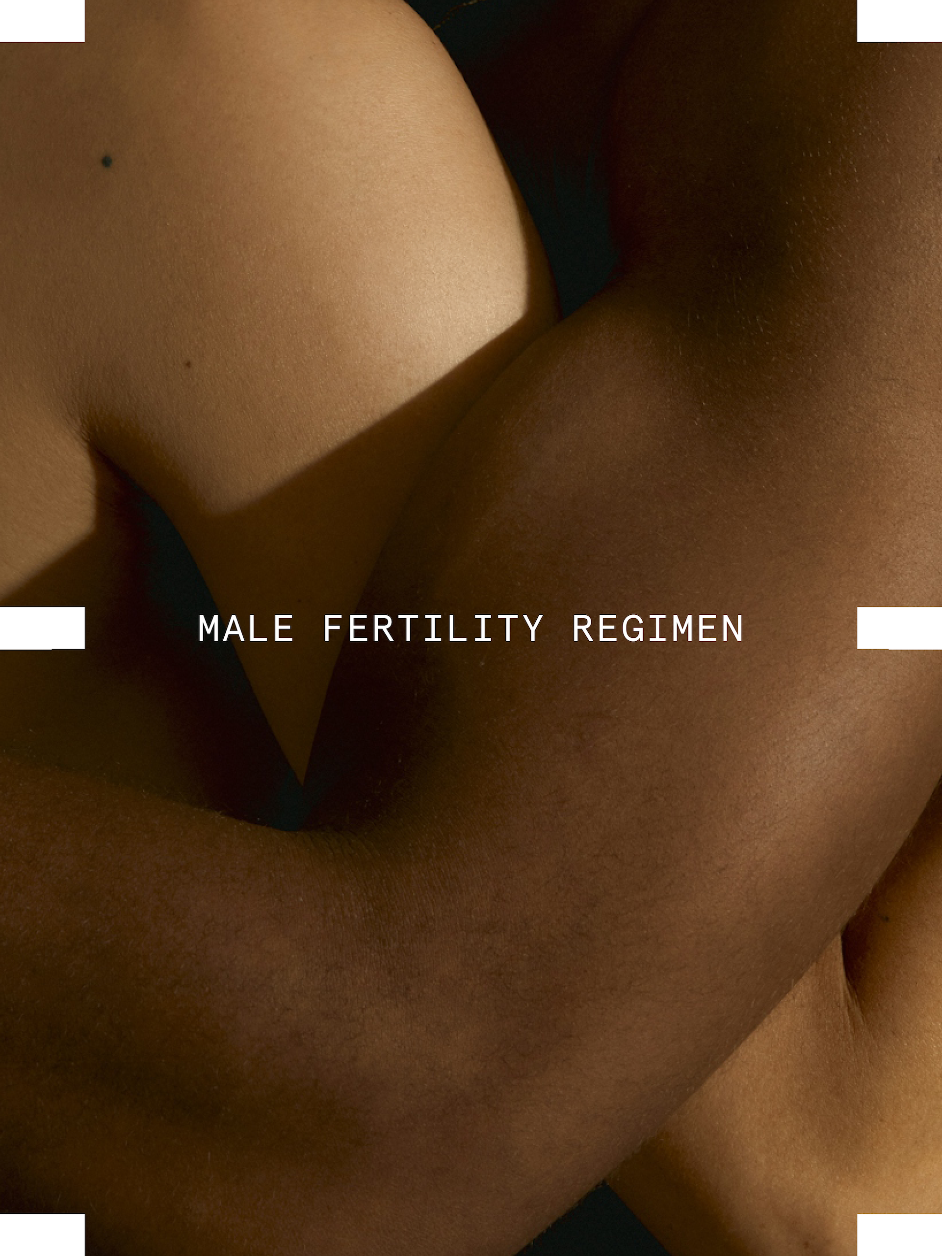
“Being approachable didn’t mean being soft or cute, it meant being honest,” says Alex Center, founder of CENTER. The Brooklyn-based studio created the identity for Swim Club, the first clinically formulated sperm performance supplement.

“When it comes to fertility, men’s health is half the equation, but it’s rarely treated that way. Sperm counts have dropped nearly 60% since 1970. Men are responsible for infertility in 50% of cases. And today, one in four men has below-average sperm.

“We wanted men to see fertility the way they see fitness or nutrition, something they can work on, understand, and improve. Swim Club speaks plainly about sperm health, DNA integrity, and reproductive performance, not as medical jargon, but as information that empowers. That honesty is what makes it approachable.”

The science had to feel accessible. The identity resolves that tension through a system where science and sport intersect – borrowing cues from DNA sequencing and the geometry of an Olympic pool.

The tiled grid conveys both movement and precision, embodying the brand’s dual focus on biological rigour and human vitality, resulting in a system grounded in order but alive with play, capable of stretching into moments of curiosity, like a tiled sperm caught mid-swim.

“The science behind Swim Club is rigorous, but our job was to give that science an emotional texture,” says Center.

“We used pattern, repetition, and structure to echo the precision of biology, but softened it through colour, typography, and art direction. Rationality and warmth aren’t opposites here; they’re partners.

“The data tells the story of life at its most fundamental level; our job was to make people feel that.”

The visual worlds of brands like Swim Club reveal how empathy in fertility branding has evolved into a spectrum of expression. It can be found in warmth or calm, precision, or playfulness.

But what connects them is a refusal to flatten the complexity of fertility.

“Fertility has long been spoken about in whispers or medical charts,” says Center. “Swim Club gives it a new language, one that’s rooted in science, but expressed with confidence and care.

“Design has the power to make complex ideas emotionally understandable. If men can talk about sperm count or DNA integrity without shame, our design has done its job.”


Source
By

“Know this designers – your work is actually a huge inconvenience”

One of the invigorating aspects of working in the branding industry is reviewing the work that other agencies do.

There are numerous examples where I think “smart, well executed” and nod approvingly. There are others where my heart sinks as the industry at large piles in to express contempt, usually with no knowledge of the landscape in which the work was created.

And then there are examples where I am open mouthed with admiration for the work I’m looking at.

This is often a response to the clarity of the idea, but increasingly I find my admiration is rooted in something else – the understanding of the huge amount of work that went into enabling that idea to be realised.

“In reality, while the idea is crucial, it is not a golden ticket.”

A rebrand comes with the hope to refresh, reposition, and future-proof against a specific challenge, or to build on a certain opportunity.

And yet I’m consistently amazed by the popular view that once the agency has cracked the idea, the hardest part is over. That the job is to deliver something bold, brilliant, and my least favourite of all, “brave.”

And if the client, or more likely their stakeholders, don’t buy it, well that’s on them.

In reality, while the idea is crucial, it is not a golden ticket. It’s the start of a journey preserving and protecting the idea through the lengthy, complex, and often dispiriting journey it must go on before it sees the light of day.

Critically, this is a journey that we must go on in partnership with our clients, not a lonely quest we send them on alone. It is our job to arm the CMO with all the weapons they need to deliver the great work, and to be by their side through that process.

It must begin by acknowledging that what we bring to the table – our strategic, unmistakable design solution – presents a risk and an inconvenience for many people inside that business. It costs money. It creates work. It disrupts processes.

As a result, it reasonably invites scrutiny from very senior stakeholders who are not in the room when the idea is first presented, and who may not fundamentally value or recognise the role of design to their business.

These are the unglamorous realities that rarely make it into that beautiful case study, but if we ignore them, we fail in our duty of care to the client and to the creative idea.

So, how do we protect the work, and give it the best possible chance of success? There are some clear principles to smooth this process from the start, and they begin long before you get anywhere near the creative presentation…

Read the room and read the brief. It’s not just about your immediate client; it’s about building a deeper understanding of the shape of the business they work in. It’s about recognising the job that you really need to do, and where there will be pitfalls, so you can adequately prepare.

Build a case for consensus. When working with large organisations, there are often many valid, but conflicting, points of view. Finding solid ground, a foundation where everyone is aligned, and building from there, will more likely lead to future buy-in.

Pick your battles. It can become a matter of pride to get hung up on every detail, to romanticise resistance. But sometimes it’s better to let small things go, to then be able to celebrate the big wins, the ones that really matter.

Make it real. As the sell-in process continues, there’s a lot of power in bringing the idea to life with an event or showcase that engages the most left-brain audiences, because, after all, “everything you can imagine is real.”

Listen and adapt. The design process is lengthy, and it cannot be static to the evolving circumstances that surround it. Being inflexible in the face of change rarely serves the work or the client.

And perhaps most crucially, remember the stakes. People’s jobs and businesses are on the line. Our responsibility, to the best of our ability, is to do the right thing.

This means respecting and trusting our client’s knowledge of their brand, making a case for design that takes every detail into consideration, listening to, and patiently addressing the most frustrating of concerns, and being an ally to the finish.

Almost nothing makes me prouder than the moment a great new piece of work is unveiled.

Not simply because the idea was brilliant, but because together we fought for it, made it work for the brand, and gave it the chance to thrive – together.

Georgina Leigh-Pemberton is managing director of Turner Duckworth.

Source

By

How “two lads in a WeWork” built Koto New York

It’s three years since branding agency Koto opened its studio in New York. It’s led by executive creative director Arthur Foliard, who’s been with Koto since 2017, and Alex Monger, who was hired to be the new managing director after stints at BBH New York and Wolff Olins.

In recent months, the studio has released a stream of eye-catching work for big clients, including Amazon, Lyft and Tripadvisor. But it hasn’t always been plain sailing.

We sat down with the pair to discuss big wins, tough times, and why they always trust the process.


Why did Koto set up in New York back in 2022?

Arthur Foliard: There was a business decision, and there was an emotional decision.

It made a lot of sense to go to the East Coast, because we’re so successful on the West Coast, in LA and Silicon Valley. And we were smashing it in Europe.

But it felt like to be seen as a global studio, you almost had to be in New York. It’s a different beast – probably the most competitive space, with the best agencies. And there were projects we were losing because we weren’t in New York.

The emotional component comes down to me. I always wanted to come out here, to fight and win against the big guys.

I was communicating that to the founders, and I think they were like, ok let’s let him go, because he’s going to give everything to make it work.

They offered me the job in December 2020, between waves of Covid. And so it took a long time, almost 18 months, to get the visa sorted.

That was probably for the best, because it gave me 18 months to understand what the fuck I was doing.

Are there things about running an agency in New York that are different to the West Coast, or Europe?

Alex Monger: The main thing is how hyper-competitive it is.

There are so many agencies that we really respect and admire, both agencies that have been around for decades and been pioneers in our industry, but there are also new agencies all the time here. That creates very high standards you have to set and maintain.

Agencies always go through that cycle – they’re good for two years, and then they’re crap for five. That’s something you have to really be vigilant against in New York.

And everybody has moved here to do something. There is a shorthand to getting business done that exists in New York. It moves fast. We’ll have an RFP from a client, and two weeks later we’ll be starting work.

It’s very quick to get to ok, how can we help each other? That entrepreneurial spirit feels quite heightened. You know what we do. We know your goals. Let’s get going.

One of you was new to the business, and one of you was steeped in Koto lore. How did you decide what to keep, and what to reinvent?

Alex Monger: We’re building the studio in the image of Koto, but with our own take on it.

We had lots of early conversations around what are the things that we want to maintain from Koto? And what are the things we want to do, either to be more culturally attuned to what’s needed in New York, or just what Arthur and I have always wanted to build in our own studio?

We definitely wanted to keep that excellence culture, striving for the best possible creative work. As an outsider, I really appreciated the sense of humour that exists in Koto, and wanted to maintain that. Because it’s not just banter – it allows people to be really honest and open with one another.

Arthur Foliard: Something I was trying to find, which was really strong in London, is that partnership among the founders. You want to have that same ambition, that same entrepreneurial spirit.

So we want to make the best work, and hire the best people, and work with the best clients. But I also want to feel that if I need to call him at 11pm, because something isn’t going well, I could do that.

You both talk about that entrepreneurial spirit. Practically, how do you build that into a culture?

Alex Monger: People might think entrepreneurial spirit means the people making revenue for the agency. But what it really means is that we look for people who are excited to build something with us.

So not somebody who’s coming into Koto and expecting that everything’s already figured out. Rather, somebody who really wants to put their fingerprints on the place, and is excited to see the impact their work will have. We want to see that spirit in everyone.

Koto New York’s studio

We have a Monday morning meeting, and at the end, we spin a wheel that picks who’s going to take the trash out for the week, and who’s going to do the dishes. We call it the wheel of death.

Obviously, we could pay for somebody to come and do that for us. But we’re always going to keep that wheel of death, because the expectation is that everyone cares about the place as much as we do.

Arthur Foliard: When we moved to New York, we started in a small WeWork, a three desk office.

We took things step-by-step and we came in with this very humble mindset, which is no-one cares if Koto is in New York or not. No-one gives a fuck.

So we worked harder than anyone else – we were always pushing that little bit more, to show people that we were the right partners.

It sounds like the founders (James Greenfield, Caroline Matthews and Jowey Roden) gave you quite a lot of freedom to build this studio. That might surprise people given that Koto was successful already when you launched…

Alex Monger: They’ve done a great job of that, creating flexibility within the framework. All five studios have clear KPIs that we report on every quarter. And we have global policies, so some things are consistent.

But they really empower the leaders of each studio to go and do the right thing for that market.

Since I’ve been in New York, I’ve worked in agencies that are global, but with a New York outpost. And it felt like we were either being controlled by HQ, or by the holding companies.

So it was refreshing to have this relative autonomy. As long as, and this is something I had to learn, you’re communicating. You have to bring the rest of the Koto world along, explain your decisions, and make sure it’s not this little black box.

Arthur Foliard: They strike the right balance between empowerment, giving you the tools to feel like you’re in control, but also being very present when you need something.

Was there one project that made it feel like you’d arrived?

Arthur Foliard: The first project we won here was for Dentee, which is software for dentists. We were in that small WeWork when we found out, and we literally jumped on the table and started dancing.

It felt like, oh my god, Koto New York is real.

Koto New York’s work for De-Extinction

Alex Monger: For me it was a project for De-Extinction that we won in my first couple of weeks here. It felt like a validation.

At that time, we heard that another agency was referring to Arthur and I as, “Two lads in a WeWork.” Later we won some pitches against them, which was very nice.

Winning Amazon must have been a pretty big moment too?

Arthur Foliard: It was incredible. We’d been heads down, working so fucking hard. And it hadn’t been easy – there was a lot of disappointment along the way.

And it felt like, if we can win Amazon, we can win anything. But the thing I like about us as a studio, is that we’re excited for five minutes. And then it’s like, ok. How do we do this?

We have to make sure that we don’t fuck it up, because that would be worse than actually losing it.

Alex Monger: Amazon was a complete high – one of the best feelings I’ve ever had in my life. But it was a reward for the first 18 months, which were tough.

There was a moment that we went for a walk around the block in Williamsburg. We’d lost some money and new business clients were ghosting us. And I remember that conversation, where we decided, we’re just going to keep going. We’re going to keep striving, and it’ll turn.

Arthur Foliard: The entrepreneurial spirit really kicked in here. We’re going to take anything. Small $20k projects. Charity work. We’ll take it all.

We almost hit the lowest of the low, but we always trusted the process. And you struggle and you struggle, but you keep doing the same thing. You keep going the extra mile. And you keep your head just above water.

And then it works for Amazon. You’re like see! Trust the process.

Koto’s new work for Amazon

Did the pressure at that time come from the founders, or were you putting it on yourselves?

Alex Monger: On ourselves, but it was a positive pressure. We wanted it to be a success, and we never lost motivation.

Arthur Foliard: During those dark times, the founders were really good at telling us to keep going. They could see how hungry we were to make it work. If they saw us waiting, being passive, it might have been a different conversation.

From the outside, it seems the studio is on a bit of a roll. Is that how it feels from where you’re sitting?

Arthur Foliard: We’re doing better, but we are very ambitious. We want to create a legacy. And you don’t create a legacy with a few projects, however great they are. It’s all about consistency.

If you tell yourself that you’ve made it, you’re going to fail.

We’re trying to be so conscious that it could be different tomorrow. So how do we build on this success, and re-invent ourselves to make sure that we’re still relevant?

Koto New York’s work for Fluz

Along with success comes criticism – you see references now to the Koto-ifcation of branding, or Koto-core. How do you feel about that?

Arthur Foliard: It makes us laugh more than anything. We use Koto-core on Slack quite a lot.

But it proves that we’re becoming even more relevant. There are always going to be haters.

Alex Monger: We work hard to make sure that our work is always fresh and different. What’s consistent – whether it’s for a B2B SaaS company, or for a museum, or for Amazon – is that optimism.

You see that optimism, that confidence, and that bold style in our work.

I think that’s what people are now seeing as Koto-core. But when you actually go deeper, every project is different.

Arthur Foliard: At the end of the day, what’s really important is that clients are happy and proud of the work, and that we had a good time doing it. A sense of empowerment and growth.

When people look back in 20 years, we want them to remember this as a great place to work. That’s what will stay with them, not, was the logo the right vector?

Koto New York’s team

Source

By

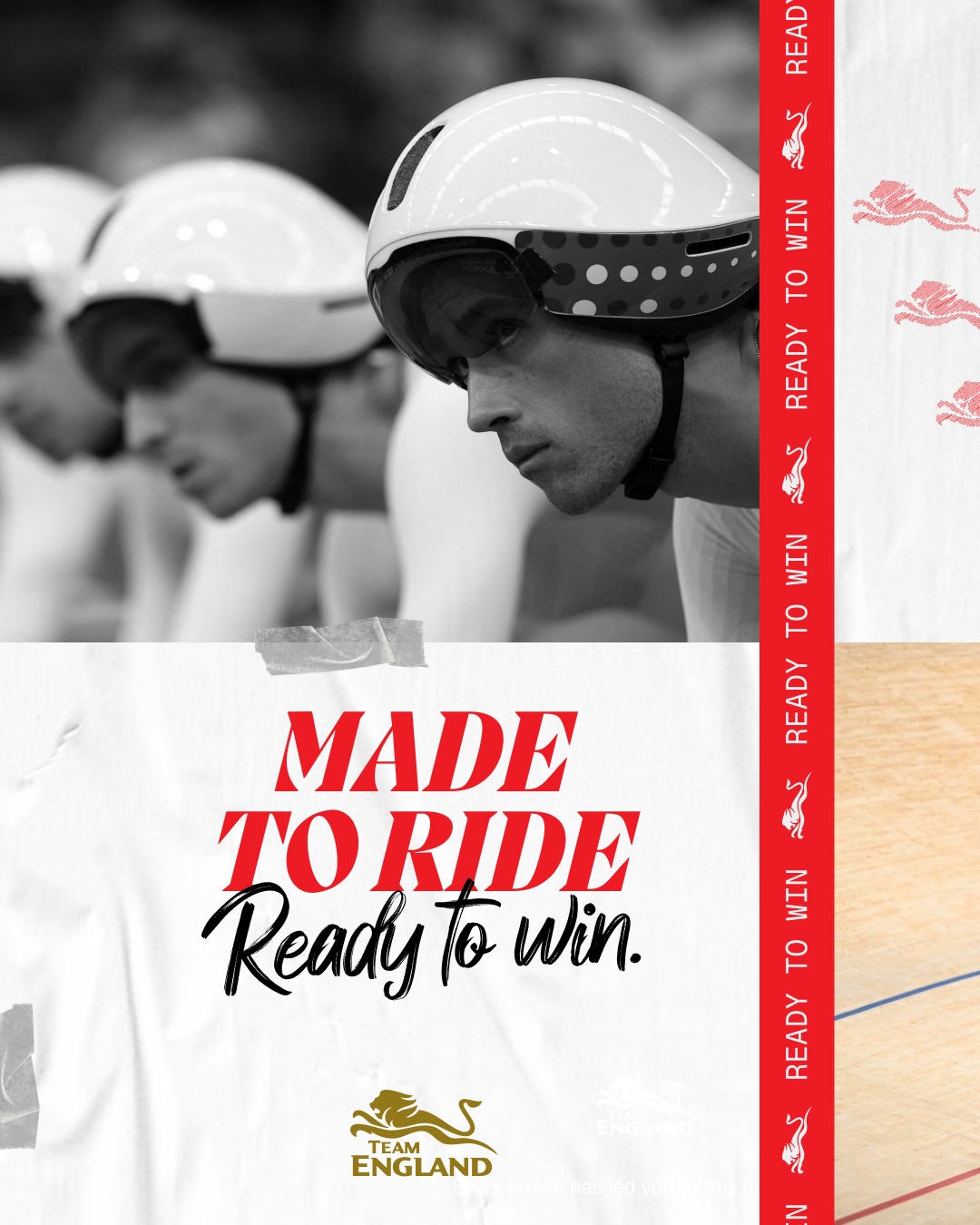
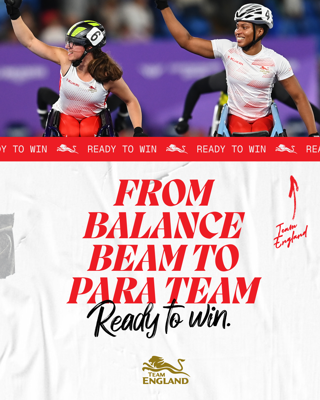
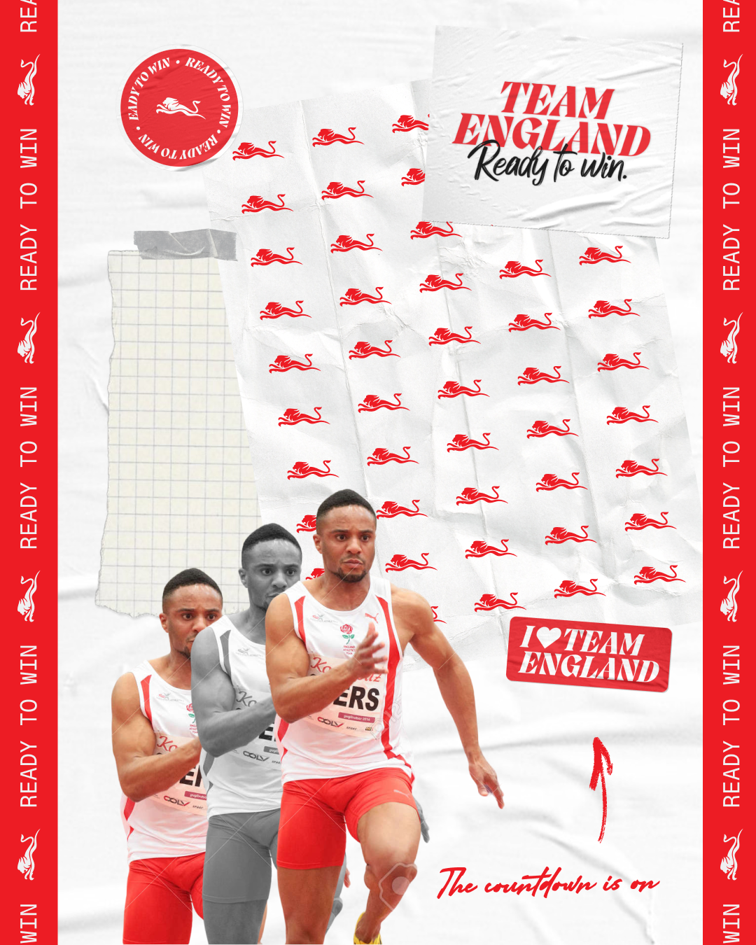
FORM Brands Studio creates Team England’s Commonwealth Games identity

FORM Brands Studio has created a new identity for Team England at the 2026 Commonwealth Games.

Against a tricky backdrop of debates around English nationalism – and in particular what the St George’s Flag represents – the London-based studio had to create a look that captured a welcoming brand of national pride.

“We wanted to celebrate our diversity and inclusivity, which is absolutely key to Team England,” says Kirsty Woodcock, head of marketing and communications at Commonwealth Games England.

“A lot of our athletes will stand under an England flag and it will be the proudest moment of their lives,” she says. “We want to create that sense of pride and belonging that people can rally behind.”

Woodcock had initially considered a full rebrand of the Team England set-up, “but we are publicly funded, and our budgets don’t stretch to that.”

So instead, she and her team focused on the team’s visual and verbal identity for next summer’s Commonwealth Games in Glasgow. The team historically has a new campaign for each Games, but Woodcock says they wanted to “think a bit more strategically” going into 2026.

The brief called for something that would “inspire, motivate and excite” athletes, fans, and staff.

It also had to create more distinctiveness, to avoid confusion with other Commonwealth Games teams like Canada and Wales, who have similar colours, but also to differentiate from England’s other sports teams, like cricket, football and rugby.

They also wanted to lean into the specific spirit of the Commonwealth Games, which brings together a wider range of athletes, young and old, than the Olympics, where British athletes compete as Team GB. The Commonwealth Games also runs its paralympic competition alongside the non-para games, not one after the other.

“Athletes have a real fondness for the Commonwealth Games, and it’s quite unique,” Woodcock explains. “You have this mega mix of experience – for some athletes and some sports it’s the pinnacle, while for others it’s an important part of their journey, a major stepping stone towards the Olympics.”


Woodcock chose FORM Brands Studio because she’d been impressed by their work on British Cycling.

Co-founder and creative director Alex Andlaw said the team began by interviewing a wide range of stakeholders, from athletes to board members, in order to create work that “could fundamentally underpin the attitude” the Team will take into next summer.

He says they also wanted to produce an identity that could last across multiple Games, and give it the stretch that could be developed over the next ten years.

The design team honed in on a central idea – “Ready to win” – but worked hard to ensure it didn’t become a macho, win-at-all-costs mantra.

“We wanted it to be optimistic, and confident, but approachable as well,” Andlaw explains. “So we didn’t want the visual identity to be too clean, or too professional – we wanted it to feel a bit edgy.”

FORM Brands Studio’s new look for England’s 2026 Commonwealth Games campaign

And Woodcock says they discussed at length how to broaden the meaning of both parts of the tagline.

She says “ready” came to cover all the different ways, places, and people that contribute to an athlete’s journey.

“And there are many different ways athletes define ‘winning.’ For some it might be a gold medal; for others it might be coming back from an injury and turning up when it didn’t seem possible.”

“It’s all about hard and soft at the same time,” Andlaw adds. “Powerful, but warm.”

To that end, a key visual device was a paper motif, “to support that feeling of preparation, scrapbooking and training schedules.”

Another device is a red line, used vertically and horizontally, which is inspired by the cross of St George’s on the England flag. The line also references the ribbons on which medals are hung.

FORM Brands Studio’s new look for England’s 2026 Commonwealth Games campaign

It becomes a ticker tape on the new Glasgow 2026 Team England website, and it’s used as a grid structure to frame and break up content in static assets.

“It’s a lovely creative element, and it nods back to the flag without being a flag,” Andlaw says.

A new logo wasn’t part of the brief, while the red and white colour palette was also pre-set. But FORM have added a gold, used sparingly across the new look, inspired by the medals so many English athletes are hoping – and expected – to win.

Pangram Pangram’s Migra is the main typeface – which Andlaw describes as “fun, with some lovely attitude,” while Geist Mono and Geist Regular play a supporting role, alongside a handwritten script, Adelina Camarie, adds more personality.

Andlaw says the new verbal identity was “a huge part” of the project.

“Ready to win” becomes a sort of incantation, used in lines that capture the athletes’ dedication – “Every stroke has led you to this moment. Made to swim, ready to win.” – and regional diversity, celebrating the towns and cities that set the athletes on the road to success – “This one’s for you, Birmingham. Ready to win.”

FORM Brands Studio’s new look for England’s 2026 Commonwealth Games campaign

This regional focus crops up in the imagery too, where athletes are pictured against the backdrop of their hometown. Textures like track grit and leather grain add more interesting dimensions to the photography.

For Woodcock, the response from a wide range of stakeholders reassures her that the new look has resonated. She says Team England staff immediately started sharing ideas for how they could build out the identity into comms and storytelling, and the athletes were similarly enthusiastic.

That, for Andlaw, is crucial.

“They are the most important audience, to inspire them to go and win medals,” he says. “I love the idea that we’ll do some work that only the athletes see, and it might give them a little bit of extra motivation. That’s super powerful.”

FORM Brands Studio’s new look for England’s 2026 Commonwealth Games campaign

Source

By

How is Mutabor using AI?

Mutabor is a Hamburg-based branding agency, which works with clients like PayPal, the Bundesliga and Porsche . Here they tell us how the studio is using AI, and how they feel about it.

You can see all the articles in this series here.

Broadly speaking, are you excited or nervous about AI in design?

Excited, honestly. We’ve always thrived on change – it’s literally in our name (Mutabor is the Latin term for the “will to change.”)

AI is powerful, fast, and yeah, sometimes a bit scary. But we don’t see it as a threat. We see it as another material to work with.

We immediately asked ourselves – how will this change branding? How will it change brand management? And what can we build with it?

That’s part of our DNA. We don’t just adapt to new tools, we think about what they mean for our work and we start building. So excited. But eyes wide open.

Do you have an agreed policy around AI as a business?

Yeah, we do. But honestly, there’s no blueprint for this yet.

From the start, we’ve been working with major corporations, helping them figure out their AI stance. We sit between marketing, IT, and legal helping them define standards that actually make sense for their business.

That’s taught us more than any handbook could. What works, what doesn’t, what keeps people up at night.

We’ve also worked closely with tech partners, legal advisors, and artists to build a solid foundation. Our own policy grew out of all that. It covers transparency, ethics, copyright, data protection, sustainable use. Being owner-managed helps. We can set standards and move fast instead of waiting for approval.

It’s not about limiting AI. It’s about using it responsibly and making sure everyone feels confident about how we work.

When did you realise AI was going to have an impact on design?

When AI entered the design world, we immediately started thinking about what it would mean for us. That’s when we created Mutabor.AI, our own brand-image generation tool.

It’s actually a very simple tool, but that was the point. We wanted to empower our clients to use AI early, in a way that non-designers to generate content consistently on brand.

That focus got us global recognition pretty quickly. It opened doors to partners, to knowledge, to talent. But more importantly, it forced everyone internally to engage with the topic. Not just the tech people. Everyone.

That’s when we knew – this isn’t a side project. This is the new normal.

As creatives, our role is to do the impossible with AI. Not just use it for efficiency, but to push it into territory where it creates something that couldn’t exist otherwise. That’s the work that matters.

Have you undergone any AI training, either as a studio or individuals?

Constantly. Everyone at Mutabor gets trained, not just creatives. Strategists, architects, account managers, everyone.

Each discipline has its own AI experts who dive deeper and share what they learn. But honestly, the best learning happens on the job. In real projects, with real clients. That’s where people gain confidence. Where they earn clients’ trust to actually use AI – not just for efficiency, but for creative exploration.

We tell our teams, “Easy tasks no longer exist. Hard tasks are the new easy tasks. Impossible tasks are the new hard tasks.”

If everyone has the same tools, creative thinking is what makes the difference. So we push people to do the impossible.

How do you use AI in the studio’s creative process?

It’s woven into everything now. Research. Concepting. Visual exploration. Content production. Workflow automation.

What’s it good for? Speed. Exploration. Iteration. Seeing possibilities you wouldn’t have thought of. It also opens up new creative territory. Things like vibe coding, creative coding, transforming code into design systems or motion. Stuff that used to feel out of reach is now accessible.

Where does it fall short? Context. Nuance. Emotion. AI doesn’t understand why something feels right. It doesn’t know when to hold back.

That’s where our teams come in. We curate. We edit. We kill things that don’t feel true to the brand. That part’s still human. And it has to be.

Do you think clients care if/how you use AI in your work?

More and more. But not in the way you might think.

Clients come to us for outstanding quality. They expect us to use whatever tools and methods deliver the best result – whether that’s the latest AI model, a traditional photoshoot, or working with artists and illustrators.

What they care about is that we make the right call. Of course, some clients have strict compliance rules around AI – data protection, copyright, legal frameworks. We’re transparent from the start about what we’re doing, why, and how we’re protecting their rights.

But ultimately, what they really want is honesty, and results. AI is a tool. The trust is still built between people.

Do you use AI for any non-creative aspects of running your business?

All the time – research, proposals, documentation, knowledge management, project planning.

It helps us move faster on the stuff that doesn’t need a human touch. That frees up time for what does – thinking, creating, collaborating. But we’re careful not to automate the wrong things.

Our meetings are still messy. Our conversations still loud. And that’s good.

Beyond the best-known tools, what is one AI tool that you would recommend to other design studios?

It’s less about specific tools, it’s about the models behind them.

We stay technology-agnostic so we can test new models without getting locked in. That said, here’s what we’re using right now:

For visual production – ComfyUI or Weavy. Node-based systems that give you real control to customise your generation pipeline

For analysis and collaboration – Langdock, which brings all major LLMs under one roof with EU-based data processing and strong compliance checks. We build agents and workflows directly with clients there.

For enterprise clients – Mutabor.AI, our own tool, built on clean, licensed data. For enterprise clients like Henkel, that means full copyright indemnification and EU AI Act compliance. Legal safety plus brand-specific customisation. If you need AI that protects your brand, talk to us.


Source

By

“Brand strategy’s not in trouble – bad strategy is”

Here’s a game. I’ll think of three numbers.

The first number is between one and six. So is the second number. The third number is between one and nine.

You have to guess those three numbers, in order. Every time you guess a number wrong, we’ll cross it off, so you know it isn’t that one. We’ll keep going until you land on the right three numbers, in order.

Sounds pretty dull. But throw in a dice and some storytelling about a murder, a list of suspects, a weapon and various rooms in a stately home, and you have a wildly popular board game that’s endured and entertained for over 80 years.

Good storytelling elevates the mundane. This isn’t new news, nor will it ever be old news.

So I can’t help rolling my eyes when I see yet another industry article earnestly asking, “Is Brand Strategy dead?” – see also: broken, outdated, irrelevant, or in one particularly harsh case, bullshit.

This narrative has taken off recently in the wake of WARC’s The Future of Strategy 2025 report.

It’s important to note that for their report, they use a broad brushstroke definition of “agency-strategy: encompassing the creative, digital and media industries, thereby combining brand, advertising, marketing, PR, social, influencer, and all the rest. This should be the first red flag.

But it’s still done a job in seemingly lending a semblance of credibility to a swathe of LinkedIn doom-mongers.

There are apparently numerous contributing forces, including:
The inevitable AI and automation.
Those pesky consumers and their ever-evolving expectations.
The fragmentation of media and attention
Next-gen talent’s tendency to challenge legacy models and eschew rigour in favour of fluidity.
The rise of community-led and participatory branding.
The shift from brand purpose to brand proof.
The blurring of brand and product experience.

It’s heady stuff.

But while all those factors are worthy of our attention – and are influencing the branding landscape – none of them mean stories are any less appealing to us as human beings, or that stories don’t influence how we feel about things, people and places.

And that’s what brand strategy should do. Whether those stories are told through brand architecture, purpose definition, brand positioning, verbal and visual identity or brand experience, they should all enhance the psychological value we attach to a product or service through effective storytelling.

WARC’s general theme is that clients still want and need strategy, but it’s at a crossroads. It needs to be more solution-led, less bland and more brilliant, with fewer frameworks and more lateral leaps.

“47% of strategists say fear of risk, leading to bland work, is the biggest threat to the discipline”, WARC advises.

“Strategists can deliver transformative strategy by challenging the status quo and looking beyond the obvious.”

Uh-huh.

“Look to break category norms and find the brand’s asymmetric advantage. Simplify the chaos for clients.”

Ok.

“Agencies need to encourage more imaginative and disruptive thinking.”

Sure. I’ve never used the phrase ‘Twas ever thus,’ but I’m tempted.

So let’s be grown-up about this. Brand strategy isn’t dead, broken or irrelevant. An easy way to tell, is that those suggesting it is…are strategists. And their proposed solution is brand strategy. Just, ironically, rebranded.

Brand strategy isn’t some archaic, old-world concept that’s being somehow “overthrown” by tech-enabled, enlightened revolutionaries.

How we identify audiences, conceive ideas, construct themes, how we craft and execute them in a way that resonates, has always been influenced by what’s around us.

It’s always been about keeping pace with culture and technology. Brand strategy isn’t a relic of a slower, more predictable era – it’s ever evolving.

Technological and cultural evolutions may be the pages turning, but this isn’t a plotline of old vs new, or big vs small, or institutions vs independents.

It’s simpler than that. It’s good vs bad.

There’s always been good and bad examples of brand strategy and always will be. Those that attract attention, those that don’t. Those that compel people, those that get ignored. Those that endure, those that fade.

The most iconic brands owe their success not to tools, but to an understanding of the human beings they engage with.

Because good brand strategy has rarely been about tools, and almost always about taste. The ability to discern the right story for the right people at the right time.

Brand strategy isn’t dead, bludgeoned with a candlestick in the kitchen by Colonel Mustard. It just needs to be good to survive. So ignore the clickbait. There are better stories out there.

Sam Hollis is head of strategy at FutureBrand.

Source

By

design/leader: Seen Studios’ Blair Cooper

Blair Cooper is creative director at Seen Studios. The London-based retail design, activation and content agency works with clients like Dr. Martens, Meta, and The North Face.

Design

What would your monograph be called?

Experiences May Vary: Blurring the Lines Between Store, Stage and Story.

My career has allowed me to bring many brand stories to life, through permanent retail spaces, seasonal campaign storytelling moments and experience led activations. All my work shares the common thread of storytelling and connecting with a specific community.

The blurred lines happen when we start to express these branded experiences in new ways always challenging what has been done, with what can be done.

What recent design work made you a bit jealous?

In permanent retail design, Australian interior design studio In Addition has created some stunning work for local brands such as July and Hommey. Their material sensibility and use of form are beautiful.

On the experiential side, shout-out to the recent work by the Nike Brand Creative Team for Area 72 in Berlin, an immersive running hub launched in time for the Berlin Marathon.

The space combined product innovation storytelling, performance analysis and community-led events, connecting all the dots architecturally, experientially and purposefully.

In terms of a seasonal campaign, the windows created by Hotel Creative for Moncler x Edward Enninful were sexy. Mitch Crook and the Hotel team replaced static mannequins for live models walking through extreme landscapes between sand and snow. Enigmatic, visually stunning, and a real hero moment for the product.

What’s an unusual place you get inspiration from?

Footwear – the combination of materials, colours and forms often inspires a material palette or design direction.

Plating – from minimalist and refined to gluttonously maximalist, cultural nuances come through in the balance of textures and forms. Food and the way it’s presented has always been inspiring.

MagCulture – a brilliantly curated magazine store in Clerkenwell that always delivers a creative boost when I need a visual recharge.

My team – particular the Gen Z designers in the studio. Their algorithms, weekends and semiotics are all completely different to mine. I love overhearing everything that is outside of my own every day.

Name something that is brilliantly designed, but overlooked.

The Apple wallet, because not having to carry 30 cards around makes life beautifully simple.

An insulated stainless steel water bottle, a permanent fixture on my desk and a daily reminder to stay hydrated.

The humble air mattress. I’ve just had my mother visit from Australia, so this one is front of mind. What a masterpiece of convenient, space saving comfort!

What object in your studio best sums up your taste?

My Double Parked coasters. I designed these back in 2020, as part of a furniture collection I wanted to launch but never focused my energies on.

The idea came from hosting many dinner parties with friends. I realised we ran out of coasters, and had to pick what it sat under – water glass or wine glass? So I designed a coaster that could hold both at once.

Recycled rubber meant it was slip-proof, whilst a pop of neon orange kept it playful. I’m always about an accent colour. As simple as it is, it sums up my taste perfectly: purposeful objects for meaningful moments that don’t take themselves too seriously.

Blair Cooper’s Double Parked coasters

Leadership

What feedback felt brutal at the time, but turned out to be useful?

The advice was not to be the first to the punch, or the loudest voice in the room. To take people on the journey, rather than meet them at the destination. Albeit, sometimes I still struggle with this one!

What’s an underappreciated skill that design leaders need?

Empathy. It’s not always about clients, deadlines or ROI. Sometimes it’s about the fundamentals of understanding, kindness, humility, vulnerability and togetherness.

Without this, you can have a technically strong and super driven team, but one that feels like a system, rather than a family that supports each other.

What keeps you up at night?

My friends and family across multiple time zones – NYC, LA, Portland, Sydney, Melbourne, Gold Coast. No matter what time of day it is in London, there’s always someone on comms.

What trait is non-negotiable in new hires?

Energy and resilience.

Complete this sentence, “I wish more clients…”

…appreciated the process. Creative ideas aren’t like a tap you can turn on and off, they’re more like a stream – flowing, and in motion. Sometimes the stream runs fast, sometimes a little slower.

The process of design and the way designers process information means we never switch off.

But clients need to allow time for ideas to form with real substance and story, rather than pushing for quick turnarounds just to tick a box. Most projects do feel like the timeline is thin.

Source