The fertility industry has long been aimed squarely at women, built on a narrative of urgency and fear around the biological clock. For decades, it’s been framed as a reactive experience – something to manage rather than take ownership of – leaving people trapped between anxiety and doubt.
The category’s branding hasn’t helped. Pastel pinks and clinical blues, sterile medical cues, and imagery of smiling parents and swaddled babies have long reduced a profoundly complex experience to its happiest possible ending.
The real story, full of nuance, hope, and heartbreak, has gone largely untold.
“The confusing mix of clichés, euphemisms and medical jargon that plagues this category only adds to the powerlessness people can feel when they’re trying to make a life,” says Fia Townshend, copy director at Ragged Edge.
When rebranding the IVF insurance brand Gaia, the team at Ragged Edge spent time dismantling the emotional and visual shorthand that had come to define fertility branding.
They wanted to give Gaia’s members something more grounded – a language that could hold the full complexity of IVF while still offering a sense of clarity and hope.
The studio deliberately stepped away from the familiar platitudes of the category – colour codes, photographs of picture-perfect families, and talk of “miracles.”
As Townshend points out, these ideas reduce something complex and unwieldy to a single outcome, the baby. And IVF is much more than its endpoint.
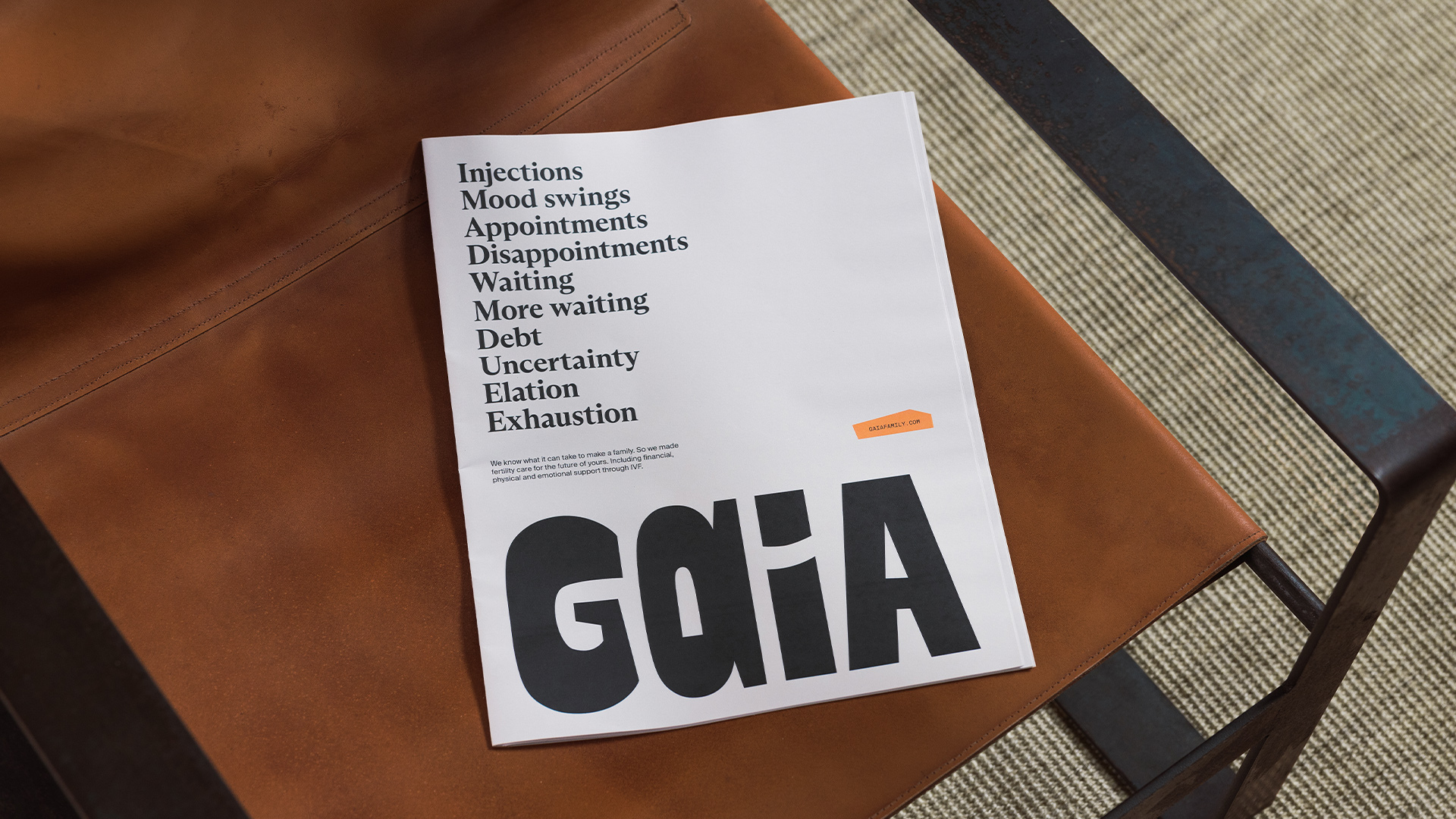
“For Gaia, we wanted to celebrate the process as much as the possibility,” she says. “We wanted to acknowledge the full emotional spectrum, the waiting, the mood swings, the doctor’s offices, the disappointment, the elation. So we avoided anything that suggested perfection or passivity.”
“The goal wasn’t to soften fertility or make it palatable. It was to make it more truthful, more varied, and more human.”
Ragged Edge’s work for Gaia
The challenge that Ragged Edge faced was as much cultural as it was creative. They had to reframe the entire conversation around fertility, and the emotions tied to it.
“Fertility has always been framed around luck and loss,” says co-founder Max Ottignon. “You’re at the mercy of biology, of fate, of whether treatment will work. Gaia reframes it around agency, helping people make active, informed choices about their path to parenthood.
“That shift reflects a broader evolution in healthcare, where trust comes not from clinical distance but from empathy and clarity.”
As Ottignon explains, design’s job in fertility branding is not only to simplify what’s complex, but also to help people feel capable within that complexity, giving them a sense of agency.
Gaia’s brand world had to feel accessible, but also credible. And Ragged Edge quickly established that credibility did not have to mean coldness.
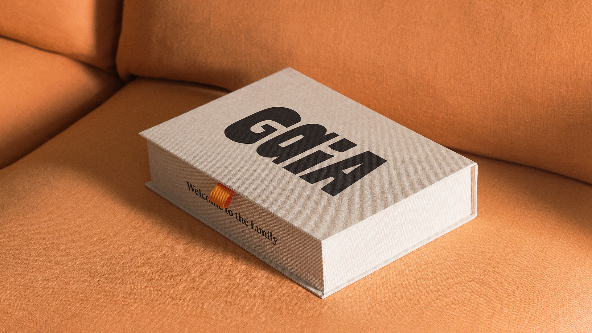
The wordmark, with its hand-sculpted look, features two different ‘A’s, a nod to Gaia’s core belief that there isn’t one perfect way to make a family.
Elsewhere, the team wove in collages with torn edges, tactile materials and authentic imagery that show the full IVF journey through intimate crops, raw moments, and varied experiences.
“The collages themselves are deliberately asymmetrical and handmade. Nothing perfect, nothing sterile,” says Ottignon.
“Together, these elements build a sense of expertise that feels lived-in rather than institutional.”
Where older fertility brands equated authority with distance, Gaia redefines it through warmth. In shaping that shift, Ragged Edge proves that empathy and expertise aren’t opposites, but allies.
“Being emotionally intelligent doesn’t make you less scientific; it makes you more trustworthy,” Ottignon says. “Because in a category where people feel vulnerable and uncertain, understanding becomes the ultimate form of expertise.”
That realignment – finding expertise in empathy – goes beyond tone or aesthetics. It’s about changing the story people tell themselves. And that speaks to what design, at its best, can do.
“Design can change more than perception – it can change how people see themselves,” Ottognon says.
“For too long, the language of fertility has told people they’re broken or running out of time. Gaia set out to show a different truth – that seeking IVF is an active choice, not a failure, and that the process itself, messy and imperfect as it is, has dignity.”
That message is clearly resonating. In September 2024, Gaia marked the birth of its 100th baby, shortly followed by a $14million Series B funding round.
Building on the shifts that brands like Gaia have set in motion, there is a broader recalibration of the fertility landscape. It’s a move away from brands that once medicalised the experience or softened it with sentimentality, toward ones that speak with honesty and connection.
Super Keen’s work for Cofertility
That shift is evident in Cofertility, a company backed by tennis star Maria Sharapova which has pioneered a no-fee egg-freezing model. It enlisted the help of Super Keen to reimagine its visual identity and brand architecture.
In building Cofertility’s new look, Brooklyn-based studio sought to reset the brand’s relationship with its audience, a change that began deep within its visual and verbal foundations.
To reflect a truly inclusive idea of family-building, the team avoided heteronormative imagery and language that treated infertility as absence, or a lack of something.
The logomark, crafted to look like a sunburst or a blooming flower, amplifies the brand’s optimism. But warmth at Cofertility isn’t just teased visually – it’s embedded in how the brand approaches the subject itself.
Super Keen’s work for Cofertility
“The warmth doesn’t come from stripping away complexity – it comes from acknowledging it with care,” says creative director Gabby Lord.
“We focused on clarity, not reduction. Every touchpoint was designed to make a deeply emotional and sometimes clinical process feel more human, without ignoring the hard parts.
“The language, tone, and photography all balance honesty with optimism. It’s not about glossing over reality; it’s about meeting people with empathy, transparency, and of course, hope for what’s possible.”
Once a taboo topic, fertility is now entering a new era. As Lord puts it, branding is no longer about simply destigmatising the conversation, “it’s about celebrating incredible advances in technology, the fact that women can take control of their fertility earlier, and that there are options for all kinds of families.”
Super Keen’s work for Cofertility
That spirit of celebration comes through in one of the identity’s most deliberate design gestures – a confetti motif that appears across visuals and applications.
“It’s a nice reminder for our members to take a moment to stop and celebrate the major milestones along the journey,” says Meela Imperato, head of marketing at Cofertility. “And at the same time, it captures the joy and gratitude we feel in being part of them.”
Building the fertility brands of tomorrow calls for designers to set new precedents for what credibility, care, and connection can look like.
Much of the work in this space is about championing that new thinking – finding harmony between logic and feeling, structure and sensitivity, without tipping too far into either.
Holding those opposing forces in equilibrium was a challenge Universal Favourite mastered when designing the identity for WHEN, Australia’s first at-home egg-count testing service.
Universal Favourite’s work for WHEN
“‘When’ is both a question and an answer, allowing the brand to hold both science and emotion,” says founder and executive creative director Dari Israelstam.
“Visually, this duality informed the interplay between precision and softness. Verbally, it permitted us to speak through an inner monologue that acknowledges uncertainty while offering guidance.”
The tension between those ideas is felt in the construction of the wordmark – set in ABC Diatype that brings a scientific edge and clarity – and the pulsating, pliable cell shape that brings adaptability and life.
The colour palette, especially the hero yellow gives the brand levity and warmth.
Universal Favourite’s work for WHEN
That balance carries through to the tone of voice.
“Instead of dwelling on what might be ‘wrong,’ the brand language focuses on curiosity and understanding,” explains Israelstam.
“The storytelling approach gives space to questions – When might I want to know more? When might I act? – rather than guilt or urgency. That tone informs the visual system; calm colours and gentle motion that celebrates knowledge as empowerment.”
WHEN’s authority comes from its restraint. Here, clarity and craft replace the old signals of trust.
Center’s work for Swimclub
And across fertility branding, new beliefs are taking hold. Approachability has become the new language of trust.
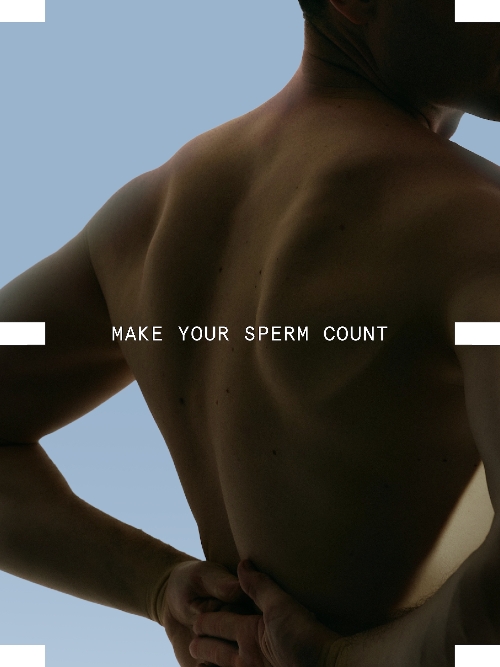
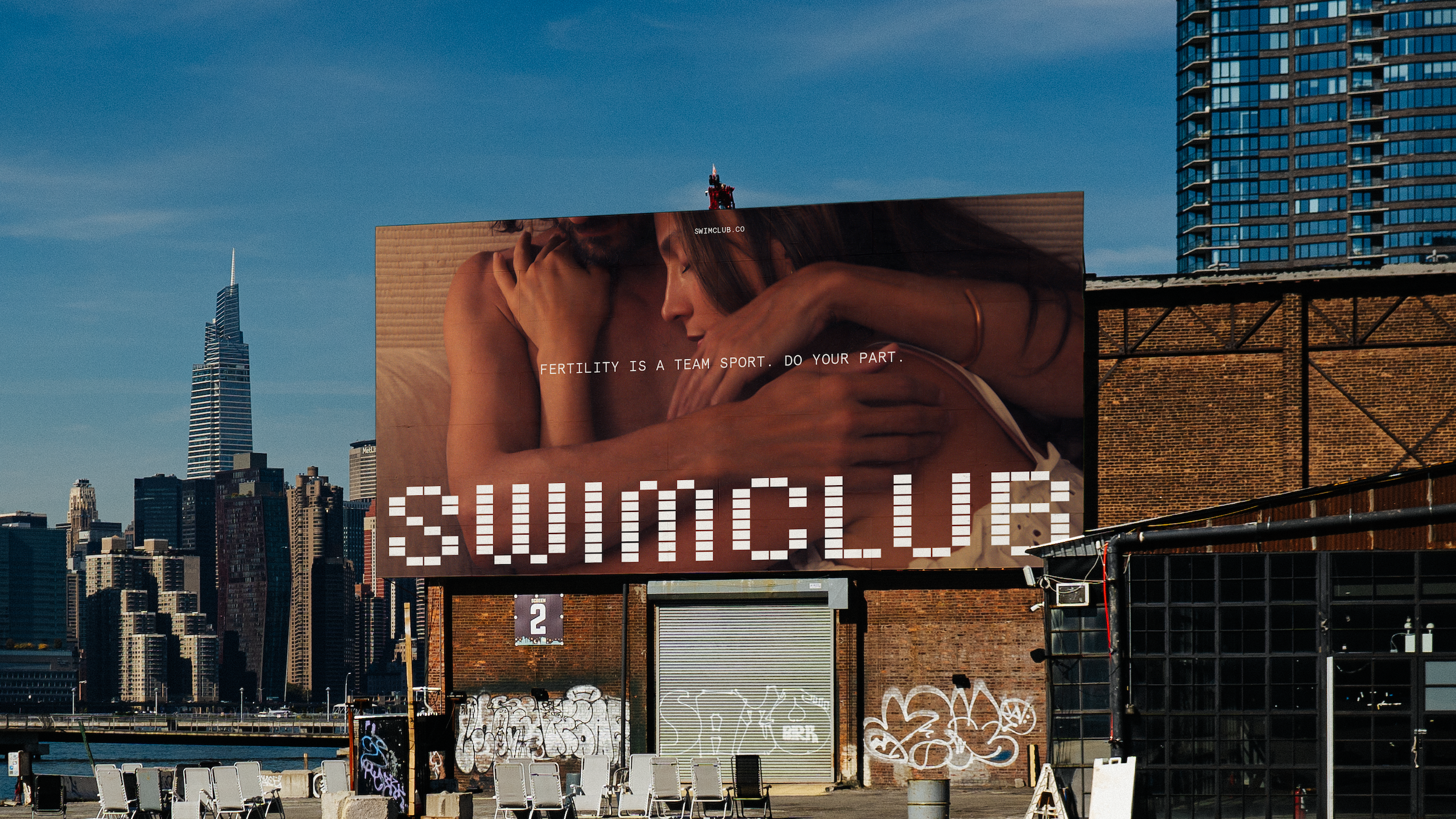
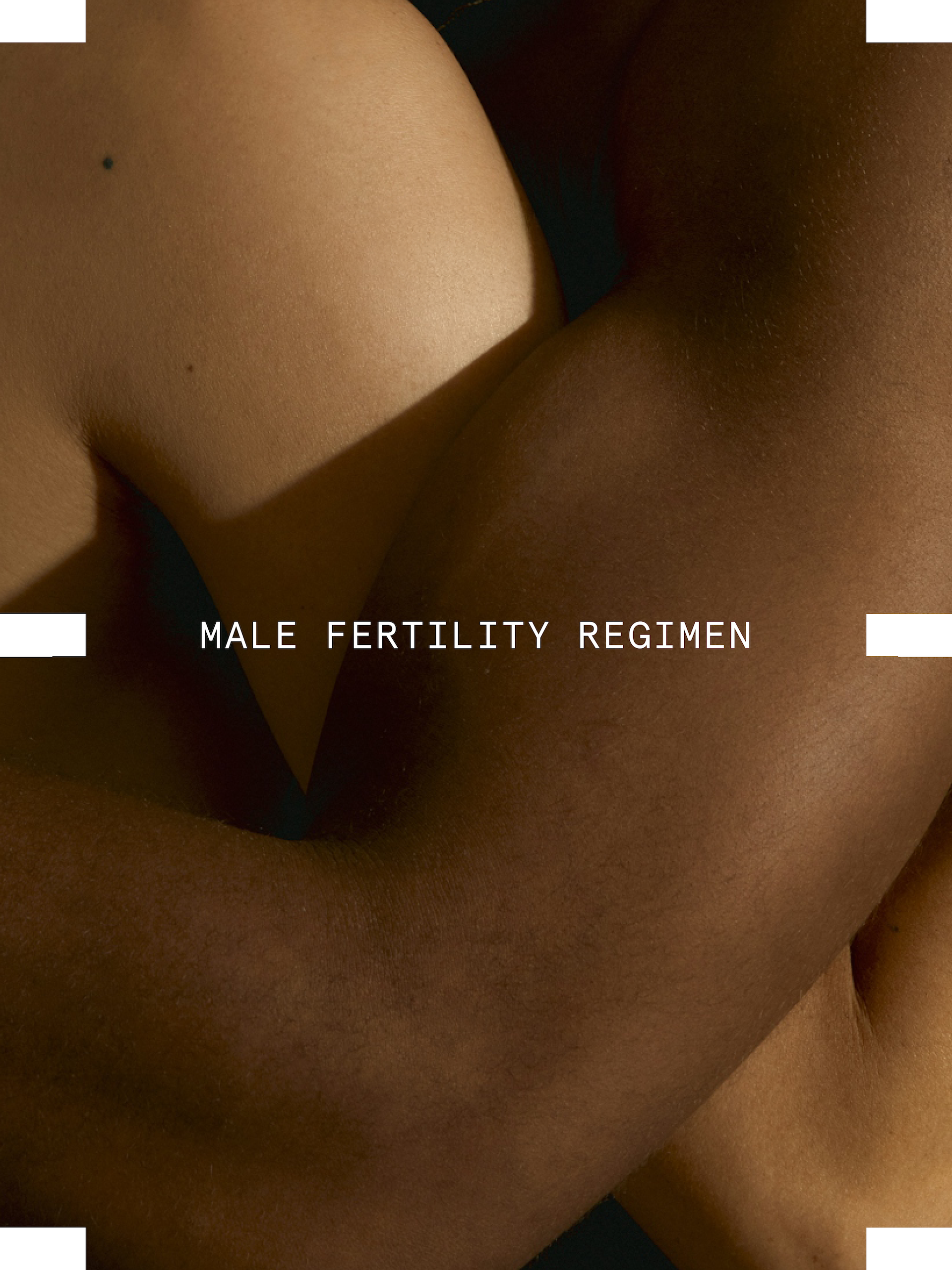
“Being approachable didn’t mean being soft or cute, it meant being honest,” says Alex Center, founder of CENTER. The Brooklyn-based studio created the identity for Swim Club, the first clinically formulated sperm performance supplement.
“When it comes to fertility, men’s health is half the equation, but it’s rarely treated that way. Sperm counts have dropped nearly 60% since 1970. Men are responsible for infertility in 50% of cases. And today, one in four men has below-average sperm.
“We wanted men to see fertility the way they see fitness or nutrition, something they can work on, understand, and improve. Swim Club speaks plainly about sperm health, DNA integrity, and reproductive performance, not as medical jargon, but as information that empowers. That honesty is what makes it approachable.”
The science had to feel accessible. The identity resolves that tension through a system where science and sport intersect – borrowing cues from DNA sequencing and the geometry of an Olympic pool.
The tiled grid conveys both movement and precision, embodying the brand’s dual focus on biological rigour and human vitality, resulting in a system grounded in order but alive with play, capable of stretching into moments of curiosity, like a tiled sperm caught mid-swim.
“The science behind Swim Club is rigorous, but our job was to give that science an emotional texture,” says Center.
“We used pattern, repetition, and structure to echo the precision of biology, but softened it through colour, typography, and art direction. Rationality and warmth aren’t opposites here; they’re partners.
“The data tells the story of life at its most fundamental level; our job was to make people feel that.”
The visual worlds of brands like Swim Club reveal how empathy in fertility branding has evolved into a spectrum of expression. It can be found in warmth or calm, precision, or playfulness.
But what connects them is a refusal to flatten the complexity of fertility.
“Fertility has long been spoken about in whispers or medical charts,” says Center. “Swim Club gives it a new language, one that’s rooted in science, but expressed with confidence and care.
“Design has the power to make complex ideas emotionally understandable. If men can talk about sperm count or DNA integrity without shame, our design has done its job.”