By

is THE LINE still becoming reality as saudi arabia reimagines its architectural future?

Saudi Arabia’s futuristic megacity ‘the line’ faces a new reality


Once hailed as the most radical experiment in twenty-first-century urbanism, THE LINE, (find designboom’s previous coverage here), a 170-kilometer-long mirrored megacity slicing through the desert, stands at the center of Saudi Arabia’s shifting architectural agenda. Conceived as the backbone of NEOM, the $500-billion development in the country’s northwest, it promised a car-free, carbon-neutral city contained within two parallel walls rising 500 meters high, an ambitious vision that faces an unexpected test of endurance.


According to multiple recent reports, Saudi Arabia is entering a period of reassessment for its vast Vision 2030 portfolio, a suite of architectural megaprojects valued at more than $1 trillion. Behind the futuristic renderings and bold rhetoric, officials have acknowledged that the pace and cost of construction have become unsustainable amid falling oil prices and growing budget deficits. THE LINE, once envisioned to stretch 170 kilometers across the Tabuk desert, has now reportedly been scaled back to a few miles of initial construction as the government redirects resources and timelines across its development landscape.

all images courtesy of NEOM unless stated otherwise


rethinking Futuristic Urban Ambitions Amid Spiraling Costs


According to Reuters, the kingdom’s $925-billion sovereign wealth fund is redirecting its focus after construction delays and spiraling costs across the country’s so-called gigaprojects. Insiders cited in The Sunday Times describe a ‘course correction,’ with THE LINE reportedly scaled back to only a few miles of construction, a fraction of its original length. The slowdown signals a broader reconsideration of Vision 2030, Crown Prince Mohammed bin Salman’s master plan to diversify the economy beyond oil and to recast Saudi Arabia as a global hub for innovation, tourism, and culture.


Architecturally, THE LINE was designed to condense urban life into a single continuous structure, a stacked ecosystem of housing, public space, vertical farms, and transport systems, all linked by high-speed transit. Renderings released by NEOM in 2022 showed the glistening mirrored facade of the structure reflecting the surrounding desert and sea. The project’s radical linear geometry challenged conventional city planning, proposing density without sprawl and mobility without cars.

a 170-kilometer-long mirrored megacity slicing through the desert


Investment Into AI, Gaming, and Future-Ready Cities


Yet as oil revenues fall and public spending tightens, other megadevelopments, including the Trojena mountain resort, planned host of the 2029 Asian Winter Games,, the Sindalah luxury island, and the $50-billion New Murabba district in Riyadh, have also faced delays or scaling back. ‘We spent too much,’ one official admitted to The Sunday Times. ‘We rushed at 100 miles an hour. We need to reprioritise.’ The Independent notes that the slowdown does not signal cancellation but rather a moment to ensure that the architectural ambition of the kingdom aligns with economic reality.


Amid this recalibration, Saudi Arabia is channeling new investment toward sectors like artificial intelligence, gaming, and data infrastructure, technologies that may still influence NEOM’s evolution. Jerry Inzerillo, CEO of the $63-billion Diriyah heritage redevelopment, described THE LINE not as a failure but as ‘a laboratory for what quality of life might look like in 2040.’ 

conceived as the backbone of NEOM

the project promices a car-free, carbon-neutral city

contained within two parallel walls rising 500 meters high

THE LINE has reportedly been scaled back to a few miles of initial construction

NEOM Stadium | image courtesy of Saudi Arabia FIFA World Cup 2034 bid

the slowdown signals a broader reconsideration of Vision 2030

the project is set to reach a fraction of its original length

Oxagon

the Trojena mountain resort has also faced delays or scaling back


project info:


name: THE LINE

location: NEOM | @discoverneom, Saudi Arabia

The post is THE LINE still becoming reality as saudi arabia reimagines its architectural future? appeared first on designboom | architecture & design magazine.

By

The Moiré Clock: A Kinetic Approach to Telling Time

Most clocks reveal time through simple rotation. The Moiré Clock, designed by Felix Cooper and Amber Li for their collective STATION Design, takes a more theatrical approach. It uses overlapping patterns to create a visual phenomenon where numbers appear to scale and shift as the clock face rotates through a stationary filter.

The moiré effect—that trippy interference pattern you get when overlapping grids or lines—isn’t often employed for functional purposes. But Cooper and Li saw potential in marrying the effect’s kinetic properties with clock movement. Hours materialize and fade as the rotating paper face passes through the filter, creating subtle animations every few minutes.

The project started as a custom glyph set testing moiré animations, then evolved into a clock body using a single strip of metal encasing the entire face. It’s an elegant solution that prioritizes material efficiency—a necessity when you’re manufacturing everything yourself.

And they do mean everything. STATION Design operates with serious commitment to vertical integration and local sourcing. The steel comes from offcuts at Metals Supermarket in Cranberry, Pennsylvania. The paper is milled by French Paper Company in Niles, Michigan. Even the quartz movements are from Takane, the sole American manufacturer. They also produced three stainless steel versions for durability.

Cooper, an industrial designer, and Li, a graphic designer and typographer, brought complementary skills—his mechanical expertise meeting her graphic sensibility. Both are recent Carnegie Mellon grads who founded STATION with two other designers from their program.

The collective’s first product drop sold out completely. Their approach mirrors streetwear’s limited release model, creating scarcity while keeping production manageable. The line includes wallets from scrap leather, train whistles from reclaimed shipping container lumber, and a RISO-printed calendar on Michigan-milled paper.

The first run was limited to 30 units, balancing high-quality materials with accessibility—no small feat when sourcing responsibly and manufacturing in-house.

Whether the moiré effect justifies itself over a standard clock face is debatable. But as proof that young designers can build vertically integrated brands straight out of school, it’s compelling work. STATION plans to restock soon, and the first drop’s sellout suggests there’s appetite for thoughtfully made, locally sourced design objects.

By

Japanese Prison to Re-Open as Luxury Hotel

A common refrain is that these days people spend money on experiences. Well, for those craving the experience of being locked up in a Meiji-era prison, Japanese hotel chain Hoshinoya has a treat for you.

“The Hoshinoya Nara Prison will be the first luxury hotel in Japan to utilize a former prison, an Important Cultural Property.”

“The former Nara Prison was one of the five major prisons completed in 1908, planned by the Meiji government with the aim of internationally standardizing prisons.”

“The iconic red brick building is a modern building with high historical value and excellent design. We offer a luxurious stay in this famous Meiji-era building with a world-renowned historical and cultural background.”

If you’re wondering what’s up with the bars on the floors, this allowed guards to monitor both the level they were on and the level below.

I assume the rooms will be getting a facelift.

The joint is scheduled to open next year, and rooms will start at ¥17,820 (USD $116) per night.

By

snøhetta sculpts hangzhou’s riverfront art museum to mimic shifting tides

hangzhou riverfront to be sculpted with fluid art museum


In Hangzhou’s Xiaoshan District, Snøhetta has won the international competition to design the Qiantang Bay Art Museum, the cultural center of the city’s new Future Headquarters development. The project sits at the meeting point of the Qiantang River and the Central Water Axis, where the city’s expanding downtown begins to open toward the water. Framed by this convergence, the 18,000-square-meter museum will serve as both civic anchor and threshold.


The scheme interprets the museum’s setting as a study of time and flow. The rhythm of the tides and the layered histories of the river become spatial motifs. Snøhetta’s design translates these influences into a sequence of fluid volumes and open rooftop terraces to create a building that’s embedded in the earth and feels to be in motion.

visualizations © ATCHAIN, Snøhetta


a continuous landscape by snøhetta


Two wave-like forms define Snøhetta’s Hangzhou Art Museum, rising and dipping across the site to link all public routes into a central gateway. From the ground plane, a series of paths meander upward, drawing the landscape into the architecture. Visitors can walk along shaded promenades or follow gentle ramps that ascend toward the rooftop terrace, where sweeping views extend from the cultural corridor to the river’s wide expanse.


This landscape approach by the architects transforms the museum into a civic terrain. The movement between indoors and outdoors blurs at key points, allowing light, sound, and breeze to filter into the experience. Each turn offers a new visual alignment — toward the water, the skyline, or the artworks inside — reminding visitors of their place between the two.

Snøhetta wins the competition to design the Qiantang Bay Art Museum in Hangzhou


a Gateway and Gathering Place


At the heart of the Hangzhou Art Museum, Snøhetta designs a central gateway which frames a direct view to the Qiantang River. This gateway is more than just an entrance. It functions as a spatial link between the urban edge and the waterfront, and a place to slow down and observe the landscape. The gateway’s ceiling and walls curve subtly, modulating the acoustics and light as visitors transition from open air to enclosure.


Inside, the galleries occupy the core, while social and educational spaces line the periphery. Spacious circulation areas invite pauses and informal gatherings. The architecture ensures that movement throughout the building remains intuitive, implying an echo of the waterways that inspired its form.


The material palette reinforces this sense of continuity. Smooth concrete, local stone, and glass are composed in layers that catch and diffuse light throughout the day. The surfaces shift with the weather, sometimes reflective, sometimes opaque, echoing the tidal variations of the Qiantang River.

two flowing volumes shape the architecture as a continuous landscape

paths and terraces invite movement between the river and the city

the design turns circulation into an experience inspired by tidal flows

a central gateway aligns sightlines toward the Qiantang River

concrete, stone and glass reflect the shifting light of Hangzhou


project info:


name: Hangzhou Qiantang Bay Art Museum

architect: Snøhetta | @snohetta

location: Hangzhou, China

client: Hangzhou Xiaoshan Qianjiang Century Development and Construction Co., Ltd.
collaborators: The Architectural Design & Research Institute of Zhejiang University Co., Ltd., Buro Happold

size: 18,000 square meters
status: Competition Win
visualizations: © ATCHAIN | @atchain, Snøhetta

The post snøhetta sculpts hangzhou’s riverfront art museum to mimic shifting tides appeared first on designboom | architecture & design magazine.

By

How fertility branding evolved to show both science and soul

The fertility industry has long been aimed squarely at women, built on a narrative of urgency and fear around the biological clock. For decades, it’s been framed as a reactive experience – something to manage rather than take ownership of – leaving people trapped between anxiety and doubt.

The category’s branding hasn’t helped. Pastel pinks and clinical blues, sterile medical cues, and imagery of smiling parents and swaddled babies have long reduced a profoundly complex experience to its happiest possible ending.

The real story, full of nuance, hope, and heartbreak, has gone largely untold.

“The confusing mix of clichés, euphemisms and medical jargon that plagues this category only adds to the powerlessness people can feel when they’re trying to make a life,” says Fia Townshend, copy director at Ragged Edge.

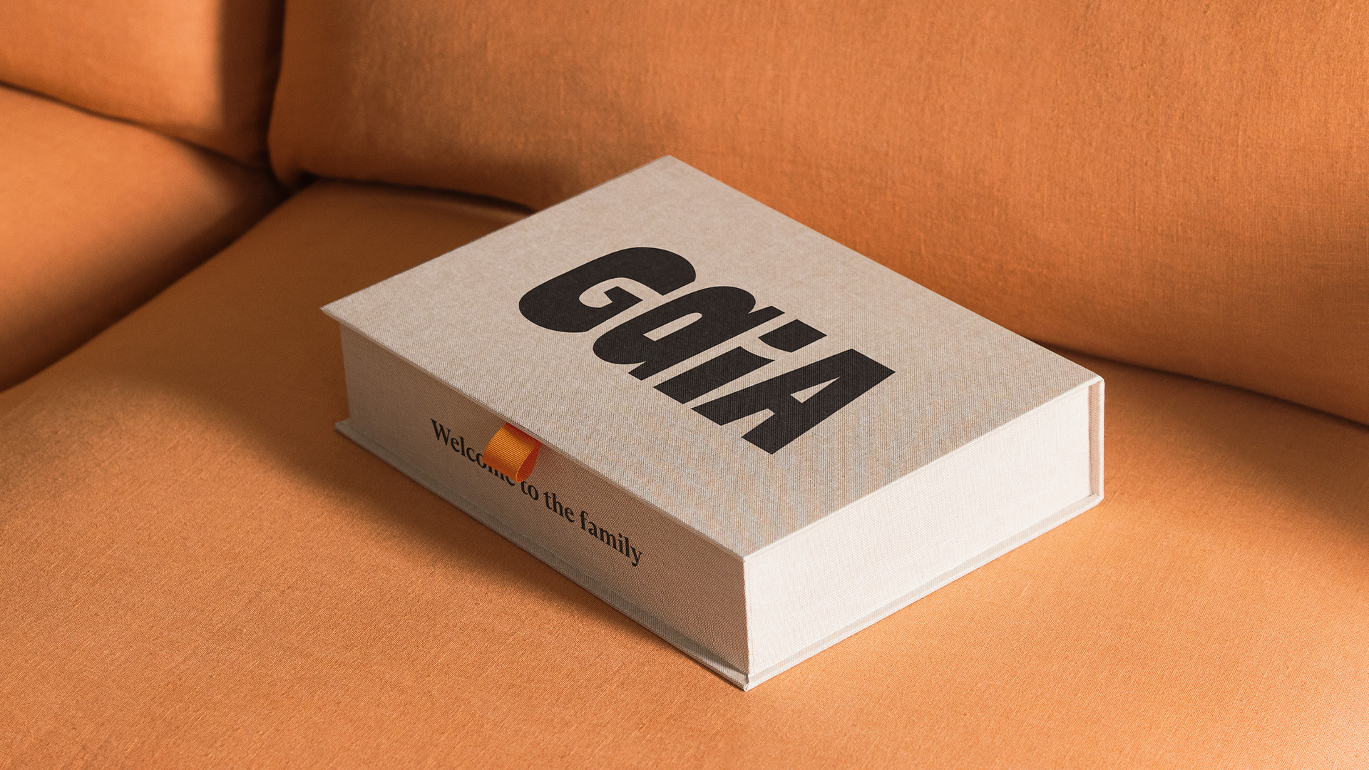
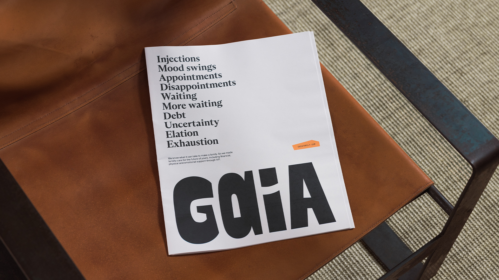
When rebranding the IVF insurance brand Gaia, the team at Ragged Edge spent time dismantling the emotional and visual shorthand that had come to define fertility branding.

They wanted to give Gaia’s members something more grounded – a language that could hold the full complexity of IVF while still offering a sense of clarity and hope.

The studio deliberately stepped away from the familiar platitudes of the category – colour codes, photographs of picture-perfect families, and talk of “miracles.”

As Townshend points out, these ideas reduce something complex and unwieldy to a single outcome, the baby. And IVF is much more than its endpoint.

“For Gaia, we wanted to celebrate the process as much as the possibility,” she says. “We wanted to acknowledge the full emotional spectrum, the waiting, the mood swings, the doctor’s offices, the disappointment, the elation. So we avoided anything that suggested perfection or passivity.”

“The goal wasn’t to soften fertility or make it palatable. It was to make it more truthful, more varied, and more human.”

Ragged Edge’s work for Gaia

The challenge that Ragged Edge faced was as much cultural as it was creative. They had to reframe the entire conversation around fertility, and the emotions tied to it.

“Fertility has always been framed around luck and loss,” says co-founder Max Ottignon. “You’re at the mercy of biology, of fate, of whether treatment will work. Gaia reframes it around agency, helping people make active, informed choices about their path to parenthood.

“That shift reflects a broader evolution in healthcare, where trust comes not from clinical distance but from empathy and clarity.”

As Ottignon explains, design’s job in fertility branding is not only to simplify what’s complex, but also to help people feel capable within that complexity, giving them a sense of agency.

Gaia’s brand world had to feel accessible, but also credible. And Ragged Edge quickly established that credibility did not have to mean coldness.

The wordmark, with its hand-sculpted look, features two different ‘A’s, a nod to Gaia’s core belief that there isn’t one perfect way to make a family.

Elsewhere, the team wove in collages with torn edges, tactile materials and authentic imagery that show the full IVF journey through intimate crops, raw moments, and varied experiences.

“The collages themselves are deliberately asymmetrical and handmade. Nothing perfect, nothing sterile,” says Ottignon.

“Together, these elements build a sense of expertise that feels lived-in rather than institutional.”

Where older fertility brands equated authority with distance, Gaia redefines it through warmth. In shaping that shift, Ragged Edge proves that empathy and expertise aren’t opposites, but allies.

“Being emotionally intelligent doesn’t make you less scientific; it makes you more trustworthy,” Ottignon says. “Because in a category where people feel vulnerable and uncertain, understanding becomes the ultimate form of expertise.”


That realignment – finding expertise in empathy – goes beyond tone or aesthetics. It’s about changing the story people tell themselves. And that speaks to what design, at its best, can do.

“Design can change more than perception – it can change how people see themselves,” Ottognon says.

“For too long, the language of fertility has told people they’re broken or running out of time. Gaia set out to show a different truth – that seeking IVF is an active choice, not a failure, and that the process itself, messy and imperfect as it is, has dignity.”

That message is clearly resonating. In September 2024, Gaia marked the birth of its 100th baby, shortly followed by a $14million Series B funding round.

Building on the shifts that brands like Gaia have set in motion, there is a broader recalibration of the fertility landscape. It’s a move away from brands that once medicalised the experience or softened it with sentimentality, toward ones that speak with honesty and connection.

Super Keen’s work for Cofertility

That shift is evident in Cofertility, a company backed by tennis star Maria Sharapova which has pioneered a no-fee egg-freezing model. It enlisted the help of Super Keen to reimagine its visual identity and brand architecture.

In building Cofertility’s new look, Brooklyn-based studio sought to reset the brand’s relationship with its audience, a change that began deep within its visual and verbal foundations.

To reflect a truly inclusive idea of family-building, the team avoided heteronormative imagery and language that treated infertility as absence, or a lack of something.

The logomark, crafted to look like a sunburst or a blooming flower, amplifies the brand’s optimism. But warmth at Cofertility isn’t just teased visually – it’s embedded in how the brand approaches the subject itself.

Super Keen’s work for Cofertility

“The warmth doesn’t come from stripping away complexity – it comes from acknowledging it with care,” says creative director Gabby Lord.

“We focused on clarity, not reduction. Every touchpoint was designed to make a deeply emotional and sometimes clinical process feel more human, without ignoring the hard parts.

“The language, tone, and photography all balance honesty with optimism. It’s not about glossing over reality; it’s about meeting people with empathy, transparency, and of course, hope for what’s possible.”

Once a taboo topic, fertility is now entering a new era. As Lord puts it, branding is no longer about simply destigmatising the conversation, “it’s about celebrating incredible advances in technology, the fact that women can take control of their fertility earlier, and that there are options for all kinds of families.”

Super Keen’s work for Cofertility

That spirit of celebration comes through in one of the identity’s most deliberate design gestures – a confetti motif that appears across visuals and applications.

“It’s a nice reminder for our members to take a moment to stop and celebrate the major milestones along the journey,” says Meela Imperato, head of marketing at Cofertility. “And at the same time, it captures the joy and gratitude we feel in being part of them.”

Building the fertility brands of tomorrow calls for designers to set new precedents for what credibility, care, and connection can look like.

Much of the work in this space is about championing that new thinking – finding harmony between logic and feeling, structure and sensitivity, without tipping too far into either.

Holding those opposing forces in equilibrium was a challenge Universal Favourite mastered when designing the identity for WHEN, Australia’s first at-home egg-count testing service.

Universal Favourite’s work for WHEN

“‘When’ is both a question and an answer, allowing the brand to hold both science and emotion,” says founder and executive creative director Dari Israelstam.

“Visually, this duality informed the interplay between precision and softness. Verbally, it permitted us to speak through an inner monologue that acknowledges uncertainty while offering guidance.”

The tension between those ideas is felt in the construction of the wordmark – set in ABC Diatype that brings a scientific edge and clarity – and the pulsating, pliable cell shape that brings adaptability and life.

The colour palette, especially the hero yellow gives the brand levity and warmth.

Universal Favourite’s work for WHEN

That balance carries through to the tone of voice.

“Instead of dwelling on what might be ‘wrong,’ the brand language focuses on curiosity and understanding,” explains Israelstam.

“The storytelling approach gives space to questions – When might I want to know more? When might I act? – rather than guilt or urgency. That tone informs the visual system; calm colours and gentle motion that celebrates knowledge as empowerment.”

WHEN’s authority comes from its restraint. Here, clarity and craft replace the old signals of trust.

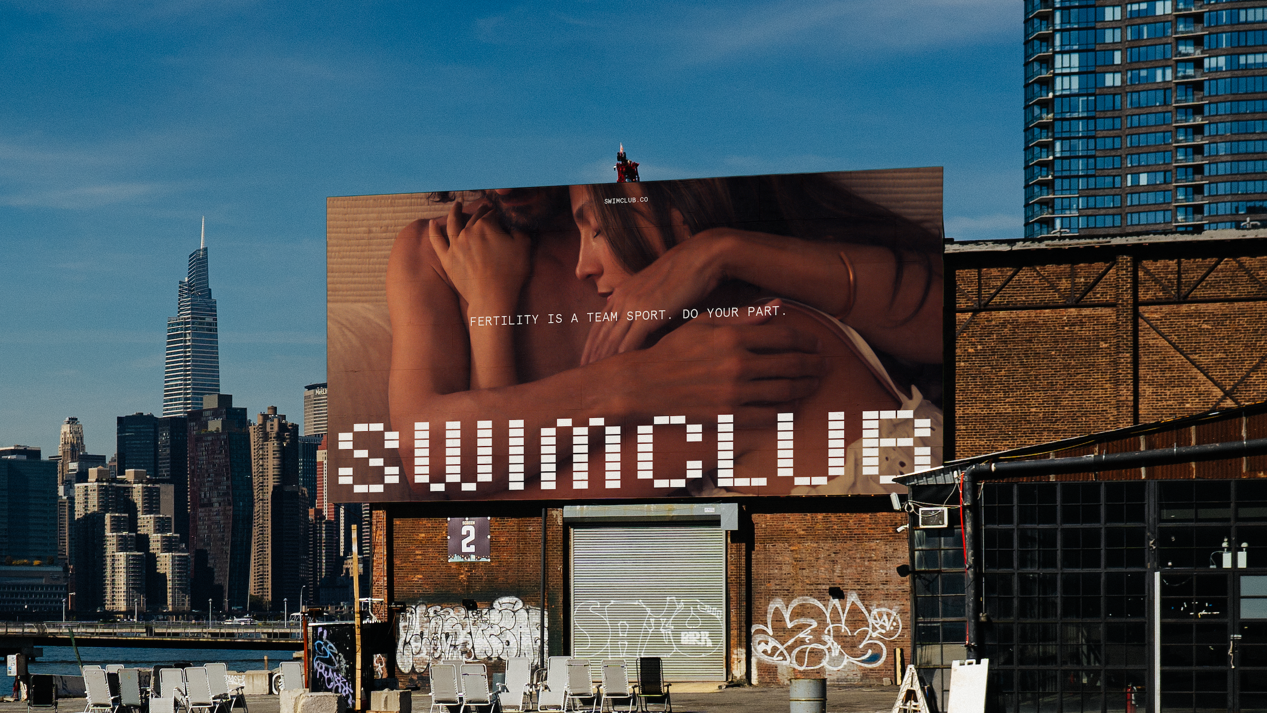
Center’s work for Swimclub

And across fertility branding, new beliefs are taking hold. Approachability has become the new language of trust.

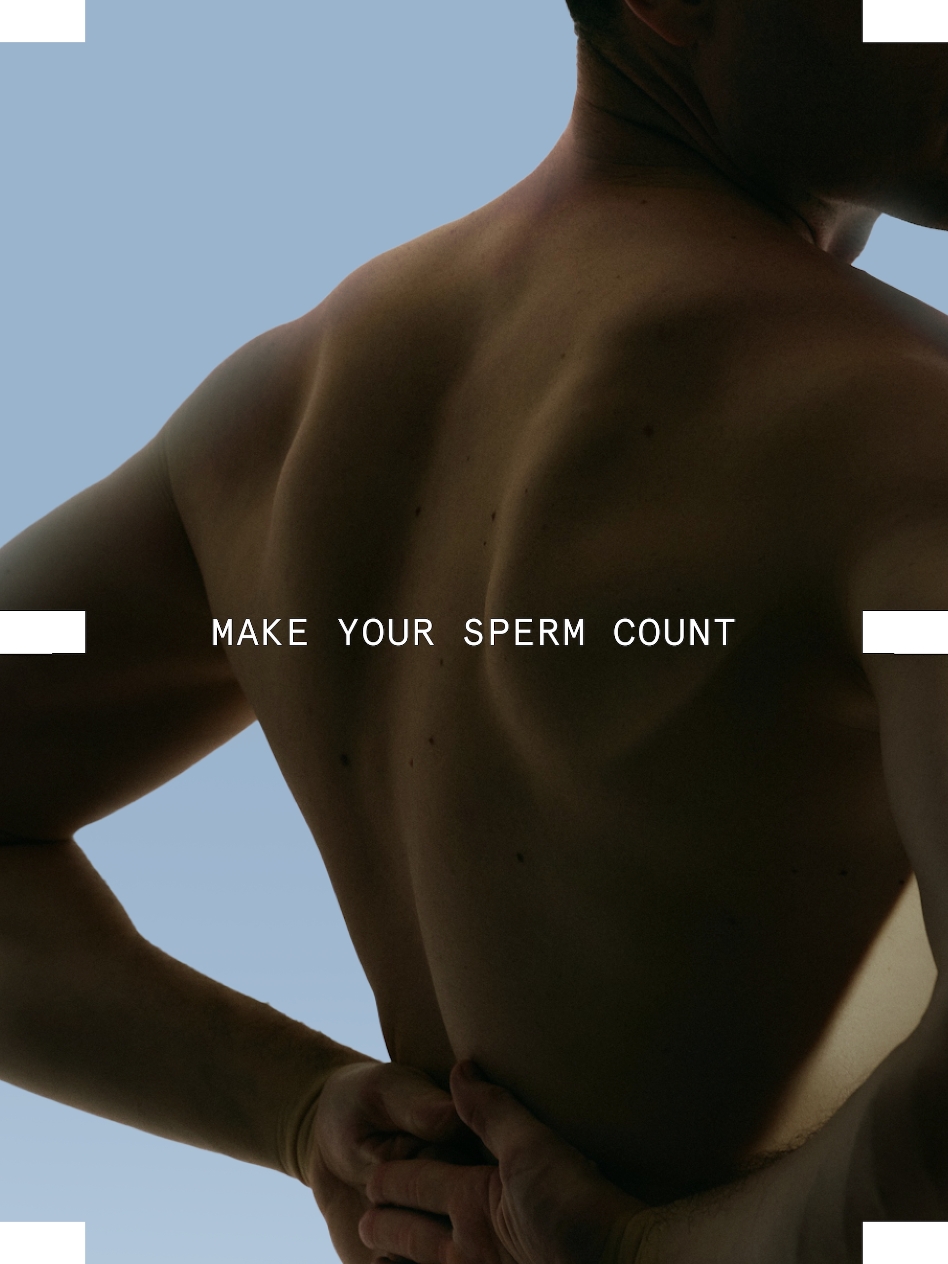
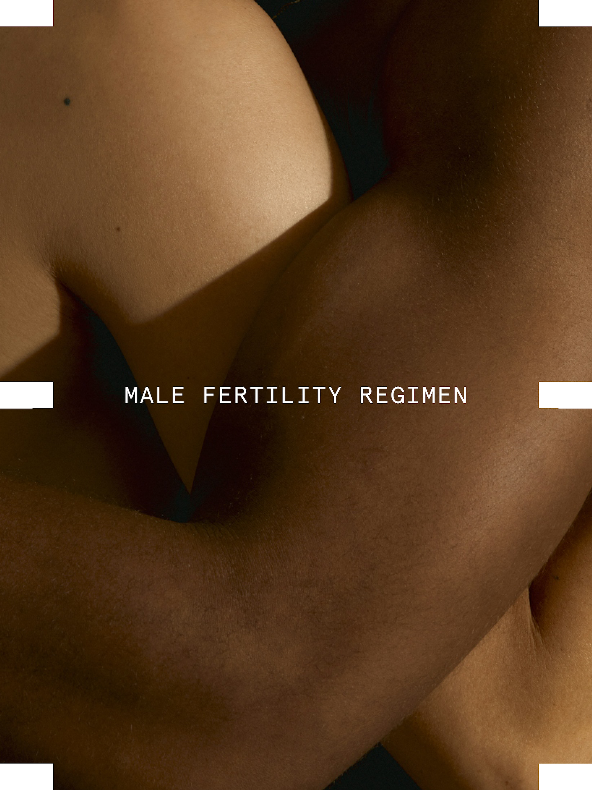
“Being approachable didn’t mean being soft or cute, it meant being honest,” says Alex Center, founder of CENTER. The Brooklyn-based studio created the identity for Swim Club, the first clinically formulated sperm performance supplement.

“When it comes to fertility, men’s health is half the equation, but it’s rarely treated that way. Sperm counts have dropped nearly 60% since 1970. Men are responsible for infertility in 50% of cases. And today, one in four men has below-average sperm.

“We wanted men to see fertility the way they see fitness or nutrition, something they can work on, understand, and improve. Swim Club speaks plainly about sperm health, DNA integrity, and reproductive performance, not as medical jargon, but as information that empowers. That honesty is what makes it approachable.”

The science had to feel accessible. The identity resolves that tension through a system where science and sport intersect – borrowing cues from DNA sequencing and the geometry of an Olympic pool.

The tiled grid conveys both movement and precision, embodying the brand’s dual focus on biological rigour and human vitality, resulting in a system grounded in order but alive with play, capable of stretching into moments of curiosity, like a tiled sperm caught mid-swim.

“The science behind Swim Club is rigorous, but our job was to give that science an emotional texture,” says Center.

“We used pattern, repetition, and structure to echo the precision of biology, but softened it through colour, typography, and art direction. Rationality and warmth aren’t opposites here; they’re partners.

“The data tells the story of life at its most fundamental level; our job was to make people feel that.”

The visual worlds of brands like Swim Club reveal how empathy in fertility branding has evolved into a spectrum of expression. It can be found in warmth or calm, precision, or playfulness.

But what connects them is a refusal to flatten the complexity of fertility.

“Fertility has long been spoken about in whispers or medical charts,” says Center. “Swim Club gives it a new language, one that’s rooted in science, but expressed with confidence and care.

“Design has the power to make complex ideas emotionally understandable. If men can talk about sperm count or DNA integrity without shame, our design has done its job.”


Source
By

Ultra-Compact Open-Source Trackball Has One Button You Can Remap

Most mice and trackballs try to do it all with extra buttons, flashy RGB lights, and complicated software that requires constant updates and configuration tweaks through bloated apps. But sometimes simplicity wins when you just need precise control and reliability without the extras. For anyone who values portability and the freedom to tinker with their gear, finding the right pointing device can be a challenge in a market flooded with gaming-focused options.

The Ploopy Nano 2 trackball is a refreshing alternative that strips away the unnecessary extras and focuses on what matters. It’s ultra-compact, open-source, and designed specifically for customization by users who want complete control over their tools. Priced at $59.99 CAD, about $43 USD, it’s made for makers, coders, and anyone who wants a mouse that fits their workflow perfectly without forcing adaptation to preset configurations.

Designer: Ploopy

The Nano 2 features a compact footprint that sits easily beside any keyboard without dominating valuable desk space for other gear. The 3D-printed body in opaque black, paired with tracking balls in red, blue, or black for personal preference, feels solid and purposeful in use during extended sessions. The minimalist design and low profile make it easy to integrate into any setup, from home offices to creative studios, without clashing with existing equipment.

Roller bearings give the 1.5-inch ball a satisfying, tactile feel during use, though they do make a scratchy grinding sound that’s part of the Nano’s mechanical character and feedback. Some users love the audible feedback as confirmation of movement, while others may find it distracting in quiet library or office environments. The sound is noticeable but adds to the analog, mechanical feel that distinguishes it from silent optical trackballs.

The big upgrade is the PAW-3222 sensor, which delivers a polling rate over 1,000Hz, up to 4,000 CPI, and 10g acceleration for smooth, precise tracking during demanding design or coding work. The new button triggers drag scrolling by default out of the box, but thanks to QMK and VIA support, you can remap it to anything you need instantly, from click to macro to custom functions.

USB-C replaces the old micro-B port found on the original Nano, improving durability and making charging and programming easier for modern setups with universal cables you already own. As with all Ploopy devices, the Nano 2 is fully open-source, with hardware under the CERN OHL license and firmware under the GPL for complete transparency and user freedom. Assembly guides, modding tips, and all design files live on GitHub.

Whether you’re coding complex projects, designing graphics, or just want a minimalist pointer for your laptop bag during travels and commutes, the Nano 2 brings personality and function to your workspace effortlessly without taking up space. Its compact size, open-source roots, and tactile feel make it a conversation starter and a daily companion for anyone who values control and creativity in their desktop tools.

The post Ultra-Compact Open-Source Trackball Has One Button You Can Remap first appeared on Yanko Design.

By

Brilliant Specialty Drill Bits!

“These revolutionary drill bits have changed the game forever,” writes creator Nick Sharpes.

You just know that someone is going to think these are real.

The specialty “drill bits” are part of Sharpes’ schtick; under the moniker The 3Dwizard, he creates “Useful and not so useful 3D prints.”

He’s also got a couple designs that go around corners:

If Sharpes was going for engagement, he got it. Over 15,000 people have “liked” this.

By

5 Architectural Designs That Redefined Our Expectations In 2025

Architecture has always been about solving problems, but the best designs do something more—they make us reimagine what’s possible. This year brought us structures that challenged architectural conventions, from a brilliant garden shed that conquered Britain to a groundbreaking skyscraper that’s rewriting Manhattan’s sustainable playbook. Each remarkable project represents thoughtful architectural design responding to real human needs with exceptional intelligence, creativity, and purposeful innovation that truly inspires us all today.

These five projects share remarkable qualities that prove great design isn’t about size or budget, but about understanding human needs deeply. Whether Robinson’s ingenious workshop flaps, Baluchon’s light-filled creativity, Foster’s sustainable innovation, Ando’s poetic restraint, or LH47’s community insight, each demonstrates that architecture’s greatest power lies in intelligent problem-solving. They transform ordinary activities into extraordinary experiences through thoughtful design that enhances rather than merely houses human life with meaningful, lasting purpose.

1. The Tiny Workshop – Robinson’s Space-Saving Masterpiece

Robinson’s tiny workshop earned Britain’s coveted Shed of the Year title through pure ingenuity. The structure features two transformative flaps that redefine functionality—one drops to create a work floor while another flips up for weather protection. Every surface serves multiple purposes, with custom 3D-printed brackets holding old spanner handles that provide both organization and visual cues about contents within.

The living green roof elevates this beyond typical garden storage, creating a wildlife habitat while housing essential tools. Robinson designed the space to serve triple duty as a toolshed, creative workspace, and storage solution for everything from garden necessities to children’s games. The careful planning of drawers, shelves, and hooks ensures every inch maximizes accessibility without sacrificing the workshop’s compact footprint.

What we like

Revolutionary dual-flap system maximizes functionality in minimal space.
A living green roof combines storage with environmental benefits.

What we dislike

Limited interior height may restrict certain workshop activities.
Weather dependence for outdoor work floor functionality.

2. Nouvelle Danse – Baluchon’s Sewing Studio Sanctuary

Baluchon’s latest masterpiece transforms tiny house living for creative professionals. Nouvelle Danse seamlessly integrates a dedicated sewing studio into a surprisingly spacious two-bedroom layout, proving specialized workspaces can thrive in compact dimensions. The French builder’s signature aesthetic mastery shines through high-contrast natural wood cladding against matte black insertions flowing across the roof, door, and window frames.

Natural light floods every corner through strategically placed windows, creating an atmosphere that feels expansive despite compact dimensions. The entrance commands attention with modern glass doors framed in striking black paneling, ensuring the home impresses whether positioned in tiny house communities or remote natural settings. Custom-built details throughout reflect Baluchon’s reputation as the industry’s most innovative craftsman.

What we like

Masterful integration of specialized workspace within compact living.
Exceptional natural light design prevents a cramped feeling.

What we dislike

High-end custom construction likely commands premium pricing.
Specialized sewing focus may limit appeal to a broader market.

3. 270 Park Avenue – NYC’s Sustainable Supertall Pioneer

Rising 1,388 feet above Midtown Manhattan, 270 Park Avenue establishes new benchmarks for sustainable skyscraper design. Foster + Partners created JPMorgan Chase’s 60-story headquarters as more than corporate space—it’s a vertical city designed for 10,000 employees with unprecedented environmental responsibility. The tower replaces the demolished Union Carbide Building with architecture that prioritizes collaboration, wellness, and flexible workspace solutions.

The building’s significance extends beyond its impressive height to its role as NYC’s first net-zero supertall skyscraper. Advanced sustainability systems integrate seamlessly with cutting-edge workplace design, creating environments that adapt to future workforce demands. The project demonstrates how corporate architecture can contribute positively to urban density while meeting ambitious environmental goals through innovative building technologies.

What we like

Groundbreaking net-zero achievement sets new industry standards.
Flexible workspace design accommodates evolving work patterns.

What we dislike

Massive scale may overwhelm the surrounding neighborhood context.
High-tech systems require ongoing maintenance and expertise.

4. Dubai Museum of Art – Ando’s Poetic Vision Above Water

Tadao Ando’s Dubai Museum of Art floats above the emirate’s natural saltwater creek like frozen fabric caught in gentle wind. The five-story structure curves and twists upward on a circular platform, its white walls punctuated by triangular windows that create dynamic shadows throughout the day. DUMA’s design draws inspiration from Dubai’s pearl-diving heritage while refusing to compete with the city’s glittering tower collection.

The museum’s distinctive silhouette speaks in whispers while the surrounding architecture shouts for attention. Ando’s mastery of concrete and light creates spaces that evoke emotion before understanding, transforming the traditional museum experience into something more intimate and contemplative. The raised platform extending over Dubai Creek connects the building to water in ways that honor the site’s historical significance.

What we like

Unique floating design creates a memorable architectural experience.
Thoughtful integration with Dubai’s maritime heritage.

What we dislike

A white exterior may require intensive maintenance in a harsh climate.
Limited ground-level connection could feel disconnected from the city.

5. Moldova Sports Hub – LH47’s Community-Centered Innovation

Architect Serghei Mirza and LH47 revolutionized children’s sports facilities by recognizing a simple truth—parents never arrive alone. The Moldova Sports Hub transforms typical waiting time into a valuable community connection through dedicated circulation routes for different user groups. Independent pathways allow kids, parents, coaches, and staff to move freely without interfering with each other’s activities.

Solar panels integrated into the design demonstrate environmental responsibility while reducing operational costs. The building’s genius lies in understanding the entire ecosystem surrounding children’s sports programs, creating spaces where parents can rest, connect with families, or stay active themselves. This approach transforms what could be dead waiting time into opportunities for community building and personal wellness.

What we like

Brilliant circulation design eliminates user conflicts and crowding.
Solar integration reduces environmental impact and operating costs.

What we dislike

A complex multi-user design may increase construction and maintenance costs.
Success depends heavily on active community programming and management.

The Future of Thoughtful Architecture

These five projects share a common thread—they solve real problems through creative thinking rather than brute force. Whether it’s Robinson’s ingenious flaps, Baluchon’s light-filled creativity, Foster’s sustainable innovation, Ando’s poetic restraint, or LH47’s community insight, each design demonstrates that architecture’s greatest power lies in understanding human needs and responding with intelligence and care.

The best architecture doesn’t just house activities—it enhances them. These projects prove that thoughtful design can transform the mundane into the extraordinary, whether that’s organizing tools in a garden shed or creating community around children’s sports. They remind us that great architecture isn’t about impressing other architects—it’s about making life better for the people who use these spaces every day.

The post 5 Architectural Designs That Redefined Our Expectations In 2025 first appeared on Yanko Design.

By

An F1 Cockpit Gaming Chair

Earlier we looked at a replica McLaren F1 seat that you can buy for your gaming rig. It’s sold by Logitech.

Hungarian industrial design firm Flying Objects is taking it further. They figure that for racing sims, players will want to be fully enclosed:

“The body parts are made of lightweight carbon fiber and fiberglass,” the firm writes, “while the frame and rails are made of folded sheet metal for durability.”

There’s also a variant that isn’t fully enclosed, but that just looks, you know, silly.

The firm says the design is going into production, by a Hungarian company called Kelako Engineering, for a 2026 launch.

By

Credit Card-Thin Handheld Has 300 Games and A Multiplayer Cable

There’s something magical about pocket-sized gaming that never gets old for those who grew up with handhelds in their backpacks and pockets. The thrill of squeezing a whole arcade into your palm, the nostalgia of pixel art and chiptunes, and the joy of discovering new games on the go bring genuine smiles that modern mobile gaming just can’t replicate. Most modern handhelds chase power and graphics, but sometimes it’s the simplicity and creativity of 8-bit gaming.

The Arduboy FX-C is a new take on that classic formula with a modern twist for contemporary gamers who appreciate retro aesthetics. It’s slim, open-source, and loaded with over 300 homebrew games, all ready to play on a device that’s barely thicker than a credit card you carry daily in your wallet. With USB-C charging and multiplayer support via link cable, it’s a retro playground for your pocket.

Designer: Kevin Bates

The FX-C is built specifically for portability, with a polycarbonate front, stamped aluminum back, and a transparent shell that shows off the ultra-thin circuit board inside for tech enthusiasts. At just 5mm thick, it slips into your wallet or pocket with room to spare for other essentials like keys and cards. The tactile buttons and crisp black-and-white 128 by 64 OLED screen channel the spirit of classic Game Boy handhelds.

Limited editions add a splash of color and personality to the minimalist design that collectors will appreciate. Purple buttons mark the Founders Edition, while electric green branding distinguishes the Standard Edition produced by Seeed Studio for wider distribution. The robust construction shrugs off daily bumps and scratches without showing wear, while the slim profile means you can carry it everywhere without thinking twice about added bulk.

The big upgrade is USB-C, making charging and programming easier than ever before for users who’ve moved to modern cables. But the real fun starts with the included USB-C link cable that enables local multiplayer battles. Connect two FX-Cs together and you unlock head-to-head multiplayer action, from classic Pong to new homebrew duels created by the passionate community. The same port supports external sensors and future mods for experimenters.

Inside, the ATmega32u4 chip and 16MB flash storage hold over 300 games, with instant switching between titles and no need to reflash the device constantly like earlier models. The 180mAh battery delivers over 8 hours of continuous play on a single charge, and the 4-channel piezo speaker brings retro soundtracks and sound effects to life. The entire system runs on open-source hardware and software that anyone can modify.

The FX-C comes preloaded with a sprawling library of platformers, shooters, puzzles, and more titles spanning every retro genre imaginable, each one crafted by a global community of open-source developers who contribute freely without commercial motivation. If you’ve ever wanted to build your own game or learn to code in a friendly environment, free tutorials and a thriving forum make it easy to get started without prior experience.

Whether you’re commuting on crowded trains, waiting in line at the coffee shop, or just need a break from your phone’s endless notifications and social media, the Arduboy FX-C delivers a burst of retro fun wherever you are throughout the day. For anyone who loves the spirit of classic gaming with a modern twist and open-source freedom, it’s proof that sometimes less really is more.

The post Credit Card-Thin Handheld Has 300 Games and A Multiplayer Cable first appeared on Yanko Design.