[searchandfilter fields="search,category"]

By

design/leader: Fluid’s Stacey Bates-McCue

Stacey Bates-McCue is creative director of Fluid. The Birmingham-based agency works on strategy and design for entertainment brands like Pac-Man, Xbox and Tetris.

Design

What would your monograph be called?

Never Say Die. This is a direct reference to my favourite Stephen Spielberg film, The Goonies. I live by this mantra, as it shows resilience through everything in life, which feeds my creative drive on a daily basis!

What recent design work made you a bit jealous?

Pentagram worked on the re-brand for Moto GP – the way they thought about the dynamics of the logo integrating the curvature of the track, the rider, the riding angle, it just floored me! Beautiful design and beautiful presentation.

Pentagram partner Angus Hyland’s new identity for MotoGP

What’s an unusual place you get inspiration from?

My co-directors of course, my two boys. Having a nine- and five -year-old with neurodiversity allows me to see the world in a completely different way. I see creativity in the smallest things with their amazing and inclusive lenses.

They have a simple and clear direction for everything in life, which brings simple clarity when it comes to design. Keep it simple. It needs to make sense, tell a story and connect with you.

Name something that is brilliantly designed but overlooked.

Restaurants for sure! I love food just as much as my job, and enjoy every detail, not just the menus and logos, but the table wear, the dress code, and the plate details. It has a real creative journey for me as has so much inspiration!

I also love looking back through history. The world rotates around fashion and trends, and it really all does come back around. Sometimes we don’t need to re-invent, just celebrate what once was and allow a natural evolution.

What object in your studio best sums up your taste?

My limited edition Streets Of Rage SEGA print. I have blue blood from my years of looking after Sonic the Hedgehog, I am a retro gamer, and the game well, it connects with me as a creative Director…

Being a creative director is like stepping into Streets of Rage.

The city? That’s the project landscape – chaotic, unpredictable, full of rival agendas and creative “boss fights.”

The ex-cops? That’s your team – talented but needing direction, each with a different fighting style and creative strength.

The weapons scattered on the ground? Those are your resources – limited, sometimes improvised, but powerful when used at the right moment.

The music? Well, that ultimately keeps us alive!

Stacey Bates-McCue’s Streets of Rage print

Leadership

What feedback felt brutal at the time, but turned out to be useful?

I won’t name the job, that wouldn’t feel right, but will name the 100 creative parameters we had to live within. No character art treatments, no editorial, no fun?

Wrong, after the team and I banging our heads against the wall, we realised that this is a little like Countdown. At first your mind boggles, but the more time you sit and look the more you see more than one answer.

We started to build layers up behind the elements we couldn’t touch and it really started to elevate the project in ways we might not have thought of if someone hadn’t tied our hands behind our backs! Creative conundrums are welcome at Fluid, we love the challenge.

What’s an underappreciated skill that design leaders need?

When we stop and listen, the room changes. Not just speaking at one another, but when we really stop to listen as a creative director, the role shifts from orchestrator of outputs to conductor of collective energy.

The work usually gets richer, the team more resilient, and the culture more inventive. Ideas no longer flow in one direction – they branch, collide, and evolve. Voices that were quiet become sparks that ignite new ways of seeing.

What keeps you up at night?

Not always the big stuff ya know! It can be something so small, I would forget about it a week later, but in that moment, it consumes me!

My ADHD brain is a storm of ideas, textures, and references – but my output is razor-focused. I live in the chaos so my work can bring clarity. I thrive in clutter, but deliver clean. That’s the creative director’s paradox. My mind is scattered; my work is straight.

I make sense of the mess so the brand doesn’t have to.

What trait is non-negotiable in new hires?

In this team, creativity fuels us – but reliability delivers us. I need people who follow through, every time.

My team are some of the most reliable people in my life. They deliver amazing work in isolation, yet can switch to be a team player in times of need beyond anything I could ever dream of.

That level of dedication is truly magical to me, and I would see that in meeting someone in the first five minutes.

Complete this sentence, “I wish more clients…”

…trusted the process. My ADHD helps me generate bold, unexpected ideas, but I need space to let them form before we edit them down.

The creative freedom I so strongly suggest in round one, should floor you for all the wrong reasons! But deep in there, is the diamond. Just got to keep digging!

Source

By

Wonderhood Design on working with its Soho neighbours

Some studios ask us not to mention where they’re based – they want to be seen as global, and use this worldliness to attract clients wherever they may be.

Others are proud to be rooted in a specific place, and use this as part of their identity. And some, like Wonderhood Design, go one step further, creating work for and with the community in which their studio sits.

Wonderhood started out making adverts and TV shows, and hired Simon Elvins from Wieden + Kennedy to lead its design department in 2021.

While working on a comms campaign for mobile network Three, Elvins realised there was an opportunity “for a complete strategic pivot, to re-evaluate the visual identity at the same time.”

Elvins worked closely with Roy Barker, the head of production and project management, and the pair saw an opportunity to help other clients with broader design work – which they did for both Branston and INEOS Grenadier.

Wonderhood Design’s identity for Sacred Grounds coffee shop

In 2023, Wonderhood Design launched as a standalone studio, with Elvins and Barker as co–founders, and they have gone on to work with clients like the V&A, Hargreaves Lansdown and the Migration Museum.

But alongside this big-name client work, the team wanted to support the businesses and other organisations which cluster around their studio in the heart of London’s Soho. To do this, they created the Neighbourly Fund, an annual initiative offering free branding for their neighbours.

“Soho is an amazing place to work, but in recent years it has definitely suffered with local and independent business closures, especially after Covid, and with bigger companies and developers moving in,” Elvins says. “They don’t have the same connection or investment in the area, so some of its charm and soul go with it.

“We wanted to do something that would help connect us with our local community, and give something back.”

Wonderhood Design’s identity for Sacred Grounds coffee shop

But, he admits, things got off to an inauspicious start.

“I was literally walking around Soho and going into sex shops, DIY stores and newsagents with a business card,” he says. “I spent a lot of time talking to confused shop attendants, who were like, ‘Yeah I’ll hand it to my manager.’ I wasn’t sure they would.”

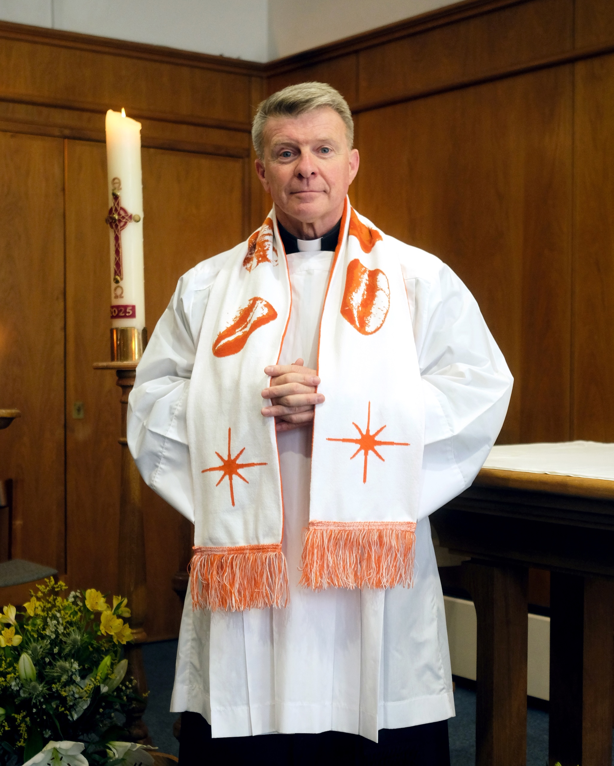
If some of the local businesses seemed suspicious, Elvins had more success with what he calls “the cornerstones of the community,” starting with the local church, St. Anne’s. They commissioned Wonderhood to create the name, branding and comms for its new coffee shop, which came to be called Sacred Grounds.

The team went all in with a new logo, bespoke fonts, merchandise and social content. This grew into an unexpected collaboration between Sacred Grounds and fashion brand Sports Banger, brokered by Wonderhood.


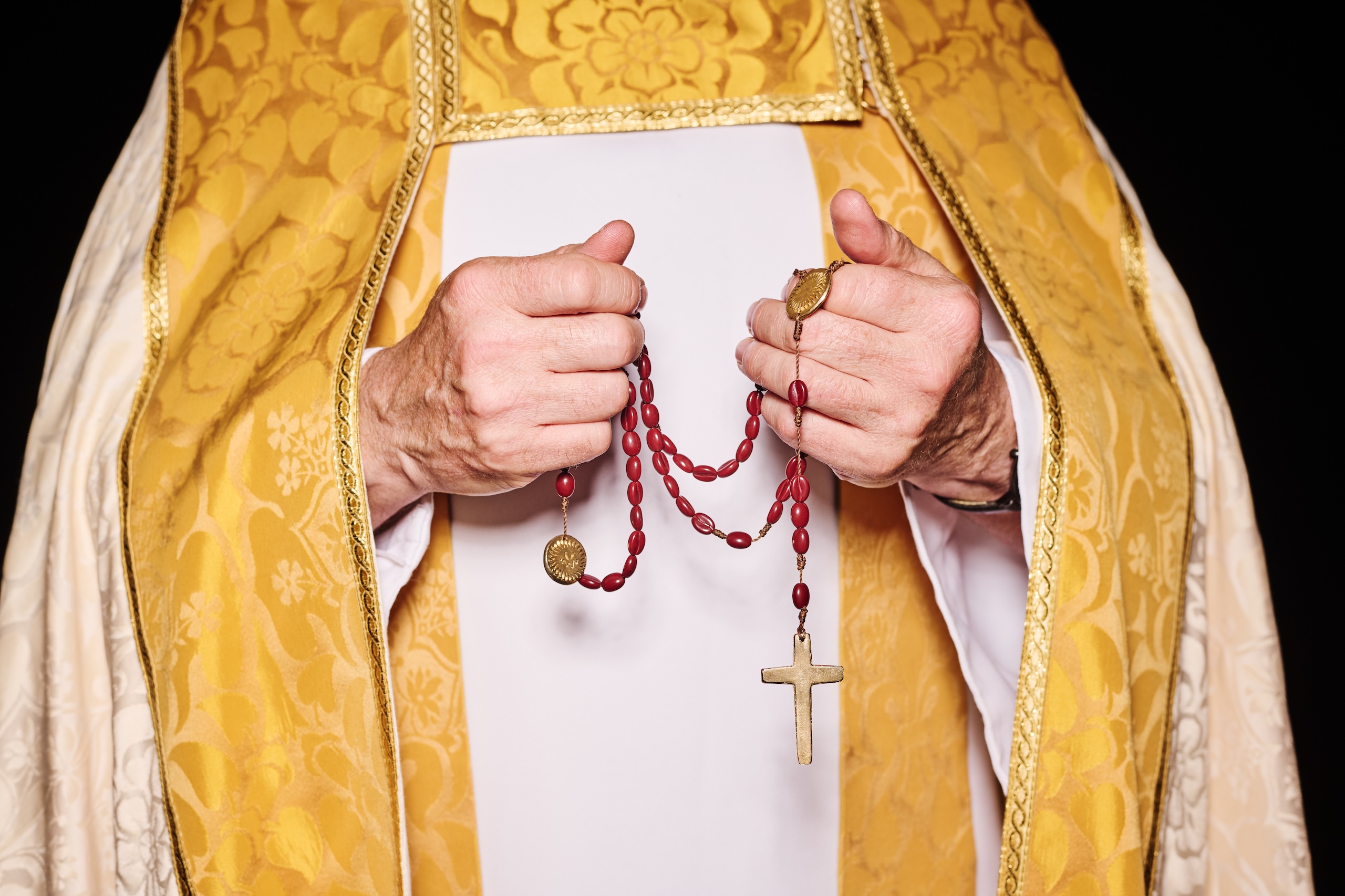
The partnership included a limited-edition range of jewellery, including coffee-bean rosary beads, and a stole-inspired scarf. They also made a zine charting the church’s history, “from Royal baptisms to drag queens and divine cappuccinos.”

“We did an event and Father Simon from the church did a blessing,” Elvins explains. “We thought it would be a fun thing to do, but it was actually very emotional, and it became a really meaningful evening.

“There was such a brilliant mix of the local community, the coffee shop regulars, the Sports Banger fashion crowd, and the church.”

The second project they worked on was for the Soho Parish CofE Primary School. It has educated local children for 150 years, but is under pressure as the last school standing in Soho, with falling pupil numbers threatening its future.

Working with the children, Wonderhood created a new logo inspired by the silhouette of the building. This could be filled with icons inspired by the pupils’ favourite things about the school.

There was also a new wordmark, based on the site’s historic signage, and a striking blue and yellow colour palette.

Again the team went above and beyond, designing banners, notebooks and personalised sticker packs, as well as providing a logo generation tool to let members of the community make personalised versions.

Wonderhood Design’s identity for Soho Parish CofE Primary School

And as with the St Anne’s team, Elvins was pleasantly surprised by how smooth the process of working together was.

“Alix Ascough, the headteacher, was a really good client,” he says. “We weren’t sure how our presentations would go down, but they were like, ‘We don’t have a lot of time. We don’t like this, we like this, let’s move forward.’ They were very decisive, which was brilliant.”

The studio’s most recent project, although not part of the Neighbourly Fund, is for another nearby business, Soho Radio.

It’s the station’s first new identity since it launched in 2014, and it’s designed to reflect its “diverse, dynamic and exploratory listening experience.”

“From our first meeting, it was clear they shared our drive to do things differently, and a deep passion for the Soho community,” says Tommy Spitters, Wonderhood’s design director.

“We wanted to futureproof their brand, keeping it relevant to their loyal audience while opening the door to new listeners.”

The work includes a flexible logo, clashing graphics, merchandise, and a punchy verbal identity that underlines the station’s commitment to unpredictable programming, with lines like “Ears wide open” and “Go off track.” They also redesigned the Soho Radio app.

As with their work for the school, the handover included a tool, developed with Testbed Studio, that allows DJs to pick and choose colours, fonts and images to promote their shows online.

For Elvins, this element really “empowers clients to take ownership” of their new identities.

“It means the people that are using the brand every day can have a more active part in shaping it, in a way that is more fluid and adaptable, rather than fixed or static,” he says. “People enjoy using them, and there’s an element of play which is engaging and rewarding.”

Wonderhood Design’s new identity for Soho Radio

Many agencies do charity work alongside their client projects. The key, Elvins thinks,  is for both sides to “develop meaningful relationships.” It takes time to build this trust, but it makes for more fruitful collaborations.

“You just have to get out there to meet and talk to people,” he says. “We got a lot of mixed responses when we were wandering around Soho, but it has led to some brilliant relationships.”

Wonderhood Design’s new identity for Soho Radio

Source

By

Brandon Consultants designs new PizzaExpress Specials range

As the cost of living continues to bite, Brits are increasingly swapping traditional takeaways for at-home ‘fakeaways,’ supermarket-bought meals designed to replicate the restaurant experience.

To take advantage of that, Pizza Express has launched a new Specials range, designed to give people that “special occasion” restaurant vibe at home.

The brand partnered with long-time collaborator Brandon Consultants, who designed the visual architecture and packaging for the new range. The Manchester and London-based studio also refreshed the look of the PizzaExpress Classics range.

“We’re the number one chilled pizza brand, with more than 20 years in supermarkets, and what sets us apart is the restaurant experience we can draw on,” says Bianca Warren, senior retail manager at PizzaExpress.

“With Specials, we wanted to create the best possible pizza for at-home occasions – whether that’s a girls’ night in, a glass of wine after a long week, or a family dinner in front of the telly – and make those moments more special.

“The idea is to make you feel like you’re in a restaurant even while you’re on the sofa.”

BrandonConsultants’ packaging for the new Specials range by PizzaExpress

Warren believes that PizzaExpress carries a unique emotional weight in Britain, as so many of us have a memory or a story tied to the brand.

“Whenever you mention you work at PizzaExpress, people don’t just say ‘oh, cool,’” she says. “They’ll tell you about their first date there, or their go-to family meal.

“We wanted to bring those emotional connections into the home, with pizzas that not only deliver on taste and flavour but also catch the eye on the shelf.”

To reflect their premium positioning, the new packaging had to speak to the craft that goes into making the pizzas. But to create something new for a brand that has been a staple of supermarket aisles for 20 years, the Brandon team had to look back before looking ahead.

“PizzaExpress originally carved out the chilled pizza category in retail, so our challenge was to go back and ask – how did we disrupt in the first place?” says Beth Johnson, account director at Brandon Consultants.

Brandon Consultants’ packaging for the new Specials range by PizzaExpress

“We wanted to find new ways to do that again – to offer something that might not be ‘new’ in the technical sense, but feels new on a human, emotional level.”

To do that, the team decided to underpin the handcrafted-ness of the product by putting the people who make the pizzas at the heart of the designs. Each pack carries the photograph of a real PizzaExpress pizzaiolo – in the iconic black and white striped T-shirt – proudly holding their creation.

The chilled aisle is notoriously cluttered, so Brandon Consultants decided to upend the category codes. Instead of top-down shots of ingredients – as is typical in the sector – the photograph of the pizzaiolos presenting the pizzas immediately communicated both flavour and the brand’s point of difference.

“We didn’t want to feel like a mass-manufactured product, because that’s not who we are,” says Johnson. “PizzaExpress’ pizzaiolos bring real expertise, and they have the history to back that up. Putting a human on the packaging was our way of capturing that emotion – and it’s something nobody else in the category does.”

And showcasing the pizzaiolos so prominently helped connect the retail offer back to the restaurant experience. “We wanted to make sure the retail range stayed anchored to that,” says Johnson.

Framing the photograph is the brand’s filigree – now seen in an amber metallic finish – and the logo. The team chose to retain Dan Forster’s custom script typeface, grounding the work with one of the brand’s most distinctive assets.

Brandon Consultants’ refreshed packaging for the Classics range

The pizzaiolos became the thread linking the new Specials to the refreshed 9-inch Classics packaging, appearing in photography on the former, and illustration on the latter.

“When you look back through the archives, PizzaExpress has always had a deep connection to art and creativity – from Enzo Apicella’s beautiful decals on our restaurant windows and walls, to the way design has shaped the brand,” says Johnson. “That history is intrinsic to who we are, and we wanted to carry it through into the modern day.”

In the suite of illustrations now seen on the Classics packaging, an expressive pizzaiolo whips up a pizza, and is seen interacting with the ingredients, a tool used for varianting.

Brandon Consultants’ refreshed packaging for the Classics range

“He’s drizzling olive oil on one and spinning pepperoni onto another – bringing real joy and life to the packs,” says Simon Magill, senior designer at Brandon Consultants.

While the team innovated through the illustrations, they also rooted the design in familiar elements such as the filigree, the brand mark, and the custom typeface.

“It’s about carrying that emotional connection through,” Warren says, “whether you’re in a restaurant or on your sofa at home.”

Source

By

Condé Nast’s Nicola Ryan on scaling design with soul

In August, GQ magazine’s cover story was an interview with Travis Kelce, the American football player (and three-time Superbowl winner) now perhaps better-known as Taylor Swift’s fiancé.

On stage at Frontify’s Paradigms conference, Nicola Ryan, VP of global design at GQ’s parent company, Condé Nast, showed the exuberant print lay-outs.

The story, which was shot by Ryan McGinley, seemed to burst out of the pages with energy – a fitting reflection of both Kelce’s personality, and his current standing in the cultural zeitgeist.

Then Ryan showed the same story in its digital form, which was very neat.

Ryan used it to pose the question – how do we scale that human element from print to digital? Or to paraphrase the title of her talk, how do we design for scale without losing soul?

To some extent, that is a question that has threaded through Ryan’s career.

GQ’s Travis Kelce cover story

After graduating from University Arts London in 2010, she joined Angus Hyland’s team at Pentagram, where she worked with clients like Cass Art, Penguin and the Qatar National Museum.

After a stint at Karmarama, she moved into the media, joining The Times as head of digital design in 2013. She went onto The Telegraph, where she became creative director, before joining Condé Nast in 2021.

As one of the biggest media organisations in the UK, The Telegraph is not an easy gig. But the leap to her new employer was, Ryan admits, “massive.”

Now, with her team of around 60 product designers, user researchers and content designers, she oversees digital experiences for 22 titles across the Condé Nast portfolio. These include some of the best-known, and most-loved, publications around, including Vogue, The New Yorker, Wired and Vanity Fair.

“It was a really steep learning curve,” Ryan says. “At a smaller, more contained company like The Telegraph, you can both look at the bigger picture with the system, and you can look at all of the individual projects.

“But when you go to something at the scale of Condé Nast, you can’t possibly do all of it.”

A selection of Condé Nast sites on mobile

In a role like this, design systems are crucial. But, Ryan says, they can’t be her only focus. “If you only look at the system, you get too abstract, and too removed from what people care about.”

For Ryan, the key balance is between systems and soul, consistency and emotional resonance. And it’s important to understand how these two things co-exist.

“Systems have the power to elevate soul, or to flatten it,” she explains. “We should audit systems for character, as well as consistency. Where is soul showing up? And where is it being squeezed out?”

Ultimately though, bringing soul into design work comes down to culture – what leaders encourage, expect, and make room for.

“Soul isn’t a feature you ship, it’s a position you hold,” Ryan says. “You don’t scale soul by making a smarter system – you scale soul by making people braver.”

“Soul isn’t a feature you ship, it’s a position you hold.”

In practical terms, that means creating a design culture that “fosters confidence to have an opinion, and processes that give time to critique.”

As everyone in the industry knows, the pressures on designers are intensifying.

The rise of AI, the squeezing of budgets, and the heightening of demands and expectations threaten to create a perfect storm.

In this turbulent context, Ryan believes, smart companies will make “quality a strategic priority.”

“AI can already create a lot of things that are ‘good enough’,” she says. “And, particularly in the media industry, quality, personality and perspective are what’s going to differentiate us.”

“I think it’s about finding the moment, and finding the narrative that ultimately hitches on to what the business is trying to do, and how you can help that through design.”

Nicola Ryan on stage at Paradigms, showing a typical leader’s calendar

A big part of her job is to make sure design is something that senior leadership cares about. Some of that is about using the right language – talking in business terms rather than leading with “the geeky aspects of typography.”

But another part is about finding ways to prove that quality and soul impact the business in positive ways.

In the media, AI is having a direct impact by reducing search traffic to websites that used to benefit from huge audiences coming via Google.

“I think there’s a recognition across the publishing industry that the future is in smaller but more loyal audiences,” Ryan says. “And therefore quality really matters, because you want people to keep coming back – loyal people who have an affinity to your brand.”

But proving the impact of that quality play, Ryan admits, is not always straightforward. Businesses have a wealth of data to analyse, but this tends to skew to short-term metrics.

“It’s harder to do with soul,” she says. “We need to look at the longer view, especially around engagement and loyalty metrics like time spent, scroll depth and bounce rate. You can’t pin those things fully on quality, but if you look at them over time, you can start to show people a pattern.”

The New Yorker homepage

With design having to prove its worth perhaps more than ever, the challenges facing design leaders are multiplied as well.

Ryan says she never had any formal leadership training – rather she was “plunged in at the deep end” earlier in her career, and expected to learn on the job.

“I came into the industry at an opportune moment, when digital was this new shiny thing and companies were giving young people, with relatively little experience, a ridiculous amount of responsibility,” she laughs.

“And so I ended up learning a lot very quickly. I had some great bosses who were also great mentors. But mainly you make mistakes, you figure it out, and you just keep getting better. I think, by and large, that’s the best way to do it.”

Ryan believes good design leaders are able to balance two characteristics that may seem contradictory.

“On the one hand, I am very democratic,” she says. “I really like listening to what everyone has to say, because the things that we work on are so complicated. If you don’t listen to people who have a lot of knowledge, it’s going to catch you out later.

“And so I like to gather a lot of opinions and ideas and understanding. But on the other hand, I also think you have to lead with a perspective, because you can’t design by committee.

“You have to listen, and then you have to make a decision, and commit to that with clarity, and intent, and conviction.”

Nicola Ryan on stage at Paradigms, showing some of the tensions leaders face

The reality of design leadership, she says, is that there are tensions – between freedom and control, for example, or global and local. A good leader recognises these competing forces, and works within them.

“There will always be these tensions, and you can’t possibly reconcile them,” Ryan explains.

“But you have to very intentionally know where you want to sit on one of those tensions, and keep tweaking so you don’t go too far in one direction, or the other. The goal is to keep everything afloat.”

For design leaders and their teams, this balancing act can seem precarious.

“It’s hard isn’t it? We can’t just focus on one thing – we have to be expanding our skillsets and figuring out how to use AI. We have to up our game, I think, as designers.”

But is she optimistic that design can come through as a creative and commercial driving force?

“I would like to be optimistic,” she says. “I think you have to be, as a leader.”

She pauses, and then doubles down.

“Yes, I am optimistic. There will be companies that are happy with ‘good enough’ design, who will just spit this stuff out. But I do think design is a differentiator, and the companies that see that will succeed and go further.

“There will be an interesting few years, where we see how this plays out. It’s also a really interesting time to be a designer,” she says. “But you have to be up for change, to try new things, and new ideas.”

Source

By

EDIT brings “motion and emotion” into English National Ballet brand

EDIT has helped English National Ballet (ENB) refresh its brand to engage new audiences on new platforms.

The company, which recently celebrated its 75th birthday, performs a mix of classic and contemporary shows across the UK and around the world. It also runs a wide range of community programmes, “to take world-class ballet to the widest possible audience.”

There were several reasons the ENB needed to rethink its identity, explains Lisa Leigh, its director of marketing and communications.

Firstly, post-COVID, there was a change in the audiences, with 15% of the previous punters not returning. The new audience demographics are quite mixed, but Leigh says they wanted to connect in particular with the 25 to 34 age bracket.

EDIT’s new identity work for English National Ballet

Also coming out of the pandemic, the ENB, like many organisations, upped its digital output and needed a brand that worked better in that context. In 2023, they also appointed a new artistic director, Aaron Watkin, and needed to make sure, “the brand strategy and the artistic vision were really aligned.”

And finally, the tough economic climate has intensified pressure on anyone looking to sell tickets. “We needed to stand out, and to make sure that people had a good reason to spend their time and their money with us,” Leigh explains.

The first phase involved working with strategists at Boardroom Consulting to refine the ENB’s positioning.

“I think part of the challenge is that the word ‘ballet’ comes with its own preconceptions,” Leigh says. “So many people see ballet as a closed or confusing world. They think it’s only for a certain type of person. But English National Ballet is not like that – we’re warm, we’re welcoming, and everyone’s invited.”

That accessibility threads through ENB’s history, from its founders’ mission back in 1950, right through to initiatives like Dance for Parkinson’s, which helps people living with the disease to find joy and engagement through dance.

“It quickly became clear that English National Ballet’s founding principles were as alive and relevant today as ever,” says Boardroom Consulting partner Claire Rigby. “The opportunity was to draw these out more clearly and confidently. “

EDIT’s new identity work for English National Ballet

The new identity built around the idea of “opening up the possibilities of ballet” which, Leigh says, informed every aspect of the work.

For Karen Hughes, co-founder and creative director of EDIT, the first task was to clarify whether the client needed, “an evolution or a revolution, a refresh or a rebrand.”

They tested three concepts with audiences and found there were “lots of positives” with the existing brand. The challenges came around the brand system.

“It was quite limited in terms of flexibility and how it could adapt,” Hughes says. Ironically for a ballet brand, “It didn’t have that stretch.”

However the testing phase also confirmed there was room to make the brand more resonant. “It felt modern, but it perhaps didn’t connect emotionally with people,” Hughes says.

The solution was to take the previous mark – which has been likened to the pointe shoes worn by ballerinas, or a set of quotation marks – and use it more confidently. In the past it was often placed “as a logo in the corner” which obscured the ENB’s own brand, or made it look like a sponsor.

“We wanted to create a symbol that could go front and centre,” Hughes says.

The EDIT team also added a new wordmark, in Google Fonts’ Bricolage Grotesque, and the same type was chosen for the copy, due to its “fluid elements.”

This desire to mimic the dynamism of the artform also drove a renewed focus on the brand’s motion design. “It felt quite static in its previous form, so there was so much potential with the motion to add more energy,” Hughes says.

Leigh says this was a key part of the project. “If you look at the way the brand mark comes to life, it’s animated and integrated across everything we’re doing.”

The team also wanted to bring more emotion into the identity. That influenced the motion design, the art direction and photography, and even the colour palette, where different shades represent different feelings, and gradients are used to show how emotions bleed into each other.

“The key idea was to ‘feel more with English National Ballet’,” Leigh explains. “That might be passion, happiness, anger, sadness – whatever it is, you’re free to feel it with us.”

EDIT’s new identity work for English National Ballet

EDIT also developed a new verbal identity, which Leigh says had been under-used in the brand’s previous incarnation. The new tone of voice leans into this sense of emotion, and presents ballet as something for everybody.

“Ballet is tricky because there can be a lot of language barriers,” Hughes says. “If you don’t feel like you understand things enough, you might feel like you don’t belong there.

“So it’s not about dumbing things down, because it’s obviously very technical and professional. But we could make it more inviting for people, and remove some of those barriers that unnecessarily get in the way.”

The other balancing act was to ensure the new branding works alongside a wide variety of shows, community programmes, and other activity, all of which may have their own personalities.

“I think the challenge for performing arts generally is the tension between product and brand,” Leigh says. “You have a broad range of product, and it changes quite quickly. What you really want to do is build the relationship with the brand, to establish who we are with audiences.”

She points out that a classic production of Swan Lake evokes different feelings from a cutting-edge premier from a new choreographer, but the ENB brand needs to work across the board.

“We need to have a strong sense of identity over and above the performance itself,” she says.

“You will see the logo often sits right in the middle of the posters, which is very unusual,” Hughes adds. “But I think it’s a signal for people to have a relationship with the organisation itself, and not just a particular show.”

The new website was created by London-based agency HdK, which like EDIT and Boardroom Consulting specialises in working with cultural institutions. Leigh says the site’s more user-friendly design reflects the broader ambitions of the brand refresh.

And she says, the ENB is excited to see where they can take the new identity.

“The reaction has been really encouraging, but I think we’re just at the start,” she says. “We have a system that can be flexed in lots of different ways, and we’re still working out exactly what that might look like going forward.”

EDIT’s new identity work for English National Ballet


Source

By

How the illustration industry is grappling with AI – a special report

In the world of illustration, AI has very quickly transformed from a future existential risk to a set of products having a tangible impact on the industry’s present.

Its effects are being seen in the legal landscape of image licensing and usage, to the copyright implications inherent in new “illustrator-friendly” AI tools, to the fees that illustrators are able to charge for their work.

And while many practitioners are now embracing the technology in their process in some form or another, others are more concerned than ever that AI poses a significant threat to the future of their craft.

In 2024, a survey of the members of The Society of Authors found that 26% of its illustrators had already lost work to AI. And 37% said that illustrated work had decreased in value due to the prevalence of Gen AI products.

In early 2025, in response to the UK Government’s open consultation on Copyright and Artificial Intelligence, the Association of Illustrators (AOI) surveyed its membership and found that over 32% of respondents had lost work to AI at an average of £9,262 per affected artist.

A frustrating lack of transparency

It is, says Rachel Hill, CEO of the AOI, difficult to have a nuanced conversation about AI at the moment. But these figures make it impossible to argue that the tech isn’t having a negative impact on the industry.

That doesn’t mean the AOI is inherently anti-AI – you can read its detailed stance on the issue here. It does, though, have no plans to allow AI-generated work to be submitted to the World Illustration Awards until there’s a legal framework preventing the exploitation of illustrators’ work in AI training.

Rather, Hill and her team are frustrated by the constant lack of transparency shown both by AI product providers, national governments and legislators around the world, which leaves clients, illustrators and agents all exposed to knotty legal issues.

For a body that seeks to represent, protect and advocate for the rights of the nation’s illustrators, this is making the AOI’s job more important than ever.

Karina Cao’s piece for Digital Frontier

New questions for agents

The same is true for agents representing commercial illustrators, whose whole approach to creating contracts and licensing agreements has been thrown into disarray due to ambiguity around AI.

“Adobe has been building AI into a lot of their products,” says Jeremy Wortsman, founder of the Jacky Winter Group, an international illustration agency headquartered in Melbourne with offices in the UK and US.

As a result, “We’ve had clients try to extend illustrated images or add extra animation frames to finished work. These things weren’t within the licenses, and artists are getting really upset by clients mangling their work.”

On the flipside, Wortsman has seen clients respond negatively to artists who have clearly used AI to create preliminary sketches for projects.

“At the same time, there’s a huge amount of interest from clients wanting to commission artists to make custom models for them, just like clients wanted entire asset libraries 10 to 15 years ago.

“But now they want it on the scale of AI, which is essentially saying, ‘We’ll pay you a tonne of money so we can replicate your style as much as possible’.”

This is the same promise on offer from “illustrator-empowering” off-the-shelf AI apps like Tess and Exactly.AI, which allow illustrators to train their own model exclusively on their own work.

In theory, this allows illustrators to generate unlimited images without any ethical concerns, but in fact, the legal issues are more complex.

“Some people think this kind of work is the Holy Grail of branding projects right now,” says Wortsman. “But the legal implications are so dicey and we’re starting to see lawsuits, like the Anthropic one,” in which the AI company was forced to pay $1.5billion to settle authors’ claims it had pirated their work to train chatbots.

For Wortsman, it’s a headache because his role is to make money for his artists.

“We represent artists with different approaches and opinions on AI,” he says. “The challenge of running an agency is that you can’t impose your own morals, and I really want to leave it to our artists to decide. We don’t want to shut down any opportunities.”

One of Charlotte Cripps’ pieces for Digital Frontier

A clear AI policy

To this end, Wortsman has spent the past few weeks co-authoring an agency-wide AI policy to clarify the group’s position to illustrators and clients alike.

It guarantees that all final work will be human-made.
If an illustrator uses AI during any part of the process it will be discussed with the client beforehand, and the specifics of that usage clearly disclosed.
The agency will consider all AI usage on a case-by-case basis, so as not to close down any work with clients interested in exploring its use.

In return, they expect their clients:

To respect the rights of their artists, as outlined in their contracts, and not to use in-built AI functionality in tools to alter and amend work.
That final images are not used for any unauthorised training of AI models and are not uploaded to platforms where they’re likely to be scraped.
They agree to notify both agency and artist before using any form of AI in the project workflow.

Wortsman expects to amend this policy on a quarterly basis to allow for the rapid pace of change in AI tech.

By the time he makes the next update, the UK government may have finally decided on a course of action following its Copyright and Artificial Intelligence consultation. But Hill doesn’t believe legislators are in a rush to make a decision.

Following on from its survey, the AOI has been proactive in joining the Creators Right Alliance and the British Copyright Council in pushing back forcefully on the UK government’s proposals to exempt AI development companies from existing copyright laws. This would allow them to scrape any online visuals, unless creatives opt their work out on an image-by-image basis.

Over 92% of UK illustrators say that opting out of training datasets would seriously harm their business by reducing their discoverability online.

Currently, illustrators are reliant on publishing large numbers of their images to the web to attract business, making opting each image out of training a logistical impossibility.

“The government’s closeness to a few big names in tech is influencing their decision-making,” says Hill. “So creators have really come together in force to oppose that.”

Not all of them of course.

AI enthusiasm

“I don’t think it’s like the big juggernaut trying to stamp on people’s creative abilities,” says designer, illustrator and art director, Charlotte Cripps. “I think it’s important to embrace it, otherwise you’re just going to be left behind.”

Until recently, Cripps was design director of Digital Frontier, a UK-based platform that explored the intersection between technology, business and society.

Until she landed the role, she had no experience at all with AI, but over the last two years has honed her skills across Midjourney, Runway, Flora and others, to produce illustrations and animations that won the publication a loyal following and various industry awards for its rich visuals.

During that time, Cripps says that AI allowed her to produce imagery in a way that kept pace with a relentless online publishing schedule, while allowing her to be more experimental and tangential with her creative thinking.

One of Charlotte Cripps’ pieces for Digital Frontier

She is, however, keen to stress that none of the illustrations she produced at Digital Frontier were just made with AI. Rather, AI formed part of her process, with final images developed and finished with human input – and she always commissioned actual illustrators for the print magazine.

“You’ve got to see it as something that can aid you to propel yourself further and set yourself apart from everyone else doing the same trade,” she says. “If you don’t, you’ll find people will be able to generate work much faster than you.”

Now that she’s left Digital Frontier to go freelance, she says clients are approaching her specifically for her ability to amplify her design and illustration abilities with new AI skills.

“Reassuringly shit”

This has not been the case for another UK-based illustrator, Matt Blease, whose hand-drawn work has recently been used to promote IBM’s latest AI tools.

“I’ve just finished a big campaign for IBM where they used a real illustrator and a real frame-by-frame animation studio to create beautiful animations to advertise their AI products. And that did all feel a bit odd.”

Unlike Cripps, Blease is unconvinced by the value of AI for image-makers. “It’s reassuringly shit,” he says, smiling. “When I’ve been struggling for a concept or something and I’ve gone to ChatGPT, the ideas have just felt so basic.”

As a result, he neither feels threatened by AI – “I’m still insanely busy” – nor compelled to use it to stay competitive. But he is frustrated by the way it’s exacerbating an already messy problem in the industry – plagiarism.

Blease reports seeing his work plagiarised on an increasingly regular basis since the arrival of AI-powered image generation, compounding an already significant industry trend towards designers expecting illustration to be free.

In fact, he readily admits to having been part of the problem in the early days of his career.

“When I was a graphic designer commissioning illustrators, if there wasn’t a budget for imagery, then my senior designers would come to me because they knew that I could draw. I’d adapt my drawing to someone’s signature style and it would go on a billboard somewhere. I was basically AI.”

Wortsman agrees that AI itself is not the issue, but as a tool it amplifies a lot of existing negative practices across the creative industries. And it’s making life harder for many people, forced to balance competing pressures.

“If I use chat GPT now for anything, there’s an environmental cost, there is an ethical cost, but I’m also able to serve my artists better, because I’m able to work faster or communicate better,” he says.

“But the original sin of AI is that there’s no way to use it ethically right now, because any data set that you intersect with is using compromised information. You have no idea where these images have been scraped from, and there’s just no way that you can use it commercially.

“Life now just requires endless trolley problems in every aspect of our life. We always have to ask, ‘What’s the least-worst thing we can do’?”

Source

By

How non-alcoholic drinks are breaking away from the design cues of booze

For years, the non-alcoholic beverage world has marketed itself on the back of a single promise of less – less alcohol, less harm, less risk. The industry has also relied heavily on aspirational stats about declining drinking, and much has been said about Gen Z’s so-called sobriety.

Yet reporting from The Financial Times and Vogue suggests the opposite – younger people are drinking more, just differently.

Now, the conversation seems to be tilting away from the idea of abstinence – or the sense of sacrifice associated with sidestepping alcohol – and towards different pleasures; not simply avoiding harm but choosing a new kind of ritual or identity. And branding is central to that reframing.

In the past, NA brands dressed like alcohol to be taken seriously, but today, designers are both remixing, discarding – and in some cases, cautiously reinterpreting – the visual codes of alcohol branding.

The goal is no longer to mimic, but to carve out presence by positioning NA not as a substitute, but as a culture in its own right.

Duzi Studio’s brand for Collider

When creating the visual world for Collider, a non-alcoholic beer brewed with mood-boosting nootropic and adaptogenic ingredients, London-based agency Duzi Studio was careful to avoid the expected clichés of beer branding.

“Non-alcoholic beer design often leans on familiar beer cues like heritage typography, traditional layouts, and craft language to signal credibility and draw parallels to their alcoholic counterparts,” says co-founder and director Ella Donald.

“Or, it leans into the craft beer space, with cues that can feel more cartoonish or garish.

“With Collider, we wanted to challenge these defaults, choosing not to mimic established alcoholic beer aesthetics but instead to build a standalone visual identity that felt, quite literally, ‘worlds apart’ from conventional tropes.”

Collider encourages a shift in our age-old mindset and relationship with alcohol. To reflect this, the team found a fitting metaphor in retro-futurism, which explores the tension between the past and the present.

Duzi Studio’s brand for Collider

This offered not only an interesting foundation on which to build Collider’s visual world, but also a symbolic lens through which to frame the brand’s core promise.

“The retro-futuristic world brought a sense of idealism, curiosity, and optimism, mirroring the way Collider invites people to explore a new kind of socialising,” says Donald.

Duzi Studio swapped heritage storytelling for more contemporary and fantastical influences, signalling a new future rather than old lineage.

Faded gradients, geometric forms, and sci-fi references evoke technological progress, while the cans are seen levitating over craggy, lunar landscapes.

“Collider’s drinking experience is focused on mood, energy, and memorable moments rather than serving as a proxy for alcohol,” says Donald.

“We art-directed a photoshoot that purposefully positioned the product in out-of-this-world environments rather than next to a beer glass, or in an environment historically associated with beer.”

Duzi Studio’s brand for Collider

Collider shows how boldly an NA beer can depart from category clichés when leaning on world-building and narrative instead of imitation.

iessi, an alcohol-free aperitif, approached the same challenge through restraint, with AD-REM’s founder Florent Gomez Siso using typography to anchor a distinctive visual language.

Siso was keen to give iessi an identity that didn’t rely on hand-me-down visual codes, but instead defined its own space. “Creating a typographic system around a custom typeface seemed to be the best way to ensure a unique and ownable voice for iessi,” he says.

That led to IESSI SANS, inspired by the work of French painter, poster artist, and type designer Cassandre, especially his work for Dubonnet. The custom typeface now dominates the labels that wrap around each bottle.

AD-REM’s identity and label design for iessi

Siso also used the form of the label and bottle to bend the rules. “Alcohol labels often evoke tradition, while bottle shapes are designed to suggest elegance and luxury,” he explains.

“iessi takes the opposite approach – its label is unapologetically modern and chic, while the modest shape of the bottle reflects a certain handcrafted-ness.” That ties back to the artisanal nature of the drink, inspired by founder Nicolas Maiarelli’s Friulan nonna and her homemade amaro recipe.

The identity is imbued with gravitas and a sense of confidence – a very deliberate decision that sets iessi up as an iconic brand, and not a fresh-faced entrant to the market.

“I was careful not to design iessi as ‘the new cool kid in town.’ It needed to feel relevant, but also timeless,” says Siso.

AD-REM’s identity and label design for iessi

The result is a look that is ownable and distinctive, which has already set the brand up for success. “The identity for iessi has become a reference point because it wasn’t trying to please the aesthetics of non-alcoholic aperitifs or the conventions of alcohol. Instead, it established its own language – one I now see other brands beginning to borrow from,” says Siso.

Collider and iessi represent the boldest end of the spectrum, discarding alcohol’s inherited codes to create identities that feel autonomous.

But not every NA brand needs to make such a clean break to be culturally relevant. Some, like Tom Holland’s non-alcoholic beer BERO, approach the challenge differently – looking squarely at beer’s visual traditions and reworking them for a new context.

In its identity for BERO, CENTER chose not to reject alcohol’s design cues outright, but to embrace their familiarity and remix them with modern clarity and a lifestyle-driven edge.

CENTER’s identity and packaging for BERO

The result is a brand that feels credible within the beer category, while also asserting that NA no longer has to apologise for what it isn’t.

“From day one, we knew we didn’t want BERO to feel like a compromise. Too often, NA beers are branded around what they aren’t, as if drinking one is a sacrifice,” says founder Alex Center.

“But BERO isn’t ‘not beer.’ It looks, smells, and tastes like beer, because it is beer. So instead of leaning into absence, we set out to build a great beer brand, period.”

CENTER used heritage codes as scaffolding but stripped away the nostalgic excess, recontextualising them for a modern audience.

CENTER’s identity and packaging for BERO

The split colour blocking on the cans still nods to tradition with metallic gold, but offsets it with rich tones of green, burgundy, and cream; a visual shorthand for BERO’s duality – modern and classic, culture and craft, taste and experience.

Typography plays a similar role. The primary typeface – Arizona Flare by Dinamo Type Foundry, with its flared stroke endings – brings a crisp contemporary edge, far removed from the florid lettering of vintage beer labels. Even the fish emblem is a push towards modernity, used symbolically rather than as a heraldic flourish.

Where most alcohol brands root their identity in terroir and heritage, BERO taps into culture. “The crest of Kingston upon Thames, Tom’s hometown, gave us our fish emblem, but it wasn’t about geography. It was about values like humility and strength,” says Center.

CENTER’s identity and packaging for BERO

Even within the non-alcoholic market, not every sector is evolving at the same pace. While beer and aperitifs have proved fertile ground for experimentation, wine, a smaller category, has been slower to embrace change.

Wine is bound up with terroir, provenance, varietals, and aging – all deeply tied to tradition. In the NA space, shifting too far from those visual codes risks undermining perceptions of quality and authenticity.

“Among all the categories venturing into the non-alcoholic space, wine may be the most traditional, with major stakes around quality perception,” says Félix Mathieu, chief strategy officer at Lonsdale, the agency behind the branding of Néphalia, the first NA wine range by Castel Frères.

“The challenge, therefore, is to blend certain classic wine codes – to reassure – while at the same time infuse a sense of freedom that gently guides consumers toward new rituals.

“Because let’s be realistic – when you bring a bottle of wine to a dinner, even, and perhaps especially, if it’s No-Lo, you still need to uphold a certain standard, with an elegant and prestigious design.”

Lonsdale’s brand for Néphalia

In creating Néphalia’s identity, Lonsdale studied the inherited playbook of wine branding, but carefully stretched convention.

Instead of defaulting to minimalist cues to evoke sobriety, they introduced a gestural brushstroke – a stylised grape cluster – as the centerpiece of the brand. The mark conveys aroma, energy, and enjoyment, celebrating the experience that Néphalia delivers even without alcohol.

The team also noticed how many NA wine brands plaster a giant “0%” or “ALCOHOL-FREE” across the label, reinforcing a sense of absence.

“Even if I’m looking for a non-alcoholic wine on the shelf and need clarity to make a quick choice, I don’t necessarily want to be reminded every day that I’m drinking something ‘without alcohol,’” says Mathieu.

Lonsdale’s brand for Néphalia

“What truly matters is the quality of the product and my emotional connection to the design of an object that lives in my kitchen or on my table.”

To counter this, Lonsdale turned the word ‘ZERO’ into an emblem, reframing it from a blunt statement of lack to a symbolic mark.

Through its stylistic deviations from the norm – even in a sector with little appetite for change – Lonsdale’s work for Néphalia proves that echoing alcohol’s codes is no longer the go-to.

The most exciting NA brands of tomorrow will be the ones that turn to storytelling to create their own languages, rituals, and identities. “The next wave of NA branding won’t be about copying conventions, it’ll be about world-building,” says Center.

Lonsdale’s brand for Néphalia

“People want to buy into brands that expand their lifestyle, not just their palate. The NA brands that succeed will create entire universes of meaning, rituals, symbols, and stories.

“Design will be less about packaging and more about culture creation.”

Donald agrees, adding that brands need to build lasting value by crafting creative universes rather than relying on borrowed archetypes.

“Instead of positioning NA drinks as imitations, strong storytelling is what will give them the space to craft their own stylistic languages, meanings, and emotional associations,” she says.

“As more brands invest in imaginative design and narratives, the NA category will be able to claim distinct visual languages that aren’t tied to alcohol mimicry.”

Source
By

Why brands are re-embracing the power of the tagline

The humble tagline is in demand again.

In the past year, my teammates and I have seen the tagline’s resurgence in RFPs across the board, from pharmaceuticals to footwear– like a long-lost relative suddenly on our doorstep.

And it’s in the market as well – many brands have begun to re-embrace the punch of a tight few words. Tag Heuer’s new CEO has sought to re-align the brand in its sports territory with “Designed to Win”, Ford has launched its first global marketing effort in 15 years with “Ready Set Ford”, and Carrier has evolved its brand with a mission-driven tagline, “For the world we share.”

Shake Shack has even recently garnered press for simply announcing that they were planning to have a tagline in the future.

The most significant tagline of late might be Nike’s recent evolution of “Just Do It” into “Why Do It”? – reimagining the tagline of all taglines to address a new generation of athletes, celebrating greatness as a choice you make, not an outcome you expect.

Like a new name or logo change, a tweaked tagline signals a new chapter. By carefully refining one of their most iconic brand assets, Nike signals they’re capable of moving forward while staying true to their core. It shows a brave willingness to tinker with one of their most valuable brand assets– imagine the Swoosh growing a second tail.

A beacon of clarity in a complex world

But why taglines now?

One answer may lie in the complexity of today’s brand systems. Brand marketers today often face an internal uphill battle when it comes to overseeing consistency.

Tasked with vision, governance and training across an organisation, brand teams can feel siloed or resisted, for example by strong-willed product teams with little appetite for brand oversight or overseas marketing teams enthralled with their regional audiences.

Externally, brand marketers must ensure brand expression across an ever-dizzying array of channels, audiences and touchpoints. From this vantage point, the sheer blunt power of the tagline must look pretty enticing – your brand in a nutshell, one catchy phrase slapped across an ad, package or pitch deck, anywhere, anytime.

Another answer might be the shifting infoscape where brands must compete for attention.

With the rise of AI as consumer tool, the future of performance marketing is in doubt. Research by Adobe Analytics shows an eye-watering 1,200% increase in retail website traffic from generative AI sources from July 2024 to Feb 2025.

Together with the tagline’s resurgence, these suggest that marketers might be eager to find new ways for their brands and products to cut through as the digital landscape shifts under their feet.

We can’t keep flooding eyeballs with banner ads, is the implication. We need a thing, a memorable thing, that can take the spotlight.

How to design a great tagline

The point isn’t – times are changing; your brand needs a tagline. The point is – times are changing; your brand should develop its expression to meet the moment.

One way is to design a tagline as you would a logo or name – with clarity, purpose and creativity so that the tag can most effectively help push a brand forward.

In designing an effective tagline, one risk is that a line, like any other singular asset, can become a kind of fetish object in the course of a marketing lifecycle.

In our lives and in our work, we can fetishise certain singular things, imbuing them with grand significance, as a way of avoiding more unpleasant truths or complex challenges – like wrangling an entire organisation to be better brand ambassadors.

So assign a distinct strategic role to the tagline, rather than expecting it to solve all your problems.

Whether it’s at the brand or campaign level, a tagline in 2025 has arguably more potential roles it can play than ever before. If Nike’s new line works, it’s because “Why Do It?” is strategically continuing a decades-long brand-audience dialogue with a new twist, turning a classic call-to-action tagline into a provocative question.

Be clear on what role you want your tagline to play – whether it’s rallying cry, mindset, heritage marker, or something else entirely.

Then imagine how that tagline role fits into your overall brand and business. Because the truth is that a good tagline truly functions as a tag – part of a whole, like the tag on a pair of jeans.

Part of a bigger story

If we often talk about the job of brand expression as good storytelling, it’s worth remembering that the title of a novel is never the whole story. The job of brand storytelling should never rest on the shoulders of any one facet, but rather how they all work in concert.

A story, after all, is not one single thing – it’s a set of things in meaningful sequence. So design your tagline with your broader brand language in mind – your messaging, your tone, your name, (not to mention your logo, design system, brand experience…) since these elements all draw strength from one another.

Lastly, when you think tagline, think dialogue. “Why Do It”? works because it’s building on decades of brand-audience dialogue between Nike and athletes around the world who are undoubtedly familiar with “Just Do It.”

In an age when effective mass communication is essential but thornier than ever, brand marketers can thrive by applying the eternal rules of real human conversation – including knowing when to speak your mind, when to shut up, when to crack a joke, and when to ask a question.

Brands that deploy effective taglines today won’t satisfy themselves with quick wit or a sly turn of phrase to land their story. They’ll nail the brief, consider the system, and mind the dialogue before they let their tagline do the talking.

William Rauscher is verbal director at Wolff Olins.

Source

By

“The drinks industry doesn’t have a sales problem – it has a bravery problem”

Everywhere you look, the drinks industry is talking about sales. Falling sales. Flat sales. Missed sales targets. Entire conferences dedicated to “unlocking growth.”

The assumption is clear – people are drinking less alcohol, so brands must scramble harder to squeeze the last drops of profit out of a shrinking category.

Let’s get one thing straight: your brand isn’t failing because people are drinking less. It’s failing because it’s boring.

Stop blaming the category slump for your slump. People aren’t bored of drinking. They’re bored of you.

Safe design. Predictable campaigns. Copy-and-paste launches. Another line extension nobody asked for. Another pack redesign that looks like the one next to it. Another ad that could belong to any brand in the category.

We tell ourselves it’s a sales problem. But really, it’s a bravery problem.

The truth is, drinks don’t just compete with drinks anymore. They’re competing with fashion drops, gaming culture, TikTok trends that catch fire overnight. Attention is the currency. And you don’t earn it by playing it safe. You earn it by being distinctive, surprising, and bold enough to cut through the noise.

The brief is broken

Most briefs don’t inspire creativity. They come wrapped in cautious language: “premium cues,” “authenticity,” “younger audiences.”

They’re written to avoid mistakes, not to spark ideas. They aim for safe middle ground and end up in creative no-man’s land.

Here’s the uncomfortable truth – the safest brief is the most dangerous one. It produces wallpaper branding. Campaigns nobody talks about. Shelves full of products nobody remembers. If we want growth, we don’t need more briefs. We need braver ones.

Creativity wins

I’ve seen the difference.

At Thirst, we’ve been lucky to work with clients who don’t just nod along to bravery but demand it. Bruichladdich is one. They’ve never asked us to play it safe. They’ve asked us to break convention, to provoke, to make whisky feel alive again.

Together, we created Not Your Classic – work that didn’t just win attention, but delivered a 29% year-on-year sales increase and helped the brand secure new supermarket listings across the UK and Europe. Proof that when brands back bravery, results follow.

Bravery isn’t permission

We’ve taken the same approach with our own concept, Res. We saw a whitespace nobody in drinks was bold enough to claim – protein fruit punch for gamers. Unapologetically loud, vibrant, and different. No safety net, no “maybe later.” Just an idea to prove that bravery doesn’t have to wait for permission.

At Thirst, bravery is our default. What kills it isn’t lack of courage – it’s briefs pre-loaded with half-baked “solutions.”

“People aren’t bored of drinking. They’re bored of you.”

Clients – bring us the problem. Or bring us the big vision. Just don’t bring us the answer, because chances are, it’s the wrong one.

People connect to brands that move them. That make them stop scrolling. Stop talking. Stop drinking the same thing they always drink, and feel something new. Bravery is refusing to be forgettable.

People don’t need another SKU – they need a reason to care

Here’s another myth: if we pump out enough innovation, people will come back.

Innovation matters. But if your brand doesn’t mean anything, your innovation won’t either. That’s when launches turn into clutter. Another flavour. Another “lite.” Another “0.0.” None of it sticks if your brand doesn’t stand for something.

Consumers don’t count SKUs. They count memories.

They remember the brand that stood for something. They share the campaign that made them laugh, or cry, or double-tap. They talk about the story that made them feel like part of something bigger than just liquid in a glass.

If your innovation pipeline is full but your brand is empty, you’re just adding clutter to the shelf.

The brief for bravery

It means impact. It means focus. It means culture.

Write briefs that scare you. If it doesn’t feel uncomfortable, it isn’t brave enough. Stop briefing categories. Start briefing culture. People buy into ideas that mean something in their lives.

Measure impact by feeling. One campaign people talk about a year later beats ten they forget in a week.

When brands bring this kind of energy, agencies can push boundaries, challenge conventions, and create work that lives beyond the trade press. And when the work resonates emotionally, the sales follow.

The end of safe

We have to stop blaming consumers. They haven’t abandoned us. We’ve abandoned them with bland ideas, beige campaigns, and briefs that aim low.

The good news is that it’s fixable. We don’t need more dashboards. We don’t need more cautious “What if?” meetings. We need bolder briefs, braver agencies, and clients willing to say yes to ideas that scare them a little.

Because here’s the thing: safe is already broken. Safe isn’t working. Safe is why we’re in this mess.

The drinks industry doesn’t have a sales problem. It has a bravery problem. And the brands bold enough to admit it will be the ones people actually want to raise a glass to.

Matt Burns is founder and executive creative director at Thirst.

Source

By

How is Studio Gruhl using AI?

Studio Gruhl is a strategy and design agency based in Berlin, that works with clients like Google, Nike, The North Face and Highsnobiety. We spoke with founder Malte Gruhl, and motion designer Joma Frenzel, to find out how they’re using AI, and how they feel about it.

You can see all the articles in this series here.

Broadly speaking, are you excited for how AI will change the design industry, or nervous?

Malte: We’ve been working with AI since 2019. Back then, we also started training our own models. It didn’t look good and it wasn’t that useful, but it was a fun experience.

AI has made huge leaps since then. But the reality is that it’s still statistics, not true intelligence. So AI is a support, but not a tool by itself.

The output can look impressive in a single image or for a specific aesthetic, but achieving consistent results across more complex systems in terms of storytelling, perspective, or even colour grading, is still far from reliable.

Yes, big corporations are downsizing in the hope that AI can help them cut corners. Meaning AI is already having an impact, the question is whether that promise holds.

We should be more concerned about the economic consequences if investors realise these tools aren’t advancing as quickly as promised. The design industry is often among the first to feel the effects of a recession, and to me, the risk of a bubble bursting is greater than the chance of AI becoming a “real” AI anytime soon.

Do you have an agreed policy around AI as a business?

Malte: Yes, we cannot control how AI was trained at the moment, but we can control how and when we use it.

For example, if we use image or video generating tools, we do not include the names of artists or photographers in prompts, and we also avoid using reference images we have not created ourselves. We write our prompts from the ground up and try to stay in control as much as possible, without tapping into someone else’s aesthetic.

When did you realise AI was going to have an impact on design?

Joma: When Sora was first released, many assumed it signalled that replacing a full VFX team with AI might only be a few months away.

Since then, it has become clear that while AI can assist with animation work, it is still far from being precise or stable enough to reliably generate something truly new and distinctive.

Google’s Genie3, for example, introduces a real-time, interactive world model that is compelling to experiment with. Yet, it currently feels more like a tool for exploration and prototyping than a replacement for a team of developers.

These advances do expand the possibilities for smaller teams to take on larger-scale projects, which is a promising direction. At the same time, much of the discourse around new AI integrations tends to highlight ambition more than it acknowledges present constraints.

Have you undergone any AI training, either as a studio or individuals?

Joma: Like most people, we’ve taught ourselves everything along the way. The only way to get good at something is by simply starting to do it.

Since AI tools have only recently begun to be optimised for designers, the learning curve feels like an emotional rollercoaster. There is no “proper” way to learn a tool that takes on a million different forms.

AI is not a magic box. It’s fun. It highlights what real value comes from our own thinking, versus what is merely generated output for the sake of content creation.

We aim to stay conscious of where things originate, and how we can still have the greatest creative impact with the outcome in our own hands. AI tools should serve to accelerate the process, not replace the creative mind behind it.

How do you use AI in the studio’s creative process?

Malte: It is always exciting to explore new tools, incorporate them into the workflow, and see what happens. AI can speed up the workflow, assist in sketching out ideas, and is a great tool for quick iterations.

It can also create a beautiful brand image or help set a visual mood, but as soon as it gets into detail, it becomes less successful.

It’s hard to control the output – compared to consistency in photography for example – and it is difficult to achieve good results outside of common visual clichés, since the training data simply isn’t there. This often leads to longer retouching times and an overall drop in quality.

Do you think clients care if/how you use AI in your work?

Malte: I think they are interested, but we are pretty transparent about what is possible and what is not. What is also quite new to see is that once we have shared a set of assets with AI content, the appetite for real photography increases, because clients start to see the value of tailored, high-quality content.

Joma: There is definitely a push, as we feel that clients now expect more output, believing that anything can be created instantly.

Yet during the process, they usually come to understand that high-fidelity work only has an impact if the concept is strong and the idea is meaningful. Depending only on AI for instant creation tends to produce results without real depth, often missing the clarity and direction that give work lasting value.

Do you use AI for any non-creative aspects of running of your business?

Malte: Spellchecking my emails, using it as a soundboard, or helping to structure loose write-ups. It has also replaced my Google habit by a lot, although this could also have to do with the fact that Google and search engines as a whole have become pretty useless.

Joma: From a technical perspective, AI can shorten render times by offering upscaling and, in some cases, removing the need for conventional denoising tools.

Beyond that, it can enhance detail, allow rapid testing of animation options, and make it easier to review ideas on a larger scale. The benefit depends largely on approaching it with a conscious and considered mindset.

Beyond the best known tools, what is one AI tool that you would recommend to other design studios?

Malte: Krea for upscaling, although Figma is doing that now as well. MidJourney for visual content and short motion tests and Black Forest to dabble around with our own data sets.

Joma: Soon there will be more AI denoising tools, which will be exciting to use directly in the viewport of your 3D software. That’s something I’m really looking forward. to

Source