[searchandfilter fields="search,category"]

By

Contagious designs dot-dash bottle for feminist whisky FEDDIE

Contagious has created a striking bottle design for a Norwegian whisky brand funded entirely by women.

The Edinburgh and Glasgow-based studio created the brand world and packaging for FEDDIE, using design to capture and communicate the movement that drives the company.

It was, FEDDIE’s CEO Aina Lemoen Lunde explains, a challenging brief.

For a start, Norway has “the strictest alcohol legislation in the world when it comes to advertising,” so there is a lot of pressure on the product.

“You can’t really express the brand anywhere else, except from the packaging, which makes that space crucial,” Lunde explains.

Secondly, the distillery is located in Fedje, a remote island off the west coast of Norway. It takes Lunde ten hours, using train, car and ferry, to get there from her home in Oslo, but it’s worth the trip.

She says the “crazy wild beauty” of its home had to shape the brand, with a strong focus on sustainability, as did its relationship with the people who live there.

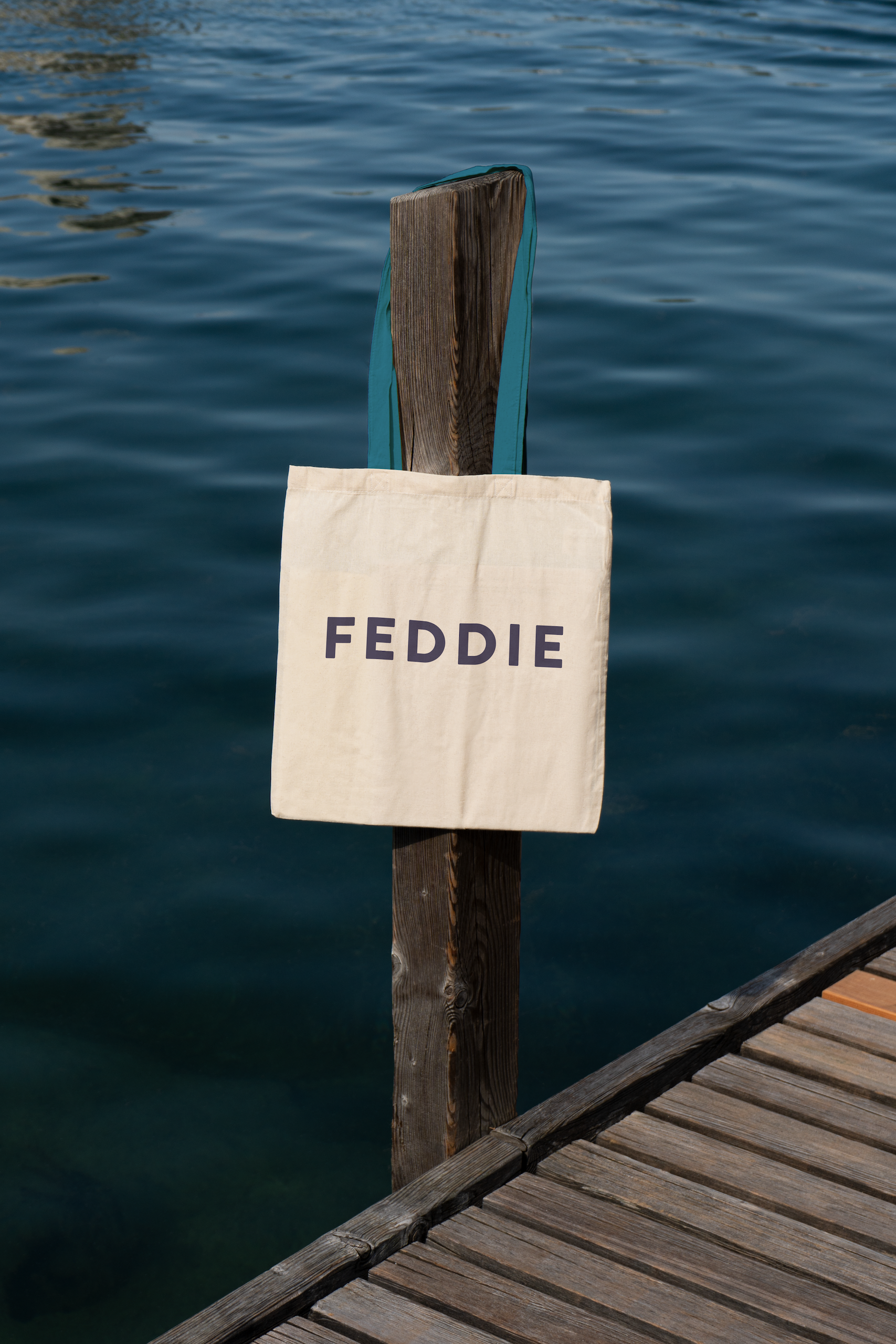
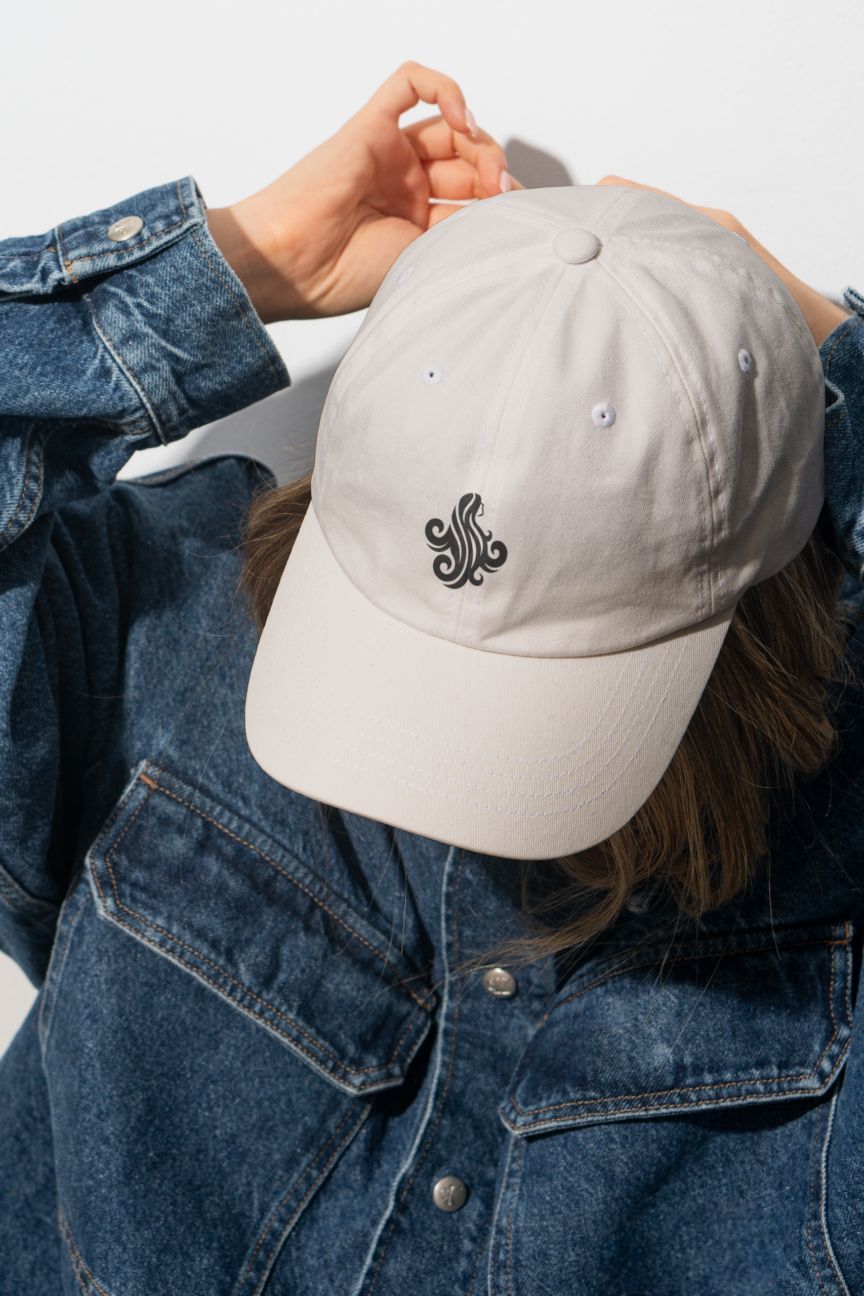
Contagious’ brand work for FEDDIE whisky

And thirdly the brand needed to communicate the gender politics behind founder Anne Koopang’s vision. Only women are allowed to invest in FEDDIE, in a bid to encourage more women to develop portfolios.

“Even though Norway is ranked as the most gender equal country in the world, 80% of the stock exchange is owned by men,” Lunde says. “The founder wanted to nudge more women to start funding companies. Today we have 1,000 – soon to be 1,200 – female investors, and they are a really important part of our identity.”

“It was certainly a challenge,” laughs Contagious’ creative director James Hartigan. He says the first phase of the work was to clarify the portfolio architecture, and to identify the core pillars of the brand.

“They were all there, but there wasn’t a clear framework,” he explains.

As the work developed, they also had to think about building Norwegian whisky as a category, both in its homeland, where it launched in 2023, and abroad. FEDDIE just last week launched in the UK, and is also available in Sweden and Switzerland.


The team visited Fedje, where the challenges facing the local community reminded them of the issues closer to home on the Scottish islands. But ultimately it was the investor angle they decided to hone in on.

“The island story didn’t really stand them apart, because they are lots of island spirits,” Hartigan says. “But there was a lot of strength in this idea of it being powered by women, especially in the spirits world.”

For the brand design, Hartigan says they wanted to stay “very true to the brand’s Nordic roots, to create something that felt very utilitarian, but also modern and progressive.”

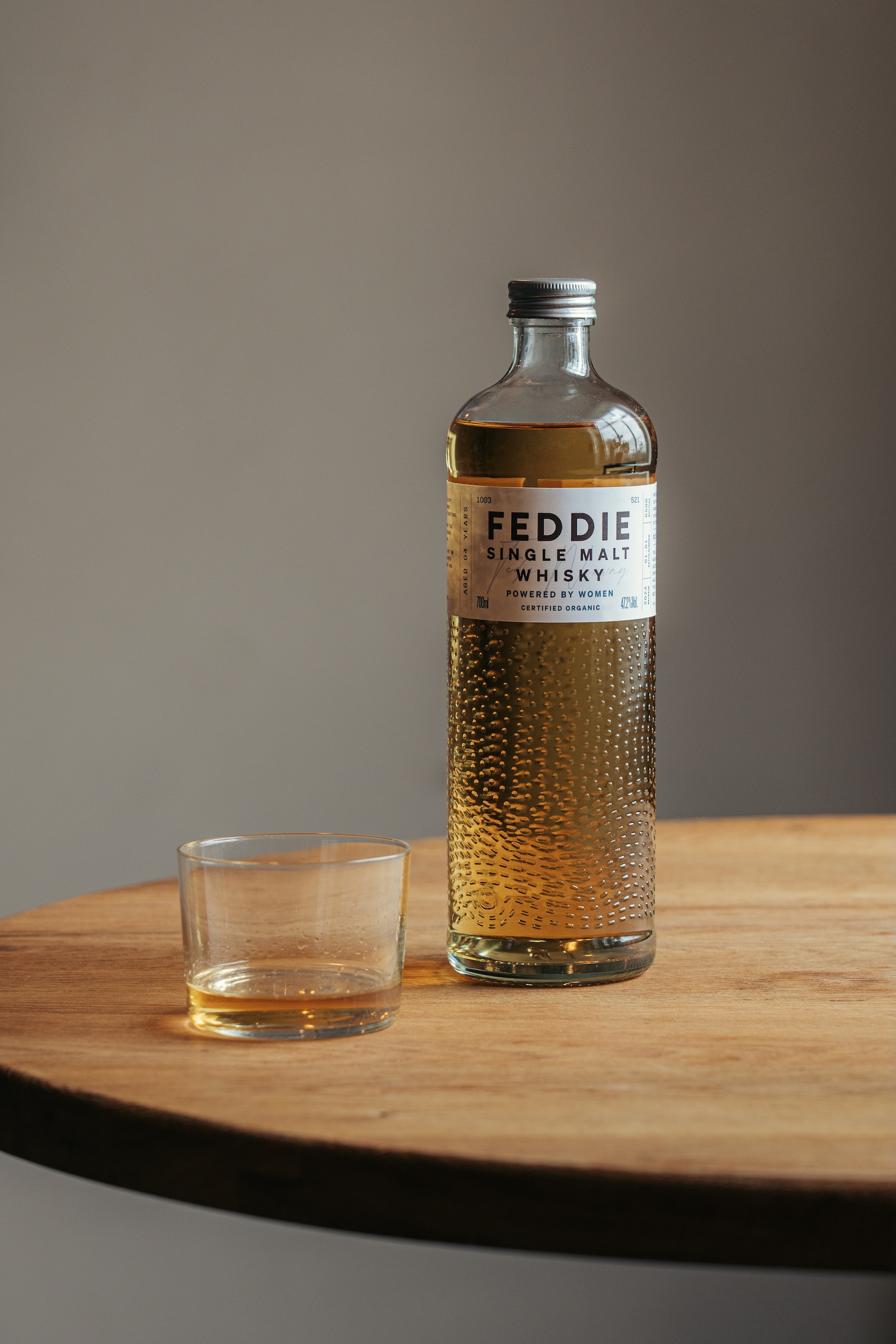
Contagious’ bottle design for FEDDIE

The main target audience for the whisky is men, but they wanted to burnish the brand’s feminist credentials too.

“Sometimes with brands that are very forthright in saying that they’re female-owned, there is a misconception that they’re just for women,” Hartigan says, “We wanted to be very clear from the beginning that it wasn’t just for women – it’s for everyone.

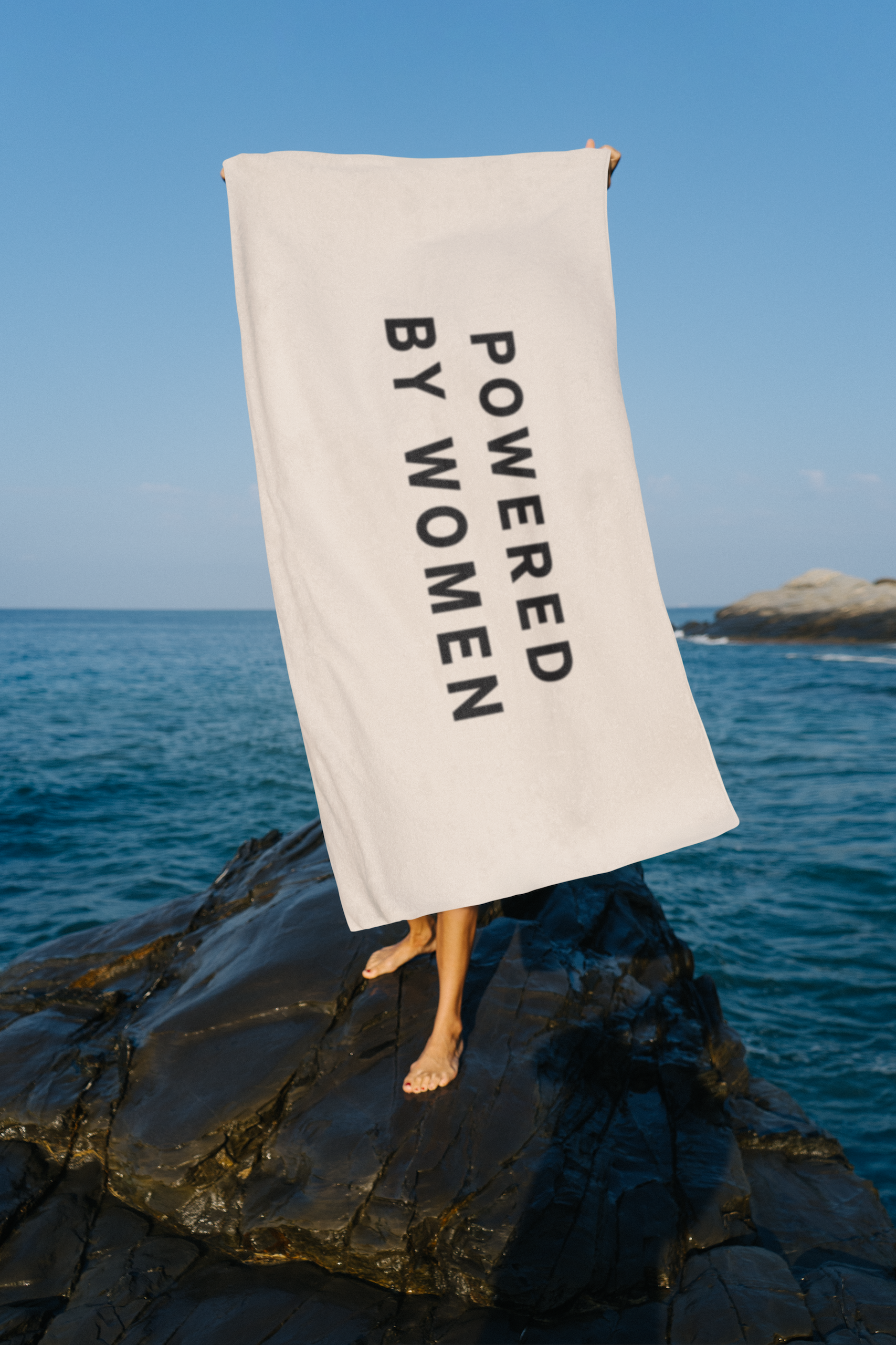
“But we were quite steadfast in having the line, ‘Powered by women” on the packaging, knowing that that would be divisive to some people. If that was a problem to someone then fine, they’re not our people.”

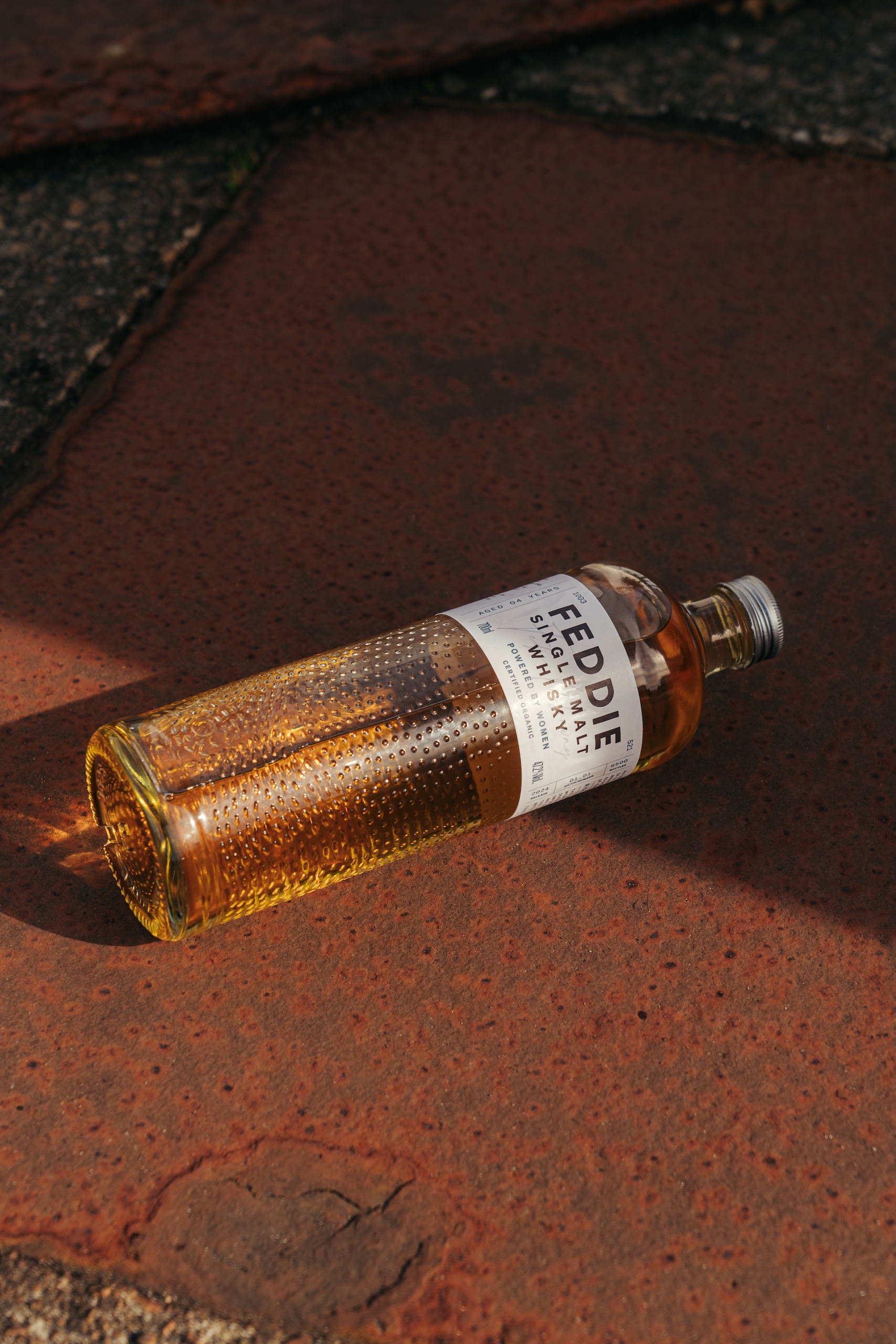
To bring the brand story to life, the bottle features 750 dots, which was the number of investors at the time of production, and 521 dashes – one for every Fedje resident.

Detail of Contagious’ bottle design for FEDDIE

People often think the design references the movement of the waves, Hartigan says.

“But what we were actually trying to get across is the movement of FEDDIE, in terms of the women, and what it’s doing for the island.”

In the future, when the bottle mold needs to be renewed, these visual elements will be expanded to reflect the up-to-date numbers.

“We are committing the cause of the brand into the glass, into the actual fabric of the packaging,” Hartigan says. “Over time, these bottles will morph and grow as the brand morphs and grows as well.”

This texture also creates an immediate interest designed to catch shoppers’ attention. “It has to look beautiful,” Hartigan says. “Becasue as soon as you get someone to pick it up, you’ve won the battle. You need a sense of intrigue to draw people in, and then they can engage with all the storytelling.”


The design team also worked hard to ensure the product’s carbon footprint was as low as possible.

There’s an aluminium screw-top instead of a cork – because cork can cause issues in recycling chains – and they made the bottles as light as possible, even though that goes against the traditional luxury codes in premium spirits, where heavy glass signals quality.

The challenge was to combine these design elements, which are usually associated with cheap own-brand spirits, in an elegant and engaging way.

When it launched in Norway, FEDDIE sold out in two weeks, and this year sales are already up 50%. For Lunde, the packaging has been a key part of this initial success.

“It feels like everything falls into place,” she says. “They have managed to make the full story very intuitive for customers.”

Contagious’ brand work for FEDDIE whisky
The FEDDIE distillery

Source

By

design/leader: NOT Wieden+Kennedy’s Adam Rix

Adam Rix is head of NOT Wieden+Kennedy, the design studio spun out of the famous ad agency. It works with clients like Upwork, Dark Arts Coffee and the Eurovision Song Contest.

Design

What would your monograph be called?

WIP. I wouldn’t be able to commit to a title, because I’d change my mind six months, or maybe even six minutes after it went to print. Because whilst I have strong points of view, they’re all pretty loosely held.

When I first came across the old adage, “the only constant is change,” it really stuck with me. It’s true of our industry, our culture, technology – and to be honest, most of my workdays.

So if we’re not constantly evolving the way we think, work, and see the world, I think we’re kind of screwed. But I actually think that’s a really positive, exciting thing. I never want to feel like I’ve figured it all out and I always believe my best work is still ahead of me.

I’m constantly evaluating our processes, replaying things I could have done better – and often, there’s plenty – learning from others, challenging my own thinking, blaming myself first when things go wrong. I get bored when I feel too comfortable – and I’m always ready to have my opinion changed.

Because if I ever get to the point where I think I know it all, that I’m no longer a work in progress – it’s not just me that will be screwed, the work will be too.

Or, in the charismatic words of Dan Wieden, “When you don’t know, you try desperately to find out. But the minute you think you know, the minute you go – oh, yeah, we’ve been here before, no sense reinventing the wheel – you stop learning, stop questioning, and start believing in your own wisdom, you’re dead. You’re not stupid anymore, you are fucking dead.”

What recent design work made you a bit jealous?

Turns out it’s not recent, it’s from 2022 – and it’s the livery for the German airline Condor.

It’s pretty unusual, as people in the industry, that any of us get to experience work for the first time outside of a bento box. But last year I landed at Frankfurt airport, looked out of my window and saw five planes all wrapped in different brightly coloured stripes – and it instantly just made me smile.

Vision Alphabet’s new designs for Condor

I’m a big believer in the power of design to go beyond ideas and aesthetics and make people feel something – and this did just that.

I love that the client must have believed in the idea so much to invest in full plane wraps in a multitude of colours, so hats off to both Remo Masala of Vision Alphabet in Berlin, and Condor.

Ironically I can only find it on one design website, but I’ve found lots of coverage in mainstream media and plenty of chatter on social and Reddit threads of people going out of their way to share their love for it – the best measure of success in my eyes.

What’s an unusual place you get inspiration from?

This might not be unusual for everyone, but it is for me. I used to find inspiration by doing, but as life has got busier over time, I find I now need to make time and space for my mind to be able to wander a little – but never sitting around with a notepad, and never ever endlessly scrolling online.

I feel like my strongest, clearest thoughts come to me when I’m walking up a hill, going for a run, or checking out an exhibition. I need to create that time and space and then trick my brain into thinking I’m not thinking. Complicated, aren’t we?

Name something that is brilliantly designed, but overlooked.

The banana‑peel wet floor sign. On a good day it delivers a moment of joyful silliness as you remain upright walking past. On a more spillage-y day it’s the moment that saves your back, and your dignity. And studies show – that’s how into this I am – that it commands 22 times more attention than traditional slippery floor signs.

The banana peel wet floor sign

What object in your studio best sums up your taste?

Technically it belongs to my kids, but our Kit-Cat Clock – Earl Arnault’s 1932 tail-wagging, eye-swivelling answer to lifting peoples’ spirits during the Great Depression. More proof that great design can be joyful, weird, and a little bit stupid.

Adam Rix’s Kit-Cat clock

Leadership

1. What feedback felt brutal at the time, but turned out to be useful?

“Other people feel your emotions.” Which is great when it’s the good, positive, excited kind. But when it’s stress, panic or negativity – the people around you start to feel that too – and that’s not so great.

The feedback I got was more around the latter. It sounds stupidly obvious when it’s said out loud, but it’s not something you tend to think about earlier in your career when you’re focussed on the work, taking on more responsibility and feeling the pressure of looming deadlines.

Our job isn’t just to create great work ourselves – it’s about creating the right environment for others to do their best work too.

What’s an underappreciated skill that design leaders need?

Invisibility. But balanced with availability. Hire good people, then get out of the way.

I believe people do their best work when given autonomy, ownership and responsibility. I don’t think “leaders” should feel the need to have their finger prints all over the work, or that they need to be the loudest voice in the room.

But they do need to be available to guide, support, and soak up the pressure when things go wrong. And if things are going brilliantly – just leave everyone to it.

What keeps you up at night?

Scroll up to the very first question. That, and too much coffee.

What trait is non-negotiable in new hires?

Paul Arden said, “No talented wankers.” Netflix’s culture document puts it a little more gently – “Brilliant jerks. Some companies tolerate them. For us, the cost to teamwork is too high.”

Whichever you prefer, both reflect my view that talent alone is not enough, and that ego is an absolute no-go.

Complete this sentence, “I wish more clients…”

This might sound a bit kiss-ass, but I’m really not into the client-bashing narrative. Like all of us, I wish every client bought the most creative idea on the table – but if they don’t, then more often than not, I think it’s on us to do better.

To put ourselves in their shoes, to understand what’s keeping them up at night, and to make the wildest, most unexpected idea feel like the most logical thing in the world. To help them see that buying that work isn’t the risk – not buying it is.

Source

By

“Everywhere, every day” – why football clubs are turning to custom type

For decades, the crest has been the most sacred emblem for football clubs, a shorthand for heritage, tradition and allegiance. As the guardian of a club’s history, it has long carried the weight of identity on its shoulders.

Now, a growing number of clubs are asking typography to share that emotional load.

No longer treated as a supporting act, custom type is becoming an everyday badge of belonging, a visual language that fans read, wear and share.

From Europe to the UK and the US, bespoke typefaces are being used to amplify heritage while keeping pace with how clubs communicate today.

They help identities work harder across an expanding range of touchpoints, from scarves to stadium screens, and help teams speak locally and globally at once – familiar to a neighbourhood, legible across a broadcast feed.

That dual power – functional and cultural – is what’s making custom type one of football’s most valuable new assets.

Gretel’s identity and custom typeface for New York City FC

When Gretel began reimagining New York City FC’s identity, the team started to think of type as a part of a larger system that could hold memory, place, and pride.

“Typography carries a club’s voice and narrative across every touchpoint. It creates hierarchy, establishes rhythm, and allows you to speak loudly or quietly, depending on what the moment requires,” says Dylan Mulvaney, Gretel’s head of design.

“Where the badge or the crest says, ‘This is us,’ type says, ‘This is how we sound.’”

In collaboration with Frere-Jones Type, Gretel set out to create a custom typeface that could “only belong to this club, in this city,” adds Mulvaney.

To do so, the team had to tap into a cultural touchstone that felt unmistakably New York. They found it in the iconic pre-modernist signage used across the Independent Subway System (IND), which has connected New York City’s five boroughs since its construction in 1932.

Gretel’s custom typeface for New York City FC

“The subway makes the five boroughs function as one city – connecting college students in Manhattan with grandparents in Queens, artists in Brooklyn with families in the Bronx. The club does similar work, creating bonds across all those differences,” says Mulvaney.

The result is the typeface NYCFC, available in two styles, Local and Express, that mirror two lettering approaches from the IND system and reflect the city’s contrasting scale – Manhattan’s towers against the lower buildings of the outer boroughs.

Local was designed by Nina Stössinger, while Express was drawn by Tobias Frere-Jones, a decision that mirrored the way New York’s subway lettering was originally made by different hands and helped retain a touch of dissonance and character between the two styles.

The lettering within the badge was also redrawn by Stössinger, based on the voice and cut of NYCFC, connecting the crest and the custom typeface.

New York City FC’s updated badge with the redrawn letterforms

“The connection matters because it signals intentionality,” says Mulvaney. “It tells supporters this isn’t piecemeal evolution. Everything is in dialogue, reinforcing the same core idea about where this club comes from and what it stands for.”

As Mulvaney points out, NYCFC now gives the club ownership in a way retail fonts never could.

“When you give fans letterforms that genuinely reflect their city’s visual DNA, rather than something licensed from a foundry that 20 other brands might use, it feels like their own,” he says.

That emotional power was something ModestWorks and Moniker were thinking about when developing the identity for Dallas Trinity FC. Together, they built a brand world that established a dialogue between the club’s crest and its pair of custom typefaces.

For a new club without deep-rooted iconography, this relationship allowed typography to share the brand’s symbolic weight and keep the crest from working alone.

ModestWorks and Moniker’s crest and custom typeface for Dallas Trinity FC

“Relying only on the crest can create fatigue. We needed something else that could carry the brand’s DNA without always leaning on the emblem or even the name of the club,” says Robert Milam, founder of ModestWorks.

“That’s where the custom typefaces come in. They create a larger system, giving us a distinctive voice that can flex across platforms.”

Like Gretel, ModestWorks and Moniker turned to a local cultural reference to ground the work.

The two typefaces they designed – Trinity Sans and Trinity Flare – were based on the typographic forms etched in the monuments in Fair Park, a National Historic Landmark in Dallas and home to the Cotton Bowl stadium, where the team would play its inaugural season.

“We studied the geometry and rhythm of the carved letterforms across Fair Park – the tall verticals, flared serifs, and compressed horizontals. Trinity Flare draws directly from those chiselled flares, giving the type an architectural presence,” says Milam.

The teams took notes from the typographic forms found in Fair Park

Trinity Sans distils the monumentality into a cleaner, modern structure, with strong verticals and horizontals that echo the inscriptions.”

Together, the two typefaces carry a sense of gravitas and permanence – qualities that feel fitting for a young club that has launched with momentum.

For both teams, it was important to get the typefaces just right.

As the most constant part of the system that shows up in every single point of communication, type is ever visible. “A crest appears in certain moments, but the type is everywhere, every day. That ubiquity makes it a direct bridge to the fan base,” says Milam.

That constant presence gives it emotional power. Type becomes the connective tissue of a club; a tool that translates collective pride and belonging into visual form.

“Type is language – the words matter more than the letterforms themselves. But when those words connect to something meaningful in a club’s culture – like ‘You’ll Never Walk Alone’ for Liverpool, or ‘Play Like a Champion Today’ at Notre Dame – type becomes just as powerful as the crest in shaping identity.”

ModestWorks and Moniker’s custom typeface for Dallas Trinity FC

In a rapidly evolving world, where a club’s identity has to perform across LED boards, TikToks, jerseys and apps, custom type has become the more agile player in the brand toolkit.

Unlike a crest – bound by history and emotion – typography can evolve more freely, carrying the flexibility modern clubs need.

FC Basel 1893’s custom variable typeface, crafted by designer Sylvan Lanz, was built with this sense of fluidity in mind. Each of its six styles, featuring circular edges and sharp angles, is designed to evolve with the club – a new cut introduced each season.

“Each version becomes a visual artefact of a specific season – something that evokes memories and emotions for fans. For example, the ‘Circular Squared’ cut used in 2023/24 is now tied to the season they almost got relegated, their worst in years,” says Lanz.

1893, a variable typeface designed for FC Basel 1893 by Sylvan Lanz

“Friends joked that my typeface brought bad luck. The ‘Angular Circular’ version used the following season, 2024/25, became associated with winning the double – league and cup – and the return of Xherdan Shaqiri.”

When designing the typeface, titled 1893, Lanz immersed himself in FC Basel’s visual history and the city’s own typographic legacy, studying historic back numbers, condensed letterforms from the Basel School of Design, and archival materials to create a system that bridges the club’s past with its present.

There was also the pressure of winning over the club’s devoted fans. It’s a challenge Lanz met head-on – and one that paid off – with supporters quickly embracing the typeface as their own.

1893, a variable typeface designed for FC Basel 1893 by Sylvan Lanz

“I often see kids redrawing the letters for signs, and fans making flags or stickers. The fan block even used it in a stadium choreography – a coordinated visual display during a match – a huge honour, since they usually reject official club visuals besides the crest and colours,” says Lanz.

“There are also fun moments – cheap counterfeits, amateur clubs using it without permission, or spotting it in design schools from other cities whose students probably support rival clubs.

“I even received one hate message, to which I replied, ‘Nobody is forcing you to buy the jersey.’ He agreed and wished me a nice weekend.

That shows just how emotionally charged this context is.”

1893, a variable typeface designed for FC Basel 1893 by Sylvan Lanz

A club’s typeface, then, isn’t just functional. It gathers meaning over time, its emotional charge deepening with every season fans spend with it.

The emotional resonance of a legacy typeface is something Nomad had to carefully consider when evolving Tottenham Hotspur’s identity and remastering its custom typeface, which was first drawn nearly 20 years ago.

“The typeface felt ‘of a moment in time’ but it was also instantly recognisable as being Tottenham Hotspur – something very few football clubs have within their design toolkit,” says co-founder Terry Stephens.

“On the surface, we didn’t want it to look different, but we all needed it to work much harder for them – both in the sheer volume of platforms and displays that a modern football brand shows up in, but also in terms of what role it could play within the identity system.”

Nomad’s remastered typeface for Tottenham Hotspur

To evolve the typeface, the team studied the club’s fiery, high-intensity style of play. In response, they stretched and compressed the original typeface to mimic the way heat might warp its form.

“Surprisingly, even when stretched by 300%, it still looked good. It accentuated the serifs and made it look more contemporary,” says Stephens.

Once the concept was sealed, Nomad turned to F37 Foundry to build on it and master a fully variable headline font and supporting text version.

The remastered typeface strengthens the system, giving the brand new range while supporting the refreshed cockerel icon and revived monogram, and reducing their overuse.

Nomad’s remastered typeface for Tottenham Hotspur

“Over the summer, Tottenham toured Asia on their pre-season tour, and the graphics created for that relied far less on the crest, but still felt authentically Spurs,” says Stephens. “That’s a win for the type, and a win for the brand.”

As design tools continue to be democratised, custom type is set to play an even greater role in how clubs define themselves.

Crafting a typeface is now more accessible than ever, and its financial advantages over licensing off-the-shelf fonts are becoming increasingly clear, as is the growing recognition of type’s power to shape identity.

“Clubs are starting to see the importance of being a brand, a word still seen as ‘dirty’ in the football world, and that a brand is more than a logo or a badge,” says Stephens.

Nomad’s remastered typeface for Tottenham Hotspur

While custom type has firmly found its place within football clubs from across the world, Lanz says there’s still more to be done.

“I hope more clubs recognise the value of working with creatives – not just on type but across their entire visual appearance.

“Personally, I’d love to see leagues like the Premier League abandon the idea of one standardised typeface for all clubs. These generic back numbers erase a club’s individuality and identity,” he says.

“Each club should have the possibility to express its identity through typography – because in football, type isn’t just type; it’s charged with meaning, emotion, memory, and belonging.”

Source

By

How Skyscanner transformed its design culture

When Ross Mawdsley started work as Skyscanner’s global head of design in 2022, he soon realised the scale of the challenge he faced.

“When I came in, half the design team couldn’t design,” he says. “It sounds mad, but they actually couldn’t design.”

Not only that, but brand wasn’t held in very high regard at the tech company. So Mawdsley set to work reshaping the team, bringing in new faces and developing those who got what he was trying to build.

“These people were incredibly creative, but they were just doing banners and stuff,” he says. “So it was about taking the shackles off, and showing them that design is a big part of what we do here.”

Ross Mawdsley on stage at Paradigms

He was joined a few months later by Carla Sandhu, now Skyscanner’s global head of design ops, and together the pair redesigned the brand team’s org structure, focusing on skillsets and ensuring the team worked on the most interesting briefs (which had previously often been outsourced).

But they also set about building a new design culture.

It started, Mawdsley says, with getting everyone on the same page, and feeling a sense of ownership over the tech company’s brand.

Skyscanner has about 1,500 employees, about a tenth of its competitors like Expedia and Booking.com. The brand team is only about 40 people, with ten full-time designers and seven producers.

“We’re a challenger brand compared to others, so we have a bit of an ‘us against them’ attitude,” Mawdsley says. “I think that’s rubbed off into the whole department, in a way that everyone feels this ownership.

“It’s our brand – we built it together. And everyone feels like they are propelling it forward, which I think makes a huge difference.”

Another part of building that sense of ownership is to make sure people across the team feel empowered.

“Autonomy is a big thing in our team,” Sandhu explains. “We allow people the space to make mistakes and to grow, but we are always there to support.

“I’ve got enough experience to know that if you give people a target, and you leave them to it, they’ll probably get there. And it might not be the way you would do it, but that’s ok.”

Carla Sandhu on stage at Paradigms

Mawdsley agrees this is a crucial plank in their culture. “We’re empowering different people, at all levels, to lead projects,” he says. “And so they don’t feel they’re just part of a production line.”

The tension, Sandhu and Mawdsley admit, sometimes comes around questions of “taste and personal preference.”

“That’s the hardest bit, because ultimately, someone does have to sign it off,” Mawdsley says. “There’s subjectivity in what is my taste, as opposed to what is right for Skyscanner.

“People who come from the agency world, like I did, are used to being taste-makers. But we have to try and take away our taste, and apply it to the brand that we’re trying to build.”

Sandu agrees. “Subjectivity doesn’t really scale that well,” she says. “Every year we’re doing more, and we can’t control every tiny thing that goes out.”

Some Skyscanner brand work overseen by Ross Mawdsley and Carla Sandhu

Unlike some leaders, neither Sandhu nor Mawdsley are big believers in rituals to bring their team together.

“The fun part is the work,” Sandhu says. “The bonding experience is that we’re all on this project together, rather than we do an icebreaker every morning, or we go to the pub every Thursday.”

Interestingly despite all the talk about change across the design industry, both also believe that while many of the challenges feel new, the core role of design leaders remains consistent.

“What I’m steering the team through, that’s changing, but the principles of leadership are the same,” Sandhu says. Transparency, for example, is key, especially as Skyscanner – like every company – grapples with how to use AI.

“We are challenged with finding AI solutions versus hiring more people,” Sandhu says. “So we’re not replacing roles, but we’re not going to add new heads in. And I think we’re at a point in time right now where we don’t really know if AI is actually going to deliver all these wonderful solutions that allow us to scale.”

Some Skyscanner brand work overseen by Ross Mawdsley and Carla Sandhu

That willingness to embrace and acknowledge uncertainty feels like a common characteristic in this generation of design leaders. And that’s perhaps in contrast to some of those who came before.

“Just because you’re the leader, doesn’t mean you’re the expert,” Mawdsley says. “I’ve come across many people in my career who led in that way. And you become indoctrinated into thinking that’s what leaders look like.

“Then when you step out of it, you suddenly go, ‘Christ, that was 20 years of being absolutely hammered.’ And that didn’t get the best out of me, because I was doing things out of fear, not through wanting to make the design work better.”

Some Skyscanner brand work overseen by Ross Mawdsley and Carla Sandhu

Good leadership, he says, is about empathy, respect and trust.

“If someone puts their faith in you, you’re going to do a better job,” he says. “You have to understand people’s nuances, when someone wants an arm around the shoulder, and when someone else wants to be pushed.

“You have to learn to read people, and not have a one-size-fits-all approach, banging your fist on the table and telling everyone, ‘This is rubbish’!”

And he says, good leaders maintain a constant sense of self-awareness, alongside a willingness to improve.

“You’ve got to keep learning, because no-one ever tells you how to be a leader,” Mawdsley says. “Never think you’re the finished article.”

Ross Mawdsley and Carla Sandhu on stage at Paradigms

It’s particularly important, Sandhu adds, to understand how designers think, and communicate in a way that is both clear and meaningful.

“It’s about learning to speak the team’s language,” she says. “I’ve been at the coal face of difficult situations in companies, and you have to understand how to translate what’s going on in a way that resonates with creative people, without unsettling them, or taking their focus away too much.”

Another challenge is to ensure that in-house creative teams understand that other areas of the business may come at things in a very different way. This can even happen within wider design teams, Mawdsley explains.

“I run the visual design of the brand and there’s an equivalent of me who runs the product design,” he says. “They come from a CX angle, with a very right brain, scientific approach. Whereas I come from a left brain, very fluid, very creative starting point.

“We want the same things, but we come at things from very different angles. Their ideas are backed by science and data, while our team can be like, ‘Go out and watch a film, or take a walk in the park, you might get an idea.”

And, Sandhu explains, this culture clash can also be felt across the wider company, which is dominated by software engineers.

“They work iteratively, as product people do, so it’s good to spend time talking to other leaders about how we set up our team, and help them understand why it is the way it is.

“You are never going to find your place in the culture, or have a culturally relevant brand, doing user research, and that’s ok,” she laughs. “We can respect each other’s differences.”

Some Skyscanner brand work overseen by Ross Mawdsley and Carla Sandhu

Some Skyscanner brand work overseen by Ross Mawdsley and Carla Sandhu

Source

By

“Creative directors aren’t heroes” – An hour with PORTO ROCHA

In just six years, PORTO ROCHA has become one of the most recognisable names in global design.

The New York-based studio’s portfolio spans work for PAC NYC, Brazilian art museum MASP, and Nike Run – an identity so widely seen and celebrated that it was virtually impossible to miss.

But beyond the big-name projects and industry recognition, founders Felipe Rocha and Leo Porto are extremely thoughtful about the design industry, and the type of business they want to run.

In conversation, they bring a rare candour – honest, unguarded, and unafraid to say it as it is. They don’t hide behind polish or posture, and that openness makes them not only compelling collaborators but also excellent interviewees.

As they gear up to open their London studio next month, we spoke to the co-founders about what has changed since they first opened their doors, their insistence on demystifying the idea of a “design hero,” and their hope that the studio’s success gives other queer, immigrant designers permission to dream bigger.

You’re now entering your sixth year as PORTO ROCHA. If you look back to when you started in 2019, what feels most different about you as founders today?

Felipe Rocha: Honestly, everything feels different. The past six years have been constant learning – things we could only understand by actually running the studio.

Every new industry we work with brings a new kind of knowledge, and I feel I’m a much more well-rounded designer now, even though I’m less hands-on than before.

I also have a deeper appreciation for the client side – their perspective and expertise – which I knew in theory before, but now really value in practice.

At the same time, I’ve also become more sceptical. I know now that a sustainability campaign won’t change the world, and that a Pride campaign is often performative. Experience helps me see what has real potential to create change, and what doesn’t.

Leo Porto: I agree with Felipe. When we started, it was just the two of us – we were designers, project managers, client leads, everything. Now we’re a team of 36, with amazing designers, project managers, and operations staff.

That shift means our role is less about being hands-on makers and more about leading – inspiring, delegating, creating the right environment, and making sure the quality of our work stays high.

The hardest part has been letting go of that designer instinct to control every file, and instead learning how to lead an entire studio.

PORTO ROCHA’s brand for Nike Run

When you launched, what did you want PORTO ROCHA to bring to the industry that you felt wasn’t there at the time?

Leo Porto: We always felt there was a gap at the intersection of design, culture, business, and strategy.

At the time, clients often had to choose between smaller design studios, which delivered beautiful craft but lacked strategic rigour, or big agencies and consultancies, which brought the strategy but not the same caliber of design.

Our idea was to bring those two worlds together – to deliver design at scale without losing quality.

Another big part of it was rethinking the role of the designer. Traditionally, designers were seen as the executors of ideas that came from strategists or directors.

We wanted designers to be seen as strategic thinkers themselves, with a real seat at the table. That mindset shaped how we’ve structured the studio, with a more horizontal way of working.

At the same time, we’ve always been against design that exists in a vacuum, is self-serving, or that makes itself the protagonist. We see design more as a vehicle – a platform to engage with people and respond to culture and the world around us.

Felipe Rocha: I don’t think design “shapes” culture; that feels pretentious. For us, it’s about translating and amplifying culture that already exists, and staying aware of our surroundings. That’s the most exciting part.

PORTO ROCHA’s work for Kunsthalle Basel

You’ve spoken about wanting to demystify the idea of the “design hero.” How do you actually embed that philosophy into the way PORTO ROCHA runs day-to-day?

Leo Porto: This ties directly to giving designers a real seat at the table. Traditionally, you had a “superstar” creative director whose vision trickled down to everyone else. Our structure is much more horizontal.

Of course, we have different titles and levels of experience, but we want the intern to feel just as free to speak up as the design director. We create space for disagreement, for questioning why things are the way they are.

In many agencies, that kind of questioning isn’t welcome – but we think it’s essential to getting to great work.

Another way we do this is through creative direction. Instead of pretending we have the perfect solution, we give focused feedback – what’s working, what needs to improve – and then let the team explore solutions.

It’s not about me being a “design hero” who comes up with an idea on the spot and says, “This is it.” It’s about trusting the designers to push the work further.

At the end of the day, creative directors aren’t heroes; they’re just people who’ve had more time and experience. And honestly, some creative directors who get to the top aren’t that great either.

Felipe Rocha: Yeah, and it’s a fine balance. Giving space doesn’t mean “anything goes.” We’re actually very demanding about the quality of the work and making sure it represents who we are. But it’s about being clear without being authoritarian.

Leo Porto: Exactly. We’re not design heroes. We’re just really annoying creative directors.

PORTO ROCHA’s brand for PAC NYC

When you opened, you set out to bring a Brazilian touch to your work. Has that cultural grounding become sharper, looser, or more layered as your practice has grown globally?

Felipe Rocha: I think “layered” is the best way to describe it. Of course, we’re Brazilian, and we do have other Brazilians on the team, but PORTO ROCHA today is truly international.

What makes the work strong is not one culture dominating, but a mix of perspectives, which is the only way to solve complex problems for global brands.

That said, I do think Brazil is often reduced to this idea of vibrancy, warmth, irreverence. And while that’s true, it’s also a simplification.

Another aspect of Brazil is this obsession with finding the best solution – being resourceful, cost-effective, and creative with what you have. That’s a cultural trait I really identify with.

Leo Porto: It’s hard to put into words how Brazil influences our work because it’s more of a way of thinking than an aesthetic.

On the one hand, you don’t have endless resources, so you’re forced to be creative and resourceful. On the other hand, Brazil is an incredibly rich cultural place, so if you know how to navigate it, amazing things can come out of that mix.

It’s like we have just enough to do something great, but not so much that we ever get comfortable. That tension often produces the best ideas.

PORTO ROCHA’s brand for PAC NYC

As Latin and queer immigrants, you’ve occupied spaces that weren’t always open to you. Do you feel the industry has shifted since you started, and how do you think PORTO ROCHA has contributed to that shift?

Felipe Rocha: I’d like to think PORTO ROCHA has contributed a little, but I also feel we’re more of a reflection of our time.

In the past, you had to be associated with a big agency to be “seen.”

Becoming a Pentagram partner, for example, was considered the peak of a career. I don’t think that’s true anymore. Clients are interested in us precisely because we’re independent and nimble, because we can tackle problems differently.

Leo Porto: It would be pretentious to say we changed the industry. We’re more a reflection of the changes already happening.

But hopefully we serve as proof that it’s possible. That someone like us – queer, Latin, immigrants – could make it. And if we can, then younger designers can see a path forward too, even if they don’t come from privilege or the “right” networks.

Felipe, you’ve recently spoken about not sounding like a “typical” design founder, and argued that design leadership is too often shaped by a narrow set of voices. What needs to change for the industry to really embrace different kinds of leaders?

Felipe Rocha: That’s a hard question, but to simplify – I think the issue isn’t about being invited into leadership roles, it’s about being trusted in them. There’s a big difference.

Too often, someone who looks or sounds different is included as a kind of gesture, but not truly empowered. What needs to change is moving from symbolic inclusion to real trust – trusting that different perspectives actually add value.

At the end of the day, I’m not here because of my accent or my background; I’m here because of the work I bring. That’s what leadership should be judged on.

Leo Porto: We’ve sometimes lost work because we didn’t look or sound like the “typical” design leaders.

We’re two relatively young Brazilians, presenting to boards of much older executives, and some clients have told us directly, “We love your work, but you don’t project the authority we need.”

Felipe Rocha: And my response to that usually is – the only things I can’t change are my age, my accent, and my background.

Leo Porto: But what we can do is prove ourselves through the work. When clients see the results and keep coming back, that’s what ultimately shifts perceptions of what a design leader looks and sounds like.

PORTO ROCHA’s identity for Brazilian art museum MASP

How would you describe your leadership style – both as individuals and as co-founders?

Leo Porto: I don’t think we’ve ever really described our leadership style before, but I’d say we’re very different as individuals while being very aligned in vision. We rarely disagree on priorities.

It always comes back to two pillars – doing great work and taking care of people.

As leaders, we’re both very direct and ambitious. We come from design, not business, so a lot of our decision-making has been intuitive – following our gut about what feels right or wrong.

Of course, now we have a finance team and models to validate things, but at the core, we still lead with instinct and heart.

For the team, I’d describe our style as setting a really high bar while being extremely empathetic. We recognise that everyone gets to the finish line differently – some fast, some slower, some needing more support.

That’s why the company is built around flexibility and trust. People know what’s expected of them, but how they get there is up to them. We don’t micromanage. In fact, we’re probably the opposite of micromanagers.

The PORTO ROCHA team

Many studios struggle with scaling while keeping their culture intact, and PORTO ROCHA has grown quite quickly. How have you managed that?

Leo Porto: Honestly, it comes down to hiring the right people. We look for people who share the vision of PORTO ROCHA, but that doesn’t mean a monoculture – our team is diverse in background and personality.

What unites us is a shared commitment to the work, and that’s helped us build strong retention. Many of our team members have been with us for years, which creates a sense that we’re building something together.

Felipe Rocha: That said, it definitely gets harder as you scale. When we were smaller, closeness happened naturally.

With 36 people, we have to consciously create those moments of connection – whether that’s shared lunches, time together in the studio, or longer creative reviews where everyone can contribute.

It takes effort, but for us, maintaining that sense of closeness is just as important as the work itself.

You place a lot of emphasis on openness, whether in sharing your own journey or demystifying design culture. How does that translate into how you collaborate with clients?

Leo Porto: For us, openness with clients really means honesty. We always remind ourselves that the goal is to solve the challenges the client has brought us, and if something gets in the way of achieving great work, we’ll be vocal about it.

A lot of agencies operate on “the client is always right,” but we don’t think that serves anyone. We’re flexible, but we’re also not afraid to disagree or to question things if we believe it’ll make the work stronger.

True collaboration is about both sides being equally open; we’ll listen deeply to what clients say, but we also want them to listen to us. It’s not about people-pleasing; it’s about having the kind of respectful disagreements that actually push the work forward.

Felipe Rocha: If you think about it, there are two extremes – on one side, the “design hero” who dictates the solution and doesn’t let the client in; on the other, the studio that just acts as a vendor, executing whatever the client asks.

We try to stay away from both. Real collaboration sits in the middle, and yes, that means there will be conflict sometimes, but that’s where the best work happens.

PORTO ROCHA’s identity for Church

As co-founders, how do you navigate the balance of being creative leaders versus strategic business leaders?

Leo Porto: The two roles are extremely connected. Every business decision directly impacts the creative output. For example, if you accept an unreasonable timeline just to win a project, you end up straining the team and rushing the work, which hurts quality.

So, as business leaders, we want to keep work coming in, but as creative leaders, we want to make sure the team has what they need to succeed – and often we’re negotiating between those two sides.

Sometimes that means saying no to projects because the circumstances aren’t right; other times it means taking on something challenging because we need it. That’s the balance.

But one thing that sets us apart is that we’re designers making business decisions.

In a lot of agencies, business leaders don’t really understand design, so their decisions are purely about numbers and profitability, and then the work suffers. For us, the business and the creative are inseparable.

Looking back, what’s been the most challenging aspect of running PORTO ROCHA?

Felipe Rocha: Figuring out how to grow sustainably – for us, our clients, and our team. Timelines keep getting shorter, budgets are often tighter, and the industry as a whole feels like it’s moving faster and faster. That pressure changes how we work and forces us to constantly adapt our process.

Leo Porto: In just six years, so much has shifted, from how people collaborate, to the tools we use, to the relationship between agencies and clients. The challenge is making sure we’re always up to speed and not becoming obsolete.

On top of that, our business model is project by project, so we’re always thinking about keeping the pipeline strong, ensuring people are paid, and making sure the work meets our standards. That responsibility is constant.

PORTO ROCHA’s brand for Nike Run

And looking ahead, what’s the next frontier for the studio?

Felipe Rocha: In the short term, our focus is on London. We’re officially launching there in November, and that feels like the next big step.

We’ve always worked globally, but having a base in Europe will shift perceptions and open up new opportunities, especially in industries we haven’t been as present in.

Another focus is strategy. We became known for our design work, but over the past four or five years, we’ve built a really strong strategy team.

That work is already shaping everything we do, and now we want to make it more visible – to be recognised as much for strategy as for design.

Leo Porto: Looking further ahead, we want to keep questioning the industry and fostering an environment where people can do their best work. If we can keep doing that while growing globally, I think we’re on the right path.

Source
By

“Weight loss drugs present design challenges and opportunities”

The rise of appetite‑suppressing drugs such as Ozempic and Wegovy isn’t just shrinking their tens of millions of users worldwide, it’s reshaping consumption habits.

That, in turn, is forcing food and beverage brands to rethink and redesign their output.

When people suddenly want less food but better nutrition, it forces companies to reconsider everything from product development to packaging design and information hierarchies.

Forget supersized portions – these future consumers will crave smaller, smarter meals they can actually finish without waste or guilt. Appetite‑suppressing drugs are causing palates to shift, with less tolerance for ultra‑sweet or greasy foods.

That’s an interesting creative opportunity from an emergent F&B design perspective.

Cleaner, simpler recipes create space to move away from diet‑style medical checklists and clinical language, or the samey, personality‑driven brands of past decades that have filled the lifestyle FMCG aisles.

Examples include brands like Huel, and similar wellness players, that balance aspirational lifestyle messaging with listed product benefits; protein and fitness brands that rely heavily on influencer partnerships and “transformation” messaging; probiotics and kombuchas covered in wellness symbolism; and snack bar brands that use similar fonts, earth‑tone aesthetics, and wellness buzzwords.

Now, consumers are making room for more authentic and appetising design language. This opens up a chance to rethink category codes and come up with new expressions.

New priorities and portfolios

Communicating clear signals of health, satisfaction, and support – while remaining desirable and appetising – will be critical as brands audit their portfolios and prioritise reformulations.

Back to today, and quick off the mark, Nestlé is launching Vital Pursuit frozen meals specifically tailored for GLP‑1 users. In the US, Conagra is adding “GLP‑1 friendly” labels to Healthy Choice trays to highlight high‑protein, portion‑controlled meals.

Daily Harvest is curating dedicated “GLP‑1 Companion” meal collections rich in fibre and nutrients.

For brands in this space, future KPIs will include:

Catering to smaller portions with right‑sized formats.
Offering no‑prep, easy‑to‑track meals that help audiences manage intake precisely.
Building dedicated sub‑brands.
Leveraging on‑pack cues and digital education.
Prioritising cleaner labels and simpler ingredient lists in offerings such as single‑serve lines and mini snacks.

A shift for restaurants

Restaurants are also seeing smaller orders, with discussions about the need to include “semaglutide sections” or small‑plate menus that cater to customers on weight‑loss medication.

Heston Blumenthal, himself a user of Mounjaro, spoke recently about launching a “mindfulness menu” where customers get the same amount of food and theatrics, just in much smaller portions – every dish one‑half to one‑third the size of a tasting menu.

As he told The Times:, “My staff and I have noticed a shift in eating habits…. Customers aren’t finishing their food like they used to. Weight‑loss medication hasn’t ruined my enjoyment of food, I just eat less of it.”

European chains like LEON, Pret a Manger, and EXKi already emphasise nutrient‑rich meals with clear calorie labelling.

In the UK, brands like GAIL’s Bakery and Joe & The Juice focus on smaller, premium‑quality offerings that support the “less but better” mindset. In the US, chains such as Sweetgreen, CAVA, and Chipotle are well‑positioned for this shift, thanks to customisable, portion‑controlled meals with more transparent nutrition.

Operators are rethinking menus to offer flexible combinations, half‑portions, and health‑forward cues without sacrificing either experience or revenue.

For fast‑casual dining chains, convenience will continue to be king. With less attention dedicated to food as an indulgent ritual, ready‑to‑drink shakes, single‑serve bowls, and no‑prep solutions can make portion control increasingly effortless.

This means outlets will need to apply more sophisticated design thinking to smaller portions by:

Right‑sizing packaging to avoid making portions look inadequate.
Creating premium positioning through materials and finishes.
Developing modular packaging systems for customisable combinations.
Designing clear nutritional communication without clinical overtones.
nnovating in portion visualisation so customers feel satisfied, not shortchanged.

As Blumenthal says, “For us, less food doesn’t mean lower cost because you still need the exact same ingredients and number of staff to make it.”

The connection to the booming health and wellness sector has also been seized by a previously ailing WeightWatchers (WW). The slimming club is repositioning itself not only to integrate GLP‑1 prescriptions but also to launch customised nutrition and behaviour plans to support women through menopause.

This signals a shift from diet‑focused to medical‑adjacent branding, which will have design implications, like moving away from traditional “weight loss” imagery and language, defining next‑generation medical credibility with approachable, supportive aesthetics and developing sub‑brands or product lines that feel less stigmatised.

Glass half full

For the beverage category, shifts are concerning: multiple sources report that people are drinking significantly less – or sometimes stopping altogether – which is a real threat for the social‑drinking category at large.

The Guardian noted “teetotal” shifts in GLP‑1 users threatening drinks companies. Forecasts predict a 4% volume decline in alcohol and soft drink categories over the next decade. This presents a clear opportunity to innovate in premium low‑ and no‑alcohol alternatives, adult soft drinks, using mindful consumption cues aligned with a more health‑conscious, lower‑appetite lifestyle.

These innovations could adopt more sophisticated aesthetics that compete with premium spirits and clearly differentiate from traditional soft drinks through:

Premium packaging materials and finishes (embossed labels, textured bottles, distinctive closures).
Ritual‑focused packaging that maintains the ceremonial aspects of drinking.
Transparent labelling of functional benefits (adaptogens, nootropics, etc.).
Colour palettes moving away from primary brights toward muted, sophisticated tones.
Typography that feels crafted rather than mass‑produced.

“Less food, more meaning”

For brands, semaglutide’s growth is both a challenge and an opportunity. They need to build trust with consumers navigating smaller appetites in an overwhelming food landscape.

Design’s future role will be crucial in balancing “less food” with “more meaning.”

This includes building trust through authentic, non‑medical visual languages, supporting new portion psychology by making smaller amounts feel satisfying and complete and communicating nutritional transparency without clinical coldness.

The challenge will be to redefine categories by breaking away from outdated diet/wellness visual codes, design consumption journeys that feel intentional and premium rather than restrictive, innovate with materials and finishes that signal quality over quantity.

And brands will need to clarify information hierarchies so nutrition communication is accessible without intimidation, telling authentic brand stories around mindful consumption rather than restriction.

The brands that win won’t just sell less food – they’ll deliver more purpose, and potential for a healthy life in every bite.

Sophie Maxwell is strategy partner at WeWantMore.

Source

By

Rabbithole brings Bradford’s “defiant beauty” into Turner Prize identity

This year, the Turner Prize – Britain’s best-known modern art award (and regular tabloid fodder) – has travelled to Bradford, the UK’s 2025 City of Culture.

The Turner Prize headlines the city’s year-long programme of cultural events.

The identity for the latest edition of the prize was developed by Rabbithole, the Leeds-based studio which also created the wider Bradford 2025 brand.

As the award is always accompanied by a major exhibition of the shortlisted artists, the identity had to work on two levels.

“We wanted a brand bold enough to turn heads in the city, but subtle enough in the exhibition to let the art speak,” says Harriet Hudson, head of marketing at Bradford 2025.

Rabbithole’s brand for the Turner Prize 2025

For Bradford 2025, the studio had already navigated the city’s complexities and dualities to deliver a brand that speaks to its soul, meeting a demanding brief with clarity.

“From the very beginning, they demonstrated that they could respond to challenging, even contradictory briefs,” says Shanaz Gulzar, creative director of Bradford 2025.

The identity for the award had to reflect the prestige and the purpose of the Turner Prize while also capturing the character and richness of Bradford as the host city.

“In an early workshop, someone described Bradford as a flower growing out of an overlooked patch of pavement – beautiful despite the cracks around it. That image of defiant beauty became our north star for crafting the identity,” says Mark Martin, strategy director of Rabbithole.

The cut-outs as seen on the brochure

This analogy led the team to the central idea of “fragmented beauty,” expressed visually through layers of scattered circular cut-outs that reveal glimpses of what lies beneath – a burst of colour, artworks, a piece of text.

“We took up a simple piece of paper, punched holes through it and layered it. Every cut-out creates a moment of unexpected discovery for those who linger and take a closer look,” says Tim Dee, creative director of Rabbithole.

The idea of a “second glance” also resonated with the spirit of the Turner Prize itself.

As an award that recognises artists pushing boundaries and offering new perspectives, it often asks audiences to look beyond first impressions. By unveiling only fragments at first, the identity encourages visitors to slow down and spend time with work that reveals itself gradually.

The Turner Prize 2025 Family Guide

Beyond anchoring the concept, the cut-out circles also become a flexible device. In nearby Lister Park, they became wayfinding markers for a community trail, guiding visitors with bite-sized introductions to the Turner Prize as they approach Cartwright Hall, the venue for the exhibition.

In the Family Guide, the cut-outs were turned into a pair of playful, bespectacled eyes that children could pop out – an interactive detail that makes the identity feel hands-on and inclusive.

“There are audiences engaging with the Turner Prize in Bradford who might never have set foot in Tate – not because of distance, but because it never felt accessible to them. This brand helps bring the prize into their world,” says Gulzar.

This democratic sensibility was also important for Rabbithole.

Rabbithole’s brand for the Turner Prize 2025

“The prestige of the Turner Prize could easily have led to something austere and serious,” says Martin. “What’s refreshing here is that the identity doesn’t take itself too seriously.”

Visually, the identity builds on the bones of Bradford 2025’s brand – the pink, green, and gold colours have been brightened and expanded into a broader palette. The team retained Displaay Type Foundry’s Denim INK, choosing a cleaner cut for the Turner Prize.

The wordmark, which is stacked to form a ‘T’ shape, benefits from the sturdiness of Denim INK’s letterforms. The ‘2025,’ which forms the stalk of the ‘T,’ gave the team more room to experiment. “Pulling the ‘2025’ apart from ‘Turner Prize’ allowed us to stretch things, draw elements, and even place things in the middle, opening up more space for play,” says Dee.

Rabbithole’s brand for the Turner Prize 2025

The resulting identity confidently bridges the worlds of Bradford and the Turner Prize. “The identity feels like Bradford 2025 presenting the Turner Prize, not being overshadowed by it – and that balance was crucial,” says Gulzar.

By tying the Turner Prize 2025 identity so closely to the Bradford 2025 system, Rabbithole created a brand that carries the prestige of the prize while remaining an unmistakable part of the City of Culture year.

That shared DNA means the prize benefits from the same recognition and resonance Bradford’s brand has already built at home and abroad, and across touchpoints.

As Gulzar puts it, “Even something as small as a pin badge stands out. When someone wears it, they can be on the other side of the world, and people will still ask, ‘What’s that?’ That’s when you know you’ve got a great brand, and great design.”

The Turner Prize pin badge
The Family Guide
Rabbithole’s brand for the Turner Prize 2025
The brand as seen at the box office and cloakroom

Source

By

Accessible make-up packaging wins top Pentawards prize

Ergonomic make-up packaging which blends elegance and accessibility has won the top prize at this year’s Pentawards.

At the awards show in Amsterdam this weekend, New York-based studio Established won the Diamond Award for its work on Tilt Beauty, a project the studio says, “required us to rethink the way beauty products are packaged from the ground up.”

It’s the second time Established has scooped the top Pentwards prize, after winning the 2015 Diamond Award for its work on the Marc Jacobs Beauty range. Established was also named design agency of the year at Saturday’s ceremony.

Established’s work for Tilt Beauty

The brief for Tilt, was to create packaging that was, “accessible to those with various physical challenges, from chronic pain to low vision, but still be coveted by all.”

For people suffering with chronic pain, existing make-up packaging can be impossible to use. Established says consumers are forced to find hacky workarounds, using sticky tape or rubber bands, or they end up avoiding make-up altogether.

The primary packaging is coated with silicone, which along with the curvy shapes are designed to help people with lower grip strength. The mascara wand is shorter than standard, as research showed people whose hands shake struggle with the longer design, and the refill system is easy to replace with a simple push mechanism.

The casing includes magnets to reduce the force required to open and close the products. The secondary packaging has large tearable strips to make it easy to open, while text is set in the Braille Institute of America’s Atkinson Hyper-Legible font to make it easy to read. There are also Braille product descriptions.

Crucially, the team was determined not to sacrifice aesthetics in a bid to make a more accessible product. “In creating Tilt, we wanted to make products that were both ‘seriously comfy’ and beautiful to look at,” they explain. “The vegan, cruelty-free makeup is easy to open, hold, read and apply, and the packaging is bold, playful and gorgeous.”

Established’s work for Tilt Beauty

The packaging is the first make-up line to get an Ease of Use certification from the Arthritis Foundation, with whom the designers collaborated on the project.

“This project really showcased the art of accessibility,” says Marc Powell, Unilever’s global accessibility centre of excellence lead, and one of the Pentwards judges.

“Not only does it feel stylish, desirable and modern, it’s just really cool that accessibility and inclusive design have been embedded into this product from start to end.”

And Established co-founder Sam O’Donahue said it was “an incredible honour” to win the top prize for the second time.

“Creating Tilt Beauty has been a labour of love and one of the most important projects we have taken on in the past 20 years,” he said. “We hope that its pioneering approach to making beauty accessible will have ripple effects throughout the industry.”

This year’s platinum winners recognised an eclectic mix of projects across the different categories.

Beverages

Diageo’s Johnnie Walker Blue Label Ultra – the lightest 70cl whisky bottle ever made – topped the beverages category.

Johnnie Walker Blue Label Ultra by Johnnie Walker

“This design does more than trim weight: it redefines what luxury in spirits packaging can mean. For decades, heft has been equated with prestige, but Blue Label Ultra proves that true refinement lies in balance; elegance without excess – a bold statement for the premium drinks sector.”

Food

Spain’s Simple Packaging Studio won platinum in the food category for its work on Pueblo charcuterie. The studio was also named best newcomer.

Simple Packaging Studio’s designs for Pueblo cold meats

“Inspired by the cultural resonance of Spanish village life, the design elevates what was once seen as humble or provincial into a point of pride. Pueblo is a design manifesto that restores dignity to ‘village’ origins and reconnects consumers with provenance through clarity and simplicity.”

Body, health and beauty

The eye-catching perfume packaging for L’ENTROPISTE by French studio Centdegres took platinum in the body, health and beauty category.

L’ENTROPISTE – Master of Disorder by Centdegres

“Centdegres imagined a radical fragrance house that celebrates chaos as its creative currency, producing a visual and structural identity that fractures traditional perfumery tropes.

“Every detail works to destabilise expectations: from layered, deconstructed graphics to asymmetry that suggests both disorder and liberation.”

Brand identity and connected packaging

The top award for brand identity and connected packaging went to the Stella McCartney x Veuve Cliquot collaboration.

Stella McCartney x Veuve Clicquot by Veuve Clicquot Ponsardin

“The identity centres on a next-gen, 100% vegan leather made from grape stems, translating vineyard by-products into a premium tactile signature. It’s a statement of values as much as aesthetics: craftsmanship, circularity, and brand storytelling aligned in one confidently modern system.”

Home, leisure and other markets

Zenpack’s Dwell Dripper for Verve Coffee Roasters won platinum in the home, leisure and other markets category.

Zenpack’s Dwell Dripper for Verve Coffee Roasters

“Designed to travel as well as it brews, the Dwell Dripper’s packaging takes cues from paper-bag lunches and accessory bags to create a friendly, take-anywhere unboxing.

“A single-part dieline streamlines production and reduces waste, while the range launches in seven colours with a matching coffee scoop engineered as an extension of the brewer itself – mirroring its angles and radii for a cohesive, durable, and easy-to-use system.”

Professional concepts

Italian studio Gentlebrand won the professional concepts platinum award for AVANCE, its limited-edition perfume collections inspired by a chess set.

Gentlebrand’s limited edition chess-inspired perfume design for AVANCE

“The concept translates strategy and symbolism into form and finish, giving each fragrance a distinctive presence while inviting the wearer into a more enigmatic, cerebral world of scent – a visual and tactile code for decoding emotion.”

Sustainable design

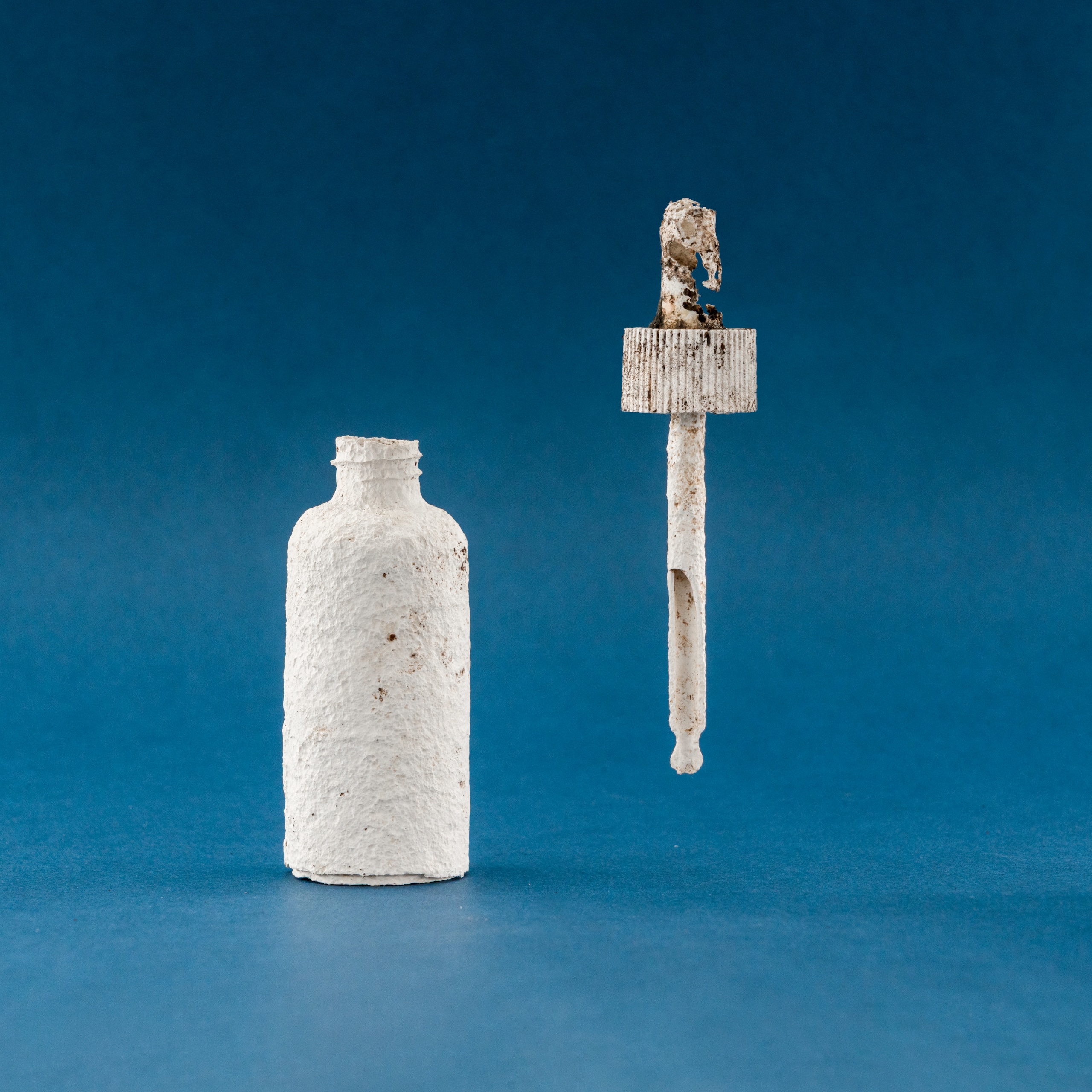
London-based Shellworks won the sustainable design award for its Vivomer Dropper – a “home-compostable” version of the cosmetics staple that, “performs like plastic in use but breaks down within 52 weeks, leaving no trace.”


‘Not only was this project considering innovation, end of life and a full packaging scale, it was really looking at a groundbreaking innovative way to penetrate an already saturated market,” says Pentawards judge and sustainability expert Sebba Alqetrani.

“It’s changing the way we look at consumption, it’s changing the way consumers look at usage and how we package products.”

Next-Gen award

Glasgow-based designer Morgan Hastie, aka The Logo Lassie, won the next-gen award for her Calentón Hot Sauce concept, while University of the Arts London was named educator of the year.

Calentón Hot Sauce by The Logo Lassie

Adam Ryan, head of Pentawards, said this diverse year’s winners show the power of great packaging design.

“What shines through this year is how packaging design touches lives – whether by making beauty more accessible, cutting waste in everyday products, or telling cultural stories through design,” he said.

“It’s proof that innovation can be practical, responsible and visually unforgettable.”

Source

By

How is Base Design using AI?

Base Design is a global network of creative studios with outposts in New York, Brussels, Geneva and Melbourne. It works on strategy, design and technology projects for clients like 12 matcha, Bellerose and Théâtre du Châtelet.

Here Mirek Nisenbaum, partner and digital director at BaseNYC, explains how they use AI, and how he feels about it.

You can see all the articles in this series here.

Broadly speaking, are you excited for how AI will change the design industry, or nervous?

Excited, without hesitation. Design has always evolved alongside new tools, from the printing press to Photoshop to Figma, and AI is another chapter in that story.

What excites me most is its potential to push us into unexpected territories, to help us reframe what concept and craft can mean today.

Of course, there are risks–  homogenisation, over-reliance, ethical pitfalls, even skills atrophy. I see those as challenges to approach with eyes wide open.

Our job is to bring discernment, taste, and critical thinking to the table, ensuring AI pushes us beyond the common denominator rather than dragging us down to it.

Do you have an agreed policy around AI as a business?

Yes, and it was one of the first things we worked on when AI tools began entering creative workflows.

We wanted clarity for our teams and reassurance for our clients, so we built a policy around transparency, human oversight, and protecting client IP.

The process was collaborative – we convened leads from cross-functional teams, mapped out the risks and opportunities, and then tested the guidelines against real project scenarios.

The outcome is a living policy that sets guardrails around tool use, security, privacy, documentation, and contract language.

When did you realise AI was going to have an impact on design?

At first it was gradual, seeing designers and artists experiment with GenAI tools a few years back. Results were unexpected, mostly funny, sometimes uncanny, but it was becoming clear that something special was beginning to happen.

Our Brussels team used GenAI as the core concept and execution for a campaign, and we could see its creative potential, even in its rough early stage.

I saw designers begin experimenting with LLMs for language in decks, research, insights, and today some of our creatives are already “vibe coding” tools for design ideation and prototyping.

This progression is making it clear to me that we are starting to see a fundamental shift in how design is practiced.

Have you undergone any AI training, either as a studio or individuals?

We’ve approached training as a mix of structured workshops and bottom-up experimentation.

We kicked off the process by bringing together a cross-disciplinary group of AI champions, a few people from every Base studio, representing different areas of expertise. Some were advanced early adopters, while others were just coming on board with curiosity and an open mind.

This group was tasked with identifying needs and blockers, and with activating adoption and experimentation across studios and disciplines.

We ran internal sessions focused on mapping workflows and pinpointing where AI could accelerate work and where it risked making it generic, from admin to creative.

We partnered with several AI-focused companies to dig deeper into workflows and gain first-hand experience with tools, guided by the teams building them. We also invited outside facilitators to introduce prompting techniques and best practices, helping our teams approach AI as a true creative partner rather than just a set of new tools.

Our hope is that the impact will be cultural as much as practical – people feeling more confident, more critical, and more willing to experiment.

How do you use AI in the studio’s creative process?

It’s the challenge we are currently navigating.

I see AI’s real promise in exploration, helping us push our thinking, test ideas in multiple directions, simulate scenarios, and prototype quickly.

The easiest uses today are more basic – asset production or workflow assistance, they don’t challenge us conceptually.

We always felt that words are as important in our creative work as images. Now with AI, the function of language as a model of the world we are building has become both amplified and more accessible for everyone on the team.

We can think deeper, surface obvious ideas quickly, use them as bounce-off points, and uncover unexpected ones.

Do you think clients care if/how you use AI in your work?

Yes, but in different ways. Some clients are curious and want to understand how AI might accelerate their own processes, while others are primarily concerned about IP protection.

What’s consistent is that transparency helps. When we explain our policy, how AI supports but never replaces judgment, it builds trust, and in some cases even strengthens our advisory role.

Do you use AI for any non-creative aspects of running your business?

We have an integrated engineering group, Base Digital, and unsurprisingly that team has been among the most active and immediate users of AI as a coding assistant.

They’ve seen direct gains in productivity, while also becoming early experts in agentic workflows, systems we can now apply both to our internal processes and to client projects.

Beyond engineering, we’ve been piloting AI in business development, proposal drafting, and internal knowledge management. For example, we’ve connected our shared drives and Slack channels to a private GPT, allowing teams to quickly surface insights from precedents, case studies, and research materials.

It saves time, accelerates onboarding for new team members, and ensures knowledge doesn’t get lost.

Operationally, AI also streamlines meeting notes, summarises transcripts, and highlights insights we might otherwise miss. In this capacity, it’s already proving highly effective.

Beyond the best known tools, what is one AI tool that you would recommend to other design studios?

We’ve been testing and piloting a lot of tools.

A few of the favourites currently are – NotebookLM for research and learning, Granola for note taking, Node based tool Flora for design and multimodel experimentation, well-known ones Midjourney (be aware of image rights) and Adobe Firefly (when copyright is a must) for images, Runway for video.

We also use Flux Kontext, Fal, Krea and Cursor for coding, Magnifique and Topaz for image upscaling.

Each has its niche, but what keeps us on our toes is how quickly the ecosystem is evolving.

Source

By

“From rock bottom to rock solid” – one designer shares his story

Creative career paths aren’t always clean-cut. Go to uni, get a degree, get a job in your field – easy, right? Yeah… not quite.

Some people hit the ground running. Others, like me,  get stuck at the start line.

I always knew I wanted to work in design. But honestly? I wasn’t very good at it.

I landed an internship at an agency in my second year of uni – a chance to prove myself. But a few days in, I could feel it – they weren’t happy with my work. I was falling behind. Everything I delivered felt subpar.

I left that placement feeling useless. Questioning whether I’d made a huge mistake. Racking up student debt with nothing to show for it.

And at the same time, I was battling a drug addiction that started in second year, and escalated fast when life began spiralling.

Final year flew by, mostly thanks to a haze of benzos, painkillers and dissociation. Somehow, I scraped through and graduated. But I felt broken.

No jobs. No direction. No self-worth.

“It’s wild what happens when someone believes in you. And even wilder when you start believing in yourself.”

So I went where a lot of people go when they feel stuck – retail.

I bounced between stores for eight years. I was good with people, but felt like that skill would never get me anywhere. The work drained me, and my addiction worsened. But somehow, I stayed afloat.

Until one day during lockdown, I nearly overdosed.

I was just lucid enough to feel myself slipping – heart slowing, breath disappearing. And I pulled myself out. That was the day I got clean.

When the numbness wore off, I woke up. I wanted something more – something I could be proud of. Something I could own.

(It was around this time that I was also diagnosed with complex PTSD. Instead of seeing this as a setback, I used my new knowledge as additional fuel to my fire.)

By what still feels like fate, I messaged an old uni mate just as a role had opened at his studio. He saw value in the one thing I had – my people skills. The ability to build relationships, sell ideas, and get people excited about the work.

That message changed my life.

Suddenly, I was working in the creative industry – not as a designer, but as someone who could champion creativity, fuel the studio, and connect it to the right people.

And it clicked. I’d found the thing I was meant to do.

Four years on, I’m now helping to shape another studio with the amazing Jack Last.

We’ve built something I’m immensely proud of. We work with incredible brands, deliver quality motion graphics, and the inner designer in me still gets a kick every time I see a new project come to life.

I’ve travelled the world, met the most inspiring people, and finally feel like I’ve found my place.

If you’d told me five years ago this is where I’d be, I’d have told you to pull the other one. But grit and determination, paired with a bit of luck and support, can change everything.

It’s wild what happens when someone believes in you. And even wilder when you start believing in yourself.

So I guess my message ahead of World Mental Health Week is don’t give up on yourself. I was close once, but use that anguish and frustration as fuel. You never know where you might end up.

If you or someone you know is struggling with mental health issues, Mind has a guide to where you can find help. The charity also has a specific resource for those fighting drug or alcohol addiction.

Jimmy Gordon is head of partnerships at OK Social, and co-host of the Months in Motion podcast.

Source