[searchandfilter fields="search,category"]

By

“I missed British creativity” – An hour with design leader James Hurst

Having spent the past eight years in the Sates, James Hurst recently returned to the UK, taking a new role as chief creative officer at Zag.

He first moved to California to spearhead DesignStudio’s work there, and went on to hold design leadership positions at three of the most significant tech companies around – Pinterest, Google, and Tinder.

We sat down with his to discuss conviction, learning how to work in-house, and why the design industry needs to rethink its approach to rebrand critiques.

What do you think is the main challenge facing design leaders right now?

One is the derivative approaches you see people taking. That was really pronounced in San Francisco, but you can see it creeping into London too.

There are lots of people that have read a design thinking book, or gone to a design thinking seminar, and they are now set up as the leader.

I think that’s dangerous, because they have tiny bit of buzzwordy language around what design is, and they’re trying to guide a project in a certain way.

They’re just coming up with derivative solutions, based on something from this social post, something from this best-in-class case study, and something from this trend forecaster. They think that adding this, plus this, plus this, must be the answer, because that’s all the right ingredients.

I think design leaders should be standing up and saying no to this way of working.

That’s a deductive solution, and good design thinking is inductive. Absolutely get those ingredients, but then give your teams the space and the oxygen to think about it, to play with it, to have a bit of romance with it.

That’s where the best ideas come from. At the moment, everyone’s looking at the same AI tool to see how they should structure something, and so everything sounds pseudo-polished.

That seems to be a response to a feeling that clients want safer work, that they’re less open to taking creative risks.

I teach a course on how to use artificial intelligence to build your aesthetic intelligence. And a big thing that I try to hammer home is that as long as I have been doing this, clients have always wanted to have creative work de-risked.

Our job is often to go in and show how we’ve been robust in our thinking to ensure we de-risk it as much as possible. But then to say, this is the right solution.

That is what has allowed people to create really brave work, work that’s changed the nature of the relationship people have with an industry, a category, or a product.

It happens when designers have conviction.

One of James Hurst’s creative aphorisms

There’s a squeeze happening now. There are all these tools that give you the baseline average answers, and people think that’s the safest solution.

The number of times I have gone in to see clients who have done their own back-of-napkin, Midjourney, ChatGPT exercise.

I think our role is to use those tools to get to that average response, to give us the foundation to say, “Great, let’s think of something else.”

One of my James-sims, is “Weird the normal, or normal the weird.”. ChatGPT can’t do that – you need people who come from different places, with different lived experiences, who have different stories to tell.

But it’s hard. Agencies are being squeezed by clients saying, “I think the value of that thing is now X, whereas last year it might have been Y.”

So there is a changing financial dynamic on the value of creativity.

What can designers do given those pressures you’ve articulated?

We need to change the conversation, to stop talking about deliverables and start talking about the broader value of creativity.

My prediction for 2026 is that there’s going to be a whole sea of breakthrough brands.

People are going to really buck the trend of this call-and-response creativity. It’s fertile ground for cut-through ideas.

That’s a nicely optimistic way of thinking. Is that something you took from your time in the US?

Certainly in the bit of California I was in, there was this rampant optimism. It was kind of bananas, how you go into any conversation and you’d say, “Oh, I’ve had a new idea for ketchup.”

And people would say, “Oh my God, my uncle owns tomato farms!” And someone else would say, “Oh, my auntie owns a bottling plant!”

And you’re like whoa, I was just thinking for a little barbecue.

James Hurst’s book, Use Design to Design Change

But I do think there’s a real lack of follow through there.

When I first moved to San Francisco, I was working with Design Studio. The number of times I’d leave conversations and think, wow, something amazing is going to happen. And then you’d never hear anything.

Whereas here in the UK, there is probably a healthy dose of cynicism in most conversations.

But when people do say yes, they do actually deliver. Alignment is harder to reach, but then the machinery seems to click into place.

Whereas I think in California, everything is an opportunity, so everyone says yes to everything. But very rarely do they then follow up on those yeses.

You mentioned Design Studio, you joined quite soon after they launched the Airbnb rebrand, which was obviously controversial at the time. We’ve just seen the furore around Cracker Barrel – what’s it like being in the eye of one of those storms?

It was my first week at Design Studio! It was wild – there was so much outrage at the time. People were making up songs about how the logo looked like genitalia.

But I think that’s more proof that conviction goes a long way.

Those teams had conviction, and Brian and Joe (Chesky and Gebbia, Airbnb co-founders) believed in the work.

We did lots of things with them after that, and there were people who joined the company who wanted to de-risk stuff. And then you had this studio from London making all these different suggestions.

It probably helped that they were both very visually-forward, both Rhode Island School of Design graduates. They didn’t need to be convinced about the power of design.

DesignStudio’s work for Airbnb

My assumption with Cracker Barrel would be that there was a team of people that had to convince another team people, who weren’t steeped in design heritage, about the value and the role of design.

The reality is that most of the time you’re not talking to design-led businesses. You’re talking to people who went to business school, whose job is to make value for shareholders. And they are wondering how you stop this crazy designer from causing a problem.

I think right now you see a lot of projects where, I suspect, there was an awful lot of friction.

But again, I am optimistic. Y Combinator just put out a call for more design-led founders. I would be amazed if in the next decade we don’t see a whole slew of design-led businesses coming out of those networks.

And you see what’s happening with Figma going public – that is going to breed hundreds of micro VCs who really get the value of design.

And that will impact the brands that get created, because studios will be working with design-forward allies who share that conviction.

Why are allies important?

Because creativity is fragile, and there are lots of points when it can fall apart all throughout the process – from presenting it to the client, to shaping the route, and then introducing it to the world.

Design leadership is really about how you keep it all stuck together.

I’ve had it fall apart at every single one of those inflection points, but you learn through those lessons. This is how we can hold this thing together. This is how we can help the people who’ve asked us to do this thing to understand that fragility, so they can advocate internally for it.

There is also a concern though, when you get those pile-ons, that some of it comes from other designers…

We just had a bit of work featured on Brand New, and I was really nervous.

I think Brand New is fantastic, and it’s a privilege to be on there because Armin and the team do so much due diligence. But the comment section can be a bit of a toxic hellscape.

Zag’s work for World Supercross

I saw some ridiculous comments on Koto’s Amazon work. That is such a thoughtful, robust bit of work that we should all be celebrating.

But it’s difficult. I believe that, as an industry, we have to be able to debate work and be critical of it. If not, design won’t evolve.

But maybe we need to get better at framing criticism, so that it’s genuinely interesting, and genuinely helping push the industry forward.

What were the biggest things you learned when you took on in-house roles at Pinterest, Google and Tinder?

My boss at Pinterest was Andréa Mallard, the CMO. I had thought marketing is about telling the rest of the world about a business.

She taught me that, no, marketing is about telling the business what the business is, so the business can start to operate in that way and tell the rest of the world what it is.

I learned so much working with her around the role of how you operationalise yourself within a particular business.

When I first started, I’d been the principal of DesignStudio America, a very lofty title in an agency where we felt we could do anything. I went from that into a company where not everyone listened to me all the time.

People had other agendas, and I learned really quickly that people didn’t give a shit about this stuff. So how do you really show that design is going to make their life easier, and do something for them?

Is that the biggest difference between in-house and agency?

When you’re in an agency, it’s like you’re sitting in a therapist’s chair. Businesses walk through the door and they’re like, help! Nobody loves us!

And you get to do something, and you feel like a hero for a day.

When you’re in a big company, you’re always in a room having to tell people, “This might be a problem.”

And the room is like, why? Is that a thing? Do we care about that? Why are we in this room?

But when you can make something happen, you can make a really big impact. I was really proud that after lots of misadventures, we did end up repositioning Pinterest as a home for creators.

It was very exciting to see the power of having all these different functions of a business come together.

Zag’s work for World Supercross

Why did you decide to come back to the UK?

Partly it was family stuff – my parents are getting older, and my kids are getting older, and we felt quite detached over there.

Also I missed British creativity. That cynicism that we were talking about earlier gives us an edge.

I think we’re willing to push forward with ideas that have a bit of a wink and a nudge – we don’t have to show the sanitised, beautiful thing.

It feels like the creative aperture is a little bit wider here, and I was hungry to come back and play a role in that.

And why was Zag the right fit?

Zag is part agency, part venture studio. I was nervous about the idea of going back into a pure agency setting where we were on the outside of a business all the time, being the service provider.

So I was really interested in the Zag model, about incubating these ventures in a more holistic way.

We’ve got a studio in Soho where we have people coming and we’ll help with everything, from building their leadership teams through to the go-to market strategies, and all the design stuff that goes along with that.

It felt like I could lean into the agency experience to help with the big foundational client stuff, and lean into the in-house experience to help build some of the venture things. It lets me flex in different ways.
Source

By

Uncommon Creative Studio’s pigeon-based identity for London Museum

Uncommon Creative Studio has unveiled the new design system for London Museum, as it prepares to open its new home next year.

The museum, first opened in 1976, is relocating to Smithfield Market as part of a £437 million project.

“It’s a huge undertaking, one of Europe’s most significant cultural projects, and we needed a brand that matched the scale and ambition of the museum’s future,” says Josh Green, London Museum’s head of design.

“The museum’s old identity was dated and limited our potential to engage new visitors,” he explains. “This new brand signals a major transformation, and has been developed to communicate the museum’s core purpose – to be a place where all London’s stories collide.”

Last summer, the museum’s new icon – a clay pigeon with a sparkly gold poo splat – was unveiled to a mixed reaction.

But for Uncommon founder Nils Leonard, the best design projects should divide opinion.

“We want to work on the most important and influential briefs, and there are two ways to approach those,” he says.

“One is, don’t fuck it up, glide through, try not to be noticed. The other is take it head-on, don’t worry about being divisive. And when the museum came to us, we released this was a chance to make an icon for London.

“This is really correct for the city. So whether people love it or hate it, I think anybody who really knows London will look at this and think, ‘Yeah, that’s about right’.”

Uncommon Creative Studio’s new identity for London Museum

Uncommon worked with brand consultancy firm Something More to host more than 100 hours of conversations with 500 Londoners. That was part of a wider effort to involve local people in the museum’s new chapter, with more than 100,000 feeding into the plans.

The brand idea that emerged from these discussions was “the grit and the glitter”, the cheek-by-jowl presence of London’s different personalities, offerings, and cultural currents. This felt like a good fit for the museum, whose collection ranges from the city’s storied history, to the fatbergs found in its sewers.

“You can’t divorce the two,” Leonard says. “You’re always 10 minutes from a shithole, or you’re 10 minutes from somewhere amazing. You’re always at risk, but also really well catered for.

“It’s the proximity of both those states that is the magic sauce under London.”

Uncommon Creative Studio’s new identity for London Museum

The pigeon emerged as the perfect icon around which to build the new identity. Not only did it encapsulate the grit and the glitter idea, it also reflected London Museum’s collection, and its mission.

There are an estimated three million pigeons in London – one for every three people – and the birds can be found on various artefacts, from Roman figurines to Victorian Valentine’s cards.

The symbol worked on a metaphorical level too. “The pigeon mirrors how we see the museum’s role as a chronicler of London’s stories, both big and small,” Green explains. “It’s the perfect icon for us.”

The team sculpted the pigeon out of clay taken from the Thames – “It sounds romantic, but it was actually disgusting,” Leonard laughs.

It’s used as a blank canvas, which can be tailored to different shows, moments or creative projects. Since it launched, there have been special Diwali, Easter and London Marathon pigeons. And the hoardings of the museum’s new site has just been wrapped in an artwork featuring 33 pigeons, designed by 33 different artists, to represent the city’s 32 boroughs and the City of London.

The Book of Boroughs pigeons, part of Uncommon Creative Studio’s new identity for London Museum

“The flexibility of the pigeon is invaluable to us,” Green says.

“Fundamentally, the pigeon allows us to express core elements of our communications with surface and texture, humour and playfulness, rather than pure photography or imagery. It’s a story-telling tool with limitless potential.”

The pigeon is paired with “the splat” – seven different variations inspired by real pigeon poo the team photographed around London. “The process is half the project,” Leonard says.

“We took endless photos of shit. But what you invest in the making – the level of depth, and craft and care – we believe comes through in the output.”

The collisions of the city’s different sides shapes the whole design system, what Leonard calls “an incredibly clean, considered aesthetic, with this sense of order and scratch.”

This is most noticeable in the typefaces. Museum Sans is an updated version of a 19th Century William Caslon font, while London Hand is a hand-drawn typeface designed to capture “the voice and signature of a Londoner.”

Uncommon Creative Studio’s London Hand type for London Museum

There is also a set of “graphic flourishes” – including doodles and squiggles – which will be used in the museum’s comms.

“We really loved the sans because it’s clean and bold and can do the functional work,” Leonard says. “But it felt too austere on its own, so we wanted something lighter, that could dance across the work.”

An attempt to create the new typeface by melding the real handwriting of thousands of Londoners was abandoned, because the results were too chaotic.

The secondary colour palette includes purple and green, as a further nod to pigeons and the colour of their feathers. But the main palette is black and white, although Leonard says the use of off-white is significant.

“We wanted something that was secretly premium,” he says. “We didn’t want that ridiculous Apple level of white – we wanted something that has that age and depth which London has.”

Uncommon Creative Studio’s new colour palette for London Museum

The new London Museum, designed by Stanton Williams, Asif Khan and Julian Harrap Architects will open in 2026. A further site, The Poultry Market, housing  a learning centre and the collection stores, will open in 2028.

And everyone involved is comfortable if the new identity continues to attract strong opinions – especially because success will, in part, be measured by the work’s ability to attract new people through the museum’s doors.

“We want to spark conversation, so if people are talking about London Museum, then that in itself is a success,” Green says.

“This identity reflects a museum with broad appeal and unexpected energy, signalling that we are doing things differently and expanding our reach to become the world’s leading city museum.”

For Leonard, that’s why he thinks clients come to Uncommon.

“The people who want to work with us are those who think there is a chance to do something special, something long-lasting,” he says. “They don’t tend to come to us if they just want a different shade of blue.”

Uncommon Creative Studio’s new identity for London Museum
The different pigeon poo splats in Uncommon Creative Studio’s new identity for London Museum
Uncommon Creative Studio’s new identity for London Museum

Source

By

A tribute to German designer Peter Schmidt (1937 – 2025)

Nowadays when we talk about branding, it goes without saying that we mean a comprehensive view of communication. We no longer think of logos or digital platforms in isolation, but look at brand identity in an holistic way.

One of the first designers in Germany to understand this principle, and shape how it is applied, was Peter Schmidt.

With his work, he laid the foundations on which many branding strategies are still based today – and that is true far beyond the borders of Germany.

Peter Schmidt passed away in July at the age of 87. He leaves behind a creative legacy that reads like a catalogue of modern design history.

Peter Schmdit’s logo for Grohe

An holistic understanding of brand

Corporate design was a relatively new discipline in the Germany of the 1970s and 80s, and it was Peter Schmidt who defined the rules of the game. He approached design not as surface, but as strategic foundation.

For him, design was the architectural core of a brand, capable of generating recognisability, appealing to emotions, and building trust in equal measure.

One of his first works was also one of his most influential – a young fashion designer asked him to create a logo for her. Her name was Jil Sander.

The fact that she was able to establish herself as a fashion icon, make German fashion socially respectable, and build her reputation as the “queen of less” is also a result of the consistency with which Peter Schmidt shaped her into a brand.

Peter Schmidt’s identity for Jil Sander

He broke with all prevailing conventions right from the start, with the logo itself.

Instead of resorting to the usual clichés for frisky female fashion, he placed Jil Sander’s minimalist style at the centre of the design and took references from the headlines of the tabloid newspapers that were emerging at the time.

He developed a powerful wordmark in all caps that would remain unchanged for more than 50 years.

At the same time, however, Peter Schmidt was thinking beyond the logo to the product design. The perfume bottles he designed for Jil Sander became timeless icons. His most outstanding work in this area was Pure Woman, a simple creation comprising basic geometric shapes – a cube and a cylinder.

The product was so revolutionary that it ended up in New York’s MoMA.

Peter Schmdit’s Pure Woman perfume bottle for Jil Sander

Germany’s best-dressed designer

Peter went onto established himself in the fashion and lifestyle segment. He recognised that fashion doesn’t work solely through garment collections, but by means of brand codes – visual markers that convey attitude, style, and lifestyle.

His flair for typography, materiality, and visual clarity made him one of the most significant designers for brands that introduced German fashion and lifestyle to the world. He played a decisive role in ensuring that brands like Joop! and HUGO BOSS were perceived as aesthetically sophisticated and internationally relevant.

His business associates appreciated Peter not only because of the work he did, but also because he shared their understanding of the power of fashion.

Wolfgang Joop described him as “Germany’s best-dressed designer.” His co-workers recall that he meticulously noted what he wore to each client meeting, to make sure he never showed up in the same outfit twice.

“Aesthetics without ethics is cosmetics”

His success in the field of lifestyle branding made Peter Schmidt a sought-after partner in other industries as well.

His passion for making the world a better place through design extended to every area of life, from product brands to stage sets, from books and magazines to everyday consumer goods.

Peter Schmdit’s Form 2026 tableware

His Form 2026 tableware for Arzberg is an aesthetic classic. An appealing interplay of basic geometric shapes. A combination of contrasting forms that simultaneously create tension and harmony. Pure and reduced to the essentials.

And the bottle he designed for Apollinaris also set new standards. It recalls the design language of a jug while at the same time alluding to the purity of flowing water. Above all, however, its design created added value.

Suddenly it made sense that an iconic bottle available only in restaurants was more expensive than comparable products available in supermarkets.
It is also true that anyone who shapes brands, products, and experiences across all industries leaves a lasting impression.

“Peter Schmidt drove the boring conventionality out of German companies,” wrote journalist Joachim Schirrmacher.

Peter himself was keenly aware of the social leverage of design. “You can kill people with ugliness, just like you can with an axe,” he maintained. But also – almost poetically – he believed, “Aesthetics without ethics is cosmetics.”

Peter Schmidt’s Apollinaris bottle

Taking German design to the international stage

Peter Schmidt’s work puts him on a par with design icons like Massimo Vignelli, Raymond Loewy, and Paul Rand.

Just as these designers shaped the understanding of brands in the USA and Italy, Schmidt fulfilled a similar role in Germany, defining German design on the international stage as precise, clear, and impactful.

Peter Schmidt elevated German brands to global awareness. He proved that good design is more than just visual form – it is cultural capital that creates trust, recognisability, and desirability.

This makes him not only a pioneer of German branding, but an icon of international design whose influence extends beyond his lifetime.

Peter Schmidt’s Davidoff logo

Would he have been uncomfortable with this assessment? Probably, because although his designs reliably attracted attention, Peter remained a man of few words.

He was not interested in volume, in being loud, but in making an impact. The focus was always on the idea, not the designer.

Those who got to know him were usually surprised how shy and reserved he could be. Even in meetings, you always had to listen closely so as not to miss a word or a thought.

Colleagues once asked him what he wanted to leave behind for posterity. “I don’t care,” he replied, knowing full well that nothing lasts forever and that life is a constant state of change.

Continuing his legacy

But we, his colleagues, did care.

It is important to us to continue working in his spirit. After all, the Peter Schmidt Group he founded not only bears his name, but many employees have absorbed his philosophy for decades – straightforward elegance, holistic design, precision and timelessness.

Meaningful aesthetics that not only serve themselves, but always follow a purpose. This approach has made the agency successful. It is now one of the largest in Europe, with offices in Germany, Portugal, Italy and Japan.

In addition to anchoring his ideas in our work, we also want to ensure that Peter Schmidt remains visually present in our creative community and continues to shape the agency’s image.

That’s why, a few years ago, we developed our new corporate typeface on the basis of his handwriting.

The new fonts created from Peter Schmidt’s handwriting

During a workshop Peter Schmidt, focused and immersed in the task at hand, used three different dip pens to write words like “Walküre,” “Hamburg,” “Trommelwirbel,” and “Elephant” – we needed every letter of the alphabet in his personal style.

Surprisingly, no two letters were alike. Every word was different – new and surprising each time. We almost suspected Peter was just trolling us. Or perhaps he didn’t want to be pinned down so easily?

Nevertheless, it was obvious what typified his handwriting – it was his versatility.

The many nuances and subtle details. An unexpectedly long stroke above every “i.” A surprising flourish on the “o.” The special features are manifold and found in every detail.

Today, the font is installed on every computer in the agency, so a part of Peter Schmidt’s personality is still shaping our communication and will continue to the future.

Lukas Cottrell is CEO of the Peter Schmidt Group.

Peter Schmidt inspects the new typefaces
The new fonts created from Peter Schmidt’s handwriting

Source

By

“Hiring a design studio may become a status symbol in the age of AI”

There was a time when hiring a design studio wasn’t even a question. If you wanted to be taken seriously as a business, you needed professionals on the job. Logos, brochures, websites, packaging, this was essential infrastructure.

But maybe that’s starting to change.

With AI now handling much of the design industry’s everyday workload, leaflets, invites, social posts, small-budget projects, what used to require a studio’s time and talent is being done by machines in minutes.

And for a lot of businesses, that level of “good enough” design might be all they need.

Design as strategic luxury

Is commissioning a design studio shifting from a business necessity to a kind of strategic luxury? Not luxury as in indulgence for indulgence’s sake, but luxury as a deliberate choice. A signal.

Like opting for a bespoke suit when an off-the-peg one would do the job just fine. Or choosing a Hermès Birkin bag instead of a standard handbag.

The Birkin isn’t just a bag. It’s a statement, one of craftsmanship, scarcity, and strategic intent. Each one is handmade by a single artisan over many hours, using the finest materials, and only produced in limited numbers.

Owning a Birkin signals more than wealth; it signals patience, taste, and a refusal to settle for the ordinary. In the same way, commissioning a top-tier design studio might be less about ticking a box and more about making a statement – “We don’t settle for generic. We are here to stand apart.”

Could we see a resurfacing of “designed by…” on the bottom of websites, the edge of ads, the back of packs. If that’s the case, should design studios rethink their offer?

If it’s no longer enough to be a reliable supplier of design work to the many, maybe the future is about becoming a more premium visible brand, to serve the few – be selected because it is smart to be seen to be selected, on top of what the selection delivers.

A move towards signature design styles

AI is setting a new baseline of competence. It’s flooding the market with polished, predictable outputs.

Maybe the studios that will thrive are those who can offer something AI can’t – lateral thinking, human insight, and a signature strategic distinctiveness that algorithms can’t replicate. But more than quirks that AI finds tough to replicate (at the moment) – to be seen as a company of people that stand for more than delivery.

Rather than “just” be highly professional and deliver good things, do agencies need to become more quirky?

Become a highly recognisable source of creativity. The same we see from photographers like Mert & Marcus, filmmakers like Wes Anderson, songwriters like Lin-Manuel Miranda. All immediately recognisable – all enormously flexible.

There used to be agencies that ran on highly visible signature moves. Almost illustrative, studios like Tomato (those Underworld album covers, the Orange ads!) and Why Not Associates, whose Next catalogues designers raced to get hold of, and not because of the clothes.

These studios carried almost instant seals of approval from the cool kids in design – seen before they were heard. You could tell immediately that they had designed that catalogue, that poster, that book, that album cover. Could we see a return to that?

At SomeOne, our work has a signature approach of creating brand worlds, with proven business outcomes, but not really a signature visual output. Everything looks very different.

Perhaps we need to change that? Do we need to push for a visual twang that connects work back to us?

A new design landscape

Maybe that’s the new luxury for those commissioning commercial creativity. Pick your player based on what they look like, not what they promise.

Don’t sign up for hand-crafted design for its own sake, but for distinctly human-led, work that drives business outcomes by adding value beyond output.

The value comes from audiences knowing who did it. That it’s a shot by Rankin, that’s it’s a design by Foster+Partners…

In a market where AI-generated design is everywhere, could deeply idiosyncratic, human-led design become the advantage? Not simply fulfilling a necessity, but a more emotive and powerful and visible choice?

When budgets, time and effort are in scarce supply, AI may do the trick. But when audiences realise a brand has been made without care, without effort, will those humans care?

If a brand’s communications are simply churned out, will customers turn up? If they do turn up, will they expect to pay fast food prices when brands are hoping to see restaurant returns.

It appears that in a new commercial reality that delivers ultra processed creativity, agencies may need to emphasise their celebrated ingredients to offer healthier returns – and stay in demand.

Simon Manchipp is co-founder and executive creative director at SomeOne.

Source

By

Turning Points: Butterfly Cannon

Butterfly Cannon is a London-based branding and design studio founded in 2010 by Natalie Alexander and Jon Davies. It works with clients like LVMH, Grand Marnier, Zoe Science and Nutrition and Palm Bay International.

We spoke with co-founder Jon Davies about the moments and decisions that defined the studio.

Jon Davies and Natalie Alexander

In 2010, the studio won the work to become Glenmorangie’s retained agency

We knew some people at Glenmorangie from way back with our old agency and just kept in touch. Obviously we had to wait until our lovely non-compete disappeared.

We had a new way of doing research, which embraced technology from the beginning. It was based on implicit association testing, and we created a bit of software where we tested our concept designs with consumers online.

Part of it was showing a picture of the design, and a word associated with the brand, and timed their reaction to say yes or no. It was quite a big thing, because it’s a really good way of understanding what people really, truly, viscerally think or feel about something, which is the most important reaction to measure.

The Glenmorangie team loved our creative and the way we approached it. After three consecutive pitch wins against the incumbent, they said, “This is getting silly,” and made us their retained agency. What followed was nothing short of transformative.

Being part of the LVMH family meant our creative output was examined under a microscope, every concept interrogated, every detail justified. Colour, copy, balance, light play, haptics, literally nothing was off-limits. It was, frankly, terrifying. But also exhilarating.

That level of intensity became part of our creative DNA that lives on today.

The work opened doors to their wider portfolio, from cult Californian wines to luxury icons, Moët and Hennessy. It was the beginning of an enduring relationship, and the making of us creatively. And 15 years later, we’re proud to say we still work with Glenmorangie.

In 2013, Butterfly Cannon moved into a new west London studio

Opening our first London studio gave us space not just to grow, but to reflect. I think the term now is “bootstrapped” but we were just bloody poor.

We literally started out of our backroom – we were in Ealing, and people get nosebleeds when they come out that far.

We needed a proper studio, and we found one in Hammersmith. It gave us the space to expand, and the credibility of feeling like we were a genuine, proper agency.

The Butterfly Cannon studio

And it helped us attract new talent. I don’t warm to designers who are “designer designers” if you know what I mean. I want people who do their homework and properly think before they start doing. Design is performative and you need to know your audience and your story.

We have a very open structure – our strategists think creatively, and our creatives think strategically. No silos, no boxes, no limitations.

During the pandemic challenges hit hard, and the studio’s values proved crucial

We had to scale down a bit, and put people on furlough. It was horrible as we were hurting people. Challenging our culture of care. We tried to look after people as best as we could, and give them the positivity that things were going to get better.

I think that’s when we solidified our values – empathy, empowerment, enthusiasm, and elegance. Though we had different names for them then. These values saw us through that time, which included a subsequent big client loss and the shift to hybrid working.

Culture is easy to write on a wall – living it is harder. But living it makes all the difference.

Butterfly Cannon’s work for Black Dog whisky

Ten years ago, the studio was invited to work on Indian whisky brand Black Dog

We got an unexpected call about a whisky that was apparently a major player in the Indian market. Honestly? We were hesitant.

At the time, India wasn’t the global growth powerhouse it is today. It seemed quite a stretch.

But curiosity and a little naïve optimism won out. We jumped on a plane, soaked in the culture, held workshops, attended research groups, and learned the subtle art of surrogate advertising in a dark market, where you’re not allowed to advertise alcohol.

That success fast-tracked our footprint across India, opening opportunities with brands in spirits and beyond. And with India on track to be the third largest economy in the world within a few years, we’re in exactly the right place at exactly the right time.

We also won a DBA Design Effectiveness award for that work. That meant a lot. We don’t do design for its own sake – our name is about the beauty,
the butterfly, and the power, the cannon.

Over time, Butterfly Cannon was asked to work on clients’ comms, as well as their brands

Our clients, already trusting us to shape their brands, began asking us to carry that thinking further, to extend the same level of craft, strategy and storytelling into their communications.

We embraced the opportunity and expanded the skills and the team to match. I have always understood AI, and I welcome it. My dad gave me the book Future Shock when I was 12 and it’s kind of stuck with me.

But we have to be careful in its application, craft really does play a role, certainly in aspirational brands, and if AI can’t deliver on our standards, we avoid it.

That craft is always going to be in our work no matter what the journey is we take to get there. “That needs a bit more space, or that texture is a little too forgiving, or the motion and music need to be dreamier.” I know it sounds ridiculous, but it does make a damn difference.

Source

By

How is COLLINS using AI?

COLLINS is a US-based transformation consultancy which works with clients like Bose, Target, YouTube and Figma. Co-founder Brian Collins explains how they use AI, and how he feels about it.

You can see all the articles in this series here.

Broadly speaking, are you excited for how AI will change the design industry, or nervous?

Nervous? Excited? Those are emotions for people who haven’t been paying attention.

First, AI will make mediocre work even more mediocre. It has already unleash tidal waves of slop and irrelevance.

But for those who truly understand design – who have judgment, imagination and the ability to ask the right questions – AI is just another tool to make extraordinary work.

So, I’m neither excited nor nervous. I’m relieved. It lets us focus on what matters: using every tool available to create work that’s unignorable.

The future never asks for permission to arrive.

I bought my first Apple Macintosh in 1985, after graduating from MassArt. I fell hard for digital design. Emigre fonts were in their infancy – loud, odd and new. The old guard hated them. Massimo Vignelli, high priest of Modernism, called Emigre a “typographic garbage factory” – a threat to the order of the universe.

But I loved Emigre for taking this new technology so seriously. So did thousands of other young designers. Back then, we all sent our typesetting out, like the laundry. I sent in a job built entirely from brand new Emigre typefaces. The typography salesman brought it back to me, laughing.

“How long?” he asked. “How long will this silly Mac trend go on? While you just ordered a hamburger, the best people, the best agencies, will always want the finest filet steak. There will always be a market for us, for typographic excellence and real expertise. Your machine will never replace that.” He jabbed a finger at my beige Mac, like it was a rat in the pantry.

“Yeah, I know, it’s limited,” I said. “But soon it won’t be. And I want to be ready.”

“AI’s impact on design has been a decade-long, overnight sensation.”

A few years passed. That beige Mac box grew up, got faster, smarter, sharper. I added a printer. New fonts multiplied like bunnies. The old, legendary typographic houses soon went dark, their unused, dusty Photo Typositors sold for scrap.

The “filet” he spoke of was soon being served up on an explosion of glowing Mac monitors all around the world. I just kept running with it. I felt the ground shifting under everyone’s feet.

But his laughter, his entitled certainty, taught me something. Design cannot only be about defending the purity of whatever came before. Our profession’s legacy, our knowledge of design and art history is crucial. But what’s equally crucial is that we work in the noisy, messy, explosive present – making things that pull the future closer.

Sure, tools change, interfaces change, mediums change. The creative task doesn’t.

Now I hear that same cynical laughter about AI. The same fingers pointing. The same warnings about “real” craft and “true” expertise. The same smug assurance that the new technology will never match the filet steak.

Got it.

I’ve seen this movie before. And right now, this is the worst this movie will ever, ever be. AI technology is outgrowing its limits, daily. So the work for all of us – the real work – is to see where it’s all going and start building there.

That’s what we’re trying to do.

Do you have an agreed policy around AI as a business?

Our policy? Do smart, great work.

At COLLINS, our approach is simple: use AI when it serves your work, never when it replaces your thinking. “Never delegate your understanding,” Charles Eames warned us all. I agree.

So, we’re learning when to start with AI and when to stop. That’s judgement. And judgement, unlike AI, cannot be prompted.

When did you realise AI was going to have an impact on design?

Seven years ago, I did an interview with the intrepid Chris Do. We talked about AI and the generative design systems we were building at COLLINS then.

In fact, we actually saw it coming long before that – my co-founder Leland Maschmeyer and I began experimenting with algorithmic visuals and coded design systems for clients like Spotify over a decade ago. It wasn’t to be “on trend.” We knew it was the next frontier.

Take a look at the Type Directors Club 35th Annual we designed back in 2014. All generative imagery. The systems we coded made it; we then selected and edited.

AI’s impact on design has been a decade-long, overnight sensation.

Have you undergone any AI training, either as a studio or individuals?

Certainly. But our profession needs people who understand when AI matters – and more importantly, when it doesn’t. That’s where we train. Well, that and trying to make work that matters. Work that shapes things for the better. Work that, we hope, lasts.

How do you use AI in the studio’s creative process?

Let’s be clear: AI is a tool. It is not a creative director.

We use it where it makes sense – agentic systems, research, visual examination, content exploration, workflow acceleration.

For example, agentic systems will help us keep the best ideas and clarity of our design programmes stronger and more coherent as they expand across more complex systems, from communications to environments to product engineering.

That will encourage, we believe, far more creativity in both conceptualisation and execution. All good.

Here’s what AI can’t do: it can’t see what we see. It can’t feel what we feel. Its biggest shortcoming? No discernment. Zip. Zero.

It can’t understand history like we do (and yes, it helps to have a library with almost 6,000 books at COLLINS to inspire us). AI can’t tell us when to stop, when something’s wrong, or when we’re asking the wrong question entirely. That’s why we need humans – and more designers with curiosity and daring – to lead.

Do you think clients care if/how you use AI in your work?

Clients don’t hire COLLINS for gimmicks or tricks. They hire us for difference – for transformative ideas that matter. They care about results.

When we created adaptive identity systems for Mailchimp or, more recently, a new, sound-responsive design program for Muse, clients didn’t ask about our “tech stack.” They respond to work that moves them.

The moment you start selling your “tech” instead of its outcomes or benefits, you’ve already lost. In the end, our clients care about one thing: does it work?

Do you use AI for any non-creative aspects of running your business?

Any tool that helps us focus on the work and dodge a bureaucratic circus is worth exploring. But we’re not chasing every shiny AI bandwagon.

We use tools where they can make a real impact – project management, data analysis, operational efficiency. The goal isn’t to automate everything – it’s to automate what doesn’t need human intelligence so we can focus on what does.

Beyond the best-known tools (like ChatGPT), what is one AI tool you’d recommend to other design studios?

OpenAI apparently likes recruiting from COLLINS. Some of my colleagues have taken good roles there and are really enjoying their work, making an impact.

But no, as much as I like them – and others – I’m not going to recommend a specific tool. That’s missing the point. The tool isn’t what matters.

Actually, let me repeat that: the tool isn’t what matters.

What matters is your ability to think and to judge.

I don’t think there is a magic bullet. What I do think is that AI will quickly replace most low- to mid-tier design work. It’s already happening.

Yes, some of us will continue to thrive in analogue disciplines. But the sharpest creative minds among us will learn to use AI with muscular, fluent, critical artistry.

Facing all of this, it’s really easy to feel overwhelmed. But you are not, not, not alone. Everyone can feel that way, too.

Three years ago COLLINS began hosting gatherings in cities around the world, places where designers and technologists can drop the armour and actually…talk. For the last two years at Cannes, COLLINS House has hosted leaders from Microsoft, Google, Adobe, Frontify, The United Nations, Monotype, Disney, along with people like Scott Galloway, Cindy Gallop, Sir John Hegarty, will.i.am.

All people experimenting at the forefront of AI. Taika Waititi, Oscar-winning director of Jojo Rabbit and Thor: Ragnarock, spent a day with us sharing how he is using new AI tools in the pre-production of his movies.

Why do all this? Because we really want the future we’re all rushing toward to feel less like a tsunami and more like a wave we can all surf.

And the tide isn’t waiting. If we’re not ready, it’ll take us somewhere we didn’t mean to go.

So all the choices we make now – about our intentions, our ethics and the world we want – will decide whether we’re riding the wave or tumbling in its undertow.

So join us. Explore more. Experiment more. Spend more time talking with others trying to figure this all out. And keep your eyes open.

Surf’s up.

Source

By

design/leader: Fettle director Andy Goodwin

Andy Goodwin is director at hospitality interiors agency Fettle, whose clients include Locke Hotels, the Ciccetti restaurant in London’s Knightsbridge and The Hoxton in Rome.

Design

What would your monograph be called?

The Reality is… Hospitality design is so often about balance, tempering creativity in a commercial environment. Bringing conceptual, artistic practices to the built environment can be a tough gig so we often have to temper our design ambitions with budgets or feasibility of construction.

Doing this while ensuring that the end result remains as impressive as the idea that we sold to the client team is a challenge and requires compromise at times.

What recent design work made you a bit jealous?

At risk of providing a dated reference I’d have to say The Standard London. It is rare in our time that ambition, opportunity and execution come to a project in equal measure but when they do, the outcome is often fantastic.

In that sense, The Standard deserves the iconic status it has garnered.

What’s an unusual place you get inspiration from?

Being an East London studio, we are spoilt by historical buildings and green spaces on our doorstep. I try to take every lunch time outside to take it in, there’s no clichéd bolt of lightning eureka moments, but it provides an opportunity to reset.

Name something that is brilliantly designed but overlooked.

Velcro. Still not really sure myself how his works.

What object in your studio best sums up your taste?

A warm-yellow striped Murano mushroom lamp that sits on my desk. A playful classic. These are seen a lot at present, however co-founder Tom Parker and I have had vintage ones at home for many years, and we still think that they look great.

Andy Goodwin’s Murano mushroom lamp

Leadership

What feedback felt brutal at the time, but turned out to be useful?

A former boss once told me that I used too many words in a client meeting and this specific client would respond better to less information delivered more quickly.

Since then, I have always considered how best to present our schemes and ideas to clients, and often that is vastly different from one project to the next.

What’s an underappreciated skill that design leaders need?

Conviction. I find that it’s important to know when a scheme or solution works well and we can progress with the other elements of our work. Being indecisive is frustrating for both the team and our clients.

What keeps you up at night?

Filing emails.

What trait is non-negotiable in new hires?

Initiative. We have solid standards and working practices in the studio, so the team are clear on what work needs to be completed.

This is especially important given that we have two studios – London and Los Angeles – that on occasion work across the same project. The team however still need to show initiative constantly to maintain momentum on a project, challenge our decisions and to keep productive.

Complete this sentence, “I wish more clients…”

… trusted their own opinions. We find it easiest to work with clients who understand their own brand, speak with the same voice if part of a team, and have conviction through the review process.

It’s unusual for clients to love everything that we suggest, and being able to give both positive and negative feedback of schemes quickly allows us to work together to push the project to be the best it can be.

The projects that we feel are the most successful always happen with great working relationships with the client and this, for us, is best when it is direct and mutually respectful.

Source

By

Beardwood&Co oversees brand refresh for the Yankee Candle Company

Beardwood&Co is refreshing the identity of the US fragrance brand the Yankee Candle Company.

The first range to sport the new look is its large, eponymous scented candle collection.

The candle company’s roots go back half a century, when 16-year-old Mike Kittredge made a candle out of household materials for his mother for Christmas, but ended up selling it to a neighbour instead.

Beardwood&Co’s new look for the Yankee Candle Company

A household name in the US, Yankee Candle is a market leader with its own stores, and more than 35,000 stockists around the world.
Home fragrance is a crowded category, with a lot of new entrants.

But in more recent times, some of these in the US have come under pressure from tariffs, as they are made overseas, explains Jamie Rose, senior director of brand management at Yankee Candle.

In contrast, Yankee Candle’s products sold in the US are made in the US, and those sold in EMEA are made in Czechia (formerly the Czech Republic).

The client’s aim was to attract new buyers while retaining its existing consumers.

Yankee Candle initially brought in ad agency Terri & Sandy to help with the rebrand. However, the agency admitted that packaging design wasn’t their strong point, and recommended Beardwood&Co took on that part of the job.

Having launched in 1969, this is the brand’s fourth redesign since 2016.

But this time, it’s in tandem with significant product investment, including longer-lasting fragrances and a new premium plant-based wax blend.

“Because of that investment, this was the opportunity for a more comprehensive refresh than in the past,” says Julia Beardwood, founder of Beardwood&Co.

Beardwood&Co’s new look for the Yankee Candle Company

The New York based agency collaborated with Yankee Candle’s cross-functional brand, design and consumer insights teams to tap into customer insights and data.

As part of modernising the brand and recruiting new consumers, Yankee Candle works with influencers to bring the product to life on social media. For example, it has 409k Instagram followers.

It spotted that its buyers, 80% of whom are female, “are after more elevated, design-forward experiences”, says Rose.

“We are experts in fragrance,” she adds. “There was an opportunity to bring forward a more true-to-life expression of our fragrances through labelling.”

While the label was up for grabs, the logo – introduced in the 2016 redesign – and the apothecary jar were not to be touched, as they are widely recognisable.

Beardwood&Co’s new look for the Yankee Candle Company

The new label is big and rectangular, evoking the labels on the original Victorian apothecary jars.

A narrow white line frames an image. “We used AI to generate the images, so that they would be cohesive across the portfolio,” design director Hannah Bardwell says.

“This technology allowed teams to prototype mood boards and capture real-time consumer sentiment quickly. Designers and photographers then translated this information into custom visuals, bringing each brand element to life.”

In the case of best-seller Pink Sands, that’s an aerial view of a pink sandy beach. Meanwhile, Sage & Citrus shows a detail of a sliced lemon and some sage leaves, and Warm Linen Cashmere shows a close-up of a pile of woollens in different blues.

The black, uppercase text sits in a white square, reminiscent of lifestyle brands such as The White Company. “Est. 1969” has been added to the label, to emphasise the brand’s heritage.

In addition, metallic embellishments were added to give the label texture.

“There’s a lot of strategy going on in the final execution,” says Beardwood. “It’s really telegraphing that scent experience.”

Beardwood&Co’s new look for the Yankee Candle Company

The Yankee Candle Company is owned by global consumer goods company Newell Brands, whose other businesses include Sharpie felt-tip pens, and Rubbermaid, which sells bins and food containers.

As well as scented candles, the Yankee Candle Company sells diffusers, plug-in room fragrances, car fresheners and other items.

“To help create a consistent brand expression, we will transition our full portfolio into this new visual brand language, with the rest moving into the marketplace in January 2026,” Rose says.

Meanwhile, the rebranded candle collection’s success will be measured by its financial performance, consumer sentiment, ratings and reviews.

Beardwood&Co’s new look for the Yankee Candle Company

Source

By

New designs mirror shifts in UK tea market

The tea aisle is reinventing itself as some consumers turn away from the mainstream builders’ brew in favour of quality black teas and healthy herbals.

In 1974, the average UK family shop included 68g – around 30 tea bags – per person. By 2023, that had dropped by two thirds, according to government figures.

Now a slew of new and reworked offerings have launched, while some mainstream brands are struggling.

Typhoo collapsed in 2024, with The Grocer putting its demise down to “a structural downturn in the traditional black tea market, amid other challenges”.

It has since been rescued by vape maker Supreme.

The SPILL branding on a tea tin

One new entrant promising to do things differently is SPILL, a black tea sourced directly from farmers in Rwanda.

The brainchild of the ex-founders of Teapigs, it launched in April, with design by Hey! What?

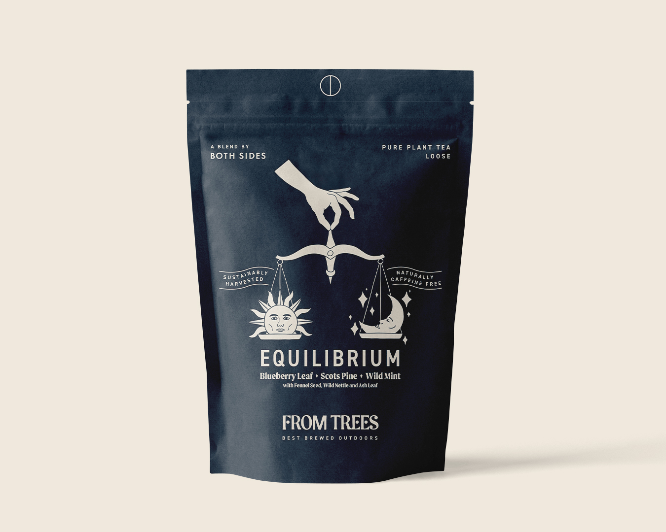
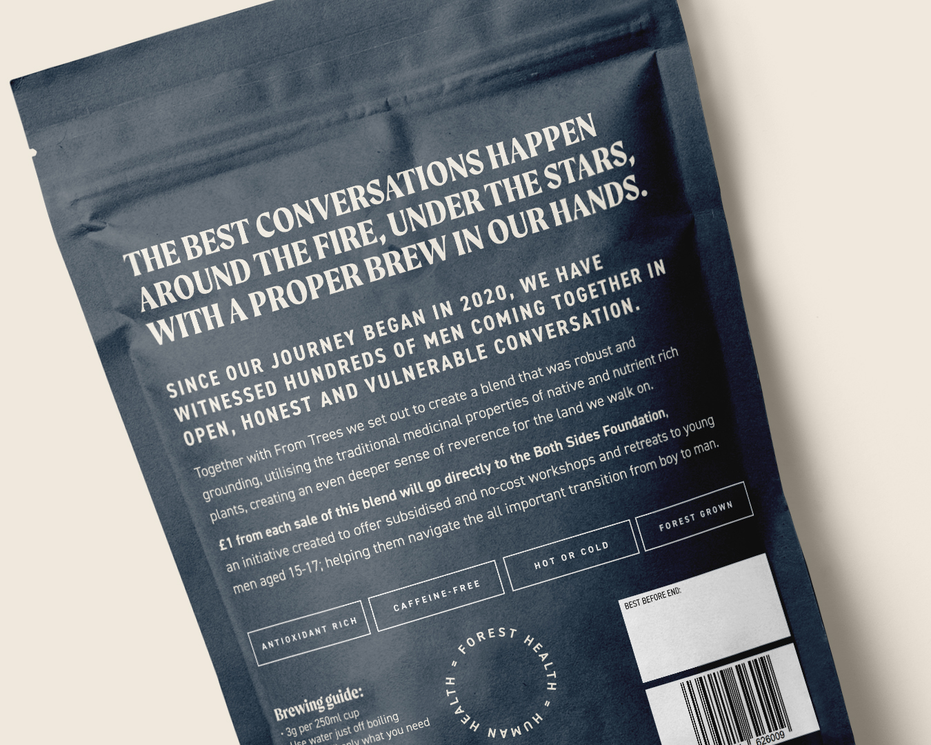
Meanwhile, caffeine-free plant tea, Equilibrium, is a collaboration between a charity connected to male-only retreats, and a Cornish tea company. Its brand and packaging was designed by Shepherd.

And in response to the crowded healthy tea category, Northern Ireland-based Thompson’s has relaunched its fruit and herbal teas, with packaging by BrandMe.

Hey! What? in Bristol won the SPILL work after replying to a LinkedIn post by its founders.

The SPILL branding on a tea tin

The name, which the founders already had, is about “spilling the tea on the tea industry,” where the big brands, unlike SPILL, typically blend teas from several countries, and don’t buy direct.

“SPILL has gone out with an everyday tea to disrupt the category,” says Hey! What? managing director Amy Gettings.

SPILL is aimed at a younger audience, adds agency creative director Christopher Rees, and that informed their design cues.

“Our visual starting point drew inspiration from premium beauty brands, those that balance honesty with clarity,” Gettings says.

Hey! What? in Bristol designed the branding for SPILL

The identity comprises a big ‘S’ – “I was trying to create something that’s spilled, in a big cartoony way. And the S made a little heart, which was fun and interesting,” Rees says.

Supporting typography, intended to look clean and contemporary, is Neue Haas Grotesk.

The team tapped into the tactile world of 1960s and 1970s kitchenware, in an effort to bring a sense of modern nostalgia to SPILL’s tins and bags.

And they developed an earthy, modular colour palette to grow with the brand as new SKUs launch.

The Brew Tea Co packaging design

SPILL’s biggest competitor is Brew Tea Co, says Gettings.

The Manchester-based brand was redesigned by Interabang, with a view to expanding it into the retail sector. This summer, Indian tea producer Luxmi Group bought a majority stake in the business.

Meanwhile, Cornish tea company From Trees has expanded its range with Equilibrium, a new variant which is a collaboration with Both Sides, a male-only retreat venture.

The retreats provide a physical, emotional and spiritual journey for men to rediscover and redefine masculinity in UK and continental Europe.

Harrison Webb, who operates as a sole trader in Cornwall as Shepherd, redesigned From Trees’ packaging in 2023, and was also responsible for the identity of Both Sides’ founder, ex-professional rugby player Anthony Mullally.

Webb says bringing together the two clients for Equilibrium wasn’t tricky, as “they’re nicely aligned, anyway.” He focused on the slow, calming nature of the brewing process, as the antithesis of the rushing coffee culture.


He kept the pack simple and bold, avoiding too much ornate pattern.

He hand-drew the sun and moon, which are intended to resemble Both Sides’ ideals, balancing strength and action with softer “down regulation” – when your nervous system drops into a sense of calm.

For the type, he paired DIN 2014, a simple, clear and concise Modern Grotesk font, with Moret, a serif display family that is bold, clear and dynamic but with a touch of calligraphic character, he says.

With so much activity in the tea sector, incumbent brands can start to look dated. This was the case for Thompson’s fruit and herbal teas.

BrandMe had worked with the Belfast business since 2012, redesigning its core black tea range – including the wordmark and tree – in 2022.

Thompson’s packaging design created by BrandMe

The central London agency was asked to give the fruit and herbal range more emotion, bring out the story of the Thompson family, and make it stand out against its many competitors.

Nielsen’s The State of Tea: 5 Key Trends report points to the growing popularity of natural and organic products, as consumers have a renewed focus on health.

“One of the biggest subcategories that aligns well with this shift is herbal teas, which have been growing in popularity in recent years,” the report says.

Alongside this is a growing demand for functional teas, it adds.

These are teas that are specifically designed to provide health benefits, such as turmeric tea and green tea.

Emma Ireland-Wakefield, BrandMe’s client business director recognised these trends.

“We saw that a lot of competitors are functional teas and talk about wellness, and lead their pack design with a health benefit.”

BrandMe decided to stay away from focusing on such benefits, and instead “heroed the ingredients,” Ireland-Wakefield says.

The team’s solution was soft, botanical illustrations by Anthony Miller.

The packs feature a big tree that wraps around the sides. To differentiate between varieties, each tea features the tree in a different colour, with a particular animal, such as an owl or a squirrel, within its branches.

Thompson’s wordmark and logo designed by BrandMe

There is also a silhouette of a parent and child under the visual identity tree, who are depicted interacting differently on each pack, like the boy being lifted onto his dad’s shoulders, or swung in the air. They represent the original Thompson father and son, who set up the business in 1896.

While the supermarket shelves are still packed with what Webb calls “dust-in-a-bag” English breakfast-style teas, patterns and pictures of tea leaves will continue to dominate.

Rees at Hey! What? agrees, pointing to the plethora of “traditional, safe packaging with serif fonts.”

But as the move to whole leaf and herbal tea continues, Webb predicts that pack design will become “much bolder and more abstract.”

So as tea-drinking habits change, studios will likely be called upon more frequently to help reposition and redesign our relationship with our national brew.

Source

By

Who should be the UK’s chief design officer?

I’m not sure anyone had “prioritise design” on their Donald Trump bingo card. But last week the president issued an executive order promising to “improve our nation through better design.”

It created a National Design Studio and a new post of chief design officer, to which Airbnb co-founder Joe Gebbia has been appointed.

His first task is to redesign more than 20,000 government websites. Gebbia has said he aims to make official government services as “satisfying to use as the Apple Store: beautifully designed, great user experience, run on modern software … an experience that projects a level of excellence for our nation, and makes life less complicated for everyday Americans.”

The initiative has a new one-page website, with copy that makes sure to butter up the boss before getting down to business.

“What’s the biggest brand in the world?” it asks. Oh crikey, big question.

“If you said Trump, you’re not wrong.” Right, I didn’t, but…

“But what’s the foundation of that brand? One that’s more globally recognised than practically anything else.”

I feel like you’re going to tell me.

“It’s the nation…where he was born. It’s the United States of America.”

Why the ellipsis? Should we read it like Dermot announcing the results of an especially fraught X Factor elimination?

It builds from there to be honest, a puzzling mix of weird stuff, very sensible stuff, and a magnificently petty jibe at President Nixon.

Anyway, we quite like the idea of a chief design officer for the UK, so here are some possible candidates, should the Prime Minister decide to follow his trans-Atlantic mate’s example.

Sir Paul Smith

A Catherine wheel of optimism, creativity and fun, Sir Paul Smith would be a really popular choice. Almost nothing in our lives – banknotes, driving licences, the official UK border at Heathrow – wouldn’t be improved by the famous Paul Smith stripes.

Ben Terrett

As one of the driving forces behind the GOV.UK redesigns, and the creation of the Government Digital Service’s Government Design Principles, Terrett has been there, done that. He’s a safe pair of hands, like bringing in Big Sam to steer a troubled team away from relegation.

Teo Connor

If the US turned to Airbnb for its first chief design officer, should the UK just follow suit? Teo Connor is a great designer and a spirited, empathetic leader. Having revamped the entire Airbnb app earlier this year, one thinks sprucing up the DVLA website would be a walk in the park.

Max Ottignon

Few speak more stirringly about the power of design than Ragged Edge co-founder Max Ottignon. If he asked me to abandon my family and march with him into battle, I’d do so in a heartbeat. Hell, I’d be at front, carrying his sigil. He’s also quite handsome, which I feel could be useful?

LinkedIn Haters

Anyone who’s ever posted an old and a new logo side-by-side and written, “half a million pounds for this?!” No, that’s not how it works. And you know that. But wilful misunderstanding aside, fine. You’re up. Godspeed.

Margaret Calvert

A designer whose work shapes our public spaces to this day and marries the technical aspects of design with the emotional. I get the sense she’d definitely say no, which only makes her all the more suited to the position. Also, her Unit Editions monograph is coming out soon, and this would be a useful promo tool for that.

Sir Jony Ive

If we want stuff to look more like Apple, why not just go and get the guy who made Apple look like Apple? He might have a pretty sweet gig at OpenAI, but surely he’d be up for this challenge. It would also be fun to see how his sometimes-gnomic way of speaking goes down on The One Show.

Victoria Beckham

When I Googled “famous British designers” I was quite surprised to find Posh Spice on the list. But not only does she have a successful fashion label, she’s married to arguably one of the British cultural icons of the past 30 years. We also know from the Netflix doc – and the ensuing meme – that she’s not afraid to massage the truth, which our public figures tend to be good at.

Kevin McCloud

The Grand Designs host is a strong contender here. Understands design? Check. Good communicator? Check. Has a finely-honed sense of the British public, our ambitious foibles, ruinous dreams, and logistical shortcomings? Check, check and indeed check!

Lisa Smith

From Wolff Olins to JKR and now Uncommon Creative Studio, Lisa Smith has the CV to waltz into this role. She also stands out in the design world for her willingness to call out where she thinks things aren’t working – in a public, articulate, and punchily forthright way.

Mary Berry

Bear with me! Berry might feel like a leftfield choice, but I think she could be a chance worth taking. A bona fide national treasure, she has exacting standards and a twinkle in her eye. You could imagine her using a fruity double entendre when facing down a dour parliamentary select committee.

Gerry McGovern

As Jaguar Land Rover’s chief creative officer, McGovern must have thickened his skin no end in the past year. That bullishness should stand him in good stead for when the inevitable vitriol rains down on the government’s attempts to rebrand, I dunno, the police or something. This? This is nothing! I did Jaguar mate…

Source