By

1950s petrol station wins photo of the year at architecture photography awards 2025

former petrol station wins photo of the year


The Architecture Photography Awards 2025 (APA 2025) announces its winners across 20 categories, presenting a survey of how photographers around the world interpret the built environment. From Icelandic churches and Sicilian cloisters to futuristic alpine huts and thunder-lit Hong Kong skylines, winning photographs form a global atlas of perspective that underscores architecture’s capacity to be seen as image, atmosphere, and narrative. 


In the Photo of the Year and winner of the Night & Low-Light category, Michael Luetge’s Architectural Minimalism captures a former 1950s petrol station in Hamburg’s Grindelviertel. Once defined by its sweeping canopy and now preserved as a listed building, the modest glass structure is framed at night as a composition of light, geometry, and urban memory.

Windows 5.9 by Werner Schwehm, winner in Windows


Architecture Photography Awards 2025 Explore Light and form


Light and its absence emerge as recurring protagonists in the rest of the awards categories as well. In Chi Ho Gary Ng’s Concrete Memento, sunlight funnels through the brutalist openings of Uji Station in Japan, spotlighting a solitary passerby on a staircase. His second APA 2025 winning entry, Hong Kong in the Veil, shifts to an urban scale, where skyscrapers pierce through thick sea fog at Victoria Harbour, backlit by a rare crimson sunset and the iconic silhouette of a junk boat.


Other winning images approach architecture through metaphor. Omar Garcia’s Vertical Piano renders the stacked balconies of Rotterdam’s Cooltoren tower as giant piano keys, illuminated at sunrise in black-and-white. Anthony Wang’s Ascension looks upward into the atrium of Atlanta’s Marriott Marquis, where John Portman’s spiraling interior seems to pull the viewer skyward.


Several works emphasize architecture’s dialogue with landscape. Paulo Sousa’s aerial view of the Monte Rosa Hut, winner of the Drone and Aerial category, shows the metallic structure glinting against the Swiss Alps, balanced delicately above the expanse of the Gorner Glacier. In Iceland, Joseph Dunatov photographs Stykkishólmskirkja, Jón Haraldsson’s 1990 church, whose sculptural forms rise starkly against the coastal town’s horizon.

Architectural Minimalism by Michael Luetge, photo of the year, winner in Night & Low-light


From Palermo’s Cloisters to Tehran’s Ice Cave


Dario Lo Presti’s Cloister of Monreale frames history and captures the Arab-Norman architecture of Palermo, a UNESCO World Heritage Site, where repeating arches echo centuries of craftsmanship. Jürgen Hammermann’s Museum Staircase turns Duisburg’s Küppersmühle Museum into a study of rhythm and circulation, while Parham Taghioff’s shot of Ice Cave in Tehran fuses futuristic white curves with a living green wall.


Minimalism and abstraction take on intimate registers. Masaki Yazaki’s Color Blocks isolates overlapping facades near his home, transforming everyday walls into geometric paintings. Josbel Tinoco’s Yellow Jam goes further into spatial fiction, dissolving orientation into a monochromatic yellow pattern of depth and illusion.

Cloister of Monreale by Dario Lo Presti, winner in Historic Architecture


architecture shaped by people, time and atmosphere


APA 2025 shows how architecture is brought to life by people and the environment around it. Mario Tarantino’s Interruption 1 captures a lone figure breaking the strict rhythm of a building’s design. Elizabeth Crane’s Bridge to Nowhere photographs the Zampa and Carquinez bridges in California disappearing into fog, turning solid infrastructure into something delicate. Ming Cheng’s The Dark Knight Awaits freezes a dramatic lightning strike over Hong Kong’s IFC tower, while car lights streak through the rainy city.


In black-and-white Vertical City, Silent Peak, Shuchuan Liu photographs Tokyo’s skyline from the Bunkyo Civic Center, setting the vertical rise of its towers against the timeless presence of Mount Fuji. Together, the APA 2025 winning photographs highlight the many ways architecture is seen and experienced. They show how buildings can be understood and felt through the changing contexts of time, atmosphere, and the people around them.

Concrete Memento by Chi Ho Gary Ng, winner in Light & Shadow

Color Blocks by Masaki Yazaki, winner in Minimalist

Monte Rosa Hut by Paulo Sousa, winner in Drone & Aerial

Bridge to Nowhere by Elizabeth Crane, winner in Bridges

Shadows in Valencia by Javier Perez, winner in Fine Art

Stykkishólmskirkja by Joseph Dunatov, winner in Open Theme

Ascension by Anthony Wang, winner in Symmetry

Interruption 1 by Mario Tarantino, winner in Human and Architecture Interaction

Yellow Jam by Josbel Tinoco, winner in Abstract and Geometric Forms

Prehistoric Spine by Werner Schwehm, winner in Reflections

Ice Cave by Parham Taghioff, winner in Interior Architecture


project info:


name: Architecture Photography Awards 2025 | @architecturephotographyawards

winning photographers: Michael Luetge, | @michaelluetge_photographie, Chi Ho Gary Ng | @Garyfive, Dámaso Ávila | @DAMASOAVILA, Omar Garcia | @nebtrxJavier Perez | @javivillas, Anthony Wang | @anthonyw_photog, Paulo Sousa, Joseph Dunatov | @dunatovdesign, Jürgen Hammermann | @limited_49, Parham Taghioff | @parhamtaghioff, Dario Lo Presti | @dariolop83, Masaki Yazaki | @masakichi.2222, Mario Tarantino | @mariotarantinophotography, Werner Schwehm | @Leipzig_trifft_Wien, Elizabeth Crane | @lizcraneart, Ming Cheng | @architectming, Shuchuan Liu | @chuanzai945, Josbel Tinoco

The post 1950s petrol station wins photo of the year at architecture photography awards 2025 appeared first on designboom | architecture & design magazine.
By

New designs mirror shifts in UK tea market

The tea aisle is reinventing itself as some consumers turn away from the mainstream builders’ brew in favour of quality black teas and healthy herbals.

In 1974, the average UK family shop included 68g – around 30 tea bags – per person. By 2023, that had dropped by two thirds, according to government figures.

Now a slew of new and reworked offerings have launched, while some mainstream brands are struggling.

Typhoo collapsed in 2024, with The Grocer putting its demise down to “a structural downturn in the traditional black tea market, amid other challenges”.

It has since been rescued by vape maker Supreme.

The SPILL branding on a tea tin

One new entrant promising to do things differently is SPILL, a black tea sourced directly from farmers in Rwanda.

The brainchild of the ex-founders of Teapigs, it launched in April, with design by Hey! What?

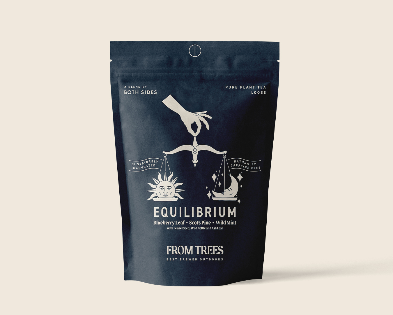
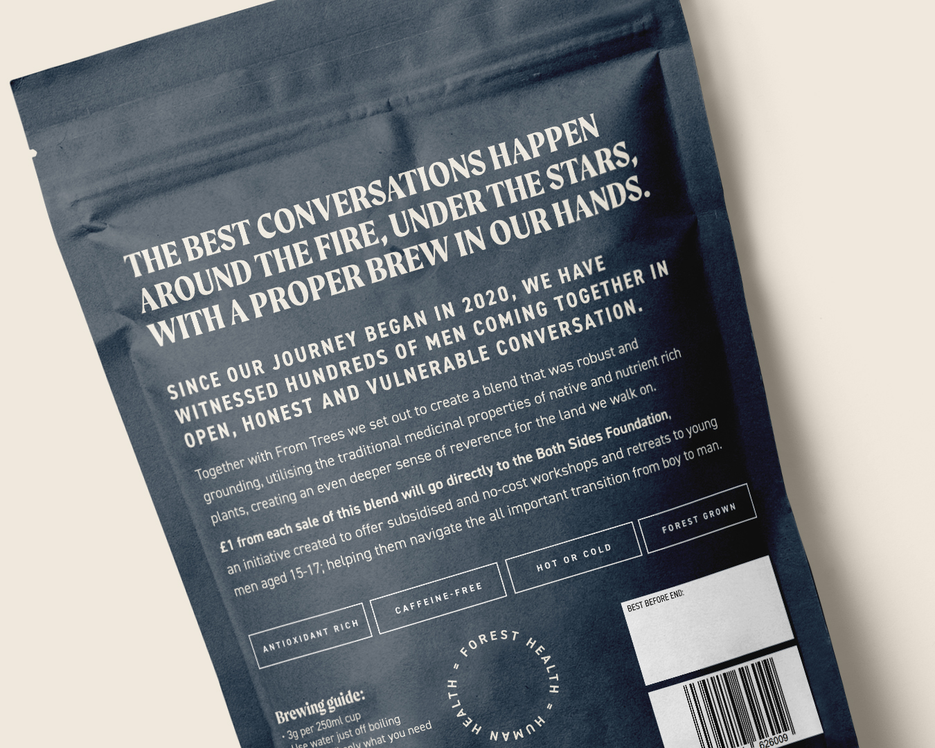
Meanwhile, caffeine-free plant tea, Equilibrium, is a collaboration between a charity connected to male-only retreats, and a Cornish tea company. Its brand and packaging was designed by Shepherd.

And in response to the crowded healthy tea category, Northern Ireland-based Thompson’s has relaunched its fruit and herbal teas, with packaging by BrandMe.

Hey! What? in Bristol won the SPILL work after replying to a LinkedIn post by its founders.

The SPILL branding on a tea tin

The name, which the founders already had, is about “spilling the tea on the tea industry,” where the big brands, unlike SPILL, typically blend teas from several countries, and don’t buy direct.

“SPILL has gone out with an everyday tea to disrupt the category,” says Hey! What? managing director Amy Gettings.

SPILL is aimed at a younger audience, adds agency creative director Christopher Rees, and that informed their design cues.

“Our visual starting point drew inspiration from premium beauty brands, those that balance honesty with clarity,” Gettings says.

Hey! What? in Bristol designed the branding for SPILL

The identity comprises a big ‘S’ – “I was trying to create something that’s spilled, in a big cartoony way. And the S made a little heart, which was fun and interesting,” Rees says.

Supporting typography, intended to look clean and contemporary, is Neue Haas Grotesk.

The team tapped into the tactile world of 1960s and 1970s kitchenware, in an effort to bring a sense of modern nostalgia to SPILL’s tins and bags.

And they developed an earthy, modular colour palette to grow with the brand as new SKUs launch.

The Brew Tea Co packaging design

SPILL’s biggest competitor is Brew Tea Co, says Gettings.

The Manchester-based brand was redesigned by Interabang, with a view to expanding it into the retail sector. This summer, Indian tea producer Luxmi Group bought a majority stake in the business.

Meanwhile, Cornish tea company From Trees has expanded its range with Equilibrium, a new variant which is a collaboration with Both Sides, a male-only retreat venture.

The retreats provide a physical, emotional and spiritual journey for men to rediscover and redefine masculinity in UK and continental Europe.

Harrison Webb, who operates as a sole trader in Cornwall as Shepherd, redesigned From Trees’ packaging in 2023, and was also responsible for the identity of Both Sides’ founder, ex-professional rugby player Anthony Mullally.

Webb says bringing together the two clients for Equilibrium wasn’t tricky, as “they’re nicely aligned, anyway.” He focused on the slow, calming nature of the brewing process, as the antithesis of the rushing coffee culture.


He kept the pack simple and bold, avoiding too much ornate pattern.

He hand-drew the sun and moon, which are intended to resemble Both Sides’ ideals, balancing strength and action with softer “down regulation” – when your nervous system drops into a sense of calm.

For the type, he paired DIN 2014, a simple, clear and concise Modern Grotesk font, with Moret, a serif display family that is bold, clear and dynamic but with a touch of calligraphic character, he says.

With so much activity in the tea sector, incumbent brands can start to look dated. This was the case for Thompson’s fruit and herbal teas.

BrandMe had worked with the Belfast business since 2012, redesigning its core black tea range – including the wordmark and tree – in 2022.

Thompson’s packaging design created by BrandMe

The central London agency was asked to give the fruit and herbal range more emotion, bring out the story of the Thompson family, and make it stand out against its many competitors.

Nielsen’s The State of Tea: 5 Key Trends report points to the growing popularity of natural and organic products, as consumers have a renewed focus on health.

“One of the biggest subcategories that aligns well with this shift is herbal teas, which have been growing in popularity in recent years,” the report says.

Alongside this is a growing demand for functional teas, it adds.

These are teas that are specifically designed to provide health benefits, such as turmeric tea and green tea.

Emma Ireland-Wakefield, BrandMe’s client business director recognised these trends.

“We saw that a lot of competitors are functional teas and talk about wellness, and lead their pack design with a health benefit.”

BrandMe decided to stay away from focusing on such benefits, and instead “heroed the ingredients,” Ireland-Wakefield says.

The team’s solution was soft, botanical illustrations by Anthony Miller.

The packs feature a big tree that wraps around the sides. To differentiate between varieties, each tea features the tree in a different colour, with a particular animal, such as an owl or a squirrel, within its branches.

Thompson’s wordmark and logo designed by BrandMe

There is also a silhouette of a parent and child under the visual identity tree, who are depicted interacting differently on each pack, like the boy being lifted onto his dad’s shoulders, or swung in the air. They represent the original Thompson father and son, who set up the business in 1896.

While the supermarket shelves are still packed with what Webb calls “dust-in-a-bag” English breakfast-style teas, patterns and pictures of tea leaves will continue to dominate.

Rees at Hey! What? agrees, pointing to the plethora of “traditional, safe packaging with serif fonts.”

But as the move to whole leaf and herbal tea continues, Webb predicts that pack design will become “much bolder and more abstract.”

So as tea-drinking habits change, studios will likely be called upon more frequently to help reposition and redesign our relationship with our national brew.

Source

By

Experimental Hook-and-Loop Attachment System for Walls and Floors

This ReCon Project, developed at Austria’s Graz University of Technology (TU Graz), proposes a hook-and-loop fastening system for wall surfaces.

While a true hook-and-loop arrangement (like that used in Velcro) isn’t possible with rigid surfaces, the research team came up with a close approximation. Protrusions were cast into concrete, and a flexible sheet material was 3D printed with corresponding protrusions on one face, allowing the sheet to be non-permanently adhered to the concrete.

“Such hook-and-loop systems make it possible to properly separate durable load-bearing structures that are intended to last for decades from more short-lived elements such as installations, surfaces, floors or non-load-bearing interior walls,” the researchers write.

That’s an intriguing proposal. I’ve recently had to replace subflooring and flooring, and am currently in the process of removing several hundred square feet of old wallpaper; both are messy, time-consuming jobs. Imagine a future where those things could simply be peeled off and replaced!

By

Top 5 Must-Have Gadgets & Gear For Effortless Event Coverage In 2025

If you’re heading to IFA 2025 in Berlin, you already know the drill. Massive exhibition halls stretch endlessly, product launches occur every hour, and back-to-back interviews with industry leaders take place, all under the constant pressure to capture everything worth covering. The world’s biggest consumer electronics show doesn’t mess around, and neither should your gear. Between navigating crowded press areas and chasing breaking announcements, having the right equipment can make the difference between professional coverage and completely missed opportunities that could define your reporting.

These five essential designs will keep you ahead of the chaos while everyone else is still fumbling with cables and dead batteries. From smart note-taking solutions that bridge analog comfort with digital efficiency to modular backpacks that adapt to changing coverage needs, this carefully curated toolkit ensures you’re properly equipped for comprehensive event coverage that stands out from the competition.

1. Almo

Most of us have tried going fully digital for note-taking, only to find ourselves missing the simple pleasure of pen on paper. The Almo gets this completely. Instead of forcing you into another app or complicated system, it lets you write naturally while adding just enough intelligence to make your life easier. Scribble down a meeting time next to your notes, and Almo spots it automatically, setting a gentle reminder without you touching a single button.

The magnetic back sticks to booth frames and equipment cases, while the kickstand works perfectly on those tiny press tables everyone fights over. The pen clips magnetically to the top because losing pens at trade shows is practically a universal law. As your deadline approaches, a subtle LED color shift gives you a heads-up without the jarring beeps that make you look unprofessional during quiet interview moments.

What we like

Handwriting recognition that works without making you change how you naturally write.
Smart mounting options that adapt to the weird spaces you end up working in at events.

What we dislike

Still a concept, so good luck buying one for this year’s show.
A small writing surface might frustrate people used to full-size notebooks.

2. Lancer300

Carrying camera gear to events usually means choosing between a bag that’s either too small for everything or too big for comfort. The Lancer300 solves this with a modular approach that makes sense. Start with the core pack for light days, then snap on modules when you need serious capacity. The exoskeleton frame looks a bit sci-fi, but it handles the abuse of constant movement while keeping your expensive toys protected.

The power station module transforms your backpack into a mobile charging hub. Cables run cleanly through the frame, so you can juice up cameras, drones, and even laptops while you walk. No more playing outlet roulette in crowded press areas or carrying a separate arsenal of battery packs. When that perfect shot opportunity hits and your camera’s at 15%, you’ll understand why this matters.

What we like

Modular design means you only carry what you need instead of lugging everything everywhere.
Built-in power system eliminates the anxiety of watching battery percentages drop during critical moments.

What we dislike

Learning curve for optimizing the modular setup might eat into your prep time.
Premium features probably mean premium pricing that’ll make your accountant wince.

3. Memento Business Card Log

Everyone exchanges LinkedIn details now, but there’s something powerful about physically handling someone’s business card while jotting down notes about your conversation. The Memento Business Card Log brings back this lost art without feeling outdated. It holds 120 cards with space for handwritten context about each person you meet. Those little details about shared interests or follow-up promises turn generic contacts into actual relationships.

The Japanese craftsmanship from Re+g shows in every detail. The binding system lets you reorganize pages easily, while the two-point card slots keep everything secure when you’re rushing between meetings. The paper feels substantial and inviting, encouraging you to slow down and actually think about the connections you’re making. In a world of digital overwhelm, taking time to write notes by hand signals true interest that people remember.

Click Here to Buy Now: $35.00

What we like

Handwritten context turns business cards into relationship-building tools instead of just contact info.
Japanese attention to detail makes this feel special rather than like another boring organizer.

What we dislike

Physical organization takes more effort than letting your phone handle everything automatically.
120 cards might not last through a major networking event if you’re working the floor.

4. Ridge Magnetic Power Bank

Event coverage means juggling multiple devices that all seem to die at the worst possible moments. The Ridge Magnetic Power Bank cuts through the usual cable chaos with a simple approach: wireless charging for your iPhone plus built-in cables for everything else. The magnetic connection holds strong enough that you can toss it in your bag without worrying about disconnection, while the 15W wireless charging keeps pace with your usage.

It truly handles real-world charging scenarios instead of trying to be everything to everyone. The built-in cables mean you’re never digging for the right connector when your camera battery hits red. The compact design disappears into jacket pockets, and the magnetic system works beautifully with existing MagSafe accessories. It’s not trying to revolutionize portable power; it’s just doing the basics well.

What we like

Built-in cables eliminate the eternal hunt for the right charging cord when you need it most.
Magnetic wireless charging that stays connected even when you’re moving around constantly.

What we dislike

Compact size means limited capacity for power-hungry professional gear.
Quality features typically come with quality pricing, so budget accordingly.

5. Lenovo C55

The best gear for event coverage isn’t the most expensive stuff. The Lenovo C55 proves this beautifully at just $70, offering excellent 4K video when you need a reliable backup or secondary angle. This little white camera isn’t trying to impress anyone or compete with your main setup. It’s just there when you need it, whether that’s grabbing B-roll while your primary camera handles the main interview or catching those spontaneous moments that happen between scheduled press events.

It is perfect for events and trade shows because the built-in ring light truly works. Anyone who’s covered IFA knows the lighting nightmare you’re walking into. One minute you’re under harsh exhibition spotlights, the next you’re squeezed into a dimly lit booth corner trying to get usable footage. Having that ring light built right in means you can grab clean interview shots anywhere without dragging lighting gear around. The physical dial feels solid and responsive when you need quick adjustments, and at 190 grams, it disappears into your bag until you need it.

What we like

Built-in ring light tackles lighting challenges without hauling additional equipment around.
Sub-$70 price point makes professional backup capability accessible to literally anyone.

What we dislike

The basic screen might make precise framing tricky in challenging lighting situations.
The compact size could get uncomfortable during longer recording sessions.

Getting Ready To Dominate IFA 2025

These five innovative tools work splendidly together without getting in each other’s way. The Almo keeps your thoughts organized while the Lancer300 carries everything you need, powered and ready. The Memento ensures those random booth conversations turn into meaningful connections, while the Ridge keeps your devices alive when outlets are nowhere to be found. The little Lenovo sits quietly in your bag until you need that perfect secondary angle or quick interview setup.

None of these will make you a better journalist or content creator overnight, but they’ll remove the friction that kills good coverage. When everyone else is scrambling for power outlets, untangling cables, or missing shots because their gear failed, you’ll be the one getting the story. IFA 2025 is going to be massive, chaotic, and essential for anyone covering tech. Show up prepared, stay mobile, and let your coverage speak for itself.

The post Top 5 Must-Have Gadgets & Gear For Effortless Event Coverage In 2025 first appeared on Yanko Design.

By

tadao ando breaks ground on national museum of uzbekistan in tashkent, set to open 2028

tadao ando’s National Museum of Uzbekistan starts to rise


The groundbreaking ceremony for the National Museum of Uzbekistan is set to take place today, on August 27th, 2025, in Tashkent, marking the start of Tadao Ando’s first large-scale commission in Central Asia. Scheduled to open in March 2028, the new institution is designed to become the country’s leading cultural landmark, conceived as both a civic hub and a gateway connecting the country’s heritage with global artistic exchange.


Previewed at the Uzbekistan Pavilion of Expo 2025 in Osaka, Ando’s design integrates his signature use of clear geometric volumes with spatial references to Uzbekistan’s architectural traditions. The 40,038 square meter building unfolds as a composition of three pure forms, a circle, a square, and a triangle, with exhibition design by German studio Atelier Brückner. ‘By building with these pure forms, I wanted to return to the origins of thought and create a space from which powerful ideas could be sent out into the world,’ shares Tadao Ando. ‘I hope that the Museum will serve as a new center of creative expression directed towards the world.’

renderings by Tadao Ando Architect & Associates, unless stated otherwise


A Home for more than 100,000 Artworks in Tashkent


Located in the heart of Tashkent, between the Abulkasym Madrasa, Istiqlol Art Palace, and the monument to Alisher Navoi, the National Museum of Uzbekistan situates itself in dialogue with the city’s historic fabric and its aspirations for cultural renewal. The project, commissioned by the Uzbekistan Art and Culture Development Foundation (ACDF), underscores the nation’s ambition to position art and culture at the core of its future identity.


The complex, designed by Japanese architect Tadao Ando, will house over 8,500 square meters of permanent and temporary exhibition halls alongside a public library, lecture hall, education rooms, conservation laboratories, and a multifunctional auditorium. A rooftop terrace and green zone extend the museum’s role into public life, while amenities such as a bookstore and café invite visitors to linger. 


The collection itself, one of the largest in Central Asia, numbers more than 100,000 works. Until now, only a fraction, around 2%, could be displayed at any one time. The new building resolves this limitation, providing space for both monumental installations and rotating exhibitions. Visitors will encounter pieces spanning Uzbekistan’s diverse traditions as well as works from East Asia, India, and Europe, many of which have remained unseen until now. ‘The National Museum of Uzbekistan reflects our revitalized cultural potential and serves as a vivid expression of our country’s noble aspirations to create creative spaces that inspire, unite, and set an example for future generations. It will stand as a majestic symbol of the New Uzbekistan, representing its rich heritage and openness to the world,’ notes President of the Republic of Uzbekistan Shavkat Mirziyoyev.


Tadao Ando’s first large-scale commission in Central Asia

the design integrates his signature use of clear geometric volumes

spatial references to Uzbekistan’s architectural traditions

commissioned by the Uzbekistan Art and Culture Development Foundation (ACDF)

the collection itself numbers more than 100,000 works | rendering by Atelier Brückner

the complex will house over 8,500 square meters of permanent and temporary exhibition halls | rendering by Atelier Brückner

the building also houses a public library, lecture hall, education rooms and more | rendering by Atelier Brückner

the National Museum of Uzbekistan is designed to become the country’s leading cultural landmark | rendering by Atelier Brückner

connecting Uzbekistan’s heritage with global artistic exchange | rendering by Atelier Brückner

amenities such as a bookstore and café invite visitors to linger | rendering by Atelier Brückner


project info:


name: National Museum of Uzbekistan

architect: Tadao Ando Architect & Associates

location: Tashkent, Uzbekistan

gross floor area: 40,038 square meters


exhibition design: Atelier Brückner | @atelierbrueckner

opening: March 2028

commissioned by: Uzbekistan Art and Culture Development Foundation (ACDF) | @acdfuz

The post tadao ando breaks ground on national museum of uzbekistan in tashkent, set to open 2028 appeared first on designboom | architecture & design magazine.

By

Abxylute’s Magnetic Snap-On Game Controller Clicks Into Mobile Fun

Mobile gaming has always had this one annoying problem: touchscreen controls feel terrible for anything more complex than Candy Crush. Most mobile controllers solve this by turning your sleek phone into a chunky handheld that barely fits in your pocket. Abxylute’s new snap-on magnetic controller takes a completely different approach that actually makes sense.

Instead of clamping onto your phone like some kind of medieval torture device, this controller attaches magnetically to the back using MagSafe or Qi2 compatibility. When you’re not gaming, it slides flat against your phone’s back, staying completely out of the way until you need it.

Designer: Abxylute (via Liliputing)

The slide-out mechanism feels surprisingly smooth and satisfying when you deploy it for gaming. The controller slides down below your phone in landscape mode, creating this mini-handheld experience without any of the usual bulk or setup hassle. The flat thumbsticks keep everything slim while still providing proper tactile feedback for precise control.

What makes this design genuinely clever is how it handles the portability problem that plagues most mobile controllers. You never have to remember to bring it because it’s always attached to your phone. No more leaving your controller at home or stuffing bulky accessories into already-crowded bags.

The Bluetooth connectivity adds another layer of flexibility that most attached controllers miss entirely. Sure, you can use it while snapped to your phone, but you can also detach it completely and prop your phone up on a table. This transforms quick gaming sessions into comfortable, ergonomic experiences where you’re not hunched over a tiny screen.

The control layout covers all the basics you’d expect: dual analog sticks, D-pad, XYAB buttons, start and select, plus rear triggers. Abxylute optimized the initial design for retro gaming, which makes perfect sense given how popular classic console emulation has become on smartphones. They’re also listening to community feedback for potential layout variations.

Compatibility looks promising since the magnetic system works with both MagSafe-equipped iPhones and Android phones using magnetic adapters. This universal approach means you won’t be locked into one ecosystem, and the controller can follow you through future phone upgrades without becoming obsolete.

The timing feels perfect as more phones adopt magnetic attachment standards. What started with Apple’s MagSafe is spreading to Android devices through Qi2, creating a whole ecosystem of magnetic accessories that actually stick properly and align consistently.

Abxylute has built their reputation on making gaming hardware that’s both affordable and practical, and this controller continues that philosophy. Instead of trying to reinvent mobile gaming entirely, they’ve focused on solving the specific problems that make current solutions annoying to use daily.

For anyone tired of choosing between terrible touchscreen controls and controllers that turn your phone into a brick, the Abxylute snap-on controller offers genuine hope. It’s the kind of accessory that could finally make mobile gaming feel as natural and convenient as it should have been all along.

The post Abxylute’s Magnetic Snap-On Game Controller Clicks Into Mobile Fun first appeared on Yanko Design.

By

Yamaha CrossWave is an ultimate water adventure craft

Yamaha is shaking up the watercraft world with the all-new 2026 Yamaha CrossWave, a personal watercraft that promises to change how you spend time on the water. This innovative machine blends the excitement of a WaveRunner with the practical features of a compact boat, making it perfect for families, anglers, and anyone who loves all-day adventures on the water.

The Yamaha CrossWave has a pretty unique 360-degree walkaround deck. Measuring an impressive 13 feet of flat, marine-matted space, the deck gives you the freedom to move, fish, or just relax in ways traditional PWCs can’t. Whether you want to cast a line, sunbathe, or simply enjoy unobstructed access to the water, the CrossWave has you covered. With comfortable seating for up to four people, it’s easy to bring your friends or family along for the ride.

Designer: Yamaha

Storage is another area where the CrossWave shines. With a massive 82 gallons of storage space, including dedicated rod holders, an anchor locker, and roomy stern compartments, there’s plenty of room for all your gear. Planning a fishing trip, picnic, or long cruise? You’ll appreciate the thoughtful storage solutions that keep your essentials secure and out of the way. Under the hood, the Yamaha CrossWave boasts the company’s most powerful engine yet, a 1.9-liter four-cylinder that delivers exhilarating performance and supports long-distance cruising. The generous 26.4-gallon fuel tank means you can spend more time exploring and less time refueling. Yamaha has also ensured the CrossWave is ready for anything, with prewiring for a Group 24 marine battery that can power everything from trolling motors to portable coolers.

One of the CrossWave’s most innovative features is the cleanout port, borrowed from Yamaha’s proven jet boats. Clearing debris from the jet intake is quick and simple, so you can spend more time on the water and less time dealing with maintenance. The CrossWave also makes navigation a breeze, thanks to twin 7-inch Simrad screens. These intuitive displays put navigation and entertainment right at your fingertips, making it easy to plan your route, check your location, and keep everyone entertained. Customization is effortless with the CrossWave’s T-track system, which runs the full length of the deck. Attach rod holders, secure coolers, or swap out gear depending on your plans for the day. This flexibility makes the CrossWave an ideal platform for fishing, exploring, or just relaxing with friends.

The 2026 Yamaha CrossWave is set to launch in spring 2026, and it’s already generating excitement among watercraft enthusiasts. It’s more than just a new PWC, it’s a whole new way to experience the water. Whether you’re chasing fish, searching for hidden coves, or just cruising on a sunny afternoon, the CrossWave delivers space, power, and adaptability like nothing else out there. Keep an eye out for this game-changing craft and get ready to redefine your adventures on the water.

The post Yamaha CrossWave is an ultimate water adventure craft first appeared on Yanko Design.

By

vincent leroy’s optical mobile of floating lenses dances with hot air balloons over cappadocia

Floating Fresnel Lenses shape a kinetic sculpture by Vincent Leroy


In the valleys of Cappadocia, French artist Vincent Leroy has installed Floating Lenses, a kinetic sculpture that interacts with wind, light, and the surrounding landscape.


The work is composed of concentric Fresnel lenses mounted on a carbon and 3D printed frame. Activated by natural air currents, the structure shifts gently, refracting and distorting its environment. As the morning balloons rise across the horizon, their forms appear multiplied, dissolved, and reshaped through the lenses, producing layered visual effects that alter the perception of space.

the lenses float between sky and earth | all images by Vincent Leroy Studio


Wind and light become active elements of the kinetic installation


Rather than functioning as a static object, the installation operates as a responsive surface. Each lens reframes fragments of sky and terrain, generating a continuous sequence of visual transformations. The project emphasizes the relationship between movement, optics, and landscape, where technology integrates with natural conditions instead of dominating them.


With Floating Lenses, artist Vincent Leroy extends his investigation into optical devices and kinetic structures, reinterpreting the Fresnel lens beyond its utilitarian origins. The installation highlights the potential of material and environmental forces, such as wind, light, and perspective, to create a spatial experience in constant flux.

the lenses capture the first rays of the sun

a silent visual choreography

the mobile echoes the morning dance of hot-air balloons in Cappadocia

a natural kaleidoscope in perpetual transformation

the work generates a spatial experience in constant flux

the installation is one with the landscape

the sculpture creates a dialogue between movement and optics

hot air balloons ripple and echo through the lenses, like a drifting mirage

close-up of refracted landscapes through a single lens


project info:


name: Floating Lenses

designer: Vincent Leroy | @vincent_leroy_studio

location: Cappadocia, Turkey


designboom has received this project from our DIY submissions feature, where we welcome our readers to submit their own work for publication. see more project submissions from our readers here.


edited by: christina vergopoulou | designboom

The post vincent leroy’s optical mobile of floating lenses dances with hot air balloons over cappadocia appeared first on designboom | architecture & design magazine.

By

studio bressan transforms italian farmhouse into residence with double-height glass portico

FARMHOUSE RENOVATION BY STUDIO BRESSAN


Studio Bressan transforms an old rural farmhouse into a contemporary residence, adding a new double-height glass portico to Casolare Biordo Vecchio, located in the hills of Asolo, Italy. This architectural gesture serves as a modern extension of the original dwelling’s traditional covered porch, marking a deliberate transition from an introverted to a more outward-facing condition. While the original stone facade remains largely discreet, the new addition fully unveils the home’s spaces to the landscape, creating a continuous dialogue between the building and its natural surroundings.

Studio Bressan transforms old farmhouse into a contemporary residence | all images courtesy of Studio Bressan


double-height glass EXTENSION brings in brightness


Located on a natural slope along Via Biordo Vecchio, the renovated farmhouse by Studio Bressan sits within a small cluster of homes facing the public road. Once past the entrance gate, the house reveals itself discreetly, dominated by the original stone facade that preserves the building’s history and ensures the privacy of the interior spaces. It is only upon rounding the southeast corner that the main architectural gesture — the expansion of the southern portico with a new double-height glass volume — unveils, creating a fan-shaped opening that frames the greenery and draws in the view, transforming the living area into a bright space.

the home is located in the hills of Asolo, Italy


living area unfolds as a single fluid space


Inside, the home’s interiors are warm and bright, defined by a palette of natural and textured surfaces. Floors of oak wood and travertine, light plaster finishes, and exposed beams tell the story of a strong bond with tradition. Natural light enters through wide openings, creating soft atmospheres, while the new portico becomes a living frame that brings the quietness of the hills indoors.


The spatial organization follows a clear and functional logic: the living area unfolds as a single fluid space with visual continuity to the outside, while the upstairs bedrooms retain a more intimate and reserved character. On the exterior, the exposed stone and pitched roof honor the region’s typical architectural language, while a natural, muted color palette helps the farmhouse blend harmoniously into the surrounding landscape.

the architects add a double-height glass extension, opening up the home to light, nature, and panoramic views

this architectural gesture serves as a modern extension of the original dwelling’s traditional covered porch

the fan-shaped opening frames the greenery and draws in the view, transforming the living area into a bright space

the home’s interiors are warm and bright, defined by a palette of natural and textured surfaces

natural light enters through wide openings

the upstairs bedrooms retain a more intimate and reserved character

the exposed stone and pitched roof honor the region’s typical architectural language

project info:


name: Casolare Biordo Vecchio
designer: Studio Bressan | @studiobressan
location: Asolo, Italy


designboom has received this project from our DIY submissions feature, where we welcome our readers to submit their own work for publication. see more project submissions from our readers here.


edited by: lisa kostyra | designboom

The post studio bressan transforms italian farmhouse into residence with double-height glass portico appeared first on designboom | architecture & design magazine.

By

Who should be the UK’s chief design officer?

I’m not sure anyone had “prioritise design” on their Donald Trump bingo card. But last week the president issued an executive order promising to “improve our nation through better design.”

It created a National Design Studio and a new post of chief design officer, to which Airbnb co-founder Joe Gebbia has been appointed.

His first task is to redesign more than 20,000 government websites. Gebbia has said he aims to make official government services as “satisfying to use as the Apple Store: beautifully designed, great user experience, run on modern software … an experience that projects a level of excellence for our nation, and makes life less complicated for everyday Americans.”

The initiative has a new one-page website, with copy that makes sure to butter up the boss before getting down to business.

“What’s the biggest brand in the world?” it asks. Oh crikey, big question.

“If you said Trump, you’re not wrong.” Right, I didn’t, but…

“But what’s the foundation of that brand? One that’s more globally recognised than practically anything else.”

I feel like you’re going to tell me.

“It’s the nation…where he was born. It’s the United States of America.”

Why the ellipsis? Should we read it like Dermot announcing the results of an especially fraught X Factor elimination?

It builds from there to be honest, a puzzling mix of weird stuff, very sensible stuff, and a magnificently petty jibe at President Nixon.

Anyway, we quite like the idea of a chief design officer for the UK, so here are some possible candidates, should the Prime Minister decide to follow his trans-Atlantic mate’s example.

Sir Paul Smith

A Catherine wheel of optimism, creativity and fun, Sir Paul Smith would be a really popular choice. Almost nothing in our lives – banknotes, driving licences, the official UK border at Heathrow – wouldn’t be improved by the famous Paul Smith stripes.

Ben Terrett

As one of the driving forces behind the GOV.UK redesigns, and the creation of the Government Digital Service’s Government Design Principles, Terrett has been there, done that. He’s a safe pair of hands, like bringing in Big Sam to steer a troubled team away from relegation.

Teo Connor

If the US turned to Airbnb for its first chief design officer, should the UK just follow suit? Teo Connor is a great designer and a spirited, empathetic leader. Having revamped the entire Airbnb app earlier this year, one thinks sprucing up the DVLA website would be a walk in the park.

Max Ottignon

Few speak more stirringly about the power of design than Ragged Edge co-founder Max Ottignon. If he asked me to abandon my family and march with him into battle, I’d do so in a heartbeat. Hell, I’d be at front, carrying his sigil. He’s also quite handsome, which I feel could be useful?

LinkedIn Haters

Anyone who’s ever posted an old and a new logo side-by-side and written, “half a million pounds for this?!” No, that’s not how it works. And you know that. But wilful misunderstanding aside, fine. You’re up. Godspeed.

Margaret Calvert

A designer whose work shapes our public spaces to this day and marries the technical aspects of design with the emotional. I get the sense she’d definitely say no, which only makes her all the more suited to the position. Also, her Unit Editions monograph is coming out soon, and this would be a useful promo tool for that.

Sir Jony Ive

If we want stuff to look more like Apple, why not just go and get the guy who made Apple look like Apple? He might have a pretty sweet gig at OpenAI, but surely he’d be up for this challenge. It would also be fun to see how his sometimes-gnomic way of speaking goes down on The One Show.

Victoria Beckham

When I Googled “famous British designers” I was quite surprised to find Posh Spice on the list. But not only does she have a successful fashion label, she’s married to arguably one of the British cultural icons of the past 30 years. We also know from the Netflix doc – and the ensuing meme – that she’s not afraid to massage the truth, which our public figures tend to be good at.

Kevin McCloud

The Grand Designs host is a strong contender here. Understands design? Check. Good communicator? Check. Has a finely-honed sense of the British public, our ambitious foibles, ruinous dreams, and logistical shortcomings? Check, check and indeed check!

Lisa Smith

From Wolff Olins to JKR and now Uncommon Creative Studio, Lisa Smith has the CV to waltz into this role. She also stands out in the design world for her willingness to call out where she thinks things aren’t working – in a public, articulate, and punchily forthright way.

Mary Berry

Bear with me! Berry might feel like a leftfield choice, but I think she could be a chance worth taking. A bona fide national treasure, she has exacting standards and a twinkle in her eye. You could imagine her using a fruity double entendre when facing down a dour parliamentary select committee.

Gerry McGovern

As Jaguar Land Rover’s chief creative officer, McGovern must have thickened his skin no end in the past year. That bullishness should stand him in good stead for when the inevitable vitriol rains down on the government’s attempts to rebrand, I dunno, the police or something. This? This is nothing! I did Jaguar mate…

Source