By

Inexpensive DIY Bamboo Disaster Relief Housing That Withstands Earthquakes

Myanmar’s disastrous civil war has displaced well over 3 million people. And even before the 2021 coup, there was a housing crisis, with demand far outstripping supply; the military conflict has only intensified that problem.

Yangon-based architecture firm Blue Temple is part of the solution. They launched an initiative called Housing NOW, whereby they designed simple—and surprisingly durable—houses that could be built out of locally-abundant bamboo.

The build concept is pretty simple: Bamboo’s everywhere, but it’s pretty thin and bendy. Bundle a bunch of shoots together, though, and now you have a bunch of structural members that are both strong and flexible.

And by first bending, then bundling them—rather like creating a bent lamination–you can create supporting archways.

The design is modular and can be scaled up.

The firm came up with two ways to execute the houses: A pre-fab version that uses steel tubing for joists and can be trucked to the site in parts, and a non-pre-fab that can be built in the field by families themselves, using Ikea-like assembly manuals printed and distributed by Housing NOW.

The most expensive parts of the design are the corrugated metal roof panels, the steel binding strips and the concrete footers. Even still, “Each unit can be built in under a week for the price of a smartphone,” the firm writes. And with the DIY version, there is little labor cost; families do most of the construction, under the supervision of Housing NOW’s technical team members.

Here’s the incredible part: Earlier this year, a 7.7 magnitude earthquake hit Myanmar, leveling the city of Mandalay. Twenty-six of Housing NOW’s bamboo houses were 15 kilometers (9.3 miles) from the epicenter, and “every house remained absolutely intact,” the firm reports. “The geometric system distributes seismic loads [as well as allowing] variations in layout and façade. The earthquake became the ultimate proof of concept: in one of the most fragile contexts on earth, bamboo housing delivered resilience and dignity at scale.”

It takes about seven days to build one of the houses, and thus far they’ve built 79 of them. More are in the works: Housing NOW has distributed around 500 of the DIY build manuals nationwide. And as the map below shows, their design and model could be used in a lot of different parts of the world.

By

IKEA’s miniature phone bed could be the endgame digital detox you deserve

The attractive screens of our smartphones keep us glued to the inevitability of doom scrolling, virtually turning us into mindless zombies. This is more of a problem when you lie down in your bed to scroll through social media content without realizing you are well past the recommended time to doze off. Blue light from phone screens disrupts the circadian rhythm, consequently affecting our daily lives in more ways than not.

The smart gadget has turned into a nemesis for many of us who just can’t get over the lure of putting the device aside and having a restful night’s sleep. Now IKEA wants to help you with dozing off at the right time every night by gamifying the daily chore, because nothing else is lucrative enough. The Swedish conglomerate specializing in ready-to-assemble furniture vows to curb your sleep habits by rewarding vouchers. According to Carla Klumpenaar, general manager of marketing, communications, HF & retail design at IKEA, “sleep is one of the most important design projects in our lives, yet it’s often the most overlooked.”

Designer: IKEA

IKEA is no stranger to creative campaigns, and its UAE division is all game for making people give up their nighttime scrolling habits. This is the Phon Sleep Collection, a miniature bed for your bestie gadget, that encourages you to get seven hours of sleep each night for at least a week. Complete the challenge and you’ll get a shopping voucher worth $27 to save on your next purchase. The wellness-centered campaign is only running in the UAE for now. To participate, you must spend at least 750 AED in IKEA’s store on the Complete Sleep range, which includes supportive pillows or breathable sheets. In return, you’ll receive a cute little bed for your phone absolutely free.

The flatpacked bed is easy to assemble and comes embedded with an NFC chip to track your sleep time. In conjunction with the IKEA app, your sleep tracking is kept for seven consecutive days. Achieve seven hours of sleep for seven days in tandem and you’ll be rewarded with the voucher. Carla adds that The Phone Sleep Collection, combining “design with a simple wellness solution,” empowers people to reclaim their nighttime routine, and “wake up recharged for what matters most.” This campaign emphasizes how small changes can have positive implications in your life.

This tiny bed has a simple design, much like the life-sized wellness and sleep solutions like the flat-pack beds. Putting the wooden slats together is as satisfying as assembling contemporary IKEA furniture. The pleasant click of piecing together the miniature bed will encourage you to put down your phone on it, the very first day you get hold of one. The idea is interesting as gamifying the whole exercise motivates one to have a positive digital detox every night.

The post IKEA’s miniature phone bed could be the endgame digital detox you deserve first appeared on Yanko Design.

By

Justified Studio’s La Sovrana rebrand leans into personality and place

Since 2017, La Sovrana has been bringing the freshest of Italian produce to London. The family-run wholesaler, led by brothers Alfonso and Pierpaolo Picaro, sources fruit and vegetables from their own farm in Campania, near the Amalfi Coast, and from a network of trusted growers across Italy.

La Sovrana’s London operation truly found its stride during the pandemic, as restaurant closures pushed demand for quality ingredients into neighbourhood shops, and many people rediscovered a passion for good food.

With business flourishing – and an outpost at New Covent Garden Market cementing their presence – the team realised their visual identity could no longer carry this growth, and approached London-based Justified Studio for a rebrand.

Beyond giving La Sovrana the confidence to move into fresh spaces, the new brand had to convey something deeper – the intentionality that underpins their trade.

Justified Studio’s identity for La Sovrana

“Being from England, I’ve grown up knowing I can get a peach or a lemon at any time of year – you just go to the supermarket and it’s always there, even if it’s all pretty shit, to be honest,” says founder and creative director Joshua Ogden.

“What’s interesting about La Sovrana is how deliberate everything is – the produce is grown for flavour, in season, and you can taste that intention. You never fully know what kind of cucumber you might get, for example, because it depends on the temperature, how it’s grown, what’s happened that year, and that’s directly tied to the taste. It’s a completely different way of thinking about food than what I grew up with.”

This proved to be fertile conceptual ground for Justified Studio to dig into. In a time when food is often engineered for convenience and efficiency, La Sovrana stands for the opposite – produce meant to be savoured, grown with patience, purpose, and generations of knowledge.

Justified Studio’s identity for La Sovrana

“The freshness of our produce doesn’t just come from how quickly it reaches the market; it comes from knowing when to pick it,” says Alfonso Picaro. “That’s knowledge my family has passed down. My brother can walk through a farm and know which tomatoes are at their peak, which ones have the right colour, the right ripeness – the perfect moment to harvest.”

Justified Studio wanted the rebrand to capture La Sovrana’s deep-rooted know-how, but without creating something stiff or weighed down by tradition. “We didn’t want to make it feel like a heritage brand,” says Ogden. “We wanted something forward-looking, with subtle nods to nostalgia.”

The team also wanted the identity to feel grounded – a reflection of where La Sovrana’s produce and its knowledge come from. When Picaro invited them to the warehouse, they were instantly drawn to the typography on packaging boxes and sticker labels on fruits – the everyday graphics of southern Italy.

Pulling on these typographic strands, they crafted a custom wordmark, a thick, curvy serif with a hand-rendered warmth.

The wordmark

The letterforms, deliberately close-knit – almost fused – evoke “the bleeding ink when a label is printed on cardboard,” as Ogden notes. Flourishes on the ‘S’ and ‘V’ give the mark presence, allowing it to command attention across market shutters and van liveries.

“We wanted the wordmark to carry the same sense of trust as a good fruit sticker,” says Ogden. “Those labels have always been a quiet mark of quality, a sign that what’s inside has been chosen with care. The logo needed to feel the same way.”

The bespoke mark was paired with Archivo as the primary typeface – chosen for its simple, yet impactful and strong weight – while IBM Plex Serif was handpicked for tagging systems and body copy to ensure clear distinction and hierarchy.

Colour became another vehicle for storytelling. The team combined the vivid hues found in La Sovrana’s produce, and the softer, sun-bleached tones of the Amalfi region, referencing vintage travel posters and the faded palettes of seaside hotels. Together, they evoke a certain Italian-ness, and this was crucial.

Justified Studio’s identity for La Sovrana

“Alfonso’s the only Italian in a very British market,” says Ogden. “So whenever you see La Sovrana, it needed to feel proudly Italian – bright, expressive, and full of that freshness and beauty you get from his produce.”

The Amalfi lemon seen in the logo – La Sovrana’s “most distinctive product,” as Picaro puts it – became another stamp of belonging. The photography extends that feeling of familiarity; shot on film, it lends the identity a nostalgic softness, while also providing a flexible system for growth – a tool that can adapt as the brand scales.

“We put a strong emphasis on imagery because it will always be central to what La Sovrana does,” says Ogden. “Rather than building a system full of graphic elements and shapes, we focused on a powerful logo mark and beautiful imagery, something that could act as an editorial vessel that can take the brand wherever it wants to go next.”

Justified Studio’s identity for La Sovrana

Source

By

Clever Use of Augmented Reality: Tracing Virtual Art to Quickly Create Murals

The other day I saw something funny: I drove past a house with a long privacy fence that had been painted white, and across it, someone had spraypainted “Mural-ideas@gmail.com” (or something similar.) I found it funny because if the e-mail address owner was not the house owner, they were essentially forcing the house owner to re-paint the fence; and if the e-mail owner and the house owner was the same person, it means they couldn’t even come up with a good idea for a mural to advertise their own services, just their scrawled e-mail address.

In any case, as we’ve seen with Hanif Panni’s clever work, painting murals takes a great deal of skill. And I’m not saying the artist below isn’t skilled, but she has come up with a techno hack that makes her job a good deal easier. Said artist, who works as a mural painter in the Mexican city of Nava, uses an AR headset to virtually overlay her drawings on the surfaces she’s working.

Then all she has to do is trace it.

The end product, by the way…

…is glow-in-the-dark:

The artist says she’s using a Meta Quest 3.

This reminds me of Foundation Year exercises at art school, where they had us trace drawings by old masters. Perhaps in the coming years, those exercises will be done by a bunch of kids wearing goggles.

By

5 Best Travel-Friendly Personal Care Products For Digital Nomads

Digital nomads face unique challenges when it comes to personal care while constantly on the move. Traditional toiletries create a perfect storm of travel headaches: liquid restrictions, bulky packaging, breakage risks, and the endless hunt for replacement products in foreign countries. Smart nomads know that every gram matters when living out of a backpack, and every product must earn its place through multifunctionality and reliability.

The solution lies in embracing innovative design that reimagines everyday essentials. These five revolutionary personal care products represent a new generation of travel gear, engineered specifically for location-independent professionals who refuse to compromise on grooming standards. From paper razors that eliminate TSA liquid hassles to precision tools that last decades, each item transforms routine maintenance into effortless efficiency.

1. Paper Razor

Forget everything you know about disposable razors contributing to plastic waste. The Japanese Paper Razor revolutionizes travel shaving with an origami-inspired design that’s 98% plastic-free while maintaining the cutting performance of premium disposables. Weighing just 4 grams and measuring 5mm flat-packed, this innovation fits anywhere while delivering surprisingly robust performance.

The water-resistant paper construction withstands temperatures up to 104°F, perfectly suitable for lukewarm travel showers. The metal head features a notched channel for easy rinsing, and the ergonomic folded design provides genuine grip control. Available in five colors, these razors solve the nomad’s dilemma of carrying sharp objects through security while maintaining grooming standards across multiple countries.

What we like

Flat-pack design takes up virtually no luggage space.
TSA-friendly with no liquid restrictions or safety concerns.

What we dislike

Single-use design requires constant replenishment during long trips.
Paper construction may feel unfamiliar compared to traditional plastic handles.

2. Lifelong Deo 2.0 Refillable Deodorant System

The deodorant dilemma has plagued travelers since commercial aviation began enforcing liquid restrictions. Traditional deodorants either leak, break, or get confiscated, leaving nomads scrambling for replacements in foreign pharmacies. The Lifelong Deo 2.0 eliminates every pain point with a revolutionary powder-based system that you mix with water at home, creating fresh deodorant on demand.

This isn’t just another eco-friendly gimmick pretending to solve environmental problems. The refill pouches are completely compostable and paper-based, arriving flat-packed for global shipping efficiency. Each applicator removes 1kg of ocean plastic through verified partnerships, making your grooming routine actively beneficial to the planet. The 64 color combinations ensure your bathroom aesthetic stays on-brand wherever you land.

Click Here to Buy Now: $28.2 $46.9 (40% off). Hurry, only 91/300.

What we like

Eliminates liquid restrictions and TSA confiscation risks completely.
The lifetime guarantee means you’ll never buy another deodorant applicator again.

What we dislike

Requires mixing with water, which might not always be available.
The initial setup cost is higher than traditional deodorants.

3. one&done Toothbrush

Toothpaste tubes represent peak travel inefficiency: they’re heavy, prone to explosive leakage, and constantly trigger liquid restrictions. The one&done Toothbrush eliminates this entire category of problems by integrating a PEZ-dispenser mechanism directly into the handle, storing and dispensing toothpaste tablets with mechanical precision. This design ensures perfect dosage control while maintaining a compact form factor.

The lightweight construction battles tooth decay without the mess that characterizes traditional tube-based systems. Each tablet provides exactly the right amount of cleaning power, eliminating waste while guaranteeing consistent results regardless of your location. The integrated storage means you’ll never face the morning horror of discovering your toothpaste exploded throughout your luggage during overnight flights.

What we like

Eliminates toothpaste tube leakage and liquid restriction hassles.
Precise tablet dosing prevents waste and ensures consistent oral hygiene.

What we dislike

Requires purchasing specific toothpaste tablets rather than universal paste.
Mechanical dispenser adds complexity that could potentially malfunction.

4. Auger PrecisionLever Nail Clipper

Most travel nail clippers are afterthoughts: flimsy tools that barely function when you need them most. The Auger PrecisionLever represents a completely different philosophy, engineered by Kai Corporation’s century of blade-making expertise to deliver professional results in a compact 86mm form factor. The patented rotating lever system maximizes cutting power while maintaining surgical precision control.

The weighted 67g construction provides satisfying stability without bulk, slipping easily into any dopp kit while delivering performance that rivals dedicated manicure tools. Stainless cutlery steel blades slice cleanly through even thick nails without tearing or splitting, ensuring professional presentation regardless of your location. This isn’t just a nail clipper; it’s a precision instrument designed to last decades of constant travel.

Click Here to Buy Now: $49.00

What we like

Patented rotating lever delivers maximum cutting power with minimal effort.
Century-proven Japanese steel construction ensures lifetime reliability.

What we dislike

Higher price point than basic travel nail clippers.
Increased weight may concern ultralight packers.

5. Auger PrecisionGrip Tweezers

Precision grooming becomes critical when your professional image directly impacts your income potential. The Auger PrecisionGrip Tweezers deliver surgical accuracy through an ultra-fine, angled tip that grips even the finest hairs without slipping, ensuring flawless execution whether you’re shaping brows before client meetings or eliminating stray facial hair during video calls.

The patented stopper system prevents lateral slipping that degrades ordinary tweezers over time, maintaining unwavering tension for controlled, effortless grooming across years of constant use. The ergonomic finger groove naturally conforms to your grip, reducing hand fatigue during detailed work while ensuring absolute steadiness. This level of engineering transforms routine maintenance into moments of mechanical satisfaction.

Click Here to Buy Now: $29.00

What we like

Patented stopper system maintains precision alignment over years of use.
Ergonomic design reduces hand fatigue during extended grooming sessions.

What we dislike

Premium pricing places them above basic travel tweezers budget-wise.
Surgical precision may be overkill for casual grooming needs.

The Digital Nomad Advantage

These five products represent more than simple travel optimization; they embody a fundamental shift toward intelligent design that serves modern mobility demands. Each item eliminates traditional pain points through genuine innovation rather than marketing gimmicks. The result transforms personal care from daily travel friction into seamless routine maintenance that supports rather than hinders location independence.

Smart nomads understand that premium tools pay dividends through reliability, efficiency, and professional presentation across diverse environments. These products ensure your grooming standards remain consistently high, whether you’re working from Balinese co-working spaces or presenting to clients from Tokyo hotel rooms. Investment in quality travel-optimized personal care creates the foundation for sustained nomadic success.

The post 5 Best Travel-Friendly Personal Care Products For Digital Nomads first appeared on Yanko Design.

By

“Excellent ordinary” – how the UK’s new rail clock was designed

Last week at London Bridge Station, Rail Clock was unveiled to the public.

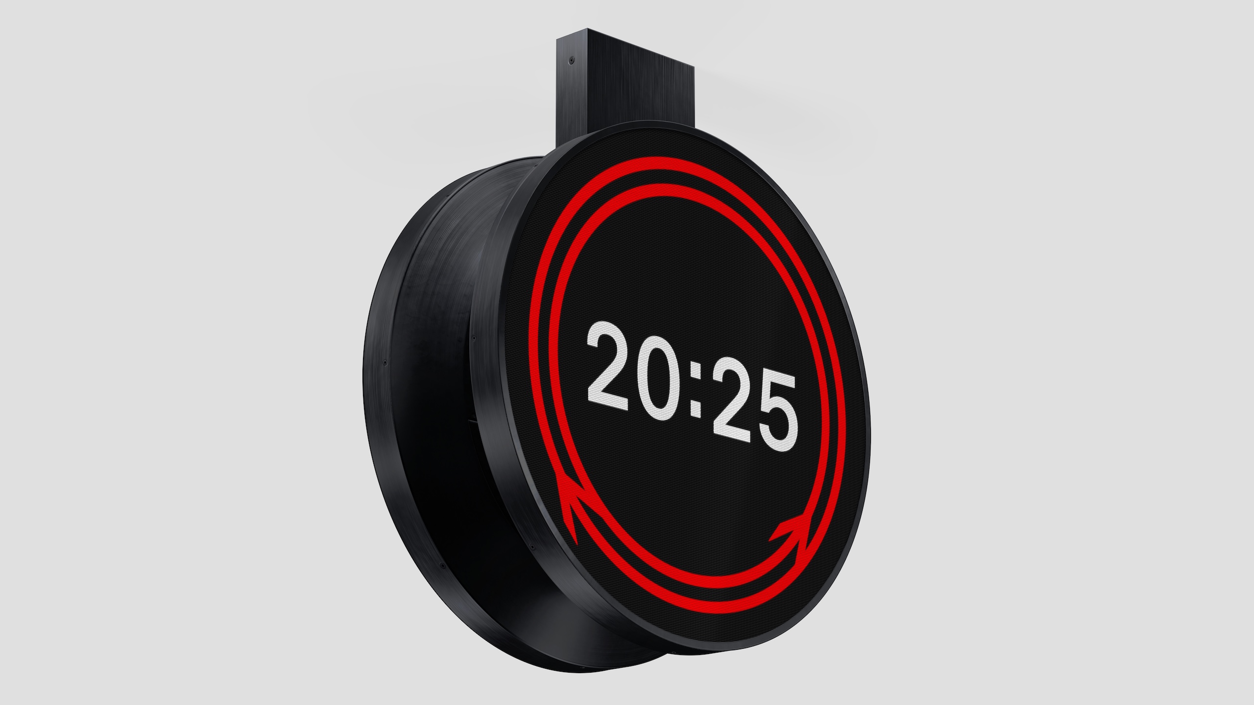
The striking circular design, which uses both Gerry Barney’s 1965 double arrow motif, and Margaret Calvert’s Rail Alphabet 2 typeface, will roll out across the UK’s rail network in both physical and digital iterations.

It was designed by Design Bridge & Partners, who won a competition run by Network Rail, the Royal Institute of British Architects (RIBA) and the Design Museum, which attracted more than 100 entries.

But the journey which led to Rail Clock actually began in 2018, when Network Rail embarked on a mission to improve design across our railways.

“We wanted to elevate the importance of design, because it’s so important to passengers and the communities around stations,“ explains Anthony Dewar, professional head of buildings and architecture at Network Rail.

“We felt that as an industry, we’d lost that connection as to why design was so important.”

So seven years ago, Network Rail ran a design competition around station footbridges; then in 2021 they looked at station design.

The success of these previous contests fed Dewar’s belief that design could play an integral part in improving everyone’s experience on the railways. And in that time, Network Rail’s open source design guidelines have been adopted by rail networks across the world.

For 2025 – which is the railway’s 200th birthday – Network Rail decided to focus on clocks.

“When you’re getting a train, you look for the platform, and you look for the time,” Dewar says. “That’s why a clock is one of the most important parts of a passenger journey.”

So they launched a contest for a “standardised, consistent and accessible design to significantly enhance the passenger experience, while reflecting the design and brand history of the railway.”


The UK hasn’t had a standard clock design since 1974, when it was set out as part of British Rail’s corporate design guide. And, Dewar explains, privatisation has created a network of sub-brands on our railways, and “a proliferation of different types of clock.”

Network Rail worked with RIBA and Design Museum to create the brief, and to ensure it was as open as possible. It was deliberately called a timepiece competition, not a clock competition, “because we didn’t want to set preconceptions about what we wanted,” Dewar says.

Design Bridge and Partners was one of many studios attracted to the complex but exciting brief – how do you create something both iconic and practical, or “excellent ordinary” as Dewar and his team described it.

The agency kicked off with informal lunchtime brainstorms, which included both creatives but also other staff interested in the brief, says Mark Wood, creative partner at Design Bridge and Partners.

This resulted in a wide range of ideas, including some “lovely, crazy ones” like a transparent clock with animated birds flying onto it.

Rail Clock by Design Bridge and Partners at London Bridge station

As they honed their ideas down to their final entries, the focus became finding something that spoke to, and celebrated, the UK’s design heritage.

“It was key to come up with an idea that could only ever be for our railway,” Wood explains.

“Obviously the Swiss railway clock is a beautiful thing, but that’s for the Swiss railway. So that led us to the double arrow symbol, which is a fabulous design, and one of the things you associate with Britain.”

The more they played with Barney’s 1965 design, the more it felt right. “The essence of the double arrow is all about connecting people,” Wood says. Stations he points out, echoing Hugh Grant’s voiceover at the start of Love Actually, are more than transitional spaces that get people from A to B.

“There is an emotional attachment to train stations,” Wood says. “Stand there for ten minutes and you see people hugging, and meeting each other or dropping people off. Parents in tears because their son or daughter is getting on a train to go to university.

“So how could we make that work as a bigger storytelling device? Once that story became circular, it led to the movement of the arrows meeting at the bottom.”

Rail Clock by Design Bridge and Partners at Charing Cross station

Using Calvert’s Typeface 2, digitised by Henrik Kubel, also seemed like an obvious decision, but the team wanted to strike a balance between adopting these symbols and re-positioning them for the modern-day.

“It’s a really tricky balance,” says Kevin Lan, creative director at Design Bridge and Partners. “The double arrow was very forward-thinking for its time. And because of privatisation we don’t see it that much anymore, particularly on trains. But it’s almost like a crown jewel of an asset, and it would seem a bit silly to ignore it.”

The question the design team kept asking, Wood adds, was, “ What could we do to it that doesn’t break it?”

Rail Clock was one of more than 100 entries that Network Rail received. Many of them, Dewar says, were “very similar” to the Swiss railway clock, which he notes drily is what Chat GPT suggests if you ask it to outline a new clock design.

After winnowing it down to a final five, Design Bridge actually had two entrants in the list, alongside ideas from Bath studio Matter, London-based Seymourpowell, and Paris agency AREP.

Over a series of workshops, the judges made it clear that Rail Clock was their preferred Design Bridge entry, and in the end it emerged as the chosen design. “It was a stand-out different submission,” Dewar says. “I think the other three were all analogue clocks.”

“We had to do things in a very measured way. But that doesn’t mean you can’t achieve excellence.”

In finalising the design, Design Bridge went out of their way to make sure Barney, Calvert and Kubel were happy with the way their designs had been used.

“These are some serious heavyweights in graphic design,” Lan laughs. “With Jerry, we were fucking with his logo – we bent it and made it move in a way maybe never thought about. So we had to get him on board.”

Barney, for his part, was “thrilled” to see his creation form part of the new design, and described the new clock as “really magic.”

“Design should evolve,” Wood says, “while still staying true to the original ideas. There’s always room for doing something different, but doing it in a respectful way was really important.”

Dewar adds that Network Rail also consulted experts in the UK’s rail design history, including Dr David Lawrence, who has written several books for Network Rail, and designer Nick Job, who runs the Double Arrow website, dedicated to British Rail’s corporate identity, and whom Dewar describes as a “a walking encyclopedia.”

A mock up of Rail Clock by Design Bridge and Partners outside a station

Once the designs were finalised, the team had to think about how they could be rolled out across the country, and across different mediums.

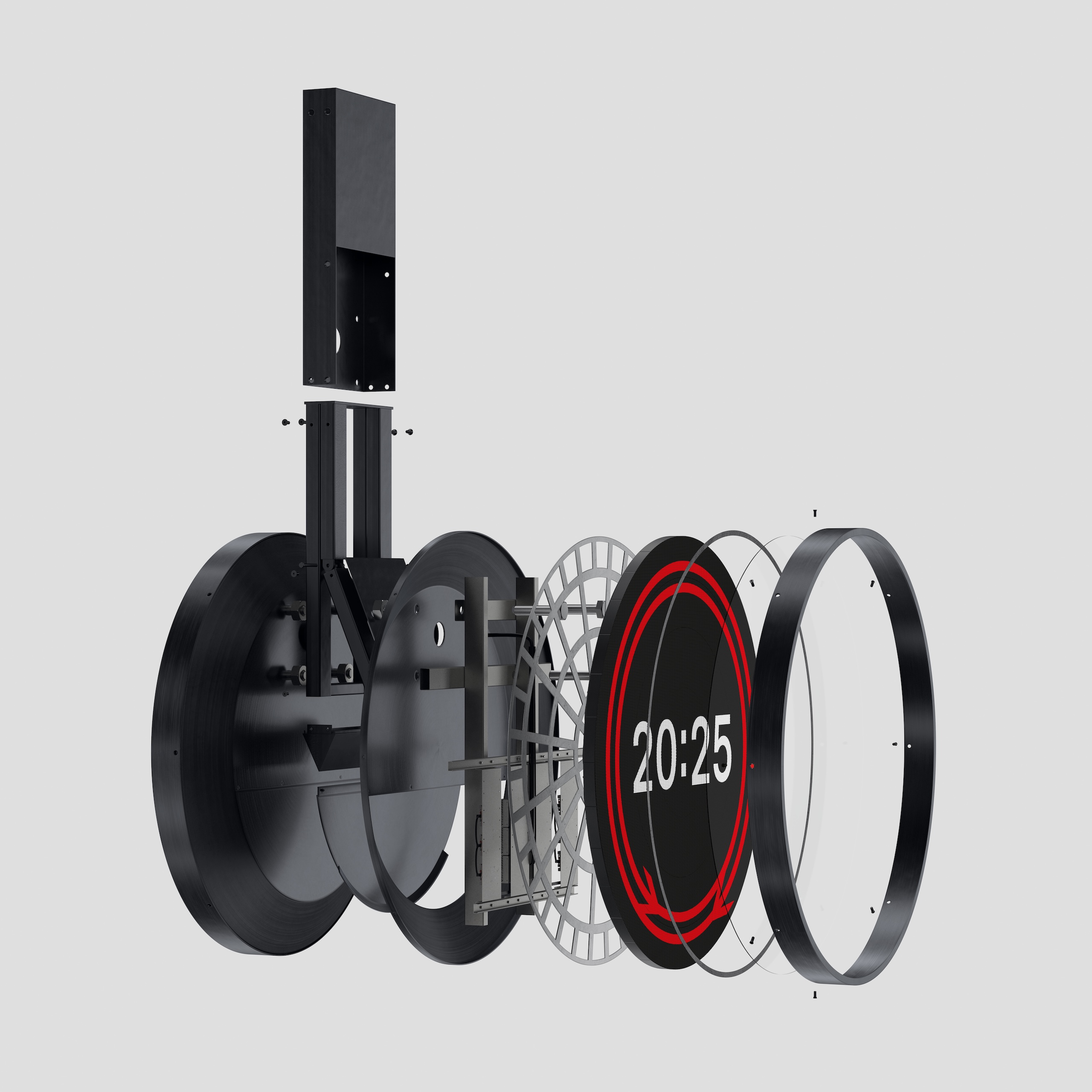
There were practical considerations for the physical versions – “We discovered round screens are quite hard to make,” Wood says – but also wider questions about adapting it to show up in different ways, from departure boards, to trains, to a soon-to-be-released app.

“The ambition is that this needs to be everywhere” Lan says.

“And it’s the repetition that will make it iconic,” Wood adds.

Rail Clock launched with the 1.8 metre version in London Bridge, and on screens at around 25 stations across the country. To assuage Twitter anxiety, Wood points out there are no plans to replace the beautiful clocks in stations like London Victoria.

There are plans to install physical versions in as many stations as possible, but Lan accepts that with public finances under pressure, there are other bits of the rail network that need money spent on them first.

The digital roll-out ensures they can get the designs out “rapidly, so that more people can appreciate it and understand it,” he says.

Similarly for Dewar and his team, the unveiling last week is just the start.

“I’m still recovering from the launch, in a really positive way,” he says. “There’s several years worth of work here, and we’ve had discussions that have gone into an incredible level of technical detail.

“But there’s something in the beautiful simplicity of Rail Clock. It looks like it should have always been there, and to achieve that with a piece of physical design is very difficult.

“We used the phrase ‘excellent ordinary’ in the brief because we’re aware of the pressures on public funding. We had to do things in a very measured way. But that doesn’t mean you can’t achieve excellence.”

Source
By

This $60 Power Bank Comes With 300 Games Built In

Remember when your biggest worry was keeping your phone charged, and your greatest joy was sneaking in a few rounds of Tetris during your lunch break? Well, someone in Japan just figured out how to give you both at the same time, and honestly, it’s kind of genius.

Oscar Japan Inc. has introduced the Mobile BOY, a portable power bank that doubles as a fully functional retro gaming console, giving you something to do while you wait for your dead phone to charge. Think of it as the love child between your old Game Boy and that emergency charger you keep in your purse.

Designer: Oscar Japan

Built into the back of this 5,000mAh MagSafe-compatible battery is a complete gaming system loaded with 300 retro titles that don’t require WiFi or any internet connection. No downloads, no updates, no wondering if you have enough data left. Just pure, simple gaming whenever boredom strikes.

The design is wonderfully nostalgic without trying too hard. While the name blatantly cribs from the Nintendo Game Boy, its layout mirrors classic handheld consoles from the ’80s and ’90s, with directional buttons on the left and command controls on the right. It fits in your pocket, looks sleek enough to pull out in public, and the rounded edges make it comfortable to hold during those longer gaming sessions.

What makes this particularly clever is how practical it is. The 5,000mAh capacity handles most modern smartphones for a single full charge, and it works with any device that supports wireless charging. For iPhone users with MagSafe, it snaps right onto the back of your phone magnetically. Android users aren’t left out either, as long as your phone has wireless charging capabilities.

A tiny screen on the bottom left displays battery percentage, and when the power bank itself needs juice, it charges via USB-C. There are also two small speakers for game audio, and a wrist strap attachment on the upper right side so you can game without worrying about dropping it. It’s these little details that show someone actually thought about how people would use this thing in real life. Color options include silver, pink, and black, each with a black display background for easy reading. The pink option is particularly appealing for those of us tired of tech that only comes in masculine colors. It weighs just 3.63 ounces, so it won’t weigh down your bag or pocket.

Here’s the catch, though. The Mobile BOY is currently available through Oscar Japan’s crowdfunding campaign, with early-bird pricing starting around ¥8,400 ($56) and general release pricing at ¥8,960 ($60). Delivery is expected in December, initially focusing on the Japanese market with potential international expansion. So if you’re outside Japan, you might need to wait a bit or use a forwarding service.

For retro gaming collectors, this hits differently than most tech gadgets. It’s not trying to be the most powerful gaming device or hold the most charge. Instead, it’s solving a very specific problem: what do you do when you’re waiting for your phone to charge and you’re bored out of your mind? The answer, apparently, is to play the same games that kept you entertained in middle school. At around $60, it’s affordable enough that you don’t need to justify it as a serious tech investment. It’s more like treating yourself to something fun that also happens to be useful. And in a world where most gadgets are either purely practical or purely entertaining, finding one that manages to be both feels like a small victory.

The post This $60 Power Bank Comes With 300 Games Built In first appeared on Yanko Design.

By

MAGMA brings its pages to paris exhibition with works by charles ray, jonas mekas and more

MAGMA turns ITS PAGES into PARIS EXHIBITION


With its third issue, The Archive of the Future, MAGMA transforms from printed matter into lived experience and takes shape in a spatial exhibition at 127 rue de Turenne in Paris. Conceived by Matière Noire together with MAGMA and presented with the support of Bottega Veneta, the show invites visitors to move from reading to presence and translate the multidisciplinary spirit of the journal into space. 


Open until November 19th, 2025, the exhibition features works by Charles Ray, Jonas Mekas, Yoko Ono and John Lennon, Patti Smith, Jean-Luc Godard, and others. Its contemplative environment resists the accelerated pace of the contemporary art circuit and encourages a more intimate form of attention.

installation images by Nicolas Brasseur


The Archive of the Future: inhabiting the rhythm of a book


The Archive of the Future exhibition brings together original works featured in the publication, including paintings, sculptures, photographs, and time-based media, and proposes an unusual encounter with art’s past, present, and speculative temporalities. Its scenography, developed by Matière Noire, builds an atmosphere of deceleration, an invitation to inhabit the temporal rhythm of a book. The visitor walks through an archive still in the making, an assemblage of voices, gestures, and memories. To ‘inhabit a book,’ as the curators describe, is to experience art as a shared duration, where reading becomes listening and viewing becomes dwelling. Throughout its month-long run, screenings, readings, performances, and conversations with participating artists become parts of the exhibition.


Among the works on view are five poetic voice recordings by sculptor Charles Ray, who for fifteen years has recorded reflections during solitary dawn walks across Los Angeles. His Five Prose Poems (2022), curated by Jean-Pierre Criqui and Cyrus Goberville, open the exhibition with the intimacy of spoken thought.


Nearby, two portraits by Elizabeth Peyton, The Death of Sarpedon (2025) and L’Aigle à deux têtes (Les Amants) (2024–2025), extend the artist’s delicate exploration of desire and temporality, while a group of unpublished Polaroids by Jonas Mekas, accompanied by drawings by Yoko Ono and John Lennon, anchors the show in a spirit of artistic camaraderie.

MAGMA transforms from printed matter into lived experience


fragments of history and homage


A sequence of works by Jill Mulleady pays homage to Lautréamont’s hermaphrodite through painting, granite, and woodcut, while Pol Taburet’s bronze and charcoal pieces merge spiritual symbolism with corporeal immediacy. Stanislava Kovalčíková contributes Die gute Hirtin (2025), an oil and foil painting that reflects her ongoing dialogue with archetypes of femininity and devotion.


On a larger scale, Michelangelo Pistoletto’s Black and Light (2024) reflects both viewer and world through the artist’s signature mirrored surface, while Michel Journiac’s monumental La Guillotine (Piège pour une exécution capitale) (1971) reasserts its political and performative charge in the present. Jos de Gruyter & Harald Thys present a new series of wood prints from 2025, furthering their surreal, psychologically charged practice.

The Archive of the Future issue takes shape in a spatial exhibition


From Godard’s Lens to Smith’s Voice


The MAGMA exhibition’s filmic and sonic program spans nearly a century of creation. Jean-Luc Godard’s first film, Opération Béton (1954), is screened in full, accompanied by a new sound work by Stephan Crasneanscki that weaves fragments of Godard’s own voice and recordings from his archive. Crasneanscki’s Mardi 13 Sept. 2022 Rolle (2025), produced by the Biennale Son, captures the soundscape of Lake Geneva on the day of Godard’s death, folding private mourning into collective memory.


The cinematic thread continues with Jonathan Glazer’s Strasbourg 1518 (2020), inspired by the historical episode of involuntary dancing mania and featuring choreography by dancers from Pina Bausch’s Tanztheater Wuppertal set to a score by Mica Levi. The exhibition closes with Patti Smith’s The Reluctant Master (2021), a piece originally included in Stephan Crasneanscki’s What We Leave Behind, bringing the show’s themes of transmission and legacy full circle.

the contemplative environment resists the accelerated pace of the contemporary art circuit

Pol Taburet, Leleco‘s walk, 2025, Charcoal on Paper ©2025 Pol Taburet © ADAGP, Paris, 2025 | image courtesy of the Artist and Mendes Wood DM Sao Paulo, Paris, Brussels, New York

the show invites visitors to move from reading to presence

the MAGMA exhibition’s filmic and sonic program spans nearly a century of creation

Jean-Luc Godard’s first film, Opération Béton (1954), is screened in full

Archive of the Future brings together original works featured in the publication | image courtesy of MAGMA

an unusual encounter with art’s temporalities | image courtesy of MAGMA

Precious Okoyomon, But Did You Die? 2024 ©2024 Precious Okoyomon Published by Serpentine and Wonder Press Courtesy of the artist

Jonas Mekas, Dumpling Party Polaroids, 1971 Unique set of 6 polaroids, with writing by John Lennon and Yoko Ono on verso © 1971 Jonas Mekas Courtesy the Estate of Jonas Mekas and APALAZZOGALLERY

featuring works by Charles Ray, Jonas Mekas, Yoko Ono and more | image courtesy of MAGMA

Jonas Mekas, Dumpling Party Polaroids, 1971 Unique set of 6 polaroids, with writing by John Lennon and Yoko Ono on verso © 1971 Jonas Mekas Courtesy the Estate of Jonas Mekas and APALAZZOGALLERY

translating the multidisciplinary spirit of the journal into space | image courtesy of MAGMA


project info:


name: MAGMA No. 3 — Archive of the Future

publication: MAGMA | @magmajournal

location: 127 rue de Turenne, 75003 Paris

set design & scenography: Matière Noire | @matiere.noire.paris


dates: October 20th – November 19th, 2025

curation & artistic direction: Paul Olivennes

head of content production: Louise Brunner

associate editor: Boris Bergmann

graphic direction: Helena Kadji & Rocío Ortiz Faye and Gina

production & technical team: CentralSV

executive and creative production: Louis Matton, Thomas Bihoré-Allegret

support: Bottega Veneta 

The post MAGMA brings its pages to paris exhibition with works by charles ray, jonas mekas and more appeared first on designboom | architecture & design magazine.

By

ulf mejergren builds mobile red cottage on scissor lift as a response to climate change

Lift House proposes movable architecture for climate resilience


Lift House by Ulf Mejergren Architects (UMA) is a compact gabled timber house refuge mounted on a mobile scissor lift. Designed for the exhibition Beredd (Ready) at ArkDes – The Swedish Center for Architecture and Design – the project explores architecture’s capacity to adapt to changing environmental conditions.


The installation responds to increasing climate instability, including more frequent rainfall and flooding, by proposing a structure that can temporarily rise above the ground when necessary. The concept engages with research from Linköping University, which outlines three primary strategies for managing environmental risk: protection, adaptation, and retreat. Lift House suggests a fourth option, temporary retreat, introducing mobility and flexibility as means of resilience.

all images by Oskar Omne unless stated otherwise


Industrial mechanics meet vernacular form in UMA’s Lift House


Constructed from a repurposed scissor lift originally used by ArkDes, the project integrates themes of reuse and resource efficiency. The lift mechanism and supporting frame were retained and coated in traditional Swedish red paint, forming the base for a small timber structure. The upper house features wooden panel cladding, a gabled roof, and a simplified chimney fabricated from CNC-cut MDF. The combination of industrial mechanics and vernacular form establishes a dialogue between technical function and domestic familiarity.


Ulf Mejergren Architects (UMA) studio prioritizes material efficiency throughout the design process. With a lift capacity limited to 227 kilograms, each component, from structure to decorative details, was carefully calculated and adjusted to maintain balance and stability. Lace curtains and minimal interior elements evoke a sense of domesticity while emphasizing lightness and precision. Lift House operates as a functional prototype as well as a conceptual proposal. It reflects on the relationship between architecture, mobility, and environmental change, suggesting how small-scale, adaptable structures can offer temporary safety and autonomy in uncertain conditions.

Lift House by Ulf Mejergren Architects is a compact refuge mounted on a mobile scissor lift

the project was created for the exhibition Beredd (Ready) at ArkDes in Stockholm

the house can be elevated above ground level during extreme weather events

Lift House acts as a conversation piece during climate debates at ArkDes | image by Sima Korenivski

the concept introduces ‘temporary retreat’ as a new form of climate resilience | image by Sima Korenivski

the timber upper house features panel cladding, a gabled roof, and a simplified chimney | image by Sima Korenivski

lace curtains and minimal furnishings introduce a domestic quality


project info:


name: Lift House (Hisshus)

architects: Ulf Mejergren Architects (UMA) | @ulfmejergrenarchitects


curators: Kris Johnson-Jones, Olle Lundin, ArkDes

exhibition producer: Carl-Oskar Linné

production team: Hangmen Studio – Kelvin Douglas, Oscar Persson Lidgren

climate research: Sofie Storbjörk, Associate Professor at Linköping University

photographers: Oskar Omne | @oskaromne, Sima Korenivski


designboom has received this project from our DIY submissions feature, where we welcome our readers to submit their own work for publication. see more project submissions from our readers here.


edited by: christina vergopoulou | designboom

The post ulf mejergren builds mobile red cottage on scissor lift as a response to climate change appeared first on designboom | architecture & design magazine.

By

This Concept Device Combines a Trackball, Dial, and Touchpad in One

Creative work demands tools that are both precise and intuitive, but most input devices stick to the same formulas that have existed for decades. You’ve got your mouse, maybe a graphics tablet, and countless keyboard shortcuts to memorize. The result is a workflow that feels fragmented, forcing you to juggle multiple devices instead of focusing on actual creative decisions.

The id360 TOUCHSTONE concept imagines a different approach entirely. This concept device blends the tactile satisfaction of a trackball, the control of a kinetic dial, and the versatility of a multi-touch zone into one sculptural desktop companion. It’s designed for creative professionals, video editors, and music producers who want their tools to feel as refined as their work.

Designer: lisostep

TOUCHSTONE’s form is calm and minimal, with a low, rectangular base and a prominent trackball at its center. The speckled, stone-like finish gives the device a tactile, architectural presence that feels more like a carefully chosen desk object than typical computer hardware. The gentle curves and understated silhouette are designed to complement creative workspaces without demanding constant attention.

The LED ring surrounding the trackball provides subtle visual feedback, glowing softly to indicate active modes or parameter changes. This lighting adds personality and reinforces the device’s high-tech yet elegant aesthetic. The overall design feels balanced and composed, bringing a sense of calm precision to otherwise chaotic creative environments.

The large trackball offers fluid, precise cursor control perfect for scrubbing video timelines, navigating complex audio projects, or moving through detailed design files. The kinetic dial integrated around the trackball’s base delivers haptic feedback, letting users make incremental adjustments with satisfying, tactile clicks that feel deliberate and controlled rather than imprecise or floaty.

A multi-touch zone surrounds the trackball, supporting gestures for zooming, panning, or triggering custom shortcuts. This seamless integration of touch and tactile input is designed to streamline workflows, reducing the need to switch between mouse, keyboard, and tablet throughout the day. All three input methods work together rather than competing for attention.

Every curve and texture is engineered for comfort and precision, with an ergonomic tilt that reduces wrist fatigue during marathon editing sessions. The compact, low-profile design ensures TOUCHSTONE doesn’t clutter valuable desk space. The device’s sound design, developed with Sonoroll, enhances interaction through carefully crafted audio feedback for clicks, rotations, and touches.

Video editors could scrub timelines with the trackball while adjusting parameters with the dial. Music producers could navigate sessions using touch gestures while fine-tuning levels through haptic rotation. Designers could position elements with trackball precision while switching tools through multi-touch shortcuts, all without reaching for a keyboard.

The concept comes in both black and white finishes, each with the same speckled texture and glowing trackball. TOUCHSTONE is a concept that rethinks what input devices can be when design, ergonomics, and functionality receive equal priority throughout development, creating tools that inspire as much as they enable.

The post This Concept Device Combines a Trackball, Dial, and Touchpad in One first appeared on Yanko Design.