By

swiss-made zuriga E2-S espresso machine masters precision in a compact, A4-sized footprint

ZURIGA SIMPLIFIES HOME ESPRESSO WITH TWO-BUTTON INTERFACE


From its inception in 2016, ZURIGA was driven by the idea of creating a home espresso machine, designed to be compact, fast, durable, and above all, easy to use. The resulting ZURIGA E2-S strips away any unnecessary complexity, featuring just two buttons: one to power the machine, and the other to start the espresso shot. This focus on the essentials also ensures speed, making it ready for the first espresso in just 90 seconds. Countering the market of oversized, elaborate devices, the compact design is small enough to fit on an A4 sheet, proving that high-quality design can perfectly fit any kitchen countertop.

ZURIGA E2-S strips away any unnecessary complexity for creating home espresso | all images courtesy of Zuriga


 A COMMITMENT TO DURABILITY AND REPAIRABILITY


The company‘s journey began when founder Moritz Güttinger took apart his home espresso machine and decided he could improve it. After two years of development, ZURIGA launched with a successful crowdfunding campaign, selling out all available machines within just five minutes. The company grew to a 40-person team that develops, designs, and builds high-quality machines in the heart of Zurich, Switzerland, in a manufactory situated in an industrial site once used to repair locomotives.


Committed to a philosophy of ‘Design for Repair,’ the connections inside a ZURIGA machine are exclusively screwed, never glued, ensuring that every single component can be individually repaired or replaced. To guarantee a long life, the company keeps spare parts in stock for at least 20 years. This dedication extends even to products with minor cosmetic flaws, which are sold under the ZURIGA:re label to ensure functionally new devices remain in circulation.

the espresso machine is designed to be compact, fast, durable, and easy to use


STAINLESS STEEL ESPRESSO MACHINE HANDMADE IN ZURICH


The ZURIGA E2-S draws inspiration from the classic archetype of a small espresso machine. The shape avoids additive details, instead it is presenting a continuous, curved casing that gives it a volumetric presence. This signature housing is crafted from a single piece of stainless steel shaped to wrap around the machine’s inlay. Complemented by anodized aluminum on the top and front, the machine gains a protective golden tone from a special process that guards against espresso splashes. Additional materials, sourced from local production partners, include walnut for the portafilter and laboratory glass for the water tank. Each machine is handmade in Zurich, consisting of 318 individual parts.

the first espresso is ready in just 90 seconds


Beyond material durability, the engineering prioritizes precision over industry convention. ZURIGA deliberately moved past older technology, using its own advanced system to achieve the same professional, commercial-grade temperature stability. The Z2 heating unit regulates water temperature by measuring it over ten times every second. Crucially, the system does not preheat water, and combined with thermal insulation and an intelligent shut-off, it guarantees maximum energy efficiency, setting a new standard for a top energy rating. 


This focused engineering was applied to introduce a steam function. The high-performance unit heats up in just 20 seconds to deliver unlimited steam for beverages like cappuccinos and lattes. Notably, the machine’s exterior silhouette is kept unchanged, with no new switches — only the discreet steam wand reveals the new function. ZURIGA also extends its exacting standards to its in-house grinder, a separate, complex device requiring maximal precision for burr adjustment. It adheres to the same ZURIGA design principles — durable and repairable — and substitutes a glass container for the industry-standard plastic.

ZURIGA also extends its exacting standards to its in-house grinder

this separate, complex device requiring maximal precision for burr adjustment

its the compact design is small enough to fit on an A4 sheet

project info:


name: E2-S

company: Zuriga | @zuriga.coffee

The post swiss-made zuriga E2-S espresso machine masters precision in a compact, A4-sized footprint appeared first on designboom | architecture & design magazine.

By

ghana’s first precast rammed earth project by deroche projects hosts community tennis court

DeRoche Projects completes rammed earth tennis court in ghana


Backyard Community Club in Accra, Ghana, designed by DeRoche Projects, introduces a model for community space in a city with limited access to green and recreational areas. Centered on a clay tennis court, the project combines sport, learning, and ecological practice within a compact urban site. It also represents Ghana’s first use of a precast rammed earth system, adapting a traditional building material for contemporary, scalable construction.


The most significant technical leap of the project lies in the pioneering use of precast rammed earth panels, developed specifically for Ghana’s climatic and labor conditions. Traditional rammed earth, while sustainable, is typically slow and weather-dependent, limiting its use in large-scale projects. The architects introduce off-site fabrication, which allows for controlled production, precision, and faster delivery. Panels are modular, easily transported, and adaptable to future sites, presenting a replicable model for sustainable construction in the region. ‘We wanted the architecture to carry the same sense of purpose as the programming, grounded, expressive, and innovative,’ adds Glenn DeRoche.

all images by Julien Lanoo


in Backyard Community club, training meets togetherness


Set within a compact urban plot in Osu, the Backyard Community Club includes spaces for training, gathering, and cultivation. A clay tennis court at its heart provides a professional-standard environment for athletes under 18, while free lessons open access to the sport for local children. A floating bench embedded along the shaded perimeter doubles as both seating and an observation deck, encouraging informal exchange between players and community. Around the court, simple ancillary spaces, changing rooms, showers, outdoor counters, and barbecue areas integrate into the landscape, designed with natural light and cross-ventilation rather than mechanical systems.


Wrapped in a 4-meter-high rhythmic enclosure of precast rammed earth panels, the modular structure filters wind and casts intricate shadows. ‘Backyard is about more than tennis, it’s about creating a platform for youth, for mentorship, and for community,’ says Glenn DeRoche, creative director of the team at DeRoche Projects. ‘We developed a custom precast system that acts as both structure and expression, pushing construction to meet the ambition of a purpose-built community space. The architecture is deliberately open-ended, where lines between sport, gathering, learning, and rest are blurred.’

Backyard Community Club in Ghana introduces a model for community space


A Living Landscape of Nourishment and Sustainability


Extending from the court, a 230-square-meter sustenance garden cultivates more than twenty species of edible and medicinal plants, including guava, banana, lemongrass, peppermint, soursop, and coconut. Its purpose is practical rather than ornamental, as it nourishes young athletes while teaching ecological responsibility. Youth also learn to tend and harvest alongside training. Ingredients are used for juices, snacks, and community meals prepared on site, while the garden itself becomes a social ground for exchange and self-reliance. When not in use for matches or training, the court transforms into a multipurpose community space for exercise, produce markets, outdoor screenings, and evening gatherings.


Sustainability operates at both material and systemic levels. The project prioritizes low-carbon, locally sourced materials, using rammed earth to enclose the clay court while reducing reliance on imported or energy-intensive components. Because clay courts require consistent moisture, the team implemented a borehole system and stormwater harvesting strategy to irrigate both the playing surface and the surrounding vegetation, minimizing use of municipal water. An earth slurry finish replaces conventional cement render, allowing the walls to breathe while lowering embodied carbon. Passive ventilation and natural daylighting eliminate the need for air conditioning, ensuring low operational energy across all structures.

centered on a clay tennis court, the project combines sport, learning, and ecological practice

Ghana’s first use of a precast rammed earth system

the modular structure filters wind and casts intricate shadows

adapting a traditional building material for contemporary, scalable construction

precast rammed earth panels are developed specifically for Ghana’s climatic and labor conditions

a replicable model for sustainable construction in the region

a 230-square-meter sustenance garden cultivates more than twenty species of edible and medicinal plants

the court transforms into a multipurpose community space for exercise, produce markets and more


project info:


name: Backyard Community Club

architect: DeRoche Projects | @derocheprojects

location: Osu, Accra, Ghana, West Africa


photographer: Julien Lanoo | @julienlanoo

The post ghana’s first precast rammed earth project by deroche projects hosts community tennis court appeared first on designboom | architecture & design magazine.

By

JDO refines Jameson’s brand and packaging

Founded in 1780, Jameson is the world’s best-selling Irish whiskey. With a legacy that runs deep, its green bottle, logomark and crest have become iconic over time.

Still, longevity brings its own pressure to stay relevant. Jameson’s new identity, created by JDO, looks to strengthen what people already know and love, while subtly modernising how it’s presented.

“It’s important for us to stay current and future-proof the brand,” says global marketing manager Claire Henry.

She says they spoke with whiskey drinkers, bartenders and retailers, “from dimly lit bars in New York to busy off-licences in Johannesburg,” and that highlighted “clear opportunities to make Jameson stand out more distinctly.”

In 2018, Jameson led a redesign centred on its flagship whiskey, the Original. This time, the scope was broader. JDO was tasked with creating visual harmony across the full portfolio, while subtly updating the Original.

JDO’s brand and packaging redesign for Jameson

The aim was twofold – to invite new drinkers in, and to give long-time fans clearer paths to explore and trade up within the Jameson family.

“We also realised the packs could do a better job of telling each whiskey’s story,” says Henry. “And we wanted to make it easier for people to see the differences between the products and understand how the range fits together.”

The team at JDO had to tread a fine line. On one hand, there was the heritage of the legacy brand, which called for careful, considered design decisions. On the other hand, there was the irreverent spirit of “the serious whiskey that does not take itself too seriously.” The two had to meet halfway.

Certain elements, such as the arched logo, the recognisable crest, and the seal (or the lollipop), were iconic in their own right, so “ensuring that they remained magnetic was really key to the brief we gave JDO,” says Henry.

The creative challenge was to take what already worked and sharpen it to reveal more of its character.

The updated wordmark

The crest was re-sculpted to stand taller on the pack, while the wordmark was given a taller cap height to lend it more presence. The team refined the serifs, tightened the drop shadows, and added a “nick” to the crossbar of the ‘A.’

Every detail was a question of restraint, knowing what to keep and how far to push change. “There’s so much equity in that logo around the world that throwing the baby out with the bathwater would’ve been a bit of a crime,” says JDO’s creative director Ben Ridley.

The tweaks to the typography, coupled with the introduction of a brighter colour palette, bring a touch of playfulness to the brand’s visual voice, as does the art direction.

“Introducing the bottle illustration gives us flexibility; we don’t need a flawless, high-gloss render every time,” says Ridley. “It can feel looser, more characterful.”

JDO introduced a bottle illustration, now used across the brand

While buffing the overarching identity, the team also built a shared system of visual codes that unites Jameson’s family of whiskeys, yet leaves room for each expression to show its own character.

“The idea is to bring people further into the Jameson world,” says Ridley. “You start with the Original, then ask – what feels a little more refined? What finishes feel more elevated? What’s more giftable, more desirable? Through a mix of design cues, we can speak to seasoned whiskey drinkers while still welcoming those just beginning their journey.”

The agency introduced refinements across every tier of the range – from the Original to the Reserve and Collectible series.

The ‘Proud Bottle,’ used for the Original, got an update. The shoulder of the bottle was elevated, and the neck shortened, which allowed the logo to be placed higher up on the pack, demanding more attention on the shelf.

The Reserve Series, with the expanded slip labels

The Reserve Series gained more storytelling through an expanded slip label that creates space for details about cask selection, ageing, and craft, turning each bottle into its own narrative. The use of two typefaces, Trade Gothic LT Pro and Sackers Gothic, gives the range both cohesion and distinction.

“When you’re designing a whiskey portfolio, you still want every bottle to feel part of the same family, but with a bit of its own personality,” says Ridley. “Each liquid has its own story – its own craft and character – and the design had to reflect that.”

The new identity, now being rolled out across every touchpoint, has, in Henry’s words, given the “brand a renewed sense of purpose.”

Across the portfolio, the team added premium print finishes

“Redesigning a brand like Jameson means walking a fine line,” says Ridley. “It’s not about starting over; it’s about understanding what already connects with people and drawing more of that character out, rather than sanding it down.”

Every change, as Ridley points out, no matter how minor, compounds quickly – small moves across the range can transform how the brand feels as a whole.

“It’s the quiet shifts that make the biggest impact,” he adds. “Carried through the full range, those refinements ripple outwards and build into something much bigger.”

The Jameson Original, with the updated ‘Proud Bottle’

Source

By

“Wet, urban, explorative” – How Rains shapes a cult brand through design

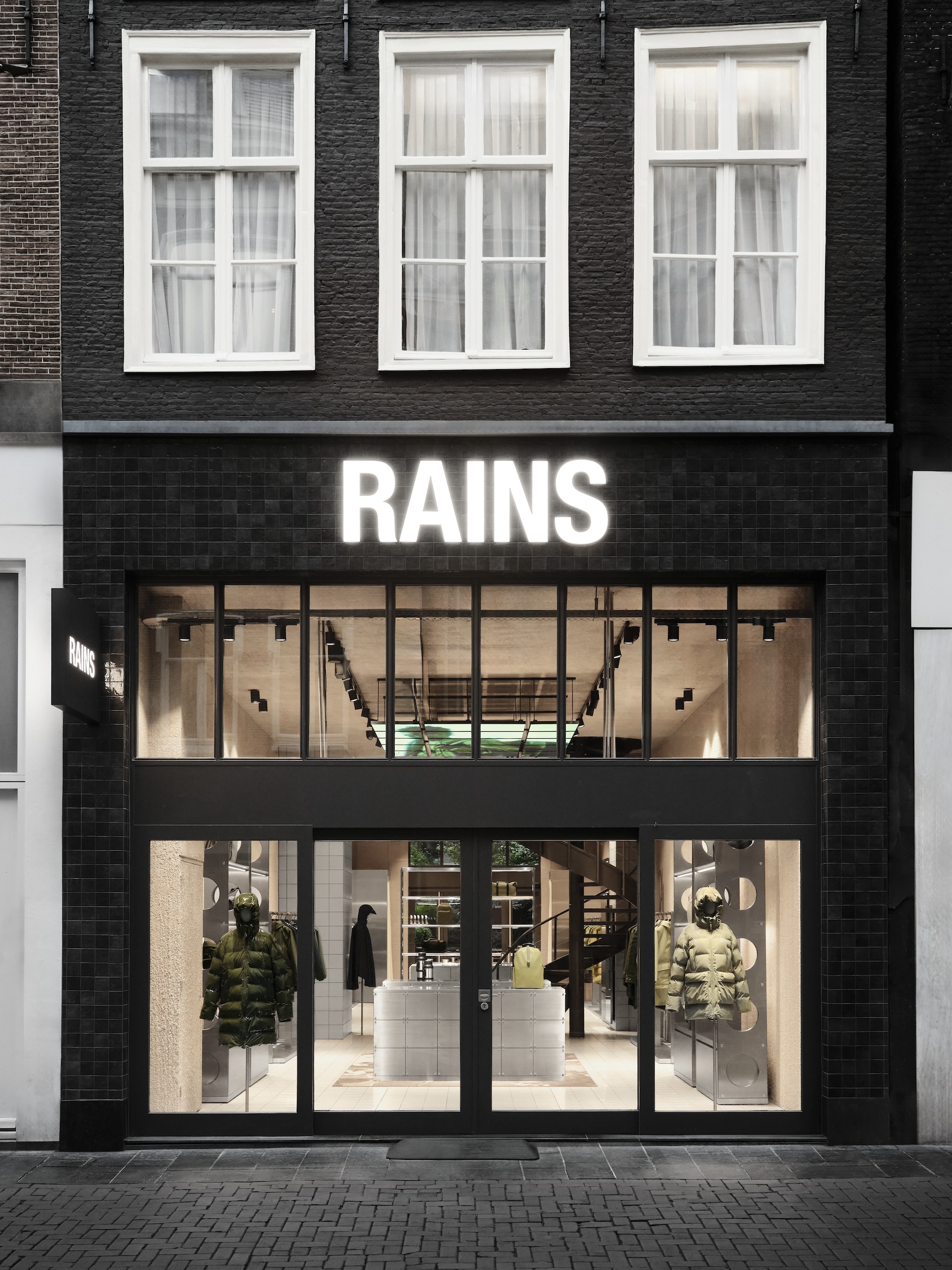
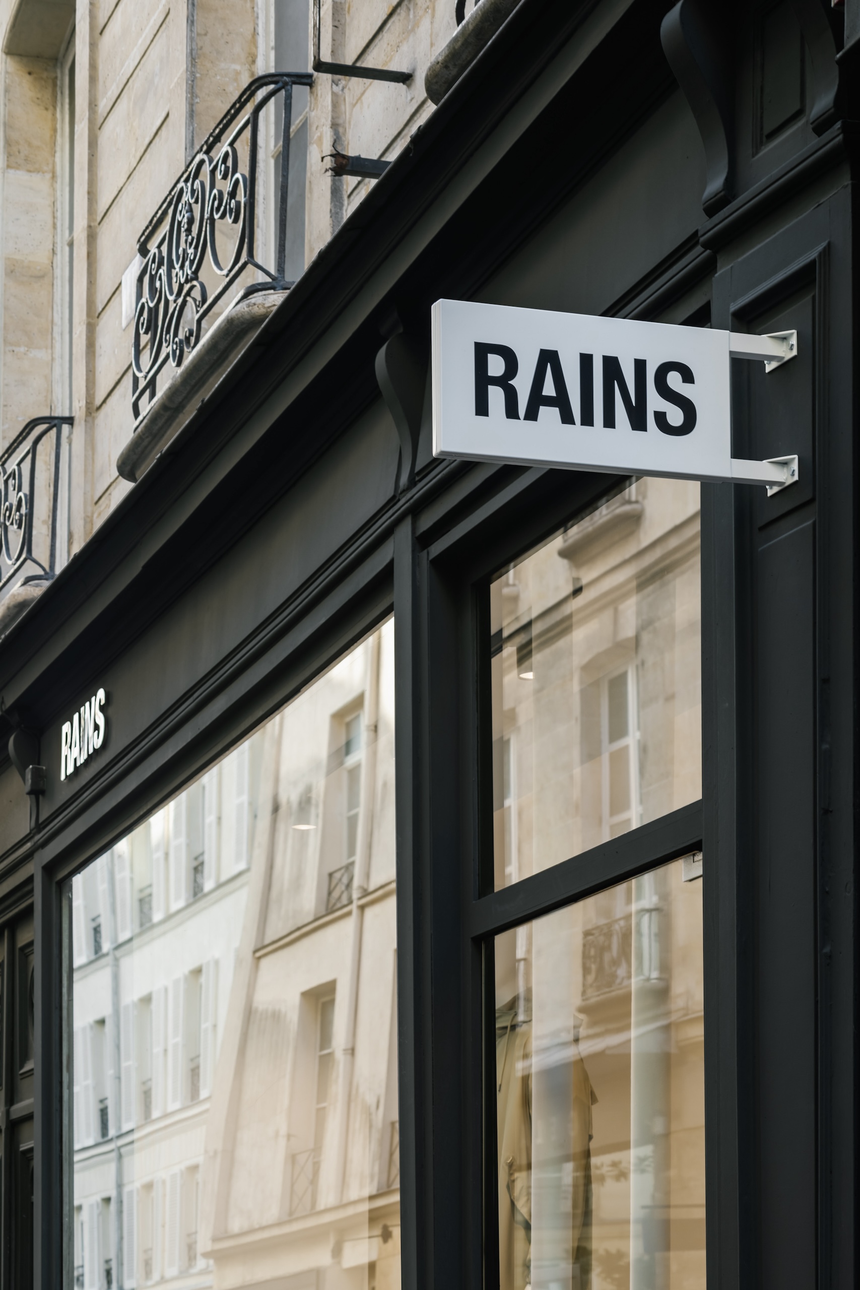
Whether you’re tuned into fashion or not, chances are you’ve seen the viral clip of an invite to the SS24 show by Rains, the Danish outerwear label that began its journey with a single poncho and has since transformed into a global cult brand for neo-Scandinavian rainwear.

In the clip, the invite seems blank at first, but once it’s held in the rain, its message appears – revealed only when drenched.


View this post on Instagram


A post shared by Rains (@rains)

The brand has come to be known for its material innovation, functional minimalism, and urban-outdoor sensibility. What’s perhaps less celebrated is its graphic voice – the quiet wit and visual precision that give form to how the brand speaks.

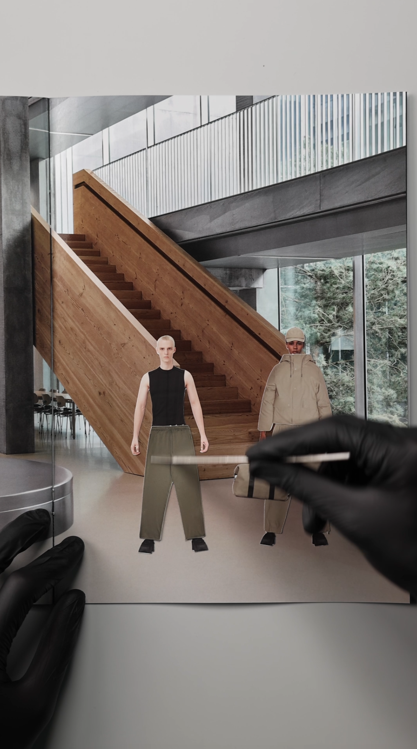
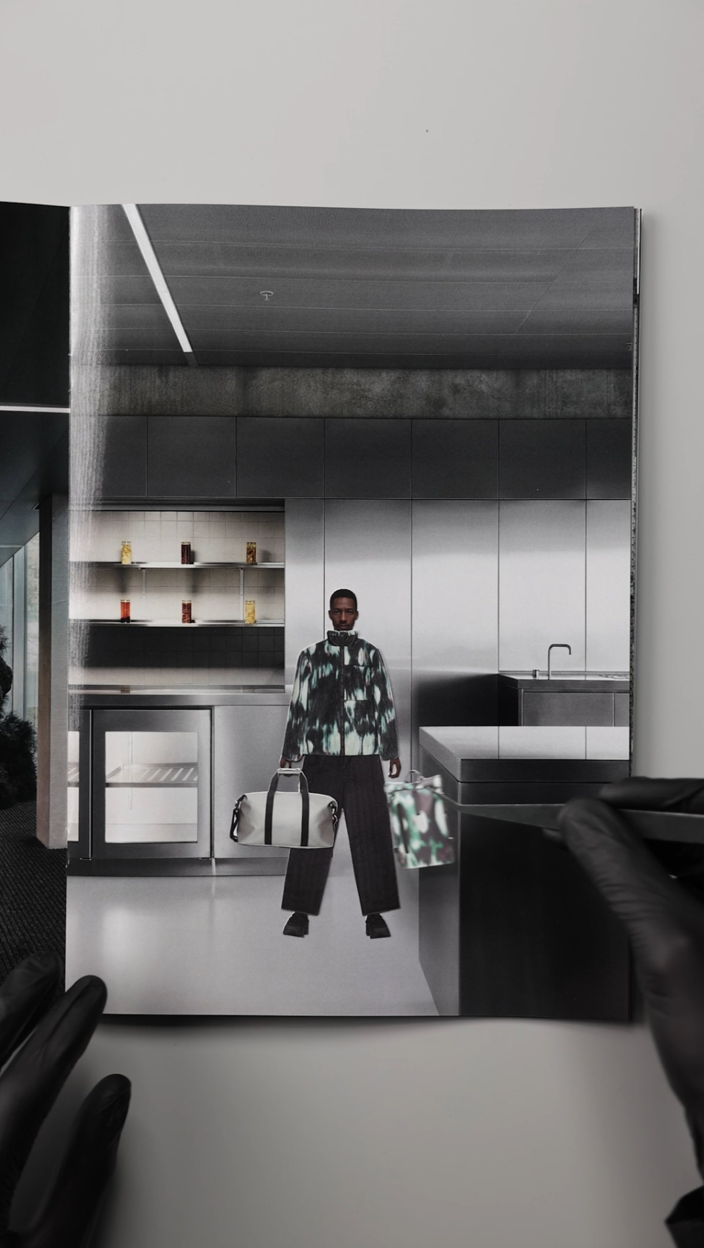
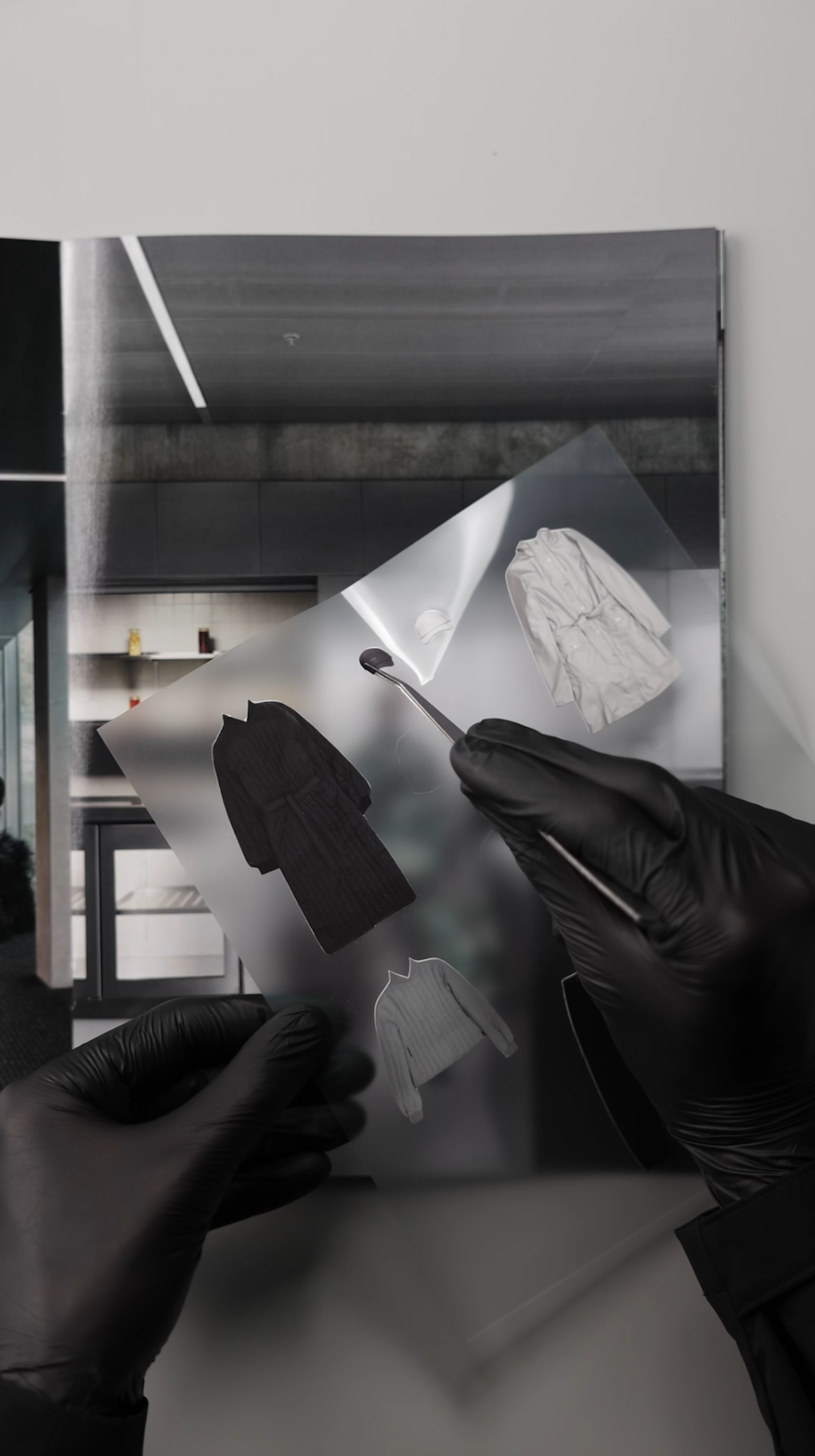
While the Rains aesthetic is rooted in Scandinavian minimalism, its design team continues to find subtle moments of surprise within that restraint. There’s a sense of play beneath the polish – whether it’s an invitation that comes to life in the rain, or a sticker book that playfully layers looks from the AW25 collection, each gesture expands the brand’s visual language without breaking its clarity.

To understand more, we spoke with brand marketing director Joshua Bredehoeft about the brand’s visual world, the joy of editing, and why, at Rains, design and marketing move as one.

What have been the pivotal moments of creative risk or reinvention that shaped how Rains expresses itself today?

I’d say there were three major moments.

First, digital shows. They made us imagine Rains through a digital lens – as this was the only way to communicate with our audience when we were in lockdown. It encouraged us to explore 360-degree storytelling from a digital POV, which has informed how we campaign today, where the concept funnels down across everything – social, web, product descriptions, packaging.

It forced us to think in “hooks” – creating something visually arresting and compelling, which makes people think differently about our brand.

Second, our Paris Fashion Week runway shows. Debuting on this calendar transformed the perception of Rains – internally and externally.

It evolved what Rains could be from a product level, which then gave us the green light to trickle this identity down into everything else.

We got to think about what a runway moment looks like for a brand like Rains in Paris. The contrast of an urban outdoor brand on a sophisticated runway gave us new tensions to explore. That has 100% informed so much of what we do today.

Each of our shows also has its own identity, allowing us to play and contrast our minimalist graphical universe. That pushed us outside of our comfort zone and gave us the courage to imagine ourselves through a new graphical lens.

Thirdly, the new identity. The former was very heritage-based. The new one (launched in 2022) was like a fresh haircut that made us feel like ourselves.

It gave us the courage to dare, to be more editorial whilst sticking to our roots of urban exploration. Some of the people who followed us from the beginning were very provoked by the change, but as time went on, they saw the vision.


Let’s talk about that identity. What made it the right time for a change, and what did that shift unlock for the brand?

The former was very heritage-focused and called for visuals that didn’t feel aligned with the new direction we wanted to take.

We had come to a place where we were quite serious about pursuing a runway version of Rains, speaking to a more conceptual universe that mixed an urban lifestyle with a sense of exploration.

The new logo gave us a base to be bolder with our concepts and seasonal storylines, whilst maintaining a clean expression to contrast any wild ideas.

Rains is often described as embodying Scandinavian minimalism, but minimalism can be restrictive. How do you work within that framework while leaving space for visual evolution?

To be Scandinavian is to edit, edit, edit – to take an idea to its core, its simplest place and work from there.

This means you really understand what you’re trying to do and why, which is always a great foundation for creative or graphic work because it doesn’t feel like restraint, but clarity.


Have there been any recent projects or experiments where you deliberately pushed that minimalist language?

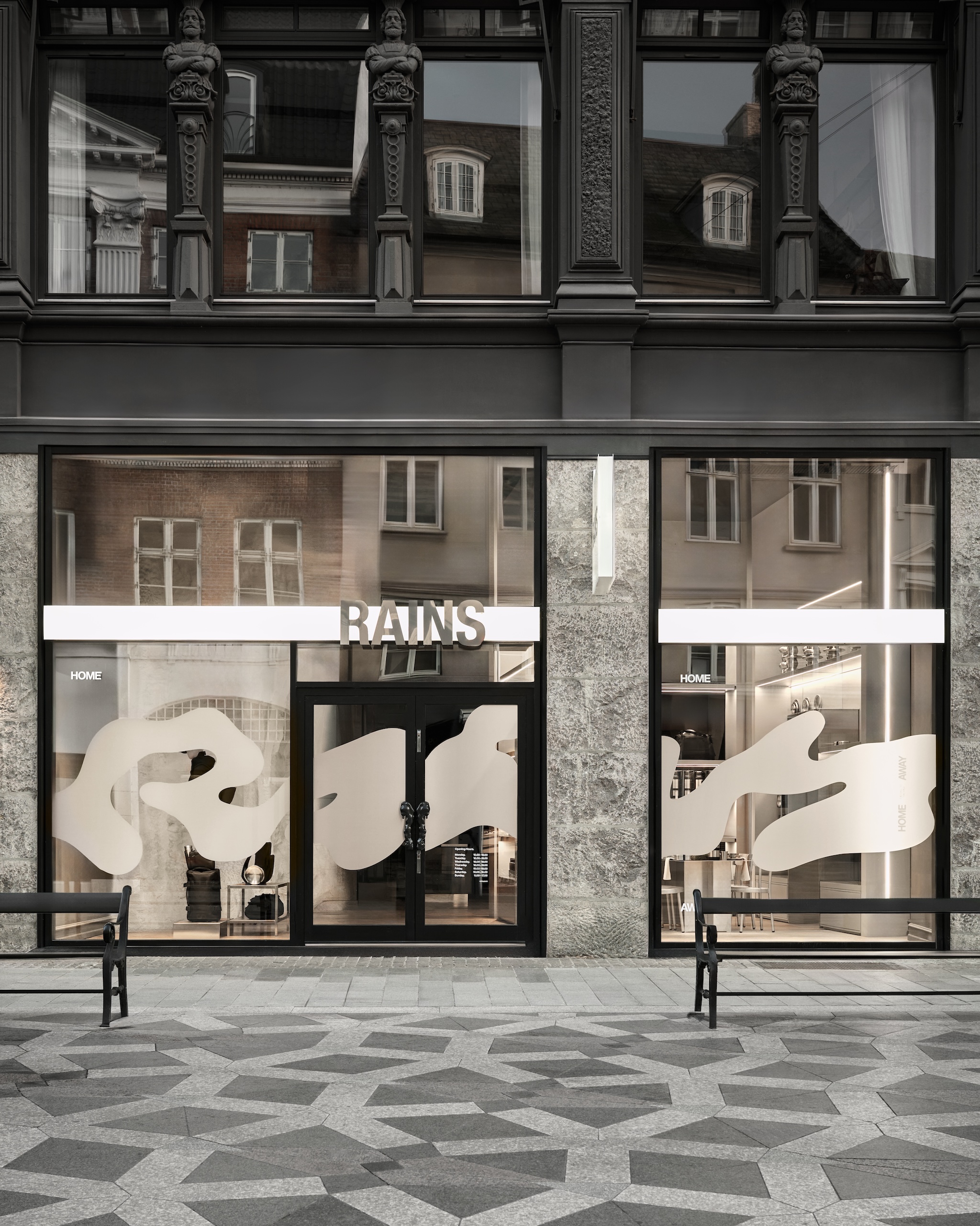
Actually, yes, the recent launch of our HOME AWAY collection is a great example.

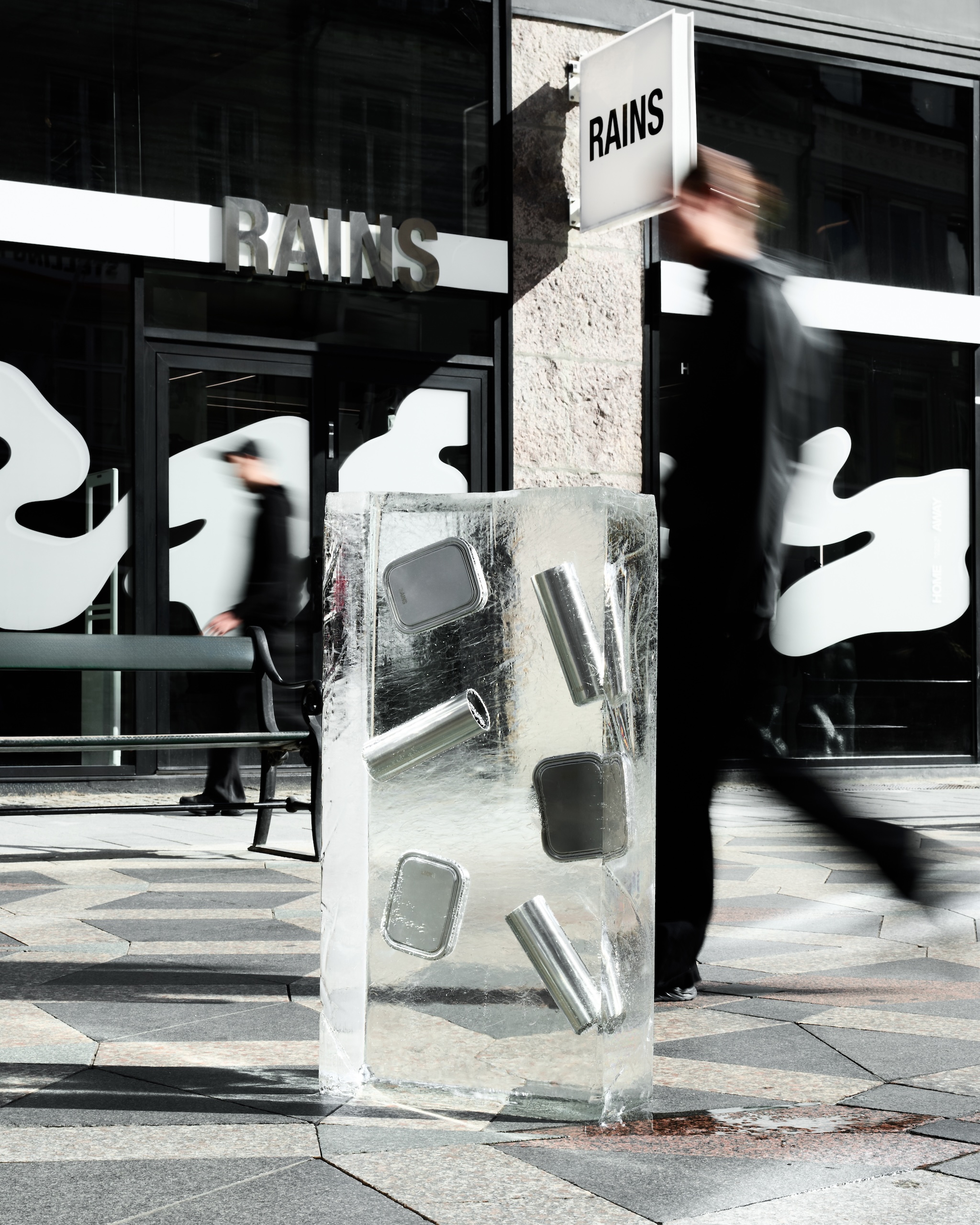
Homeware is a newer category for us, so the team decided that it needed a whole new graphic identity – one tied to both the brand and concept, which is about balancing the indoors and outdoors, brutalism and the softness of nature.

They came up with a beautiful, expressive take on the Rains logo, organic and inspired by blurred writing on rainy windows. This was contrasted with the minimalism of the HOME AWAY logo, which was clean yet smartly constructed to represent the hybrid uses for the actual designs.

We chose to keep this simple because we needed this logo to feel like part of our world, visually. It’s the contrast between the two that I believe is very strong.

Rains often builds intrigue through understated, yet viral gestures, like the rain-activated SS24 invite. How deliberate is that use of curiosity in your communication strategy?

Curiosity is one of the biggest strengths of our team. What’s amazing about the Rains universe is that it’s very clear. Wet, urban, and explorative.

Those creative confines are the very canvas that allows us to constantly ask – “How can we iterate? What story have we not told yet?”

We have yet to run out of ways to express ourselves, and I don’t see that stopping anytime soon.


Rains’ print experiments – like the recent For When it Rains book and the sticker book – feel like cultural objects in themselves. Are they tools for storytelling, brand building, or creative play?

Honestly, the answer is a little bit of each. Take our Getting dressed should be fun sticker book, for example. While visually simple, it showed the breadth of our AW25 collection.

This season, we’ve introduced knitwear, and we have such beautiful layering options, so we needed to communicate this graphically. Using clean pack shots to create a nostalgic sticker format lets us layer pieces, subliminally visualising the brand’s evolution for our audience, and having some fun in the process.

And are these print experiments for customers, or are they intended more as internal creative artefacts and brand expressions?

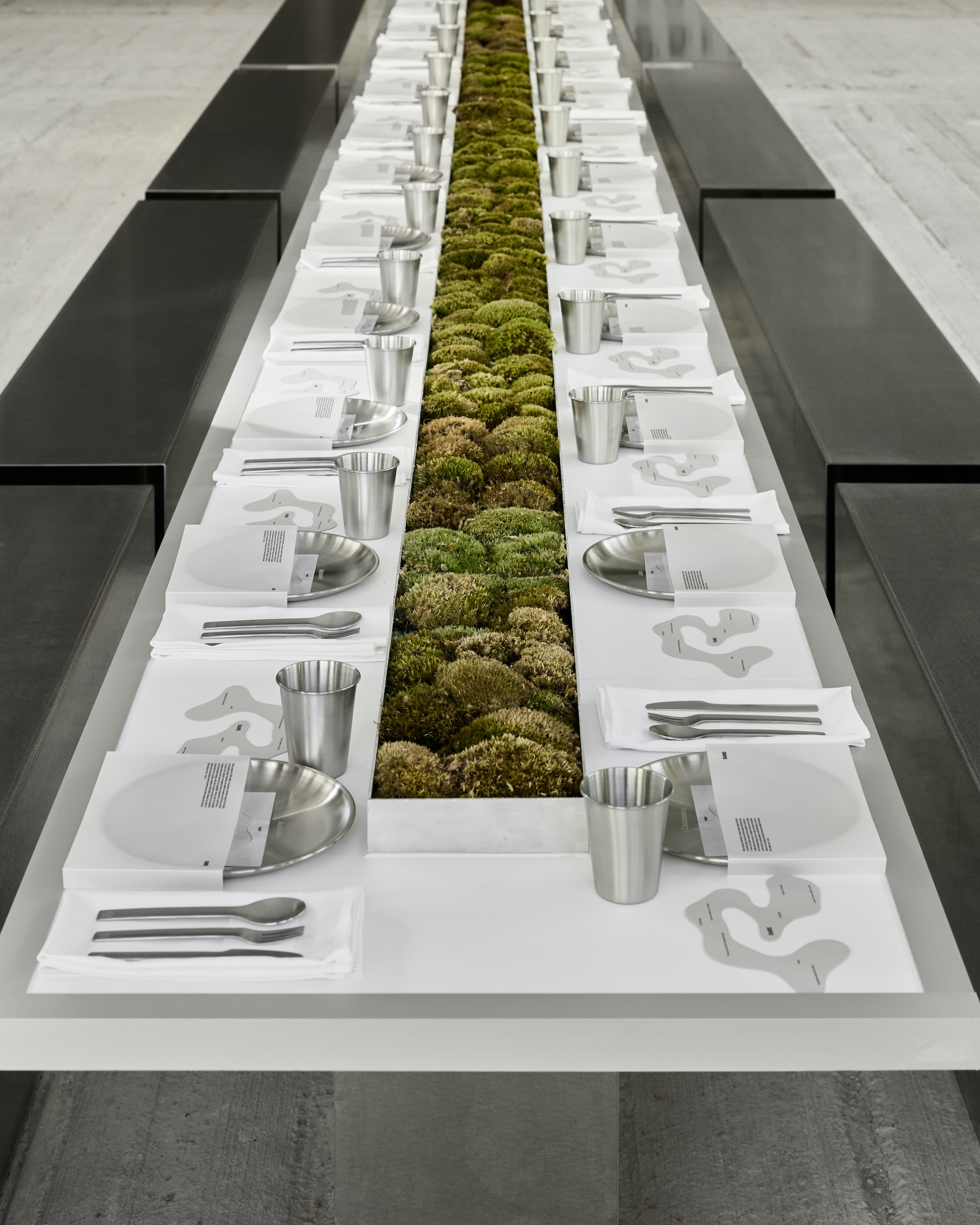
They started as creative artefacts to feed social content, but they are growing into customer-facing activations. We recently created a small recipe book for our HOME AWAY launch that we gifted to customers when they purchased our homeware products.

This elevates the storytelling and allows customers to see the products in real-world scenarios. You’ll see a lot more of this in the future of Rains.


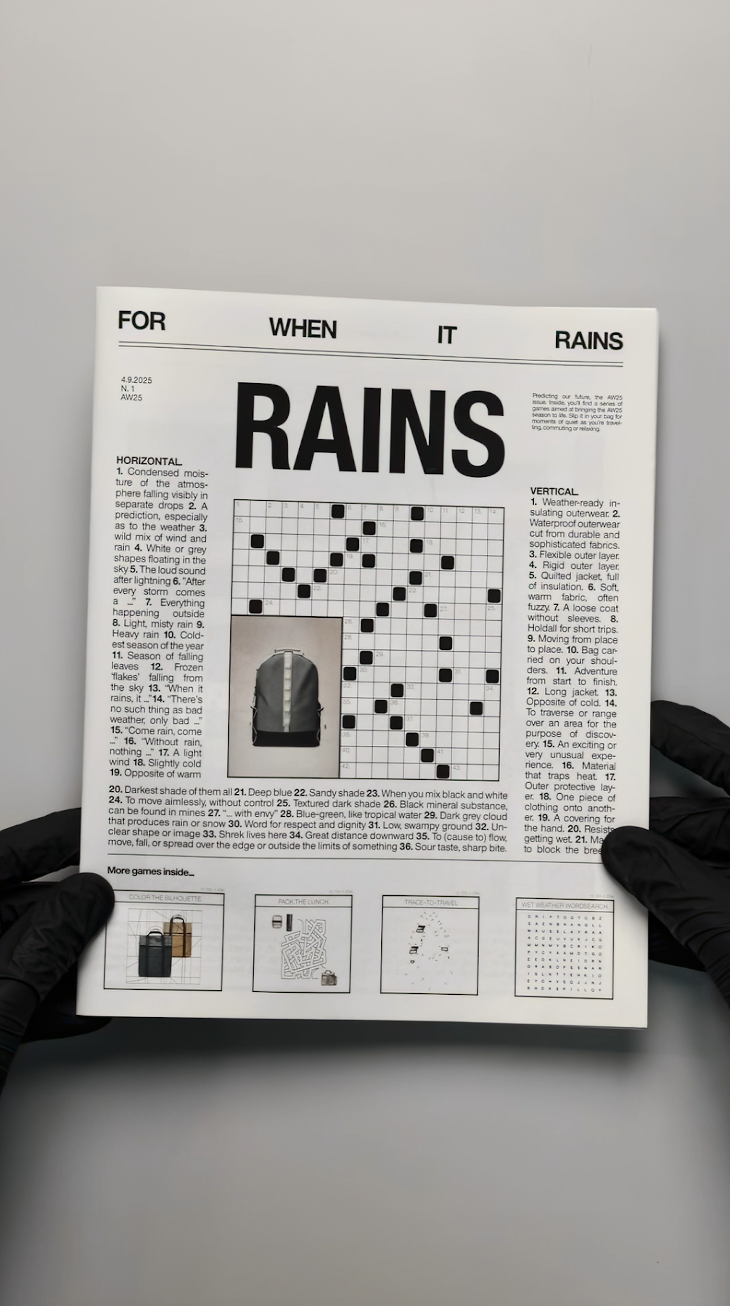
The design of the For When It Rains booklet is particularly striking. How did that come to life?

The booklet takes inspiration from classic printed crossword and quiz magazines. Its design is raw, simple, and direct.

We wanted it to evoke nostalgia and be something physical that can actually be interacted with. We see the booklet as a reminder that even rainy days can be transformed into moments of joy, relaxation and leisure.

It features various games – crosswords, word searches and join-the-dots – inspired by our brand, universe and collections, alongside visuals from our latest campaigns.

What does building a brand through design mean in practice at Rains? How do you make sure the storytelling carries through not just the big campaigns, but even the smaller design gestures?

We see everything as an opportunity to deepen the storytelling and narrative around our brand.

I actually think it’s the tiny details that our community notices most – and we take great care to bring the same stylistic and conceptual approach to all those “smaller” creations.

The logo for the Rains x Umbro collection

Rains has a strong internal creative culture. How is the relationship between marketing, design, and creative direction structured internally?

We’re a tight-knit and concise team, each with our own specialisms. We work closely on all projects, and our work is quite horizontal.

Instead of work being passed from art director to copywriter to designer, everyone is briefed together, creating a more collaborative way of working.

Collaboration is the foundation of Rains’ creativity. Graphic design and creative direction sit as part of the marketing team, joining in brainstorms and strategy meetings so that everyone has a solid overview of all activity, and their role within it.

How do you define taste within the brand? Are there guiding principles that help maintain Rains’ aesthetic consistency while still allowing experimentation?

Contrast. Duality. That’s always one of our guiding principles. If the imagery feels colder, how can we create warmth or “contrast” through our graphic touches? We see ourselves as a brand built around duality; we design for the urban outdoors – a contrast in itself.

To what extent do you see Rains’ graphic design as a differentiator in a crowded lifestyle market? Do you consciously design to stand apart from competitors?

We choose our aesthetic based on what works for us, what feels like us.

Innovation is part of our DNA – from our very first product – so pushing and reinventing our graphic language feels as natural to us as designing the pieces themselves.

It’s always nice to stand out, but I wouldn’t want us to do anything purely to stand out. It has to connect with what we’re saying and where we’re trying to go.

Source
By

wildflower studios: bjarke ingels group opens vertically-stacked film studio in new york

bjarke ingels group brings wildflower film studios to nyc


Located in Astoria, New York, Wildflower Studios is a new vertical film production complex designed by Bjarke Ingels Group. The development is led by Robert De Niro and establishes a new urban typology for filmmaking in Queens’s dense industrial landscape.


Film studios are traditionally organized across expansive ground-level lots, each stage accessed directly by truck. In Queens, where space is constrained, Bjarke Ingels Group condensed that familiar model into a vertical arrangement — stacking sound stages and production spaces to form what the architects describe as a ‘studio village.’ The design rethinks the logistics of production, integrating movement, delivery, and collaboration within a reduced footprint that reflects the spatial realities of the city. See designboom’s previous coverage here!

images © Laurian Ghinițoiu


a vertically-stacked building of eleven modules


The program is composed of eleven studio modules, each containing a large-span stage, vertical transport, and support spaces including dressing rooms and scene shops. Organized in two-story rows within a single volume, the modules are connected by a central spine that acts as the building’s internal street. This shared corridor forms the social core of the complex, linking stages with offices and communal terraces while drawing daylight deep into the structure.


One entire floor of Wildflower Studios is dedicated to office and production support, while additional spaces like cafés and fitness areas encourage collaboration among actors, writers, and technical crews. This hybrid environment creates a working community among the practical infrastructure of filmmaking.

Wildflower Studios rises in Astoria, Queens as a new vertical model for film production


a ‘floating village’ in astoria


Clad in precast concrete panels, the 145-foot-tall building changes character as sunlight shifts across its angled facade. Two open-air terraces cut into the envelope, offering framed views toward the Manhattan skyline and a direct connection to the waterfront. The roof supports a 150,000-square-foot solar array, supplying power and demonstrating the project’s environmental intent.


BIG lifts the structure above the floodplain, allowing service vehicles to operate beneath the building and freeing the street edge for public access. The site design extends this openness with a walkway along the creek, creating a connection between the industrial block and the riverfront. The overall form is described by the architects as a ‘floating village.’


Folded planes in the facade open the building to daylight and break down its massing, linking interior circulation routes to the outdoor terraces and public realm. Within, the continuous envelope creates a sense of cohesion across the various stages and workspaces.

BIG reimagines the traditional horizontal sound stage as a compact stack for the city

the modules form a dense production village tailored to the spatial constraints of New York City

the building integrates cafés and lounges to encourage collaboration among production teams

a central spine connects stages, offices, and communal terraces to bring daylight deep inside

the structure is elevated above the floodplain, creating sheltered loading areas and a public walkway below

open air terraces lend views of the Manhattan skyline and direct access to the waterfront


project info:


name: Wildflower Film Studios

architect: Bjarke Ingels Group | @big_builds

location: Astoria, Queens, New York, NY

previous coverage: September 2019, February 2022

photography: © Laurian Ghinițoiu | @laurianghinitoiu 

The post wildflower studios: bjarke ingels group opens vertically-stacked film studio in new york appeared first on designboom | architecture & design magazine.

By

Masterpiece Story: Aristide Bruant in His Cabaret by Henri de Toulouse-Lautrec

The post Masterpiece Story: Aristide Bruant in His Cabaret by Henri de Toulouse-Lautrec appeared first on DailyArt Magazine.

By

five rotating modules reconfigure to form interactive segmented house of the future

Michael Jantzen’s Interactive Segmented House of the Future


The Interactive Segmented House of the Future is a conceptual design proposal by Michael Jantzen for an adaptive, self-contained dwelling that can alter its configuration in response to environmental conditions and user needs. The structure consists of a central living space surrounded by five movable segments. Each segment can rotate manually or automatically around the core to adjust for sunlight, wind, rainfall, and views. This rotation enables the house to warm itself through solar exposure, cool naturally through air circulation, collect rainwater, and continuously reshape its overall form.


Constructed primarily from lightweight steel, the proposed design incorporates photovoltaic cladding to generate electricity for internal systems. The glass floor supported by a steel frame allows for visual continuity and spatial fluidity, enabling occupants to experience a full 360-degree connection with the surrounding environment. Openings in the floor permit air to circulate after being captured by the adjustable wind scoops integrated into the outer segments.

all images courtesy of Michael Jantzen


Five rotating movable segments shape the conceptual house


Each segment shares the same geometric profile but can perform multiple functions depending on orientation. Some feature windows that rotate 360 degrees to direct sunlight or frame specific views, while others act as rainwater collectors or wind channels. The modular system allows the segments to operate independently or in coordination, offering precise environmental control.


Inside, furnishings are stored within semicircular cabinets concealed beneath the glass floor. These units can be raised and unfolded for use, keeping the main living area open and adaptable. Additional segments could be added to expand the structure’s size and functionality. The Interactive Segmented House of the Future project by designer Michael Jantzen explores how dynamic geometry can redefine domestic architecture by integrating environmental responsiveness, flexibility, and user interaction into a single transformable system.

Michael Jantzen’s Interactive Segmented House of the Future explores adaptive residential design

the concept envisions a self-contained structure responsive to environmental conditions

five movable segments surround a central living core

each segment can rotate manually or automatically to adjust to its surroundings

the rotating modules respond to sunlight, wind, rainfall, and views

lightweight steel frames form the primary structure of the house

each segment shares a consistent geometry with flexible performance

openings allow air captured by wind scoops to circulate through the interior

rotating windows direct sunlight, frame views, and shape interior lighting

the open-plan interior emphasizes adaptability and minimal spatial obstruction

a glass floor supported by steel enhances transparency and spatial flow


project info:


name: The Interactive Segmented House of the Future

designer: Michael Jantzen | @michael.jantzen22


designboom has received this project from our DIY submissions feature, where we welcome our readers to submit their own work for publication. see more project submissions from our readers here.


edited by: christina vergopoulou | designboom

The post five rotating modules reconfigure to form interactive segmented house of the future appeared first on designboom | architecture & design magazine.

By

This Solar Bench Just Turned Every City Street Into a Charging Hub

Picture this: you’re exhausted from walking through the city, desperately need to charge your phone, and suddenly spot the perfect bench bathed in soft light. You sit down, plug in, and realize this isn’t just any piece of street furniture. It’s actually harvesting energy from the sun and transforming the urban landscape around you. Welcome to Perovia, a design project that’s making us rethink what public spaces can be.

Created by TAIWA, a contemporary design laboratory that lives at the crossroads of technology, sustainability, and spatial aesthetics, Perovia is essentially an urban bench on steroids. But calling it just a bench feels like calling a smartphone just a phone. It’s so much more than that.

Designer: TAIWA

The name itself is a clever nod to perovskite, a revolutionary solar material that’s been causing quite a stir in renewable energy circles. Unlike traditional bulky solar panels, perovskite cells are flexible, efficient, and can be integrated into all sorts of surfaces. TAIWA took this cutting-edge tech and asked a simple question: what if our city furniture could work as hard as we do?

The result is something that looks like it rolled out of a sci-fi movie set. Perovia functions as what the designers call “a node of light in the urban circuit.” During the day, it quietly soaks up solar energy through its integrated perovskite cells. As evening falls, it transforms into a glowing beacon, providing ambient lighting that makes public spaces feel safer and more inviting. But it doesn’t stop there. The bench also features USB charging ports, because let’s be honest, in 2025, a dead phone battery is basically a modern emergency.

What makes this design particularly brilliant is how it addresses multiple urban challenges simultaneously. Cities everywhere are wrestling with sustainability goals, trying to reduce their carbon footprints while making public spaces more livable. Street lighting gobbles up enormous amounts of electricity, and providing public charging stations requires complex infrastructure. Perovia tackles both issues in one sleek package.

But beyond the recognition and the tech specs, what’s really exciting about Perovia is its philosophy. TAIWA describes being inspired by “the silent rhythm of cities,” and you can feel that in the design. Cities have their own pulse, their own flow of energy and movement. Most street furniture just sits there passively, but Perovia actively participates in that urban metabolism. It takes energy when the sun is high, gives light when darkness falls, and serves people whenever they need it.

This kind of thinking represents a fundamental shift in how we approach urban design. For too long, sustainability features have been add-ons, afterthoughts bolted onto existing infrastructure. Perovia shows what happens when you bake sustainability into the core concept from the beginning. The result doesn’t just work better, it looks better too. The bench manages to be both futuristic and inviting, high-tech without feeling cold or intimidating.

Of course, the real test will be seeing these benches roll out in actual cities, weathering real conditions and serving real communities. Will the technology hold up? Can it scale affordably? These are questions that only time will answer. But as a proof of concept and a vision of what’s possible, Perovia absolutely delivers.

We live in a world where climate change dominates headlines and cities struggle to reinvent themselves for a sustainable future. So we need designs that don’t make us choose between functionality and environmental responsibility. Perovia suggests we can have both, wrapped up in a package that actually makes our cities more beautiful and livable. That’s the kind of design innovation worth getting excited about.

The post This Solar Bench Just Turned Every City Street Into a Charging Hub first appeared on Yanko Design.

By

Fitnexa SomniPods 3 Block 42dB of Noise for Side Sleepers

Anyone who has shared a bed with a snorer or tried to sleep in a city apartment knows how fragile nighttime silence can be. Most earplugs force you to choose between blocking noise and staying comfortable, leaving you either wide awake from unwanted sound or unable to sleep from constant pressure against your ear canal throughout the night.

Fitnexa SomniPods 3 was designed as a solution to that trade-off by making silence and comfort coexist rather than compete. Every curve and contour is shaped around one core idea: earbuds that disappear against your pillow while the world around you fades to quiet, without forcing you to sacrifice either aspect for the other during extended wear.

Designer: Fitnexa

Click Here to Buy Now: $129.99 $189.99 ($60 off). Hurry, deal ends soon!

The design starts with a fundamental question: how do people actually sleep, rather than how engineers typically design for performance first. Each earbud reflects that thinking through its proportions: just 3.3 grams and under 9.9 millimeters thin, with a softly rounded form that avoids creating pressure points when your head rests sideways on a pillow for hours at a time. The medical-grade silicone tips feel gentle against your skin, while the compact footprint ensures the earbuds never protrude or press uncomfortably as you shift naturally through the night.

Fitnexa includes ten pairs of ear tips in two distinct shapes and five sizes each, plus four sizes of ear wings for additional stability options. This variety addresses the reality that ear canals vary significantly between people, while multiple size options ensure proper acoustic seal without creating pressure or discomfort during overnight wear when you can’t easily adjust fit.

This variety does more than improve comfort alone. It establishes the foundation for effective passive noise cancellation by ensuring a secure, well-sealed fit that blocks ambient sound naturally. This proper seal gives the adaptive ANC system the stable acoustic base it needs to perform at its best throughout the night without gaps or inconsistencies.

Building on that passive isolation foundation, the hybrid ANC system uses feedforward and feedback microphones to detect and cancel noise from both outside and within the ear canal itself. A low-latency processor generates counter-phase signals in real time to maintain consistent quiet as you move or change sleeping positions naturally throughout the night.

Within the ANC system, Adaptive Leak Compensation continuously senses subtle changes in ear canal pressure or seal integrity and automatically adjusts the ANC response in real time. The result is up to 42 decibels of noise reduction across different sleeping positions. Snoring, traffic, the hum of air conditioners, all fade into natural silence while SomniPods 3 hold the soundscape steady, whether you’re on your back or on either side.

The IPX4 water resistance extends design thinking beyond the bedroom into real-world scenarios where sleep happens in imperfect conditions. After-workout naps and long flights no longer require worry about moisture damage. Hi-Res Audio with LDAC and aptX Lossless keeps sound quality rich and detailed, while the 10-band EQ lets you adjust the experience precisely to match preferences.

Battery life reaches up to 12 hours in Sleep Mode, extending to 48 hours with the charging case for multiple nights without interruption. Integrated sensors quietly track sleep stages and positions throughout the night, while the Fitnexa app translates that data into AI-driven insights that help you build better sleep habits gradually over time without overwhelming you with information.

Fitnexa SomniPods 3 bring together comfort, advanced noise cancellation, and smart sleep coaching into a discreet package that actually works for real-world use. For anyone tired of restless nights and noisy environments, these earbuds offer a smarter, quieter way to sleep, no matter where life takes you or what challenges your bedroom environment presents.

Click Here to Buy Now: $129.99 $189.99 ($60 off). Hurry, deal ends soon!

The post Fitnexa SomniPods 3 Block 42dB of Noise for Side Sleepers first appeared on Yanko Design.

By

This Bamboo Pavilion Turns a Beach Car Park Into a Carbon-Negative Community Hub

BaleBio, a bamboo pavilion designed by Cave Urban for Bauhaus Earth’s ReBuilt initiative, pioneers a new paradigm of carbon-negative architecture in Bali. Rising gracefully above the sands of Mertasari Beach in Denpasar, the 84-square-meter structure transforms what was once a disused car park into a vibrant communal hub, an open meeting space that merges ecological innovation with social purpose.

In a landscape where coastal development is often driven by tourism and concrete infrastructure, BaleBio offers an alternate vision: a prototype for buildings that store carbon rather than emit it. Drawing inspiration from the Bale Banjar, the traditional Balinese village hall central to community life, the design reinterprets this open and inclusive layout through a contemporary lens of sustainability. It preserves the spirit of collective gathering while integrating the principles of environmental stewardship, positioning itself as both a cultural reinterpretation and a climate-responsive model.

Designer: Cave Urban and Bauhaus Earth

The pavilion’s sweeping barrel-vaulted roof, rising 8.5 meters above the beach, serves as both a visual statement and a functional marvel. Crafted from slender bamboo rafters and clad in pelupuh (flattened bamboo), the canopy promotes natural ventilation and passive cooling. Below this organic form lies a structural frame of laminated petung bamboo, locally sourced, resin-bonded, and compressed to deliver the strength and precision of steel or timber, yet without their heavy carbon cost.

Every element of BaleBio was grown, processed, and assembled within Indonesia, ensuring a circular, local supply chain that minimizes transportation emissions. Traditional joinery techniques blend seamlessly with precision-engineered fittings, while locally sourced volcanic rock, lime plaster, and repurposed terracotta tiles add thermal mass and textural warmth. Together, these materials form a coherent system that fuses bio-based, geo-based, and reused resources into one holistic construction.

A life cycle assessment by Eco Mantra verified BaleBio as carbon-negative from cradle to completion, documenting a 110% reduction in embodied carbon compared to conventional builds. The pavilion saves more than 53 tonnes of CO₂ emissions, the equivalent of planting over 2,400 trees. In measurable terms, its carbon balance stands at –5,907 kilograms of CO₂ equivalent, against a baseline of nearly 60,000 kg, an achievement that moves the project beyond symbolism into empirical proof.

Since its completion, BaleBio has evolved into a gathering space for residents, students, and travelers, reactivating civic participation through design. Its creation involved collaboration with Warmadewa University, local artisans, and community organizations, ensuring it remains grounded in Balinese cultural rhythms even as it experiments with global standards of circular construction.

In 2025, BaleBio’s achievements in material innovation, carbon performance, and social engagement earned it three major honors: the Australian Good Design Award for Social Impact, a commendation from the Built by Nature Prize, and Gold at the German Design Award in the Circular Design and Fair & Exhibition categories.

As part of Bauhaus Earth’s ReBuilt initiative, BaleBio is not merely a pavilion; it is a blueprint for systemic change. It demonstrates that architecture can regenerate rather than deplete, that communities can thrive in structures born of their own landscapes, and that good design in the age of climate urgency must be measured not only by form and function but by its contribution to the planet’s recovery.

The post This Bamboo Pavilion Turns a Beach Car Park Into a Carbon-Negative Community Hub first appeared on Yanko Design.