[searchandfilter fields="search,category"]

By

New platform selling off-the-shelf designs hopes to fix “broken” branding industry

A new platform has launched which hopes to “break the traditional designer-client cycle” by selling off-the-shelf brands.

Brands Like These (BLT) is the brainchild of Sheffield-based agency Lyon & Lyon. It came about after they shared an unused design concept from a client project on Pinterest, and someone got in touch asking to buy it. That, BLT’s founders explain, “was the lightbulb moment.”

BLT, which went live yesterday, is a marketplace for personal design projects and unused commercial routes.

It’s aiming to give designers opportunities to, “sell their best unpublished brand concepts, free from creative constraint” and offer entrepreneurs, “a curated collection of agency-standard brand kits, ready to launch.”

Brands Like These

Co-founder Ben Lyon hopes the platform will help designers make money in a new way, and fix some issues in the branding industry, which the BLT team believes is “broken.”

“With clients, there’s often a massive amount of trepidation because they’re about to drop X amount of budget, and they don’t know what the outcome is going to be,” Lyon explains.

“On the flip side, lots of designers knock out concepts to keep their creative juices flowing, or there are things from client work that don’t get used. We thought there must be a way to sell some of those things.”

How it works

Any designer can submit work to BLT, but Lyon says the brands that make it onto the site are carefully curated. “We want to set a high bar, with work that feels agency-standard,” Lyon says.

Designers can sell brands in three tiers – a starter pack, which costs between £2,500 and £5,000, a builder pack, which costs £5,000 to £10,000, and a scaler pack, priced between £10,000 and £40,000.

These tiers reflect the amount of assets included, so while all three feature logos and typography, only the two higher tiers include packaging designs for physical products.

Fabrica, one of the concepts on Brands Like These

The money will be split 50/50 between the designer and BLT, although Lyon says he “hopes and assumes” the platform’s cut will come down over time.

Each concept can only be bought once, and after it’s been purchased, the buyer can have it tweaked to meet their specific requirements. This will obviously include changing the name, but may also extend to type and colour changes. Brands can also be adapted to suit a different product or industry.

These changes will be carried out by Lyon & Lyon, to ensure the final branding can be delivered on time.

BLT launched with six brands available to buy, including Uvie wash-on sunscreen bar, Fabrica haircare and hotel brand Cove.

Lyon explains that the target buyers are “serial entrepreneurs who spin out new businesses on the regular” but also established brands who may want to trial a new product or service without investing in a full end-to-end branding project.

“We might also put live briefs out, if clients are asking to see more stuff in a specific space, like the AI SaaS space, for example,” Lyon says.

Brands Like These

He thinks BLT will attract clients who aren’t willing or able to spend huge amounts on branding projects. And by providing designers with a new income steam, he sees it as win-win.

The platform may also, Lyon hopes, help address some of the homogenisation seen across the branding world in recent years, as samey briefs create similar-looking client work.

“We hope it’s going to be a place where there is some real experimentation,” he says. “What do designers create when there isn’t a client on their back? It could give people this ultimate creative freedom.”

By unleashing this “human-led creativity”, Lyon hopes BLT will help designers fend off some of the threats from generative AI.

Fed up with the rollercoaster

The BLT team says the platform will develop in the coming weeks and months. Lyon says legal and IP issues may prove tricky, especially around unused client work, and they need to see how it works with Lyon & Lyon tweaking another designer’s concepts.

“Honouring the original creative will be quite a challenge, because we’re going to be custodians for a brief amount of time,” he explains. They may in some instances commission the original designer to make the changes.

They also want input from the design community, to ensure it becomes an attractive place to sell and showcase their work. There are plans to let designers create profiles on the site, a bit like Behance, and Lyon hopes to run events as part of BLT’s community engagement.

So far, Lyon says feedback from designers has been very positive, with many sharing the frustrations which led to BLT’s launch.

“We were a little bit fed up with the whole roller coaster ride,” Lyon says. “We’ve been out here for 11, 12 years and we know all about the peaks and troughs of work.

“What if we didn’t have to rely on clients in the same way, and we could put all this stuff out there, and it could be bought while we were doing other creative work?”
Source

By

Gretna Green says “I do” to Squad’s new brand identity

Squad is repositioning Gretna Green as an experiential visitor destination with appeal beyond run-a-way weddings.

The Scottish border village has been famous since 1754, when English people started eloping to its forge to get married by the blacksmith over an anvil. This was because young couples could bypass England’s stricter marriage laws, which demanded parental consent for those under age.

Gretna Green’s fame has since been fuelled by its many mentions in films and TV shows, from Downton Abbey and Bridgerton to Coronation Street and unforgettable 1980s sitcom You Rang, M’Lord?.

Despite the UK’s declining marriage rate, the village still facilitates nearly 4,000 ceremonies a year, and in peak season can get through eight a day.

But David Barraclough, creative partner at Squad, explains that changing attitudes to marriage are not “the driving factor” behind the new look.

“The opportunity is bigger than that – to develop the site as a retail offer and visitor attraction,” he says.

The Lucky Arch typeface used for the branding alongside the inspiration from old signage at Gretna Green

While Gretna Green is the name of the ancient village, it is also the name of the business which owns many of the village’s key properties, including the Old Blacksmith’s Shop and two hotels.

Five generations of the Houston Family have run the Gretna Green business since 1885, and it’s now under the leadership of John Holliday, who joined as executive chair in 2023. Squad’s work is part of an £8 million investment to rethink the entire visitor experience. The hope is that visitors will come to eat, drink, stay and explore, as well as marry.

“The vision is to develop a broader offer, anchored in love, passion and escape,” says Barraclough. “You might return for anniversaries; you might propose there.”

“We’re trying to reimagine the history we’ve got and turn it into a 21st Century destination,” says Oliver Rolfe, COO of Gretna Green. “We want to modernise the brand and the site for future generations.”

“We’re trying to reimagine the history we’ve got and turn it into a 21st Century destination.”

There was a need to refurbish some parts of the site, and the team wanted to carry out that renovation work with a clearer idea of what the brand stands for.

“Our objective is to make people happy. There’s an experiential element to that,” Rolfe explains. “Stay in a hotel, go to the shops, sit in a café – we need to root all that in who we are and what our brand is.”

Even the toilets have been redesigned with the new brand in mind, with 400 years of stories depicted on the walls, and black metal lighting to reference its forge-based fame.

Branding for the new cafe

Squad, which is based in Manchester and London, first turned their attention to the commercial offer, naming the new café, Runaways, consolidating the number of shops, and renaming and redesigning the restaurant, which is due to open early next year.

Squad then repositioned Gretna Green with a new narrative – the little village on the Scottish border with a big story of love and escape to share with the world.

Squad’s visual identity is underpinned by the pillars of passionate love, fiery craft and Scottish hospitality embedded in four centuries of rebellious romantic history, and delivered with a contemporary spin, according to Barraclough.

The positioning is not “sweet and sickly,” he explains, adding that the presence of the Old Blacksmith’s Shop – where fire would have been used to shape metal – creates a “beautiful symmetry” with the notion of fiery passion.

The new logo over illustration used within the branding alongside an image of the old blacksmith’s shop and anvil.

The identity puts a modern twist on the characteristics of a traditional village, marrying tartan and traditional shop signs with the modern revival of craft and local produce, which is sold on site.

There was plenty of existing vernacular typography to draw on, like the eclectic mix of signage, some of which is hand-painted onto the many anvils around the site.

“We’ve tried to take that idiosyncratic historic feel and bring it up to date,” Barraclough says. “Not ruthless consistency, but a look that flexes out.”

Location-wise, Gretna Green is just off the M6 and already gets plenty of coach parties stopping by. The aim is to also appeal to more families in cars, so a play area is being developed, which Squad will also name and brand.

The ambition is that with the repositioning, refurbishments of existing offers, and introduction of new attractions, more people will come, and they will stay longer.

A wall at the new Runaways cafe
Detail of wall decoration at the new Runaways cafe
Art created to decorate the walls at Runaways, inspired by the new brand story
The food counter at the new Runaways cafe with point-of-sale in the new branding

Source

By

“How I learned to stop worrying about awards and love making real impact”

A few years ago, my co-founder Glenn Taylor and I made a decision that felt pretty radical and risky at the time. We stopped entering design awards.

Not because we couldn’t win them – we had our share of hunks of metal gathering dust. We stopped because we finally did the maths.

Our annual award submissions were consuming countless hours of creative time,  plus thousands of pounds in entry fees that, cumulatively, could fund months of meaningful pro bono work.

So we decided to use that time and money for exactly that. Good Deeds was born.

Stocks Taylor Benson’s branding for Stomp Round Leicester

In a nutshell, Good Deeds is our structured approach to pro bono work. We select meaningful community projects that create long-term partnerships, rather than one-off favours, and commit to causes where design can make a genuine difference.

Our studio HQ happens to be in Leicester. That doesn’t matter to our clients – which include national and global brands like Canon, Baker Hughes, Morrisons and Centrica – but for our people it’s where they live and work. It’s their community.

In desperately seeking validation from judges we’d likely never meet, we were missing opportunities to strengthen that community in a meaningful, mutually beneficial way.

With recent revelations about fabricated case studies and dubious effectiveness stats at major awards, it’s time our industry stopped pretending this emperor has clothes.

The harsh truth about awards ROI

Let’s be blunt – when did you last win new business because of an award? When did that trophy genuinely help you attract better talent, or solve a client’s problem?

Awards give you a moment of industry backslapping, some LinkedIn posts, and take up shelf space. For the most part, that’s it.

But we didn’t just stop doing awards – we asked ourselves what would actually deliver the networking, credibility, and team motivation that awards promise but never deliver, while using our skills for a good cause. The answer was right on our doorstep.

“Let’s be blunt – when did you last win new business because of an award?”

Our Good Deeds initiative delivers genuine new business connections, enhanced tender responses that actually win work, and staff who contribute their own time because they’re genuinely invested. And we see measurable returns that no trophy ever provided.

We wasted years optimising for an audience of peers instead of building relationships that matter. While we were puffing up case studies for judging panels, real opportunities awaited.

Over the six years since we launched Good Deeds, we’ve redirected over 2,500 design hours – around 7% of our total studio capacity – into community partnerships that strengthen our business.

Strategic investment in the community

It’s not just about “giving back” in a charitable way. Yes, we’re supporting great causes – but it runs deeper than that. It’s a smart business strategy too.

Community work creates business advantages that awards simply can’t.

When you’re genuinely embedded in a place, you build relationships with local business leaders, councillors, journalists, and other creative professionals. You become known for something beyond just your client work.

You’re not just another studio – you’re part of the fabric.

Our long-running partnership with the incredible LOROS Hospice recently culminated in Stomp Round Leicester – 40 giant elephant sculptures (and 82 babies) across the city centre.

This project showcases our diverse capabilities better than any award submission, from visual identity to compelling brand storytelling, community engagement to project management at scale.

While other studios scramble for pitches, we’re embedded in our community. Being Stomp Round Leicester’s official design partner delivers PR value, credibility and kudos that reaches far beyond Leicester.

We’ve broadened and strengthened our networks of collaborators, and put the studio front-of-mind for businesses outside our usual stomping ground. Our community commitment impresses prospective clients and strengthens our tender applications, while our team lends their skills to worthy causes.

Don’t be a tourist in your own city

Another of our long-running Good Deeds collaborations has been with Leicester’s oldest live performance venue, The Y Theatre. Linked to the YMCA, it plays a commendable role in tackling youth homelessness – an issue close to Glenn’s heart in particular.

We have a few criteria that help us choose our next Good Deeds project.

Can we solve a genuine design problem? Will this raise awareness for something important?

Do our team members have personal connections that drive authentic investment? And can we build something long-term, rather than completing another project and moving on?

As an employee-owned trust, we make our Good Deeds selection process as democratic as we can to ensure team members get a fair chance to champion causes of their own. When everyone has skin in the game, the work gets better, and the commitment runs deeper.

This isn’t just about being nice. Unlike studios that treat location as irrelevant, we’ve learned that being genuinely embedded somewhere gives you advantages that place-agnostic competitors simply cannot access.

The hard question your studio needs to answer

Awards validate work that’s already done. Our Good Deeds initiative creates work worth doing.

So ask yourself this – which is a better use of your time and money, when it comes to building a stronger studio in the years and decades to come?

We’re not anti-awards per se. If they work for your business model, fine.

But if you’re spending creative time and real budget on industry navel-gazing, while your local creative community struggles for investment, perhaps it’s time to question your choices.

We think every studio leader should ask – are you just chasing the approval of your peers, or real business advantage?

Because after six years of redirecting our awards budget into community partnerships, I’m pretty sure which one pays better dividends for us.

Lois Blackhurst is managing and creative partner at Stocks Taylor Benson.

Source

By

How is Hey Studio using AI?

Hey Studio is a creative agency based in Barcelona. It works on creative strategies and visual languages for clients like Lufthansa and Google, as well as local restaurants and bakeries. Here, founder and creative directress Verònica Fuerte shares how they are working with AI.

You can see all the articles in this series here.

Broadly speaking, are you excited for how AI will change the design industry, or nervous?

Right now I feel like I’m somewhere between paradise and hell. On one side, it’s a beautiful moment because AI pushes me to be better, faster, and even a stronger designer.

But I also know that in the future it will change the way we work, not only in design but in everything. That’s why I think it’s important to be aware of it now, so you can redirect yourself and adapt.

Do you have an agreed policy around AI as a business? If so, how did you create it?

For now, we only use AI for prototypes, not for final deliverables. And we do have something written into our contracts – we don’t accept briefs from clients that come with AI-generated art direction. That’s our way of making sure the work we do remains original and aligned with our standards.

When did you realise AI was going to have an impact on design?

About a month after ChatGPT launched. I realised it wasn’t just going to impact design, but life itself.

I honestly think the idea of “having a job” as we know it today will disappear. We won’t be working 9 to 5 anymore. In five or ten years, work won’t look like this, maybe it will be more about circles, communities, volunteering.

I don’t know exactly what form it will take, but I do believe we won’t be going to “a job” in exchange for a salary in the way we do now.

Have you undergone any AI training, either as a studio or individuals?

No, we haven’t done any official courses. I believe the best way is self-training, following your own curiosity and learning by doing. What we do, both myself and the team, is dedicate work time to exploring tools.

We actually set aside a morning called Hey Lab every Thursday, where we all experiment together with different AI programmes and create imaginary projects. That way we learn which tools are best for what.

It’s not formal training, it’s more like self-discovery. And I think it’s important – if you don’t know what AI is capable of, you won’t see the possibilities.

How do you use AI in the studio’s creative process? What is it good for? Where are its shortcomings?

We mainly use it to prototype ideas we already have. Sometimes also for illustration, things like trying out different lights, textures, or finishes, just to explore a bit further.

It’s good for opening up options and making the process faster. And honestly, I think in the future we’ll end up designing through a chatbox window. That’s how I imagine design will happen in many years from now.

Do you think clients care if/how you use AI in your work?

So far, in our experience, no. None of our clients have asked us to use AI or questioned if we do.

Sometimes in new business we’ve seen things made with AI, but not in actual projects. I think AI is just another process, sometimes you work analogue, sometimes digital, sometimes with AI.

In the end, it’s about choosing the best process for the project, no matter what technique you use.

Do you use AI for any non-creative aspects of running your business? If so what, and how does it help?

es, I use it quite a lot. Not only for design-related tasks, but also more like having a “coach.” I already have a coach, but sometimes I ask AI specific questions when I have doubts, or for strategies I would normally have to research myself.

It helps me a lot, even with very concrete business questions like, “What would you do in this situation?” I find it really useful for thinking through business strategies and decisions.

Beyond the best known tools (like ChatGPT) what is one AI tool that you would recommend to other design studios?

Honestly, I think almost every app I use today already has AI built in. I use Notion with AI, Google Gemini, so in a way I feel like I use AI everywhere because it really helps me work faster.

But if I had to choose one type of tool, I’d say transcription apps. I love any AI app that transcribes conversations or meetings, because it’s been so helpful to have everything written down. And I also think it protects you if there’s ever a problem – having things documented makes everything much clearer.

Source

By

Tributes paid to the James Bond 007 logo designer Joe Caroff

The graphic designer who created the iconic 007 James Bond logo has died aged 103.

Joe Caroff designed the famous logo – which features a gun as the 7 – for the first Bond film, Dr. No, in 1962. He was paid $300 and it was originally meant to be used as a letterhead for the studio’s press release. But it has gone on to be used in every subsequent Bond film, albeit with minor adjustments.

Caroff later admitted he initially found Bond’s gun of choice, the Walther PPK, “pretty unimpressive” when he looked it up in the New York public library. But given that the 007 code means “licence to kill” he decided that “it had to be in the logo.”

“It’s become a global icon,” he said in the 2022 documentary, By Design: The Joe Caroff Story. “I certainly always feel good about that.”

Caroff was born in New Jersey and studied at the Pratt Institute in New York. As a student, he worked for the poster designer Jean Carlu, but shortly after graduating he was drafted into the US Army. He was stationed for a while at RAF Molesworth in Cambridgeshire, and later in North Africa.

After leaving the army he worked as a packaging designer and then set up his own book design studio, creating the cover for Norman Mailer’s first novel, The Naked and the Dead, among others.

His big break into entertainment came via the poster design for West Side Story in 1961. After the Bond logo, he worked a lot for the film industry, with the poster for The Beatles’ A Hard Day’s Night (1964) – featuring a guitar with a knotted neck – posters and typography for Last Tango in Paris (1972) and Manhattan (1979), and title sequences for films like Rollerball (1975) and Martin Scorsese’s The Last Temptation of Christ (1988).

He also designed logos for Orion Pictures and ABC News, as well as the channel’s Olympic coverage and news magazine programme, 20/20.

Joe Caroff’s poster for West Side Story (1961)

Despite working on so many famous and much-loved identities, Caroff kept a low profile and was something of an unsung design hero.

Writing in Eye magazine in 2021, Thilo von Debschitz pointed out that, “Caroff always saw himself as a service provider and did not sign most of his works, so this may explain why he has remained largely unknown in the design world.

“He has not kept a single design – not a single poster – from his long career in his New York apartment.”

But he clearly had an impact on many designers working today, given the fulsome tributes that have been paid following the news of his death, just one day before his 104th birthday.

Peter Allinson, the head of design at UKTV, wrote that Caroff’s work, “has quietly shaped culture for decades. You might not know his name, but you’ll definitely know his work… A true giant of design and creativity.”

Joe Caroff’s ABC Olympics logo

Carl Rush, founder and creative director of Brighton-based Crush, echoed this tribute.

“Joe Caroff’s work is a masterclass in timeless design,” he says. “Much like Saul Bass, he had the rare ability to distill complex ideas into bold, simple, graphic forms that never feel dated. His work not only stood the test of time but also helped define what ‘timeless’ looks like.”

Mark Cerulli, who produced the 2022 documentary, called Caroff “humble, brilliant and prolific” while the design writer Steven Heller was quoted in The New York Times as saying, “That he was unknown is shocking.”

But writing on LinkedIn, art director Marianne McDougall says Caroff’s work is a useful example of letting design speak for itself.

“As designers, we often chase recognition, but Caroff reminds us that the true power of design lies in the mark it leaves on culture, not just the credit line.

“His approach was deceptively simple: focus on clarity, storytelling, and emotional punch. He never saved his original sketches, never treated his work as ‘greatness’ – yet he created symbols that will outlive us all.

His work, she continued, “is a reminder of why we do what we do. A logo is never ‘just a logo’ – in the right hands, it can become part of global culture.”

Source

By

Studio Kiln refreshes Vinted identity with flowing ribbon motif

The new look is a result of Studio Kiln spending a month sitting alongside Vinted’s in-house design team at the HQ in Lithuania.

Vinted’s roots go back to 2008, when Milda Mitkute was moving house but had too many clothes to take with her.

Justas Janauskas offered help and built a website to allow her to give away her clothes to friends.

From that, Mitkute and Janauskas co-founded Vinted.

Now, Vinted has 2,200 staff working from the Vilnius HQ and offices around Europe, and millions of registered users across more than 20 markets in Europe and North America.

Revenue was up 36% in 2024 compared with 2023, and net profit soared 330% year-on-year.

For its brand refresh, Vinted wanted a team from a design agency to work alongside the in-house designers in Vilnius for a month.

The Vinted brand refresh guidelines by Studio Kiln

Studio Kiln’s creative director Charlie Hocking co-founded the agency in Cornwall in 2022, having previously been at DesignStudio, where he worked on London-based e-commerce site, Depop, and OLX, a vast network of online second-hand marketplaces in countries including Bulgaria, Brazil and Kazakhstan.

A former DesignStudio colleague had joined Vinted as a project manager, and Kiln was one of the agencies interviewed for this job.

“Kiln had only been going for a short time, and I was able to go over there and integrate with their team,” Hocking says.

More typically, such a project would be handled remotely, but Hocking saw benefits from being on the ground.

“It was helpful to become a team member and understand the practicalities and roadblocks to getting work approved.

“It’s a massive team, so there was a need to move slowly and be patient.

“And we all bonded closely, and that trust was built that much quicker.”


Like many successful or high-profile businesses, Vinted had spawned imitators.

The business wanted to “differentiate more clearly within a competitive landscape”, says a spokesperson for Vinted’s design team.

Some of these competitors had adopted a variation of Vinted’s turquoise as a brand colour.

“So the Vinted brand wasn’t recognisable enough,” Hocking adds.

And in early 2025, Vinted introduced a new brand idea, ‘New Again’.

“It captures the core of what Vinted offers – giving items a second life – while also providing creative breadth to express our purpose and offering in fresh and engaging ways,” the spokesperson says.

It was the task of Kiln and the in-house team to translate that idea into a refreshed visual identity that would allow the company to amplify its external communications and unify the brand as it expands into other categories, like electronics and high-value fashion.

The refreshed brand on OOH advertising

“We opted for a darker hue, as it gave a little more sophistication. And we paired that with mint to give zip,” Hocking explains.

This brand refresh didn’t include the existing hand-written-style logo, which has been retained.

“Our logo is one of Vinted’s most recognisable brand assets, so it was important to preserve its core throughout the brand evolution,” the spokesperson says.

“Rather than making drastic changes, we chose to build the rest of the identity around it, ensuring continuity and familiarity while still allowing for growth and refresh.”

Instead, the focus was on the colour palette, the typefaces and the motion principles of certain elements of the brand.

The new visual identity is built around the notion of unravelling the logo’s script, to create a colourful, flowing line or ribbon that guides users around Vinted’s app and website and beyond.

The line weaves its way through the image frames of items for sale, and is intended to add tactility and life to the digital experience.

“We wanted the lines to feel hand-drawn and textured,” Hocking adds, so that their imperfection was a nod to the second-hand nature of the products on sale.

Meanwhile, Vinted’s design team commissioned Very Cool Studio in California to create a new weight of VC Honey – chosen for its vintage warmth and versatility – for the brand.

Previously, Vinted used Inter, which is designed to work well in small sizes and is often found in apps, Hocking says.

“It’s successful because it lacks personality. But it doesn’t work with brand.”

A flowing line or ribbon guides users around Vinted’s app and website

This isn’t Vinted’s only refresh in recent years – since 2017, there have been three major iterations.

In 2018, the former logo was ditched in favour of the current Vinted wordmark.

Then in 2020, new graphic elements and typography were added; and two years later, the wordmark lettering was refined to improve legibility and accessibility.

“We aim to keep our brand identity evolving continuously, to avoid the need for complete rebrands,” the spokesperson says.

Since the new look has been introduced, “We’ve seen positive sentiment from users and partners, consistent or increased performance metrics, and improved perceptions of the brand overall,” the spokesperson adds.

The refreshed brand on OOH advertising

Source

By

design/leader: North creative director Jeremy Coysten

Jeremy Coysten is partner and creative director of North. The London-based design and branding agency works with clients like the Barbican, Somerset House and The Earthshot prize.

Design

What would your monograph be called?

We have published a book, called North, Extracts from Visual Identities, but it isn’t a monograph as such, so it can’t really be that.

We’re working on the next book and it will be called North, Archive of Visual Identities. We’re emptying the archive room and photographing everything from test sheets, prototypes, print, mock-ups, merch, the rejects, and general North bits and bobs.

What recent design work made you a bit jealous?

The new Centre Pompidou brand refresh by Zoo. They brilliantly reinvented the visual identity, whilst retaining the building symbol by Jean Widmer.

Working for iconic cultural organisations such as the Pompidou is a privilege. Projects like those don’t often come along. Over our 30 years we have been lucky enough to have done quite a few.

We’re currently working with the Fundació Joan Miró, in Barcelona – a very special place, which I first visited over 30 years ago as an art student. This year they celebrate their 50th year.

What’s an unusual place you get inspiration from?

A visit to Leyland SDM hardware shop on Farringdon Road. It’s a calming place full of positivity.

Jeremy Coysten’s much prized rubber

Name something that is brilliantly designed, but overlooked.

A Staedtler Mars Plastic Rubber is a tool I’ve been using all my life. My father used them, and I inherited their use. The card sleeve ensures you have a clean, fresh rubber for the task ahead. They never seem to run out.

What object in your studio best sums up your taste?

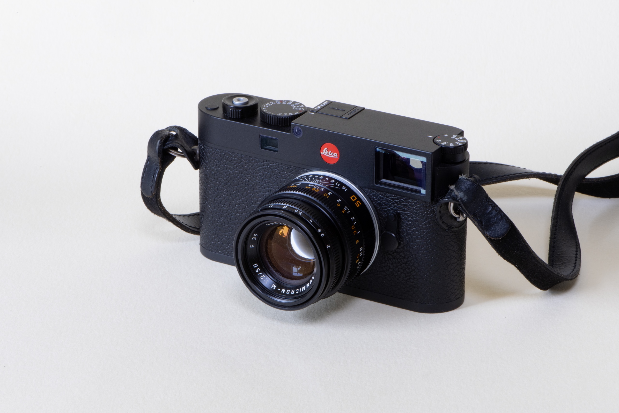
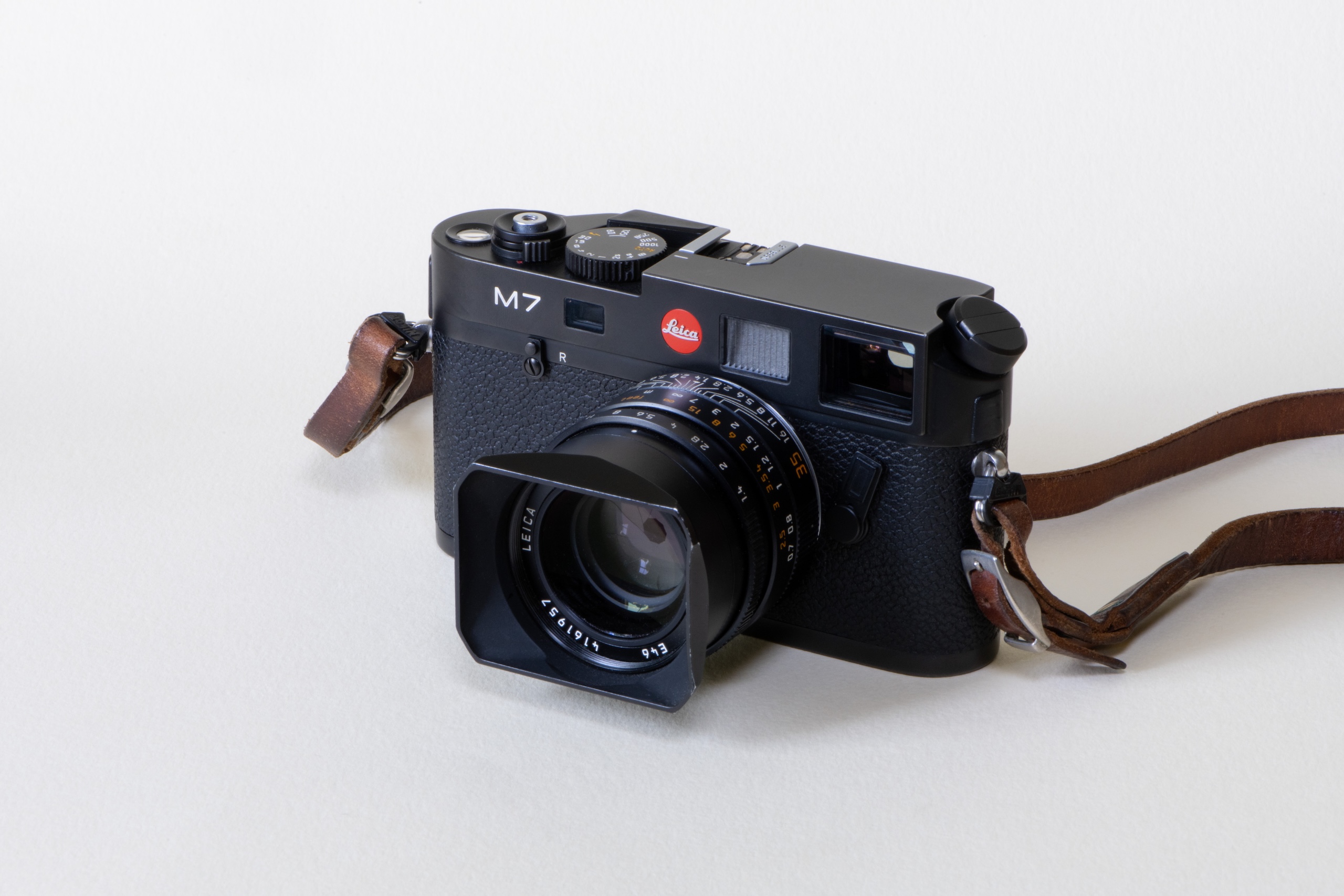
My Leica M7 and Leica M11 cameras.


Leadership

What feedback felt brutal at the time, but turned out to be useful?

Hard to mention any names, but the conversation went something like this, “We know the guidelines are finished, and we launch in a few weeks, but we have to change the name.”

Through the process, we discovered a more suitable name that was more relevant, more distinctive, more international, and more campaign-friendly. There’s always a solution.

What’s an under appreciated skill that design leaders need?

Tenacity. Don’t ever give up on what you believe in.

What keeps you up at night?

Ideas and tinnitus.

What trait is non-negotiable in new hires?

More than one. You have to be competitive, hungry, hardworking and a nice person. In an interview, I always ask myself, would I like to sit next to you?

You can teach the craft, but it’s hard to teach these traits, and they’re impossible to spot in a portfolio or interview. 
Any new hire must prove themselves.

Complete this sentence, “I wish more clients…”

…didn’t use Teams.

Source

By

“It’s like Tetris” – what studio managers want designers to know

How has the role of studio manager changed over recent years?

As budgets have been squeezed, and employee well-being has risen in importance, the studio manager role has broadened and become more strategic.

“It’s evolved from purely operational oversight to a hybrid of studio leadership, team coordination, and project management,” says Naima Hidalgo Muñoz, who “wears many hats” at Cardiff-based Toward studio, including studio manager.

“With many teams now working remotely or in hybrid set-ups, studio managers are expected to manage distributed workflows, maintain team cohesion, and ensure deadlines are met without the benefit of in-person oversight—which is challenging!” she adds.

For Jessica Moore, studio assistant at strategy and design studio Dalziel & Pow, as the role has become more diverse, it’s also become more human.

“It’s not just about admin anymore, although yes, I still know where everything is,” she says. “These days I’m also part culture-builder, part unofficial therapist, and occasionally, snack re-stocker.”

“I’m part culture-builder, part unofficial therapist, and occasionally, snack re-stocker.”

In terms of being more strategic, the role plays a more central part in agency life.

“It’s no longer just about scheduling,” says Emily Payne, director of operations at Turner Duckworth.

“It’s about creating the right environment for great work to happen, while navigating tighter budgets, faster turnarounds, and the ongoing challenge of finding the right freelance support.”

And with clients expecting more value for money, “studio planning has had to ‘box smart’ in how we resource projects,” says Becky Drew, WMH&I’s people and planning lead. “Generally, this has meant leaner teams. Ten years ago, we might have had three or four creatives on a project; now it’s typically one or two, supported by a wider network.”

She’s also noticed a welcome shift “towards prioritising mental health, wellbeing, and recognising individual differences. “Creating an environment where people feel respected and able to thrive is key – from rethinking processes to better supporting neurodiversity, to shaping working models that help everyone do their best work.”

Moore at Dalziel & Pow echoes this, talking of “fostering a studio environment where people feel inspired, respected, and like they want to show up, even on a Monday.”

What’s the most time-consuming part of your job, and why?

“Organising creatives is no small feat!” admits SJ Howard-Parkinson, practice manager at Shepherd&.

The architecture and interior design firm has four founding directors, “each with their own unique style of working. Understanding how everyone operates and being adaptable to their approach is absolutely key,” she adds.

“With shifting timelines and sometimes limited budgets, making sure we have the right people in place, while ensuring everyone feels creatively fresh takes constant care and attention,” Payne at Turner Duckworth says.

Drew at WHM&I backs this up. “Acting as the go-between within the studio, the most time-consuming part is gathering information from across the business to stay on top of shifting project statuses.

“Without this, it’s impossible to prioritise studio traffic accurately or fairly, or ensure work is delivered on time and on budget.”

Or as Toward’s Hidalgo Muñoz puts it, “It’s like playing Tetris with people’s time, while trying to keep everyone happy, and projects on track.”

The need to be across many different things at all times can feel non-stop. “Managing the energy, morale and day-to-day flow of a creative studio takes constant attention,” says Dalziel & Pow’s Moore.

What don’t designers understand about your role?

Most of the studio managers we spoke to gave similar answers, which is how much of their work goes unnoticed.

“Many designers don’t see how much behind-the-scenes negotiation, forecasting and fire-fighting goes into making their day run smoothly,” Hidalgo Muñoz says.

“Studio managers are constantly juggling budgets, client expectations, internal politics, and team capacity. We’re not just assigning work – we’re protecting their time, managing stress levels, and creating an environment where creativity can actually happen,” she adds.

Payne has a similar take. “Behind the scenes, there’s a lot of juggling and working with our client services team to make sure projects run smoothly, deadlines are realistic, and we’re not over-promising to clients.”

Likewise, Drew sees a studio manager’s job as lifting the pressure off designers so they can focus on the creative. “We’re there to smooth the process, spot issues before they arise, and reduce stress by bridging the gap between creative and client services.”

So it’s not just about shuffling meeting rooms, as useful as that is. Moore describes herself as the Wi-Fi whisperer, snack supplier and unofficial crisis counsellor.

“No matter what’s going on, I want people to feel they can come to me for anything, even if it’s just to ask where the good biscuits are.”

Howard-Parkinson is just a year into the design industry, and feels she could do with “a design industry-specific dictionary.”

“Maybe it’s just me being fairly new to the design world, but I often find myself googling abbreviations and phrases. There’s so much to learn, and no two projects or clients are the same.”

What’s the one thing designers could do to make your life easier?

Labelling is top of Moore’s list. “You’d be amazed at how quickly a studio turns into a tile-themed escape room when samples start showing up unlabelled.

“If designers could take five seconds to label samples, it would save me time and save me from writing emails that start with, ‘Hey, anyone’s sample?’.”

Meanwhile, Howard-Parkinson, who was previously in the hospitality industry, values a convivial atmosphere.

“I genuinely believe that everything runs smoother when the vibe is good. The most important part of any workplace is how people treat each other, and mutual respect is everything. A few jokes along the way help, but kindness and a friendly environment make all the difference.”

She, Payne, Hidalgo Muñoz and Drew all highlight communication. “Just keep talking to me,” Payne says. “A quick check-in or flagging something early helps me stay ahead of issues and support the team as best I can.”

Howard-Parkinson agrees. “Clear communication and straightforward direction are crucial, even if that can be a bit of a challenge when working with creative minds, but that’s part of the fun.

Because without communication, Drew says, “everything unravels.” Hidalgo Muñoz agrees. “It’s surprises that throw everything off.”

What’s the worst thing a designer can say to a studio manager?

Naima Hidalgo Muñoz: “Can I just have more time?” That usually means a cascade of scheduling headaches, unhappy clients and resource reshuffling.”

Emily Payne: “I didn’t realise this was due today.” When timelines are tight, surprises like that can throw everything off. A quick heads-up can make all the difference.

SJ Howard-Parkinson: It’s those little requests that pop up all the time, usually when you least expect them! “Hey, remember those 50 drawings I asked you to print the other day? Any chance you could reprint them for me?”

Source

By

Tothepoint brands new scheme to boost London’s biggest and most maligned borough

Tothepoint has created the branding for a new loyalty scheme for Croydon, building on its previous work for London’s biggest borough.

It has around 390,000 residents, of which more than 190,000 live in the town of Croydon itself, and it’s also home to big employers like the Home Office.

But Croydon has sometimes struggled with its reputation. In 2013, a poll named it the second crappiest town in the country and last year it was named “the most depressing place” to live in London, and the 12th most depressing in the UK.

This led to a feisty backlash though – last August The Telegraph ran a piece headlined, “Why Everything You Think About Croydon Is Wrong” which praised its spirit and innovation, and argued that “Britain’s most slandered town does not deserve its reputation.”

Tothepoint’s new visuals for the Checkout Croydon scheme

Like many UK high streets, “Croydon town centre is struggling,” says Matthew Sims, who has been chief executive of Croydon Business Improvement District (BID) since 2012. Part of his remit is to encourage more people to spend more time and money in the town centre.

BIDs are defined areas in which local businesses have voted to invest together to improve the local environment. Croydon BID is the biggest in the UK, and represents 500 businesses.

Sims and his team launched a discount card, designed by London-based studio Tothepoint, around 10 years ago, but it struggled to collect exclusive offers, and was short-lived.

This new iteration of Checkout Croydon is purely digital, and it’s open to employees, visitors and residents – other BID discount cards tend to be open just to employees.

Sim believes that “some towns and cities can be too risk-averse with campaigns. Creatively, we wanted it to be risky, different and to stand out.”

Tothepoint’s team was responsible for the brand concept, advertising, web development, campaign messaging and animated content.

The identity not only had to stand out so that it would drive public engagement, it also had to sit cohesively within Croydon BID’s broader marketing ecosystem.

Tothepoint has been working with the client for more than eight years. “Too often, I see businesses changing their approach to creative design from agency to agency,” says Sims. Instead, he wanted a long-term relationship for consistency and the studio’s ability “to take a campaign and really unpack it.”

Tothepoint’s redesign for Croydon BID

Previously, Tothepoint oversaw a brand refresh and redesigned website for the Croydon BID, which both went live in May 2024.

The new website merged previously separate BID and consumer websites into one offering, while having a clear split between business and leisure – blue and Avant Garde font for the former; pink and Silka font for the latter.

“Previously, they were competing against each other for attention,” says Tothepoint head of digital, James Hipkiss.

Tothepoint’s new visuals for the Checkout Croydon scheme

For Checkout Croydon, the designers looked at other BID websites, noting that in the US, where BIDs have blossomed, they are geared towards the consumer.

The Checkout Croydon brand mark has two interlocking C’s – for Checkout and Croydon – which form a subtle pin location icon. Its neon pink background is intended to be highly visible, and create digital impact.

For the Checkout Croydon campaign, Tothepoint set out to make direct connections with the target audience.

Creative director Kevin Cox says he and his team made a “conscious effort to bring in humour, and reflect the multicultural and working-class make-up of Croydon.”

Sims backs this up. “We wanted to talk to the punter, the customer, wherever you are, at work, in the pub, in the toilets. It had to be playful and put a smile on people’s faces.”

Tothepoint’s new visuals for the Checkout Croydon scheme

To avoid sounding corporate, Tothepoint went for conversational copy and cheeky wordplay across the card’s five categories of eating, drinking, entertainment, shopping and general.

“We were trying to test the water with street talk – we felt it might make even more of a connection,” says Cox.

They also developed a series of animated animal characters, and paired each with a headline. So eating’s “Deals to drool over” is illustrated by a big dog sitting at a dining table, saliva pouring out of its mouth as it eyes a burger.

Tothepoint used AI to implement the visual side of the concept more cost effectively.

“Checkout Croydon is not a silver bullet, but provides a tool,” says Sims. “The card offers businesses a chance to gain new custom, and keep current custom.”

In the first two days, there were 1,200 sign-ups, and website traffic was double those of a typical month.

Tothepoint’s new visuals for the Checkout Croydon scheme

Source

By

Have design job ads become too specific?

“The level of specificity on job ads now is insane,” says designer and founder of Never Dull Studio, Ben Mottershead.

He reflects a growing sentiment among designers that job listings have become too rigid in their criteria, particularly when it comes to asking for sector or industry experience.

The first thing to acknowledge is that this is not a new phenomenon. Designer Graham Wood remembers an illustrator friend losing out on a commission to draw bananas in the 1980s, “because they hadn’t previously illustrated bananas.”

More common, or more visible?

Some recruiters we spoke to explained that as frustration in a difficult job market boils over, we just hear more about these frustrations than we used to.

Dan Poole, the founder of Path design recruitment, subscribes to that view.

“I’ve been recruiting in this space for nearly 20 years, and I don’t see this as anything new,” he says. “It’s just more visible, as it’s shared on social media.

“Design is a fast-paced industry, and clients and agencies are time poor. Clients are always specific on their needs and rarely bend them.”

But others in the industry do think things have changed. Craig Ward admits that asking designers for industry-specific experience “has always been a thing to an extent.” But, he says, “It has definitely become more pronounced over the last few years.”

And Daisy Crowder, the brand and marketing director at design recruitment specialists Craft, agrees.

“We’re definitely seeing more clients asking for specific sector experience, especially in brand and strategy briefs,” she says.

Crowder says this requirement is most commonly used for freelance roles, which seemingly makes sense. “It’s usually about minimising risk; they want someone who’s done it before and can hit the ground running.”

A tough job market

It’s hard to find reliable and up-to-date information about the state of the design job market. And clearly it’s not a homogenous whole – the state of UX hiring is different to graphic, industrial and interior design.

In June, Fast Company published its second annual design jobs report. Its team analysed data from 176,000 US job listings between October 2023 and February this year.

“The clearest and perhaps most reassuring takeaway this year? Designers are still needed,” Fast Company’s data editor Andrew Thompson wrote. It was a mixed picture across different disciplines – while game and urban design jobs were up, graphic and UX jobs were stable, but product design listings were down 24%.

One of Fast Co’s main takeaways was that even though the design industry is under pressure from the rise of generative AI, it’s not currently affecting job listings. “If an AI-driven design industry apocalypse is coming, it hasn’t arrived yet,” Thompson wrote.

But even if the number of job listings are relatively stable, it feels like the market is more competitive than ever. Several high-profile agencies have laid people off, as have brands like Bumble, which recently cut its in-house design team.

Leapers, an organisation that promotes freelancers’ mental health estimates that between 25 and 30% of current freelancers didn’t choose this way of working, but were forced into it. Some of them clearly take to freelance life well, but for others it’s a precarious necessity.

A broken system

Against this backdrop, we hear from a lot of designers about the mental toll of navigating the current job market. From ghosted applications to overly onerous design interview tasks, there is a sense that things are broken.

It’s not just industry- or sector-specific experience that designers say they’re seeing on job roles.

London-based design director Harry Thornbory, who was previously brand and design lead at ITV, says job listings increasingly stipulate the names of agencies they expect applicants to have worked with.

“While I get sector and type of work experience as a criteria, the requirements to have worked at certain agencies or studios comes across as a ‘closed shop’ mentality,” Thornbory says. “Surely it’s a smaller pool of talent?”

As different stringent requirements are added to job roles, this creates a matrix effect, says US-based creative director Prescott Perez-Fox.

“Lately you see 2×2 levels of specificity,” he explains. “So not just a branding designer with experience in real estate, but an icon designer with deep sector expertise in commercial office leasing. Construction and residential experts need not apply!”

Many designers are similarly quick to poke fun at what they see as the ludicrous specificity of current job listings

“We get requirements like ‘must have no less than three portfolio projects for diet cannabis CPG brands that included motion principles, print campaign, and cross-platform social strategy’,” says freelance design director Brooks Heintzelman.

“Every employer seems to want a proven commodity,” he adds. “No-one wants to be the one who takes a chance on a hire and it not work out.”

Fresh eyes vs a safe pair of hands

Daniel Swann, creative director of Swann-Studios agrees. “Client-side it’s risk aversion, and confirmation the candidate already gets the sector and all the nuances that come with that,” he says. “Risk aversion is always higher in economic downturns.”

But is it that simple? Some believe that because there are too many designers going for too few jobs, adding specifications to job listings – freelance or permanent – is a way of managing the deluge of applications that can feel overwhelming.

Others think that there are specific nuances in some sectors and industries that require some direct previous experience. When we polled our LinkedIn community about these types of requirements, 69% said it was valid in certain sectors.

“If you work in the drinks sector, specifically spirits for example, it has its own language,” says D8 Studio creative director, Adrian Carroll.

“If you don’t understand that, it can take a while to get to grips with, and the client doesn’t always have the time to make that investment.

“I’m not saying it’s always right, and good designers can definitely learn and switch sectors, but I can understand why certain roles look for sector experience,” Carroll adds.

But for some designers, it’s a cautious approach that compromises the creative thinking.

“It’s a misplaced risk reduction strategy,” says How&How strategy director Jack Wimmer. “In reality it just increases the odds of the work looking like other brands in that category.”

And interestingly Craft’s Daisy Crowder says their team is starting to see push-back against the desire to hire someone with familiar experience.

“Where the studio manager might lean on known contacts with sector knowledge to get somebody in quick, we’re hearing directly from the creative directors who ask us for adjacency over exactness,” she says.

“Fortunately the more creative-led thinkers are still after a fresh pair of eyes, over a safe pair of hands.”

Source