
Whether you’re tuned into fashion or not, chances are you’ve seen the viral clip of an invite to the SS24 show by Rains, the Danish outerwear label that began its journey with a single poncho and has since transformed into a global cult brand for neo-Scandinavian rainwear.
In the clip, the invite seems blank at first, but once it’s held in the rain, its message appears – revealed only when drenched.
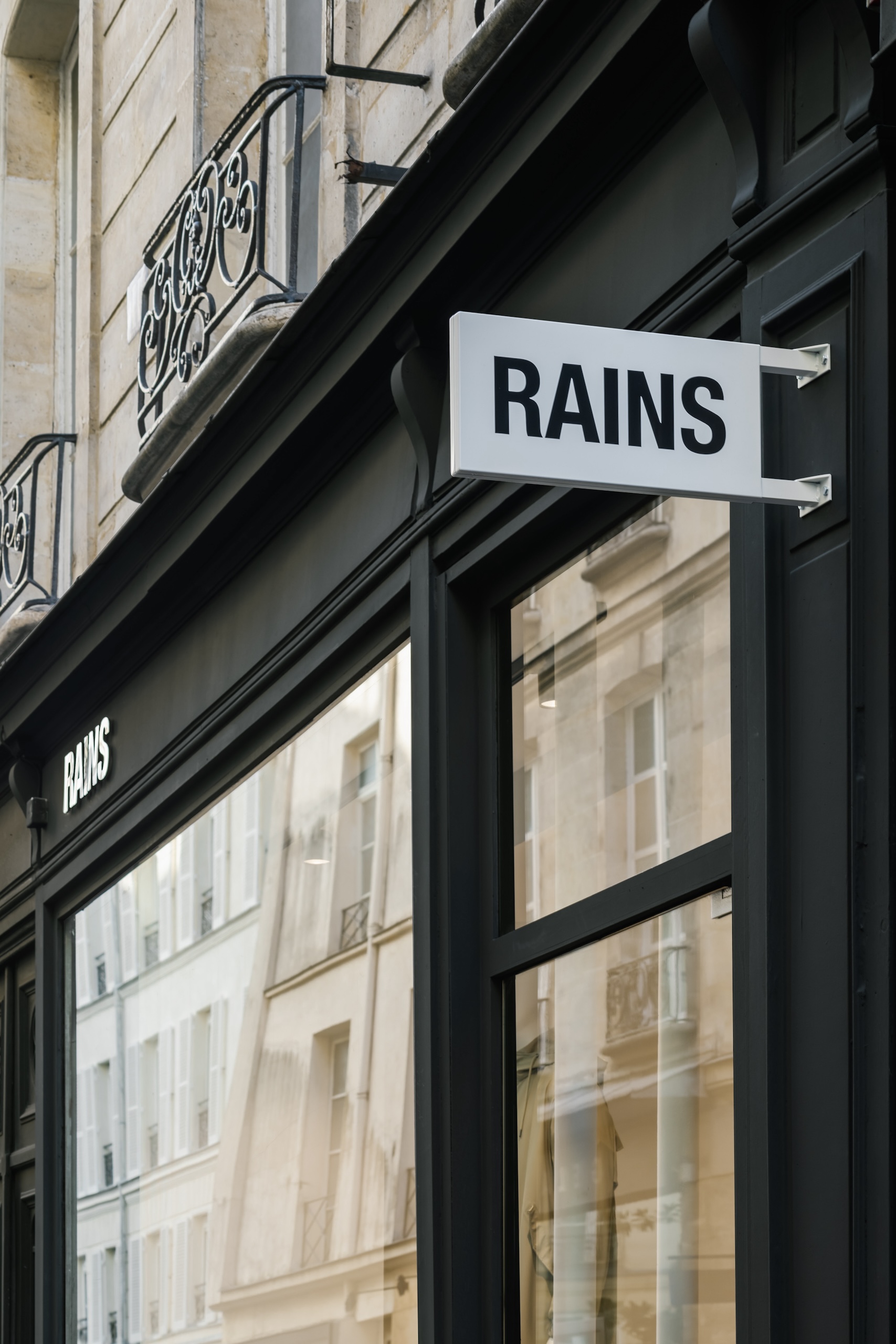
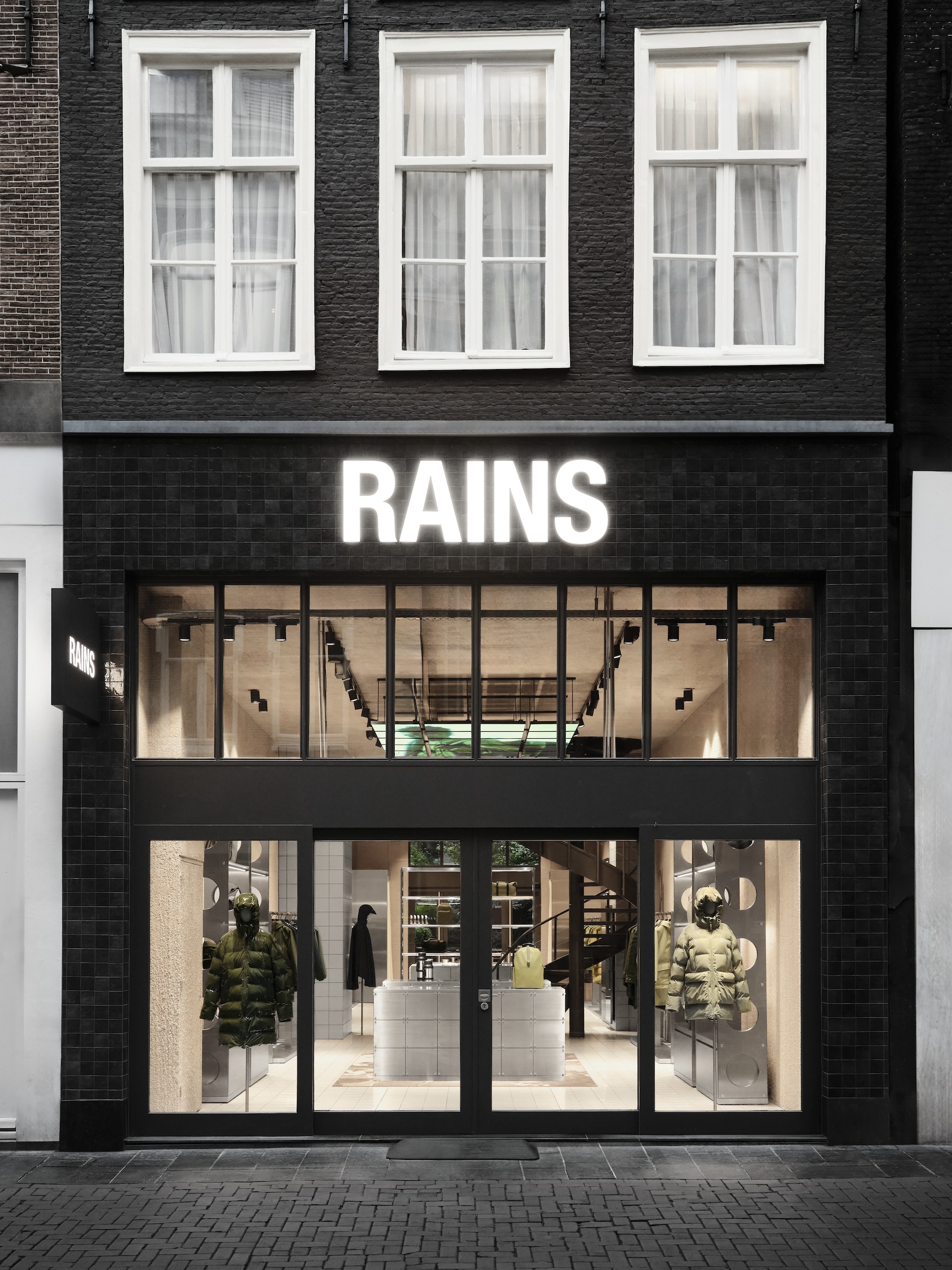
The brand has come to be known for its material innovation, functional minimalism, and urban-outdoor sensibility. What’s perhaps less celebrated is its graphic voice – the quiet wit and visual precision that give form to how the brand speaks.
While the Rains aesthetic is rooted in Scandinavian minimalism, its design team continues to find subtle moments of surprise within that restraint. There’s a sense of play beneath the polish – whether it’s an invitation that comes to life in the rain, or a sticker book that playfully layers looks from the AW25 collection, each gesture expands the brand’s visual language without breaking its clarity.
To understand more, we spoke with brand marketing director Joshua Bredehoeft about the brand’s visual world, the joy of editing, and why, at Rains, design and marketing move as one.
What have been the pivotal moments of creative risk or reinvention that shaped how Rains expresses itself today?
I’d say there were three major moments.
First, digital shows. They made us imagine Rains through a digital lens – as this was the only way to communicate with our audience when we were in lockdown. It encouraged us to explore 360-degree storytelling from a digital POV, which has informed how we campaign today, where the concept funnels down across everything – social, web, product descriptions, packaging.
It forced us to think in “hooks” – creating something visually arresting and compelling, which makes people think differently about our brand.
Second, our Paris Fashion Week runway shows. Debuting on this calendar transformed the perception of Rains – internally and externally.
It evolved what Rains could be from a product level, which then gave us the green light to trickle this identity down into everything else.
We got to think about what a runway moment looks like for a brand like Rains in Paris. The contrast of an urban outdoor brand on a sophisticated runway gave us new tensions to explore. That has 100% informed so much of what we do today.
Each of our shows also has its own identity, allowing us to play and contrast our minimalist graphical universe. That pushed us outside of our comfort zone and gave us the courage to imagine ourselves through a new graphical lens.
Thirdly, the new identity. The former was very heritage-based. The new one (launched in 2022) was like a fresh haircut that made us feel like ourselves.
It gave us the courage to dare, to be more editorial whilst sticking to our roots of urban exploration. Some of the people who followed us from the beginning were very provoked by the change, but as time went on, they saw the vision.
Let’s talk about that identity. What made it the right time for a change, and what did that shift unlock for the brand?
The former was very heritage-focused and called for visuals that didn’t feel aligned with the new direction we wanted to take.
We had come to a place where we were quite serious about pursuing a runway version of Rains, speaking to a more conceptual universe that mixed an urban lifestyle with a sense of exploration.
The new logo gave us a base to be bolder with our concepts and seasonal storylines, whilst maintaining a clean expression to contrast any wild ideas.
Rains is often described as embodying Scandinavian minimalism, but minimalism can be restrictive. How do you work within that framework while leaving space for visual evolution?
To be Scandinavian is to edit, edit, edit – to take an idea to its core, its simplest place and work from there.
This means you really understand what you’re trying to do and why, which is always a great foundation for creative or graphic work because it doesn’t feel like restraint, but clarity.
Have there been any recent projects or experiments where you deliberately pushed that minimalist language?
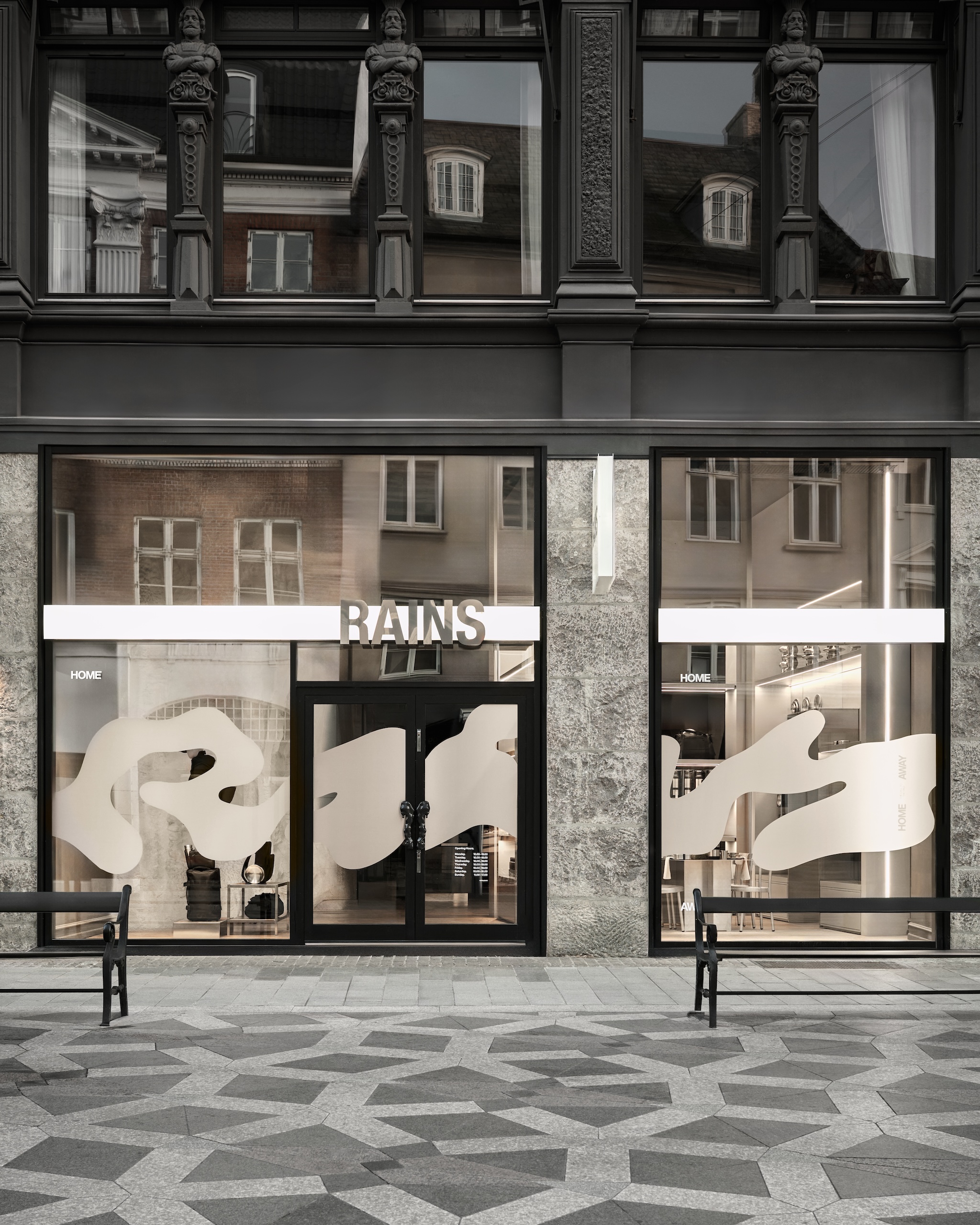
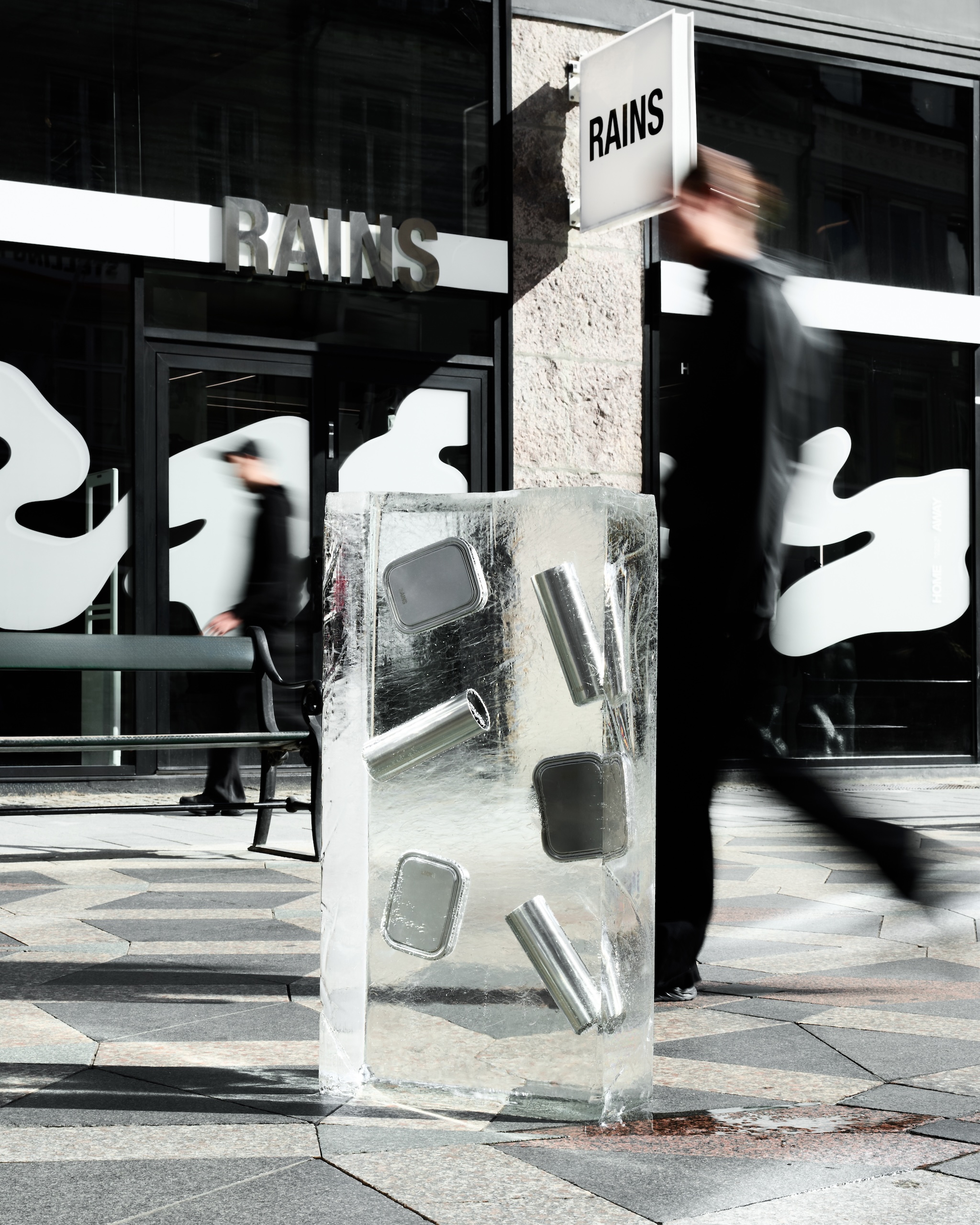
Actually, yes, the recent launch of our HOME AWAY collection is a great example.
Homeware is a newer category for us, so the team decided that it needed a whole new graphic identity – one tied to both the brand and concept, which is about balancing the indoors and outdoors, brutalism and the softness of nature.
They came up with a beautiful, expressive take on the Rains logo, organic and inspired by blurred writing on rainy windows. This was contrasted with the minimalism of the HOME AWAY logo, which was clean yet smartly constructed to represent the hybrid uses for the actual designs.
We chose to keep this simple because we needed this logo to feel like part of our world, visually. It’s the contrast between the two that I believe is very strong.
Rains often builds intrigue through understated, yet viral gestures, like the rain-activated SS24 invite. How deliberate is that use of curiosity in your communication strategy?
Curiosity is one of the biggest strengths of our team. What’s amazing about the Rains universe is that it’s very clear. Wet, urban, and explorative.
Those creative confines are the very canvas that allows us to constantly ask – “How can we iterate? What story have we not told yet?”
We have yet to run out of ways to express ourselves, and I don’t see that stopping anytime soon.
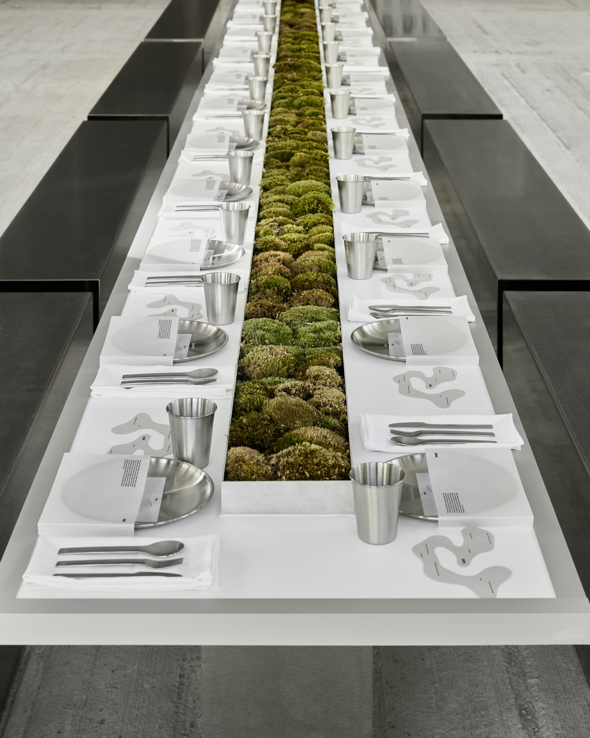
Rains’ print experiments – like the recent For When it Rains book and the sticker book – feel like cultural objects in themselves. Are they tools for storytelling, brand building, or creative play?
Honestly, the answer is a little bit of each. Take our Getting dressed should be fun sticker book, for example. While visually simple, it showed the breadth of our AW25 collection.
This season, we’ve introduced knitwear, and we have such beautiful layering options, so we needed to communicate this graphically. Using clean pack shots to create a nostalgic sticker format lets us layer pieces, subliminally visualising the brand’s evolution for our audience, and having some fun in the process.
And are these print experiments for customers, or are they intended more as internal creative artefacts and brand expressions?
They started as creative artefacts to feed social content, but they are growing into customer-facing activations. We recently created a small recipe book for our HOME AWAY launch that we gifted to customers when they purchased our homeware products.
This elevates the storytelling and allows customers to see the products in real-world scenarios. You’ll see a lot more of this in the future of Rains.
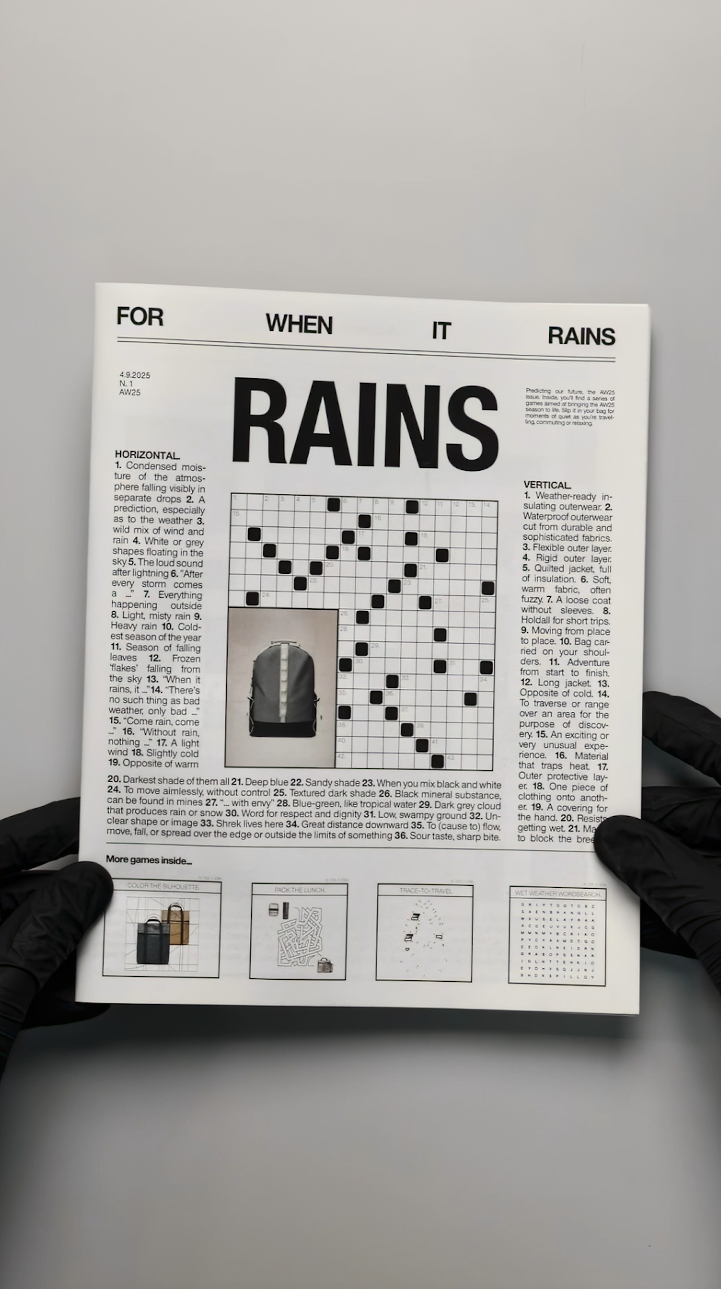
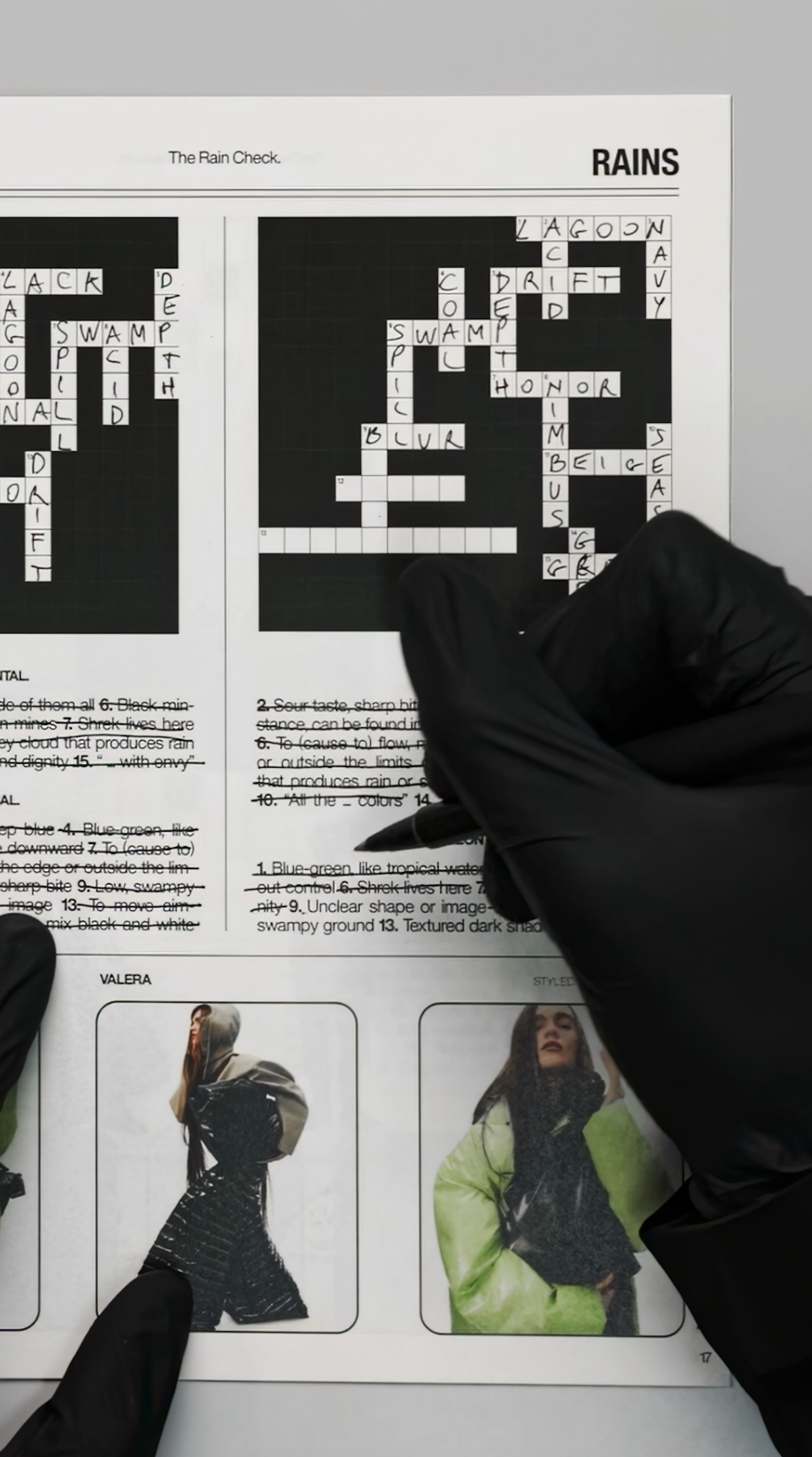
The design of the For When It Rains booklet is particularly striking. How did that come to life?
The booklet takes inspiration from classic printed crossword and quiz magazines. Its design is raw, simple, and direct.
We wanted it to evoke nostalgia and be something physical that can actually be interacted with. We see the booklet as a reminder that even rainy days can be transformed into moments of joy, relaxation and leisure.
It features various games – crosswords, word searches and join-the-dots – inspired by our brand, universe and collections, alongside visuals from our latest campaigns.
What does building a brand through design mean in practice at Rains? How do you make sure the storytelling carries through not just the big campaigns, but even the smaller design gestures?
We see everything as an opportunity to deepen the storytelling and narrative around our brand.
I actually think it’s the tiny details that our community notices most – and we take great care to bring the same stylistic and conceptual approach to all those “smaller” creations.
The logo for the Rains x Umbro collection
Rains has a strong internal creative culture. How is the relationship between marketing, design, and creative direction structured internally?
We’re a tight-knit and concise team, each with our own specialisms. We work closely on all projects, and our work is quite horizontal.
Instead of work being passed from art director to copywriter to designer, everyone is briefed together, creating a more collaborative way of working.
Collaboration is the foundation of Rains’ creativity. Graphic design and creative direction sit as part of the marketing team, joining in brainstorms and strategy meetings so that everyone has a solid overview of all activity, and their role within it.
How do you define taste within the brand? Are there guiding principles that help maintain Rains’ aesthetic consistency while still allowing experimentation?
Contrast. Duality. That’s always one of our guiding principles. If the imagery feels colder, how can we create warmth or “contrast” through our graphic touches? We see ourselves as a brand built around duality; we design for the urban outdoors – a contrast in itself.
To what extent do you see Rains’ graphic design as a differentiator in a crowded lifestyle market? Do you consciously design to stand apart from competitors?
We choose our aesthetic based on what works for us, what feels like us.
Innovation is part of our DNA – from our very first product – so pushing and reinventing our graphic language feels as natural to us as designing the pieces themselves.
It’s always nice to stand out, but I wouldn’t want us to do anything purely to stand out. It has to connect with what we’re saying and where we’re trying to go.