
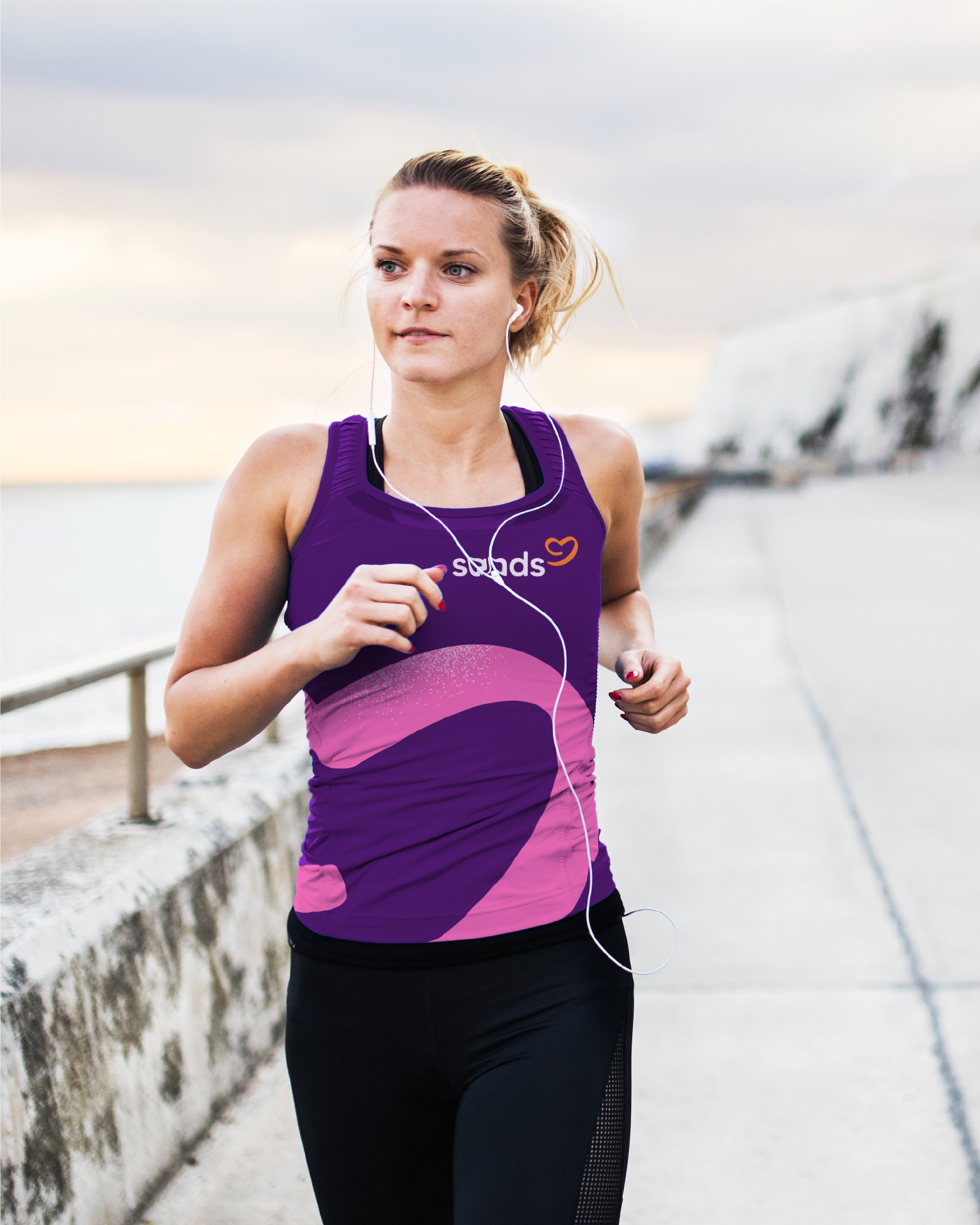
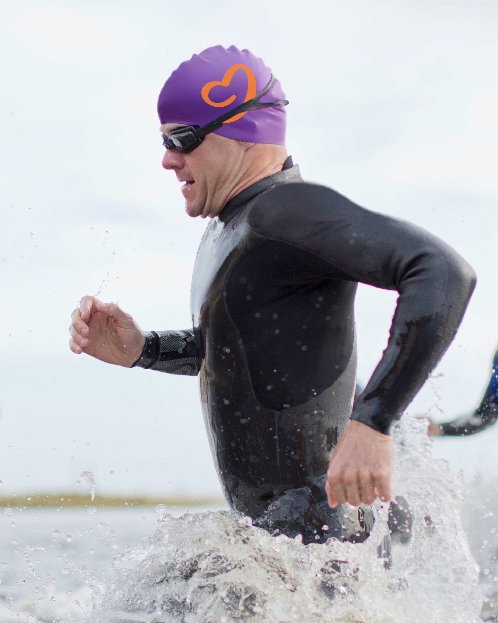
The Team has created a new visual and verbal identity for Sands, one of the UK’s leading pregnancy and baby loss charities.
Founded in 1978, Sands supports families and others affected by baby loss, and funds research to prevent baby deaths in the future. In 2023/24, 760,000 people accessed its support and advice services, and Sands was involved in 90 research studies alongside bereaved parents.
The challenge for the charity was that these two parts of its mission didn’t always sit easily together in its branding and communications.
Initially Sands commissioned The Team to carry out a consultation, to see where its existing identity wasn’t working. From those conversations, it emerged that a new look and feel was needed to “better reflect the ambition and breadth of Sands’ work.”
“We needed to do something new in order to make the impact that we wanted to make,” says Alexis Aggett, creative and design lead at Sands. “The initial part of the project was exactly how we usually work – listening to people, and finding out what needs to happen for real change to be made.”
The Team’s new identity for Sands on a brochure
Over the course of 18 months, they ran surveys, workshops and created a steering group to gather as much information from the community as possible. In the end, more than 10,000 pieces of feedback, from thousands of different people, fed into The Team’s work.
On the one hand, they discovered that 24% of people who had experienced baby loss had never heard of Sands. On the other hand, those people who did know Sands sometimes felt unable to access the support it offered.
“If someone’s experienced pregnancy loss, we don’t want them to be questioning if the gestation is far enough along for them to have support,” Aggett says. “Everyone deserves to have their voice heard, so that they can make a difference.”
Sometimes, this very personal, human side of the brand took a back seat to its campaign work.
“The insight part of the charity was very much at the fore, compared to the more emotive, community part,” says The Team design director, Ryan Miller. “That’s a big part of who they are, but it just wasn’t coming across.”
Miller explains that sometimes the identity could show up in a jarring way, because the tone with which they championed the great policy work they do could feel “diametrically opposed” to what grieving parents needed, or expected.
He says it was key that the listening exercise didn’t “shy away from” the very sensitive, emotional nature of baby loss, and the team found that often, “the strongest advocates in the room were the ones that had been on the most traumatic bereavement journeys.”
The aim was to “reconcile” those audiences and draw a line between the two experiences. “That level of in-depth research gave us the knowledge and understanding that meant we could design with confidence,” Aggett says.
The Team’s new identity for Sands
While making the required changes, they also needed to bring people with them for whom the old brand still meant a great deal. Internally, they referred to the work as a “brand strengthening” exercise, rather than a brand refresh, because they found this resonated more strongly with internal stakeholders.
The previous logo, showing a foetus with a teardrop, was found to be “quite divisive” but it “had acquired a huge amount of emotional cachet, because of its longevity,” Miller explains.
The new symbol is more abstract – some people see a heart, some see the outline of a baby in the negative space, others see a speech bubble.
“The ambiguity of the mark is its strength,” Miller says. “In the testing phase, those audiences that needed to see the support tended to see the heart. The audiences who were wanting to be more vocal around baby loss, they see the speech bubble.”
The typeface used for the wordmark is a custom version of a MADE font, which Miller chose for its “natural geometry” and “softness in the detailing.”
The name is moved into lowercase, with the two bookending ‘s’ letterforms representing “saving” and “supporting,” the two main strands of Sands’ work.
The Team’s new identity for Sands
Miller says Aggett pushed The Team to ensure that warmth and humanity showed up across every visual touchpoint. The colour palette is bright and soft, most of the shapes have rounded edges, and texture is used to ground the identity.
They also did a lot of work on the tone of voice, to land on something that could engage both parents and policy-makers, medics and researchers.
“The primary focus was to make our language more relatable and make our mission, our values, and how we work clearer and more succinct,” Aggett says.
The new look has been rolled out across the Sands website and digital channels, but its print and other IRL components will be updated on a rolling basis, to make the changes as sustainable as possible and use the charity’s funds responsibly.
But, Aggett says, they are already seeing the impact of the new branding.
“We knew there was a lot we were doing right, but it wasn’t necessarily translating to who was talking about us and who was coming to us,” she says. “The wonderful thing is that those conversations have already started to happen.”
Aggett says that research has shown that half of the UK adult population have been affected, directly or indirectly, by pregnancy or baby loss. “This is not a niche subject, and so it’s important that we normalise conversations about it,” she says.
Miller agrees, and says they want to lessen the taboos in the same way mental health awareness has transformed over the past 15 years. “We want to get to a point where it’s a lot easier for anyone who’s affected to talk about it.”
The Team’s new website for Sands