By

“Graphic design is too one-dimensional” – Sarah Hyndman on her multi-sensory mission

Sarah Hyndman has an experiment she has been running at events for several years. She asks people to sniff two bottles of perfume and then say what they smell in each. Both perfumes are identical – only the typography on the bottles is different.

And yet 72% of participants, nearly three quarters, describe the perfumes differently.

It’s a perfect example of the sorts of insights Hyndman has been sharing through her books, talks, and other projects for the past 12 years.

Having worked as a graphic designer – “one of the original Mac monkeys” – and run her own agency, Hyndman started Type Tasting in 2013, inspired by Stefan Sagmeister’s regular client-free sabbaticals.

She wanted to research type’s ability to influence our other senses, find evidence to back up her intuition, and bring this knowledge to a broad audience (which she does through Type Safaris, and wine-tasting events among others).

Now in her new podcast, Seeing Senses, she is interviewing chefs, psychologists and perfumiers, “to discover how they connect what we see to what we sense and feel.”

We sat down with her to find out why she thinks multi-sensory design might help save the industry.

Sarah Hyndman’s podcast Seeing Senses

How does your podcast build on Type Tasting’s work?

From the outset, Type Tasting was always multi-sensory, but I was looking at typography because it was a niche area. Type was just the gateway into the other senses.

So we start with what you see, vision. Vision is about what gets your attention – that’s what branding and packaging does. But in my opinion, what we’ve forgotten in design is the follow-through – that senses like smell and sound boost the mood more than vision.

So you need to back up the experiences you are designing with all the other senses if you’re going to create an emotional connection, make something feel personal, and create memories.

What does that mean for graphic designers and their work?

I think graphic design, as a term, is too one-dimensional.

The visuals are the flag for your brand, so you can recognise it really quickly. But what does it sound like? What does it smell like? What does it feel like? How does your experience of this product change from location, to moment, to experience?

I think we need to rewrite our job descriptions, so that we start thinking in a multi-sensory way from the outset. Who cares if it wasn’t in the brief? We need to be the challengers, the rebels that are saying “No, I think you need to think about this differently.”

If we keep doing what’s already been done, that’s what AI could do. Our job is to find the gaps, to be the mavericks, and to do the lateral and creative thinking which, at the moment, AI can’t do.

That infamous Future of Jobs report, that said graphic design was at risk of becoming extinct, was a wake-up call.

That report is based on what business leaders think will be important over the next five years. Why is graphic design not seen as a useful skill? And do we need to talk about what it does in a different way?

Yes, absolutely. Leaders need to see designers doing something, or being something, different. It always used to be that clients loved visiting their agencies. Why aren’t businesses excited by designers any more?

I think we need to show people something that makes them say, “Oh, we need that.” Rather than showing them something which will win them awards.

Type Tasting activations at Adobe Max. Photo by Grant Terzakis.

As someone now studying neuroscience, how do you see the relationship between science and creativity?

I did science all the way through school. I’ve never studied graphic design, so nobody ever told me I wasn’t allowed to experiment.

As designers, we’re given permission to come up with solutions that fit the brief, but we’re not somehow given permission to go out and experiment.

And there is a big misconception that science is very rigid, and will take all of your creativity away. Whereas real research is about constantly interrogating every statement. Always asking why, like an annoying five-year-old.

And that same curiosity is key to good design as well, right?

Exactly. But as designers, I think we’ve lost a bit of bravery to do that. So my thing is – think more like a scientist. Science is about proving yourself wrong, and finding what’s right.

The interesting stuff, when it comes to my experiments, are the really weird answers, the outliers. That’s where the magic is – when someone tells you something different, and you discover it’s because they grew up somewhere where that means something else, or they’ve had an experience where that means something else.

A lot of your experiments seem to be very fun – is that an important part of designing them?

If I want people to take part, I have to make them really understandable. I have to make them fun. And if I’m going to gather your data, I need to give you something – some insight or learning.

I did a talk for 1,000 people in Germany not so long ago, where we gave them all pairs of jelly beans, and I played a load of different stimuli, to show how it changed what they tasted.

I talked them through the science of what happens, so that everybody could feel for themselves how it worked.

A Type Tasting event at London Design Festival. Photo by David Owens.

Is there any tension between that sense of fun, that showmanship, and the scientific rigour you are clearly interested in?

I like that I sit in the middle. I think as designers, we are basically showmen. Packaging, branding, everything that we do is about showmanship. It’s about catching attention, selling imagination, sensation transference.

But then in spaces like FMCG, they have consumer neuroscientists, and everything is measured to an infinite degree.

What’s your hope for the podcast, and the new books, you are working on?

Hopefully they will help graphic design to keep changing, so this amazing profession can stay alive, but also evolve as it needs to.

Type Tasting does wine tasting in London. Photo by David Owens.
Source

By

David Alonso is Redefining the Future of MotoGP

If Formula 1 is the king of car racing, then MotoGP is its two-wheeled equivalent – making for the highest level of professional motorcycle road racing in the world. With riders hitting speeds of over 220 miles per hour, knees scraping the asphalt in death-defying corners, and races that often come down to hundredths of a second, it’s definitely not a sport for the faint of heart. Enter: David Alonso – a fresh-faced 18-year-old who has already etched his name into motorcycle racing history.

And the best part? He’s representing the Latinos.

Born in Madrid to a Spanish father and Colombian mother, he proudly races under the Colombian flag, and he’s quickly becoming the next racer to watch in the world of MotoGP. 

The MotoGP World Championship is divided into three classes: Moto3, the entry-level category, featuring smaller 250cc four-stroke engines; Moto2, the next step up, featuring more powerful and even faster bikes with 765cc engines, and MotoGP, the premier class where legends compete on custom-built, state-of-the-art bikes. 

As of right now, his meteoric rise through the ranks of Moto3 has captivated fans worldwide, positioning him as a formidable talent to watch in the Moto2 World Championship and beyond. Here’s a closer look at his impressive trajectory. 

From Toy Bikes to World Records

Alonso’s passion for racing ignited at the tender age of five when his parents gifted him an adorable toy motorcycle. But while we may have all been gifted Sesame Street-themed pianos or Barbie’s Malibu Dream House as kids, not many of us have taken the steps to make those childhood toys into adulthood realities. 

Yet for the 18-year-old Colombian athlete, this seemingly innocuous present sparked a lifelong dedication to the sport. By the age of six, he was already competing in regional championships (!!!), propping him up for a career marked by relentless ambition and exceptional skill.

Alonso would eventually become a force to be reckoned with, if that hadn’t been established already by his literal racing skills at six years old, as he went on to earn the Spanish 85GP Championship in 2018, secure the European Talen Cup title in 2020, and eventually win the Red Bull MotoGP Rookies Cup with six victories and ten podiums by 2021.

RELATED POST: Brazil Hosting the FIFA Women’s World Cup Is a Big Deal. Here’s Why.

Alonso would then go on to make his official, full-time debut in the 2023 Moto3 season – which was nothing short of spectacular. He clinched four victories and four additional podiums, earning the title of Rookie of the Year and finishing third overall in the championship standings. 

The following year, Alonso’s performance reached real historic heights. In the 2024 season, he amassed 14 wins out of 20 races, setting a new record for the most victories in a single Moto3 season. Seven of those wins were back-to-back-to-back, landing him a whopping total of 421 points, the highest ever in the Moto3 category. With a record like that, it’s no surprise he went on to win the Moto3 World Championship, and subsequently solidified himself as the most successful rider in Moto3 history.

Latino Representation in Motorsport

Alonso’s wins on the track are clearly more than just a personal triumph; it’s a win for Latino representation in motorsports overall. Most riders within MotoGP, motocross, and motorsports in general tend to be from Europe, which doesn’t give other racers with talent the ability to push through the barriers that stand before them. Even his decision to run for Colombia instead of Spain (again, his father’s heritage) stands out as a huge defiance of what is traditionally represented on an international level.  

In true Mami’s Boy fashion, Alonso made the decision to run for Colombia in honor of his mother’s unwavering support over the years.  

In an interview with El Colombiano, he elaborated on his choice, saying, “It’s a decision I made together with my team and my family to honor my mother. To raise the tricolor flag as high as possible. When you hear the anthem, you feel much more special in those podium moments. It just makes you feel better.” 

The love is being given right back to him, with his success resonating deeply in Colombia, a country not traditionally known for producing motorcycle racing champions. Alonso’s achievements have ignited a newfound enthusiasm for the sport, inspiring a generation of young Colombian riders to pursue their own dreams, and even a new entertainment surge of motorcycle stunt shows in places like Bogota and Medellin. Who knew? 

What Lies Ahead

This year, Alonso has already taken the next step in his career by moving up to the Moto2 World Championship with the CFMoto Aspar Team. He’s one of the team’s newest and youngest additions, and while the competition is fiercer and the challenges are sure to be more demanding, Alonso’s track record suggests he’s well-equipped to excel beyond expectations.

And his aspirations don’t just stop at Moto2. The budding Colombian rider has his sights set on MotoGP, the very pinnacle of motorcycle racing. 

With his blend of talent and determination, he’s got everything it takes to become a future world champion. But even more impressively, he’s walking that path for Colombia and Latinos everywhere. It’s a feat that hasn’t been given to Latin America in the past, but is sure to soon develop more racers like Alonso ready to show the world that we’ve got what it takes.

The post David Alonso is Redefining the Future of MotoGP appeared first on Nuestro Stories.

By

Garden variety – V&A Dundee hosts ambitious design exhibition

V&A Dundee’s new exhibition starts before you get up to the first-floor gallery.

As visitors enter the main hall of Kengo Kuma’s 2018 waterfront building, they’re confronted by 11 big white flowers dangling from the double-height ceiling.

Called Shylight and created by Amsterdam’s Studio DRIFT, the floral forms slowly rise and fall courtesy of robotics, with their silk petals folding inwards, mimicking those flowers which close up at nightfall.

Thought-provoking and visually pleasing, it sets the tone for Garden Futures: Designing With Nature, the exhibition which opened last week and runs until 25 January.

It also hints that not everything in the garden (exhibition) is rosy. Beyond horticulture, there’s also technology – starting with those Shylight robotics – and art. That’s quite a juggling act.

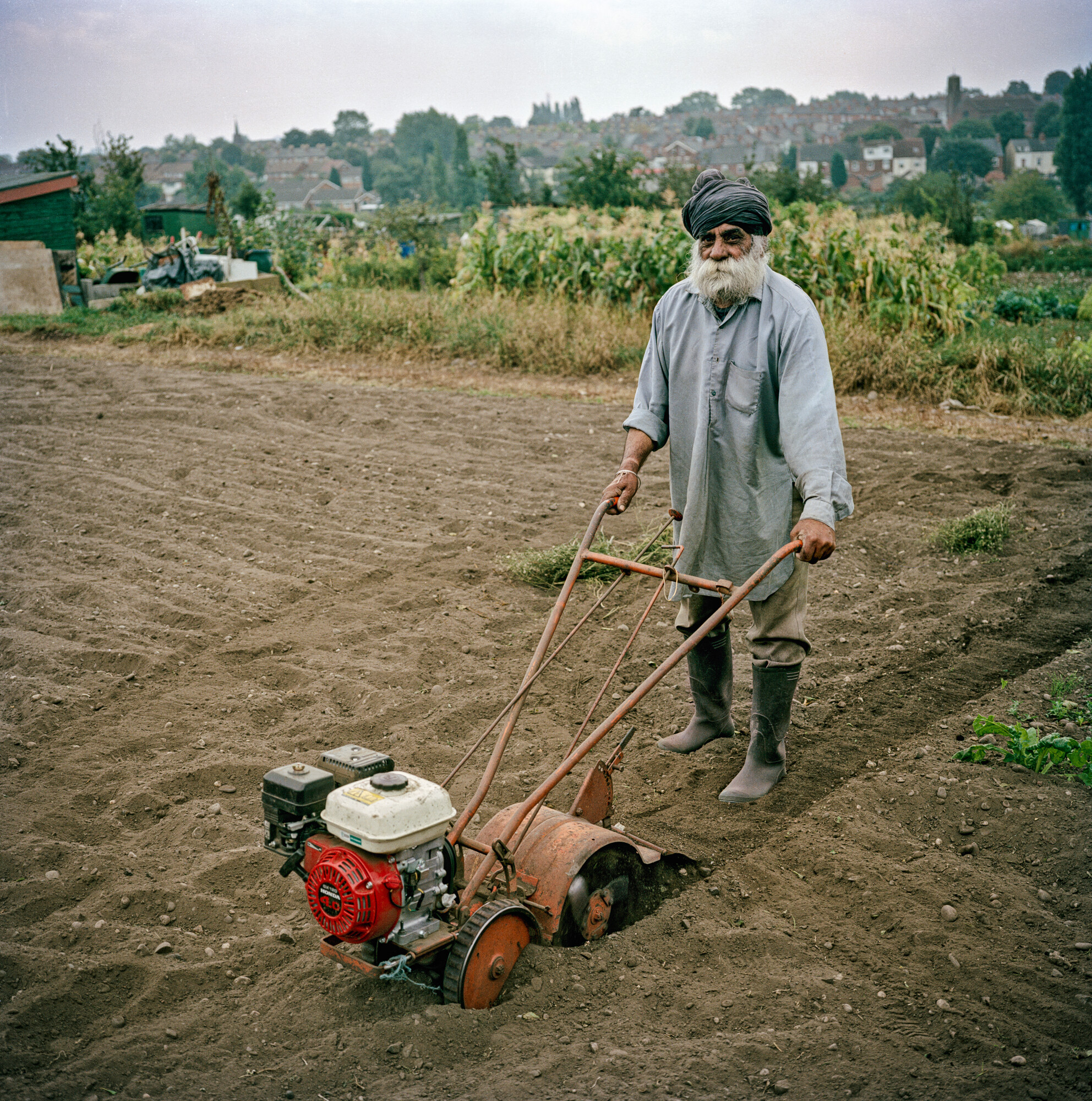
As a long-standing allotment holder, it was the horticulture content which drew me in. If I hadn’t had that focus, the exhibition could have been overwhelming: so many topics, so many ideas, so many things to take in.

This is the touring show’s only UK stop, having debuted at Vitra Design Museum in Germany’s, before appearing across various European venues. Vitra Design Museum’s deputy director Sabrina Handler claims it’s the first major exhibition on the history of modern garden design.


The original show comprised 300 objects. V&A Dundee has an extra 200m2 of space to play with, and has added another 130 objects to give it their own spin and highlight some Scottish contributions to the topic.

Msoma Architects were brought in to reimagine the show for Dundee, building on Formafantasma’s original concept for the Vitra Design Museum. The graphics were handled by Boris Meister.

In terms of the gardens on show here, they vary from productive spaces for work, rest and play, to places representing spiritual, cultural and political ideas. What they have in common is that they’re all designed spaces.

Like a virulent form of bindweed, this show is covering a lot of ground. Its material is grouped in sections themed as Paradise, Sanctuary, Retreat and Labour of Love. It’s Paradise that makes the strongest impression – and rightly so – with its ice-cream-pink structure.

The Paradise section, designed by Msoma Architects. Photo by Grant Anderson

The overarching aim is to demonstrate how garden design impacts us both functionally – providing food, hence Birmingham’s Uplands Allotments and seed companies – and aesthetically – hence William Morris wallpaper and the naturalistic planting of Dutch garden designer Piet Oudolf.

It combines factual photos with artworks, and roams from floral tile panels from 17th Century Persia to a Chinese garden inspired by a video game, and from vast landscapes to hand tools.

The two wall displays of the taxonomy of tools will add to the dwell time of any visitors who actually garden or grow.

Biome Collective’s Garden video game

But for those after interaction, Dundee-based creative studio Biome Collective has created Garden, a video game that allows players to create a virtual musical garden. They’re also behind the Pollinator Pathway digital tool that creates a planting design tailored for the maximum benefit of pollinating insects.

And then there’s the smell trail – little wooden boxes whose lids lift to give off a specific scent, such as a cypress tree.

The image of Prospect, Derek Jarman’s Dungeness house and garden, might feel over-familiar to some. Likewise architect Stefano Boeri’s Bosco Verticale, the residential skyscraper covered in greenery in Milan – but an exhibition like this has to cater to all knowledge levels.

Stefano Boeri’s Bosco Verticale

Specific V&A Dundee content includes Seeds of Scotland in the Highlands, which produces resilient seeds. The company’s utilitarian packaging sits alongside photos of vegetables and the seeds themselves – another stop to linger for any growers in the audience.

There’s also Oban’s Seaweed Gardens, a community-led project, and the garden designed by Arabella Lennox-Boyd for cancer patients at Maggie’s Centre, Dundee. On a smaller scale, there are origami-inspired self-watering plant pots made from marine waste, the brainchild of Glasgow-based company POTR.

And when it comes to Dundee’s own garden future, things could be looking up. The Eden Project has a scheme to transform a defunct gasholder into a vast glasshouse. It’s got planning permission, and the 2025 model of architecture firm Feilden Clegg Bradley Studios brings the £130million idea to life.

POTR’s self-watering plant pots

There’s something counter-intuitive about going indoors to experience gardens. But this isn’t the only show tackling that problem.

Gardens and gardening are having a moment. The exhibition Soil, which explored soil’s vital role in our planet’s future, finished at London’s Somerset House in April, getting 50,000 visitors in three months.

Now Garden Futures is off the ground, V&A Dundee will be thinking about how to spend the £2.6million of government funding which was confirmed in February.

The plan is to improve the permanent Scottish galleries. The museum’s director, Leonie Bell says there’s demand for them to be bigger.

Her ideas so far include expanding the time frame to go as far back as Skara Brae, the prehistoric village on Orkney, and to explore Scotland’s influence on global design, for example in fashion. Exhibition designers, watch this space.

The taxonomy of tools walls. Photo by Grant Anderson
Arabella Lennox-Boyd’s garden for Maggie’s Centre, Dundee.

Source

By

Potatoes Aren’t Irish! They’re 100% Peruvian, and We’ve Got the Receipts!

Ask someone where the potato comes from, and, odds are, they’ll say Ireland. Blame the Great Famine of the 1800s, or the country’s famous shepherd’s-pie comfort dish. But the true origin of the world’s most versatile vegetable lies not in the emerald hills of Europe, but high in the Andean mountains of South America, specifically, modern-day Peru.

Potatoes: a Peruvian Crop as Old as Time

Long before Europeans had ever laid eyes on a potato, Indigenous communities in the Andes were cultivating and cooking them. Archaeological evidence shows that potatoes were first domesticated in Peru thousands of year ago, making them one of the oldest cultivated crops in the world.

“Between 7,000 and 10,000 years ago, local people in South America’s Andes Mountains bred a poisonous plant into edible potatoes” the American Museum of Natural History explains

RELATED POST: Intangible Gems: The Rise of Peruvian Ceviche

The plant thrived in the harsh, high-altitude climate, and Peruvians didn’t just grow it—they worshipped it. The Incas even built intricate agricultural terraces to grow potatoes and used a freeze-drying method called chuño to preserve them for years.

So Why Does Ireland Get All the Credit?

When Spanish conquistadors arrived in the 16th century, they took more than gold and silver back to Europe. Along with maize, tomatoes, and cacao, they brought the potato. But it took some time to catch on. Suspicion over the strange tuber ran deep. Some Europeans even thought it caused leprosy.

But, by the 1700s, potatoes had taken root in countries like Ireland, where they became a dietary staple due to their hardiness and high yield. That dependency ultimately led to disaster during the Irish Potato Famine in the 1840s, further cementing the potato’s (somewhat misleading) Irish identity in the global imagination.

From the Andes to the World

Today, potatoes are one of the world’s most widely grown crops. But back in Peru, the spud still reigns supreme. The country is home to more than 1,000 native varieties ranging from bright purple and deep red to knobby, finger-sized varieties you won’t find at your local grocery store. Each type has its own flavor and texture.

Potatoes in Peru are the star of many plates. Papa a la Huancaína is a classic appetizer featuring boiled yellow potatoes smothered in a creamy, spicy cheese sauce made with ají amarillo peppers. Then there’s causa limeña, a cold layered dish where mashed yellow potatoes sandwich a filling of tuna, chicken, or avocado. And no Peruvian menu is complete without lomo saltado, a beef stir-fry that pairs soy-marinated meat with thick-cut fries.

Fried, mashed, boiled, or baked. However you slice them, potatoes are pure comfort food. And now you know: they’re proudly, unmistakably, 100 percent Peruvian. The Irish may have made them famous, but the Andes made them iconic.

The post Potatoes Aren’t Irish! They’re 100% Peruvian, and We’ve Got the Receipts! appeared first on Nuestro Stories.

By

design/leader: Beardwood&Co. founder Julia Beardwood

Julia Beardwood is founder of Beardwood&Co. The New York-based branding and strategy agency works with B2C and B2B clients like Danone, Pottery Barn and Rabble Wine.

Design

What would your monograph be called?

Illuminating Possibilities. Everything we do is about helping clients see opportunities that aren’t obvious.

Whether that’s a new take on their category, bringing an unusual perspective informed by experience and insights we’ve uncovered in completely different fields, or a big creative idea with legs to run on for years.

What recent design work made you a bit jealous?

The Brooklyn Museum identity by Other Means and Brooklyn Museum design team.

The interlocking of the double O’s in Brooklyn and two dots bookending the logo together create a distinctive word mark that feels a bit quirky, yet rooted in a rich history, like the borough itself.

What impresses me most is the thoroughness of the brand experience, from the t-shirts the staff proudly wear to the exhibit communications.

They completely nailed the strategy, which is to be a modern, multi-faceted and thoroughly engaging museum that serves the diverse community of Brooklyn, and attracts visitors from all over the city and the world.

The new Brooklyn Museum logo by Other Means and the in-house team

What’s an unusual place you get inspiration from?

Riding on any kind of public transport gets my mind whirring. It doesn’t matter if it’s a bus, tube, train or ferry.

From the incredible variety of people and pets, funny and tawdry ads, to the surprising scenes I see out the window, I find stimulation in observing daily life. It’s a mental game to brainstorm for projects based on what you’re seeing and hearing.

Name something that is brilliantly designed, but overlooked.

Paper clips – so useful, so simple, so elegant! It’s a miniature work of art that does its job perfectly.

I keep a few in my pocket at all times because they’re so multi-purpose, like when I need to pop open my iPhone sim card.

What object in your studio best sums up your taste?

This wooden owl – designed and made in the UK by Matt Pugh – is our gift for team members on their fifth anniversary with us.

Carved from sustainably sourced oak with a painted head, it’s sleek and simple, and a symbol of the uncommon wisdom we seek to bring our clients. It brings me immense pleasure to share these beauts with our team.

The wooden owl given to Beardwood&Co staff on their fifth anniversary at the studio.

Leadership

What feedback felt brutal at the time, but turned out to be useful?

It came from a client who I had massive respect for. We’d just finished a major rebrand project and were feeling rightly proud. She said, “We’re thrilled with how this turned out, but the journey to get there was horrible.”

That made me realise that the client experience is equally as important as the design work.

Now we pay a lot of attention to ensure that every client feels welcomed and appreciated, that communication is crystal clear and transparent, that we are fully aligned, and that meetings are fun and inspiring. Every project should make our clients feel like it was a career highlight to brag about.

What’s an underappreciated skill that design leaders need?

Translating design into the language of business, so that the people who buy our work understand why it’s so valuable.

Designers are not taught this in school, so it’s a skill they often learn on the job. It’s a reason why some of the strongest design leaders have gone to business school.

Language matters – you don’t want design to sound esoteric or mysterious. You need your clients to understand it’s all about building brand equity, creating irresistible desire to attract new customers, and instilling insatiable loyalty among your biggest fans.

What keeps you up at night?

How to ensure AI is serving humanity and not the other way around. It’s a moment for immense change as big as the introduction of the internet.

Uncertainty creates anxiety, but also opportunity. We’re all exploring and experimenting to figure out the best uses for AI, and so far, it’s super-helpful.

But we know clients expect to reap cost savings from their agencies. You just have to keep demonstrating value and how to use AI to bring efficiency.

What trait is non-negotiable in new hires?

Telling us what they think.

Speaking up with fresh ideas to make us and our clients better. Being brave enough to call out group think. Every individual hire that joins us has the power to change and improve our firm.

Silence is not golden – we want and need to hear strong opinions.

Complete this sentence, “I wish more clients…”

…asked more questions.

Clients often feel like they need to know it all, so they don’t ask as many questions as they should because it makes them feel vulnerable to criticism.

In my experience, when clients are brave enough to ask more questions, they feel empowered and equipped to make braver choices in the work.

Source

By

Cholita Style Just Hit Hollywood Thanks to Dany Escalera Zambrana and ‘Cholita Takes L.A.’

When the creators of the new short film “Cholita Takes L.A.,” a short film by Minivela, were casting the wardrobe for their main character, a Bolivian luchadora-slash-fashionista dropped into East L.A., they didn’t run to Rodeo Drive. No, they went straight to the source: Dany Escalera Zambrana.

Zambrana, the internationally acclaimed Bolivian designer and founder of La Piquito de Oro Boutique, created all the looks for the film delivered designs to dress a character and tell a story. By blending handmade detail with heritage, she turned every scene into a love letter to Bolivia.

Zambrana is famous for doing what most fashion designers only claim to do: honoring tradition while keeping things fresh. She’s taken the timeless cholita aesthetic (layered pollera skirts, embroidered blouses, colorful mantas, and the familiar bowler hat) and made it move fluidly between La Paz and the city of angels.

Wait, What’s a Cholita?

With the recent release of “Cholita Takes L.A.,” many are asking the question What’s a cholita? Think of the cholita as the original fashion rebel.

“The word cholla was a derogatory term for someone of mixed race (Spanish and indigenous). Adding an ‘ita’ on the end in South American Spanish either makes something smaller or refers to it with tenderness and so the word ‘cholita’ has been reclaimed by groups of indigenous women,” Hero Traveler explains. “Most cholitas in Bolivia come from the Aymara or Quechua cultures, two of Bolivia’s 36 recognised indigenous groups. In the mountainous Andean region of La Paz the predominant cultural group is Aymara and nearer Cochabamba you’ll find more people with Quechua ancestry.”

RELATED POST: Cholita Climbers Scale New Heights

Cholitas dress to impress, but also to resist, to remember, and to reclaim their place in a society that once tried to erase them. Over the centuries, cholitas said, “Fine. We’ll wear your skirts but our way.” What was once imposed became reimagined, and honestly, way better.

Cholitas Go to Hollywood

In “Cholita Takes L.A.,” Zambrana’s designs help tell the story of a woman who doesn’t have to choose between heritage and ambition. She carries both with every swish of her skirt. The film is part heartwarming drama and part fashion show with soul.

Zambrana, whose dresses have already traveled to eight countries, sees her work as more than fashion. She says it’s a love letter to Bolivian women and the power of dressing like you mean it.

As for the new Hollywood project, Zambrana was an obvious choice.

Catching up with Dany Escalera Zambrana

We caught up with Zambrana to learn more about the inspiration behind her boutique, her work is preserving cultural heritage through fashion, and more

NS: How long have you been creating Bolivian fashion?

DEZ: Since 2019, I’ve been dedicated to creating and promoting Bolivian fashion through La Piquito de Oro Boutique, the first boutique exclusively for Bolivian women who wear the pollera. Our goal is to highlight Bolivia’s cultural richness by fusing tradition and modernity in each design. To date, we’ve exported custom designs to clients in eight countries: Spain, the United States, Brazil, Argentina, Peru, Canada, Sweden, and Switzerland.

… we specialize in dresses inspired by the cholita boliviana style. These designs aim to honor and revitalize traditional clothing by incorporating contemporary elements that allow for proud cultural expression.

We’ve showcased our collections at fairs, events, TV shows, and also on digital platforms:

NS: When did you notice Cholita-style fashion becoming popular in Bolivia?

DEZ:  Although cholita clothing has been part of Bolivian culture for centuries, its popularity and recognition have grown significantly in recent decades. Events like fashion shows and appearances in international media have helped spread and elevate its global appreciation.

A recent example is our participation in the short film ‘Cholita Takes L.A.,’ where our creations were featured as part of the wardrobe.

Additionally, our brand has been recognized on important platforms that promote women’s entrepreneurship in Bolivia. In 2019, we were awarded the Red Mujer recognition by Banco Económico, receiving seed funding and mentorship to strengthen our business. This award highlights women entrepreneurs whose projects have economic, social, and environmental impact.

We also participated in the TV program Nada Te Detiene, a competition that supports talent and the national economy. Our participation helped us showcase our proposal and connect with a wider audience.

These experiences have been key to bringing cholita fashion into new spaces, showing that tradition and innovation can go hand in hand.

NS: What was it like working on the ‘Cholita Takes L.A.’ project?

DEZ: Participating in ‘Cholita Takes L.A.’ was an enriching experience. The short film celebrates the identity and strength of Bolivian women, and contributing our designs allowed us to bring the essence of the cholita to an international audience, showing its relevance and beauty in a modern context.

NS: What do you think of your dresses in the finished film?

DEZ: I hope our dresses highlight the elegance and pride of cholita culture, complementing the short film’s narrative and offering an authentic, powerful representation of our traditions.

NS: How can readers learn more about your dresses?

DEZ: You can learn more about our designs by visiting our social media and website:

• Facebook: La Piquito de Oro Boutique
• YouTube: Dany Escalera Zambrana
• Website: lapiquitodeoro.com
• Instagram: @lapiquitodeoro.boutique
• TikTok: @lapiquitodeoro_boutique

There, we share our latest creations and projects that celebrate Bolivian fashion.

The post Cholita Style Just Hit Hollywood Thanks to Dany Escalera Zambrana and ‘Cholita Takes L.A.’ appeared first on Nuestro Stories.

By

Industrial Design Case Study: Fluid Design Updates Beurer’s Grooming Devices

Beurer is a German manufacturer of personal care products. When they needed to update their line of men’s grooming devices, they turned to Munich-based industrial design firm Fluid Design.

Beurer MenCare

The Challenge

Crafting the next generation of a MenCare range that seamlessly embodies the Beurer brand DNA.

The Solution

Based on the newly developed Beurer Visual Design Language, we created a destinctive MenCare Line that celebrates newly established design elements.

A bold design language

We have injected a dynamic and confident expression of the Beurer design DNA into the MenCare line, giving a fresh and strong resonance to its audience. The MenCare line includes an all-in-one multi-groomer, beard trimmer, hair clipper and a rotary shaver. While each product serves a distinct function and varies in size, they share a common character that underscores their belonging to the same family.

All products feature a unified front contour with a consistent 4-degree tapering angle, creating a cohesive appearance. This design includes a recessed surface on the front that serves as a functional space for ergonomic buttons and the display.

On the back, the well-defined gripping ribs have been carefully incorporated to ensure a secure hold, even in situations where hands may be wet, such as in the bathroom. Additionally, the prominent red “Beurer line” serves as a defining element that also contributes to a distinctive and cohesive aesthetic across all products.

?A strategic partnership

?As Beurer’s strategic partner, we developed the company’s newly defined design language and product design guidelines to ensure a consistent company portfolio. The MenCare Line is an excellent example to represent the new aesthetics of Beurer’s design language.

Highlights & Capabilities

A pivotal design element

?The red “Beurer line” separates the functional from the user interaction area, supporting intuitive handling and usability while also adding to the overall distinctive aesthetics of the product line.

Multidisciplinary, full-service design

?Starting with early conceptual sketches, followed by in-depth market research, gathering user insights and developing both, low and high-fidelity mockups, we seamlessly progressed to the final product.

You can see more of Fluid Design’s work here.

By

The big design winners at this year’s D&AD awards

W Conran Design’s graphic design for last year’s Paris Olympics has won D&AD’s highest accolade.

The Black Pencil is reserved for “truly groundbreaking work” and some years none are given out.

But this year’s juries awarded three Black Pencils, including the Paris games’ visual identity. The judges called it a “breakthrough for traditional sports marketing aesthetics” and praised the design for being “playful and scalable, with a unifying but distinctive feel that blends heritage and sport.”

W Conran Design co-founder and creative director Gilles Deléris called working on the Olympics and Paralympics, “a once-in-a-lifetime opportunity for a designer.”

“We are so proud and honoured by this recognition, which celebrates five years of collaboration with the Paris 2024 Organising Committee teams,” he said. “It was a shared commitment to excellence and a design system that is fresh, joyful, and popular.”

W Conran Design’s work for the Paris Olympics

It is only the fifth time a graphic design project has won a Black Pencil, joining Johnson Banks’ Fruit and Veg stamps for Royal Mail (2004), the new UK coin designs for the Royal Mint (2005), TBWA’s Trillion Dollar Flyers for the exiled Zimbabwean Newspaper (2010), and Hans Thiessen’s provocative annual report for the Calgary Society for Persons with Disabilities (2012).

One rebrand has previously won the top honour – Made Thought’s 2015 work for GF Smith.

This year, the Paris design was joined on the Black Pencil podium by A$AP Rocky’s music video Tailor Swif, by Iconoclast LA, and FCB New York’s Spreadbeats, which hacked spreadsheets as a way to promote Spotify’s ad offerings.

Its Black Pencil was for digital design, and this award caps a fine couple of weeks for that work, which also cleaned up at the ADC Annual awards, where it was named Best in Show.

This year, 11,689 entrants from 86 countries submitted 30,000 pieces of work to the D&AD awards.

But JKR global executive creative director Lisa Smith, who is also a D&AD trustee, said that judging was tricky due to a level of creative sameness.

“Too many entries follow the same established design codes and trends, making everything start to look and feel alike, regardless of category,” she said. “The work that stood out – and was ultimately awarded – was the kind that breaks away from the expected: inspiring, well-crafted, and truly fit for purpose.”

The Yellow Pencil is the highest award in each category. There were 48 in total, 11 of which went to the main design categories. These were:

Brand Identity Refresh: Porto Rocha’s Nike Run rebrand

Porto Rocha’s work for Nike Run

New Brand Identity: Meat Studio for Pangmei Deserts

Meat Studio’s work for Pangmei Desserts

New Brand Identity: Scholz & Friends Berlin for the Tiroler Festspiele

Scholz & Friends Berlin’s work for the Tiroler Festspiele

New Brand Identity: Angelina Pischikova and Karina Zhukovskaya for mud

Angelina Pischikova and Karina Zhukovskaya’s identity for their mud pet care brand.

Graphic Design and Packaging Design: Serviceplan Germany’s Price Packs for PENNY

Serviceplan Germany’s Price Packs for PENNY

Graphic Design and Spatial Design: Circus Grey Peru’s Sightwalks for UNACEM


Magazine and Newspaper Design: Uncommon Creative Studio covers for Port Magazine

Uncommon Creative Studio’s work for Port Magazine

Typography: DutchScot’s work for Danish textile company Tameko

DutchScot’s work for Danish textile company Tameko

Type Design and Lettering: TypeTogether’s Playwrite for Google

TypeTogether’s Playwrite for Google

Overall there were 107 pencils awarded in the design categories, led by graphic design (21%), packaging design (17%) and type design and lettering (15%).

There were 31 pencils awarded in the branding categories, with double the number of awards in the new brand category (21) compared to brand refresh (10).

There were 26 pencils for illustration, 20 for experiential, 12 for typography, and seven for writing for design.

Across the board, the winners demonstrate “the power of design not just as a form of art, but as a catalyst for commercial success and behavioural change,” says D&AD CEO, Dara Lynch.

“The resurgence of craftsmanship stands as a reminder that in an era of automation, true excellence lies in the thoughtful execution of ideas,” she added.

You can see all the D&AD winners here.

Source

By

La Chancla: Older Than Time, Scarier Than Zeus, and Apparently Used by Aphrodite

Move over Zeus. Take a seat, Hercules. There’s a new ancient weapon trending online, and it’s not a thunderbolt or a lion skin. It’s la chancla. Yes, that legendary slipper of doom we all remember from childhood. You know, the one that could turn a kitchen into a courtroom and a hallway into a racetrack. And now, according to Latino corners of Facebook and X (formerly Twitter), la chancla is mythological.

Aphrodite Used La Chancla

Recently, an image of a Greek vase from around 360 B.C. went viral on Reddit, then took off faster than a kid hearing “¡Ya vas a ver!”

The vase? It shows none other than Aphrodite, goddess of love, holding what appears to be la chancla, threatening her son Eros (a.k.a. Cupid). Forget arrows and roses. This goddess, and apparent disciplinarian, brought the real heat.

“Did you know that the traditional mother’s threat, using the back of her slipper, is as old as Aphrodite and her son Eros?” the Reddit caption reads, accompanied by a photo of the ancient vase that instantly sparked a cultural earthquake.

From the comment sections of Facebook pages to the threads on X timelines, the reactions have been pure gold:

“Even the Greek gods weren’t safe from la chancla. We’ve been warned for centuries!”

“This confirms my abuelita’s power was divine.”

“Next, we’re gonna find out la Virgen had a backup chancla under her robe.”

About the Chancla

A chancla, or chancleta, is a slipper or flip-flop (typically rubber or plastic, usually old and slightly bent from years of use). It is worn by mothers and grandmothers across Latin America and the U.S., and when wielded with precision, it becomes a missile of maternal justice. Its power lies not in the flexible material, but in the intention behind it.

Chanclas are multilingual. They don’t care if you speak English, Spanish, or even Greek. They are aerodynamic. They defy physics. They are like boomerangs. They always find you, even around corners. 

RELATED POST: Potatoes Aren’t Irish! They’re 100% Peruvian, and We’ve Got the Receipts!

And now? We learn that Aphrodite herself might have been the original chancla queen. And the chancla transcends time, language, and now, apparently, entire civilizations.

This historical revelation begs the question: what else have archaeologists been hiding? 

The post La Chancla: Older Than Time, Scarier Than Zeus, and Apparently Used by Aphrodite appeared first on Nuestro Stories.

By

Romania, Witches & a Frog’s Behind? The Bizarre Origins of ‘Sana Sana, Colita de Rana’ Explained

Just yesterday, I overheard my daughter comforting her friend by gently rubbing her head and saying, “Sana Sana, culito de rana.” My daughter was serious. Her friend was confused.

You see, Dahlia had told Cristina, my daughter, that she had a headache. Naturally, Cristina wanted to help her feel better. So, like any self-respecting Latina, she performed the time-honored “Sana Sana” ritual.

And that’s when the cultural clash we often see here in the United States made an appearance, right in the middle of an afterschool activity. A well-meaning gesture caused confusion. And the healing powers of a frog’s butt took center stage.

It all made me wonder: How did a tiny amphibian body part become the best medical advice my child could give? Like most Latino sayings, there had to be a good reason behind it … or was this just one giant leap (pun intended) of faith?

Origins of ‘Sana Sana’

Most of us raised in a Latino household know this rhyme – mostly by mothers, grandmothers, or any person authorized to kiss booboos –, works every time. It’s like Neosporin for the soul.

Sana, Sana, Colita de Rana (heal, heal, little frog’s tail) is an endearing phrase based on a common children’s rhyme in Spanish about a little frog’s tail healing to offer comfort and build resilience,” an article on the topic, by  the County of San Mateo, explains. “This expression is commonly used in many Latino/a/x communities to offer consolation when one, specifically a child, has fallen or gotten hurt. The phrase continues with ‘if you don’t heal today, you will heal tomorrow.’”

But where did it come from? A couple of unexpected origin theories hop into the story.

A Romanian blogger claims, “’Sana Sana, Colita de Rana‘ actually comes from a medieval Romanian phrase: Vindeca ca o broasca, si azi si maine!’”  (“Heal like a frog, both today and tomorrow.”)

He says it was brought to Spain by Romani (Gitano) communities through flamenco music, then passed on to Latin America during colonization. In Romanian folklore, frogs were seen as healing creatures, especially for their magical ability to regrow limbs, often used (allegedly) in witchcraft.

This takes us to Spanish-language TikToker, @diccionariovenezolano, who offers his own theory: it’s rooted in Northern Irish witchcraft, suggesting that the rhyme’s healing power has mystical origins far older than Latin America.

Is it Sana Sana Colita, Culito, or Curita?

Everyone can agree that, at its core, no matter what country it came from, “Sana Sana” has a great message: things will get better tomorrow. Some go so far as to say that, as a healing ritual, this rhyme actually works. As Dr. Gustavo Ferrer, author of “Cough Cures: The Best Natural Remedies and Over-the-Counter Drugs for Acute and Chronic Cough,” tells me, most healing rituals by Abuelas bring comfort no matter what. They “offer a moment of mindfulness, a spiritual reset.”

Now, because Latin America is a vast, diverse place full of linguistic creativity, “Sana Sana” comes in many forms. The magical spell has a few colorful variations, so let’s explore them. Here’s what real Reddit users, and others, had to say about the variations they grew up with.

Mexico: Tail or … Not-Tail

“I know people sing it differently,” one Reddit user explains. “Some people say, ‘culito de rana,’ which is frog’s a*s. My mom always sang ‘colita de rana,’ which is frog’s tail. She said it was because the pain, much like a tadpole’s tail when it turns into a frog, will go away and you won’t even notice,” a Reddit user explains.

So, depending on where you stand in Mexico (or maybe which tia is doing the healing), your frog anatomy lesson might get a little … anatomical.

Cuba: Let’s Just Say It

“My Cuban family always said culito,” a Cuban American Reddit user writes.

Culito. Straight-up. No frogs pretending to be modest. This version is less about healing and more about making you giggle so hard you forget you just face-planted off a tricycle.

Chile: The Butt is Small, But Still a Butt

“In Chile, we say ‘Potito de rana,’” my Chilean American friend tells me.

Potito is a cutesy way of saying “little butt.” This is how Chileans gently ease you into the realization that life hurts, but it’s adorable about it.

RELATED POST: The ‘Limpia de Huevo’ Explained: Latino Reiki, Placebo Effect, and Abuela’s Touch

4. Puerto Rico: Bring in the First Aid Kit

“My Puerto Rican mom said ‘Curita sana,’” another Reddit User writes.

A curita is a Band-Aid. So this version skips the frog entirely and goes straight to first aid. Practical and sanitary, like Puerto Rican moms tend to be.

Latin American Moms in General: Rated G

“My mom always said curita,” a Reddit user writes. “I wonder if that was a family way of making it G rated.”

This G-rated version replaces frog butts with healing bandages, for moms who don’t want their kids repeating questionable anatomy terms at school during Show & Tell. Other online comments related to this version.

So what have we learned here? That frogs are apparently powerful healers? That moms everywhere are creative ancient healers? That “Sana Sana” may be rooted in witchcraft and/or frog abuse?

It doesn’t matter. What matters is that, if it doesn’t work out today, well, then there’s always mañana.

The post Romania, Witches & a Frog’s Behind? The Bizarre Origins of ‘Sana Sana, Colita de Rana’ Explained appeared first on Nuestro Stories.