By

designboom radar: exhibitions to see around the world this october

october exhibitions from DESIGNBOOM RADAR


October brings a new set of exhibitions that open conversations across art, design, and architecture, with museums and galleries presenting projects that look back through history and forward into the future. Among them are Virgil Abloh: The Codes at the Grand Palais in Paris, and Dream Rooms at M+ in Hong Kong. The aptly-timed show, Ghosts: On the Trail of the Supernatural opens in Switzerland, and the Museum of Wisconsin Art debuts a survey of Frank Lloyd Wright’s furniture practice. Meanwhile in Kyoto, teamLab unveils its first permanent Biovortex installation.


Some of the exhibitions highlighted in earlier radars and our dedicated event guide remain on view, giving designboom readers more time to encounter them in their travels. On the whole, the broad list of exhibitions shows the range of themes taken by both designers and galleries across the world. 


virgil Abloh: The Codes


The Virgil Abloh Archive, in partnership with Nike, announces Virgil Abloh: The Codes, the first major European exhibition dedicated to the late designer’s work. Opening on September 30, 2025 — Abloh’s birthday — and running through October 9th at the Grand Palais in Paris, the show draws from the 20,000-object Virgil Abloh Archive to chart nearly two decades of his multidisciplinary practice.


Curated by Chloe Sultan and Mahfuz Sultan, the exhibition expands on the 2022 edition of The Codes, presenting hundreds of objects, prototypes, sketches, and images alongside pieces from Abloh’s personal collections and library. The installation traces the ‘codes’ that defined his approach to apparel, footwear, architecture, music, and beyond, while spotlighting the collaborations and collective spirit that shaped his influential career.


name: The Codes
artist: Virgil Abloh
gallery: Grand Palais
location: Paris, France
dates: September 30th – October 9th, 2025

image courtesy of Grand Palais


Frank Lloyd Wright: Modern Chair Design


Frank Lloyd Wright: Modern Chair Design highlights the architect’s overlooked contributions to furniture, presenting forty chairs alongside drawings and photographs that chart his evolution from Prairie School to Taliesin West. The show emphasizes how Wright used his homes and studios as laboratories, experimenting with form, materials, and the role of furniture in 20th century domestic life.


In addition to historic pieces, the show debuts newly fabricated works based on Wright’s unrealized designs, created from archival sources and exhibited for the first time. Produced in partnership with the Frank Lloyd Wright Foundation and Taliesin Institute, these reconstructions are framed as explorations of Wright’s process and philosophy, offering a deeper view of his design legacy.


name: Frank Lloyd Wright: Modern Chair Design
designer: Frank Lloyd Wright
gallery: Museum of Wisconsin Art
location: Wisconsin, USA
dates: October 4th, 2025 – January 5th, 2026

image courtesy of the Frank Lloyd Wright Foundation, Scottsdale, AZ


teamlab: Biovortex


teamLab will debut Biovortex Kyoto on October 7th, 2025, establishing its first permanent museum in the city and the collective’s largest venue in Japan. Set just east of Kyoto Station, the 10,000-square-meter space is designed as a fully immersive environment where the art responds to the presence of each visitor.


More than fifty works will unfold across multiple floors, combining new commissions with well-known installations such as the Forest of Resonating Lamps and the soap bubble-formed Massless Amorphous Sculpture. Each work reacts to movement and sound to generate an experience that is never the same twice. The exhibition emphasizes the idea that the artwork exists in the interaction between people and space, and with shifting light, color, and form to shape a fluid landscape.


name: teamLab: Biovortex
artist: teamLab
location: Kyoto, Japan
dates: October 7th, 2025 (permanent)

image © teamLab


leandro erlich


Amos Rex in Helsinki presents the first Finnish exhibition of Argentinian artist Leandro Erlich, known for immersive works that subvert everyday experience. Born in Buenos Aires in 1973, Erlich has built an international reputation for creating large-scale installations that invite audiences to question the reliability of perception and the stability of familiar environments.


The exhibition includes signature pieces that transform ordinary settings into disorienting encounters: a climbable Helsinki facade, a classroom which seems to be abandoned to ghosts, and an elevator lobby without a destination. Erlich overturns physical logic and visual certainty, and stages situations that are playful and unsettling.


name: Leandro Erlich
artist: Leandro Erlich
gallery: Amos Rex
location: Helsinki, Finland
dates: October 8th, 2025 – April 6th, 2026

Leandro Erlich, Bâtiment, 2004, courtesy of Leandro Erlich Studio 2004, France, Nuit Blanche, Paris


Ronan Bouroullec – Inchiostri


Ronan Bouroullec — Inchiostri presents a new series of Murano glass vases created in collaboration with Maestro Simone Cenedese. Each piece is composed of four distinct elements — blocks of cast glass, a blown glass tube, and a shallow dish — arranged in shifting combinations of size, thickness, height, and color. From a near-infinite range of possibilities, Bouroullec has selected twenty compositions that continue his long-standing interest in modularity, balance, and the reversibility of assemblage.


The works sit between sculpture and vessel, their layered transparencies and unpolished surfaces emphasizing color, light, and depth. With Inchiostri, Bouroullec extends a career-long exploration of form and function, highlighting how simple elements can be joined, reconfigured, and reimagined to probe questions of utility, fragility, and transformation.


name: Ronan Bouroullec — Inchiostri
artist: Ronan Bouroullec
gallery: Giorgio Mastinu Fine Art Gallery
location: Venice, Italy
dates: September 13th – October 30th, 2025

Ronan Bouroullec x Giorgio mastinu, image © Giorgio Mastinu


Robert Rauschenberg Guggenheim


This exhibition marks the centenary of Robert Rauschenberg with a focused presentation of key works from the Guggenheim’s collection, alongside significant loans from the Robert Rauschenberg Foundation. Together, they trace the artist’s experimental approach to materials and media, underscoring his role as a pivotal figure in shaping the trajectory of contemporary art. The selection situates Rauschenberg’s work within a broader global tribute, celebrating a practice defined by risk, invention, and cross-disciplinary exchange.


At the center of the exhibition is Barge (1962–63), a 32-foot-long silkscreen painting executed largely in a single day. The largest in a series of roughly 80 works created between 1962 and 1964, Barge exemplifies Rauschenberg’s embrace of scale, immediacy, and image-based experimentation. The work returns to New York for the first time in nearly twenty-five years.


name: Robert Rauschenberg: Life Can’t Be Stopped
artist: Robert Rauschenberg
gallery: Guggenheim New York
location: New York, USA
dates: October 10th, 2025 – May 3rd, 2026

Robert Rauschenberg, Yellow Body (1968) © Robert Rauschenberg Foundation/licensed by VAGA, New York, NY/ARS, New York


Diagrams by AMO/OMA


Diagrams: An Exhibition by AMO/OMA at the Fondazione Prada in Venice brings together more than 300 works, ranging from medieval manuscripts to contemporary digital media. Installed across the ground and first floors of the Palazzo Ca’ Corner della Regina, the exhibition assembles documents, publications, images, and videos that trace the diagram as both a historical tool and a contemporary mode of communication.


Organized thematically, the display situates diagrams within pressing global contexts while also highlighting their long and varied lineage. By presenting material that spans centuries and cultures, the show demonstrates the capacity of the diagram to bridge disciplines and eras, showing how visual systems continue to shape design and collective understanding.


name: Diagrams: An Exhibition by AMO/OMA
architect: AMO/OMA
gallery: Fondazione Prada
location: Venice, Italy
dates: until November 24th, 2025

image by Marco Cappelletti, courtesy of Fondazione Prada


Precious Okoyomon – it’s important to have ur fangs out at the end of the world


Precious Okoyomon creates large-scale sculptural environments that confront the ways racial histories are inscribed in the natural world. Working with organic materials, their practice foregrounds cycles of rot, decay, and rebirth as both subject and process, challenging cultural denials of decomposition while emphasizing nature’s resilience in the face of human-made crises. The installations serve as a reminder of violence and a celebration of survival, urging audiences to recognize the stakes of neglecting ecological and social entanglements.


Born in London in 1993 and based in Brooklyn, Okoyomon approaches their work as an ongoing experiment in ‘unthinking’ invisibility, using living matter to generate forms that adapt and resist permanence. Through this perspective, their practice asks viewers to listen closely to the natural world while considering the consequences of failing to act.


name: Precious Okoyomon – it’s important to have ur fangs out at the end of the world
artist: Precious Okoyomon
gallery: Mendes Wood DM
location: Paris, France
dates: October 20th, 2025 – December 6th, 2025

image courtesy of Mendes Wood DM


Lucas Samaras – Master of the Uncanny


Pace Gallery and The Intermission present a survey of Lucas Samaras in Piraeus, marking the artist’s first solo exhibition in Greece in two decades. Bringing together works from the 1960s through the 2010s, the exhibition highlights the breadth of Samaras’s practice, spanning sculpture, painting, photography, digital media, and wearable art, while also celebrating his nearly sixty-year relationship with Pace, which has represented him exclusively since 1965.


Born in Kastoria in 1936 and immigrating to the United States in 1948, Samaras became a central figure in New York’s postwar avant-garde, shaped by his early involvement in the Happenings. The exhibition features Auto Polaroids, Photo-Transformations, Mosaic Paintings, Reconstructions, pastels, and jewelry, alongside sculptures from the Box series and other transformed objects. Together, these works illustrate his lifelong exploration of selfhood and transformation.


name: Lucas Samaras – Master of the Uncanny
artist: Lucas Samaras
gallery: Pace Gallery and The Intermission
location: Piraeus, Greece
dates: until December 20th, 2025

image courtesy of Pace Gallery


dream rooms: Environments by Women Artists 1950s–Now


Dream Rooms: Environments by Women Artists 1950s–Now traces the overlooked history of immersive environments through the work of pioneering women artists across multiple generations and continents. Featuring full-scale reconstructions developed with experts and the artists themselves, the exhibition restores works that were often destroyed after their initial presentation, foregrounding women’s contributions to a form central to contemporary art.


Originally conceived by Haus der Kunst München in 2023, the exhibition arrives at M+ Hong Kong with an expanded focus that includes environments by Asian women artists. By revisiting these landmark works and situating them within a global perspective, Dream Rooms both recovers a vital history and demonstrates how immersive practice continues to shape the future of visual art.


name: Dream Rooms: Environments by Women Artists 1950s–Now
museum: M+
location: M+ Hong Kong
dates: until January 18th, 2026

Aleksandra Kasuba: Spectral Passage, 1975, image by Agostino Osio, courtesy of M+


Yayoi Kusama


Fondation Beyeler is set to present the first major retrospective of Yayoi Kusama in Switzerland, tracing more than seventy years of her practice. Organized in collaboration with Kusama’s studio, the exhibition spans early drawings and lesser-known works through to her best-known installations and mirror rooms. New productions will stand alongside works that have never before been displayed in Europe, and one of her celebrated Infinity Mirror Rooms will feature in the presentation.


The show will emphasize the multiplicity of her media — painting, sculpture, installation, collage, fashion, performance, and literature — and the persistence of her signature visual vocabulary, including polka dots, repetition, and infinite environments.


Following its run in Switzerland, the show will continue on to Museum Ludwig in Cologne and the Stedelijk Museum in Amsterdam.


name: Yayoi Kusama
artist: Yayoi Kusama
gallery: Beyeler Foundation
location: Riehen, Switzerland
dates: October 12th, 2025 – January 25th, 2026

image courtesy of Fondation Beyeler


Nan Goldin: This Will Not End Well


Pirelli HangarBicocca presents This Will Not End Well, the first exhibition devoted to Nan Goldin’s work as a filmmaker, uniting her most extensive body of slideshows ever shown together with new works and a specially commissioned sound installation. Installed in a series of architecturally distinct structures designed by Hala Wardé, the exhibition unfolds as a symbolic village, each building conceived in dialogue with a specific piece. While the title carries a note of foreboding, it also captures Goldin’s characteristic blend of candor, humor, and resilience, affirming the life force that animates her art.


The retrospective offers an immersive journey through Goldin’s four decades of practice, from intimate portraits of friends and communities to explorations of trauma and ecstasy. Her use of the slideshow format remains at the heart of her work and combines photography, film, and performance. In Milan, these installations come together on an unprecedented scale.


name: Nan Goldin: This Will Not End Well
artist: Nan Goldin
gallery: Pirelli HangarBicocca
location: Milan, Italy
dates: October 11th, 2025 – February 15th, 2026

Nan Goldin, The Other Side (1994-2019). image courtesy of Pirelli HangarBicocca


Catwalk: The Art of the Fashion Show


Catwalk: The Art of the Fashion Show at the Vitra Design Museum traces the evolution of the fashion show from exclusive Parisian salons of the early 1900s to today’s global multimedia spectacles. Bringing together original garments, films, photographs, stage sets, and archival invitations, the exhibition examines how the catwalk became a site where fashion, architecture, choreography, sound, and scenography merge into a cultural performance. 


Organized in four chapters, the exhibition emphasizes the role of models, designers, and collaborators in shaping new narratives — whether through the rise of the supermodel, the deconstruction of fashion’s formats, or performances engaging directly with politics and identity. The exhibition positions the fashion show as a Gesamtkunstwerk, or ‘total work of art,’ and demonstrates how this short-lived format continues to serve as a stage for storytelling.


name: Catwalk: The Art of the Fashion Show
gallery: Vitra Design Museum
location: Weil am Rhein, Germany
dates: October 8th, 2025 – February 15th, 2026

image courtesy of Vitra Design Museum


yoko ono: Music of the mind


Yoko Ono: Music of the Mind at the MCA offers one of the most extensive surveys of the artist’s career ever presented in the United States, tracing over seven decades of work across performance, film, music, installation, and participatory art. Featuring more than 200 pieces, the exhibition highlights Ono’s pioneering role in conceptual art and her lasting influence on contemporary practice, from her 1960s involvement with Fluxus and landmark works such as Cut Piece (1964) to ongoing projects like Wish Tree (1996–present).


The exhibition underscores Ono’s ability to merge poetic instruction, humor, and activism into art that demands audience engagement. Early films like Fly (1970–71) and Film No.4 (Bottoms) (1966–67) will show alongside collaborative projects with John Cage, Ornette Coleman, and John Lennon. Meanwhile, interactive installations such as My Mommy is Beautiful (2004) and public works like Imagine Peace (2003) and Peace is Power (2017) reflect her dreams of peace and collective imagination.


name: Yoko Ono: Music of the Mind
artist: Yoko Ono
gallery: Museum of Contemporary Art Chicago
location: Chicago, USA
dates: October 18th, 2025 – February 22nd, 2026

image © Yoko Ono. photo © Oliver Cowling, courtesy of Tate


Erwin Olaf – Freedom


Erwin Olaf – Freedom is the first museum retrospective since the Dutch artist’s passing two years ago, offering a comprehensive view of his multifaceted career. The exhibition traces his evolution from candid black-and-white reportages of the early 1980s, centered on social movements and LGBTQ+ rights, to his staged studio photography, where themes of diversity, identity, and freedom remained central. Alongside iconic series, visitors encounter Olaf’s lesser-known works, including videos, sculptures, commercial campaigns, and archival material that illuminate the scope of his creative process.


The presentation culminates with his most recent series, each addressing pressing social and cultural themes through Olaf’s precise lens. The exhibition concludes with his final, unfinished video For Life, a meditation on mortality symbolized through recurring motifs of flowers in bloom and decay. 


name: Erwin Olaf – Freedom
artist: Erwin Olaf
museum: Stedelijk Museum
location: Amsterdam, The Netherlands
dates: October 11th, 2025 – March 1st, 2026

Erwin Olaf, Ice Cream Parlour from Rain, 2004. image courtesy of Stedelijk Museum


Ghosts: On the trail of the supernatural


The Kunstmuseum Basel’s Ghosts: On the Trail of the Supernatural explores the enduring presence of ghosts in Western visual culture. With over 160 works spanning 250 years, the exhibition focuses on the 19th century as a pivotal moment when spiritualism, psychology, and new technologies like Pepper’s Ghost converged to fuel fascination with apparitions despite the era’s emphasis on science and rationality.


Positioning ghosts as mediators between life and death, visibility and invisibility, the exhibition highlights their persistent role across art, literature, theater, and film. By tracing how these figures have shaped imagination and belief from Romanticism to the present, Ghosts reveals why spirits remain powerful symbols in both cultural history and contemporary consciousness.


name: Ghosts: On the trail of the supernatural
gallery: Kunstmuseum Basel
location: Basel, Switzerland
dates: until March 8th, 2026

image courtesy of Kunstmuseum Basel


Marie Antoinette Style


London’s V&A South Kensington presents Marie Antoinette Style, an exhibition that examines of one of history’s most recognizable figures. Bringing together over 250 years of design, fashion, film, and art, the show explores how the queen’s image has been continually reinterpreted, from 18th-century court dress to contemporary cultural references.


Framed by her youth, elegance, and demise, Marie Antoinette emerges as a style icon as well as a complex symbol of power and excess. The exhibition traces her lasting influence across centuries and shows how her persona continues to shape visual culture today.


name: Marie Antoinette Style
museum: V&A South Kensington
location: London, UK
dates: until March 22nd, 2026

image © Victoria and Albert Museum, London


exposition générale


The Fondation Cartier pour l’art contemporain is entering a new chapter with its move to a landmark building designed by French architect Jean Nouvel. Rising on the historic Place du Palais-Royal in Paris, this new home marks a decisive moment in the foundation’s history, reinforcing its commitment to artistic creation and public dialogue. To inaugurate the space, the Fondation presents Exposition Générale, running from October 20th, 2025, to August 23rd, 2026.


Gathering nearly six hundred works by more than one hundred artists, Exposition Générale retraces the foundation’s identity from its beginnings in 1984 to today. Shaped by four decades of exhibitions, the show spans art, architecture, technology, and science, offering a portrait of a collection built through curatorial dialogue. Its title, drawn from the historic Expositions Générales once held at the Grands Magasins du Louvre, connects the foundation’s mission to a broader lineage of cultural exchange and experimentation in the heart of Paris.


name: Exposition Générale
gallery: Fondation Cartier pour l’art contemporain
location: Paris, France
dates: October 25th, 2025 – August 23rd, 2026

photo © Luc Boegly


From the Functional to the Fabulous: 600 Years of Decorative Design


The Montreal Museum of Fine Arts presents a newly reimagined installation of its renowned decorative arts and design collection, one of the largest in North America. Spanning two levels of the pavilion designed by Fred David Lebensold, the display brings together collection highlights, recent acquisitions, and objects shown for the first time in a space that emphasizes history and innovation together.


Occupying nearly 2,000 square meters, the installation features over 800 works by more than 400 designers, artists, and artisans. Silverware, ceramics, furniture, jewelry, textiles, glass, and industrial design objects reflect the scope of the collection. In Montreal, visitors will witness a near-complete overview of craft and design practices across cultures and centuries.


name: From the Functional to the Fabulous: 600 Years of Decorative Design
gallery: Montreal Museum of Fine Arts
location: Montreal, Canada
dates: September 13th – ongoing

installation view, image courtesy of MMFA

The post designboom radar: exhibitions to see around the world this october appeared first on designboom | architecture & design magazine.

By

Open Printer Gives Makers a Fully Open Flexible Inkjet Platform

Traditional inkjet printers have become increasingly frustrating for anyone who values flexibility, repairability, or creative experimentation. Locked-down firmware prevents modifications, expensive proprietary cartridges drain budgets, and when something breaks, you’re often better off buying a new printer than attempting repairs. This throwaway culture feels particularly wasteful when you consider how much useful technology gets discarded due to artificial limitations.

What makes the Open Printer project particularly compelling is how it reimagines what an inkjet printer can be when freed from corporate constraints. This open-source platform puts control back in users’ hands, offering a fully documented, hackable, and repairable alternative that encourages experimentation rather than discouraging it through proprietary barriers and planned obsolescence.

Designer: Léonard Hartmann, Nicolas Schurando, Laurent Berthuel (Open Tools)

The hardware centers around a Raspberry Pi Zero W that serves as the printer’s brain, enabling wireless connectivity and remote control through a simple web interface. The modular carriage system uses standard HP inkjet cartridges, keeping operating costs reasonable while ensuring replacement parts remain widely available. You get a printer built from 3D-printed components and off-the-shelf parts that anyone can source, assemble, and modify.

The creative potential becomes apparent when you consider the flexible media support. Unlike consumer printers that restrict you to specific paper sizes and types, the Open Printer can handle everything from standard documents to envelopes, cardboard, wood, and even fabric. This opens up possibilities for art projects, prototyping, and experimental applications that would be impossible with conventional printers.

Of course, the open-source nature means the printer can evolve based on community needs and contributions. All hardware designs, schematics, and firmware live on GitHub, encouraging users to share improvements, add features, or adapt the design for specific applications. This collaborative approach ensures the printer becomes more capable over time rather than becoming obsolete.

The wireless operation and web-based interface make the Open Printer surprisingly user-friendly despite its DIY nature. You can upload print jobs from any device on your network, monitor progress remotely, and manage the printer without installing special drivers or software. This simplicity makes it particularly appealing for educational settings where students can learn about printer mechanics without getting bogged down in proprietary complexity.

That said, the project’s broader significance extends beyond just printing. The Open Printer challenges the assumption that complex devices must remain black boxes that users can’t understand, modify, or repair. By providing complete documentation and encouraging experimentation, it demonstrates how open-source hardware can create more sustainable, educational, and empowering relationships between people and technology.

The Open Printer taps into something fundamental about how we relate to our tools and devices. Rather than accepting artificial limitations imposed by manufacturers, this approach invites exploration, learning, and creative problem-solving. You can see how this kind of thinking might influence other hardware categories, creating a future where our devices serve our needs rather than corporate interests.

The post Open Printer Gives Makers a Fully Open Flexible Inkjet Platform first appeared on Yanko Design.

By

Solopatch is an assistive tool that changes everyday independence

Solopatch is transforming the world of assistive tools with a simple yet powerful idea. Designed by Liu Chia-Yi , it is a thin, lightweight patch made from special fabric featuring embossing and advanced adhesive technology. Its purpose is to make everyday tasks easier for anyone who needs a little extra help, whether due to age, injury, or disability. As someone who already has trouble gripping things now, this can be a helpful tool when I grow older and this becomes worse.

Traditional assistive devices are often bulky, obvious, and sometimes expensive. Solopatch, in contrast, blends in with the objects you use every day. It doesn’t add weight or make things look awkward. Instead, you simply attach Solopatch to almost any surface, and it enhances grip and stability immediately. This can make opening a stubborn bottle with one hand, holding a pen securely, or keeping lightweight items from sliding around much easier.

Designer Name: Liu Chia-Yi

One of the standout advantages of Solopatch is its affordability. With an estimated price range of $2 to $5 per unit, it’s much more accessible than many assistive devices currently on the market. This low cost also means that it’s practical to produce in large quantities, making it possible to reach a wide range of people who could benefit from a simple solution.

The effectiveness of Solopatch is backed by real-world testing. In studies with 30 participants, including input from occupational therapists, the patch reduced the time needed to open bottle caps by 85 percent and cut the required force by 70 percent. For many, this makes the difference between needing help and being able to take care of a task independently. That boost in autonomy can translate into greater confidence and quality of life for elderly users, people with disabilities, and those recovering from injuries.

Solopatch’s development involved end-users and professionals from the start. By bringing together participants for usability testing and incorporating feedback directly into the design, the creators ensured that the final product is not only safe but genuinely helpful in real-life scenarios. This collaborative approach helped build trust and credibility, making Solopatch a socially accepted and respected assistive tool.

The potential applications for Solopatch go far beyond the home. Because it’s so easy to use and cost-effective to produce, it can be adopted in hospitals and rehabilitation centers, as well as schools and workplaces. There’s also the opportunity to partner with consumer brands to include Solopatch as a standard feature in everyday items, further expanding its reach. This patch represents a new wave of inclusive design, one which is affordable, practical, and accessible to all. Its innovative approach and proven results make it a standout solution for anyone seeking greater independence in daily life.

The post Solopatch is an assistive tool that changes everyday independence first appeared on Yanko Design.

By

three-legged installation turns industrial gas pipes into intimate public shelter

Matyáš Barák shapes Industrial gas pipes into a Space for Pause


Tripus by Matyáš Barák is a public space installation that reuses industrial gas pipes to create a compact architectural structure. The three-legged form defines an intimate zone within the urban environment, functioning as a place of retreat during the day and as a softly illuminated shelter at night.


The design addresses a common absence in public space: the provision of small, personal zones for temporary withdrawal. Its construction emphasizes the direct use of standard industrial components. Gas pipes and fittings are welded into a spatial frame, while a central plywood seat provides an anchor for the user. The hollow pipes accommodate wiring for integrated lighting and other practical functions, such as charging devices.

all images by Anna-Marie Křížová unless stated otherwise


Three-Legged Structure emits a Gentle Glow into urban space


After dark, the structure is capped by a lamp that distributes a gentle glow into the space below. This dual role, both functional and atmospheric, reinforces the project’s intent to balance utility with a sense of enclosure. While designer Matyáš Barák originally conceived the structure as an individual piece, Tripus also suggests the potential for a dispersed network. Positioned across public spaces, these structures could form a series of small-scale interventions, offering consistent opportunities for pause and individual use within the shared urban setting.

Tripus by Matyáš Barák reuses industrial gas pipes in public space

a three-legged structure defines a compact architectural zone

a central plywood seat anchors the user

designed as a place of retreat within the city

by day, Tripus creates an intimate urban shelter

at night, it transforms into a softly glowing space | image by Vladimír Barák

constructed from standard gas pipes and fittings | image by Vladimír Barák

the design emphasizes direct, industrial logic | image by Vladimír Barák

hollow pipes conceal wiring for integrated lighting | image by Vladimír Barák

a lamp caps the structure, casting light into the space below| image by Vladimír Barák


project info:


name: Tripus
designer: Matyáš Barák | @matyasbarak

photographers: Anna-Marie Křížová | @aniikrizova, Vladimír Barák


designboom has received this project from our DIY submissions feature, where we welcome our readers to submit their own work for publication. see more project submissions from our readers here.


edited by: christina vergopoulou | designboom

The post three-legged installation turns industrial gas pipes into intimate public shelter appeared first on designboom | architecture & design magazine.

By

wearable electric motorcycle with repurposed bike parts makes users ride while planking

Bike parts make the wearable electric motorcycle suit cruise


Jake Carlini makes his own wearable electric motorcycle suit with repurposed bike parts that lets users ride in a planking position. The content creator decided to build his motorized outfit after crashing his own bike, from which he extracted the working parts to make a body-mounted system that lets him ride it again but without a seat or while hovering closely to the ground. The first step was salvaging the motor, which was built into the rear wheel. Instead of mounting the wheel on a frame, Jake Carlini attached it directly to his legs using painter’s stilt straps as braces. These straps held the wheel forks against his shins, allowing him to lock his legs into the motor assembly. 


Next, he needed a way to carry the power source, so he removed his electric bike’s battery from its frame and placed it into the back pocket of a wearable vest. The pocket was too small, so he cut slits and reinforced the fabric with glue to avoid the heavy battery from falling out. The vest became the storage unit for the battery and wiring system. The suit also required steering, and without handlebars, balance was difficult, so he created a front-wheel section with added grips. Standard handlebars did not fit, nudging him to improvise by thickening a metal rod and attaching bike pegs and armrest pads. These bars let him rest his forearms while cruising.

all images courtesy of Jake Carlini


Planking position while riding with body support


Electronics from the bike, including the throttle and display, were transferred to the wearable electric motorcycle suit. The throttle was mounted on the right handlebar for acceleration control, while the display was hidden but accessible for checking power and speed. Wires ran along his arms and into the vest, where the battery and connectors were positioned. During testing, the content creator found out that the design needed strong core muscles to balance. The rear wheel strapped to his legs gave him propulsion, but without enough body support, the structure was unstable. To fix this, he adjusted the stilt straps for a wider surface area, giving his calves and shins more support. The aero bars also reduced the need for constant abdominal strength by shifting weight to his arms.


During tests, the wearable electric motorcycle suit reached speeds over 20 miles per hour. The rear wheel motor worked when powered by the relocated battery, and the throttle and display functioned as expected. Some of the parts Jake Carlini used were mainly recycled bike parts: the motorized wheel, throttle, display, battery, and metal frame pieces. Additional equipment included painter’s stilt straps, a vest with reinforced fabric, glue, screws, drilled holes, pegs, and aero bars. Standard tools like screwdrivers and pliers were used for assembly, and electrical wiring required careful trimming and simplification to remove unneeded brake and light connections. The project, then, represents a hybrid between vehicle and clothing, where instead of riding a machine, the rider wears the machine.

Jake Carlini makes his own wearable electric motorcycle suit with repurposed bike parts

the suit makes riders cruise in a planking position

the rear wheel strapped to his legs gives the creator propulsion and support during cruising

Jake Carlini installs his old bike’s motor into the rear wheel

the creator attaches the wheel directly to his legs using painter’s stilt straps as braces

during tests, the motorized outfit reach speeds over 20 miles per hour


project info:


name: I Built an Electric Motorcycle Suit

creator: Jake Carlini | @jakecarlini

The post wearable electric motorcycle with repurposed bike parts makes users ride while planking appeared first on designboom | architecture & design magazine.

By

Wonderhood Design on working with its Soho neighbours

Some studios ask us not to mention where they’re based – they want to be seen as global, and use this worldliness to attract clients wherever they may be.

Others are proud to be rooted in a specific place, and use this as part of their identity. And some, like Wonderhood Design, go one step further, creating work for and with the community in which their studio sits.

Wonderhood started out making adverts and TV shows, and hired Simon Elvins from Wieden + Kennedy to lead its design department in 2021.

While working on a comms campaign for mobile network Three, Elvins realised there was an opportunity “for a complete strategic pivot, to re-evaluate the visual identity at the same time.”

Elvins worked closely with Roy Barker, the head of production and project management, and the pair saw an opportunity to help other clients with broader design work – which they did for both Branston and INEOS Grenadier.

Wonderhood Design’s identity for Sacred Grounds coffee shop

In 2023, Wonderhood Design launched as a standalone studio, with Elvins and Barker as co–founders, and they have gone on to work with clients like the V&A, Hargreaves Lansdown and the Migration Museum.

But alongside this big-name client work, the team wanted to support the businesses and other organisations which cluster around their studio in the heart of London’s Soho. To do this, they created the Neighbourly Fund, an annual initiative offering free branding for their neighbours.

“Soho is an amazing place to work, but in recent years it has definitely suffered with local and independent business closures, especially after Covid, and with bigger companies and developers moving in,” Elvins says. “They don’t have the same connection or investment in the area, so some of its charm and soul go with it.

“We wanted to do something that would help connect us with our local community, and give something back.”

Wonderhood Design’s identity for Sacred Grounds coffee shop

But, he admits, things got off to an inauspicious start.

“I was literally walking around Soho and going into sex shops, DIY stores and newsagents with a business card,” he says. “I spent a lot of time talking to confused shop attendants, who were like, ‘Yeah I’ll hand it to my manager.’ I wasn’t sure they would.”

If some of the local businesses seemed suspicious, Elvins had more success with what he calls “the cornerstones of the community,” starting with the local church, St. Anne’s. They commissioned Wonderhood to create the name, branding and comms for its new coffee shop, which came to be called Sacred Grounds.

The team went all in with a new logo, bespoke fonts, merchandise and social content. This grew into an unexpected collaboration between Sacred Grounds and fashion brand Sports Banger, brokered by Wonderhood.


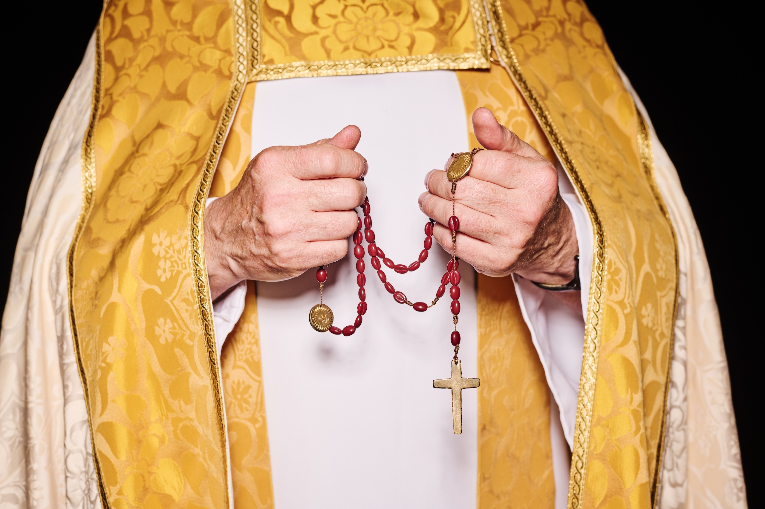
The partnership included a limited-edition range of jewellery, including coffee-bean rosary beads, and a stole-inspired scarf. They also made a zine charting the church’s history, “from Royal baptisms to drag queens and divine cappuccinos.”

“We did an event and Father Simon from the church did a blessing,” Elvins explains. “We thought it would be a fun thing to do, but it was actually very emotional, and it became a really meaningful evening.

“There was such a brilliant mix of the local community, the coffee shop regulars, the Sports Banger fashion crowd, and the church.”

The second project they worked on was for the Soho Parish CofE Primary School. It has educated local children for 150 years, but is under pressure as the last school standing in Soho, with falling pupil numbers threatening its future.

Working with the children, Wonderhood created a new logo inspired by the silhouette of the building. This could be filled with icons inspired by the pupils’ favourite things about the school.

There was also a new wordmark, based on the site’s historic signage, and a striking blue and yellow colour palette.

Again the team went above and beyond, designing banners, notebooks and personalised sticker packs, as well as providing a logo generation tool to let members of the community make personalised versions.

Wonderhood Design’s identity for Soho Parish CofE Primary School

And as with the St Anne’s team, Elvins was pleasantly surprised by how smooth the process of working together was.

“Alix Ascough, the headteacher, was a really good client,” he says. “We weren’t sure how our presentations would go down, but they were like, ‘We don’t have a lot of time. We don’t like this, we like this, let’s move forward.’ They were very decisive, which was brilliant.”

The studio’s most recent project, although not part of the Neighbourly Fund, is for another nearby business, Soho Radio.

It’s the station’s first new identity since it launched in 2014, and it’s designed to reflect its “diverse, dynamic and exploratory listening experience.”

“From our first meeting, it was clear they shared our drive to do things differently, and a deep passion for the Soho community,” says Tommy Spitters, Wonderhood’s design director.

“We wanted to futureproof their brand, keeping it relevant to their loyal audience while opening the door to new listeners.”

The work includes a flexible logo, clashing graphics, merchandise, and a punchy verbal identity that underlines the station’s commitment to unpredictable programming, with lines like “Ears wide open” and “Go off track.” They also redesigned the Soho Radio app.

As with their work for the school, the handover included a tool, developed with Testbed Studio, that allows DJs to pick and choose colours, fonts and images to promote their shows online.

For Elvins, this element really “empowers clients to take ownership” of their new identities.

“It means the people that are using the brand every day can have a more active part in shaping it, in a way that is more fluid and adaptable, rather than fixed or static,” he says. “People enjoy using them, and there’s an element of play which is engaging and rewarding.”

Wonderhood Design’s new identity for Soho Radio

Many agencies do charity work alongside their client projects. The key, Elvins thinks,  is for both sides to “develop meaningful relationships.” It takes time to build this trust, but it makes for more fruitful collaborations.

“You just have to get out there to meet and talk to people,” he says. “We got a lot of mixed responses when we were wandering around Soho, but it has led to some brilliant relationships.”

Wonderhood Design’s new identity for Soho Radio

Source

By

gaudí’s casa batlló reopens hidden apartment as gallery for contemporary art by mesura

Gaudí’s casa batlló opens new contemporary art gallery


Casa Batlló, Antoni Gaudí’s 1906 Barcelona landmark and UNESCO World Heritage site, adds a new layer to its long history with a permanent exhibition space dedicated to contemporary art. Opening on January 31st, 2026, the gallery occupies a 230-square-meter second-floor apartment that has remained closed to the public for decades. Barcelona-based studio Mesura restores the space and includes new architectural interventions.


The inaugural exhibition, Beyond the Facade, will be staged by United Visual Artists (UVA), founded by Matt Clark. The exhibition is paired with UVA’s commission for the building’s iconic facade, featuring a new projection mapping piece created for the fifth edition of Casa Batlló’s annual mapping festival. Conceived as a prologue, the facade work will launch the same day the gallery opens.

image by Anibal Trejo


inaugural show by united visual artists explores cycles of life


The initiative, called Casa Batlló Contemporary, signals a major step in how the iconic building engages with present-day culture. For the first time, Gaudí’s modernist interiors are renovated by the Barcelona-based team at Mesura to host two contemporary art shows annually, accessible either as part of the full visitor route or with a standalone ticket. According to program director Maria Bernat, the aim is to ‘foster a dialogue between the past and future,’ situating Gaudí’s radical vision within a contemporary framework.


The opening show will center on British art practice UVA’s exploration of cycles of life through light and movement. Known for projects that bring together art, architecture, and technology, UVA has previously exhibited at the Royal Academy of Arts in London, YCAM in Tokyo, and the Sydney Biennale. Their installation at Casa Batlló invites visitors to glimpse themselves within shifting patterns of light. 

render of Casa Batlló Contemporary Exhibition Space, courtesy of Mesura


mesura’s architectural intervention


Transforming Gaudí’s domestic floor into a gallery posed a challenge for the architectural team of Mesura. Historically, the second floor housed private apartments before later serving as a conservation workshop. The intervention restores original features such as woodwork and stained glass while introducing a new architectural language. Central to the redesign is a curved metal ceiling screen-printed with concentric ripples, resembling water disturbed by a drop. Produced with robotic technology, it provides structural support and a distinct identity without overwhelming Gaudí’s hand. ‘Our goal was to create an echo of his work, a whisper that adds to his universe without altering it,’ explains Carlos Dimas, partner at Mesura.

graphic study of casa batlló facade mapping | courtesy of United Visual Artists


gaudí’s legacy in the 21st century


The project is timed to coincide with the centenary of Gaudí’s death in 2026, as well as Barcelona’s designation as World Capital of Architecture. For Casa Batlló’s directors, the new gallery embodies the idea of ’21st-century heritage’: a cultural institution that is both rigorously preserved and actively reinterpreted. General director Gary Gautier emphasizes that the gallery reinforces Casa Batlló’s role as a cultural beacon, expanding its identity beyond conservation toward innovation.


The transformation also reflects long-term planning. The new space was envisioned in Casa Batlló’s 2015 Master Plan, which set guidelines for conservation, use, and dissemination of the building. ‘Something we envisioned 10 years ago will soon become a reality: reviving a historic space, opening it to the city, and giving it a new purpose,’ says chief architect Xavier Villanueva.


Casa Batlló has already become a platform for digital and media-based art, commissioning works since 2021 from Refik Anadol, Sofía Crespo, and Quayola for its facade and interiors. With the launch of Casa Batlló Contemporary, those interventions expand into a permanent curatorial program. The new gallery positions the building as a historic icon of modernism but also as an active participant in Barcelona’s avant-garde cultural scene.

graphic study of casa batlló facade mapping | courtesy of United Visual Artists

Matt Clark portrait | image by Anne Ray, courtesy of United Visual Artists


project info:


name: Casa Batlló Contemporary

location: Casa Batlló | @casabatllo, Barcelona, Spain

architecture: Mesura | @mesura.eu

facade mapping 2026: United Visual Artists | @unitedvisualartists

area: 230 sqm second-floor gallery


opening: 31 January 2026

initiator: Casa Batlló Master Plan (2015)

The post gaudí’s casa batlló reopens hidden apartment as gallery for contemporary art by mesura appeared first on designboom | architecture & design magazine.

By

BURR completes minimalist, vaulted ‘benito’ renovation in madrid

BURR Transforms Former Shop into Compact Home


Benito is a residential renovation by Madrid-based architecture studio BURR, reworking a disused furrier’s shop into a compact dwelling. The project is located in the city’s southern districts, where the architects adapted the limitations of a split-level floor plan into the defining character of the home.


The plan is divided into two narrow bands: a street-level strip with a generous four-meter (thirteen-foot) ceiling height and a mezzanine raised 180 centimeters (six feet) above, originally designed to permit cars to pass beneath toward a basement garage. This uneven section results in an L-shaped volume, where the connection between levels becomes central to the spatial experience.

images © Maru Serrano


Circulation and Spatial Gradient


The team at BURR thoughtfully designs the staircase of its Benito residence to play a dual role as both circulation and infrastructure. Beneath its treads, stepped doors conceal appliances, storage, and even a compact water-closet. The precision of this integration, reminiscent of transport interiors, allows the architects to maximize usable space without visual clutter.


Movement through the home follows a U-shaped loop. Entry begins from the street at the lower band and gradually shifts upward through the stair to the upper level, which returns to the main facade. This sequence introduces a gradient of public and private use, distinguishing the shared lower zone from the more intimate upper floor.

Benito transforms a former shop into a compact Madrid residence


Courtyards and Ventilation


Both levels of Benito open outward, reinforcing a connection to air and light. The ground floor links to a communal patio, while the mezzanine opens to a private terrace directly attached to the dwelling. With facades at both ends of the unit, cross ventilation is established naturally, further supported by the open layout. Only the bathroom and water-closet are enclosed, maintaining a sense of openness elsewhere.


This spatial clarity is part of BURR’s careful response to a constrained footprint. Instead of subdividing, the architects relied on voids, courtyards, and circulation to structure the home.

the stair serves as both circulation and concealed storage


a vaulted ceiling intervention


The context of the building introduced further challenges. Shared residential services run across the ceiling at different heights, cutting into the space in uneven ways. BURR’s solution was to introduce a half-barrel vault across the public-facing portion of the dwelling. This intervention provides acoustic and visual insulation while lending a surprising sense of volume to the compact interior.


The vault stands in deliberate contrast to the project’s otherwise modest scale, balancing practicality with a subtle architectural gesture. In this, the renovation elevates a small domestic corner of Madrid into something distinctive without excess.

BURR organizes the dwelling through a split level floor plan

a half barrel vault conceals building services overhead

cross ventilation is established through openings on both facades

a U-shaped loop defines the movement through the interior

the upper level connects to a private terrace


project info:


name: Benito

architecture: BURR | @burr.studio (Elena Fuertes, Ramón Martínez, Álvaro Molins, Jorge Sobejano)

location: Madrid, Spain 
team: Natalia Molina, Guillermo Hernández, Marina Van der Linden, Amanda Bouzada
photography: © Maru Serrano

The post BURR completes minimalist, vaulted ‘benito’ renovation in madrid appeared first on designboom | architecture & design magazine.

By

Brandon Consultants designs new PizzaExpress Specials range

As the cost of living continues to bite, Brits are increasingly swapping traditional takeaways for at-home ‘fakeaways,’ supermarket-bought meals designed to replicate the restaurant experience.

To take advantage of that, Pizza Express has launched a new Specials range, designed to give people that “special occasion” restaurant vibe at home.

The brand partnered with long-time collaborator Brandon Consultants, who designed the visual architecture and packaging for the new range. The Manchester and London-based studio also refreshed the look of the PizzaExpress Classics range.

“We’re the number one chilled pizza brand, with more than 20 years in supermarkets, and what sets us apart is the restaurant experience we can draw on,” says Bianca Warren, senior retail manager at PizzaExpress.

“With Specials, we wanted to create the best possible pizza for at-home occasions – whether that’s a girls’ night in, a glass of wine after a long week, or a family dinner in front of the telly – and make those moments more special.

“The idea is to make you feel like you’re in a restaurant even while you’re on the sofa.”

BrandonConsultants’ packaging for the new Specials range by PizzaExpress

Warren believes that PizzaExpress carries a unique emotional weight in Britain, as so many of us have a memory or a story tied to the brand.

“Whenever you mention you work at PizzaExpress, people don’t just say ‘oh, cool,’” she says. “They’ll tell you about their first date there, or their go-to family meal.

“We wanted to bring those emotional connections into the home, with pizzas that not only deliver on taste and flavour but also catch the eye on the shelf.”

To reflect their premium positioning, the new packaging had to speak to the craft that goes into making the pizzas. But to create something new for a brand that has been a staple of supermarket aisles for 20 years, the Brandon team had to look back before looking ahead.

“PizzaExpress originally carved out the chilled pizza category in retail, so our challenge was to go back and ask – how did we disrupt in the first place?” says Beth Johnson, account director at Brandon Consultants.

Brandon Consultants’ packaging for the new Specials range by PizzaExpress

“We wanted to find new ways to do that again – to offer something that might not be ‘new’ in the technical sense, but feels new on a human, emotional level.”

To do that, the team decided to underpin the handcrafted-ness of the product by putting the people who make the pizzas at the heart of the designs. Each pack carries the photograph of a real PizzaExpress pizzaiolo – in the iconic black and white striped T-shirt – proudly holding their creation.

The chilled aisle is notoriously cluttered, so Brandon Consultants decided to upend the category codes. Instead of top-down shots of ingredients – as is typical in the sector – the photograph of the pizzaiolos presenting the pizzas immediately communicated both flavour and the brand’s point of difference.

“We didn’t want to feel like a mass-manufactured product, because that’s not who we are,” says Johnson. “PizzaExpress’ pizzaiolos bring real expertise, and they have the history to back that up. Putting a human on the packaging was our way of capturing that emotion – and it’s something nobody else in the category does.”

And showcasing the pizzaiolos so prominently helped connect the retail offer back to the restaurant experience. “We wanted to make sure the retail range stayed anchored to that,” says Johnson.

Framing the photograph is the brand’s filigree – now seen in an amber metallic finish – and the logo. The team chose to retain Dan Forster’s custom script typeface, grounding the work with one of the brand’s most distinctive assets.

Brandon Consultants’ refreshed packaging for the Classics range

The pizzaiolos became the thread linking the new Specials to the refreshed 9-inch Classics packaging, appearing in photography on the former, and illustration on the latter.

“When you look back through the archives, PizzaExpress has always had a deep connection to art and creativity – from Enzo Apicella’s beautiful decals on our restaurant windows and walls, to the way design has shaped the brand,” says Johnson. “That history is intrinsic to who we are, and we wanted to carry it through into the modern day.”

In the suite of illustrations now seen on the Classics packaging, an expressive pizzaiolo whips up a pizza, and is seen interacting with the ingredients, a tool used for varianting.

Brandon Consultants’ refreshed packaging for the Classics range

“He’s drizzling olive oil on one and spinning pepperoni onto another – bringing real joy and life to the packs,” says Simon Magill, senior designer at Brandon Consultants.

While the team innovated through the illustrations, they also rooted the design in familiar elements such as the filigree, the brand mark, and the custom typeface.

“It’s about carrying that emotional connection through,” Warren says, “whether you’re in a restaurant or on your sofa at home.”

Source

By

Condé Nast’s Nicola Ryan on scaling design with soul

In August, GQ magazine’s cover story was an interview with Travis Kelce, the American football player (and three-time Superbowl winner) now perhaps better-known as Taylor Swift’s fiancé.

On stage at Frontify’s Paradigms conference, Nicola Ryan, VP of global design at GQ’s parent company, Condé Nast, showed the exuberant print lay-outs.

The story, which was shot by Ryan McGinley, seemed to burst out of the pages with energy – a fitting reflection of both Kelce’s personality, and his current standing in the cultural zeitgeist.

Then Ryan showed the same story in its digital form, which was very neat.

Ryan used it to pose the question – how do we scale that human element from print to digital? Or to paraphrase the title of her talk, how do we design for scale without losing soul?

To some extent, that is a question that has threaded through Ryan’s career.

GQ’s Travis Kelce cover story

After graduating from University Arts London in 2010, she joined Angus Hyland’s team at Pentagram, where she worked with clients like Cass Art, Penguin and the Qatar National Museum.

After a stint at Karmarama, she moved into the media, joining The Times as head of digital design in 2013. She went onto The Telegraph, where she became creative director, before joining Condé Nast in 2021.

As one of the biggest media organisations in the UK, The Telegraph is not an easy gig. But the leap to her new employer was, Ryan admits, “massive.”

Now, with her team of around 60 product designers, user researchers and content designers, she oversees digital experiences for 22 titles across the Condé Nast portfolio. These include some of the best-known, and most-loved, publications around, including Vogue, The New Yorker, Wired and Vanity Fair.

“It was a really steep learning curve,” Ryan says. “At a smaller, more contained company like The Telegraph, you can both look at the bigger picture with the system, and you can look at all of the individual projects.

“But when you go to something at the scale of Condé Nast, you can’t possibly do all of it.”

A selection of Condé Nast sites on mobile

In a role like this, design systems are crucial. But, Ryan says, they can’t be her only focus. “If you only look at the system, you get too abstract, and too removed from what people care about.”

For Ryan, the key balance is between systems and soul, consistency and emotional resonance. And it’s important to understand how these two things co-exist.

“Systems have the power to elevate soul, or to flatten it,” she explains. “We should audit systems for character, as well as consistency. Where is soul showing up? And where is it being squeezed out?”

Ultimately though, bringing soul into design work comes down to culture – what leaders encourage, expect, and make room for.

“Soul isn’t a feature you ship, it’s a position you hold,” Ryan says. “You don’t scale soul by making a smarter system – you scale soul by making people braver.”

“Soul isn’t a feature you ship, it’s a position you hold.”

In practical terms, that means creating a design culture that “fosters confidence to have an opinion, and processes that give time to critique.”

As everyone in the industry knows, the pressures on designers are intensifying.

The rise of AI, the squeezing of budgets, and the heightening of demands and expectations threaten to create a perfect storm.

In this turbulent context, Ryan believes, smart companies will make “quality a strategic priority.”

“AI can already create a lot of things that are ‘good enough’,” she says. “And, particularly in the media industry, quality, personality and perspective are what’s going to differentiate us.”

“I think it’s about finding the moment, and finding the narrative that ultimately hitches on to what the business is trying to do, and how you can help that through design.”

Nicola Ryan on stage at Paradigms, showing a typical leader’s calendar

A big part of her job is to make sure design is something that senior leadership cares about. Some of that is about using the right language – talking in business terms rather than leading with “the geeky aspects of typography.”

But another part is about finding ways to prove that quality and soul impact the business in positive ways.

In the media, AI is having a direct impact by reducing search traffic to websites that used to benefit from huge audiences coming via Google.

“I think there’s a recognition across the publishing industry that the future is in smaller but more loyal audiences,” Ryan says. “And therefore quality really matters, because you want people to keep coming back – loyal people who have an affinity to your brand.”

But proving the impact of that quality play, Ryan admits, is not always straightforward. Businesses have a wealth of data to analyse, but this tends to skew to short-term metrics.

“It’s harder to do with soul,” she says. “We need to look at the longer view, especially around engagement and loyalty metrics like time spent, scroll depth and bounce rate. You can’t pin those things fully on quality, but if you look at them over time, you can start to show people a pattern.”

The New Yorker homepage

With design having to prove its worth perhaps more than ever, the challenges facing design leaders are multiplied as well.

Ryan says she never had any formal leadership training – rather she was “plunged in at the deep end” earlier in her career, and expected to learn on the job.

“I came into the industry at an opportune moment, when digital was this new shiny thing and companies were giving young people, with relatively little experience, a ridiculous amount of responsibility,” she laughs.

“And so I ended up learning a lot very quickly. I had some great bosses who were also great mentors. But mainly you make mistakes, you figure it out, and you just keep getting better. I think, by and large, that’s the best way to do it.”

Ryan believes good design leaders are able to balance two characteristics that may seem contradictory.

“On the one hand, I am very democratic,” she says. “I really like listening to what everyone has to say, because the things that we work on are so complicated. If you don’t listen to people who have a lot of knowledge, it’s going to catch you out later.

“And so I like to gather a lot of opinions and ideas and understanding. But on the other hand, I also think you have to lead with a perspective, because you can’t design by committee.

“You have to listen, and then you have to make a decision, and commit to that with clarity, and intent, and conviction.”

Nicola Ryan on stage at Paradigms, showing some of the tensions leaders face

The reality of design leadership, she says, is that there are tensions – between freedom and control, for example, or global and local. A good leader recognises these competing forces, and works within them.

“There will always be these tensions, and you can’t possibly reconcile them,” Ryan explains.

“But you have to very intentionally know where you want to sit on one of those tensions, and keep tweaking so you don’t go too far in one direction, or the other. The goal is to keep everything afloat.”

For design leaders and their teams, this balancing act can seem precarious.

“It’s hard isn’t it? We can’t just focus on one thing – we have to be expanding our skillsets and figuring out how to use AI. We have to up our game, I think, as designers.”

But is she optimistic that design can come through as a creative and commercial driving force?

“I would like to be optimistic,” she says. “I think you have to be, as a leader.”

She pauses, and then doubles down.

“Yes, I am optimistic. There will be companies that are happy with ‘good enough’ design, who will just spit this stuff out. But I do think design is a differentiator, and the companies that see that will succeed and go further.

“There will be an interesting few years, where we see how this plays out. It’s also a really interesting time to be a designer,” she says. “But you have to be up for change, to try new things, and new ideas.”

Source