By

“The age of imperfection – why brands are embracing flaws as features”

In Italy, we argue endlessly about pasta shapes – whether rigatoni holds more sauce than penne, or if spaghetti should ever meet ragù.

But my grandmother once revealed to me a secret that cut through all that noise – minuzzaglia.

A humble mix of broken pasta pieces, once considered poor people’s food in old Neapolitan homes. No elegance, no uniformity, just scraps gathered together.

And yet, when she served it, it was a feast of surprises.

Every spoonful was different – ridges, curves, twists, smooth bites, a feast of textures and tastes. What looked imperfect was, in truth, a hidden luxury – one dish, infinite variations.

That day, I learned that imperfection is not the opposite of beauty. Sometimes, imperfection is alive, playful, and generous.

“Imperfection isn’t a lack – it’s a point of view.”

In that bowl of broken pasta, I first tasted a truth that later followed me into design – perfection is overrated.

I’ve spent most of my life working in design, and if there’s one thing I’ve grown suspicious of its perfection. Perfectly polished visuals. Perfectly balanced campaigns. Nice, yes. Safe, sure.

But just like a dish of pasta where every piece looks the same, safe never made anyone fall in love.

That’s why I hold onto a different idea: take the word imperfect. Now shift one small mark and create a space, and it becomes “I’m perfect.” Nothing added, nothing removed.

That apostrophe? That’s you! The perspective, the human touch, the spark that changes everything. That’s design in a nutshell – the power to reframe imperfection as meaning.

That tiny apostrophe opens a bigger conversation – how brands today are using imperfection not as a compromise, but as a strategy.

Imperfection as a way of thinking

Fashion designer Martin Margiela taught me that imperfection can be a philosophy. He flipped fashion inside out, showing seams, raw hems, and labels exposed.

His work was never about polish but about honesty, chaos, and wit. Margiela revealed what brands often hide: process, fragility, the unfinished. He showed that imperfection isn’t a lack. It’s a point of view.

Imperfection as sustainability

Patagonia expresses imperfection differently. For them, it’s about durability. Their jackets tell stories through patches, repairs, scars. They run ads that literally say “Don’t Buy This Jacket.” They remind us that imperfection is proof of life lived, of respect for resources, of responsibility.

I see Patagonia’s approach as radical honesty. They don’t pretend their products last forever or stay pristine. Instead, they embrace wear-and-tear as value.

A stain isn’t a flaw; it’s a memory. A patch isn’t a fix; it’s pride. In a market obsessed with the new, Patagonia’s imperfections become their strongest badge of authenticity. And they help you to keep it that way.

Imperfection as generosity

Too Good To Go takes imperfection and turns it into care. Meals that supermarkets would discard, portions that vary, surprises in the bag. Nothing polished, everything human.

Here imperfection becomes generosity, the simple act of saving food instead of wasting it.

Every imperfect meal tells a story: someone noticed, someone cared, someone chose to act. That small gesture transforms imperfection into a moral choice, a kindness made visible.

Imperfection as lifestyle

Then there’s Vans. No skater wants clean, perfect sneakers.

Perfection, in their world, holds no meaning. Shoes need scribbles, tape, torn soles. Every scrape is a badge of honour. The more battered, the better.

Vans built an entire lifestyle brand on this truth. They don’t sell pristine sneakers; they sell rebellion, chaos, and energy in motion.

Imperfection here is not just tolerated, it’s the very identity of the culture. I love how raw that is. Vans says, “Go ahead, ruin me.” That’s how I become yours.

Imperfection as nature

Aesop’s imperfection is quiet, almost meditative. Step into one of their stores, and nothing is standardised.

Uneven walls, rough textures, natural irregularities. No two spaces are the same. In a world of glossy sameness, Aesop creates environments that feel alive, tactile, and rooted.

Their philosophy is steeped in wabi-sabi – the beauty of the incomplete, the transient, the raw.

Walking into Aesop doesn’t feel like entering a branded machine; it feels like entering a space shaped by nature and humans alike, with respect for place, time, and imperfection.

Imperfection in process

My most personal encounter with imperfection came while filming a campaign for Baxter inside the Gipsoteca Antonio Canova.

The museum is filled with plaster prototypes of Canova’s sculptures, not flawless marbles, but works in progress, alive with motion and human touch. Standing among them, I felt electricity.

The prototypes carried more life than perfection ever could. Baxter understood this: the unfinished is not a flaw, it is a process. Imperfection carries honesty, momentum, and genius in motion.

Imperfection in living

A furniture catalogue is not a showroom. It’s a portrait. Most interior design brochures show flawless, staged homes, polished but lifeless.

For Zanotta, a different path was chosen – 12 real homes, belonging to architects, DJs, artists, lawyers. Full of objects, rituals, clutter, laughter, and love.

The only rule: move just one or two pieces to introduce a Zanotta object. That small act sparked a dialogue between design and life, elegance and reality. Even the shoot broke convention; flash captured immediacy, spontaneity, and the luxurious vitality of living.

Beauty is not in flawless display, but in conversation with life itself.

Imperfection in design

Even the most iconic brands carry imperfection in their very symbols. Take Apple – the logo is not a perfect apple; it has a bite taken out.

That bite is everything. It breaks symmetry, gives the mark a narrative, and makes it unforgettable. A flawless apple? Just an apple. The missing piece is what made it legendary.

When the myth of perfection fades, what remains are these imperfect gestures I choose to live by:

People over polish. The best logos feel like friends – familiar enough to trust, surprising enough to love.

Art, not just design. Design solves problems and art stirs the soul. Let feeling and poetry break the grid wide open.

Make a symbol. Not just a logo, but a living mark – a heartbeat, a song, a sketch. Strong enough to be remembered, gentle enough to smile back.

Designed to be redesigned. Nothing is sacred or fixed. Bend it, break it and let others redraw it. A system is alive only if it mutates

The smile factor. Because nothing disarms like joy. Design is braver when it smiles at you first.

When I see the word imperfect, I don’t see failure anymore.

I see Patagonia jackets with patched elbows. Vans shoes – torn and taped. Too Good To Go’s meals saved.

The apostrophe in “I’m perfect” is more than punctuation; it’s the reminder that what makes us human is what makes us matter. Here’s the truth I’ve come to believe – perfection is admired, but imperfection is loved.

Angelo Ferrara is creative director and partner at global brand design agency Robilant.
Source

By

This 49-Gram GPS Watch Has a Feature No Garmin or Apple Watch Offers

GPS watches for outdoor adventures have become frustratingly similar, all promising the same basic features with minor variations. Most focus purely on tracking metrics and recording routes, treating every hike, climb, or fishing trip like a data collection exercise. True adventurers want something that captures the spirit and story of their journeys, not just the statistics.

The COROS NOMAD breaks this mold by treating your adventures as stories worth remembering rather than just workouts to analyze. This GPS watch doesn’t just track where you went and how fast you moved. It helps you document the moments that matter, turning every outdoor experience into a personal narrative you can revisit and share.

Designer: COROS

Design and construction reflect real-world adventure demands rather than boardroom aesthetics. The lightweight build weighs just 49 grams with the nylon band, making it comfortable for multi-day expeditions without the bulk that plagues many adventure watches. Simple controls featuring a single action button and stainless steel dial work perfectly with gloves or wet hands during challenging conditions.

The always-on Memory-In-Pixel display stays visible in bright sunlight without draining battery life like power-hungry OLED screens. Hardened mineral glass protects against rocks, branches, and the inevitable bumps that come with serious outdoor exploration. This watch expects to get dirty and handles abuse without complaint.

What truly sets the NOMAD apart is its Adventure Journal feature, something no other GPS watch offers. Beyond tracking routes and elevation, you can log fishing catches, document summit conditions, record wildlife sightings, and capture trip notes directly on your wrist. This transforms the watch from a simple tracker into a digital diary for outdoor memories.

Dual-frequency GPS with global offline maps provides navigation capabilities that rival dedicated GPS devices. Street names, topographic details, and turn-by-turn directions work anywhere in the world without requiring phone connectivity. The system tracks accurately even in dense forests or canyon environments where other watches struggle with signal reception.

Battery performance enables genuine expedition use with 22 days of daily operation or 50 hours of continuous GPS tracking. Fast charging means less than two hours gets you back to full power, perfect for multi-day adventures where charging opportunities are limited. The efficiency comes from smart power management rather than compromising features.

Sport modes cover everything from traditional running and cycling to specialized activities like fishing and mountaineering. Each mode captures relevant metrics while the Adventure Journal lets you add context that makes reviewing past trips meaningful rather than just scrolling through endless data screens.

Health monitoring includes heart rate, HRV, SpO2, and sleep tracking with REM analysis, providing comprehensive wellness insights for recovery planning. Safety features like storm alerts and emergency functions add peace of mind during remote adventures where help might be hours away.

The NOMAD succeeds because it understands that outdoor adventures are about more than performance metrics and route optimization. Every summit, every perfect fishing spot, every challenging trail becomes part of your personal adventure story rather than just another data point in an endless fitness log.

The post This 49-Gram GPS Watch Has a Feature No Garmin or Apple Watch Offers first appeared on Yanko Design.

By

perforated terracotta screens enclose pool pavilion within indian residence

Pool Pavilion is shaped around water as a spatial counterpoint


Thirdspace Architecture Studio has completed The Pool Pavilion, a residence designed around the relationship between water, light, and spatial balance. Located within a dense urban neighborhood in Belagavi, India, the home integrates a semi-open swimming pool pavilion as both a climatic device and an experiential extension of domestic life.


The eastern setback of the plot is reinterpreted as a pool pavilion defined by terracotta screens and a glass canopy. This zone functions as a transitional layer between the interior and exterior, mediating light, temperature, and privacy. The public areas are arranged between the transparent pool enclosure and the solid private block, creating a sequence of interconnected volumes that balance openness with enclosure. Sectional openings enable layered views across spaces, allowing soft reflected light from the pool to animate the interiors. The plan adheres to Vastu principles while maintaining spatial flexibility. The design seeks equilibrium between programmatic density and a sense of openness, aligning the client’s requirements with environmental and contextual constraints.

the front view reveals a calm interplay of solid and open volumes | all images by Suryan and Dang


Thirdspace employs a restrained palette of timber and neutrals


The site demanded the accommodation of multiple functions, parking for seven cars, service areas, four bedrooms, a home theater, and a pool, within limited space. The architects resolved this through a series of calibrated spatial moves. The residence is raised on a high plinth, allowing the semi-ground floor to contain service areas in a compact layout. This frees the upper ground level for the primary living zones, organized along a north–south spine. The pool occupies the eastern edge, transforming the setback into a semi-open pavilion. Defined by terracotta jaalis on three sides and a glazed roof above, the pavilion contributes to passive cooling by moderating temperature and humidity. It also acts as a focal element within the spatial hierarchy, connecting the living and dining areas through adjoining decks and sit-outs.


A restrained palette of timber finishes and neutral tones defines the interior, complemented by diffused daylight and reflections from the pool surface. The use of natural materials and light modulation supports the home’s environmental responsiveness while establishing a calm visual identity. Externally, the building maintains a measured, opaque expression that contrasts with the openness of its interior configuration. Within, spatial overlaps, controlled vistas, and sectional transparency create varied experiences of movement and inhabitation.

the view at dusk highlights the warm glow of interior spaces and screened openings

the pool area acts as a light-filled extension of the main living zones

water is a spatial counterpoint, mediating temperature, light, and visual continuity

the dining space opens to views of the pool, enhancing the home’s sense of openness and connection

double-height glazing brings in abundant light, making the pool a focal point within the interiors

folding doors open the living area to the pool, blurring the line between indoors and outdoors

a quiet seating corner overlooks the pool, filled with dappled light filtering through patterned screens

a restrained palette of timber and neutrals defines the home’s material language

the staircase forms a central spine, visually linking different floors and spaces

the interior connects living spaces with the pool area through layered openings and natural light

the bedroom pairs warm tones with soft daylight to create a calm, inviting retreat

gentle sunlight fills the bedroom, creating a serene and airy atmosphere

filtered daylight creates shifting patterns across the pool and interior walls


project info:


name: The Pool Pavilion (House for the Netalkars)
architects: Thirdspace Architecture Studio

principal architects: Praveen Bavadekar, Namrata Betigiri

design team: Praveen Bavadekar, Madhuri Gulbani

structural design: D L Kulkarni & Associates, Belagavi

gross built area: 600 sqm

location: Belagavi, Karnataka, India

photographer: Suryan and Dang


designboom has received this project from our DIY submissions feature, where we welcome our readers to submit their own work for publication. see more project submissions from our readers here.


edited by: christina vergopoulou | designboom

The post perforated terracotta screens enclose pool pavilion within indian residence appeared first on designboom | architecture & design magazine.

By

How is Studio Dumbar using AI?

Studio Dumbar is a Dutch agency that works on strategy, branding, design and motion for clients like OpenAI, Instagram and the Utah Jazz. Here the studio, as a collective, tells us how they use AI, and how they feel about it.

You can see all the articles in this series here.

Broadly speaking, are you excited for how AI will change the design industry, or nervous?

Definitely excited. We’ve always looked for ways to create outside our mainstream design software.

We have embraced motion and 3D early on, and we love finding interesting concepts using tools that are not specifically made for design. That is also the reason why we started using creative coding in our design process – so we could make our own tools, but also come to and embrace unexpected results.

Of course, there are things about AI that we need to solve before we fully welcome it, like ownership and claiming your own creative input while using i., But it opens so many more doors than it closes.

Do you have an agreed policy around AI as a business?

We are a part of DEPT®, and as such, we have a Digital Ethics Advisory Board to analyse the societal impact of our craft, to develop our perspective, to align results with our values and goals, and to collaborate with our clients in all matters related to AI.

Next to this we have global AI guardrails, which we check every time we want to use a new tool to make sure it’s safe. Lastly, we always ask our clients for their AI policies, to make sure we are sticking to those as well.

When did you realise AI was going to have an impact on design?

Our first real introduction to AI was around 2018 when image-generation GANs came on the scene. It was before the current AI boom, and the quality and usability was nothing compared to what we are used to now.

Still, there was something magical about watching images appear that were drawn by a non-human. They carried a distinct aesthetic where one image would dissolve into another, which we wanted to replicate for a project we worked on at that time.

We never got it to work because the outcome was unpredictable and impossible to control. It needed immense training time – that we didn’t have.

The struggle with control is still there, but transformers have changed the scale and quality of what AI can do. The question is no longer about generation itself, but about how much ownership we hold over the results.

Have you undergone any AI training, either as a studio or individuals?

As a studio, we did not do any official AI training, but we definitely had work sessions where we all experimented with AI in image, video and sound generation, as well as vibe coding explorations.

Some people in the studio have a natural interest in AI and delve way deeper into how it works, and how we can apply it in our design process.

How do you use AI in the studio’s creative process?

The obvious uses are there – brainstorming, generating images or video for early inspiration, or coding experiments that help us explore ideas quickly. We also use upscaling and editing tools to move faster and often to get better results than we could otherwise.

For all technologies we use in the studio, we believe the more you understand how it works, the better you can work with it.

So, using AI to speed things up is all fine. But to make actual strong work using AI, we either want enough control to shape the details exactly as we want, or treat the AI as a partner in the process.

This goes beyond typing a clever prompt and waiting for results. It’s about knowing how to push, guide, and play with the system until the work feels truly ours.

Do you think clients care if/how you use AI in your work?

Yes, most of our clients – around 80% – strictly forbid us to use AI in the end product, due to potential legal issues.

Even clients that are in AI themselves, as a business, often still want bespoke manual work that fits their question better. However, we also see more and more specific demand for AI-generated work, where the generation of images and video is part of the assignment.

What matters most to us is the final result. We don’t limit ourselves to one process, so if AI gives us something unique or impossible otherwise, we’ll embrace it when we have the chance.

Do you use AI for any non-creative aspects of running your business?

Yes, we use it to review quotes, check mails, analyse research and for investigative strategy work for new clients

Beyond the best known tools, what is one AI tool that you would recommend to other design studios?

We like tools where it still feels like we’re the ones steering, not just AI doing its thing.

For example Flora, where you can chain genAI models together and build images or videos in steps, feels closer to design work than just prompting 20 random variants and picking one.

Lately we’ve also been trying out training our own models and messing around with set-ups in Automatic1111 or ComfyUI. It’s about putting AI into our workflow, not turning the workflow over to AI.

Source

By

Contagious designs dot-dash bottle for feminist whisky FEDDIE

Contagious has created a striking bottle design for a Norwegian whisky brand funded entirely by women.

The Edinburgh and Glasgow-based studio created the brand world and packaging for FEDDIE, using design to capture and communicate the movement that drives the company.

It was, FEDDIE’s CEO Aina Lemoen Lunde explains, a challenging brief.

For a start, Norway has “the strictest alcohol legislation in the world when it comes to advertising,” so there is a lot of pressure on the product.

“You can’t really express the brand anywhere else, except from the packaging, which makes that space crucial,” Lunde explains.

Secondly, the distillery is located in Fedje, a remote island off the west coast of Norway. It takes Lunde ten hours, using train, car and ferry, to get there from her home in Oslo, but it’s worth the trip.

She says the “crazy wild beauty” of its home had to shape the brand, with a strong focus on sustainability, as did its relationship with the people who live there.

Contagious’ brand work for FEDDIE whisky

And thirdly the brand needed to communicate the gender politics behind founder Anne Koopang’s vision. Only women are allowed to invest in FEDDIE, in a bid to encourage more women to develop portfolios.

“Even though Norway is ranked as the most gender equal country in the world, 80% of the stock exchange is owned by men,” Lunde says. “The founder wanted to nudge more women to start funding companies. Today we have 1,000 – soon to be 1,200 – female investors, and they are a really important part of our identity.”

“It was certainly a challenge,” laughs Contagious’ creative director James Hartigan. He says the first phase of the work was to clarify the portfolio architecture, and to identify the core pillars of the brand.

“They were all there, but there wasn’t a clear framework,” he explains.

As the work developed, they also had to think about building Norwegian whisky as a category, both in its homeland, where it launched in 2023, and abroad. FEDDIE just last week launched in the UK, and is also available in Sweden and Switzerland.


The team visited Fedje, where the challenges facing the local community reminded them of the issues closer to home on the Scottish islands. But ultimately it was the investor angle they decided to hone in on.

“The island story didn’t really stand them apart, because they are lots of island spirits,” Hartigan says. “But there was a lot of strength in this idea of it being powered by women, especially in the spirits world.”

For the brand design, Hartigan says they wanted to stay “very true to the brand’s Nordic roots, to create something that felt very utilitarian, but also modern and progressive.”

Contagious’ bottle design for FEDDIE

The main target audience for the whisky is men, but they wanted to burnish the brand’s feminist credentials too.

“Sometimes with brands that are very forthright in saying that they’re female-owned, there is a misconception that they’re just for women,” Hartigan says, “We wanted to be very clear from the beginning that it wasn’t just for women – it’s for everyone.

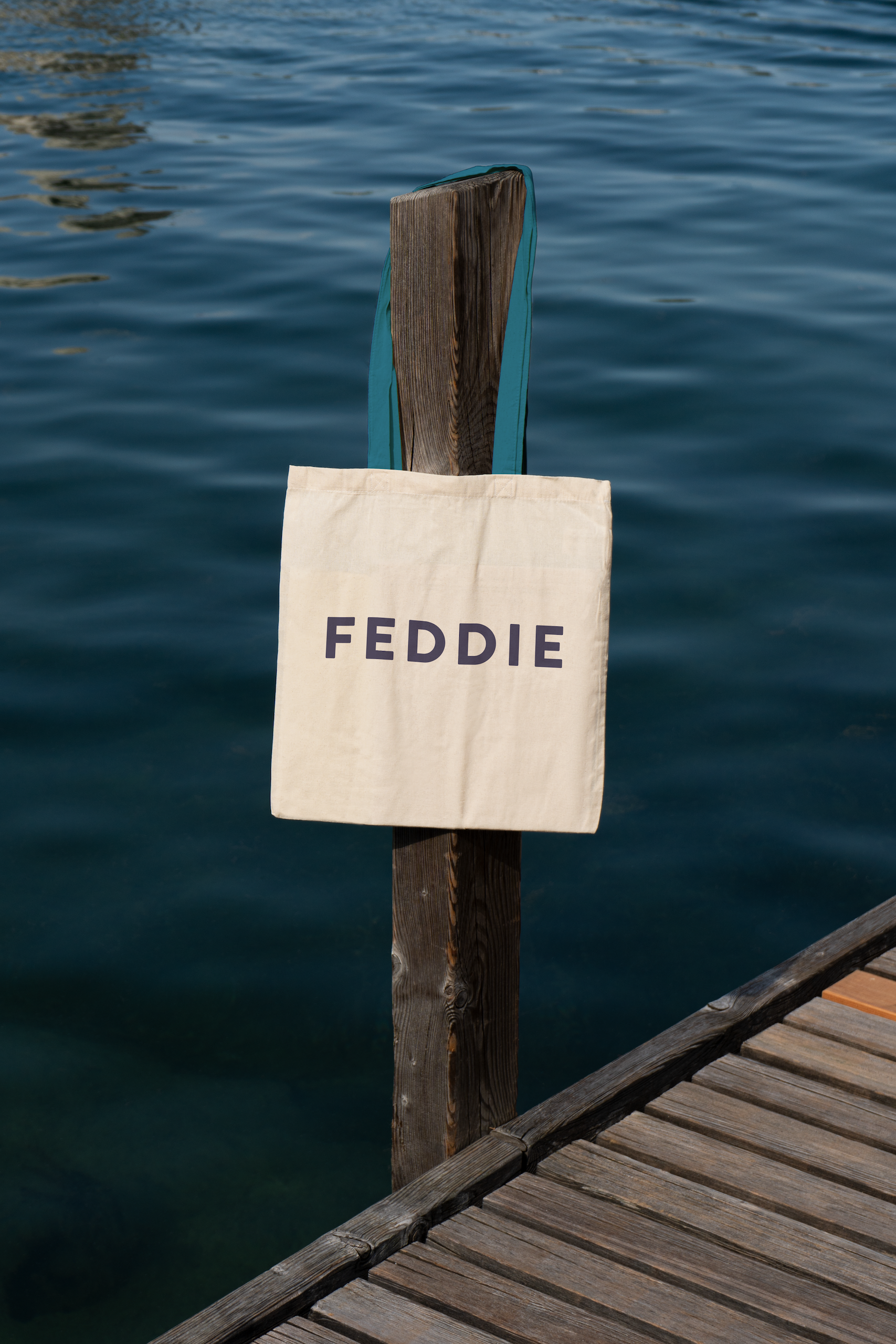
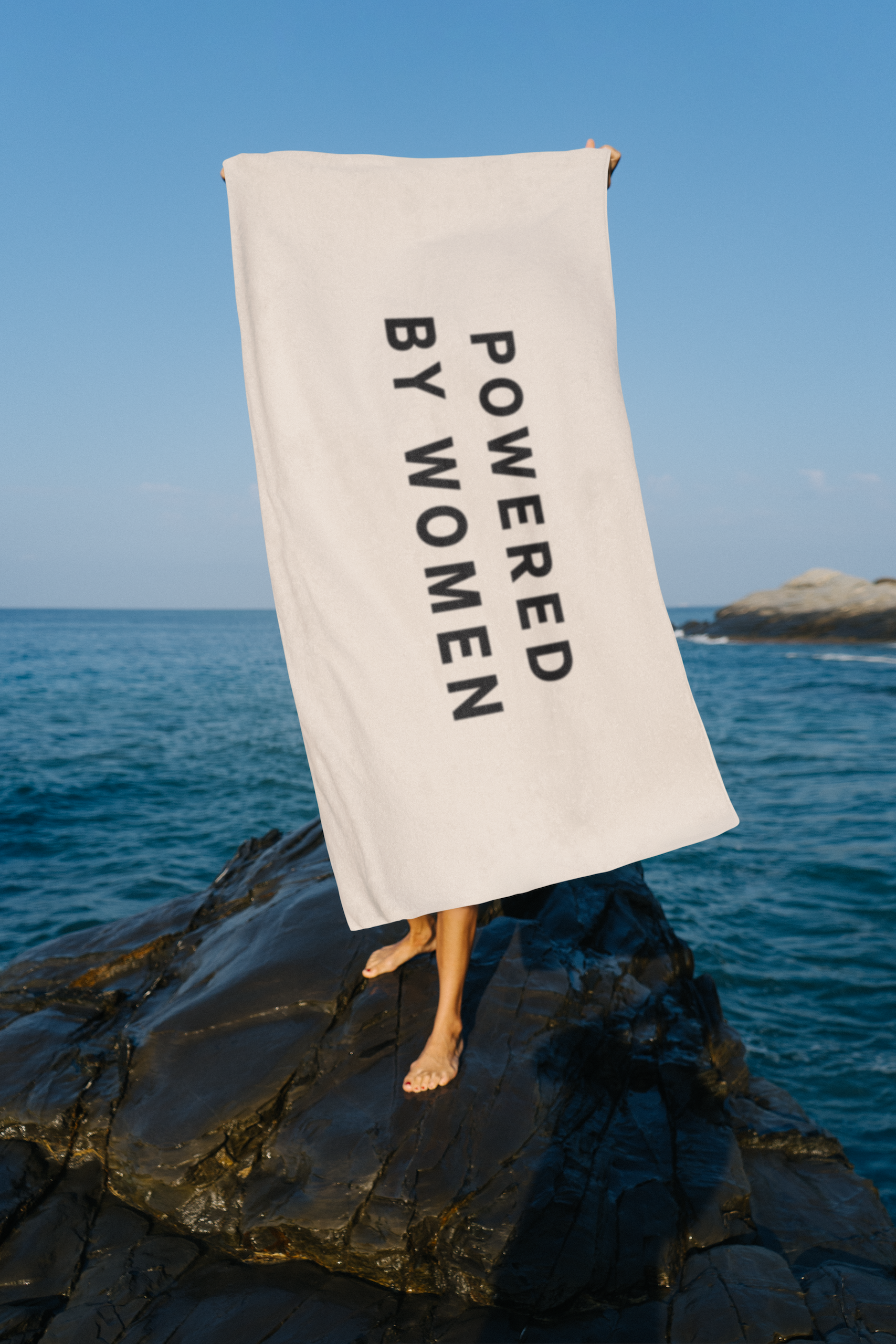
“But we were quite steadfast in having the line, ‘Powered by women” on the packaging, knowing that that would be divisive to some people. If that was a problem to someone then fine, they’re not our people.”

To bring the brand story to life, the bottle features 750 dots, which was the number of investors at the time of production, and 521 dashes – one for every Fedje resident.

Detail of Contagious’ bottle design for FEDDIE

People often think the design references the movement of the waves, Hartigan says.

“But what we were actually trying to get across is the movement of FEDDIE, in terms of the women, and what it’s doing for the island.”

In the future, when the bottle mold needs to be renewed, these visual elements will be expanded to reflect the up-to-date numbers.

“We are committing the cause of the brand into the glass, into the actual fabric of the packaging,” Hartigan says. “Over time, these bottles will morph and grow as the brand morphs and grows as well.”

This texture also creates an immediate interest designed to catch shoppers’ attention. “It has to look beautiful,” Hartigan says. “Becasue as soon as you get someone to pick it up, you’ve won the battle. You need a sense of intrigue to draw people in, and then they can engage with all the storytelling.”


The design team also worked hard to ensure the product’s carbon footprint was as low as possible.

There’s an aluminium screw-top instead of a cork – because cork can cause issues in recycling chains – and they made the bottles as light as possible, even though that goes against the traditional luxury codes in premium spirits, where heavy glass signals quality.

The challenge was to combine these design elements, which are usually associated with cheap own-brand spirits, in an elegant and engaging way.

When it launched in Norway, FEDDIE sold out in two weeks, and this year sales are already up 50%. For Lunde, the packaging has been a key part of this initial success.

“It feels like everything falls into place,” she says. “They have managed to make the full story very intuitive for customers.”

Contagious’ brand work for FEDDIE whisky
The FEDDIE distillery

Source

By

florim & gensler reinterpret matter’s evolution with formatech porcelain stoneware collection

Florim and Gensler introduce Formatech


Florim, the Italian ceramic surfaces manufacturer, has unveiled Formatech, a porcelain stoneware collection developed in collaboration with international design practice Gensler. Presented as a flexible design system rather than a decorative product, Formatech reinterprets foundational materials like concrete, metal, and plaster through advanced technology and sustainable production. Conceived from a dialogue between the company’s industrial expertise and Gensler’s design vision, the collection reflects on transformation, durability, and responsibility at a time when architecture increasingly demands both authenticity and environmental awareness.


Each tile preserves the traces of time, the marks of tools, and the patinas that reveal lived experience. Together with Gensler, Florim redefines ceramic surfaces as architectural instruments where decoration meets honesty, offering designers a language to build spaces that are both expressive and enduring.

Florim and Gensler collaborate for porcelain stoneware collection Formatech | all images courtesy of Florim


redefining ceramic surfaces as architectural instruments


The name Formatech merges ‘forma,’ the Latin root meaning appearance or figure, with technology, underscoring its dual focus on aesthetic and technical performance. Instead of mimicking surfaces, the collection interprets them, capturing raw materials at specific stages of their lifecycle. Concrete, metal, and plaster are translated into stoneware that crystallizes their evolution over time, bearing the marks, patinas, and textures that narrate their transformation. This approach emphasizes design honesty: not perfection, but authenticity.


As product design consultant, Gensler sought to create a tool for architects and designers that balances consistency and versatility. The result is a finely tuned palette available in three finishes: Cast, which channels the inclusions and aggregates of concrete; Forge, evoking the chromatic variations of oxidized metal; and Cure, a minimal take on plaster in its curing stage. Offered in multiple formats, from 30×60 cm to 120×280 cm, and in three thicknesses, the Italian company‘s Formatech collection adapts seamlessly across applications, from interiors to large-scale architectural projects.

emerging from an intense technical and creative dialogue, the collection explores the natural inclination of matter to change


florim positions formatech as a reflection on material truth


Behind the collection lies Florim’s most advanced decorative technology. Pad-printed graphics, digital chromatic applications, and three-dimensional materials are layered onto a colored porcelain body, producing surfaces that combine expressive depth with technical resilience. In the Cast finish, granules embedded in the body interact with the 3D decoration to create subtle variations of gloss and texture. In Forge, nuanced tonalities recreate the natural aging of metals. These innovations ensure that the surfaces not only achieve visual richness but also maintain the durability required in demanding architectural contexts.


Formatech also embodies Florim’s strong commitment to sustainability. Produced in facilities powered by up to 100% self-generated renewable energy, the collection contains up to 60% recycled material. Waste from raw and fired production, along with wastewater, is entirely recovered and reused. Additionally, Formatech is part of Florim’s CarbonZero project, which offsets CO₂ emissions over the product’s full lifecycle. As a Benefit Corporation and certified B Corp, Florim frames this collection not only as a design innovation but also as a responsible choice for future-focused architecture.

the material captures its different phases and crystallizing its evolution

Formatech is a delicate balance between authenticity and innovation, where porcelain stoneware becomes both expressive and functional

the collection stems from the desire to investigate how ceramic surfaces can convey the essence of raw elements such as concrete, metal, and plaster

close-ups show how Formatech restores the formal truth of these raw materials in a dimension that is both accessible and enduring

the result is a collection that interprets three material archetypes, each portrayed at a specific stage of its lifecycle

product design consultant Gensler translated its design needs into a valuable tool for architects and designers

the finely tuned palette defines a consistent style, versatile enough to adapt across multiple applications without losing its identity

Formatech is offered in three distinctive finishes, Cast, Forge, and Cure

available in three thicknesses, Formatech provides flexible solutions through complementary formats


project info:


name: Formatech

company: Florim | @florim_ceramiche

product design consulant: Gensler | @gensler_design

The post florim & gensler reinterpret matter’s evolution with formatech porcelain stoneware collection appeared first on designboom | architecture & design magazine.

By

can lines and arrows explain everything? AMO/OMA explores diagrams at fondazione prada

Decoding the world at Fondazione Prada in Venice


How do we make sense of the world? Often, the answer comes through lines, arrows, and boxes: the seemingly simple language of diagrams. At Fondazione Prada’s Venetian venue, the exhibition Diagrams, on view until November 24th, 2025, turns this visual shorthand into a subject of deep reflection. Conceived by AMO/OMA, the research arm of Rem Koolhaas’ studio, the project explores how diagrams shape the way we understand, communicate, and even manipulate knowledge. Spread across the 18th-century Palazzo Ca’ Corner della Regina, the exhibition, which runs alongside the Venice Architecture Biennale, assembles more than 300 objects, from medieval manuscripts to contemporary digital graphics, that cross centuries and cultures. These materials are not just archival curiosities; they reveal how visual schematics have been enlisted to address urgent issues, from public health to war, climate change to inequality.


AMO/OMA arranges the show around nine core themes: Built Environment, Health, Inequality, Migration, Environment, Resources, War, Truth, and Value. Each is presented in vitrines that resemble unfolding thought processes, aligned in parallel throughout the palazzo’s central hall. The experience feels less like a traditional display and more like an active tool for speculation, inviting visitors to view diagrams not as neutral or objective devices but as cultural artifacts with the power to clarify, persuade, or distort.

Fondazione Prada, Venice | all images by Marco Cappelletti courtesy of Fondazione Prada, unless stated otherwise


AMO/OMA Unpack Centuries of Visual Thinking


The exhibition draws on extensive research by the art and culture institute Fondazione Prada, conducted in close collaboration with Rem Koolhaas and Giulio Margheri, Associate Architect at architecture firm OMA, and enriched by the expertise of historian Sietske Fransen. Together, they trace the diagram as a nearly constant companion to human thought. Up until the 24th of November, visitors can discover striking examples, from three-dimensional diagrams in South Africa dating back 40,000 years to intricate wood-carved maps of Greenland’s coastline. For Koolhaas, these artifacts prove that ‘the diagram is an enduring form of communication that adapts to whatever medium exists at the time.’


What makes this journey compelling is the way ancient and modern forms speak to each other inside the palazzo’s galleries. The exhibition shows how diagrams move effortlessly between explanation and persuasion, able to illuminate areas as diverse as fashion, religion, and social inequality. Their independence from words makes them, as Koolhaas notes, ‘one of the most effective forms of representation,’ capable of crossing centuries and cultures with clarity and immediacy. By presenting diagrams not just as tools of knowledge but also as cultural artifacts, the show invites visitors to reflect on how images have always helped us make sense of complexity. Infographics of the 20th century, shaped by avant-garde movements, sit alongside earlier forms to highlight surprising connections.

Diagrams is on view until November 24th, 2025


Designing with Diagrams: Rem Koolhaas Reflects


Equally central to the exhibition is AMO/OMA’s own design practice. Koolhaas notes that diagrammatic thinking has been a guiding principle for the studio since the 1970s. ‘Complex ideas are almost an intellectual or sometimes artistic pleasure, and they became a driving element in what we were trying to do. In this context, diagrams were incredibly helpful. By researching and designing them, we were trying to form a space or to define another architecture, the form of which required an enormous amount of argument and articulation.’ He continues, ‘We would not have come close to that if I had not discovered a number of diagrams. The role of diagrams was crucial at that time because we needed the physical burden of proof to show that what we wanted to achieve was possible. Today, I may find myself in a different position, where I no longer have to prove that things are possible, and that certainly changes the nature or the role of diagrams. But I would still say that diagrams are an important part of my repertoire.’


Through this lens, Diagrams is more than a historical survey. It is a meditation on the enduring power of visual reasoning, a space where centuries-old artifacts converse with modern graphics, and where the diagram emerges as both a practical instrument and a medium of imagination. 

Diagrams by AMO/OMA is on view until November 24th, 2025, at Fondazione Prada’s Venice venue (Ca’ Corner della Regina). More info and tickets to the show available here

spread across the 18th-century Palazzo Ca’ Corner della Regina, the exhibition assembles more than 300 objects

the project explores how diagrams shape the way we understand, communicate, and even manipulate knowledge

Elwin J. Woodward, Historic and prophetic diagram of the world: God’s plan of salvation for law breakers, 1912. Colored lithograph, exhibition copy David Rumsey Map Collection, David Rumsey Map Center, Stanford University Libraries. Courtesy David Rumsey Map Collection, David Rumsey Map Center, Stanford University Librarie

the exhibition draws on research by Fondazione Prada, conducted in close collaboration with Rem Koolhaas and Giulio Margheri

the show invites visitors to reflect on how images have always helped us make sense of complexity

W.E.B. Du Bois, Conjugal condition of American Negroes according to age periods, c. 1900. Exhibition copy of a statistical chart illustrating the condition of the descendants of former African slaves now in residence in the United States of America, Atlanta University. Ink and watercolor on paper. Daniel Murray Collection, Prints and Photographs Division, Library of Congress, Washington, D.C. Courtesy Library of Congress, Prints and Photographs Division Washington, D.C., Daniel Murray Collection

the exhibited materials reveal how visual schematics have been enlisted to address urgent issues, from public health to war, climate change to inequality

AMO/OMA arranges the show around nine core themes: Built Environment, Health, Inequality, Migration, Environment, Resources, War, Truth, and Value

each theme is presented in vitrines that resemble unfolding thought processes

visitors are invited to view diagrams not as neutral or objective devices but as cultural artifacts with the power to clarify, persuade, or distort

John Auldjo, Map of Vesuvius showing the direction of the streams of lava in the eruptions from 1631 to 1831, 1832 Exhibition copy from a printed book In John Auldjo, Sketches of Vesuvius: with Short Accounts of Its Principal Eruptions from the Commencement of the Christian Era to the Present Time (Napoli: George Glass, 1832) Olschki 53, plate before p. 27, Biblioteca Nazionale Centrale di Firenze, Firenze Courtesy Ministero della Cultura – Biblioteca nazionale centrale di Firenze.

the exhibition shows how diagrams move effortlessly between explanation and persuasion

for Koolhaas, these artifacts prove that ‘the diagram is an enduring form of communication that adapts to whatever medium exists at the time’

Ed Hawkins, Temperature changes around the world between 1901 and 2018, 2019. Published by BBC on June 21, 2019. Digital image. From BBC News at bbc.co.uk/news and Prof. Ed Hawkins, National Centre for Atmospheric Science, University of Reading, UK www.ShowYourStripes.info. Courtesy BBC News

the diagrams’ independence from words makes them, as Koolhaas notes, ‘one of the most effective forms of representation’

in Diagrams, a space emerges where centuries-old artifacts converse with modern graphics


project info: 


name: Diagrams
exhibition design: AMO/OMA | @oma.eu
location: Fondazione Prada | @fondazioneprada in Venice, Italy 
dates: until November 24th, 2025 
tickets: here

The post can lines and arrows explain everything? AMO/OMA explores diagrams at fondazione prada appeared first on designboom | architecture & design magazine.

By

Making Something Beautiful: An Introduction to Inuit Artist Kenojuak Ashevak

The post Making Something Beautiful: An Introduction to Inuit Artist Kenojuak Ashevak appeared first on DailyArt Magazine.

By

The Art of Photography: Lee Miller at Tate Britain

The post The Art of Photography: Lee Miller at Tate Britain appeared first on DailyArt Magazine.

By

Recognizing Dorothea Lange’s Contributions to The Family of Man Exhibition on Its 70th Anniversary

The post Recognizing Dorothea Lange’s Contributions to The Family of Man Exhibition on Its 70th Anniversary appeared first on DailyArt Magazine.