By

liu wei to transform the MET’s fifth avenue facade with site-specific sculptures in 2026

liu wei’s sculptures to take over the met facade in 2026


The Metropolitan Museum of Art announces that Beijing-based artist Liu Wei will create a new suite of four large-scale sculptures for its Fifth Avenue facade in New York, to be unveiled in fall 2026. The Genesis Facade Commission: Liu Wei marks the artist’s first major presentation in the United States and the seventh iteration of The Met’s annual facade commission, an initiative that brings contemporary art directly into the public sphere.


designboom attended The Met’s press conference in Paris, where the artist was announced as the next participant in The Genesis Facade Commission. The event also featured architect Frida Escobedo, who presented the museum’s forthcoming Oscar L. Tang and H.M. Agnes Hsu-Tang Wing, her major expansion for The Met’s modern and contemporary art collection, set to open in 2030 (find designboom’s previous coverage here). 

Dimension (2021), installation view Art Basel 2022 Unlimited exhibition, image courtesy of Art Basel


reconfiguring urban fragments into monumental reflections


Liu Wei, known for his monumental sculptural installations that repurpose fragments from urban and historical environments, will engage the niches of the Met facade with works exploring cycles of rupture, resistance, mending, and creation. Using his distinctive language of reconfiguration and assemblage, the Beijing-based artist is expected to combine the raw and the refined, inviting viewers to reconsider the contradictions of contemporary life. ‘Liu Wei’s sculptures for The Genesis Facade Commission are sure to reflect the curiosity, innovation—and even humor—he is known for,’ shares Max Hollein, The Met’s Marina Kellen French director and CEO. ‘This commission also reflects the spirit of The Met’s Tang Wing for Modern and Contemporary Art, opening in 2030, where global perspectives and boundary-pushing artistic practices like Liu Wei’s will be at the heart of how we present art of our time.’


Curated by Lesley Ma, Ming Chu Hsu and Daniel Xu curator in the Department of Modern and Contemporary Art, the commission, on view from September 17th, 2026, through June 8th, 2027, situates Liu’s practice within the broader effort of the institution to expand its contemporary program. ‘To dialogue with the tremendous legacy of human civilization through The Met’s Genesis Facade Commission makes me so excited and anxious,’ notes Liu Wei. ‘What a challenge and a blessing.’

Liu Wei, Microworld (2018) | Installation view, Venice Biennale, Arsenale, 2019 | image by Roberto Marossi


a stage for free and public art


Since its inception in 2019, the facade commission has redefined how The Met introduces itself to the world using its monumental exterior as a site for free and public art. Previous installations have included Wangechi Mutu’s mythic bronze figures The NewOnes, will free Us (2019); Carol Bove’s metallic distortions The séances aren’t helping (2021); Hew Locke’s gilded reimaginings of power, Gilt (2022); Nairy Baghramian’s Scratching the Back (2023); and most recently, Lee Bul’s Long Tail Halo (2024) and Jeffrey Gibson’s The Animal That Therefore I Am (2025). Each commission invites artists to engage with The Met’s architectural and symbolic presence, forging links between history, material, and identity.


For Liu Wei, this commission extends his long-standing engagement with urban transformation and the fragmentation of the modern condition. A leading figure among Chinese conceptual artists of the late 1990s, Liu’s work, spanning sculpture, painting, video, and installation, uses everyday materials to expose the tensions of contemporary life. His practice, defined by assemblage and reconfiguration, transforms industrial and found elements into complex spatial systems that oscillate between chaos and control.

Nudità exhibition, installation view © Liu Wei | image © White Cube (Ollie Hammick)


the museum’s transformation toward 2030


The commission arrives as The Met prepares for a major architectural transformation with the construction of the Oscar L. Tang and H.M. Agnes Hsu-Tang Wing, designed by Frida Escobedo. Set to open in 2030, the 11,706-square-meter addition will house the museum’s collection of modern and contemporary art from 1890 to today. During the announcement in Paris, Escobedo reflects on the challenge of designing within the existing footprint of the historic institution. ‘The Met is composed of 21 individual buildings, constructed over 100 years. It’s very much like a medieval town, a collection of narrow streets and open plazas,’ she comments.


Her design draws from the logic of weaving, employing modular grids and screens. The Tang Wing will open new visual connections to Central Park through layered galleries, blending daylight, texture, and rhythm into the museum’s evolving architectural language. ‘We aim to create moments of surprise and contemplation, of encounter and reflection,’ Escobedo says, noting that the new spaces will bring the park’s landscape into dialogue with the city skyline and the museum’s interior.

installation view of Big Dog at Qatar Museums Gallery Al Riwaq, 2016 | image by Wen-You Cai, courtesy Cai studio

Jeffrey Gibson, installation view of they carry messages between light and dark spaces bia̱kak / dawodv / hawk for The Genesis Facade Commission: Jeffrey Gibson, The Animal Therefore I Am, 2025 Courtesy the artist Silicon bronze with patina finish | image by Eugenia Burnett Tinsley | courtesy of The Metropolitan Museum of Art

installation view Lee Bul, Long Tail Halo: CTCS #1, 2024 | image by Sabrina Steck/BFA.com © BFA

Installation view Lee Bul, Long Tail Halo: The Secret Sharer II, 2024. courtesy the artist | image by Eugenia Burnett Tinsley courtesy of The Metropolitan Museum of Art

Lee Bul, Long Tail Halo, The Metropolitan Museum of Art, 2024. © Genesis | image by Alfonso Lozano. courtesy of the artist

Nairy Baghramian’s Scratching the Back (2023) | image courtesy of The Metropolitan Museum of Art

Carol Bove’s The séances aren’t helping (2021) | image courtesy of The Metropolitan Museum of Art


Wangechi Mutu’s mythic bronze figures The NewOnes, will free Us (2019) | image courtesy of The Metropolitan Museum of Art


Frida Escobedo presented the museum’s forthcoming wing | image ©designboom


project info:


name: The Genesis Facade Commission: Liu Wei

artist: Liu Wei

curator: Lesley Ma, Ming Chu Hsu and Daniel Xu Curator, Department of Modern and Contemporary Art, The Met

institution: The Metropolitan Museum of Art | @metmuseum

location: Fifth Avenue facade, New York, USA

dates: September 17th, 2026 – June 8th, 2027

previous artists: Wangechi Mutu (2019), Carol Bove (2021), Hew Locke (2022), Nairy Baghramian (2023), Lee Bul (2024), Jeffrey Gibson (2025)

The post liu wei to transform the MET’s fifth avenue facade with site-specific sculptures in 2026 appeared first on designboom | architecture & design magazine.
By

BOOX Palma 2 Pro Has 5G Connectivity, Color E Ink, and Stylus Support

Most e-readers and digital notebooks are designed for quiet corners and slow mornings, but real life rarely stands still. Whether you’re commuting, traveling, or juggling tasks between meetings, you need a device that keeps up without adding bulk or forcing you to hunt for Wi-Fi every time you want to sync or browse.

The BOOX Palma 2 Pro is a color ePaper device built specifically for motion. The pocketable form blends a soft, newspaper-like display with features that make it function as a reader, note-taker, and connected companion. It’s designed for people who want to stay productive and present, wherever the day leads them.

Designer: BOOX

The 6.13-inch Kaleido 3 color E Ink screen delivers gentle hues that remain readable in direct sunlight without the harsh glare of traditional screens. The display never strains your eyes, even during marathon reading sessions. Adjustable dual-tone front lights with a built-in sensor adapt to your surroundings, making it equally comfortable for late-night reading or outdoor use.

The hybrid SIM slot stands out as a genuinely useful upgrade. Pop in a data-only SIM and access 5G networks for streaming podcasts, syncing reading progress, or checking weather updates without Wi-Fi. Alternatively, use dual SIMs or pair a SIM with a microSD card for up to 2TB of additional storage, perfect for travelers and remote workers. It should be noted that while network calls and SMS are not supported, but Internet calls and chats are.

Built-in A-GPS adds another layer of versatility by providing reliable navigation for trails, cities, or daily commutes. You can map your route, track your position, and read or take notes all from the same pocket-sized device. This combination of connectivity and portability makes the Palma 2 Pro feel uniquely complete.

Support for BOOX’s new InkSense Plus stylus transforms the device into a digital memo pad. With 4096 levels of pressure sensitivity, you can jot down ideas, sketches, reminders, or quick to-do lists on the move. The stylus connects directly without Bluetooth and charges via USB-C, making it simple to carry and use whenever inspiration strikes. That said, this is no Wacom tech, so don’t expect other styluses to work on it.

Performance hardware includes an octa-core processor, 8GB RAM, and 128GB storage, ensuring everything stays fast and responsive. Android 15 and Google Play support mean you can install your favorite apps and customize your workflow. EinkWise display presets let you switch between optimized modes for reading, browsing, or note-taking with a single tap.

The smart side button supports customizable gestures for screenshots, full refresh, and other functions you use frequently. At just 175 grams and 8.8 millimeters thin, the device fits comfortably in one hand and slips easily into pockets or small bags. The water-repellent finish protects against daily spills and light rain.

Real-world use cases span from reading books on trains to mapping unfamiliar cities to capturing meeting notes on cafe napkins digitally. The combination of color ePaper, mobile connectivity, and stylus support creates a rare blend of analog comfort and digital power that adapts to whatever rhythm your day demands.

Color E Ink, mobile data, and stylus support finally come together in a device that fits in your pocket. Whether you’re navigating a new city, reading between meetings, or capturing ideas on the move, the Palma 2 Pro adapts to whatever your day demands. BOOX has created something genuinely different here, proving that portable devices can be both mindful and connected.

The post BOOX Palma 2 Pro Has 5G Connectivity, Color E Ink, and Stylus Support first appeared on Yanko Design.

By

This Prosthetic Leg Celebrates Athletic Bodies, Not Hides Them

There’s something quietly revolutionary happening in prosthetic design, and it starts with a simple question: why should replacement limbs apologize for existing? For too long, most prosthetic limbs have operated under the outdated philosophy that replacement body parts should be invisible and apologetic, designed to blend in rather than stand out. But Ffate, a stunning new prosthetic leg that just won the prestigious Red Dot: Best of the Best award, is flipping that entire approach on its head.

Created by a talented team of designers including Hongyi Sun, Feitong Li, Huanrui He, Yutong Wang, and Yiran Qin, Ffate isn’t trying to hide anything. The design completely rejects traditional approaches by embracing what the designers call a “strong and dynamic appearance,” creating a prosthetic that looks more like advanced athletic equipment than a medical device. And honestly, that’s exactly what makes it so compelling. This isn’t just another prosthetic, it’s a statement piece that celebrates the reality of the human experience.

Designers: Hongyi Sun, Feitong Li, Huanrui He, Yutong Wang, Yiran Qin

What really catches your eye is the visual design. The copper-colored internal structure visible through the black exoskeleton openings resembles organic muscle fiber, creating this beautiful contrast that feels both futuristic and somehow natural at the same time. It’s like the designers took inspiration from how our bodies actually work and transformed it into something you’d want to show off, not cover up.

But Ffate isn’t just about looking good (though it definitely does). The fiber-like inner layer doesn’t just look organic, it functions organically, stretching with movement and absorbing impact in ways that help users adapt to their prosthetic more quickly and naturally. That’s the kind of thoughtful engineering that changes lives. When your prosthetic moves with you instead of against you, it becomes less of a medical device and more of an extension of yourself.

The customization options are where Ffate really shines for athletes. The modular foot system acknowledges that athletic amputees don’t need one-size-fits-all solutions, they need specialized attachments for different sports and activities, while material and color customization options ensure that each Ffate prosthetic becomes a unique expression of its user’s personal style. Want to go running today and rock climbing tomorrow? Swap out the foot attachment. Want yours in electric blue instead of classic black? Done. This level of personalization transforms the prosthetic from something you endure into something that truly belongs to you.

Instead of hiding the technology, Ffate celebrates it, transforming the prosthetic from something users endure into something they can showcase as part of their identity and capabilities. This shift in thinking matters more than you might realize. When we design assistive devices that people are proud to wear, we’re not just solving a functional problem. We’re acknowledging that people with prosthetics deserve to feel confident, powerful, and yes, even stylish.

This Red Dot: Best of the Best winner represents more than just innovative prosthetic design, it’s a fundamental shift toward technology that enhances human capability and self-expression rather than simply replacing lost function. That’s what makes Ffate so important. It’s showing us a future where assistive devices aren’t medical necessities to be hidden away, but powerful tools that enhance who we are.

The recognition from the Red Dot Award judges confirms what we’re seeing: this is design that matters. It’s thoughtful, it’s bold, and it’s exactly the kind of innovation that changes how we think about bodies, ability, and what it means to be human in an increasingly technological world. Ffate isn’t just a prosthetic leg. It’s a glimpse into a future where we celebrate all bodies, exactly as they are.

The post This Prosthetic Leg Celebrates Athletic Bodies, Not Hides Them first appeared on Yanko Design.

By

how can blind patients see and read again? scientists use eye implant with tiny solar cells

Eye implant with solar cells can restore vision 


Doctors and scientists at Science, a tech company started by Neuralink co-founder, show how blind patients can restore their central vision using an eye implant with tiny solar cells. Titled the PRIMA project, the study sees the creation of a retinal implant that can restore the central vision in people affected by geographic atrophy, which is a late stage of age-related macular degeneration. The latter causes the gradual loss of photoreceptor cells in the retina, leading to central blindness while leaving peripheral vision mostly intact. The PRIMA system combines a small eye implant with external glasses that can transmit light and data to the device using embedded solar cells in the retinal object. The PRIMA implant is a photovoltaic device that converts light into electrical signals. 


It is a square chip measuring 2 millimeters by 2 millimeters and only 30 micrometers thick and contains microscopic electrodes that act as artificial photoreceptors. It is surgically placed under the retina, in the area where natural photoreceptors have been lost due to geographic atrophy, and the system operates with a pair of glasses. These glasses capture visual scenes through a small camera mounted at the front, and the images are processed and converted into near-infrared light signals, which are projected onto the implant through the eye’s pupil. The implant absorbs this infrared light and transforms it into electrical impulses. These impulses stimulate the remaining retinal cells, which then send signals through the optic nerve to the brain. The result is the perception of shapes, letters, and objects in the central visual field, restoring the sight of the blind people affected by geographic atrophy.

all images courtesy of Science


Glasses with video signal help make the details clearer


The eye implant works like a miniature solar panel, or solar cells, with each of its pixels receiving light and producing an electric current. The photovoltaic surface is made from semiconductor materials similar to those used in solar cells, coated to prevent tissue reaction, and the entire chip is sealed to protect internal components from eye fluids. These signals stimulate the retinal neurons above the implant, which then ‘communicate’ with the brain’s visual cortex. It creates form vision, meaning that instead of just perceiving flashes of light, the user can identify defined shapes, letters, and words. Patients wear the glasses with a video processing unit, and the video signal is processed to improve the contrast and detail. Users can adjust a zoom function to magnify text or objects, allowing them to read printed material and recognize outlines or patterns in their surroundings.


The PRIMA system was developed from early research at Stanford University led by Professor Daniel Palanker. The clinical study tested the eye implant with solar cells on 38 patients at 17 hospitals in five countries, with the results showing that 80 percent of patients experienced meaningful improvement in visual acuity. Many participants were able to read letters, numbers, and words using the implant, and on average, patients showed a gain of 25.5 letters on the standard ETDRS vision chart after 12 months. The procedure also didn’t cause a decline in patients’ remaining peripheral vision. The implant was found to be safe for placement under the macula, and most side effects appeared within the first two months after surgery and resolved within the same period. Based on these outcomes, the study’s Data Safety Monitoring Board recommended approval of the PRIMA system for use in Europe, with the regulatory review being ongoing in both Europe and the US for usage. 

the glasses come with a video processing unit to improve the contrast and details of what the patients see

the photovoltaic material is embedded into the implant

view of what the patients can see (right)

the PRIMA system combines a small eye implant with external glasses

the PRIMA implant is a photovoltaic device that converts light into electrical signals.

the PRIMA system was developed from early research at Stanford University


project info:


name: Subretinal Photovoltaic Implant to Restore Vision in Geographic Atrophy Due to AMD / PRIMA

company: Science Corporation 

study: here

The post how can blind patients see and read again? scientists use eye implant with tiny solar cells appeared first on designboom | architecture & design magazine.
By

How Havas London put design at the centre of Asahi Super Dry’s new brand platform

At a time when Asahi Super Dry is expanding its global footprint, Havas London was tasked with building a visual system that could unify the brand without flattening its character.

The result, created in collaboration with Havas Creative Network agencies across Asia, Australia, and North America, is Seek What Is Unique – a global platform that connects Japan’s best-selling beer with its roots, while giving it the tools to speak consistently across markets.

The design system was crafted to respond to the brand’s need for scalable coherence.

For years, the beer’s visual world had suffered from inconsistency and fragmentation, challenges that couldn’t be solved by a single, dapper campaign. What Asahi needed instead was something more enduring – a repeatable, flexible visual engine capable of translating across markets, formats, and touchpoints.

Havas London’s refreshed design system for Asahi Super Dry

“We need to move away from the idea of a consistent look and feel, and instead become obsessed with a consistent feel,” says Lorenzo Fruzza, chief design officer at Havas London.

“A ‘look and feel’ mindset traps you in guidelines, straightjackets and templates. The harder – and more rewarding – job is making the brand feel the same on TikTok as it does out-of-home, or in a real-world experience.”

This focus on feel over surface signals a wider shift in how Havas London sees design’s role – not as aesthetic veneer, but as structural thinking embedded at the core of modern advertising.

“I’ve spent the past 20 years fighting for design’s place at the table,” says Fruzza.

“We’re finally in a position where design has a real voice – not as decoration at the end, but as structure from the start. My team sits upstream, in the same conversations as strategy and comms, because design’s job isn’t to make things pretty; it’s to codify creativity, to work out how ideas break apart and come back together.”

Havas London’s refreshed design system for Asahi Super Dry

He adds that many agencies still misunderstand what it means to “put design at the centre.” “It means inviting design thinking in at the beginning,” he explains.

Havas London put this principle into practice for Asahi Super Dry, developing the brand world and campaign as two sides of the same system – each anchored by the brand’s defining idea, Seek What Is Unique.

The line draws directly from Asahi Super Dry’s origins. When it launched in 1987, its crisp Karakuchi taste – a Japanese term for a clean, dry flavour – broke away from the sweetness typical of other beers. This differentiation helped redefine Japan’s beer market, embedding that instinct for distinction deep within the brand.

Today, that ethos shapes not just Asahi’s storytelling, but the very structure of its design language. Across product photography and the graphic system, the team uses dynamic angles and intersecting perspective planes to lead the viewer’s eye, and draw them in.

The tagline, set vertically

Even the tagline follows this principle. It’s set vertically – a subtle nod to Japanese typography, but also a deliberate moment of intrigue within the layout.

“It changes the rhythm of reading,” Fruzza explains. “In the UK, we read left to right, but here the viewer’s eye moves downward, leading them through the message and finally to the logo. They’re small decisions, but all of them stem from that same idea – what does Seek What Is Unique mean for the design system itself?”

At every point in the creative process, Havas London set up guides and codes instead of rigid rules. Three of these became central.

The team leaned into retrofuturism, which gives the brand its cool, cinematic tones and subtle neon accents; a focus on minimalism, seen in the pared-back compositions and use of red against silver; and juxtaposition, drawn from the precision of the craft and the vibrancy of the drinking experience, a tension that runs through every touchpoint.

Havas London’s refreshed design system for Asahi Super Dry

Together, they give the identity both discipline and energy – a system that feels alive rather than locked down.

These codes helped define how the brand behaves, ensuring it could flex across formats without repeating itself.

“The enemy in such projects is the ‘matching luggage’ mentality,” says Fruzza. “It’s toxic and reductive – the idea that your TV spot should look exactly like your print or social work. Consistency shouldn’t mean uniformity; it’s about creating a shared feel, not identical executions.”

When refreshing the design system, the team chose to preserve two sacred elements – the logo and the silver – both carrying deep brand equity.

Every new addition was designed to work with these anchors. Red was introduced to complement the silver – subtle rim lighting in photography, or sleek accents appearing on ice buckets and beer pumps.

The red hue is used across touchpoints

Meanwhile, the team used the logo as the foundation for the Apex graphic framework, the visual glue that binds the system together. Its sharp, peak-like ‘A’ form became the starting point for a geometric pattern that extends across formats, from campaign visuals to physical brand experiences.

Each of these elements comes together to form a scalable structure that primes the brand for growth. Ultimately though, as Fruzza says, the success of such a system lies in its ability to not just reach new audiences, but move them.

The Apex pattern in action

“I want to know that the work is clear and enticing enough that more people buy the beer,” he says. “But I also want to know that the tone has landed – that people feel Asahi is an exciting, premium brand. Design sits somewhere between the functional and the emotional, and the impact should show on both sides.”

In many ways, Asahi Super Dry proves for Fruzza that design can no longer play a supporting role in advertising – it deserves equal footing.

“Design has always been the poor cousin of creative in advertising,” he says. “But this project has changed that for me. I can now confidently talk to the industry about why design needs to be valued more – and this gives me a cast-iron example of that. It’s not words anymore. Here’s the proof.”

Havas London’s refreshed design system for Asahi Super Dry

Source

By

light festival noor riyadh illuminates city with interactive installations ‘in the blink of an eye’

noor riyadh returns from 20 November to 6 December


In Riyadh, creativity is reshaping the very fabric of the city as Noor Riyadh, the world’s largest festival of light and art and part of the Riyadh Art program, is transforming the Saudi capital from 20 November to 6 December. Curated under the theme ‘In the Blink of an Eye,’ the fifth edition of the festival captures Riyadh’s rapid urban transformation through over 60 large-scale, light-based installations by both local and international artists. 


Before the main lights of Riyadh come alive, Noor Riyadh joins forces with the Fondazione Querini Stampalia to present a capsule exhibition in Venice from October 19 to November 23, 2025. Installed within the iconic Carlo Scarpa-designed spaces, the show offers international audiences an early glimpse of Noor Riyadh 2025, underscoring the enduring dialogue between Saudi Arabia and Italy.

globally recognized as the largest light art festival in the world, Noor Riyadh 2025 returns from November 20 to December 6 (PALACE OF LIGHT by Robert Wilson, created for Noor Riyadh 2021 at the At-Turaif World Heritage Site | all images courtesy of Riyadh Art


the light festival spreads across riyadh


Since its launch in 2021, Noor Riyadh has attracted over nine million visitors and evolved into one of the world’s most ambitious public art platforms. Each year, the festival invites artists from across the globe to craft site-specific installations and immersive experiences that reimagine Riyadh’s public spaces, from parks and plazas to bridges and transit corridors.


The 2025 edition is curated by Mami Kataoka (Curatorial Advisory Lead), Sara Almutlaq (Curator), and Li Zhenhua (Curator). Their curatorial approach embraces kinetic sculpture, interactive environments, and technology-driven works to reflect the movement and energy of the city. During these days, walkways glow underfoot, while towering kinetic sculptures rotate and shimmer, mirroring the rhythms of daily life and the city’s swift evolution.

under the theme ‘In the Blink of an Eye,’ this edition celebrates Riyadh’s pace of transformation (Earth by SpY, Noor Riyadh 2022)


from the metro to the center in the blink of an eye


The theme, ‘In the Blink of an Eye,’ reflects Riyadh’s astonishing pace of growth and transformation – at light speed. The festival’s artworks bridge the past and present, connecting history to a futuristic infrastructure. In the historic core, installations illuminate centuries-old landmarks, inviting reflection on memory and place. Meanwhile, Riyadh Metro stations act as cultural nodes, hosting large-scale works that visualize the rhythm of daily life in the city. Through these experiences, light becomes a vehicle for storytelling, tracing movement, connection, and the dynamic evolution of a modern metropolis.


With each edition of Noor Riyadh, we witness how light becomes more than a medium – it becomes a mirror of the city’s transformation. “In the Blink of an Eye” captures the pace at which Riyadh is evolving, not just physically, but culturally. This festival is about more than illuminating spaces; it’s about connecting people, stories, and ideas across time and place. It reflects our ambition to make creativity a lived experience for all,’ says Nouf Almoneef, Director, Noor Riyadh.

the festival offers a visual journey that links the city’s historical past with its bold, technological future (Submergence by Squidsoup, Noor Riyadh 2021)


As a preview to the main program, Noor Riyadh extends its reach to Europe with a capsule exhibition at the Fondazione Querini Stampalia in Venice, running October 19–November 23, 2025. Set within the iconic spaces designed by Carlo Scarpa, the presentation introduces international audiences to the festival’s forthcoming theme and curatorial vision featuring four artists also participating in Noor Riyadh 2025.


Ayoung Kim highlights the Riyadh Metro as both infrastructure and cultural platform; Wang Yuyang explores Riyadh’s illuminated technological development; Abdelrahman Elshahed bridges Venice and Riyadh through calligraphy; and a tribute to the late Safeya Binzagr (1940–2024) introduces Italian audiences to one of Saudi Arabia’s pioneering modernists.

Noor Riyadh extends its reach to Europe at the Fondazione Querini Stampalia in Venice set within the iconic spaces designed by Carlo Scarpa

Noor Riyadh 2025 is curated by Mami Kataoka (Curatorial Advisory Lead), Li Zhenhua (Curator), and Sara Almutlaq (Curator) (I see you brightest in the dark by Muhannad Shono, Noor Riyadh 2022)

The festival is part of the broader Riyadh Art program, one of the city’s four mega projects launched under the Kingdom’s Vision 2030, which aims to embed creativity into the everyday life of the capital. To date, Riyadh Art has brought together more than 500 artists and delivered over 6,500 community engagement activities, contributing to a growing collection of public artworks across the city.


Notably, the Riyadh Art Collection includes major works by artists like Alexander Calder, Jeff Koons, and Robert Indiana, whose sculptures are now iconic landmarks at metro stations and city squares. Additionally, new commissions like ‘Echoes of Land’ by Davide Rivalta invite urban communities to re-engage with nature through public bronze forms in Riyadh’s parks. These installations form part of a long-term vision: to make art accessible, participatory, and integrated into everyday life.

the festival unfolds across two distinct yet interconnected narratives (Earthtime 1.26 Riyadh by Janet Echelman, Noor Riyadh 2023. )


In 2026, the narrative shifts from light to material in Tuwaiq Sculpture, returning under the theme ‘Traces of What Will Be.’ Set within Riyadh’s Tahlia District, once home to the city’s first desalination plant, the symposium transforms an industrial landscape into a creative workshop. The program allows visitors to observe sculptors working live, chiseling, welding, and shaping works from local stone and reclaimed metal.


These materials, chosen for their embedded histories, link geological time with industrial memory. The resulting sculptures are being permanently installed across key districts, including Qasr Al-Hukm, forming a dispersed museum that maps Riyadh’s evolution in stone and steel. 

through the festival, light becomes both medium and metaphor (Future Herbarium by Laurent Grasso, Noor Riyadh 2023)

kinetic sculptures and interactive environments trace the movement of people, visualize connectivity, and reflect Riyadh’s dynamic evolution (Infinity Mirror Room—Brilliance of the Souls by Yayoi Kusama, Noor Riyadh 2021)

the theme honors the city’s past while embracing rapid change, using light to spark new perspectives in science, society, and self (Amplexus by Grimanesa Amorós, Noor Riyadh 2022)

walkways glow underfoot, while towering installations rotate and shimmer (Submergence by Squidsoup, Noor Riyadh 2021.)

Noor Riyadh invites residents and visitors to experience the capital in a new, illuminated dimension (Ghosts of Today and Tomorrow by Ahaad Alamoudi, Noor Riyadh 2022)


project info:


name: Noor Riyadh 2025 | @noorriyadhfestival

organization: Riyadh Art

curation: Mami Kataoka, Li Zhenhua, and Sara Almutlaq

dates: 20 November – 6 December, 2025

location: Riyadh, Saudi Arabia

The post light festival noor riyadh illuminates city with interactive installations ‘in the blink of an eye’ appeared first on designboom | architecture & design magazine.
By

Jolie creates immersive safari lodges for Chester Zoo

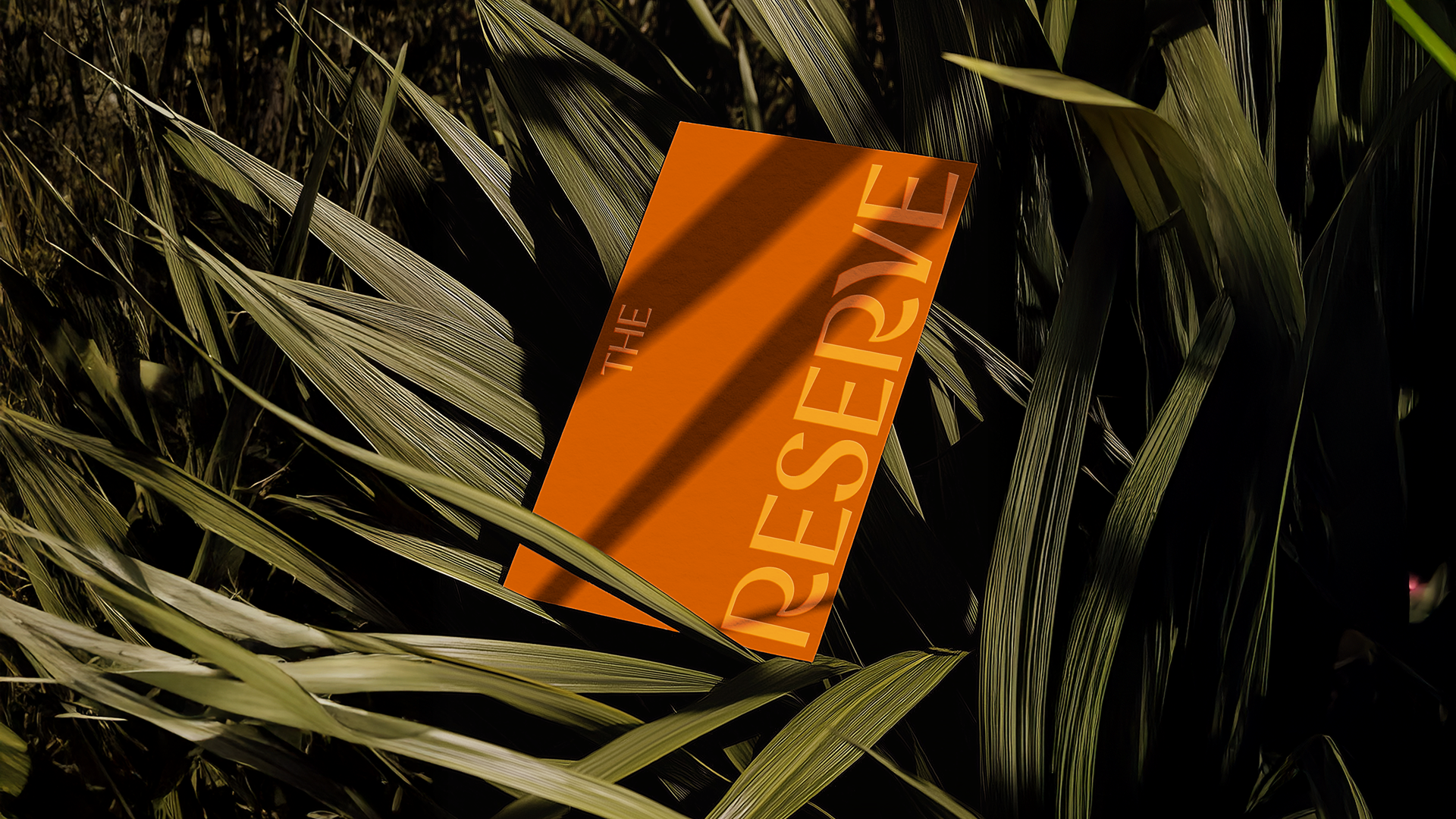
Chester Zoo has opened The Reserve, safari-style lodges to help educate visitors and fund its conservation work.

Designed by Jolie, the 51 lodges, communal “welcome lodge” and lakeside terrace are integrated into the zoo’s Grasslands habitat, allowing vistors to come face-to-face with giraffes, zebras and antelope.

Chester Zoo is one of the UK’s leading conservation zoos.

“As a not-for-profit organisation, each stay at The Reserve directly funds our work in Africa and around the world,” says Kevin Jackson  the zoo’s major project lead.

London-based Jolie, which won the job against four other agencies, wasn’t given a detailed design brief.

“We wanted our designers to bring their own creativity to the project, to make it truly unique,” Jackson says.

“We asked for a design that delivered a boutique hotel- style quality, that felt luxury, while still capturing elements of a safari lodge.”

Obviously Chester doesn’t have the same climate as popular safari destinations like Kenya, Tanzania and South Africa. So rather than an exact replica, Jackson says the team wanted, “to capture the sense of luxury and escape that an African safari lodge offers.”

“We didn’t want it to be too theme-y with African styling, or for it to feel brand new,” says Jolie creative director, Sarah Wakefield. “Instead we went for subtle, high-end boutique.”

Jolie drew on Sandibe Okavango Safari Lodge in Botswana, which was revamped in 2014 by Nicholas Plewman Architects and Michaelis Boyd design agency.


The lodges were provided by modular building firm Starship, with Jolie working on their interior plans, including the positioning of the windows.

Some lodges are interconnected, to suit extended families and groups of friends. Because while zoos tend to be designed with children in mind, these lodges are also aimed at the pre-children crowd, Wakefield says, particularly those who are eco-conscious and into animals.

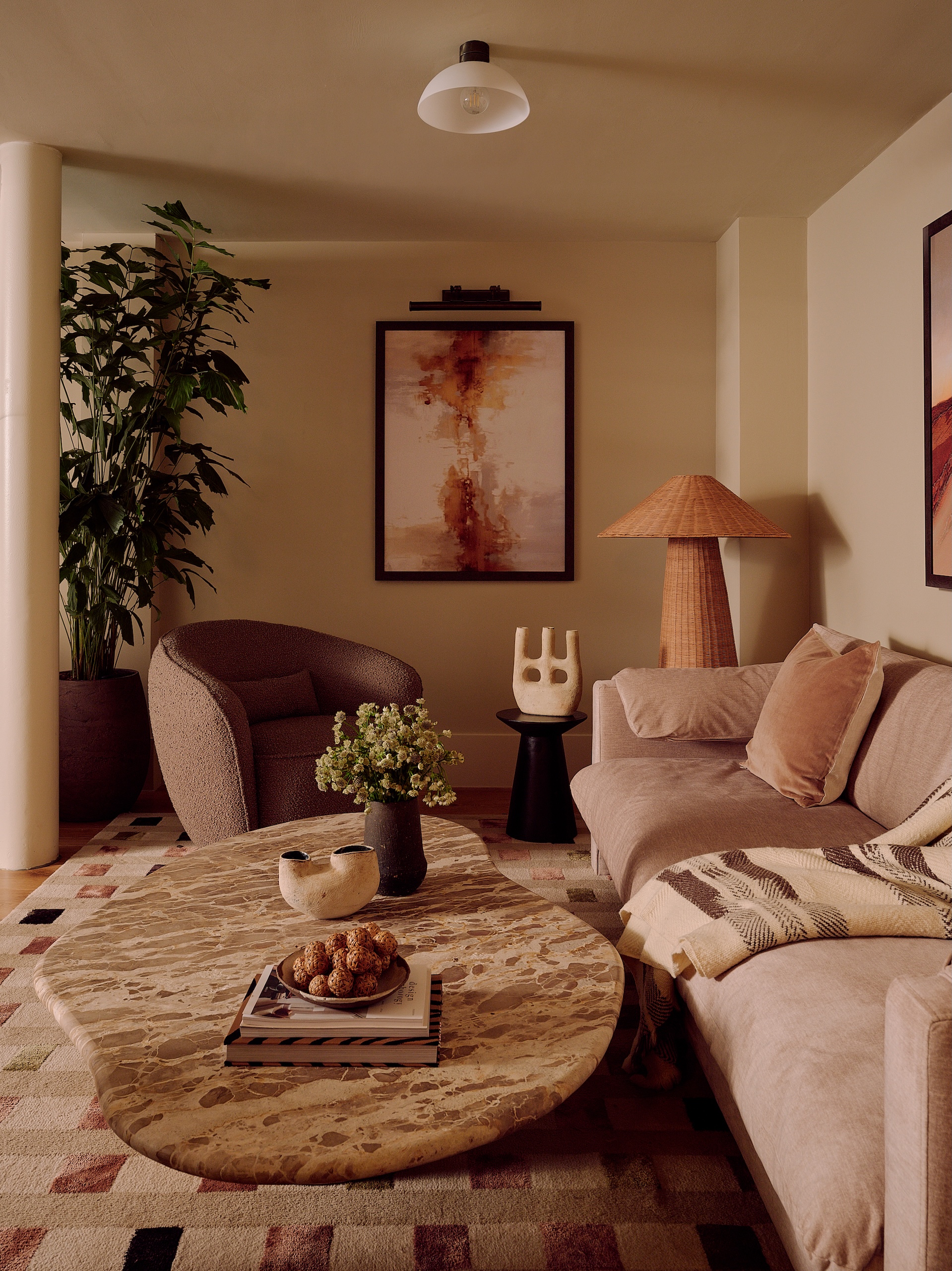
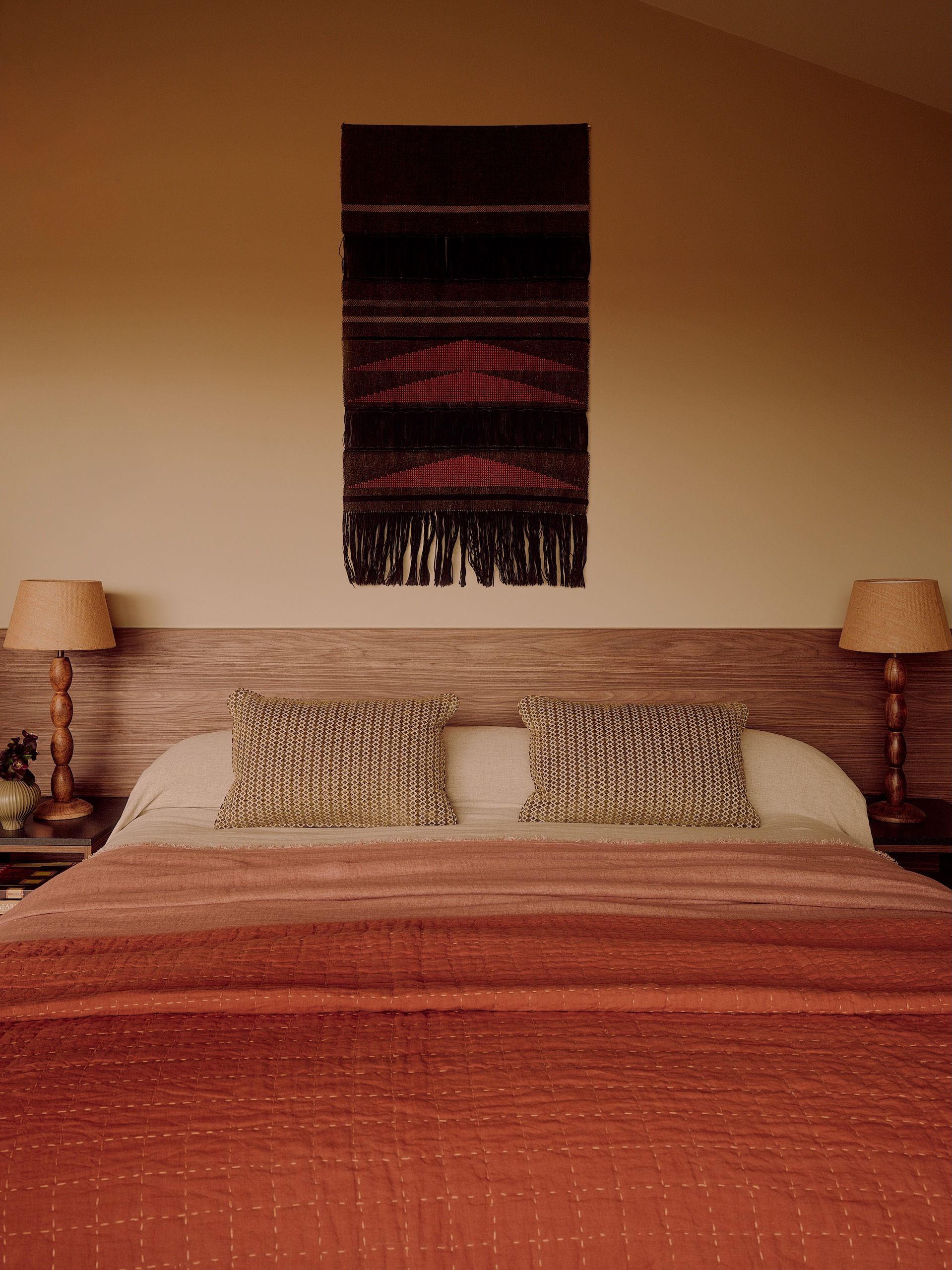
Boutique hotel touches include placing the bed in the centre of the bedroom and the gentle ambient lighting.

Meanwhile, eco credentials include sustainably sourced materials such as the rugs and carpets made from fishing nets and other recycled yarns.

And instead of using interior designers’ go-to material Corian – made by mixing minerals with acrylic resins – for the vanity surfaces, Jolie specified Woodio, a solid composite made from recycled timber.

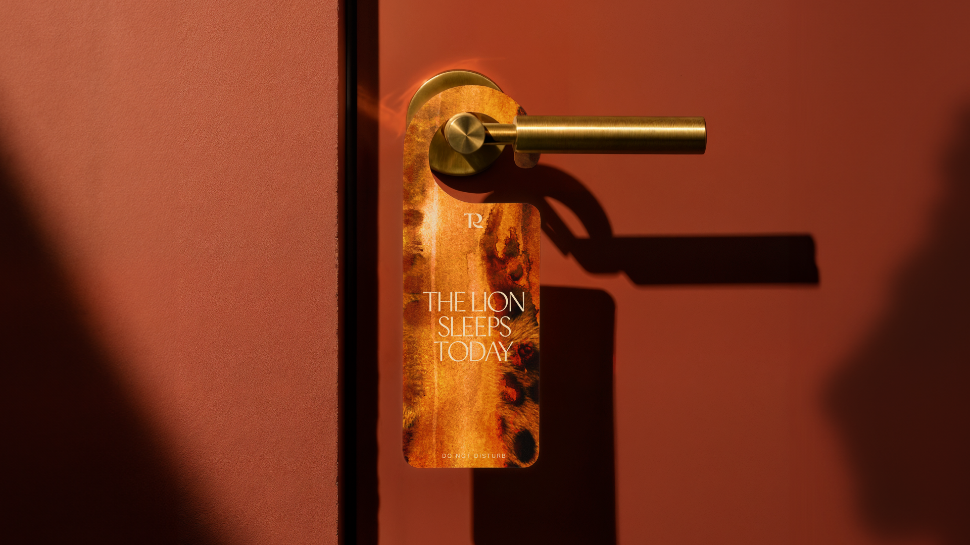
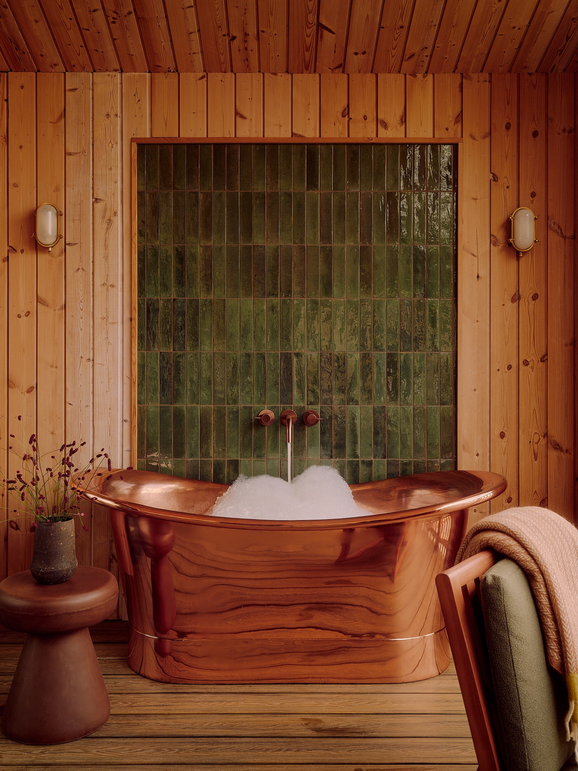
Aesthetically, the earthy palette and textures, such as the bare plaster in the bathroom, are intended to hint at the savannah and link with the landscape outside. The cushion fabric comes from Coral & Hive, which is made by craftspeople in West Africa.

Jolie Studio’s new lodges for The Reserve at Chester Zoo

In the two-storey welcome lodge, the ground floor has a banquette seat with African grasses planted in its centre, while the open-plan lounge and restaurant are decked out in natural wood and marble.

Upstairs, the bar is moodier and more adult-focused, Wakefield says.

Here, she paired natural materials – the bar front is pebble-dash – with darker colours like navy and midnight blue. “We took those influences from star-gazing.”

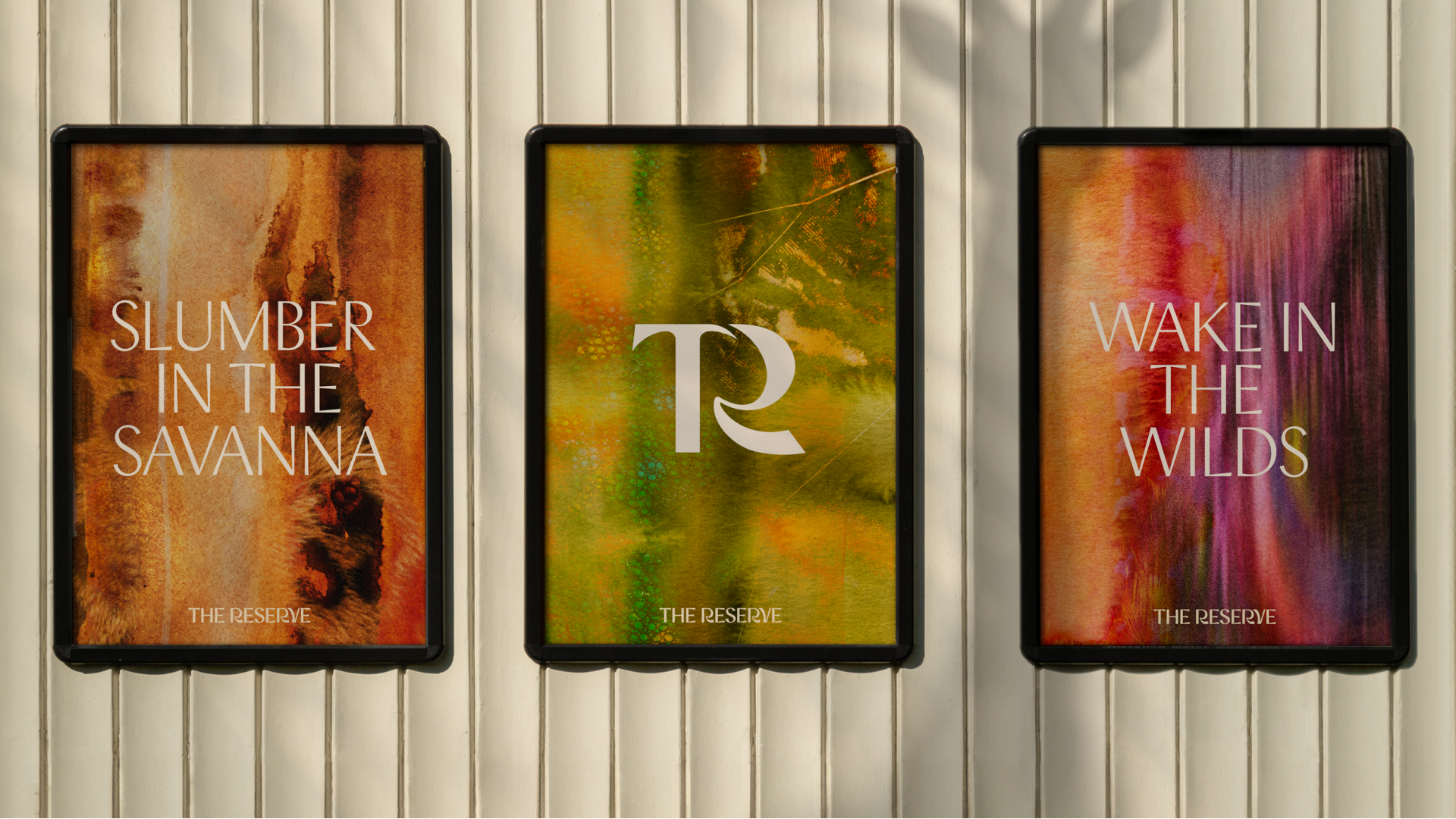
The branding for The Reserve was done How&How, who also rebranded the zoo last year.

How&How’s branding for The Reserve at Chester Zoo

“They wanted it to be known as a place of discovery – a world of memorable experiences,” Cat How explains. “They were very keen on us distilling and combining some core elements of the Chester Zoo brand with luxury and a bit of sass.”

The identity includes elegant typography, fluid motion behaviours and animal-print patterns hand-painted by How & How’s senior creative, Eilidh Reid.

“We knew we needed to find a subtle way of tying in The Reserve to the Chester Zoo brand, so using patterns inspired by animals but in a much more crafted way felt like a logical elevation for this luxury offering,” Reid explains.

Each visual combines patterns associated with two or three different animals, to reflect the experience of encountering multiple species at the zoo. And Reid created them in watercolour, to evoke both the lake around which the lodges sit, and because as a medium, “it’s unpredictable, like nature. You don’t know how they’re going to react with each other.”


For the word mark, the rhino horn created using the negative space in the ‘C’ of Chester, reoccurs in the two “R’s of The Reserve.

When it comes to animal-based immersive sleepovers, Chester Zoo is riding a wave. There’s Port Lympne Safari Park’s treehouses in Kent, designed in 2015 by Tara Bernerd and Partners, the Safari Lodges at the West Midlands Safari Park, designed by Newman Gauge, and the Yorkshire Wildlife Park has the Hex Wildlife Hotel.

Jolie Studio’s new lodges for The Reserve at Chester Zoo

Source

By

TETRO elevates house on concrete tree-like columns above the hills of belo horizonte, brazil

TETRO stacks four-level residence on a steep slope in brazil


Overlooking the Serra do Curral mountain range in Belo Horizonte, Brazil, Lua House by TETRO is composed of a vertical sequence of terraces. The residence is built on a sharply inclined plot and organized into four stacked levels, each one designed as a belvedere, making it seem like it hovers.


The upper volume rests on four branching concrete columns that recall tree trunks, a gesture that allows air, light, and vegetation to circulate beneath. The suspended block is enveloped by a metallic brise-soleil that reads as a monolithic mass from the outside and filters sunlight and casts evolving shadows across the interior.

all images by Luisa Lage


Lua House hovers between land and sky, aligned with the moon


A transparent atrium at the entrance acts as a transition zone between the dense urban fabric and the openness beyond. From this glazed pause space, the entire panorama of Belo Horizonte is revealed, while the vertical circulation connects the sequence of volumes above and below. Brazilian firm TETRO places the private areas, including the master suite and bedrooms, on the upper block, while two additional rooms complete the family’s program on this level. One floor down, the living room and kitchen extend outward toward a wooden deck and swimming pool. The lowest level, more reserved, contains the service spaces and an office, yet still keeps the horizon in sight.


The project’s name and orientation stem from the residents’ fascination with the moon, which rises behind the mountains that define Belo Horizonte’s skyline. Each evening, this celestial event becomes part of domestic life. The view turns into an experience, the architecture into a lens through which to witness it.

Lua House by TETRO is composed of a vertical sequence of terraces

the metallic brise-soleil reads as a monolithic mass from the outside

built on a sharply inclined plot

the upper volume rests on four branching concrete columns

the culumns recall tree trunks

allowing air, light, and vegetation to circulate beneath

a transparent atrium at the entrance acts as a transition zone

the project’s name and orientation stem from the residents’ fascination with the moon

the living room and kitchen extend outward toward a wooden deck

TETRO places the private areas on the upper block

the moon rises behind the mountains that define Belo Horizonte’s skyline


project info:


name: Lua House

architect: TETRO | @tetro.architecture

location: Belo Horizonte, Minas Gerais, Brazil

plot area: 477 square meters

total built area: 455 square meters


architects in charge: Carlos Maia, Débora Mendes, Igor Macedo

collaborators: Gregório Magno, Bianca Carvalho, Bruno Bontempo, Giovanna Giacomo, Luisa Lage, Carolina Amaral

construction: Real Construtora

structure: MVE Estruturas

hydraulic: Alexandre José Gonçalves

electrical: Antonio Sergio de Carvalho (FASE Engenharia e Projetos LTDA)

lighting design: Gilza Carvalho

windows, skylights & brise-soleil: Vitarka Esquadrias

interiors: Ana Flávia Souza Silva

granite: Pedras Paraná

vinyl flooring: Komlog

woodwork: Armários Nobre

automation: Josimara Andrade

wooden deck: Macal Madeiras

pool installation: Tecnosolar

landscaping: Nativa

photographer: Luisa Lage | @luisaglage

The post TETRO elevates house on concrete tree-like columns above the hills of belo horizonte, brazil appeared first on designboom | architecture & design magazine.
By

Gwen John in Post-Impressionist Paris

The post Gwen John in Post-Impressionist Paris appeared first on DailyArt Magazine.

By

Anna Bilińska’s Parisian Career and Tragic Life

The post Anna Bilińska’s Parisian Career and Tragic Life appeared first on DailyArt Magazine.