By

REDMAGIC 11 Pro Review: Watch Liquid Cooling Flow Like Sci-Fi

PROS:


Eye-catching visible liquid cooling design

Water- and dust-proof mini turbo fan

Has a rare 3.5mm headphone jack

Flat back design with no protruding camera bump

Impressive overall performance

CONS:


Gamer aesthetic won’t appeal to everyone

Visible liquid cooling is only available on more expensive transparent designs

RATINGS:

AESTHETICS
ERGONOMICS
PERFORMANCE
SUSTAINABILITY / REPAIRABILITY
VALUE FOR MONEY

EDITOR’S QUOTE:

The REDMAGIC 11 Pro makes cooling beautiful with visible liquid pulsing through its transparent body.

Gaming smartphones have become a category unto themselves, but most either sacrifice design for performance or deliver great specs with boring looks that blend into the sea of generic slabs. For anyone who wants a phone that feels as exciting to hold as it is to use during competitive matches or daily tasks, the market has been surprisingly limited, forcing compromises that feel unnecessary given modern manufacturing capabilities and design possibilities.

The REDMAGIC 11 Pro enters the scene with a bold promise that challenges those compromises directly: flagship gaming performance wrapped in a design you’ll actually want to show off to friends and fellow gamers. With visible liquid cooling, a flat-back transparent body, and specifications that deliver the processing power, it’s a phone that promises visual impact as well as winning matches and dominating leaderboards. Let’s take a deeper look inside to see how well it actually performs in real-world use.

Designer: REDMAGIC

Aesthetics

The REDMAGIC 11 Pro’s design is unapologetically futuristic, especially in the Nightfreeze and Subzero transparent versions that showcase some of the phone’s internal engineering like a piece of wearable art you can carry. The flat rear panel eliminates the camera bump entirely, creating a sleek profile that sits comfortably on desks without wobbling and feels balanced in hand during extended gaming sessions that stretch for hours.

The most arresting detail is the visible liquid cooling system, particularly the circular Time-Space Ring window that reveals the AI server-grade fluorinated coolant pulsing through laser-cut microchannels beneath the transparent metal body. Watching the ice-blue liquid flow as the phone cools itself during intense gameplay creates a kinetic, sci-fi effect that’s both functional and mesmerizing, turning thermal management into visual theater that never gets old.

Dynamic RGB lighting frames the visible cooling loop and extends to a side strip that can be customized through software for different effects and colors. The transparent metal construction showcases intricate craftsmanship, revealing some of the components through the premium material. The effect is industrial yet refined, appealing to both gamers and design enthusiasts who appreciate engineering on display rather than hidden behind opaque shells.

Material choices reinforce the premium positioning throughout the device from every angle you examine it. Corning Gorilla Glass protects the display from scratches and impacts, while the aluminum alloy mid-frame provides structural rigidity without excessive weight that would make extended gaming uncomfortable. The matte Cryo version offers a more subdued look for those who prefer understated elegance, but the transparent models are where REDMAGIC’s design philosophy truly shines.

Ergonomics

Despite its futuristic looks and transparent internals packed with visible technology, the REDMAGIC 11 Pro remains remarkably practical for daily use and extended gaming sessions without causing discomfort. At 230 grams, the phone has a substantial feel without being uncomfortably heavy during one-handed use, and the weight distribution keeps it balanced during two-handed gaming grips that competitive gamers favor during intense matches requiring precision control.

The flat back and rounded corners create a comfortable grip that doesn’t dig into palms during marathon sessions lasting several hours. The absence of a camera bump means the phone sits flush on surfaces without rocking annoyingly, making it ideal for desk gaming, table use during video calls, or content consumption on flat surfaces where other phones wobble constantly from protruding cameras.

The phone’s 8.9 millimeter thickness makes it surprisingly pocketable for a gaming device with this much cooling hardware inside, fitting into most pants and jacket pockets without excessive bulk. The flat design actually helps here, distributing the phone’s footprint evenly rather than creating awkward bulges from protruding camera modules that plague most flagship smartphones today and make them uncomfortable to carry.

Button placement is thoughtfully considered throughout the design for both gaming and daily use scenarios. The power button and volume rocker are positioned for easy access, whether you’re gaming in landscape orientation or using the phone normally in portrait mode. The 3D ultrasonic fingerprint sensor works reliably even with wet hands, a practical detail for gamers who get sweaty during intense sessions. The customizable Magic Key on the side provides quick access to Game Space or other functions without interrupting gameplay or requiring menu navigation that pulls you out of immersion.

The 520Hz shoulder triggers are positioned perfectly for landscape gaming, offering tactile, responsive control that feels natural within seconds of picking up the phone for the first time. These physical buttons provide a significant advantage over touchscreen-only controls, especially in competitive shooters where split-second reactions determine outcomes and touchscreen delays can cost matches. The triggers support both landscape and portrait modes for versatility.

Performance

The REDMAGIC 11 Pro’s performance capabilities start with the Snapdragon 8 Elite Gen 5 processor, Qualcomm’s fastest mobile chipset built on a 3nm process with clock speeds reaching 4.6GHz across its cores. Paired with up to 24GB of LPDDR5T RAM and 1TB of UFS 4.1 Pro storage, this configuration handles anything you throw at it, from graphically demanding games to heavy multitasking across dozens of apps simultaneously without slowdowns.

What truly separates the REDMAGIC 11 Pro from competitors is the revolutionary AquaCore Cooling System, the world’s first mass-produced smartphone implementation of flowing liquid cooling technology used in AI servers. This system uses non-conductive fluorinated liquid, circulating it through micron laser-cut channels to draw heat directly from the battery and processor during sustained high-performance use that would throttle most phones.

The cooling system combines four technologies working in concert to maintain optimal temperatures throughout extended sessions. Flowing liquid cooling provides direct heat extraction from hot spots, Liquid Metal 3.0 ensures rapid thermal conductivity between components, and the industry’s largest 13,116 square millimeter vapor chamber distributes heat evenly, and a waterproof 24,000 RPM TurboFan accelerates air circulation without failing in humid or dusty conditions.

Testing with demanding titles like Genshin Impact and Honkai Star Rail demonstrates the cooling system’s effectiveness in real-world gaming scenarios. The phone maintains consistent 60-plus frame rates with minimal variance over multi-hour sessions, while competing devices show significant performance degradation and frame stuttering as internal temperatures climb. Battery consumption during gaming is noticeably lower, extending playtime significantly beyond what other flagships achieve.

The 6.85-inch AMOLED display dominates the front with minimal bezels at just 0.7 millimeters thick, achieving a 95.3 percent screen-to-body ratio that creates an immersive viewing experience without distractions. The display’s 2688 by 1216 resolution and 144Hz refresh rate deliver fluid visuals for both gaming and everyday scrolling, while the under-display camera technology eliminates notches or punch holes entirely, maintaining clean lines across the entire screen surface.

The screen emphasizes the importance of the touch experience as much as it does the visuals. The Synaptics 3910v chip enables 2,592Hz instant touch sampling, making on-screen controls incredibly responsive and precise during competitive play where milliseconds matter. The new wet-hand mode ensures reliable touch recognition even in rain or immediately after washing hands. The 3D ultrasonic fingerprint sensor works reliably even with wet hands, a practical detail for gamers who get sweaty during intense sessions.

The 7,500mAh battery provides genuinely impressive endurance across all usage scenarios, delivering up to 34 hours of daily mixed use and over 7 hours of Genshin Impact gameplay at maximum settings without charging. The 80W wired and wireless fast charging reaches full capacity quickly enough to top up during short breaks, and the inclusion of reverse wireless charging means you can power up accessories.

The camera system handles daily photography needs competently without pretending to be a dedicated camera phone, which is perfectly fine for a gaming-focused device. The 50MP main sensor with optical image stabilization and anti-glare coating captures sharp, stable shots in good lighting, while the 50MP ultra-wide lens handles group photos and landscapes with natural perspective. The 16MP front camera, tucked beneath the display, delivers selfies enhanced by AI processing that keeps skin tones natural and details clear during video calls or casual shots.

Sustainability

The REDMAGIC 11 Pro approaches sustainability through durability and longevity rather than disposability, building a phone designed to remain relevant and functional for years rather than requiring replacement. The aluminum alloy mid-frame and Corning Gorilla Glass construction create a robust foundation that withstands daily wear, accidental drops, and the rigors of travel without showing excessive damage or requiring replacement after minor incidents.

The IPX8 water resistance rating and unique dust-proof design protect the phone’s internals from environmental damage that would compromise cheaper devices, extending its practical lifespan significantly. The waterproof and dust-proof mini fan is a REDMAGIC industry first, ensuring the active cooling system continues functioning reliably even in dusty or humid environments where conventional fans would fail or degrade rapidly, maintaining cooling efficiency.

The visible liquid cooling system, while visually striking, also serves a crucial sustainability purpose by preventing thermal degradation of internal components over time. By maintaining lower operating temperatures consistently during heavy use, the phone’s processor, battery, and other heat-sensitive components experience less thermal stress, extending their functional lifespan and maintaining performance consistency across years of heavy gaming.

Value

The REDMAGIC 11 Pro’s pricing positions it strategically within the high-end smartphone market, especially considering what you receive for the investment in terms of hardware and design. The transparent Nightfreeze and Subzero versions start at $849 for 16GB of RAM and 512GB of storage, while the top configuration with 24GB of RAM and 1TB of storage comes in at $999, offering flagship specs without flagship pricing.

When you compare these specifications and prices to other gaming phones and premium non-gaming flagships currently available in the market, the value proposition becomes compelling. Many similarly specced devices with advanced cooling systems, high-refresh displays, and large storage capacities often cost significantly more, sometimes well over the $1,000 mark, and frequently lack the visual flair, gaming-focused features, or transparent design aesthetic that makes the REDMAGIC 11 Pro distinctive.

When you factor in the visible engineering, waterproof active cooling, and gaming-specific features like shoulder triggers and dedicated gaming chips, the value equation tilts heavily in REDMAGIC’s favor. Throw in the 3.5mm headphone jack, 80W wireless charging, and reverse wireless charging, and you’re essentially getting desktop-class gaming performance in a pocketable form factor at prices competitive with conventional flagships.

The rare combination of visible engineering, industry-leading cooling technology, and thoughtful design choices makes the REDMAGIC 11 Pro stand out in ways that raw specifications alone cannot capture. You’re not just buying processing power and storage capacity; you’re investing in a device that celebrates its capabilities visually and functionally, making every gaming session and daily interaction feel intentional and exciting rather than routine.

Verdict

The REDMAGIC 11 Pro delivers on its promise to blend cutting-edge gaming performance with a futuristic design that turns heads and starts conversations wherever you use it publicly. The visible liquid cooling system is genuinely innovative beyond its aesthetic appeal, providing tangible thermal management advantages that translate to sustained performance during the gaming sessions that matter most to competitive players. Combined with the Snapdragon 8 Elite Gen 5, massive battery, and thoughtful gaming features, it’s a phone that respects your competitive aspirations.

For gamers, power users, and design enthusiasts who want their technology to look as advanced as it performs during daily use, the REDMAGIC 11 Pro offers a compelling package. The transparent design, waterproof cooling fan, and flat-back profile demonstrate that gaming phones can be both powerful and beautiful, setting a new standard for what’s possible when engineering and aesthetics receive equal priority in product development without compromise.

The post REDMAGIC 11 Pro Review: Watch Liquid Cooling Flow Like Sci-Fi first appeared on Yanko Design.

By

interlocking bamboo and cedar frames shape wild boar nest installation by cheng tsung feng

Cheng Tsung Feng reimagines wild boar nests as an installation


At Danongdafu Forest Park in Guangfu Township, Hualien, Taiwan, artist Cheng Tsung FENG designs Nesting Plan VII: Formosan Wild Boar. The outdoor installation translates the nest-building behavior of the native Formosan wild boar into architectural form. The project is part of FENG’s ongoing Nest Plan series, which investigates the construction practices of animals and reinterprets them through human craftsmanship and building materials. By studying the boar’s instinctive nesting methods, FENG develops a structural system that reflects both the animal’s habits and its spatial logic.


Constructed from locally sourced Japanese cedar and Makino bamboo, the installation draws from two behavioral patterns: the piling of dry grass and branches to form a protective enclosure, and the animal’s tendency to rest inside the nest while facing the entrance, a posture of alertness to the external environment. These observations are translated into a series of interlocking pentagonal and hexagonal frames that overlap from front to back, forming a semi-spherical enclosure reminiscent of a curled body at rest.

all images by FIXER Photographic Studio


Layered bamboo and wood structure shapes FENG’s installation


Around the wooden framework, bamboo branches wrapped in white tape create a layered surface that references the texture of wild grasses. The interplay between the rigid geometric structure and the loose, fibrous exterior gives the work both architectural order and organic fluidity. Inside, a circular arrangement of benches defines a shared central space. The interior provides shade and seating, while encouraging visitors to experience the sense of concealment and attentiveness found in the animal’s nest. The installation serves as both a small gathering point for outdoor activities and a quiet resting place within the forest park. Through Nesting Plan VII, artist Cheng Tsung FENG continues his exploration of how natural behaviors can inform spatial design, positioning the work as a study in coexistence between human architecture and animal habitats.

Nesting Plan VII: Formosan Wild Boar by Cheng Tsung FENG at Danongdafu Forest Park, Hualien

the installation translates the nest-building behavior of the Formosan wild boar into architectural form

the work is part of FENG’s ongoing Nest Plan series exploring animal construction and spatial intelligence

constructed from locally sourced Japanese cedar and Makino bamboo

interlocking pentagonal and hexagonal frames form the structure’s geometric framework

inside, circular benches define a central space for gathering and reflection

the form is inspired by the way wild boars pile grass and branches to build protective enclosures

overlapping layers create a semi-spherical enclosure resembling a curled body at rest

reflecting the boar’s instinct to rest inside its nest while facing the entrance in alertness

visitors experience the spatial logic of concealment and attentiveness found in the animal’s nest

the bamboo exterior is wrapped in white tape, evoking the texture of wild grasses

the layered bamboo skin softens the precision of the wooden framework

the design creates a dialogue between rigid geometry and organic material expression


project info:


name: Nesting Plan VII Formosan Wild Boar

artist: Cheng Tsung FENG | @chengtsungfeng

location: Danongdafu Forest Park, Hualien, Taiwan


adviser: Forestry and Nature Conservation Agency, Hualien Branch
curator: Sen Shen Studio, Kao Kung Chi Studio

project designers: Ching Cheng CHANG, Chan Wei HSU
structural analysis: Jian Quan Engineering Consultants
woodwork: Yi Chuang Timber Structure
metal work: Rui Yang Laser
lighting design: OuDe Light
lighting engineer: Beamtec Lighting

photographer: FIXER Photographic Studio | @fixer_photographic_studio


designboom has received this project from our DIY submissions feature, where we welcome our readers to submit their own work for publication. see more project submissions from our readers here.


edited by: christina vergopoulou | designboom

The post interlocking bamboo and cedar frames shape wild boar nest installation by cheng tsung feng appeared first on designboom | architecture & design magazine.

By

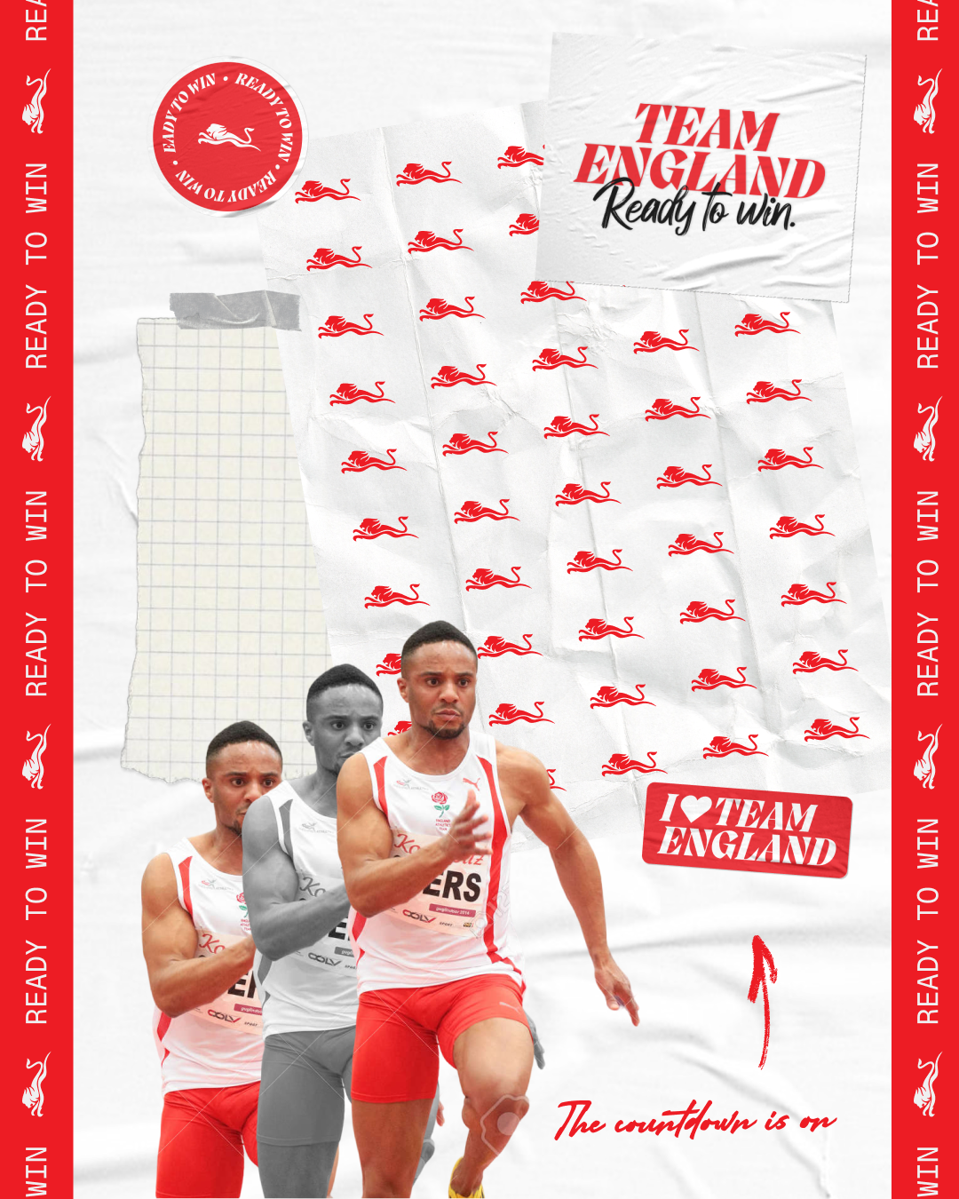
FORM Brands Studio creates Team England’s Commonwealth Games identity

FORM Brands Studio has created a new identity for Team England at the 2026 Commonwealth Games.

Against a tricky backdrop of debates around English nationalism – and in particular what the St George’s Flag represents – the London-based studio had to create a look that captured a welcoming brand of national pride.

“We wanted to celebrate our diversity and inclusivity, which is absolutely key to Team England,” says Kirsty Woodcock, head of marketing and communications at Commonwealth Games England.

“A lot of our athletes will stand under an England flag and it will be the proudest moment of their lives,” she says. “We want to create that sense of pride and belonging that people can rally behind.”

Woodcock had initially considered a full rebrand of the Team England set-up, “but we are publicly funded, and our budgets don’t stretch to that.”

So instead, she and her team focused on the team’s visual and verbal identity for next summer’s Commonwealth Games in Glasgow. The team historically has a new campaign for each Games, but Woodcock says they wanted to “think a bit more strategically” going into 2026.

The brief called for something that would “inspire, motivate and excite” athletes, fans, and staff.

It also had to create more distinctiveness, to avoid confusion with other Commonwealth Games teams like Canada and Wales, who have similar colours, but also to differentiate from England’s other sports teams, like cricket, football and rugby.

They also wanted to lean into the specific spirit of the Commonwealth Games, which brings together a wider range of athletes, young and old, than the Olympics, where British athletes compete as Team GB. The Commonwealth Games also runs its paralympic competition alongside the non-para games, not one after the other.

“Athletes have a real fondness for the Commonwealth Games, and it’s quite unique,” Woodcock explains. “You have this mega mix of experience – for some athletes and some sports it’s the pinnacle, while for others it’s an important part of their journey, a major stepping stone towards the Olympics.”


Woodcock chose FORM Brands Studio because she’d been impressed by their work on British Cycling.

Co-founder and creative director Alex Andlaw said the team began by interviewing a wide range of stakeholders, from athletes to board members, in order to create work that “could fundamentally underpin the attitude” the Team will take into next summer.

He says they also wanted to produce an identity that could last across multiple Games, and give it the stretch that could be developed over the next ten years.

The design team honed in on a central idea – “Ready to win” – but worked hard to ensure it didn’t become a macho, win-at-all-costs mantra.

“We wanted it to be optimistic, and confident, but approachable as well,” Andlaw explains. “So we didn’t want the visual identity to be too clean, or too professional – we wanted it to feel a bit edgy.”

FORM Brands Studio’s new look for England’s 2026 Commonwealth Games campaign

And Woodcock says they discussed at length how to broaden the meaning of both parts of the tagline.

She says “ready” came to cover all the different ways, places, and people that contribute to an athlete’s journey.

“And there are many different ways athletes define ‘winning.’ For some it might be a gold medal; for others it might be coming back from an injury and turning up when it didn’t seem possible.”

“It’s all about hard and soft at the same time,” Andlaw adds. “Powerful, but warm.”

To that end, a key visual device was a paper motif, “to support that feeling of preparation, scrapbooking and training schedules.”

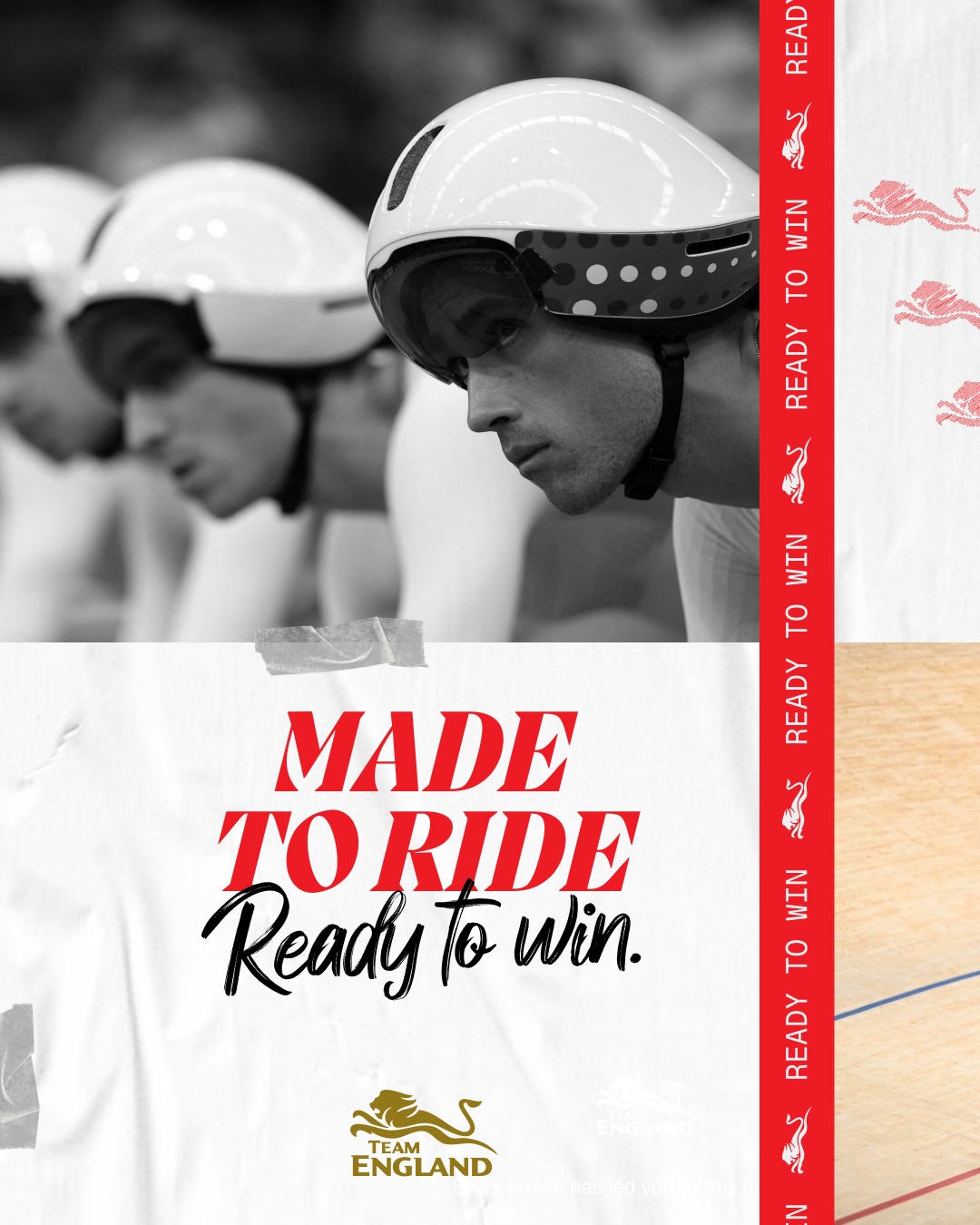
Another device is a red line, used vertically and horizontally, which is inspired by the cross of St George’s on the England flag. The line also references the ribbons on which medals are hung.

FORM Brands Studio’s new look for England’s 2026 Commonwealth Games campaign

It becomes a ticker tape on the new Glasgow 2026 Team England website, and it’s used as a grid structure to frame and break up content in static assets.

“It’s a lovely creative element, and it nods back to the flag without being a flag,” Andlaw says.

A new logo wasn’t part of the brief, while the red and white colour palette was also pre-set. But FORM have added a gold, used sparingly across the new look, inspired by the medals so many English athletes are hoping – and expected – to win.

Pangram Pangram’s Migra is the main typeface – which Andlaw describes as “fun, with some lovely attitude,” while Geist Mono and Geist Regular play a supporting role, alongside a handwritten script, Adelina Camarie, adds more personality.

Andlaw says the new verbal identity was “a huge part” of the project.

“Ready to win” becomes a sort of incantation, used in lines that capture the athletes’ dedication – “Every stroke has led you to this moment. Made to swim, ready to win.” – and regional diversity, celebrating the towns and cities that set the athletes on the road to success – “This one’s for you, Birmingham. Ready to win.”

FORM Brands Studio’s new look for England’s 2026 Commonwealth Games campaign

This regional focus crops up in the imagery too, where athletes are pictured against the backdrop of their hometown. Textures like track grit and leather grain add more interesting dimensions to the photography.

For Woodcock, the response from a wide range of stakeholders reassures her that the new look has resonated. She says Team England staff immediately started sharing ideas for how they could build out the identity into comms and storytelling, and the athletes were similarly enthusiastic.

That, for Andlaw, is crucial.

“They are the most important audience, to inspire them to go and win medals,” he says. “I love the idea that we’ll do some work that only the athletes see, and it might give them a little bit of extra motivation. That’s super powerful.”

FORM Brands Studio’s new look for England’s 2026 Commonwealth Games campaign

Source

By

adaptable building conference gathers change-makes to enable future-proof dwellings

THE Nieuwe Instituut HOSTS INAUGURAL ADAPTABLE BUILDING CONFERENCE


The Adaptable Building Conference (ABC) is set to land at the Nieuwe Instituut in Rotterdam on 22 January 2026, g gathering a critical mass of thinkers to enable a new generation of buildings. As the national museum for architecture, design, and digital culture, the Nieuwe Instituut offers the perfect launchpad for this international symposium, which aims to fuse insights across the entire value chain – from political and financial frameworks, architecture and design, engineering and construction to operation and maintenance in order to enable buildings that can adapt to changing needs and requirements without adversely affecting our planet.


Secure your place at the Adaptable Building Conference 2026 today – here.

image © Panels by Knauf, Max Guther


A forum to foster and drive change


The Adaptable Building Conference challenges how we imagine, design, construct, fitout and operate buildings. In an era defined by rapid technological evolution, shifting societal needs, and ecological crisis, the status-quo in the built environment is increasingly becoming an obsolete model. The ABC aims to champion a future where

buildings can evolve and transform. This means designing for user-driven adaptable housing, workplaces that fluidly respond to hybrid models, and urban ecosystems that integrate flexibility from the blueprint to the block. The conference asks its speakers and guests one question: how to future-proof our dwellings against inevitable change.

image © Panels by Knauf


The status-quo underscores the immediate necessity of the conference’s guiding question. Global climate targets demand a massive reduction in construction and demolition waste, while chronic housing shortages and rapidly evolving work/living patterns apply intense pressure to our existing infrastructure. Modular construction, circular systems, and design-for-disassembly are no longer niche concepts; they are essential, actionable tools and serve as foundation for a sustainable and resilient industry. The ABC’s program prompts and highlights discussions about approaches, concepts and proven solutions that blend ecological responsibility with socio-economic viability.

image © Superlofts by Marc Koehler Architects


Moving beyond isolated discussions, the ABC – the first international conference fully dedicated to adaptable building initiated by leading companies including Knauf, Hettich and Tesa forges a cross-sector dialogue that is both deep and practical. Its program combines visionary talks, provocative panel debates, and in-depth case studies to present new, tested models for housing, workplaces, and entire urban developments. It is a gathering designed not just to inspire, but to equip attendees with the business and policy models required to reward flexibility and drive long-term value creation in the market.

image © Superlofts by Marc Koehler Architects


The day’s agenda features a powerhouse lineup of industry leaders. Attendees can expect essential insights from speakers like Marc Koehler (Superlofts) on the cutting edge of user-driven adaptable housing, and Steven Paynter (Gensler) on the increasingly vital practice of office-to-residential transformation. Policy and large-scale strategy will be covered by Paco Bunnik (Amsterdam Municipality) discussing adaptable urban planning, while technical innovation takes the stage with Daniel Veenboer (Ramboll, Copenhagen) on sustainable systems design and Lukas Kauer (Panels by Knauf) exploring modular wall systems for true circularity. These discussions will be moderated by Robert Thiemann (BETTERNESS / Frame).


Register now to join the conversation and shape the future of adaptive architecture – book here.

image © Superlofts by Marc Koehler Architects

image © Panels by Knauf

image © Panels by Knauf

Pilot Installation for Adaptable Office Space in Partnership with UBM Development AG

image © Panels by Knauf

the conference includes a powerhouse lineup of industry leaders, moderated by Robert Thiemann | image © Nieuwe Instituut

image © Nieuwe Instituut


event info:


event name: Adaptable Building Conference

speakers: Marc Koehler (Superlofts), Steven Paynter (Gensler), Paco Bunnik (Amsterdam Municipality), Daniel Veenboer (Ramboll, Copenhagen), Lukas Kauer (Panels by Knauf), and Robert Thiemann (BETTERNESS / Frame)

date: 22 January 2026

location: Nieuwe Instituut, Rotterdam, Netherlands

The post adaptable building conference gathers change-makes to enable future-proof dwellings appeared first on designboom | architecture & design magazine.

By

curved electric motorcycle ‘outlier’ comes with hooded front panel and bucket-style seat

Honda reveals electric motorcycle EV Outlier Concept


During Japan Mobility Show 2025, Honda presents its EV Outlier Concept, an electric motorcycle with a sloping front panel and a bucket-style seat. Instead of the typical short or frontless face, the concept two-wheeler puts an umbrella at the front, a semi-translucent hooded panel, which makes the body look flowy. This theme continues through the seat, and if viewers look closely, the seating and the engine panel are merged into one, as the designer only places bucket-style backrests to complete the setup.


The project is part of Honda’s entry into the electric motorcycle market, led by designer Yuya Tsutsumi, who worked on the idea, the structure, and the production model. The EV Outlier Concept follows the earlier Honda electric models called the EV Fun Concept and EV Urban Concept, which were announced and shown at the international motorcycle exhibition EICMA in 2024.

all images courtesy of Honda, unless stated otherwise


Low-height seat to make the rider closer to the ground


The design of the EV Outlier Concept follows a Honda design theme called Precision of Intrinsic Design, which focuses on making the shape of the electric motorcycle match its function. In this case, the battery is placed in the center black section of the frame while other electronic components are kept separate. This design gives a clear layout and shows how each part works. The vehicle has in-wheel motors on both front and rear wheels so the motors are built directly inside the wheels instead of being in the center, giving more control to the rider and using the power of the motors directly on the road.


The frame and body use a mix of lightweight metal and plastic materials. Then, the horizontal suspension is placed under the main body to allow a lower seat height and change how the rider feels when sitting on the bike. The front area has added volume to highlight the low seating position, and the body panels use smoked transparent material that reveals the inside parts. If viewers take a closer look, the seat height is lower than on normal Honda motorcycles because the designer wants the rider to be close to the ground when riding the electric motorcycle EV Outlier Concept, changing their overall view and control. 

the rear light is attached to the backrest of the seat


Side mirrors replaced by cameras in the concept two-wheeler


The steering area includes a thin, wide digital meter, and the mirrors are replaced by cameras. The display shows riding information, with two separate screens: the upper display shows regular driving data, while the lower display shows motor power, front and rear torque balance, and riding modes. The rider can switch between driving modes. When doing so, the sub-display shows how the motors change power in real time. 


The design team used trial models to test proportions because electric motorcycles have different internal parts and old design rules for gas bikes couldn’t apply. The wheelbase, seat height, and overall size were tested repeatedly to find the right balance. For the electric motorcycle EV Outlier Concept, the Honda team uses modular components for the body to make the vehicle flexible for future development or maintenance. While the company plans to expand its electric motorcycle lineup, the EV Outlier Concept is not (yet) a production model but a test for future designs. 

there’s a singular frame connecting the front and the seat

the hooded panel at the front gives Honda’s concept electric motorcycle a flowing look

side view of the vehicle

the company reveals the vehicle at Japan Mobility Show 2025 | image © designboom

image © designboom

view of the bucket-style backrest

detailed view of the hooded panel at the front

designer Yuya Tsutsumi leads the Honda team for the creation of the concept model

so far, the EV Outlier Concept is not (yet) a production model | image © designboom


project info:


name: EV Outlier Concept

company: Honda | @honda

event: Japan Mobility Show 2025 | @jama_jpn

The post curved electric motorcycle ‘outlier’ comes with hooded front panel and bucket-style seat appeared first on designboom | architecture & design magazine.

By

carbon-negative bamboo pavilion by cave urban gives new life to disused car park in bali

BALEBIO PIONEERS CARBON-NEGATIVE ARCHITECTURE IN BALI


BaleBio, a bamboo pavilion designed by Cave Urban for Bauhaus Earth’s ReBuilt initiative, pioneers carbon-negative architecture in Bali while reimagining the traditional communal spaces of the island for a changing climate. Rising above the sands of Mertasari Beach in Denpasar, the 84-square-meter structure transforms a disused car park into a living community hub, an open meeting space that merges environmental performance with social purpose.


In a city where coastal construction is often driven by tourism, BaleBio serves as a prototype for buildings that store carbon instead of emitting it and that house collective needs. Its design draws on the Bale Banjar, the traditional village hall central to Balinese social life, reinterpreting its open and inclusive layout through contemporary engineering and a new understanding of ecological responsibility.

all images by Iwan Sastrawan for Bauhaus Earth


barrel-vaulted roof shades the BAMBOO PAVILION


The sweeping, barrel-vaulted roof of the pavilion rises 8.5 meters above the beach. Crafted by the multidisciplinary design studio Cave Urban for the Bauhaus Earth research institution from slender bamboo rafters and clad in pelupuh (flattened bamboo), the canopy offers natural ventilation and passive cooling. Beneath it, a structural frame of laminated petung bamboo, locally sourced, resin-bonded, and compressed, delivers the strength and precision of steel or timber without the associated carbon cost.


All components were grown, processed, and assembled in Indonesia, establishing a circular supply chain. Construction combined traditional joinery techniques with precision-engineered fittings. Locally sourced volcanic rock, lime plaster, and repurposed terracotta roof tiles contribute to thermal mass and reduce embodied energy, integrating bio-based, geo-based, and reused materials into a coherent system.

designed by Cave Urban for Bauhaus Earth’s ReBuilt initiative


from cradle to construction: beyond zero emissions


A life cycle assessment conducted by environmental engineering consultancy Eco Mantra confirmed BaleBio as verifiably carbon-negative from cradle to construction. The project records an 110% reduction in embodied carbon compared with a conventional build, saving over 53 tonnes of carbon dioxide emissions, equivalent to planting more than 2,400 trees. In quantitative terms, its carbon outcome stands at –5,907 kilograms of carbon dioxide equivalent against a baseline of nearly 60,000 kg.


This rigorous evaluation extends the impact of the project beyond aesthetics or symbolism. By treating the building itself as a test case for a new value chain, Bauhaus Earth and its partners demonstrate the feasibility of carbon-negative construction at an architectural, social, and industrial scale.

this bamboo pavilion pioneers carbon-negative architecture in Bali


a regenerative anchor for local life


Since opening, BaleBio has become a gathering point for residents and visitors alike. What was once a neglected urban plot has turned into a public stage, classroom, and meeting place, reactivating local participation through design. The project’s collaborative process, with contributions from Warmadewa University, community organizations, and local artisans, makes sure that the pavilion remains rooted in its cultural context even as it experiments with global standards of sustainable construction.


For its combined achievements in material innovation, carbon performance, and civic value, BaleBio received three major international distinctions in 2025: the Australian Good Design Award for Social Impact, a commendation from the Built by Nature Prize, and Gold in Excellent Architecture at the German Design Award in the Circular Design and Fair & Exhibition categories.


These accolades highlight the broader ambition of the project to redefine what good design means in an age of climate urgency. BaleBio is part of Bauhaus Earth’s ReBuilt initiative, which seeks to catalyze systemic change in the construction industry through applied research, bio-based materials, and the development of cities as natural carbon sinks.

the sweeping, barrel-vaulted roof of the pavilion rises 8.5 meters above the beach

the design draws on the Bale Banjar

reimagining the traditional communal spaces of the island for a changing climate

crafted from slender bamboo rafters and clad in pelupuh

the project records an 110% reduction in embodied carbon compared with a conventional build

BaleBio positions itself as a prototype for buildings that store carbon instead of emitting it

a structural frame of laminated petung bamboo delivers the strength and precision of steel or timber

all components were grown, processed, and assembled in Indonesia

Bauhaus Earth and its partners demonstrate the feasibility of carbon-negative construction

locally sourced volcanic rock, lime plaster, and repurposed terracotta roof tiles contribute to thermal mass

integrating bio-based, geo-based, and reused materials into a coherent system


project info:


name: BaleBio Pavilion

concept: Bauhaus Earth | @bauhaus_earth

design: Cave Urban | @caveurban

location: Mertasari Beach, Denpasar, Bali, Indonesia

area: 84 square meters


structural engineering: Atelier One

project management: Bamboo Village Trust

community engagement: Kota Kita, Warmadewa University

government engagement: Gamalaw

LCA analysis: Eco Mantra

manufacturing: Indobamboo, Kaltimber, Bhoomi, Bamboo Pure, Wedoo, Rothoblaas

materials: structural laminate bamboo (Dendrocalamus asper), reclaimed volcanic rock, recycled terracotta tiles, lime-plastered earth

carbon outcome: –5,907 kg CO₂e vs conventional baseline (~59,722 kg CO₂e)

funding: German Federal Ministry for the Environment, Climate Action, Nature Conservation and Nuclear Safety (BMUKN)

photographer: Iwan Sastrawan 

The post carbon-negative bamboo pavilion by cave urban gives new life to disused car park in bali appeared first on designboom | architecture & design magazine.

By

Motorola Edge 70 Is 5.9mm Thin But Somehow Lasts 50 Hours

Flagship phones keep getting pricier and chunkier, making it easy to feel left out if you want a device that’s both stylish and practical without emptying your wallet or your pockets. The latest Samsung Galaxy S25 Edge and Apple iPhone Air are everywhere, but their price tags and premium positioning aren’t for everyone who just wants a good-looking phone that works reliably without costing a month’s rent.

The Motorola Edge 70 is Motorola’s answer to those flagships with a phone that looks the part, feels great in hand, and packs a battery that goes the distance without constant charging. It’s designed to compete with the big names visually and functionally, but takes a slightly different approach under the hood with mid-range specs. The Edge 70 offers style and stamina where others demand deep pockets and constant charging anxiety.

Designer: Motorola

The Motorola Edge 70 is impossibly thin at just 5.9mm, making it the slimmest in its class and lighter than most competitors at only 159 grams. The matte finish, rounded corners, and Pantone-certified color options like Lily Pad and Bronze Green give it a premium vibe that stands out in a sea of black rectangles flooding the market. The aerospace-grade aluminum frame adds durability without compromising the slim profile.

Up front, you get a 6.7-inch pOLED display with a buttery-smooth 144Hz refresh rate and Pantone-validated color accuracy for authentic visuals. It’s bright at 4500 nits peak, vibrant, and smooth for scrolling, streaming, or editing photos on the go. The screen-to-body ratio of 96.32 percent delivers edge-to-edge immersion that rivals the best flagships on the market today.

Under the hood, the Snapdragon 7 Gen 4 chip, 12GB LPDDR5X RAM, and 512GB UFS 4.0 storage handle daily tasks, social media, and light gaming with ease and reliability. While it won’t out-muscle the Galaxy S25 Edge or iPhone Air in benchmarks, it’s more than capable for most users who aren’t pushing hardcore gaming or intensive video editing. The specs are mid-range, but performance feels premium for everyday life.

The Motorola Edge 70 sports a triple 50MP camera setup, including main, ultra-wide, and telephoto lenses, plus a high-resolution selfie camera for social sharing and video calls. Moto AI brings smart features like auto-capture, scene optimization, and instant note-taking from photos without complicated menus or settings. The camera system is versatile for everyday snaps, portraits, and 4K video recording, though it’s not aiming to dethrone dedicated camera phones at higher price points.

Where the Motorola Edge 70 really shines is battery life and charging speed that outpace many flagships. The 4800mAh silicon-carbon cell and 68W TurboPower charging mean you can go up to 50 hours on a single charge with moderate use, and top up in just 15 minutes when you’re running low. This battery performance beats many flagships that sacrifice capacity for thinness, making the Edge 70 ideal for heavy users.

Shipping with Android 16, IP68 splash resistance, 5G connectivity, Wi-Fi 6E, and stereo speakers with Dolby Atmos, the Motorola Edge 70 is a well-rounded package at £700. For anyone who wants flagship style, exceptional battery life, and everyday performance without the flagship price or constant charging anxiety that plagues thinner competitors, it’s a compelling alternative worth serious consideration.

The post Motorola Edge 70 Is 5.9mm Thin But Somehow Lasts 50 Hours first appeared on Yanko Design.

By

How is Mutabor using AI?

Mutabor is a Hamburg-based branding agency, which works with clients like PayPal, the Bundesliga and Porsche . Here they tell us how the studio is using AI, and how they feel about it.

You can see all the articles in this series here.

Broadly speaking, are you excited or nervous about AI in design?

Excited, honestly. We’ve always thrived on change – it’s literally in our name (Mutabor is the Latin term for the “will to change.”)

AI is powerful, fast, and yeah, sometimes a bit scary. But we don’t see it as a threat. We see it as another material to work with.

We immediately asked ourselves – how will this change branding? How will it change brand management? And what can we build with it?

That’s part of our DNA. We don’t just adapt to new tools, we think about what they mean for our work and we start building. So excited. But eyes wide open.

Do you have an agreed policy around AI as a business?

Yeah, we do. But honestly, there’s no blueprint for this yet.

From the start, we’ve been working with major corporations, helping them figure out their AI stance. We sit between marketing, IT, and legal helping them define standards that actually make sense for their business.

That’s taught us more than any handbook could. What works, what doesn’t, what keeps people up at night.

We’ve also worked closely with tech partners, legal advisors, and artists to build a solid foundation. Our own policy grew out of all that. It covers transparency, ethics, copyright, data protection, sustainable use. Being owner-managed helps. We can set standards and move fast instead of waiting for approval.

It’s not about limiting AI. It’s about using it responsibly and making sure everyone feels confident about how we work.

When did you realise AI was going to have an impact on design?

When AI entered the design world, we immediately started thinking about what it would mean for us. That’s when we created Mutabor.AI, our own brand-image generation tool.

It’s actually a very simple tool, but that was the point. We wanted to empower our clients to use AI early, in a way that non-designers to generate content consistently on brand.

That focus got us global recognition pretty quickly. It opened doors to partners, to knowledge, to talent. But more importantly, it forced everyone internally to engage with the topic. Not just the tech people. Everyone.

That’s when we knew – this isn’t a side project. This is the new normal.

As creatives, our role is to do the impossible with AI. Not just use it for efficiency, but to push it into territory where it creates something that couldn’t exist otherwise. That’s the work that matters.

Have you undergone any AI training, either as a studio or individuals?

Constantly. Everyone at Mutabor gets trained, not just creatives. Strategists, architects, account managers, everyone.

Each discipline has its own AI experts who dive deeper and share what they learn. But honestly, the best learning happens on the job. In real projects, with real clients. That’s where people gain confidence. Where they earn clients’ trust to actually use AI – not just for efficiency, but for creative exploration.

We tell our teams, “Easy tasks no longer exist. Hard tasks are the new easy tasks. Impossible tasks are the new hard tasks.”

If everyone has the same tools, creative thinking is what makes the difference. So we push people to do the impossible.

How do you use AI in the studio’s creative process?

It’s woven into everything now. Research. Concepting. Visual exploration. Content production. Workflow automation.

What’s it good for? Speed. Exploration. Iteration. Seeing possibilities you wouldn’t have thought of. It also opens up new creative territory. Things like vibe coding, creative coding, transforming code into design systems or motion. Stuff that used to feel out of reach is now accessible.

Where does it fall short? Context. Nuance. Emotion. AI doesn’t understand why something feels right. It doesn’t know when to hold back.

That’s where our teams come in. We curate. We edit. We kill things that don’t feel true to the brand. That part’s still human. And it has to be.

Do you think clients care if/how you use AI in your work?

More and more. But not in the way you might think.

Clients come to us for outstanding quality. They expect us to use whatever tools and methods deliver the best result – whether that’s the latest AI model, a traditional photoshoot, or working with artists and illustrators.

What they care about is that we make the right call. Of course, some clients have strict compliance rules around AI – data protection, copyright, legal frameworks. We’re transparent from the start about what we’re doing, why, and how we’re protecting their rights.

But ultimately, what they really want is honesty, and results. AI is a tool. The trust is still built between people.

Do you use AI for any non-creative aspects of running your business?

All the time – research, proposals, documentation, knowledge management, project planning.

It helps us move faster on the stuff that doesn’t need a human touch. That frees up time for what does – thinking, creating, collaborating. But we’re careful not to automate the wrong things.

Our meetings are still messy. Our conversations still loud. And that’s good.

Beyond the best-known tools, what is one AI tool that you would recommend to other design studios?

It’s less about specific tools, it’s about the models behind them.

We stay technology-agnostic so we can test new models without getting locked in. That said, here’s what we’re using right now:

For visual production – ComfyUI or Weavy. Node-based systems that give you real control to customise your generation pipeline

For analysis and collaboration – Langdock, which brings all major LLMs under one roof with EU-based data processing and strong compliance checks. We build agents and workflows directly with clients there.

For enterprise clients – Mutabor.AI, our own tool, built on clean, licensed data. For enterprise clients like Henkel, that means full copyright indemnification and EU AI Act compliance. Legal safety plus brand-specific customisation. If you need AI that protects your brand, talk to us.


Source

By

“Brand strategy’s not in trouble – bad strategy is”

Here’s a game. I’ll think of three numbers.

The first number is between one and six. So is the second number. The third number is between one and nine.

You have to guess those three numbers, in order. Every time you guess a number wrong, we’ll cross it off, so you know it isn’t that one. We’ll keep going until you land on the right three numbers, in order.

Sounds pretty dull. But throw in a dice and some storytelling about a murder, a list of suspects, a weapon and various rooms in a stately home, and you have a wildly popular board game that’s endured and entertained for over 80 years.

Good storytelling elevates the mundane. This isn’t new news, nor will it ever be old news.

So I can’t help rolling my eyes when I see yet another industry article earnestly asking, “Is Brand Strategy dead?” – see also: broken, outdated, irrelevant, or in one particularly harsh case, bullshit.

This narrative has taken off recently in the wake of WARC’s The Future of Strategy 2025 report.

It’s important to note that for their report, they use a broad brushstroke definition of “agency-strategy: encompassing the creative, digital and media industries, thereby combining brand, advertising, marketing, PR, social, influencer, and all the rest. This should be the first red flag.

But it’s still done a job in seemingly lending a semblance of credibility to a swathe of LinkedIn doom-mongers.

There are apparently numerous contributing forces, including:
The inevitable AI and automation.
Those pesky consumers and their ever-evolving expectations.
The fragmentation of media and attention
Next-gen talent’s tendency to challenge legacy models and eschew rigour in favour of fluidity.
The rise of community-led and participatory branding.
The shift from brand purpose to brand proof.
The blurring of brand and product experience.

It’s heady stuff.

But while all those factors are worthy of our attention – and are influencing the branding landscape – none of them mean stories are any less appealing to us as human beings, or that stories don’t influence how we feel about things, people and places.

And that’s what brand strategy should do. Whether those stories are told through brand architecture, purpose definition, brand positioning, verbal and visual identity or brand experience, they should all enhance the psychological value we attach to a product or service through effective storytelling.

WARC’s general theme is that clients still want and need strategy, but it’s at a crossroads. It needs to be more solution-led, less bland and more brilliant, with fewer frameworks and more lateral leaps.

“47% of strategists say fear of risk, leading to bland work, is the biggest threat to the discipline”, WARC advises.

“Strategists can deliver transformative strategy by challenging the status quo and looking beyond the obvious.”

Uh-huh.

“Look to break category norms and find the brand’s asymmetric advantage. Simplify the chaos for clients.”

Ok.

“Agencies need to encourage more imaginative and disruptive thinking.”

Sure. I’ve never used the phrase ‘Twas ever thus,’ but I’m tempted.

So let’s be grown-up about this. Brand strategy isn’t dead, broken or irrelevant. An easy way to tell, is that those suggesting it is…are strategists. And their proposed solution is brand strategy. Just, ironically, rebranded.

Brand strategy isn’t some archaic, old-world concept that’s being somehow “overthrown” by tech-enabled, enlightened revolutionaries.

How we identify audiences, conceive ideas, construct themes, how we craft and execute them in a way that resonates, has always been influenced by what’s around us.

It’s always been about keeping pace with culture and technology. Brand strategy isn’t a relic of a slower, more predictable era – it’s ever evolving.

Technological and cultural evolutions may be the pages turning, but this isn’t a plotline of old vs new, or big vs small, or institutions vs independents.

It’s simpler than that. It’s good vs bad.

There’s always been good and bad examples of brand strategy and always will be. Those that attract attention, those that don’t. Those that compel people, those that get ignored. Those that endure, those that fade.

The most iconic brands owe their success not to tools, but to an understanding of the human beings they engage with.

Because good brand strategy has rarely been about tools, and almost always about taste. The ability to discern the right story for the right people at the right time.

Brand strategy isn’t dead, bludgeoned with a candlestick in the kitchen by Colonel Mustard. It just needs to be good to survive. So ignore the clickbait. There are better stories out there.

Sam Hollis is head of strategy at FutureBrand.

Source

By

vertical cuts split monolithic ‘cube within a cube’ suburban residence in cyprus

Kyriakos Miltiadou sculpts an Introverted Concrete home


Situated near a sparse forest with intriguing vistas over the suburbs of Nicosia, Cyprus, stands AER, a suburban residence by Studio Kyriakos Miltiadou. Rather than adopting a conventional residential typology that opens outward to offer uninterrupted views of the surrounding landscape, it rises as an austere, introverted box.


The architectural proposal constitutes a systematic elaboration of the primordial dwelling-box and its reinterpretation in relation to contemporary modes of domestic living. The design begins with a three-dimensional grid, a lattice of points forming the rudimentary outline of a box with a 14×17-meter plan. Fragments of the natural landscape gradually infiltrate the box, triggering its progressive fragmentation. Through this systematic process of erosion, a complex prismatic composition of voids and solids emerges. Four vertical concrete walls, six meters high, wrap around the fragmented box, holding its split volumes within a coherent yet fluid whole. Carved with vertical cuts, these walls act as mediators between the inside and outside world: filtering, protecting, framing, and revealing, fostering in this way a dialectical relationship with the forest, the city, and the sky.

The residence rises within its surroundings as an austere, sculpted box.


AER Residence unfolds in ‘A Cube Within a Cube’ formation


Acting as a ‘collector,’ the box absorbs both tangible and intangible layers of its surroundings, reinterpreting them in relation to the family’s domestic life. What emerges morphologically is at first unfamiliar and deeply primal: a cube nested within a cube. An austere yet perforated shell is encased within another, standing as an archaic stone within its context. A vertical slit on the east facade serves as the entrance, marking arrival and emphasizing the transition from the exterior to the inner world of the building, designed by Studio Kyriakos Miltiadou. The first encounter is with an open yet sheltered garden, a central space that becomes a key compositional element around which the family’s daily life unfolds. This focal point is part of a continuous network of outdoor spaces, passages, and courts that surround the built mass of the house vertically and horizontally. Planted with local vegetation and filled with abundant natural light from above, they form a unique inner ‘garden’ nestled within the broader landscape ‘garden.’

The building is monolithic, constructed entirely from exposed concrete.


AER’s design Blurs Boundaries Between Living and Landscape


Internally, the house is organized across four distinct levels, always in relation to the surrounding network of outdoor spaces. On the ground floor lie the public areas, the kitchen, dining room, and living space. On the upper level, the private rooms unfold across two different planes. Intermediate spaces are used to provide a fluid arrangement between the functional units of the house, softening the boundaries between the public and private spheres of domestic life. A hidden external staircase leads to a small rooftop terrace above. Here, the roof dissolves into the intense Mediterranean blue of the sky, while much of its surface is planted with natural vegetation, fostering unique conditions for the creation of a microclimate. A horizontal aperture at the far end frames a captivating view of the forest and the distant mountain ranges.


The structural and architectural design operates as a unified entity. The building is monolithic, constructed entirely from exposed concrete. The sculpted surfaces envelop human activity, transforming it into a dwelling space. Over time, vegetation climbs and gradually softens the monolithic presence of the structure. The interplay between human activity, architecture, and nature becomes continuous and inseparable.

Carved with vertical cuts, the concrete walls frame and highlight intriguing views of the surrounding environment.

A continuous network of outdoor spaces and pathways surrounds the interior spaces of the building.

An external staircase leads to a hidden rooftop terrace.

Part of the building’s roof is planted with native vegetation, enhancing its bioclimatic performance.

Planted with local vegetation and filled with abundant natural light from above, they form a unique inner ‘garden’ nestled within the broader landscape ‘garden’.

All functional areas of the residence are organized around a central atrium space.

The interior spaces of the residence are organized on four distinct levels, always in relation to the enclosed outdoor garden.

Large sliding glass doors blur the boundaries between the interior and exterior spaces of the residence.

Acting as a ‘collector’, the box absorbs both tangible and intangible layers of its surrounding, reinterpreting them in relation to the family’s domestic life.

Four vertical walls, each six meters high, surround the main volume of the building, creating a dialectical relationship between the interior and exterior of the residence.


project info:


name: AER

architect: Kyriakos Miltiadou | @kyriakos.miltiadou
design team: Kyriakos Miltiadou, Maria Tsoupani
location: Nicosia, Cyprus


designboom has received this project from our DIY submissions feature, where we welcome our readers to submit their own work for publication. see more project submissions from our readers here.


edited by: christina vergopoulou | designboom

The post vertical cuts split monolithic ‘cube within a cube’ suburban residence in cyprus appeared first on designboom | architecture & design magazine.