
The tea aisle is reinventing itself as some consumers turn away from the mainstream builders’ brew in favour of quality black teas and healthy herbals.
In 1974, the average UK family shop included 68g – around 30 tea bags – per person. By 2023, that had dropped by two thirds, according to government figures.
Now a slew of new and reworked offerings have launched, while some mainstream brands are struggling.
Typhoo collapsed in 2024, with The Grocer putting its demise down to “a structural downturn in the traditional black tea market, amid other challenges”.
It has since been rescued by vape maker Supreme.
The SPILL branding on a tea tin
One new entrant promising to do things differently is SPILL, a black tea sourced directly from farmers in Rwanda.
The brainchild of the ex-founders of Teapigs, it launched in April, with design by Hey! What?
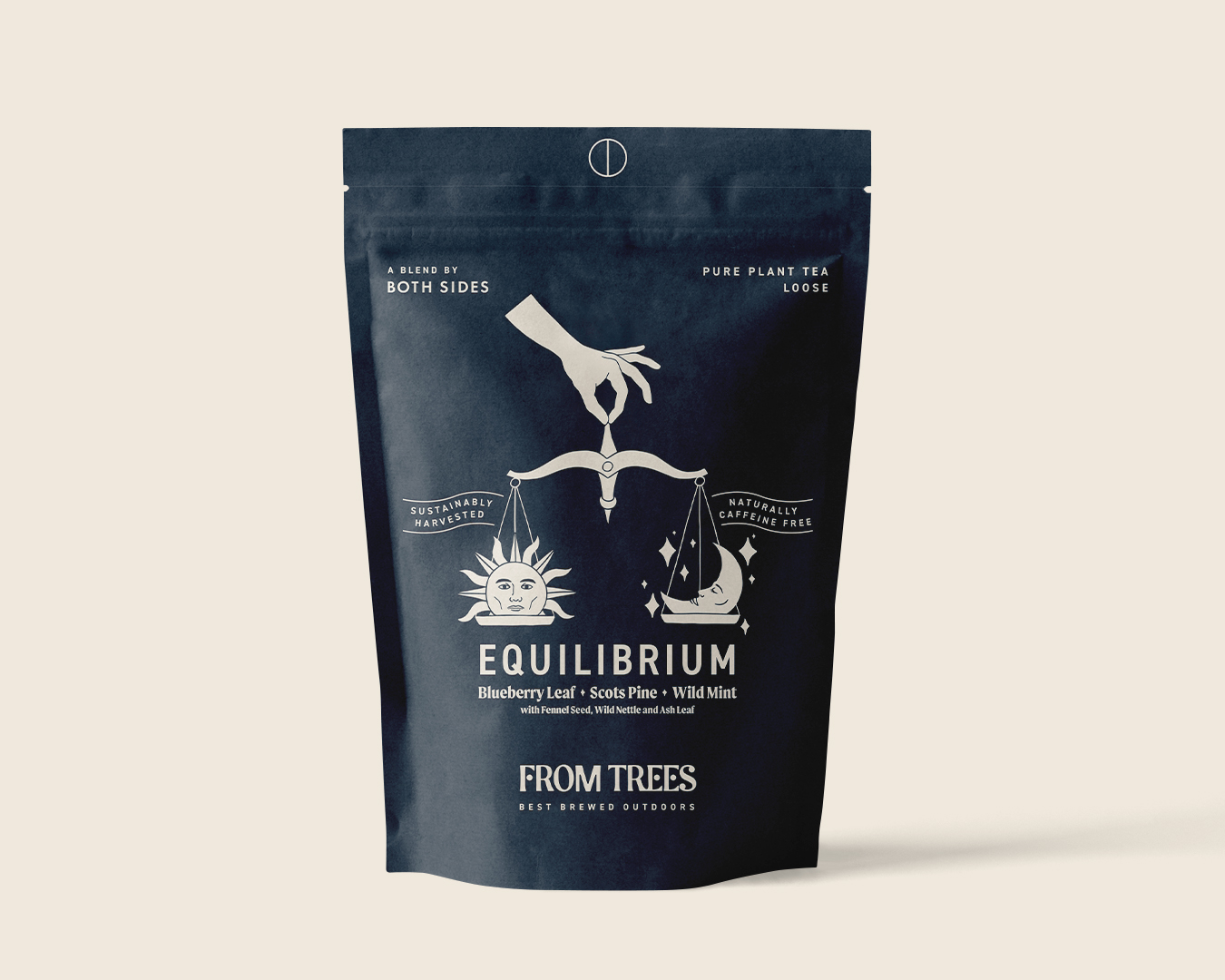
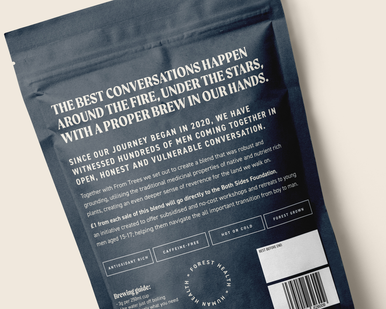
Meanwhile, caffeine-free plant tea, Equilibrium, is a collaboration between a charity connected to male-only retreats, and a Cornish tea company. Its brand and packaging was designed by Shepherd.
And in response to the crowded healthy tea category, Northern Ireland-based Thompson’s has relaunched its fruit and herbal teas, with packaging by BrandMe.
Hey! What? in Bristol won the SPILL work after replying to a LinkedIn post by its founders.
The SPILL branding on a tea tin
The name, which the founders already had, is about “spilling the tea on the tea industry,” where the big brands, unlike SPILL, typically blend teas from several countries, and don’t buy direct.
“SPILL has gone out with an everyday tea to disrupt the category,” says Hey! What? managing director Amy Gettings.
SPILL is aimed at a younger audience, adds agency creative director Christopher Rees, and that informed their design cues.
“Our visual starting point drew inspiration from premium beauty brands, those that balance honesty with clarity,” Gettings says.
Hey! What? in Bristol designed the branding for SPILL
The identity comprises a big ‘S’ – “I was trying to create something that’s spilled, in a big cartoony way. And the S made a little heart, which was fun and interesting,” Rees says.
Supporting typography, intended to look clean and contemporary, is Neue Haas Grotesk.
The team tapped into the tactile world of 1960s and 1970s kitchenware, in an effort to bring a sense of modern nostalgia to SPILL’s tins and bags.
And they developed an earthy, modular colour palette to grow with the brand as new SKUs launch.
The Brew Tea Co packaging design
SPILL’s biggest competitor is Brew Tea Co, says Gettings.
The Manchester-based brand was redesigned by Interabang, with a view to expanding it into the retail sector. This summer, Indian tea producer Luxmi Group bought a majority stake in the business.
Meanwhile, Cornish tea company From Trees has expanded its range with Equilibrium, a new variant which is a collaboration with Both Sides, a male-only retreat venture.
The retreats provide a physical, emotional and spiritual journey for men to rediscover and redefine masculinity in UK and continental Europe.
Harrison Webb, who operates as a sole trader in Cornwall as Shepherd, redesigned From Trees’ packaging in 2023, and was also responsible for the identity of Both Sides’ founder, ex-professional rugby player Anthony Mullally.
Webb says bringing together the two clients for Equilibrium wasn’t tricky, as “they’re nicely aligned, anyway.” He focused on the slow, calming nature of the brewing process, as the antithesis of the rushing coffee culture.
He kept the pack simple and bold, avoiding too much ornate pattern.
He hand-drew the sun and moon, which are intended to resemble Both Sides’ ideals, balancing strength and action with softer “down regulation” – when your nervous system drops into a sense of calm.
For the type, he paired DIN 2014, a simple, clear and concise Modern Grotesk font, with Moret, a serif display family that is bold, clear and dynamic but with a touch of calligraphic character, he says.
With so much activity in the tea sector, incumbent brands can start to look dated. This was the case for Thompson’s fruit and herbal teas.
BrandMe had worked with the Belfast business since 2012, redesigning its core black tea range – including the wordmark and tree – in 2022.
Thompson’s packaging design created by BrandMe
The central London agency was asked to give the fruit and herbal range more emotion, bring out the story of the Thompson family, and make it stand out against its many competitors.
Nielsen’s The State of Tea: 5 Key Trends report points to the growing popularity of natural and organic products, as consumers have a renewed focus on health.
“One of the biggest subcategories that aligns well with this shift is herbal teas, which have been growing in popularity in recent years,” the report says.
Alongside this is a growing demand for functional teas, it adds.
These are teas that are specifically designed to provide health benefits, such as turmeric tea and green tea.
Emma Ireland-Wakefield, BrandMe’s client business director recognised these trends.
“We saw that a lot of competitors are functional teas and talk about wellness, and lead their pack design with a health benefit.”
BrandMe decided to stay away from focusing on such benefits, and instead “heroed the ingredients,” Ireland-Wakefield says.
The team’s solution was soft, botanical illustrations by Anthony Miller.
The packs feature a big tree that wraps around the sides. To differentiate between varieties, each tea features the tree in a different colour, with a particular animal, such as an owl or a squirrel, within its branches.
Thompson’s wordmark and logo designed by BrandMe
There is also a silhouette of a parent and child under the visual identity tree, who are depicted interacting differently on each pack, like the boy being lifted onto his dad’s shoulders, or swung in the air. They represent the original Thompson father and son, who set up the business in 1896.
While the supermarket shelves are still packed with what Webb calls “dust-in-a-bag” English breakfast-style teas, patterns and pictures of tea leaves will continue to dominate.
Rees at Hey! What? agrees, pointing to the plethora of “traditional, safe packaging with serif fonts.”
But as the move to whole leaf and herbal tea continues, Webb predicts that pack design will become “much bolder and more abstract.”
So as tea-drinking habits change, studios will likely be called upon more frequently to help reposition and redesign our relationship with our national brew.