
FORM Brands Studio has created a new identity for Team England at the 2026 Commonwealth Games.
Against a tricky backdrop of debates around English nationalism – and in particular what the St George’s Flag represents – the London-based studio had to create a look that captured a welcoming brand of national pride.
“We wanted to celebrate our diversity and inclusivity, which is absolutely key to Team England,” says Kirsty Woodcock, head of marketing and communications at Commonwealth Games England.
“A lot of our athletes will stand under an England flag and it will be the proudest moment of their lives,” she says. “We want to create that sense of pride and belonging that people can rally behind.”
Woodcock had initially considered a full rebrand of the Team England set-up, “but we are publicly funded, and our budgets don’t stretch to that.”
So instead, she and her team focused on the team’s visual and verbal identity for next summer’s Commonwealth Games in Glasgow. The team historically has a new campaign for each Games, but Woodcock says they wanted to “think a bit more strategically” going into 2026.
The brief called for something that would “inspire, motivate and excite” athletes, fans, and staff.
It also had to create more distinctiveness, to avoid confusion with other Commonwealth Games teams like Canada and Wales, who have similar colours, but also to differentiate from England’s other sports teams, like cricket, football and rugby.
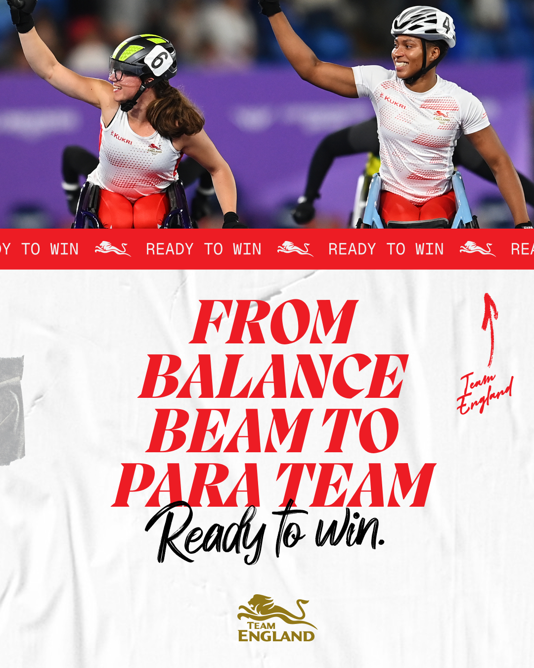
They also wanted to lean into the specific spirit of the Commonwealth Games, which brings together a wider range of athletes, young and old, than the Olympics, where British athletes compete as Team GB. The Commonwealth Games also runs its paralympic competition alongside the non-para games, not one after the other.
“Athletes have a real fondness for the Commonwealth Games, and it’s quite unique,” Woodcock explains. “You have this mega mix of experience – for some athletes and some sports it’s the pinnacle, while for others it’s an important part of their journey, a major stepping stone towards the Olympics.”
Woodcock chose FORM Brands Studio because she’d been impressed by their work on British Cycling.
Co-founder and creative director Alex Andlaw said the team began by interviewing a wide range of stakeholders, from athletes to board members, in order to create work that “could fundamentally underpin the attitude” the Team will take into next summer.
He says they also wanted to produce an identity that could last across multiple Games, and give it the stretch that could be developed over the next ten years.
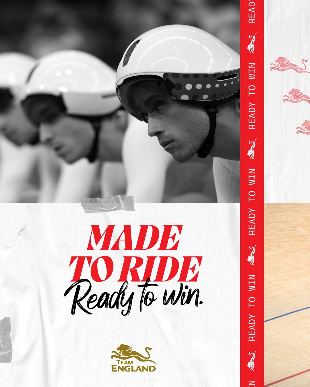
The design team honed in on a central idea – “Ready to win” – but worked hard to ensure it didn’t become a macho, win-at-all-costs mantra.
“We wanted it to be optimistic, and confident, but approachable as well,” Andlaw explains. “So we didn’t want the visual identity to be too clean, or too professional – we wanted it to feel a bit edgy.”
FORM Brands Studio’s new look for England’s 2026 Commonwealth Games campaign
And Woodcock says they discussed at length how to broaden the meaning of both parts of the tagline.
She says “ready” came to cover all the different ways, places, and people that contribute to an athlete’s journey.
“And there are many different ways athletes define ‘winning.’ For some it might be a gold medal; for others it might be coming back from an injury and turning up when it didn’t seem possible.”
“It’s all about hard and soft at the same time,” Andlaw adds. “Powerful, but warm.”
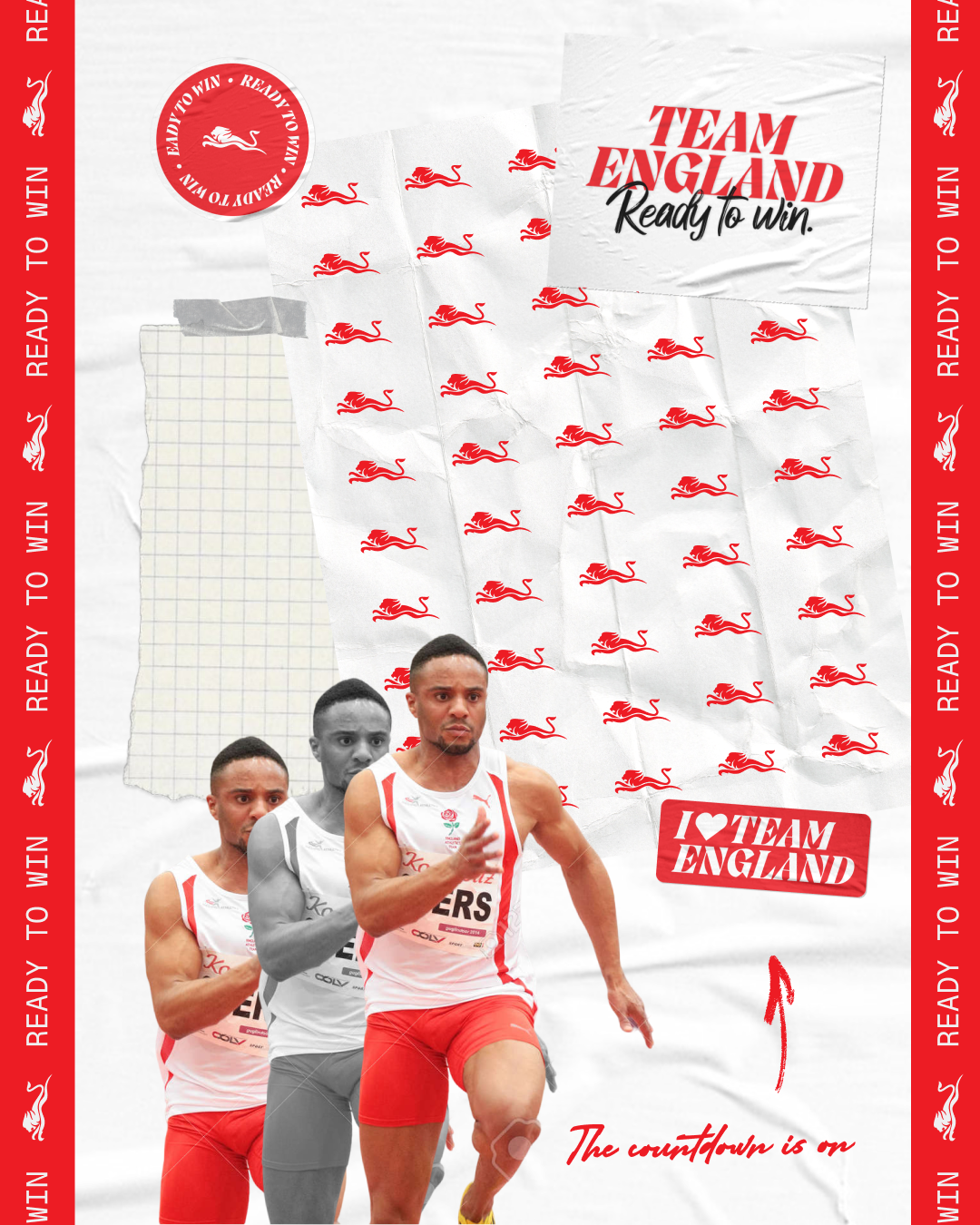
To that end, a key visual device was a paper motif, “to support that feeling of preparation, scrapbooking and training schedules.”
Another device is a red line, used vertically and horizontally, which is inspired by the cross of St George’s on the England flag. The line also references the ribbons on which medals are hung.
FORM Brands Studio’s new look for England’s 2026 Commonwealth Games campaign
It becomes a ticker tape on the new Glasgow 2026 Team England website, and it’s used as a grid structure to frame and break up content in static assets.
“It’s a lovely creative element, and it nods back to the flag without being a flag,” Andlaw says.
A new logo wasn’t part of the brief, while the red and white colour palette was also pre-set. But FORM have added a gold, used sparingly across the new look, inspired by the medals so many English athletes are hoping – and expected – to win.
Pangram Pangram’s Migra is the main typeface – which Andlaw describes as “fun, with some lovely attitude,” while Geist Mono and Geist Regular play a supporting role, alongside a handwritten script, Adelina Camarie, adds more personality.
Andlaw says the new verbal identity was “a huge part” of the project.
“Ready to win” becomes a sort of incantation, used in lines that capture the athletes’ dedication – “Every stroke has led you to this moment. Made to swim, ready to win.” – and regional diversity, celebrating the towns and cities that set the athletes on the road to success – “This one’s for you, Birmingham. Ready to win.”
FORM Brands Studio’s new look for England’s 2026 Commonwealth Games campaign
This regional focus crops up in the imagery too, where athletes are pictured against the backdrop of their hometown. Textures like track grit and leather grain add more interesting dimensions to the photography.
For Woodcock, the response from a wide range of stakeholders reassures her that the new look has resonated. She says Team England staff immediately started sharing ideas for how they could build out the identity into comms and storytelling, and the athletes were similarly enthusiastic.
That, for Andlaw, is crucial.
“They are the most important audience, to inspire them to go and win medals,” he says. “I love the idea that we’ll do some work that only the athletes see, and it might give them a little bit of extra motivation. That’s super powerful.”
FORM Brands Studio’s new look for England’s 2026 Commonwealth Games campaign
FORM Brands Studio’s new look for England’s 2026 Commonwealth Games campaign
FORM Brands Studio’s new look for England’s 2026 Commonwealth Games campaign
FORM Brands Studio’s new look for England’s 2026 Commonwealth Games campaign
FORM Brands Studio’s new look for England’s 2026 Commonwealth Games campaign