
Last week at London Bridge Station, Rail Clock was unveiled to the public.
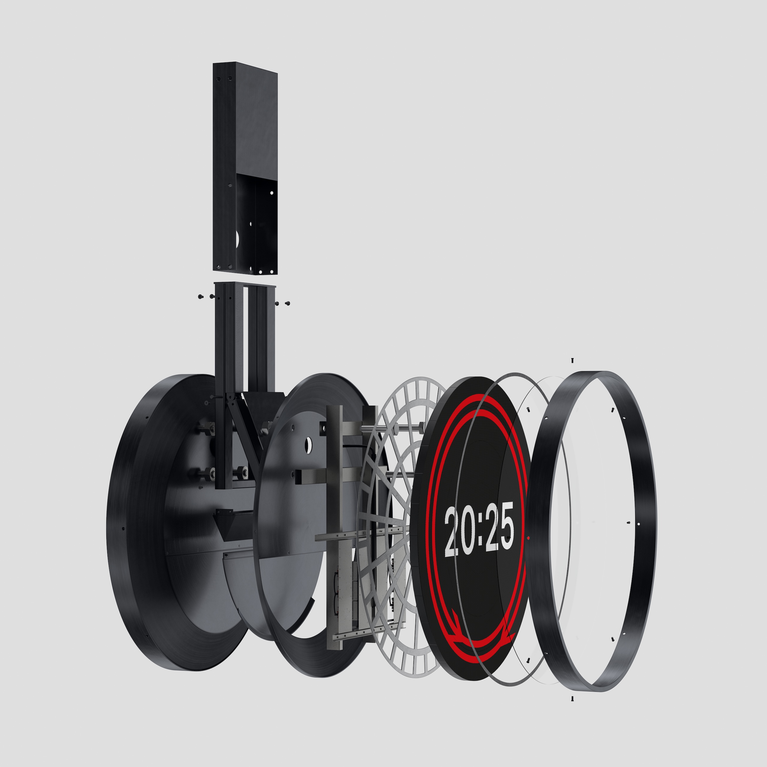
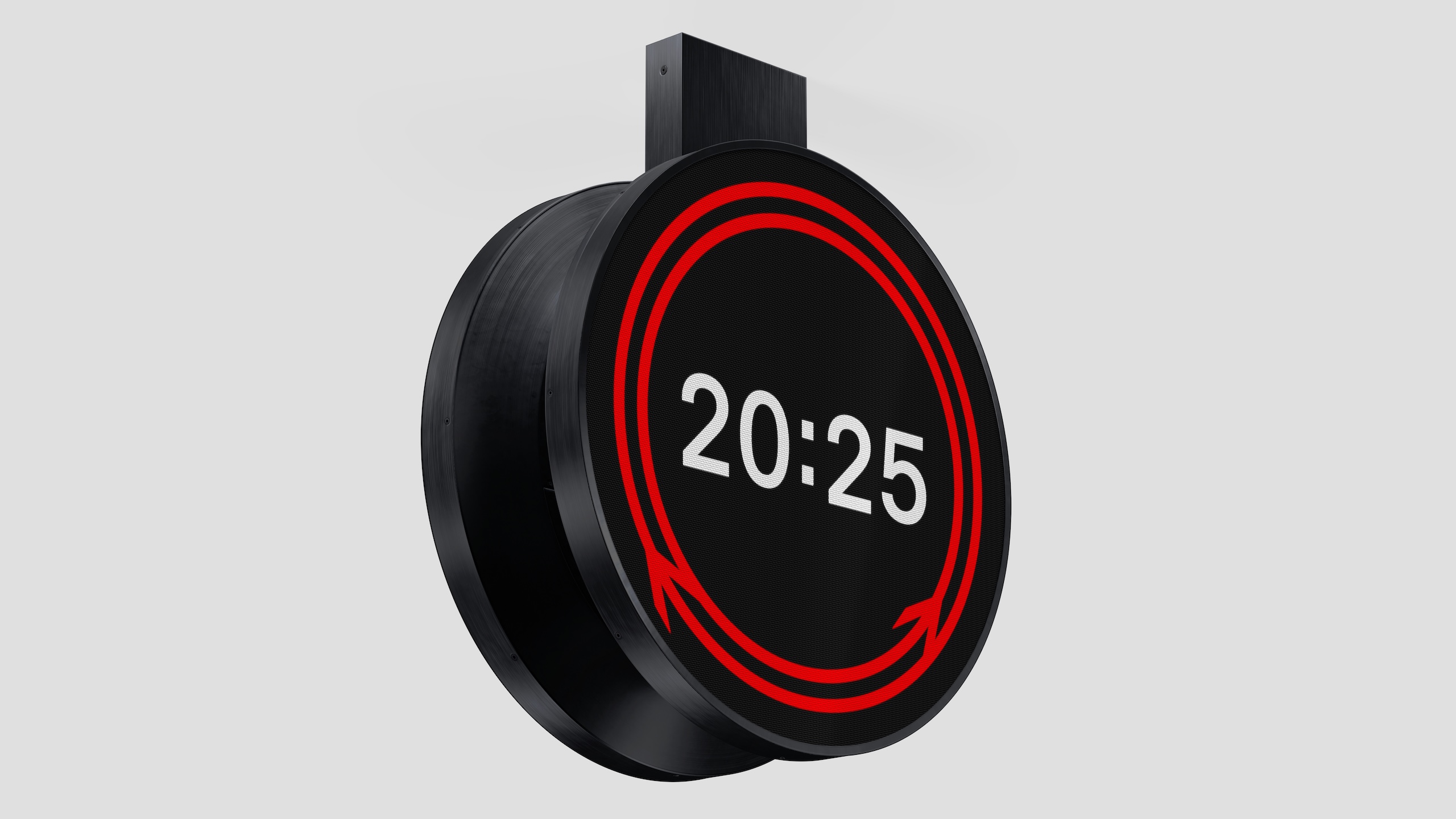
The striking circular design, which uses both Gerry Barney’s 1965 double arrow motif, and Margaret Calvert’s Rail Alphabet 2 typeface, will roll out across the UK’s rail network in both physical and digital iterations.
It was designed by Design Bridge & Partners, who won a competition run by Network Rail, the Royal Institute of British Architects (RIBA) and the Design Museum, which attracted more than 100 entries.
But the journey which led to Rail Clock actually began in 2018, when Network Rail embarked on a mission to improve design across our railways.
“We wanted to elevate the importance of design, because it’s so important to passengers and the communities around stations,“ explains Anthony Dewar, professional head of buildings and architecture at Network Rail.
“We felt that as an industry, we’d lost that connection as to why design was so important.”
So seven years ago, Network Rail ran a design competition around station footbridges; then in 2021 they looked at station design.
The success of these previous contests fed Dewar’s belief that design could play an integral part in improving everyone’s experience on the railways. And in that time, Network Rail’s open source design guidelines have been adopted by rail networks across the world.
For 2025 – which is the railway’s 200th birthday – Network Rail decided to focus on clocks.
“When you’re getting a train, you look for the platform, and you look for the time,” Dewar says. “That’s why a clock is one of the most important parts of a passenger journey.”
So they launched a contest for a “standardised, consistent and accessible design to significantly enhance the passenger experience, while reflecting the design and brand history of the railway.”
The UK hasn’t had a standard clock design since 1974, when it was set out as part of British Rail’s corporate design guide. And, Dewar explains, privatisation has created a network of sub-brands on our railways, and “a proliferation of different types of clock.”
Network Rail worked with RIBA and Design Museum to create the brief, and to ensure it was as open as possible. It was deliberately called a timepiece competition, not a clock competition, “because we didn’t want to set preconceptions about what we wanted,” Dewar says.
Design Bridge and Partners was one of many studios attracted to the complex but exciting brief – how do you create something both iconic and practical, or “excellent ordinary” as Dewar and his team described it.
The agency kicked off with informal lunchtime brainstorms, which included both creatives but also other staff interested in the brief, says Mark Wood, creative partner at Design Bridge and Partners.
This resulted in a wide range of ideas, including some “lovely, crazy ones” like a transparent clock with animated birds flying onto it.
Rail Clock by Design Bridge and Partners at London Bridge station
As they honed their ideas down to their final entries, the focus became finding something that spoke to, and celebrated, the UK’s design heritage.
“It was key to come up with an idea that could only ever be for our railway,” Wood explains.
“Obviously the Swiss railway clock is a beautiful thing, but that’s for the Swiss railway. So that led us to the double arrow symbol, which is a fabulous design, and one of the things you associate with Britain.”
The more they played with Barney’s 1965 design, the more it felt right. “The essence of the double arrow is all about connecting people,” Wood says. Stations he points out, echoing Hugh Grant’s voiceover at the start of Love Actually, are more than transitional spaces that get people from A to B.
“There is an emotional attachment to train stations,” Wood says. “Stand there for ten minutes and you see people hugging, and meeting each other or dropping people off. Parents in tears because their son or daughter is getting on a train to go to university.
“So how could we make that work as a bigger storytelling device? Once that story became circular, it led to the movement of the arrows meeting at the bottom.”
Rail Clock by Design Bridge and Partners at Charing Cross station
Using Calvert’s Typeface 2, digitised by Henrik Kubel, also seemed like an obvious decision, but the team wanted to strike a balance between adopting these symbols and re-positioning them for the modern-day.
“It’s a really tricky balance,” says Kevin Lan, creative director at Design Bridge and Partners. “The double arrow was very forward-thinking for its time. And because of privatisation we don’t see it that much anymore, particularly on trains. But it’s almost like a crown jewel of an asset, and it would seem a bit silly to ignore it.”
The question the design team kept asking, Wood adds, was, “ What could we do to it that doesn’t break it?”
Rail Clock was one of more than 100 entries that Network Rail received. Many of them, Dewar says, were “very similar” to the Swiss railway clock, which he notes drily is what Chat GPT suggests if you ask it to outline a new clock design.
After winnowing it down to a final five, Design Bridge actually had two entrants in the list, alongside ideas from Bath studio Matter, London-based Seymourpowell, and Paris agency AREP.
Over a series of workshops, the judges made it clear that Rail Clock was their preferred Design Bridge entry, and in the end it emerged as the chosen design. “It was a stand-out different submission,” Dewar says. “I think the other three were all analogue clocks.”
“We had to do things in a very measured way. But that doesn’t mean you can’t achieve excellence.”
In finalising the design, Design Bridge went out of their way to make sure Barney, Calvert and Kubel were happy with the way their designs had been used.
“These are some serious heavyweights in graphic design,” Lan laughs. “With Jerry, we were fucking with his logo – we bent it and made it move in a way maybe never thought about. So we had to get him on board.”
Barney, for his part, was “thrilled” to see his creation form part of the new design, and described the new clock as “really magic.”
“Design should evolve,” Wood says, “while still staying true to the original ideas. There’s always room for doing something different, but doing it in a respectful way was really important.”
Dewar adds that Network Rail also consulted experts in the UK’s rail design history, including Dr David Lawrence, who has written several books for Network Rail, and designer Nick Job, who runs the Double Arrow website, dedicated to British Rail’s corporate identity, and whom Dewar describes as a “a walking encyclopedia.”
A mock up of Rail Clock by Design Bridge and Partners outside a station
Once the designs were finalised, the team had to think about how they could be rolled out across the country, and across different mediums.
There were practical considerations for the physical versions – “We discovered round screens are quite hard to make,” Wood says – but also wider questions about adapting it to show up in different ways, from departure boards, to trains, to a soon-to-be-released app.
“The ambition is that this needs to be everywhere” Lan says.
“And it’s the repetition that will make it iconic,” Wood adds.
Rail Clock launched with the 1.8 metre version in London Bridge, and on screens at around 25 stations across the country. To assuage Twitter anxiety, Wood points out there are no plans to replace the beautiful clocks in stations like London Victoria.
There are plans to install physical versions in as many stations as possible, but Lan accepts that with public finances under pressure, there are other bits of the rail network that need money spent on them first.
The digital roll-out ensures they can get the designs out “rapidly, so that more people can appreciate it and understand it,” he says.
Similarly for Dewar and his team, the unveiling last week is just the start.
“I’m still recovering from the launch, in a really positive way,” he says. “There’s several years worth of work here, and we’ve had discussions that have gone into an incredible level of technical detail.
“But there’s something in the beautiful simplicity of Rail Clock. It looks like it should have always been there, and to achieve that with a piece of physical design is very difficult.
“We used the phrase ‘excellent ordinary’ in the brief because we’re aware of the pressures on public funding. We had to do things in a very measured way. But that doesn’t mean you can’t achieve excellence.”