
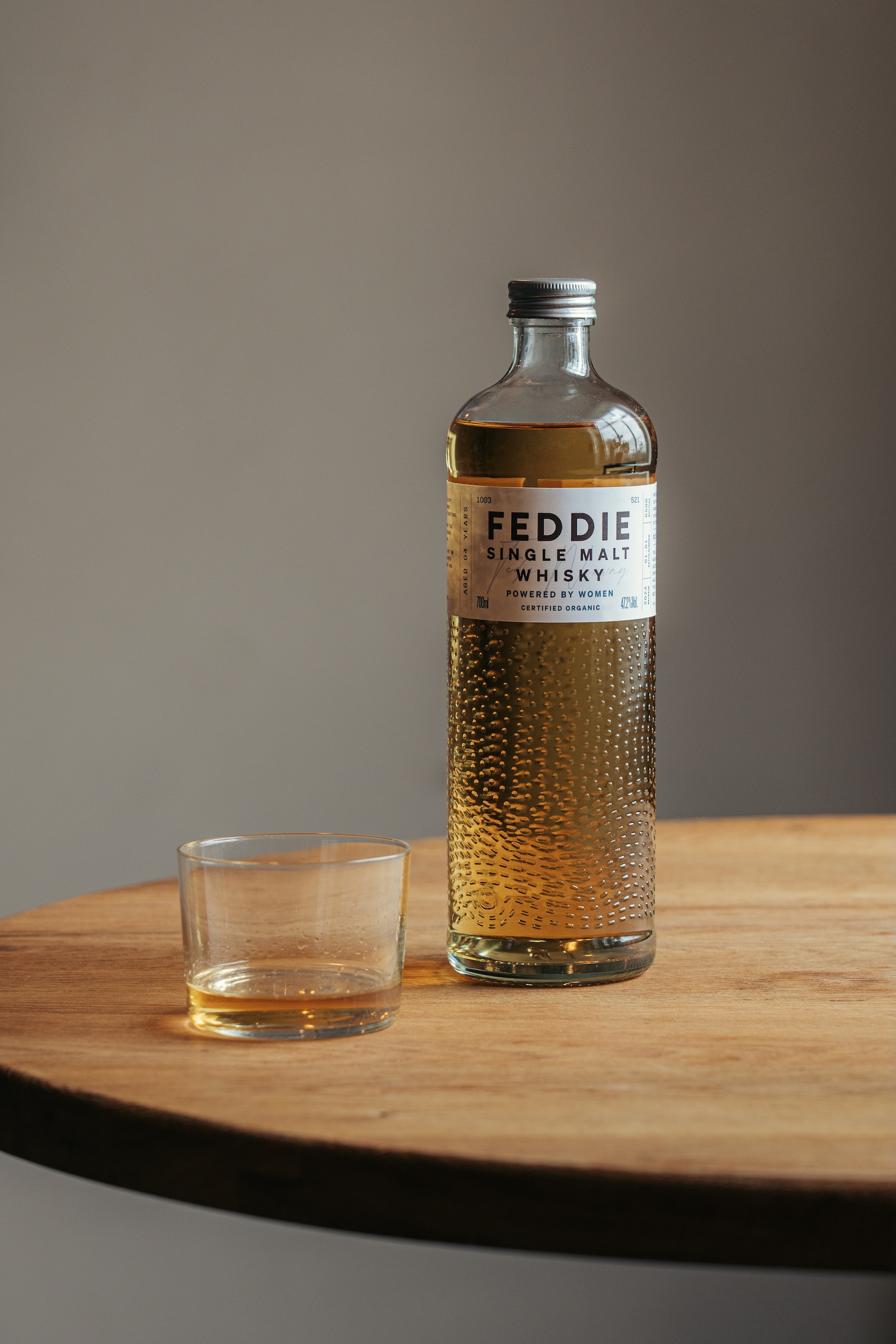
Contagious has created a striking bottle design for a Norwegian whisky brand funded entirely by women.
The Edinburgh and Glasgow-based studio created the brand world and packaging for FEDDIE, using design to capture and communicate the movement that drives the company.
It was, FEDDIE’s CEO Aina Lemoen Lunde explains, a challenging brief.
For a start, Norway has “the strictest alcohol legislation in the world when it comes to advertising,” so there is a lot of pressure on the product.
“You can’t really express the brand anywhere else, except from the packaging, which makes that space crucial,” Lunde explains.
Secondly, the distillery is located in Fedje, a remote island off the west coast of Norway. It takes Lunde ten hours, using train, car and ferry, to get there from her home in Oslo, but it’s worth the trip.
She says the “crazy wild beauty” of its home had to shape the brand, with a strong focus on sustainability, as did its relationship with the people who live there.
Contagious’ brand work for FEDDIE whisky
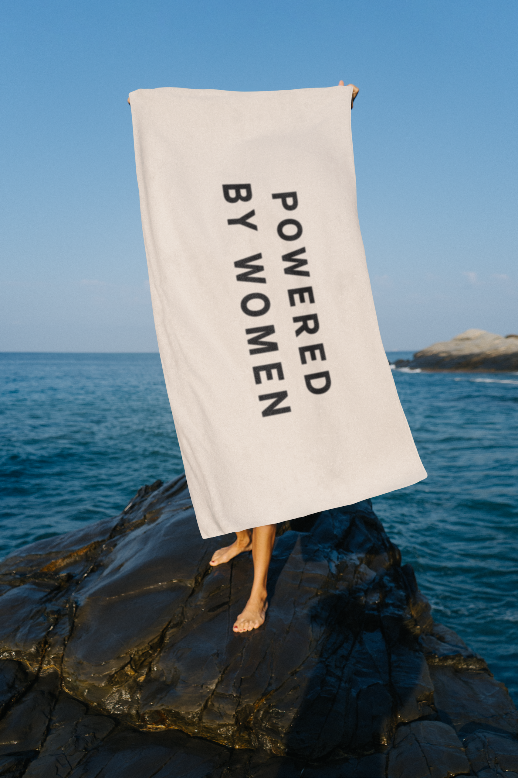
And thirdly the brand needed to communicate the gender politics behind founder Anne Koopang’s vision. Only women are allowed to invest in FEDDIE, in a bid to encourage more women to develop portfolios.
“Even though Norway is ranked as the most gender equal country in the world, 80% of the stock exchange is owned by men,” Lunde says. “The founder wanted to nudge more women to start funding companies. Today we have 1,000 – soon to be 1,200 – female investors, and they are a really important part of our identity.”
“It was certainly a challenge,” laughs Contagious’ creative director James Hartigan. He says the first phase of the work was to clarify the portfolio architecture, and to identify the core pillars of the brand.
“They were all there, but there wasn’t a clear framework,” he explains.
As the work developed, they also had to think about building Norwegian whisky as a category, both in its homeland, where it launched in 2023, and abroad. FEDDIE just last week launched in the UK, and is also available in Sweden and Switzerland.
The team visited Fedje, where the challenges facing the local community reminded them of the issues closer to home on the Scottish islands. But ultimately it was the investor angle they decided to hone in on.
“The island story didn’t really stand them apart, because they are lots of island spirits,” Hartigan says. “But there was a lot of strength in this idea of it being powered by women, especially in the spirits world.”
For the brand design, Hartigan says they wanted to stay “very true to the brand’s Nordic roots, to create something that felt very utilitarian, but also modern and progressive.”
Contagious’ bottle design for FEDDIE
The main target audience for the whisky is men, but they wanted to burnish the brand’s feminist credentials too.
“Sometimes with brands that are very forthright in saying that they’re female-owned, there is a misconception that they’re just for women,” Hartigan says, “We wanted to be very clear from the beginning that it wasn’t just for women – it’s for everyone.
“But we were quite steadfast in having the line, ‘Powered by women” on the packaging, knowing that that would be divisive to some people. If that was a problem to someone then fine, they’re not our people.”
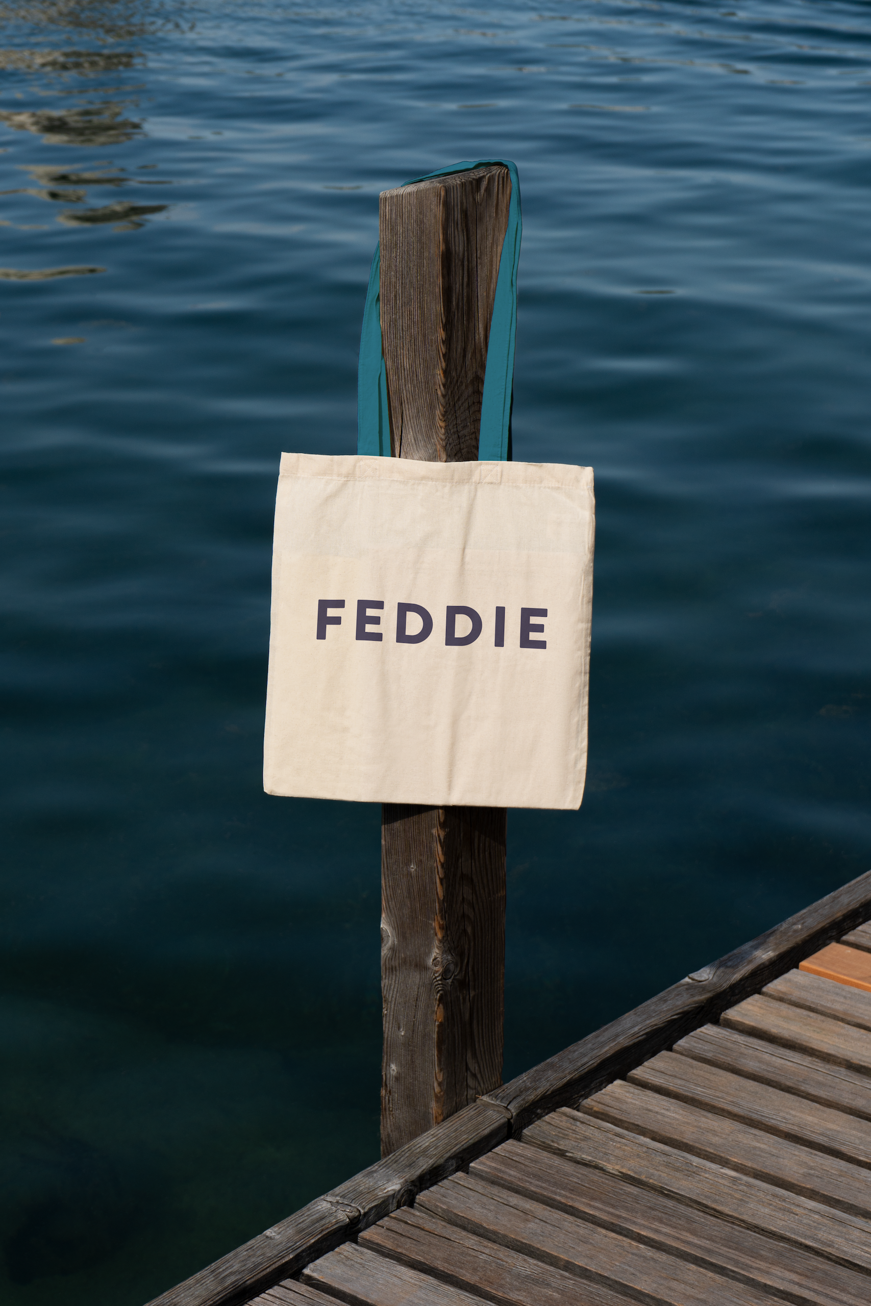
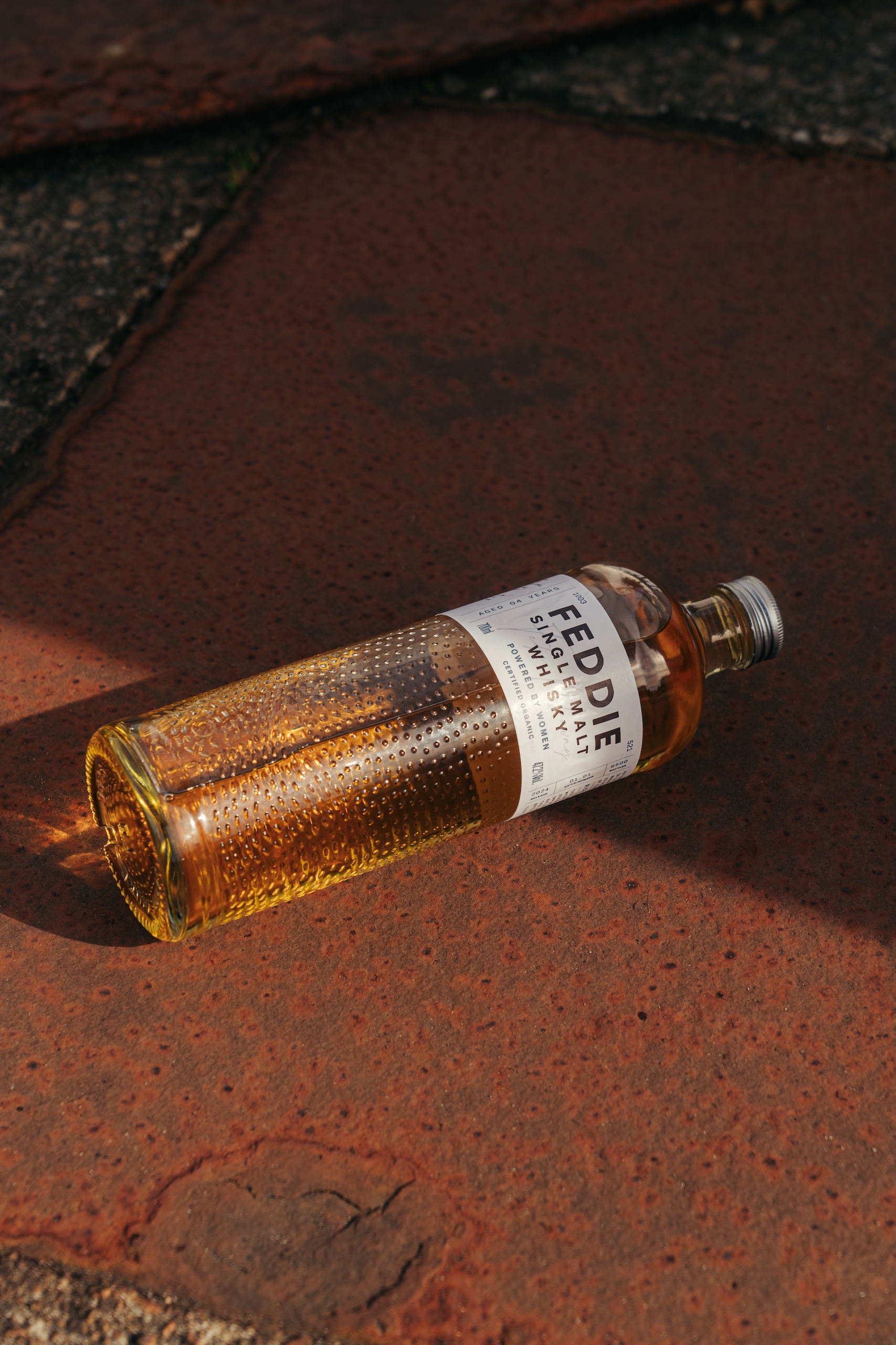
To bring the brand story to life, the bottle features 750 dots, which was the number of investors at the time of production, and 521 dashes – one for every Fedje resident.
Detail of Contagious’ bottle design for FEDDIE
People often think the design references the movement of the waves, Hartigan says.
“But what we were actually trying to get across is the movement of FEDDIE, in terms of the women, and what it’s doing for the island.”
In the future, when the bottle mold needs to be renewed, these visual elements will be expanded to reflect the up-to-date numbers.
“We are committing the cause of the brand into the glass, into the actual fabric of the packaging,” Hartigan says. “Over time, these bottles will morph and grow as the brand morphs and grows as well.”
This texture also creates an immediate interest designed to catch shoppers’ attention. “It has to look beautiful,” Hartigan says. “Becasue as soon as you get someone to pick it up, you’ve won the battle. You need a sense of intrigue to draw people in, and then they can engage with all the storytelling.”
The design team also worked hard to ensure the product’s carbon footprint was as low as possible.
There’s an aluminium screw-top instead of a cork – because cork can cause issues in recycling chains – and they made the bottles as light as possible, even though that goes against the traditional luxury codes in premium spirits, where heavy glass signals quality.
The challenge was to combine these design elements, which are usually associated with cheap own-brand spirits, in an elegant and engaging way.
When it launched in Norway, FEDDIE sold out in two weeks, and this year sales are already up 50%. For Lunde, the packaging has been a key part of this initial success.
“It feels like everything falls into place,” she says. “They have managed to make the full story very intuitive for customers.”
Contagious’ brand work for FEDDIE whisky
The FEDDIE distillery