[searchandfilter fields="search,category"]

By

“What ad agencies get wrong about opening design studios”

Advertising agencies are suddenly discovering design. They’re putting it on a pedestal, and it’s making headlines.

No wonder – creating a brand that lasts, that captivates, and that people buy in to, is one built by design.

But to think that simply re-labelling an existing capability is enough, is a mistake.

Droga5 London recently announced the appointment of Dan Roberts and Matteo Alabiso as co-creative directors of design, while, last month, Lucky Generals became the latest creative agency to set out its intention to see design as a creative force in its own right.

It announced the appointment of its first executive design director to prove it.

It’s not alone. And nor is it the first – Mother, Uncommon, Not Wieden+Kennedy and our team at Wonderhood Design were among the earlier trailblazers. And as under-pressure agencies belatedly scramble to find new revenue streams in a tough financial landscape, it won’t be the last.

But if you’re only now treating design as a shiny new capability, you’re already behind the curve. Here are some reasons why…

Selling design

Behind many ad agencies’ decision to open a design studio is the growing realisation of the need for course-correction. This comes after years during which design departments, by and large, were rarely seen or heard in the creative process.

This created a profound problem – a diminished role for design, in turn, diminishes their ability to impact how a brand shows up. And if the designers go unseen, it’s unlikely their time can be sold to clients effectively, either. Lose, lose.

Dream teams

For a long time, the remit of a designer in an ad agency was to layer-in their graphic approach to advertising campaigns.

Whereas building a brand, or creating a visual identity. remained the exclusive responsibility of branding agencies. For good reason – the skill-sets are very different.

For a creative agency’s design studio to succeed, the department needs to be carefully curated, with a diverse range of designers from different technical backgrounds.

This allows for both design teams who are quick on the tools, and can work successfully on a fast-paced retail account, for example, or more conceptual designers, who can collaborate on a slower moving, holistic brand-building exercise.

It’s a mistake to think that one designer fits all.

Process

Building an ad agency’s design team is hard to get it right. And you probably won’t, the first time.

Because we have advertising in our bones, agencies have existing creative processes that we assume design will fall into line with.

But that’s simply not the case. And it takes time to bend, flex and test the process, to ensure it welcomes designers in, and allows them to flourish.

The consistent thread is the presence of design from beginning to end, on each project.

Design is woven into the fabric of Wonderhood Studios and always has been. So, when we launched our standalone design studio three years ago, we were ideally positioned to start testing our own process, and design’s role within it.

It remains a work-in-progress. But it’s important to recognise that we’re prepared to make mistakes, to challenge ourselves, and to improve every day, in order to have the best framework for crafting distinctive design.

We have done so with branding projects, working in partnership with design-literate clients who value our influence to make brands last.

And we have achieved this for our ad campaigns too, by ensuring design remains at the heart of our creative process, and designers are seen and heard – both internally, and by client partners, too.

Educate

It’s almost 10 years since Uncommon’s Nils Leonard, at the re-opening of London’s Design Museum, declared, “Design lasts, and it’s time the world paid attention.”

He wasn’t wrong. And a growing number of clients now seem to agree.

Even so, the fact a creative agency announcing a new Design Capability™️ still makes headlines suggests it takes a lot for design to be seen, and sold

For it to work, it requires an education of the entire agency, to ensure everyone understands design’s role and value. And then a commitment to putting it into practice every day.

This means account management working closely with their client partners to shape and build vision and ambition.

It means a receptive client paying a fair amount for the role design plays – not as an afterthought, but throughout the entire lifecycle of a campaign.

And it means a brilliant design team making banging work for brands, and proving their worth.

As agencies and clients recognise the power of design, those ambitious enough to embrace it will understand the truth – you can’t build a captivating brand without it.

Roy Barker is co-founder, and creative and design operations director at Wonderhood Design.

Source

By

How is View Source using AI?

View Source is a New York-based design and technology studio that works with clients like Pantone, Netflix and Bandit Running. Here, creative director and partner Andrew Rutledge explains how they’re using Ai, and how he feels about it.

You can see all the articles in this series here.

Broadly speaking, are you excited for how AI will change the design industry, or nervous?

Tim Berners-Lee, the inventor of the World Wide Web, once said, “You can make the walled garden very, very sweet, but the jungle outside is always more appealing.”

It’s that sense of boundless possibility that excites us, the thrill of discovery, the late-night  – or, for me as an early riser, pre-dawn – energy of mastering a new tool or workflow.

What’s troubling though, is how quickly our industry has embraced the idea that you can dismantle the fundamentals of the creative process and still produce remarkable work.

Shopify’s founder has said that anyone not learning to use AI tools is in a state of slow-motion failure. We agree with the sentiment, but experience and taste must remain part of the equation.

Great design distils complexity into simplicity, and that will always require trained minds and relentless talent. The tools will evolve, and so will we.

Do you have an agreed policy around AI as a business?

We set our AI policy during a company roundtable last October. Back then, we agreed to use AI primarily for conceptual thinking.

It’s a great tool for that – the process of building mood boards or exploring early ideas is just as loose and intuitive as sitting back, closing your eyes, and imagining possibilities.

In that same conversation, with a mix of our strategists, designers, and engineers, we also agreed that we’re not comfortable claiming AI-generated work as entirely our own.

A year later, we have several live projects that thoughtfully integrate generative AI.

When did you realise AI was going to have an impact on design?

Like everyone, our feeds became flooded with hyper-saturated visuals that felt more unsettling than inspiring. That’s now changed.

The output today is remarkable, and with the right balance of human direction and smart systems, quality is in our control.

What’s more striking, and a bit sobering, is that cutting humans out of the creative process is now a real consideration, not just a distant idea. As anthropologist Carlos Castaneda wrote, “We hardly ever realise that we can cut anything out of our lives, anytime, in the blink of an eye.”

For us, AI only comes in after people set the direction. We shape the vision, craft the imagery, write the strategy, and then use AI to create agentic efficiencies.

That’s how we keep control, maintain a high degree of taste, and stay differentiated. Because undifferentiated brands fail, AI or not.

Have you undergone any AI training, either as a studio or individuals?

I feel the urge to peek under rocks, crack open walls, and explore the unknown. I’ve spent this year rising early to participate in an AI training programme every weekday before starting our studio work. We began with Stable Diffusion, then moved onto ComfyUI.

I continue to train and attend monthly NYC meet-ups, now with a sharper focus after hundreds of hours learning and applying these tools.

The impact has been enlightening. It’s given us a clearer sense of what AI can do, when it’s appropriate to use it, and how to apply it ethically.

I’ve realised you can’t connect the dots looking forward, you can only do so looking backward. The more we learn, the more connections we uncover, helping us apply AI thoughtfully and responsibly in our work.

How do you use AI in the studio’s creative process?

I’ll give you an example – using generative AI as a concept tool, our 3D content team created an otherworldly rebrand for the blockchain platform Moonbeam.

With Stable Diffusion, we generated all kinds of moonlight-synthesised creatures and landscapes to help us visualise the creative idea. Once refined and animated, these elements became precise, controllable motion assets that work seamlessly across formats, from digital out-of-home campaigns to an interactive website experience.

We’ve also been using tools like ComfyUI to accelerate the rapid prototyping of site animations and content for brands like Garden. And we’ve trained our own custom AI models to bring specific visual ideas to life, which gives us much more creative control over the final output.

As an agency that creates original content for the brands, founders, and companies we work with, whether that’s through our photography studio BRICK or through digital design, the best starting point is to own your input data. This helps ensure creative integrity and prevents potential issues further down the line.

Do you think clients care if/how you use AI in your work?

Absolutely. We invite them in, explain the possibilities, and respect their comfort levels.

Do you use AI for any non-creative aspects of running of your business?

Research tops the list. Some tasks are handled by AI within set parameters, but everything is reviewed and approved by a human with tight oversight.

It’s generally helpful for understanding our organisation and what makes us unique, since it effectively studies how we operate. As a result, we gain clarity and confidence more quickly, allowing us to focus on our strengths.

Beyond the best-known tools, what is one AI tool that you would recommend to other design studios?

Topaz’s suite and Cursor.

Source

By

Justified Studio’s La Sovrana rebrand leans into personality and place

Since 2017, La Sovrana has been bringing the freshest of Italian produce to London. The family-run wholesaler, led by brothers Alfonso and Pierpaolo Picaro, sources fruit and vegetables from their own farm in Campania, near the Amalfi Coast, and from a network of trusted growers across Italy.

La Sovrana’s London operation truly found its stride during the pandemic, as restaurant closures pushed demand for quality ingredients into neighbourhood shops, and many people rediscovered a passion for good food.

With business flourishing – and an outpost at New Covent Garden Market cementing their presence – the team realised their visual identity could no longer carry this growth, and approached London-based Justified Studio for a rebrand.

Beyond giving La Sovrana the confidence to move into fresh spaces, the new brand had to convey something deeper – the intentionality that underpins their trade.

Justified Studio’s identity for La Sovrana

“Being from England, I’ve grown up knowing I can get a peach or a lemon at any time of year – you just go to the supermarket and it’s always there, even if it’s all pretty shit, to be honest,” says founder and creative director Joshua Ogden.

“What’s interesting about La Sovrana is how deliberate everything is – the produce is grown for flavour, in season, and you can taste that intention. You never fully know what kind of cucumber you might get, for example, because it depends on the temperature, how it’s grown, what’s happened that year, and that’s directly tied to the taste. It’s a completely different way of thinking about food than what I grew up with.”

This proved to be fertile conceptual ground for Justified Studio to dig into. In a time when food is often engineered for convenience and efficiency, La Sovrana stands for the opposite – produce meant to be savoured, grown with patience, purpose, and generations of knowledge.

Justified Studio’s identity for La Sovrana

“The freshness of our produce doesn’t just come from how quickly it reaches the market; it comes from knowing when to pick it,” says Alfonso Picaro. “That’s knowledge my family has passed down. My brother can walk through a farm and know which tomatoes are at their peak, which ones have the right colour, the right ripeness – the perfect moment to harvest.”

Justified Studio wanted the rebrand to capture La Sovrana’s deep-rooted know-how, but without creating something stiff or weighed down by tradition. “We didn’t want to make it feel like a heritage brand,” says Ogden. “We wanted something forward-looking, with subtle nods to nostalgia.”

The team also wanted the identity to feel grounded – a reflection of where La Sovrana’s produce and its knowledge come from. When Picaro invited them to the warehouse, they were instantly drawn to the typography on packaging boxes and sticker labels on fruits – the everyday graphics of southern Italy.

Pulling on these typographic strands, they crafted a custom wordmark, a thick, curvy serif with a hand-rendered warmth.

The wordmark

The letterforms, deliberately close-knit – almost fused – evoke “the bleeding ink when a label is printed on cardboard,” as Ogden notes. Flourishes on the ‘S’ and ‘V’ give the mark presence, allowing it to command attention across market shutters and van liveries.

“We wanted the wordmark to carry the same sense of trust as a good fruit sticker,” says Ogden. “Those labels have always been a quiet mark of quality, a sign that what’s inside has been chosen with care. The logo needed to feel the same way.”

The bespoke mark was paired with Archivo as the primary typeface – chosen for its simple, yet impactful and strong weight – while IBM Plex Serif was handpicked for tagging systems and body copy to ensure clear distinction and hierarchy.

Colour became another vehicle for storytelling. The team combined the vivid hues found in La Sovrana’s produce, and the softer, sun-bleached tones of the Amalfi region, referencing vintage travel posters and the faded palettes of seaside hotels. Together, they evoke a certain Italian-ness, and this was crucial.

Justified Studio’s identity for La Sovrana

“Alfonso’s the only Italian in a very British market,” says Ogden. “So whenever you see La Sovrana, it needed to feel proudly Italian – bright, expressive, and full of that freshness and beauty you get from his produce.”

The Amalfi lemon seen in the logo – La Sovrana’s “most distinctive product,” as Picaro puts it – became another stamp of belonging. The photography extends that feeling of familiarity; shot on film, it lends the identity a nostalgic softness, while also providing a flexible system for growth – a tool that can adapt as the brand scales.

“We put a strong emphasis on imagery because it will always be central to what La Sovrana does,” says Ogden. “Rather than building a system full of graphic elements and shapes, we focused on a powerful logo mark and beautiful imagery, something that could act as an editorial vessel that can take the brand wherever it wants to go next.”

Justified Studio’s identity for La Sovrana

Source

By

“Excellent ordinary” – how the UK’s new rail clock was designed

Last week at London Bridge Station, Rail Clock was unveiled to the public.

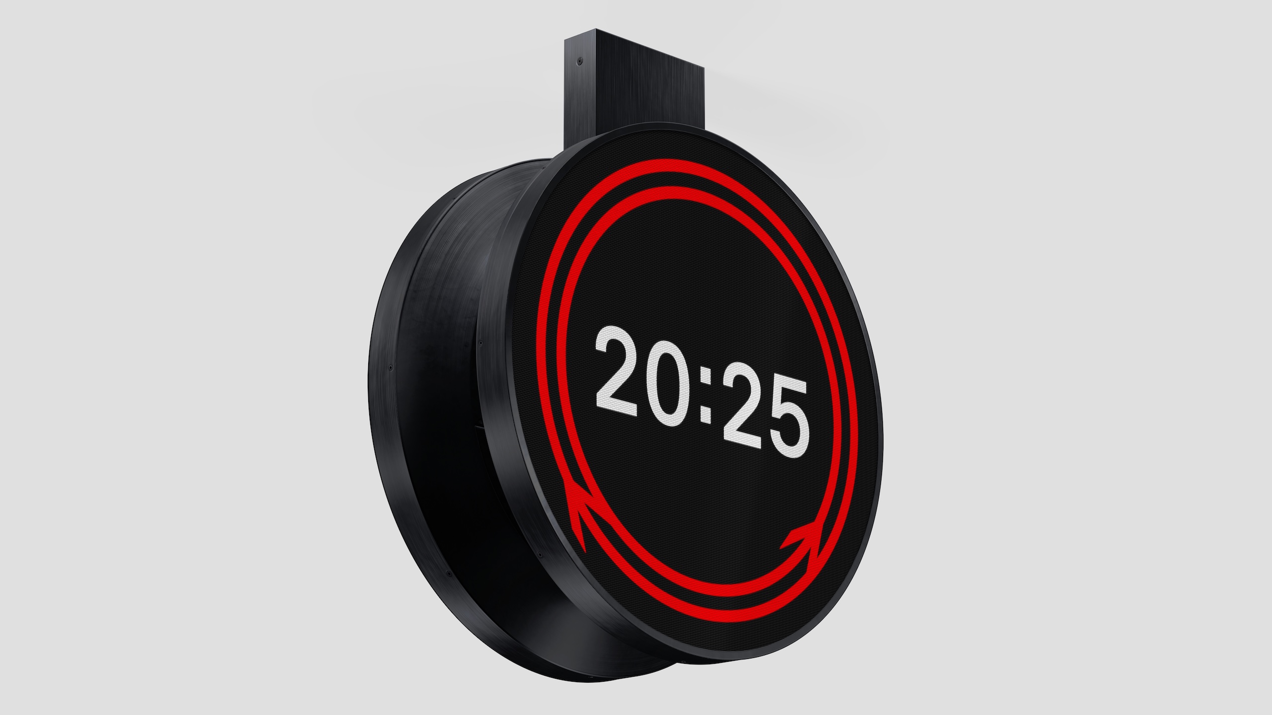
The striking circular design, which uses both Gerry Barney’s 1965 double arrow motif, and Margaret Calvert’s Rail Alphabet 2 typeface, will roll out across the UK’s rail network in both physical and digital iterations.

It was designed by Design Bridge & Partners, who won a competition run by Network Rail, the Royal Institute of British Architects (RIBA) and the Design Museum, which attracted more than 100 entries.

But the journey which led to Rail Clock actually began in 2018, when Network Rail embarked on a mission to improve design across our railways.

“We wanted to elevate the importance of design, because it’s so important to passengers and the communities around stations,“ explains Anthony Dewar, professional head of buildings and architecture at Network Rail.

“We felt that as an industry, we’d lost that connection as to why design was so important.”

So seven years ago, Network Rail ran a design competition around station footbridges; then in 2021 they looked at station design.

The success of these previous contests fed Dewar’s belief that design could play an integral part in improving everyone’s experience on the railways. And in that time, Network Rail’s open source design guidelines have been adopted by rail networks across the world.

For 2025 – which is the railway’s 200th birthday – Network Rail decided to focus on clocks.

“When you’re getting a train, you look for the platform, and you look for the time,” Dewar says. “That’s why a clock is one of the most important parts of a passenger journey.”

So they launched a contest for a “standardised, consistent and accessible design to significantly enhance the passenger experience, while reflecting the design and brand history of the railway.”


The UK hasn’t had a standard clock design since 1974, when it was set out as part of British Rail’s corporate design guide. And, Dewar explains, privatisation has created a network of sub-brands on our railways, and “a proliferation of different types of clock.”

Network Rail worked with RIBA and Design Museum to create the brief, and to ensure it was as open as possible. It was deliberately called a timepiece competition, not a clock competition, “because we didn’t want to set preconceptions about what we wanted,” Dewar says.

Design Bridge and Partners was one of many studios attracted to the complex but exciting brief – how do you create something both iconic and practical, or “excellent ordinary” as Dewar and his team described it.

The agency kicked off with informal lunchtime brainstorms, which included both creatives but also other staff interested in the brief, says Mark Wood, creative partner at Design Bridge and Partners.

This resulted in a wide range of ideas, including some “lovely, crazy ones” like a transparent clock with animated birds flying onto it.

Rail Clock by Design Bridge and Partners at London Bridge station

As they honed their ideas down to their final entries, the focus became finding something that spoke to, and celebrated, the UK’s design heritage.

“It was key to come up with an idea that could only ever be for our railway,” Wood explains.

“Obviously the Swiss railway clock is a beautiful thing, but that’s for the Swiss railway. So that led us to the double arrow symbol, which is a fabulous design, and one of the things you associate with Britain.”

The more they played with Barney’s 1965 design, the more it felt right. “The essence of the double arrow is all about connecting people,” Wood says. Stations he points out, echoing Hugh Grant’s voiceover at the start of Love Actually, are more than transitional spaces that get people from A to B.

“There is an emotional attachment to train stations,” Wood says. “Stand there for ten minutes and you see people hugging, and meeting each other or dropping people off. Parents in tears because their son or daughter is getting on a train to go to university.

“So how could we make that work as a bigger storytelling device? Once that story became circular, it led to the movement of the arrows meeting at the bottom.”

Rail Clock by Design Bridge and Partners at Charing Cross station

Using Calvert’s Typeface 2, digitised by Henrik Kubel, also seemed like an obvious decision, but the team wanted to strike a balance between adopting these symbols and re-positioning them for the modern-day.

“It’s a really tricky balance,” says Kevin Lan, creative director at Design Bridge and Partners. “The double arrow was very forward-thinking for its time. And because of privatisation we don’t see it that much anymore, particularly on trains. But it’s almost like a crown jewel of an asset, and it would seem a bit silly to ignore it.”

The question the design team kept asking, Wood adds, was, “ What could we do to it that doesn’t break it?”

Rail Clock was one of more than 100 entries that Network Rail received. Many of them, Dewar says, were “very similar” to the Swiss railway clock, which he notes drily is what Chat GPT suggests if you ask it to outline a new clock design.

After winnowing it down to a final five, Design Bridge actually had two entrants in the list, alongside ideas from Bath studio Matter, London-based Seymourpowell, and Paris agency AREP.

Over a series of workshops, the judges made it clear that Rail Clock was their preferred Design Bridge entry, and in the end it emerged as the chosen design. “It was a stand-out different submission,” Dewar says. “I think the other three were all analogue clocks.”

“We had to do things in a very measured way. But that doesn’t mean you can’t achieve excellence.”

In finalising the design, Design Bridge went out of their way to make sure Barney, Calvert and Kubel were happy with the way their designs had been used.

“These are some serious heavyweights in graphic design,” Lan laughs. “With Jerry, we were fucking with his logo – we bent it and made it move in a way maybe never thought about. So we had to get him on board.”

Barney, for his part, was “thrilled” to see his creation form part of the new design, and described the new clock as “really magic.”

“Design should evolve,” Wood says, “while still staying true to the original ideas. There’s always room for doing something different, but doing it in a respectful way was really important.”

Dewar adds that Network Rail also consulted experts in the UK’s rail design history, including Dr David Lawrence, who has written several books for Network Rail, and designer Nick Job, who runs the Double Arrow website, dedicated to British Rail’s corporate identity, and whom Dewar describes as a “a walking encyclopedia.”

A mock up of Rail Clock by Design Bridge and Partners outside a station

Once the designs were finalised, the team had to think about how they could be rolled out across the country, and across different mediums.

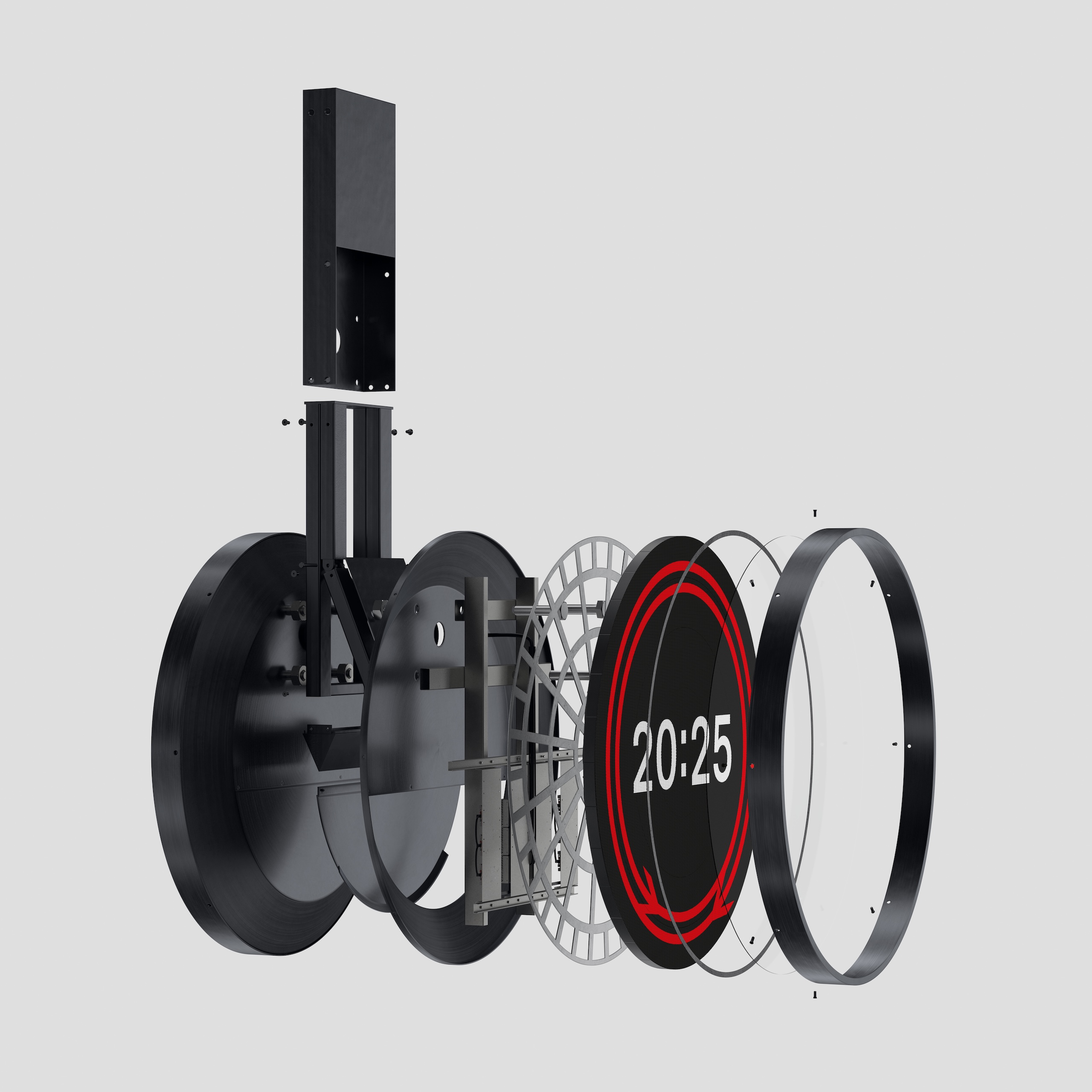
There were practical considerations for the physical versions – “We discovered round screens are quite hard to make,” Wood says – but also wider questions about adapting it to show up in different ways, from departure boards, to trains, to a soon-to-be-released app.

“The ambition is that this needs to be everywhere” Lan says.

“And it’s the repetition that will make it iconic,” Wood adds.

Rail Clock launched with the 1.8 metre version in London Bridge, and on screens at around 25 stations across the country. To assuage Twitter anxiety, Wood points out there are no plans to replace the beautiful clocks in stations like London Victoria.

There are plans to install physical versions in as many stations as possible, but Lan accepts that with public finances under pressure, there are other bits of the rail network that need money spent on them first.

The digital roll-out ensures they can get the designs out “rapidly, so that more people can appreciate it and understand it,” he says.

Similarly for Dewar and his team, the unveiling last week is just the start.

“I’m still recovering from the launch, in a really positive way,” he says. “There’s several years worth of work here, and we’ve had discussions that have gone into an incredible level of technical detail.

“But there’s something in the beautiful simplicity of Rail Clock. It looks like it should have always been there, and to achieve that with a piece of physical design is very difficult.

“We used the phrase ‘excellent ordinary’ in the brief because we’re aware of the pressures on public funding. We had to do things in a very measured way. But that doesn’t mean you can’t achieve excellence.”

Source

By

“The moment for us is right now” – An hour with JKR

JKR is having a pretty good time of things. The 35-year-old branding agency, based in London and New York, saw a 16% rise in new business last year, rising to 25% in new sectors like tech and finance.

So far in 2025, its win-ratio is 90%, with new clients including Ford and Intuit, and it was named design agency of the year by both Fast Company and Creative Review.

To build on its recent success, the company has restructured its leadership team, bringing 15 senior executives together to drive innovation and ensure the business is focused on the right things.

The group includes Melanie McShane, JKR’s first-ever executive strategy director, and Jonny Spindler, who becomes the UK CEO.

We sat down with global CEO James Nixon, chief growth officer Sara Hyman, and chief creative officer Tosh Hall, who together have nearly 50 years’ combined experience in the company, to discuss change, AI, and their plans to build a legacy.

Why did you decide to restructure the leadership team?

James Nixon: We’ve been operating with the same model for many years, with individual P&Ls across different markets.

We took a view that the most success we’ve had in our history has been about real focus on creativity, clients and strategy. That’s the fundamental thing.

And we found the old model was having a huge weight on brilliant talent, who ended up being far too focused on the day-to-day running of the business.

The restructure means we have the best talent in the world focusing on business problems for our clients. It’s about a one JKR approach, removing barriers so we can operate more seamlessly, and put more focus on the things that really matter.

And why make these changes now?

Tosh Hall: We’re at an inflection point in our industry. Depending on who you ask, it’s the best of times, it’s the worst of times. We’re in a Dickensian moment.

This agency has been through seismic shifts in technology and media. From doing the chalice for Stella Artois – with some packaging, maybe some TV – through the dotcom boom, the failure of that, the dotcom boom again, the smartphone, everyone freaking out about the internet. And now everyone losing their minds about AI.

The moment for us is right now, because we believe that what matters most is what has always mattered to this agency, which is to be distinctive. And now the difference is to be distinctive everywhere.

JKR’s work for the RSPCA

AI is going to radically revolutionise creativity and the marketing industry.

What will matter is quality and creativity. And so we’re setting ourselves up for that future – organising ourselves to have creativity win the day in today’s market.

I think the marketing services business will come around to brand being the tip of the spear, and creativity being the tool. So we’re going to reshape marketing services like we haven’t done in 100 years.

Sara Hyman: A big part of the thesis that we take to brands is to defy the conventions of your category.

But when we look at our category, there are these lazy preconceptions that have crept in about who branding agencies are.

You see this bifurcation, with certain shops perceived to be the strategy powerhouses, and then these boutiques that are known for creative excellence and bravery.

We’ve looked at those silos and thought, fuck that. Why do clients have to choose between one or the other? Why do they either get strategic rigour and expertise or creative brilliance?

So this restructure is about putting the big strategy brains and the big creative brains together in one leadership team, to help clients with the big questions they’re facing, which are quite intense. But also blow their minds of what’s possible creatively.

You mentioned your mission, to make brands distinctive everywhere. It feels like right now, both of those words are in flux…

James Nixon: That’s why it’s such a unique moment. The need for distinctiveness has only ramped up, and our relationships with clients have gone up the food chain.

The C-suite taking more and more interest in the importance of distinctiveness has been a big part of our growth.

We’re really proud that the philosophy and positioning of distinctiveness has been with us for 35 years. It’s never changed.

I think it’s at the heart of everything – the infrastructure, the way we think, what we do, the processes we have, the talent orientation.

And now we have all these mediums, all these technologies, all these algorithms, hitting us with more and more choice. So standing out as a business is critical.

Branding is quite a mid- to long-term play, but many senior leaders are under pressure to deliver – and demonstrate – immediate impact. How do you navigate building long-term brands in what feels like a short-term business culture?

Tosh Hall: You just have to open your news app to see the medium- and short-term mistakes that destroy value in companies. It has never been more critical than now to get it right. The stakes are enormous.

Sara Hyman: There can be a tension between being timeless and timely.

How can we build these brands so we’re giving them the tools to endure and set up their strategic foundations? But then also building things so they can act, and move, and get on culture in more dynamic ways.

Because it’s important to understand the reality of running a business right now…

Sara Hyman: Exactly. Clients don’t want us to disappear into a black box for four weeks, and then come back to surprise them with the answer.

A lot of the preciousness of our business has been eroded in the last five years. You’ve got to be a lot more experimental, open, and share the wrong stuff as much as the right stuff, because clients want that level of interaction.

James Nixon: One of our founders coined the phrase, “The problem with the design industry is designers.”

Tosh Hall: And it was the creative side that said that. It wasn’t a bunch of account people beating up on us design folks.

But in some ways the design industry is microscopic. The brand industry is bigger. Communication and marketing services are even larger.

Why are we so focused on the minutiae, when design, at its best, is a strategic problem solving tool? Brand, at its best, is a valuable asset on a company’s P&L.

It’s striking that you all reference the founders quite regularly. How do you balance maintaining a JKR DNA that goes back to its roots, while also evolving to meet new challenges?

James Nixon: We believe in building a legacy. And we agree that one of the things that makes our business unique is that there are components that have always been part of JKR.

The founders believed they could do it better than anybody else – there was a fundamental belief around quality. That’s what brings the soul, even if the backdrop, or the context changes.

Tosh Hall: We’ve been around for 35 years, and we intend to be around for the next 35.

With lots of companies, when the original founders transition, they cease to exist, or they get gobbled up by someone else, and no longer have the prominence or relevance that we do. And so that transition has been very deliberate.

One of our principles is look back, and look forward.

You can’t know where you’re going until you’ve known where you’ve come from. But you have to make it relevant today, and figure out how to take the next leap.


Sara Hyman: I think a lot of the soul comes down to the values we created a few years ago. We interviewed all these people across the company, and asked them what’s your best memory of JKR? Tell us about the toughest time you ever had.

We listened back to all those interviews to work out the signature features of the business – individuality, bravery, and tenacity.

I don’t think any of us are sitting here thinking we’ve cracked it. But we got to those values through other people telling stories. It’s our job now to give the next generation their versions of those stories.

Tosh Hall: It’s pretty simple. We do to ourselves what we do to our clients – we’re going to make you, you. Only more so. That sounds like voodoo, but it’s what we do.

For new business, what specific verticals are you focused on?

Sara Hyman: We obviously looked at what categories and verticals are growing – where are the tailwinds?

We also looked at B2B – we have an amazing pedigree in consumer branding, and so we asked where that spirit could translate into new sectors? Where was there a bit of inertia, and blanding in play that we could grab and disrupt?

And we looked at where we think the top marketeers are going, the people who are actually going to commission bold work for brands.

That took us to four categories – finance, healthcare and wellness, media and entertainment, and technology.

I’ll never forget pitching a very elite financial institution in 2021. Tosh and I were like – how on earth are we going to convince them they should go with us?

We just confidently owned the work that we had. We talked to them about Burger King and we talked to them about Dunkin’. We didn’t talk about the superficial category they were in – we connected the dots between the challenges those brands were facing.

It’s not about having relevant category expertise, it’s do you have the skills to take a brand from X to Y? Or to take an audience from A to B?

And it’s working, that push to being a category agnostic branding business. This year our win rate is 90%. It’s bananas.

Tosh Hall: And it’s not like that’s nine out of ten. We did 22 out of 24.

Sara Hyman: We also call BS on the premise that you specialise in B2B or B2C. It doesn’t matter whether they sell boardroom to boardroom SaaS products, or it’s burgers and beers. It’s still comes down to telling a distinctive story about a brand that makes it salient and different.

Why was it important to hire JKR’s first executive strategy director?

James Nixon: As I said, we’re working more in that C-suite environment. We’re seeing more and more exposure to the fundamental strategy around the business, and we’re providing the bridge into the brand.

We needed to make sure that we had the right capabilities and talent to be that bridge. And Mel McShane, who has lots of experience at places like Wolff Olins and Siegel+Gale, is that bridge.

You also announced a new UK CEO. How do you see the relationship between the UK and the US studios?

Tosh Hall: We used to be a two-studio company, that we described like a tennis match. London would fire the ball across the ocean, and you’re like, “Oh my god what have these fuckers done? It’s incredible.”

And then New York would fire it back, and London would think, “Oh my god, did you see what they just did? We need to get our shit together and go faster.”

That competition fuelled creative quality.

But now there’s no distinction really – it’s just one creative team. We put the best talent on the best opportunities. We have Brits working on New York things, and New Yorkers working on British things.

James Nixon: Having moved to the US about four years ago, I think the difference in commercial mindset here – in terms of trying something, and if it doesn’t work, trying something else – is quite profound. But that can also create challenges.

So our new model creates an intertwined balance between driving ambition and desire and hustle and tenacity, versus some stability and common sense.

Tosh Hall: You can decide which one is which…

James Nixon: The UK economy is clearly a challenging environment. But in 2016 or 2017, we made a pretty brave decision that we would come away from a lot of domestic UK brands, and go after big international companies.

And the ecosystem of clients in the UK is very international – we’re not very exposed to UK business. So I’m really pleased we did that on reflection, when you look at where we are today.

Source

By

How Havas London put design at the centre of Asahi Super Dry’s new brand platform

At a time when Asahi Super Dry is expanding its global footprint, Havas London was tasked with building a visual system that could unify the brand without flattening its character.

The result, created in collaboration with Havas Creative Network agencies across Asia, Australia, and North America, is Seek What Is Unique – a global platform that connects Japan’s best-selling beer with its roots, while giving it the tools to speak consistently across markets.

The design system was crafted to respond to the brand’s need for scalable coherence.

For years, the beer’s visual world had suffered from inconsistency and fragmentation, challenges that couldn’t be solved by a single, dapper campaign. What Asahi needed instead was something more enduring – a repeatable, flexible visual engine capable of translating across markets, formats, and touchpoints.

Havas London’s refreshed design system for Asahi Super Dry

“We need to move away from the idea of a consistent look and feel, and instead become obsessed with a consistent feel,” says Lorenzo Fruzza, chief design officer at Havas London.

“A ‘look and feel’ mindset traps you in guidelines, straightjackets and templates. The harder – and more rewarding – job is making the brand feel the same on TikTok as it does out-of-home, or in a real-world experience.”

This focus on feel over surface signals a wider shift in how Havas London sees design’s role – not as aesthetic veneer, but as structural thinking embedded at the core of modern advertising.

“I’ve spent the past 20 years fighting for design’s place at the table,” says Fruzza.

“We’re finally in a position where design has a real voice – not as decoration at the end, but as structure from the start. My team sits upstream, in the same conversations as strategy and comms, because design’s job isn’t to make things pretty; it’s to codify creativity, to work out how ideas break apart and come back together.”

Havas London’s refreshed design system for Asahi Super Dry

He adds that many agencies still misunderstand what it means to “put design at the centre.” “It means inviting design thinking in at the beginning,” he explains.

Havas London put this principle into practice for Asahi Super Dry, developing the brand world and campaign as two sides of the same system – each anchored by the brand’s defining idea, Seek What Is Unique.

The line draws directly from Asahi Super Dry’s origins. When it launched in 1987, its crisp Karakuchi taste – a Japanese term for a clean, dry flavour – broke away from the sweetness typical of other beers. This differentiation helped redefine Japan’s beer market, embedding that instinct for distinction deep within the brand.

Today, that ethos shapes not just Asahi’s storytelling, but the very structure of its design language. Across product photography and the graphic system, the team uses dynamic angles and intersecting perspective planes to lead the viewer’s eye, and draw them in.

The tagline, set vertically

Even the tagline follows this principle. It’s set vertically – a subtle nod to Japanese typography, but also a deliberate moment of intrigue within the layout.

“It changes the rhythm of reading,” Fruzza explains. “In the UK, we read left to right, but here the viewer’s eye moves downward, leading them through the message and finally to the logo. They’re small decisions, but all of them stem from that same idea – what does Seek What Is Unique mean for the design system itself?”

At every point in the creative process, Havas London set up guides and codes instead of rigid rules. Three of these became central.

The team leaned into retrofuturism, which gives the brand its cool, cinematic tones and subtle neon accents; a focus on minimalism, seen in the pared-back compositions and use of red against silver; and juxtaposition, drawn from the precision of the craft and the vibrancy of the drinking experience, a tension that runs through every touchpoint.

Havas London’s refreshed design system for Asahi Super Dry

Together, they give the identity both discipline and energy – a system that feels alive rather than locked down.

These codes helped define how the brand behaves, ensuring it could flex across formats without repeating itself.

“The enemy in such projects is the ‘matching luggage’ mentality,” says Fruzza. “It’s toxic and reductive – the idea that your TV spot should look exactly like your print or social work. Consistency shouldn’t mean uniformity; it’s about creating a shared feel, not identical executions.”

When refreshing the design system, the team chose to preserve two sacred elements – the logo and the silver – both carrying deep brand equity.

Every new addition was designed to work with these anchors. Red was introduced to complement the silver – subtle rim lighting in photography, or sleek accents appearing on ice buckets and beer pumps.

The red hue is used across touchpoints

Meanwhile, the team used the logo as the foundation for the Apex graphic framework, the visual glue that binds the system together. Its sharp, peak-like ‘A’ form became the starting point for a geometric pattern that extends across formats, from campaign visuals to physical brand experiences.

Each of these elements comes together to form a scalable structure that primes the brand for growth. Ultimately though, as Fruzza says, the success of such a system lies in its ability to not just reach new audiences, but move them.

The Apex pattern in action

“I want to know that the work is clear and enticing enough that more people buy the beer,” he says. “But I also want to know that the tone has landed – that people feel Asahi is an exciting, premium brand. Design sits somewhere between the functional and the emotional, and the impact should show on both sides.”

In many ways, Asahi Super Dry proves for Fruzza that design can no longer play a supporting role in advertising – it deserves equal footing.

“Design has always been the poor cousin of creative in advertising,” he says. “But this project has changed that for me. I can now confidently talk to the industry about why design needs to be valued more – and this gives me a cast-iron example of that. It’s not words anymore. Here’s the proof.”

Havas London’s refreshed design system for Asahi Super Dry

Source

By

Jolie creates immersive safari lodges for Chester Zoo

Chester Zoo has opened The Reserve, safari-style lodges to help educate visitors and fund its conservation work.

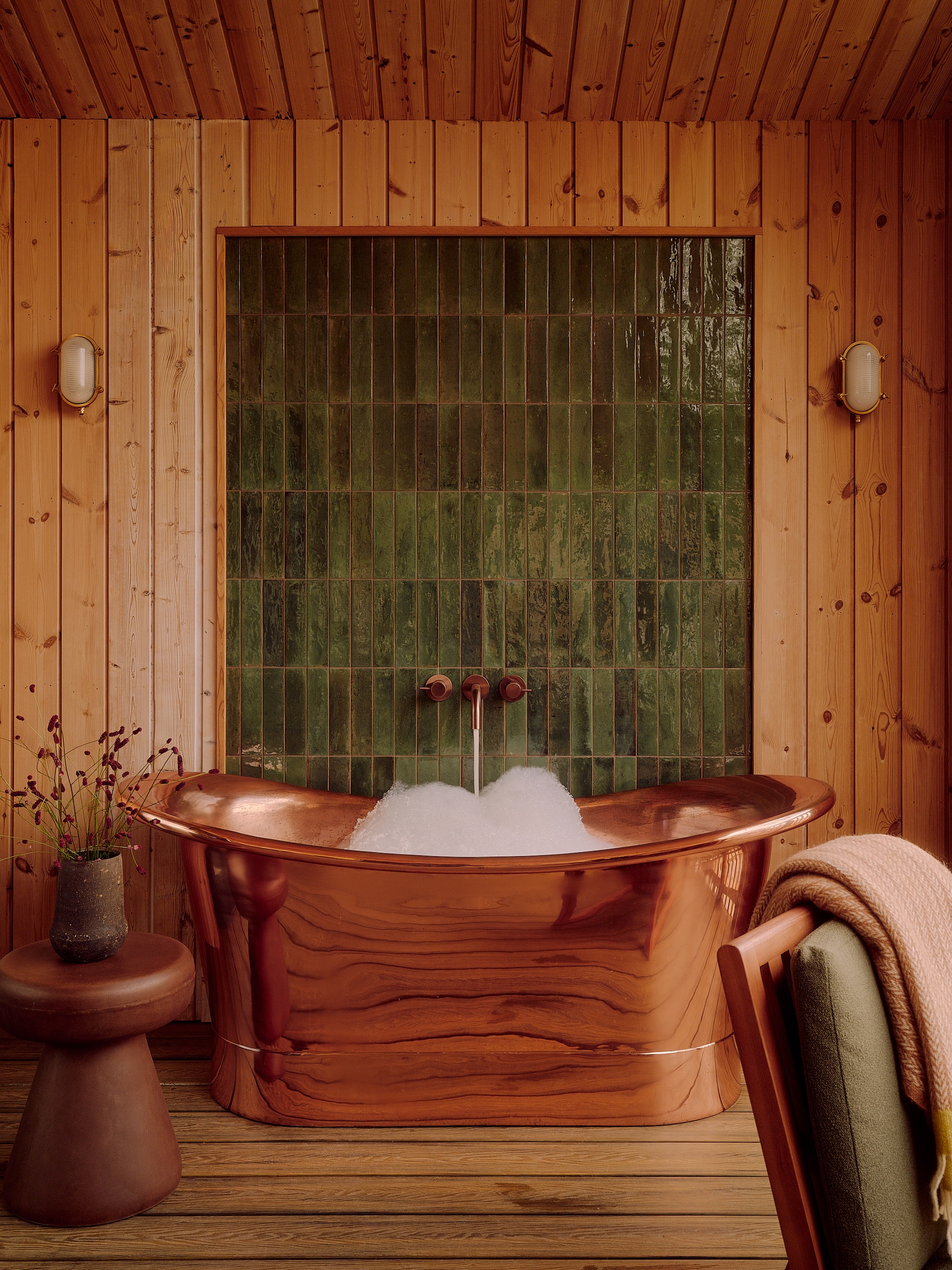
Designed by Jolie, the 51 lodges, communal “welcome lodge” and lakeside terrace are integrated into the zoo’s Grasslands habitat, allowing vistors to come face-to-face with giraffes, zebras and antelope.

Chester Zoo is one of the UK’s leading conservation zoos.

“As a not-for-profit organisation, each stay at The Reserve directly funds our work in Africa and around the world,” says Kevin Jackson  the zoo’s major project lead.

London-based Jolie, which won the job against four other agencies, wasn’t given a detailed design brief.

“We wanted our designers to bring their own creativity to the project, to make it truly unique,” Jackson says.

“We asked for a design that delivered a boutique hotel- style quality, that felt luxury, while still capturing elements of a safari lodge.”

Obviously Chester doesn’t have the same climate as popular safari destinations like Kenya, Tanzania and South Africa. So rather than an exact replica, Jackson says the team wanted, “to capture the sense of luxury and escape that an African safari lodge offers.”

“We didn’t want it to be too theme-y with African styling, or for it to feel brand new,” says Jolie creative director, Sarah Wakefield. “Instead we went for subtle, high-end boutique.”

Jolie drew on Sandibe Okavango Safari Lodge in Botswana, which was revamped in 2014 by Nicholas Plewman Architects and Michaelis Boyd design agency.


The lodges were provided by modular building firm Starship, with Jolie working on their interior plans, including the positioning of the windows.

Some lodges are interconnected, to suit extended families and groups of friends. Because while zoos tend to be designed with children in mind, these lodges are also aimed at the pre-children crowd, Wakefield says, particularly those who are eco-conscious and into animals.

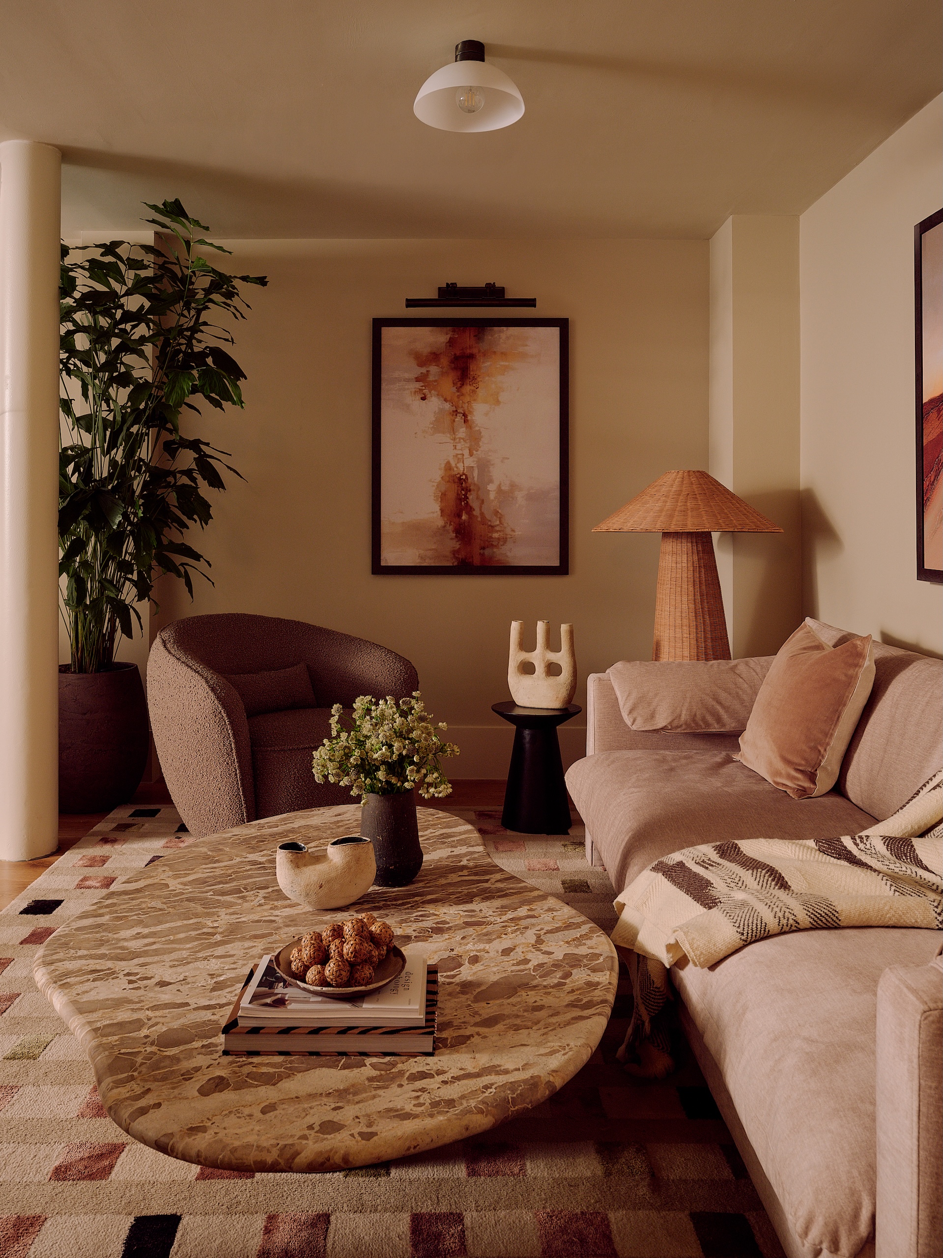
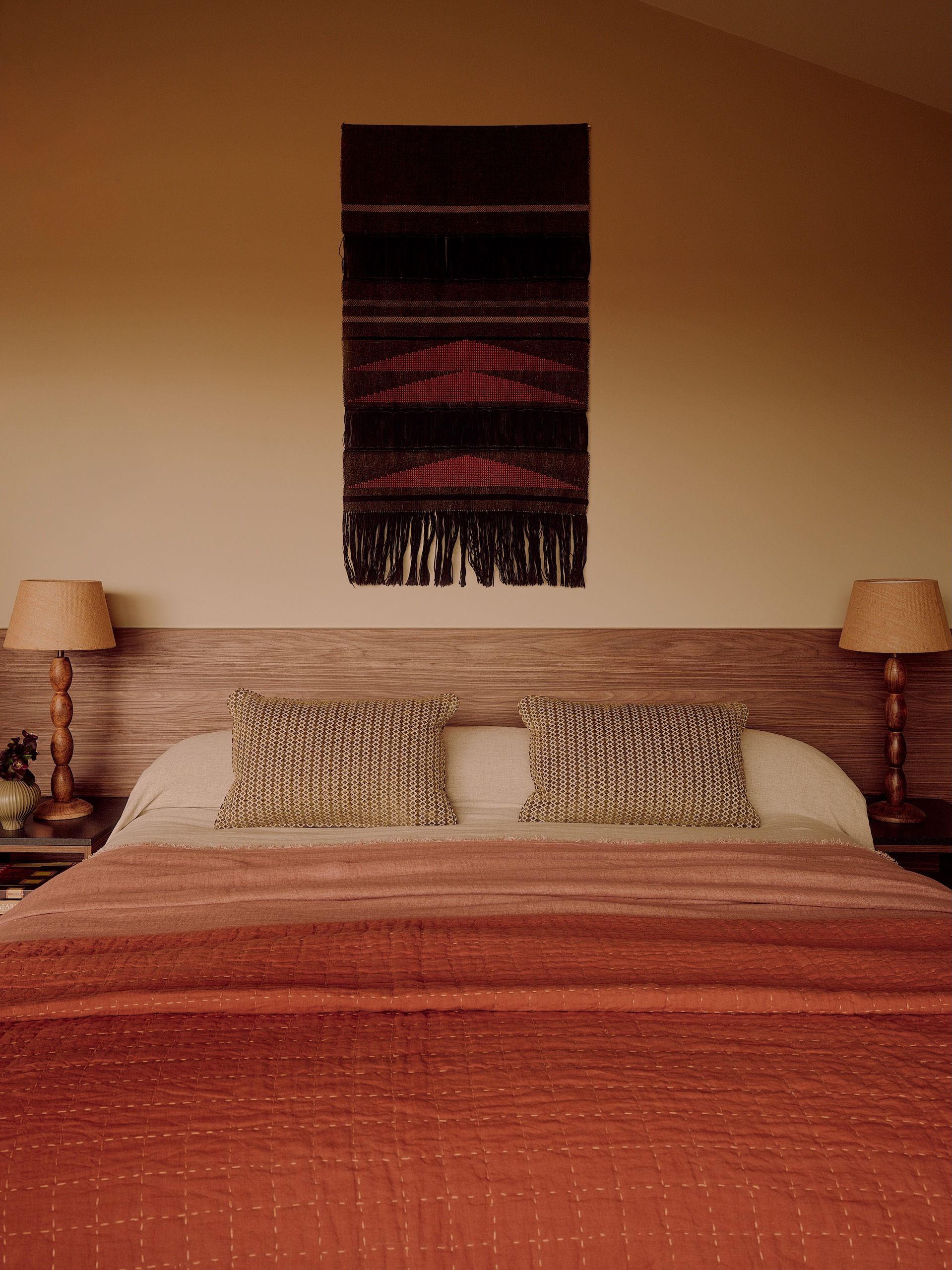
Boutique hotel touches include placing the bed in the centre of the bedroom and the gentle ambient lighting.

Meanwhile, eco credentials include sustainably sourced materials such as the rugs and carpets made from fishing nets and other recycled yarns.

And instead of using interior designers’ go-to material Corian – made by mixing minerals with acrylic resins – for the vanity surfaces, Jolie specified Woodio, a solid composite made from recycled timber.

Aesthetically, the earthy palette and textures, such as the bare plaster in the bathroom, are intended to hint at the savannah and link with the landscape outside. The cushion fabric comes from Coral & Hive, which is made by craftspeople in West Africa.

Jolie Studio’s new lodges for The Reserve at Chester Zoo

In the two-storey welcome lodge, the ground floor has a banquette seat with African grasses planted in its centre, while the open-plan lounge and restaurant are decked out in natural wood and marble.

Upstairs, the bar is moodier and more adult-focused, Wakefield says.

Here, she paired natural materials – the bar front is pebble-dash – with darker colours like navy and midnight blue. “We took those influences from star-gazing.”

The branding for The Reserve was done How&How, who also rebranded the zoo last year.

How&How’s branding for The Reserve at Chester Zoo

“They wanted it to be known as a place of discovery – a world of memorable experiences,” Cat How explains. “They were very keen on us distilling and combining some core elements of the Chester Zoo brand with luxury and a bit of sass.”

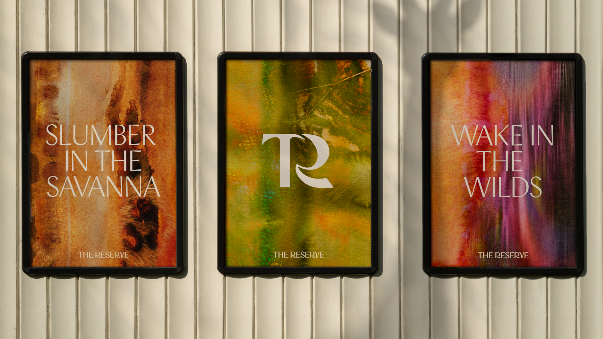
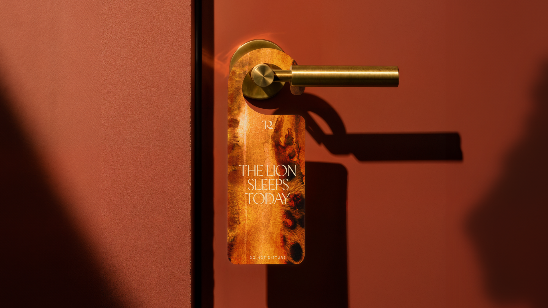
The identity includes elegant typography, fluid motion behaviours and animal-print patterns hand-painted by How & How’s senior creative, Eilidh Reid.

“We knew we needed to find a subtle way of tying in The Reserve to the Chester Zoo brand, so using patterns inspired by animals but in a much more crafted way felt like a logical elevation for this luxury offering,” Reid explains.

Each visual combines patterns associated with two or three different animals, to reflect the experience of encountering multiple species at the zoo. And Reid created them in watercolour, to evoke both the lake around which the lodges sit, and because as a medium, “it’s unpredictable, like nature. You don’t know how they’re going to react with each other.”


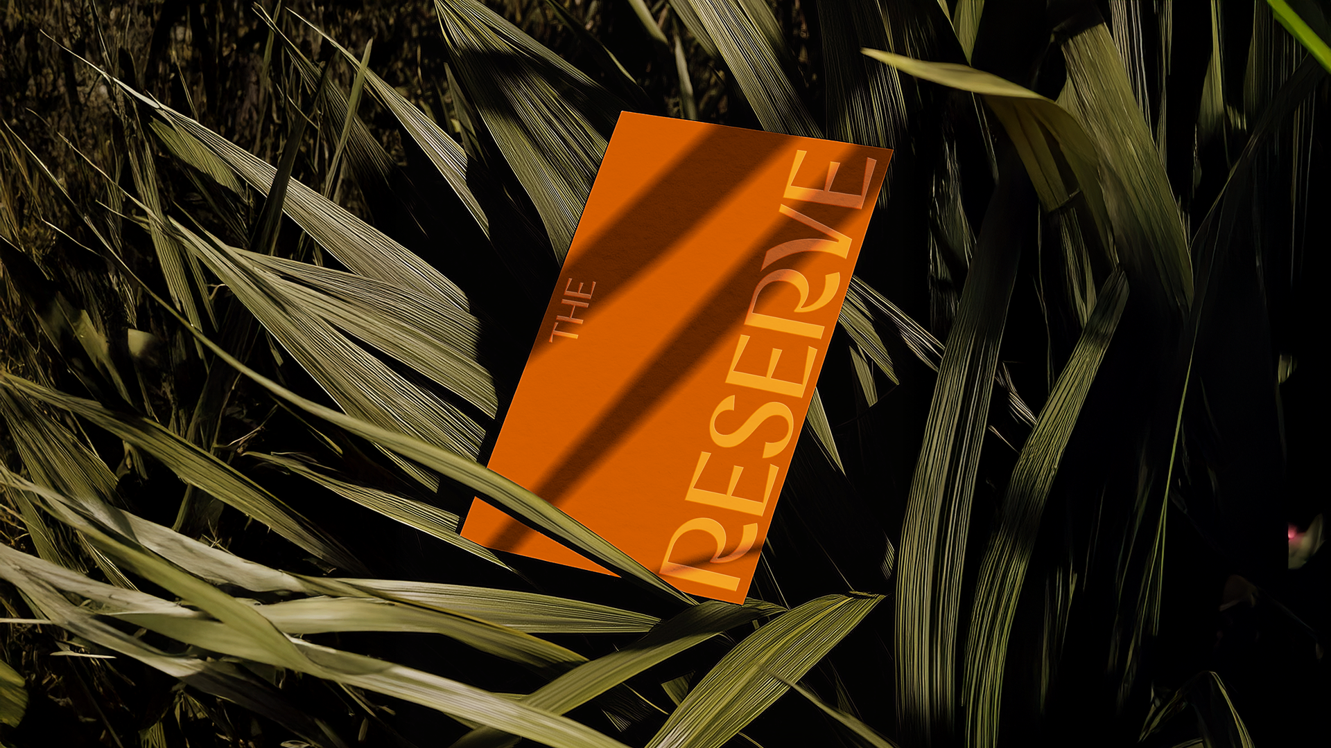
For the word mark, the rhino horn created using the negative space in the ‘C’ of Chester, reoccurs in the two “R’s of The Reserve.

When it comes to animal-based immersive sleepovers, Chester Zoo is riding a wave. There’s Port Lympne Safari Park’s treehouses in Kent, designed in 2015 by Tara Bernerd and Partners, the Safari Lodges at the West Midlands Safari Park, designed by Newman Gauge, and the Yorkshire Wildlife Park has the Hex Wildlife Hotel.

Jolie Studio’s new lodges for The Reserve at Chester Zoo

Source

By

Bossing it – Nomad creates new identity for Football Manager franchise

Nomad has created a new visual identity – inspired by the manager’s technical area – for Football Manager. The hugely popular game makes its much-anticipated return next month, after its original 2025 launch was postponed.

Nomad has been working with the Football Manager team since 2021, evolving the brand through slight tweaks year-on-year.

But Sports Interactive – the studio which makes the game – wanted a bigger rebrand to mirror the major changes coming with the new release.

Football Manager 26 has new licenses with FIFA and the Premier League, includes women’s football for the first time, and is now built on the Unity engine.

“It’s very much a strategic moment for us, so we didn’t want a soft refresh,” Sports Interactive’s marketing director, Alan Granger, explains. “We felt for a while our brand has lacked distinctiveness. It made sense to align the new brand around this new era for us, and this next-generation product.”

Nomad’s new identity for Football Manager

While Granger and Football Manager brand marketing manager Kamal Miah challenged Nomad to push boundaries and take a “holistic look at everything,” everyone involved knew that they had to be mindful of the franchise’s huge and devoted fanbase.

“People absolutely love this game, and so change was not something we treat lightly,” says Nomad co-founder Terry Stephens.

Their existing relationship emboldened Nomad to challenge the client and make suggestions, such as the need for a new logo, which wasn’t initially part of the brief.

As the game continues to grow with international audiences, many of whom don’t speak English, Stephens says that “a universal symbol that sits at the heart of the system felt like a smart thing.”

For the new mark, Nomad worked with designer Miles Newlyn to create a symbol inspired by a three-panel football, with ‘F’ and “M’ rendered in a fluid, abstract style.

“It can adapt to these different markets, but it also to the future ambition, to create a short-form symbol that will hold up in 20 or 30 years,” says Nomad design director George Edwards.

Miah says they considered many iterations of the design, and every tiny detail was considered. “Where we landed is very intentional in showcasing the movement of the ball,” he says. “It’s tilting forward to show progressive energy.”

The way the logo is used actually changed between the aborted 2025 release and the new one. Granger says they reviewed all the design decisions made last year – because both “football and gaming are constantly changing” – and they wanted to ensure the work was right for the new context, 12 months on.

“One of the key learnings was that we weren’t being confident enough with the symbol in isolation,” Miah explains. “It was actually impacting the legibility because we were shoehorning it into places where it didn’t really work.”

The main building block of the new visual system is inspired by the managers’ technical area – the two rectangles either side of the half-way line where bosses direct their players, berate the officials, celebrate goals and bemoan defensive mistakes.

“It’s a gift,” Stephens says. “It was one of those things where we were like, ‘Why didn’t we think of this before’?”

Nomad used the rectangle as a design device to bring “focus and intensity” – it’s used in both static and motion assets, vertically and horizontally.

“That’s a manager’s domain, and where their destiny is defined,” Granger explains. “It’s so simple, but that’s when branding’s at its best. It’s a really ownable symbol for us.”

It also influenced the motion design principles, as a starting point from which the visual assets could flex. “That’s where the game is won and lost,” Miah says. “So the motion principles open up from that device, transitioning from there so it doesn’t feel enclosed.”

Edwards says other parts of the motion design were inspired by the ebb and flow of football matches. “They are built around anticipation – these longer, drawn-out build-ups with sudden drops of excitement.”

And the technical area also shaped the new key art for the game’s packaging. Managers – both male and female – are shown in their technical areas, with the action unfolding behind them, “so that our USP as a management simulation was clear from the artwork,” Miah explains.

For the typeface, Nomad commissioned the Pangram Pangram foundry to create FM Universe. Edwards says the new type had to “do two jobs” – riffing off the sharp edges of the technical area, while also reflecting the “tapering nature, smooth curves and pinches” of the symbol.

The type was an integral part of increasing the confidence and ownability of the new brand. “We used to throw logos literally everywhere, on every asset,” Miah says. “We wanted other visual assets that could represent the brand, and the new font helps a lot with that.”

The brand’s use of purple was one of the only things that had to remain – usefully purple is not associated with any big football clubs, which might enrage rival fans. But the shade of purple was updated, and it’s used in different combinations in the new identity.

Nomad’s new type for Football Manager, created with Pangram Pangram

Miah says that previously, their designers sometimes hit what they came to call “the purple wall,” when they had to use lots of brand colour in place of imagery from licenses they didn’t yet have. With the new agreements in place, a refined colour balance will work across the much wider range of imagery they now have access to.

With the launch of the new game now just a couple of weeks away, Granger says the new identity is already proving its worth.

“The biggest compliment I can pay is that normally at this point, us brand marketers are absolutely fed up with seeing the brand,” he says. “But we don’t feel like that. We haven’t really scratched the surface yet of how we can use it, and how we can flex it. And that’s tremendously exciting.”

That long-term ambition is why the project became so broad, Stephens explains. “It’s about putting the component parts in place so the brand can communicate coherently for years to come.”

Nomad’s new identity for Football Manager

Source

By

Burnout by design – How to protect creatives’ purpose and passion

Burnout, it seems, has changed. For many creatives, it looks less like exhaustion and more like a vanishing of curiosity.

It has many faces – dwindling drive, a persistent sense of underachievement that’s hard to shake, creeping self-doubt, or a dull detachment from work. Burnout, we’re learning, isn’t about running out of energy. Rather, it’s an erosion of purpose, confidence and joy in making.

“Burnout and tiredness are totally different,” says Chara Smith, co-founder and copy chief at US agency Smith & Diction.

“Creative work is naturally tiring because it requires so much brain power. But on a good day, it’s a satisfied kind of tired, like how you feel after a long run. But with burnout, there’s no longer satisfaction in the work. The work just becomes work, with more piles of work behind it.”

From taboo to talking point

Across the industry, burnout has shifted from taboo to a talking point. Once dismissed as a personal failing, it’s now seen as a structural design flaw baked into agency economics, client expectations and the myth of constant passion.

Designers are often expected to be endlessly inventive, always brimming with the next great idea, yet that pressure collides with a troubling reality – burnout is widespread.

Nearly 70% of creatives reported experiencing it last year, which in one way might be seen as good news. “We are finally starting to say it out loud,” says Emmi Salonen, a designer and the author of The Creative Wellbeing Handbook.

The way burnout shows up in the lives of creatives is quickly evolving. As Salonen points out, Dropbox’s 2025 report highlights chronic focus loss, procrastination, irritability in collaboration, and creative blocks, shifting the emphasis from burnout as fatigue to burnout as attention and idea depletion.

“Gone are the days when being the last to leave the office was a badge of honour.”

In 2023, Salonen conducted the Creative Wellbeing Insights survey with 58 creatives based across 17 countries. She asked designers about the biggest challenges they face in their work and their answers revealed four themes – motivation, management, time and pay.

“The pressure to create on-demand, coupled with unclear briefs, poor communication, irregular work hours and project management issues, makes managing creative projects complex. And, with limited time for testing out new ideas, it’s difficult to push boundaries or find new avenues,” she says.

“Added to this, there’s often a lack of appreciation for creative work, and sometimes insufficient financial compensation. This can make it hard to believe in the worth of our work and, ultimately, our own self-worth.”

Spotting the early signs

As complex and varied as its causes are, burnout always has tells – subtle changes in behaviour, energy or attitude. Design leaders need to learn to spot these signs early.

“You can often see burnout or feel it in your gut. It’s difficult to hide,” says Nick Howe, CEO at Uniform Group. “Notice when and how long people are working; have they taken enough holidays, or are they always ‘too busy’ or ‘soldiering on’?”

“As a leader, you need to model healthy habits so your team can see them – leave on time, take a lunch break, get some exercise, enjoy life outside of work,” he explains.

“Encourage balance; make sure people don’t miss their kids’ school performances or meals with friends. Gone are the days when being the last to leave the office was a badge of honour.”

As conversations around burnout deepen, the creative industry is also undergoing a quiet cultural change. The romanticisation of overwork – once seen as a mark of dedication – is beginning to lose its shine.

In some corners of the industry, glorifying exhaustion now feels outdated, even tone-deaf. But awareness alone won’t fix things, not unless this shift is matched by tangible structural reform.

“A change I’d love to see industry-wide is to plan to 80% capacity and build pause into the schedule,” Salonen says. “When weeks are booked to 100%, there’s no room to think, learn or recover – the very inputs creativity runs on.

“An 80% plan gives you space for pause, and protects quality. That goes hand-in-hand with pricing and scoping for a sustainable pace, not ‘more, faster’.”

AI exacerbates the problem

The industry’s built-in obsession with speed has only been amplified by the rise of AI. According to Salonen’s research, AI has become a stressor in itself.

“When teams are mandated to adopt generative AI, many describe it as soul-crushing and ethically murky,” she says. “Secondly, job anxiety and morale dips are widespread – replacement fears, a saturated market, and even client feedback that’s clearly ChatGPT-generated.”

Clients expect agencies to use AI to do more things, more quickly, and more efficiently. But this survey of UK agency workers reveals that AI has actually increased workload for one in five staff, turning the promise of automation into a new front for burnout.

With fresh pressures compounding old ones, studios are realising that tackling burnout means acting on several fronts at once, from supporting individuals and redesigning team workflows, to rethinking organisational pace.

But even as studios become more focused on employee wellbeing, one kind of burnout still remains less openly discussed – the strain on founders and leaders.

The pressure on leaders

After more than 25 years of leading Uniform Group – and following a period of long COVID – Howe experienced what he calls “complete burnout.”

“I was signed off by the doctor and had to take three months off to recover,” he says.

“Lots of therapy and accepting that I didn’t have to be everything to everyone helped me take a more balanced approach. Letting go was important, as was managing the guilt of not always being present.

“I learned that protecting my own energy and health allows me to be the best version of me for our board, our team and my family. That starts with looking after yourself mentally and physically, setting healthy boundaries, and trusting the people around you.”

Burnout has a way of forcing change. It can sometimes be so unsettling that it alters the course of a creative’s career journey.

That was true for Smith, who experienced burnout while working at an agency in 2021, near the end of the pandemic – a period that would ultimately push her to rethink how, and why, she wanted to work.

“Back then, everyone was still working from home, on Zoom calls nine hours a day, and with actual work to do after that.”

After “a miserable few months” Smith where co-founder Mike Smith was “running Smith & Diction essentially alone,” they rethought the culture, taking time to define what they wanted, and what they didn’t.

This meant making intentional changes, including a “no after-hours work” policy, turning down projects once the team reaches capacity, and avoiding the creative stagnation that comes from sticking to the same types of projects.

“To help protect our team from burnout, we actively try not to get stuck in specific niches. This business is constantly trying to convince you to make more of the same, and it’s hard not to get burnt out and lose that creative spark when you’re working on, say, your 11th financial services rebrand in a row,” says Smith.

“So we always try to keep different kinds of projects coming into the studio, which helps the work feel fresh and unexpected.”

“It wasn’t about working too much, it was about caring too much about everything, all the time.”

Underpinning this approach is a commitment to transparency, and a quiet challenge to the expectations of what a studio should deliver, and how.

While working on the identity for Perplexity, the team spent about two weeks “banging their heads against the wall” trying to create a second logo option.

“We just didn’t have anything that could hold up to the first logo. So we told the clients, ‘We can burn ourselves out forcing another idea, or we can show you the one we believe in,’” says Smith.

“Luckily, they got it immediately, and we were able to move forward without virtue signalling by trying to have more options in the mix that we didn’t really believe in.”

That same philosophy extends beyond process to principle.

As they see it, burnout isn’t just about long hours or deadlines; it’s what happens when passion drains out of the work.

“There are many ways that happens,” says Smith, “like lowering your standards or letting mediocre work out the door. Mediocrity sucks the life out of creatives just as quickly as overwork.”

“Protect your curiosity”

Quality often erodes as it passes through layers of hierarchy, leaving creatives feeling they’ve lost control over the very work they make.

That was precisely what Penelope Stephens and Eden Brandenburg aimed to escape when they left full-time jobs to start Boring Studios. It’s a creative studio turned e-commerce brand now offering tools, templates and courses that help creatives – especially those leaving 9-to-5s – learn business skills and scale on their own terms.

“In agency life, everyone has a say in client work, and no-one wants to stand up for what is actually going to move the needle or produce the best creative. Designers are always so defeated and just need to get through the day,” says Stephens.

“We were tired of creative work going back and forth with advice from departments that aren’t creative. We felt our opinions, work and ideas as creatives weren’t valued,” she adds. “Boring Studios was built out of the craving for freedom in our work – to be able to complete the vision from beginning to end. And to be able to do it on our terms.”

As founders who left behind employee life to become entrepreneurs – and who now create tools for other creatives taking that same leap – they’re acutely aware that running your own practice can be even more demanding than a steady day job. And it comes with its own heightened risk of burnout.

“Burnout usually comes from a lack of clarity, not overwork. You need systems, plans, structure, discipline – that’s where freedom is found,” says Stephens.

“When starting your own business, the goal isn’t to escape structure – it’s to design your own version of it. And yet, entrepreneurship is not for everyone. We always say it’s easier to work for someone else, because frankly, it is. You go home and you get your paycheck.”

Where burnout once came from overwork, it now comes from overexposure – “too many platforms, opinions, and comparisons,” says Stephens.

“There’s also the new wave of digital fatigue that’s hard to avoid as a freelancer or business owner,” she adds. “You have to be ever reachable, build a personal brand, build a business brand. It’s exhausting.”

That kind of always-on culture can quietly push even the most self-aware creatives to the edge. Stephens says she and Brandenburg recently came out of what she describes as a six-month “burnout slump” – their first real experience of it.

“It wasn’t about working too much,” she says, “it was about caring too much about everything, all the time.”

To course-correct, the duo stepped back completely – switching off social media, rebuilding their routines, and learning to draw clearer lines between their work and their wellbeing.

“We build breaks into the work, not around it. Rest isn’t the reward; it’s part of the system,” says Stephens. “When things feel heavy, we zoom out, remembering that we don’t need perfection, just progress.”

Having come out the other side, Stephens has a grounded message for anyone caught in a similar cycle.

“You have to keep the momentum rolling – living in the real world, talking to people, going outside, learning, growing. And at the end of the day, protect your curiosity like you protect your profit. Once curiosity dies, burnout isn’t far behind.”

Source
By

“From grocerants to fashion cafes – The Gen Z food trends reshaping design”

Economic pressures continue to mount, but consumers – especially Gen Z – are still splurging on food and gourmet bites, and justifying them as necessities.

New research shows that young people are pushing treat culture into the mainstream and spending hundreds a month on indulgences, like snacks, as a coping mechanism to deal with societal pressures.

At a dark time in the world, food is offering people moments of joy, indulgence, stability and escape.

Valued at over £145billion in 2024, the global luxury food market is projected to tip over £610billion by 2033.

The sector is booming as consumers prioritise luxury food over other purchases, opting for a tasting menu over a designer bag, the latest restaurant drop over a retail splurge.

During the cost of living crisis last year, younger consumers were willing to cut back their spending on fashion, tech and beauty in order to spend on food, according to research from Lifesum.

Food is also becoming a much more nuanced form of value exchange. Foodies are increasingly informed and opinionated. The ability to offer recommendations has become its own form of status. Knowing the best new ramen spot, or understanding the difference between a natural wine and a pét-nat, now holds a great deal of social currency.

Food culture is about living in the moment and creating immersive, shareable experiences that tell a story. Just picking up a takeaway coffee can be turned into a compelling piece of content.

As food culture takes over, people are hungrier than ever for IRL experiences that build on their food knowledge, and brands across sectors are capitalising on this trend.

Here are some ways brands and retailers are forging connections with consumers and communities by harnessing the latest trends in food culture.

Creating a third space and a sense of belonging

Instead of a daily chore, the food shop is becoming a fun outing and opportunity to socialise. Retail spaces are evolving from being purely transactional to providing novelty, playfulness and a space for socialising and forging a sense of community.

This is demonstrated with the rise of grocery restaurants, or ‘grocerants’, which offer a place where people can socialise between the shelves.

These include Lulu’s in London which is a café, fishmonger, deli and wine bar all in one, and ICA supermarket in Stockholm which boasts a juice and smoothie bar, a vegan butchery station, and a seafood and champagne bar.

These meet the increasing consumer demand for specialist services while also nurturing a neighbourhood feel.

Starbucks, which pioneered the ‘third space’ concept is doubling down on it again in its design plans for its new “coffee house of the future.” The brand wants to reclaim its role in providing cosy settings that sit between someone’s home and work.

People are also looking to food culture for a sense of community and belonging, and brands are meeting this need by designing spaces that welcome and support specific communities.

Hags is a restaurant in the East Village in New York created by Queer people for all people, which supports local artists and shares recipes and information with its community. Gooce Supper Club in London offers a place where single people can meet and bond over food and music.

Elevating the retail experience

Consumers are seeking exclusivity, discovery and nostalgia, and brands are responding by elevating the in-store shopping experience.

While some food retailers focus purely on aesthetics, others are blending sophisticated design with a focus on sustainability, such as Natoora in London, an artfully designed produce outlet which works directly with growers to build a more sustainable food system.

Meanwhile Pop Up Grocers in New York offers highly-curated neighbourhood stores that showcase the most innovative and exciting natural food brands.

But harnessing food culture in this way isn’t just for food brands. Retailers across different sectors are elevating their offering by framing food as something novel, stylish and worth the visit.

Fashion brands are getting in on the action with Prada opening a café in Harrods and Ralph Lauren’s Ralph’s Coffee in Mayfair.

As retail becomes increasingly focused on entertaining customers, brands are enhancing the in-store experience through imaginative, food-themed displays and interactions that surprise and delight, such as the Jellycat Diner in New York serving up food-themed plushies, which went viral on Tiktok.

Dialling up convenience

As consumers are increasingly time-poor, retail spaces should feel intuitive, purposeful, and easy to navigate. Brands are focusing more on flexibility and providing a frictionless experience that aims to relieve the mental load that comes with food shopping and mealtimes.

Success lies in meeting consumers where they are, fitting fluidly into their routines, and having a distinctive offering.

The Salad Project in London aims to make healthy eating on-the-go effortless by providing fresh alternatives to traditional convenience food. The retailer aaA operates an ATM cake machine in Bilbao, Spain, which combines novelty with convenience by dispensing freshly made treats in paper bags.

Meanwhile, Dutch online supermarket Picnic delivers groceries with a focus on speed, convenience and sustainability. Picnic deliveries are free, made via electric vehicles, with friendly drivers and runners in a model that harks back to the milkman-style services of old.

Storytelling through food

As food knowledge is the new social currency, brands are investing in storytelling through food and offering rare or one-off dining experiences that will generate talkability and buzz.

The London restaurant Six by Nico offers a six course tasting menu inspired by a theme or concept that changes every six weeks. For example, its latest menu is designed to represent space exploration, from launch to lunar landing.

Ramping up the theatrical side of the dining experience, globally renowned Le Petit Chef combines delicious food with a 3D cinema experience on your plate.

Capturing consumers’ imaginations or taking them on a journey of discovery dials up desirability and offers a sense of exclusivity for foodies everywhere, boosting virality, brand love and loyalty in the process.

Elle Ashby is insights researcher at Dalziel & Pow.

Source