[searchandfilter fields="search,category"]

By

“Design leaders must manage the invisible client – time”

When we launched Badberries a year ago, I thought I understood what challenges we’d face.

Finding clients. Creating standout work. Building our reputation. Yes, these were true. But what I’ve come to realise is that the heart of all these challenges revolves around a single question: where do we invest our time?

The invisible client that never sleeps

Every agency has two distinct sides that constantly compete for attention. The first is client delivery – the work that pays bills and builds reputation. The second is the business itself – operations, growth, and longevity.

I’ve started thinking of this second side as our “invisible client.” Like any client, it has deadlines, demands, and deliverables. But unlike external clients, this one never stops needing attention, never wraps a project, and never takes a holiday.

The challenge? If you neglect client work, you have no income. If you neglect the invisible client, you have no future.

Complementary founders as strategic advantage

Recognising this tension early was crucial to our survival. As managing director with a background in complex agency projects, I bring planning and operational expertise.

Meanwhile Dani Wolf, our creative director and my co-founder, ensures our output remains distinctive and compelling. Together, we lead a team of designers who execute our vision for clients.

This complementary partnership has been fundamental to our success. When we first discussed starting the studio, Dani appreciated my approach, recognising how proper structure could give the creative work room to flourish.

He saw how systems would help us be more efficient, meet deadlines consistently, improve collaboration and help the creative process flow better.

This balance allows us to serve both our visible and invisible clients more effectively than either of us could alone. When urgent client needs arise, we can divide and conquer, one of us focusing on delivery while the other keeps our business moving forward.

Time as investment currency

In a service business where we essentially buy time – from ourselves and our team – and sell it to clients, we’ve learnt to think of time allocation as investment decisions. This may sound very dry, but it’s necessity to recognise it.

In the creative industry, there are typically two pricing approaches: value-based and time-based. Value-based pricing operates on the principle that the worth of the work transcends the time invested in creating it.

There’s a famous anecdote about Paula Scher, the legendary Pentagram designer, who reportedly designed the Citibank logo during a meeting on a napkin. As she famously said, “It took me a few seconds to draw it, but it took me 34 years to learn how to draw it in a few seconds.”

“The main question isn’t how to manage time, it’s how to invest it wisely.”

As a new business, we made the conscious decision to adopt time-based pricing. Not because we don’t value our work, but because it creates transparency with clients while protecting us from scope creep. It’s given us the clarity and flexibility needed in our first year, allowing us to be agile while maintaining healthy margins.

More importantly, it’s forced us to be intentional about where we invest non-billable hours. When you track time meticulously, you quickly see which activities generate returns and which don’t.

The art of delegation

One of our biggest time management lessons has been understanding what to outsource and what to handle ourselves. The equation isn’t simply about cost, it’s about strategic focus.

We quickly outsourced accounting and legal services, areas where mistakes would be costly and specialised expertise is essential.

This decision, while an investment, freed mental space and reduced stress considerably.

For marketing, our approach has evolved. We initially outsourced social media management but brought it back in-house when we realised we were still finding our voice. Conversely, hiring a PR specialist to build brand awareness has been transformative precisely because it’s a specialised skill neither of us possesses.

The question isn’t what can we afford to outsource? It’s what can we afford not to outsource if we want to grow?

Beyond billable hours

Six months into our journey, we faced an uncomfortable truth – while we were steadily winning client work, these projects had limited portfolio potential.

This realisation sparked a multi-pronged approach. First, we became more intentional about which client projects we pursued, weighing creative potential alongside financial return.

Sometimes a smaller budget project with greater creative freedom became a better long-term investment than a larger but creatively constrained opportunity.

Second, we carved out specific time for “studio projects” – self-initiated work that might not generate immediate revenue but would demonstrate our capabilities, showcase our passions as a business, and attract the type of clients we ultimately wanted.

Fluid time allocation

What we’ve ultimately learnt is that time allocation isn’t about rigid formulas, it’s about maintaining a fluid, responsive approach while never losing sight of both sides of the business.

Our approach continues to mature. Some weeks demand intense focus on client delivery; others allow more investment in the invisible client. The key isn’t perfect balance in any given week, but ensuring that neither side gets neglected over the longer term.

This fluidity extends to how we work as founders and how we blend our work and personal lives.

Dani, a morning person, starts early when he’s most energised. As a night owl, I often put in hours after my son’s bedtime. We’ve even started taking a couple of weekend hours to plan the week ahead, as we found weekdays often began with immediate client needs that left no space for strategic thinking.

I’m not advocating for poor boundaries. But as founders, finding the rhythm that works for your life circumstances is essential. Another lesson our invisible client has taught us.

Looking forward

A year in, we’re still refining this balance. But we’ve learned that the main question isn’t how to manage time, it’s how to invest it wisely across both sides of our business.

For those starting their own creative venture, recognise early that your invisible client demands as much strategic thinking as any external project.

Build systems that acknowledge both sides need nurturing, be intentional about outsourcing, and remember that sometimes the most valuable hours you spend won’t appear on any client invoice.

Natasha Szczerb is managing director and co-founder of design and branding studio Badberries.
Source

By

How&How on ignoring “don’t touch the logo” mandates

When How&How was commissioned to rebrand e-commerce platform Big Cartel, one thing was made crystal clear – the logo had to stay the same. “The idea of changing the logo was categorically vetoed in the original scope,” co-founder Cat How explains.

“It’s a designer’s nightmare,” How&How creative director Chris Clayton says. “It makes you question the client’s appetite for change. And how will a new brand system fit with the old logo? But I think we also see it a massive challenge.”

That’s because the team has learned – through many rebrands with different clients – that the logo probably is up for grabs. “In the past we would take it as gospel,” Cat How says. “Now we nod our heads, and smile. Because in our experience, that’s never really going to be it.”

The previous Big Cartel logo

The main reason clients warn designers off changing the logo is that they believe it has brand equity which they don’t want to lose. But, as Rog How explains, this is often overstated.

“For a very mature brand that everyone knows, where they do genuinely have that equity, change has to be more incremental. You’d probably struggle to get Tiffany to change their turquoise.

“But most of the companies we work with are either in a scrappy scale-up phase, or they’ve hit a bit of a plateau and need to unlock that next bit of growth.”

There can also be personal issues in the mix – logos designed by the founder, or a family member, which come with emotional baggage. “We once had to tell a client that their logo – which had been designed by his wife – was really ugly and didn’t suit the brand at all.”

In this scenario, the agency commissioned research to point out where the current logo was falling short. The point is that any brand asset – a logo, typeface, brand colours – needs to work within the broader whole.

“The logo always seems like the biggest deal, but in all honesty it is just one part of the bigger brand system,” Clayton explains.

Any good brand positioning work will interrogate who that company is and what it stands for. It all begins with that strategic work, and most of the time, an old logo won’t work as part of a new strategy.

“The logo has to represent the character of the company and if you have refined the positioning, it will usually have a knock-on effect on the logo,” Rog How explains.

For its work for Big Cartel, the strategy was designed to give the company, which has been around since 2005,  a “new lease of life.” The new positioning was built around the idea “Goodbye caution” to highlight the platform as “the go-to for entrepreneurs taking the leap.”

The How&How team presented the client with various routes, some of which included the old logo, some of which didn’t.

The idea was to start a conversation about whether the new direction needed a new logo too. The designers were convinced it did, but they needed the client to get there themselves.

“When you show people the brand evolution with the old logo, and then a new logo, nine times out of ten they agree that the new one is way better,” Rog How says. “They can see it’s been considered as part of the whole system.”

How&How’s new identity for Big Cartel

The new visual direction is deliberately scrappy, from its use of illustration to risograph textures and a punchy tone of voice.

“The new logo needed to preserve the independent spirit that made the original so meaningful to the team,” Clayton says. “Our goal was to evolve it – not replace it – capturing the same attitude and scrappy energy that of the new brand.”

Once they showed the client the hand-drawn new logo in the context of the rest of the design work, it was a no-brainer. “It was impossible to argue with,” Clayton says. “The brand felt so distinctive but all the elements lived in perfect harmony with each other.”

In fact, when How&How sent the client their case study and press materials one main request came back – they wanted to make more of the logo redesign.

The key to all of this, Cat How says, is trust. If you build the right relationship with a client, you gain the permission to push and challenge them, however adamantly they rule out certain things at the start.

“It’s a very gradual dance,” she explains.

“I think clients, and it’s not their fault, come to us thinking they know what they want. It’s our responsibility to show them what they could have, and what they don’t know they need yet.

“It’s not about getting smaller and self-referencing – it’s about showing them how to take a creative leap based on emotion, and strategy, and language.

How&How’s new identity for Big Cartel

Source

By

Intense energy to inevitable risks – Designing for a start-up

“Culturally, working with founders is intense, in the best possible way,” says Kelly Mackenzie, founder and creative director of White Bear. The London and Dublin based branding agency has form working with founder-led companies, including Tom Parker Creamery and chocolate brand Luvli.

“The business isn’t just what they do, it’s often wrapped up in their identity, sense of self-worth and purpose,” Mackenzie explains.

And because of this intensity, the agency becomes almost as invested as the client.

“When we’re asked to evolve or build their brand, we often tell them that it’s like being asked to mind their child,” Mackenzie says. “Naming that emotional connection early builds trust. It helps them feel safe in a process they’ve often never experienced before.”

Many designers talk of going on a journey with these clients.

“You have a very close relationship with the founders, and get to know them very deeply,” says Hijinks co-founder Marc Allenby. “Their idea is usually based on passion, and you – as a designer – are fuelled by that passion. That energy is self-motivating, you really care about what you’re creating.”

The WeRepresent logo and wordmark designed by Hijinks

When Hijinks presented the founder of talent agency WeRepresent with their logo, she burst into tears, which isn’t standard practice when presenting to bigger clients.

But Hijinks had created an animated version that “breathed” – a nod to the founder’s traumatic experience of being in a coma on a ventilator with Covid. A moving approach, in more ways than one.

The entrepreneurial spirit found in start-ups can be infectious.

“Rather than being jaded, they have a youthful energy, and that attracts us,” says Russell Potter, the co-founder of architecture and design firm SODA, whose many hospitality start-up clients include the Instagram-beloved crumble shop, Humble Crumble.

Then there’s the potential for creative freedom. “It’s a blank canvas. We’re creating something from nothing,” says Allenby at Hijinks, in contrast to a more mature brand that will come with its own baggage.

But these clients may not have worked with a design studio before process, and inevitably there’s a lot of hand-holding.

Dundee-based Agency of None branded the start-up QuickBlock

“Start-ups by their nature, are often a very small group of people, all trying to cover many roles. So the role of the designer is often as an educator, as much as a designer,” says Lyall Bruce, director of Dundee-based Agency of None, whose start-up clients include QuickBlock, a sustainable building block made from recycled food packaging, and coffee roaster Bryte.

As a consequence of this inexperience, the brief is rarely formal. It might be a loose deck, a stream-of-consciousness call, or a rough vision, according to Mackenzie. “And throughout, there will be extra calls to talk through thinking, being available on WhatsApp or Slack, and giving reassurance at each step.”

That naivety is both beautiful and brilliant, says Potter at SODA. But if you’re not careful, you can get dragged into a lot of business decisions. “We’re often asked to comment above our pay grade – we can’t always have the answers,” he says. “Someone client side has to have a leap of faith and make a decision.”

Inevitably budgets are tight, and agencies often need to explain the value of effective design,
“Once they see the link between strong branding and commercial outcomes, budget conversations become much easier,” says Mackenzie at White Bear. Although, as several designers pointed out, this challenge is not unique to start-up clients.

But for start-ups, agencies often break down payment into smaller chunks, as a way of protecting themselves.

The interior of the new Crunch sandwich shop in London’s Soho designed by KIDZ

KIDZ, which has offices in Amsterdam, Belgrade, Dubai and Paris, designed the new Crunch sandwich shop in London’s Soho. “Working with early-stage companies inevitably involves risk — timelines can shift, priorities may change, or funding may fall through,” says KIDZ co-founder Dmitrii Mironov.

“To protect our team and ensure a smooth process, we break the work into smaller, clearly defined stages. We require prepayment for each stage; keep written records of all agreements, even when communication is fast and informal; limit the number of revisions and fix the scope of work for each stage; and withhold certain deliverables until full payment is received.”

They’ve had a few cases where a project wasn’t completed because the client pivoted or changed direction unexpectedly. “While that’s never ideal, it’s part of the reality of working with start-ups,” he adds.

And sometimes it makes sense to rethink payment completely.

In lieu of fees from a business consultancy, Hijinks did a skills swap.

Meanwhile, when Run for the Hills designed a third site for restaurant chain Cricket in London’s White City, they threw in a £5,000 bar bill to make up for the smaller fee. That allowed the agency to take the team out, thereby boosting morale, and host clients, thereby showcasing their work.

The interior of one of the Humble Crumble shops, designed by SODA studio

In 2015, SODA had a start-up client in the hospitality sector who offered to pay part of the fee in Bitcoin. “We ummed and ahhed, but decided to take the £19,000 in money,” Potter says.

Some years later, it would have been worth over £1 million, though Potter points out that they would have sold it before then.

Then there’s the gamble of a profit share, where you’re investing in their business in lieu of partial payment.

At a former agency, product designer Jake Weir occasionally ended up doing sweat equity to help out, “so you’re basically partners.” When a hairdresser with limited funding came to him wanting to develop a new hair curler, the agency was given shares in the company for their design input. “We were incentivised to make it work,” Weir says. The product was a success – ultimately sold to BaByliss for “millions.”

But even when budgets are low, these jobs are still worth doing sometimes. “We’ll do them as a passion project as they’re quick turnaround and they give younger guys in the studio more on-site experience,” Potter says.

What happens when the client’s dream is never going to make it?

MAP Project Office was once asked to design a very specific backpack. “We wondered if there was a market for this,” says MAP Project Office creative director, Weir.

When people are pouring their life savings into a project, there’s a responsibility to warn them of the risks. Regardless, founders often have their mind set on these things. In these circumstances, MAP Project Office will look for a way to “dial the founders’ single-mindedness down,” Weirs says.

“If you relax the concept a little bit, you can make it less niche and more accessible, especially for a first product.”

White Bear’s work with the Tom Parker Creamery brand

And experienced designers in this sector get good at spotting the jobs to avoid.

Start-ups have a reputation for being short-lived. It’s commonly said that 90% of them fail, although the source for this stat is not at all clear.

Harvard Business Review puts it more modestly, claiming that more than two-thirds of them never deliver a positive return to investors. The food and beverage sector, in particular, is full of such tragedies, according to The Grocer.

But these potential risks shouldn’t be a reason not to take on a start-up. “The reason the project fails is not because of the design,” says Trotman at Run for the Hills, “unless the client has shittified it.”

A fish restaurant that Run for the Hills worked on in London had great interiors and a cool brand, Trotman says. “But it failed on the food, and we can’t do anything about the food.”

Conversely, when they do well, the agency is part of that success story. In 2005, Big Fish named and branded start-up chocolate puddings company Gü, cleverly persuading its founder to ditch his name, The Belgian Chocolate Company. Just seven later, it was sold for £32.5m.

And because the agency is so embedded – it’s personal, remember – the work takes on real significance.

“You really get the chance to make a lasting impact and build a long-term working relationship,” says Bruce at Agency of None. And better still for the broader industry. “The experience they have here will set up the relationship with design forever.”

Source

By

Google looks to level up craftsmanship in new AI Search tools

Google announced a host of AI-powered updates to its Search products yesterday, with a major focus on “richer and more vivid” designs.

“We’ve been working really hard to up the level of craftsmanship within Google search,” said Rhiannon Bell, Google’s VP of Search UX.

At its annual I/O developer conference in California, CEO Sundar Pichai unveiled what he called “a total re-imaging of Search” which with 8.5 billion daily enquiries, brings “AI to more people than any other product in the world.”

The new tools announced yesterday include:

AI mode and Deep Search, which allow deeper queries, follow-up questions, and let users create “an expert-level fully-cited report” in minutes.
Search Live which lets users talk back-and-forth with Search in real time through your camera.
AI agents to help with tasks like booking tickets.
A data visualisation tool which uses AI Mode to “analyse complex datasets and create graphics that bring them to life.” These will allow users to create custom-built charts and graphs and will roll-out first for sports and finance queries – to compare two stock prices over time, or two teams’ win ratios, for example.

The new AI tools are available from today in the US, but Google couldn’t yet confirm when they will be available in the UK.

Bell, a British design leader who has been based in San Francisco for the past two decades, said it was a big moment for the brand.

“This technology is allowing us to do things that we could have only dreamed of before,” they say. “Bringing the Search product and the AI capabilities together is a phenomenal product and design opportunity.”

But they explained, there are also a raft of design challenges their team must consider when implementing AI into Google’s product suite.

“This technology is incredibly powerful and we are bringing that power into people’s lives,” Bell explained. “I think we have a responsibility to make sure that it is really accessible.

“We’re moving so fast, and this technology can do so many things, I do worry sometimes that we’ll over-complicate things. And so we have protocols around making sure we’re keeping certain aspects of what Google’s really good at – at in terms of its core simplicity – as sacred as possible.”

Bell said there was “a constant dialogue” between the design leaders to ensure they are “staying true” to the Google Search product.

Alongside this simplicity, Bell also explained the team was focused on creating more crafted UX across the new tools.

“I really wanted to make sure that we were bringing the vividness, the variety, and the visual richness of the open web to the foreground,” they said.

This will show up in the way images are displayed and organised, Bell said, as well as new shopping experiences and specific design elements like the eclipse – a new waveform that appears when users are speaking with the AI tools.

The wave goes up when people speak to their device, and down when the AI model is responding, and Bell says it’s designed to create “synergy” across different touchpoints in a visually pleasing way.

More broadly, Bell says they understand designers’ anxiety around AI and what it might mean for the profession. But she is optimistic around the opportunities for skilled designers to translate AI into usable, and exciting, interfaces.

“I feel like UX is actually having a bit of a moment,” they say. “Our role in shepherding this technology to people everywhere is so important. It’s not going to happen without us.

“AI is changing our discipline, but I think it’ making us more capable. And I think the nuances of user experience design, and that dialogue with users, are very hard to replicate.”

Other announcements at I/O included Google Flow, a new AI filmmaking tool, and a new version of its image-generation tool Imagen. The new model is said to be “significantly better at spelling and typography.”

Google also unveiled its new Google Glasses, which use Android extended reality (XR). The tech giant will partner with eyewear brands Gentle Monster and Warby Parker to design glasses that people “want to wear all day.” The move echoes Meta’s collaboration with Ray-Ban on its XR glasses.

Source

By

Sir Jony Ive to lead design and make new products for OpenAI

Sir Jony Ive will “assume deep design and creative responsibilities” to build new products for OpenAI, the company that makes ChatGPT.

It comes after the company bought io, a hardware start-up Ive founded with fellow Apple alumni Scott Cannon, Evans Hankey and Tang Tan in 2024. The long-term plan was seemingly always to merge with OpenAI.

The deal is reported to be worth $6.5 billion, and although Ive will not join OpenAI himself, his LoveFrom studio will “take over design for all of OpenAI, including its software,” Bloomberg reports.

The first products are expected to launch in 2026, although there are no details yet as to what they will be.

“I have a growing sense that everything I have learned over the last 30 years has led me to this moment,” Ive said.

“While I am both anxious and excited about the responsibility of the substantial work ahead, I am so grateful for the opportunity to be part of such an important collaboration.”

A statement posted on the OpenAI website said that founder Sam Altman started working with LoveFrom – co-founded by Ive, Marc Newson and Peter Saville – two years ago.

“Tentative ideas and explorations evolved into tangible designs,” the statement says.

“The ideas seemed important and useful. They were optimistic and hopeful. They were inspiring. They made everyone smile. They reminded us of a time when we celebrated human achievement, grateful for new tools that helped us learn, explore and create.”

“I have a growing sense that everything I have learned over the last 30 years has led me to this moment.”

This led to the realisation that OpenAI’s “ambitions to develop, engineer and manufacture a new family of products demanded an entirely new company” and this led to the creation of io.

“AI is an incredible technology, but great tools require work at the intersection of technology, design, and understanding people and the world,” Altman said. “No-one can do this like Jony and his team; the amount of care they put into every aspect of the process is extraordinary.

“What it means to use technology can change in a profound way. I hope we can bring some of the delight, wonder and creative spirit that I first felt using an Apple Computer 30 years ago.”

OpenAI also released a ten-minute video announcing the new partnership. In the film, Altman says he believes, “they have an opportunity to completely re-imagine what it means to use a computer.”

io’s team of hardware and software engineers, physicists, researchers and manufacturing experts have already produced the first prototype. Altman says Ive called it “the best work he had ever done” while Altman thinks it will be “the coolest piece of technology that the world will have ever seen.”

So far, AI-enabled products like the Rabbit R1 companion and the Humane AI Pin have been underwhelming – tech blogger Marques Brownlee called the latter, “the worst product I’ve ever reviewed.”

But Altman is clearly confident that their products will buck this trend. In the film, Ive points out that the hardware people use to work with AI comes from a different era.

“The products that we are using to connect us to unimaginable technology, they’re decades old,” he says. “And so it’s just common sense to at least think, surely there’s something beyond these legacy products.”

Altman agrees. “I think this technology deserves something so much better,” he says.

When he appeared on the BBC’s Desert Island Discs programme in February, Ive said that society needed “healthy discussions” about AI and in particular “the rate of change” which he feared was not yet being fully grasped.

In the same interview, he also admitted that he was troubled by the iPhone’s legacy.

“The nature of innovation is there will be unpredicted consequences,” he told host Lauren Laverne.

“I celebrate, and am encouraged by, the very positive contribution, the empowerment and the liberty it has provided to so many people, in so many ways.”

And while what he calls “the not-so-positive consequences” were unintended, “that doesn’t matter relative to how I feel responsible,” Ive said. “That weighs, and is a contributor to decisions that I have made since, and decisions I am making in the future.”

In the OpenAI film, Altman says the pair bonded over “shared values about what technology should be, when technology’s been really good, when it’s gone wrong.”

“Our motivations and values are completely the same,” Ive adds.

Ive also has previous experience working with a visionary but controversial founder, in Steve Jobs.

In a review of tech journalist Karen Hao’s new book, Empire of AI: Inside the Reckless Race for Total Domination, The Guardian described Altman as, “depending how you view him, the villain who has put humanity on the path to mass extinction, or the visionary utopian who will bring us cures for diseases and a revolution in how we work.”

Speaking on Desert Island Discs, Ive complained about the “absurd anecdotes and stories” about Jobs and his leadership style, which Ive insisted had been taken out of context.

Source

By

“Graphic design is too one-dimensional” – Sarah Hyndman on her multi-sensory mission

Sarah Hyndman has an experiment she has been running at events for several years. She asks people to sniff two bottles of perfume and then say what they smell in each. Both perfumes are identical – only the typography on the bottles is different.

And yet 72% of participants, nearly three quarters, describe the perfumes differently.

It’s a perfect example of the sorts of insights Hyndman has been sharing through her books, talks, and other projects for the past 12 years.

Having worked as a graphic designer – “one of the original Mac monkeys” – and run her own agency, Hyndman started Type Tasting in 2013, inspired by Stefan Sagmeister’s regular client-free sabbaticals.

She wanted to research type’s ability to influence our other senses, find evidence to back up her intuition, and bring this knowledge to a broad audience (which she does through Type Safaris, and wine-tasting events among others).

Now in her new podcast, Seeing Senses, she is interviewing chefs, psychologists and perfumiers, “to discover how they connect what we see to what we sense and feel.”

We sat down with her to find out why she thinks multi-sensory design might help save the industry.

Sarah Hyndman’s podcast Seeing Senses

How does your podcast build on Type Tasting’s work?

From the outset, Type Tasting was always multi-sensory, but I was looking at typography because it was a niche area. Type was just the gateway into the other senses.

So we start with what you see, vision. Vision is about what gets your attention – that’s what branding and packaging does. But in my opinion, what we’ve forgotten in design is the follow-through – that senses like smell and sound boost the mood more than vision.

So you need to back up the experiences you are designing with all the other senses if you’re going to create an emotional connection, make something feel personal, and create memories.

What does that mean for graphic designers and their work?

I think graphic design, as a term, is too one-dimensional.

The visuals are the flag for your brand, so you can recognise it really quickly. But what does it sound like? What does it smell like? What does it feel like? How does your experience of this product change from location, to moment, to experience?

I think we need to rewrite our job descriptions, so that we start thinking in a multi-sensory way from the outset. Who cares if it wasn’t in the brief? We need to be the challengers, the rebels that are saying “No, I think you need to think about this differently.”

If we keep doing what’s already been done, that’s what AI could do. Our job is to find the gaps, to be the mavericks, and to do the lateral and creative thinking which, at the moment, AI can’t do.

That infamous Future of Jobs report, that said graphic design was at risk of becoming extinct, was a wake-up call.

That report is based on what business leaders think will be important over the next five years. Why is graphic design not seen as a useful skill? And do we need to talk about what it does in a different way?

Yes, absolutely. Leaders need to see designers doing something, or being something, different. It always used to be that clients loved visiting their agencies. Why aren’t businesses excited by designers any more?

I think we need to show people something that makes them say, “Oh, we need that.” Rather than showing them something which will win them awards.

Type Tasting activations at Adobe Max. Photo by Grant Terzakis.

As someone now studying neuroscience, how do you see the relationship between science and creativity?

I did science all the way through school. I’ve never studied graphic design, so nobody ever told me I wasn’t allowed to experiment.

As designers, we’re given permission to come up with solutions that fit the brief, but we’re not somehow given permission to go out and experiment.

And there is a big misconception that science is very rigid, and will take all of your creativity away. Whereas real research is about constantly interrogating every statement. Always asking why, like an annoying five-year-old.

And that same curiosity is key to good design as well, right?

Exactly. But as designers, I think we’ve lost a bit of bravery to do that. So my thing is – think more like a scientist. Science is about proving yourself wrong, and finding what’s right.

The interesting stuff, when it comes to my experiments, are the really weird answers, the outliers. That’s where the magic is – when someone tells you something different, and you discover it’s because they grew up somewhere where that means something else, or they’ve had an experience where that means something else.

A lot of your experiments seem to be very fun – is that an important part of designing them?

If I want people to take part, I have to make them really understandable. I have to make them fun. And if I’m going to gather your data, I need to give you something – some insight or learning.

I did a talk for 1,000 people in Germany not so long ago, where we gave them all pairs of jelly beans, and I played a load of different stimuli, to show how it changed what they tasted.

I talked them through the science of what happens, so that everybody could feel for themselves how it worked.

A Type Tasting event at London Design Festival. Photo by David Owens.

Is there any tension between that sense of fun, that showmanship, and the scientific rigour you are clearly interested in?

I like that I sit in the middle. I think as designers, we are basically showmen. Packaging, branding, everything that we do is about showmanship. It’s about catching attention, selling imagination, sensation transference.

But then in spaces like FMCG, they have consumer neuroscientists, and everything is measured to an infinite degree.

What’s your hope for the podcast, and the new books, you are working on?

Hopefully they will help graphic design to keep changing, so this amazing profession can stay alive, but also evolve as it needs to.

Type Tasting does wine tasting in London. Photo by David Owens.

Source

By

Garden variety – V&A Dundee hosts ambitious design exhibition

V&A Dundee’s new exhibition starts before you get up to the first-floor gallery.

As visitors enter the main hall of Kengo Kuma’s 2018 waterfront building, they’re confronted by 11 big white flowers dangling from the double-height ceiling.

Called Shylight and created by Amsterdam’s Studio DRIFT, the floral forms slowly rise and fall courtesy of robotics, with their silk petals folding inwards, mimicking those flowers which close up at nightfall.

Thought-provoking and visually pleasing, it sets the tone for Garden Futures: Designing With Nature, the exhibition which opened last week and runs until 25 January.

It also hints that not everything in the garden (exhibition) is rosy. Beyond horticulture, there’s also technology – starting with those Shylight robotics – and art. That’s quite a juggling act.

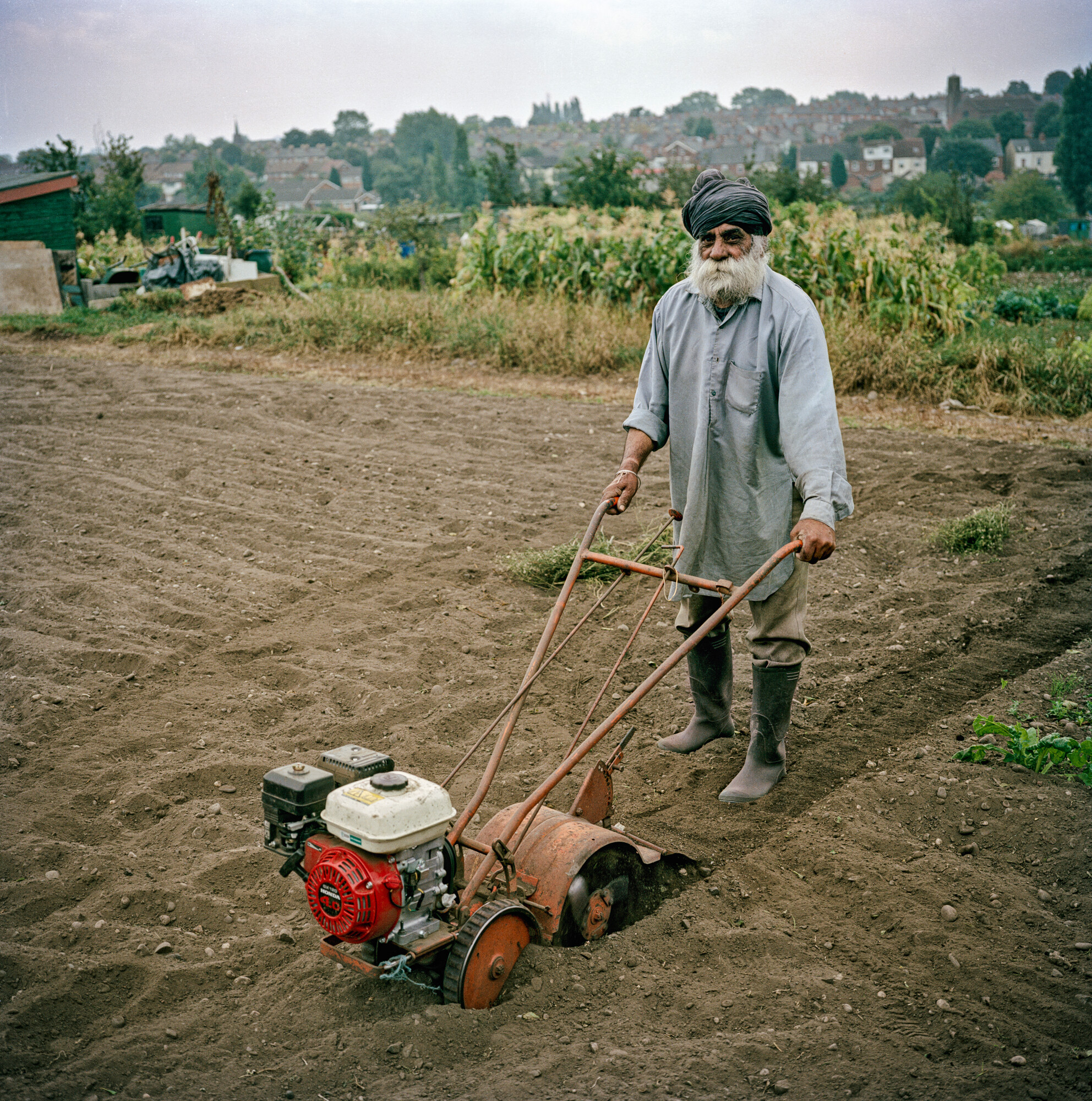
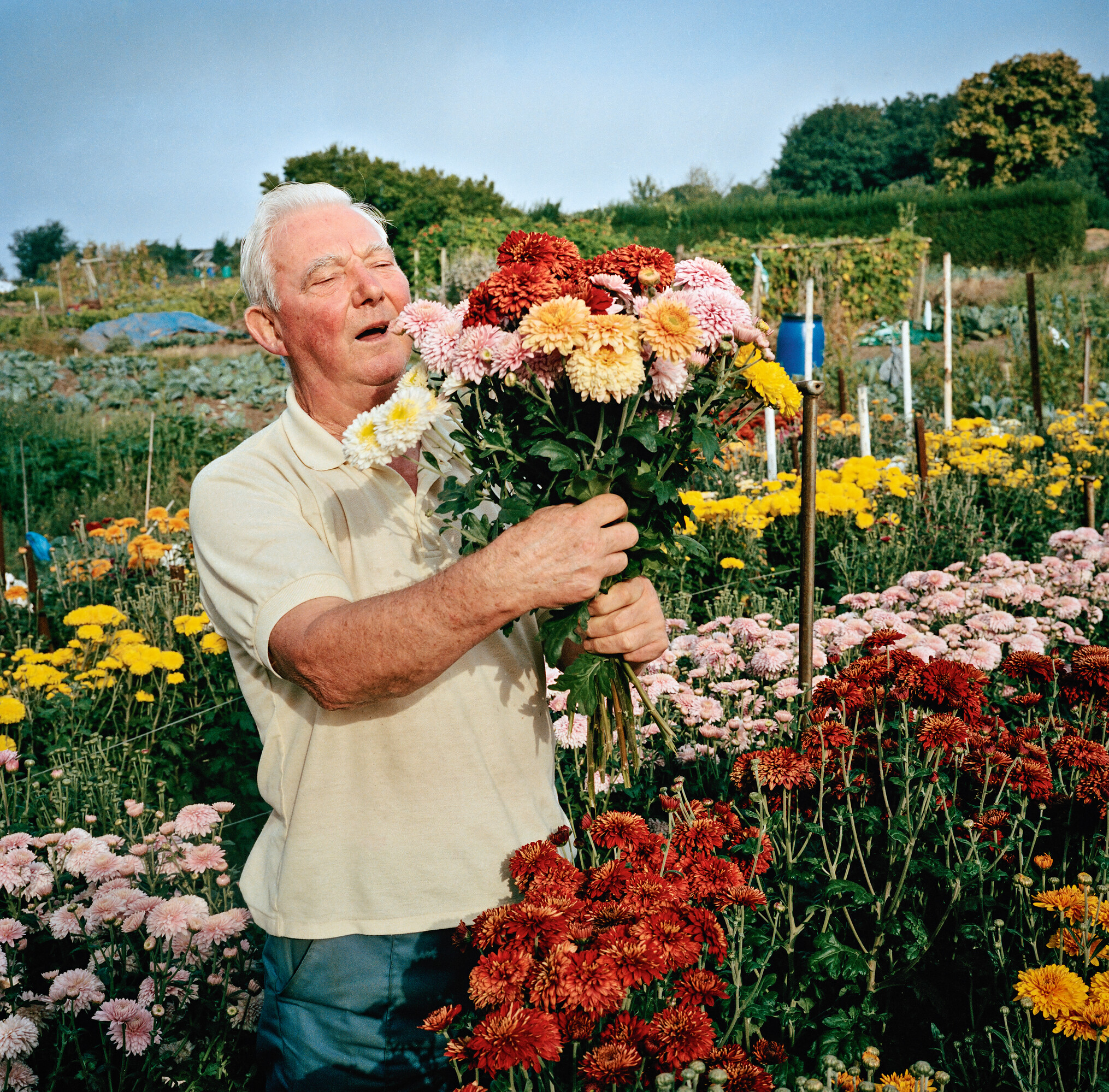
As a long-standing allotment holder, it was the horticulture content which drew me in. If I hadn’t had that focus, the exhibition could have been overwhelming: so many topics, so many ideas, so many things to take in.

This is the touring show’s only UK stop, having debuted at Vitra Design Museum in Germany’s, before appearing across various European venues. Vitra Design Museum’s deputy director Sabrina Handler claims it’s the first major exhibition on the history of modern garden design.


The original show comprised 300 objects. V&A Dundee has an extra 200m2 of space to play with, and has added another 130 objects to give it their own spin and highlight some Scottish contributions to the topic.

Msoma Architects were brought in to reimagine the show for Dundee, building on Formafantasma’s original concept for the Vitra Design Museum. The graphics were handled by Boris Meister.

In terms of the gardens on show here, they vary from productive spaces for work, rest and play, to places representing spiritual, cultural and political ideas. What they have in common is that they’re all designed spaces.

Like a virulent form of bindweed, this show is covering a lot of ground. Its material is grouped in sections themed as Paradise, Sanctuary, Retreat and Labour of Love. It’s Paradise that makes the strongest impression – and rightly so – with its ice-cream-pink structure.

The Paradise section, designed by Msoma Architects. Photo by Grant Anderson

The overarching aim is to demonstrate how garden design impacts us both functionally – providing food, hence Birmingham’s Uplands Allotments and seed companies – and aesthetically – hence William Morris wallpaper and the naturalistic planting of Dutch garden designer Piet Oudolf.

It combines factual photos with artworks, and roams from floral tile panels from 17th Century Persia to a Chinese garden inspired by a video game, and from vast landscapes to hand tools.

The two wall displays of the taxonomy of tools will add to the dwell time of any visitors who actually garden or grow.

Biome Collective’s Garden video game

But for those after interaction, Dundee-based creative studio Biome Collective has created Garden, a video game that allows players to create a virtual musical garden. They’re also behind the Pollinator Pathway digital tool that creates a planting design tailored for the maximum benefit of pollinating insects.

And then there’s the smell trail – little wooden boxes whose lids lift to give off a specific scent, such as a cypress tree.

The image of Prospect, Derek Jarman’s Dungeness house and garden, might feel over-familiar to some. Likewise architect Stefano Boeri’s Bosco Verticale, the residential skyscraper covered in greenery in Milan – but an exhibition like this has to cater to all knowledge levels.

Stefano Boeri’s Bosco Verticale

Specific V&A Dundee content includes Seeds of Scotland in the Highlands, which produces resilient seeds. The company’s utilitarian packaging sits alongside photos of vegetables and the seeds themselves – another stop to linger for any growers in the audience.

There’s also Oban’s Seaweed Gardens, a community-led project, and the garden designed by Arabella Lennox-Boyd for cancer patients at Maggie’s Centre, Dundee. On a smaller scale, there are origami-inspired self-watering plant pots made from marine waste, the brainchild of Glasgow-based company POTR.

And when it comes to Dundee’s own garden future, things could be looking up. The Eden Project has a scheme to transform a defunct gasholder into a vast glasshouse. It’s got planning permission, and the 2025 model of architecture firm Feilden Clegg Bradley Studios brings the £130million idea to life.

POTR’s self-watering plant pots

There’s something counter-intuitive about going indoors to experience gardens. But this isn’t the only show tackling that problem.

Gardens and gardening are having a moment. The exhibition Soil, which explored soil’s vital role in our planet’s future, finished at London’s Somerset House in April, getting 50,000 visitors in three months.

Now Garden Futures is off the ground, V&A Dundee will be thinking about how to spend the £2.6million of government funding which was confirmed in February.

The plan is to improve the permanent Scottish galleries. The museum’s director, Leonie Bell says there’s demand for them to be bigger.

Her ideas so far include expanding the time frame to go as far back as Skara Brae, the prehistoric village on Orkney, and to explore Scotland’s influence on global design, for example in fashion. Exhibition designers, watch this space.

The taxonomy of tools walls. Photo by Grant Anderson
Arabella Lennox-Boyd’s garden for Maggie’s Centre, Dundee.

Source

By

design/leader: Beardwood&Co. founder Julia Beardwood

Julia Beardwood is founder of Beardwood&Co. The New York-based branding and strategy agency works with B2C and B2B clients like Danone, Pottery Barn and Rabble Wine.

Design

What would your monograph be called?

Illuminating Possibilities. Everything we do is about helping clients see opportunities that aren’t obvious.

Whether that’s a new take on their category, bringing an unusual perspective informed by experience and insights we’ve uncovered in completely different fields, or a big creative idea with legs to run on for years.

What recent design work made you a bit jealous?

The Brooklyn Museum identity by Other Means and Brooklyn Museum design team.

The interlocking of the double O’s in Brooklyn and two dots bookending the logo together create a distinctive word mark that feels a bit quirky, yet rooted in a rich history, like the borough itself.

What impresses me most is the thoroughness of the brand experience, from the t-shirts the staff proudly wear to the exhibit communications.

They completely nailed the strategy, which is to be a modern, multi-faceted and thoroughly engaging museum that serves the diverse community of Brooklyn, and attracts visitors from all over the city and the world.

The new Brooklyn Museum logo by Other Means and the in-house team

What’s an unusual place you get inspiration from?

Riding on any kind of public transport gets my mind whirring. It doesn’t matter if it’s a bus, tube, train or ferry.

From the incredible variety of people and pets, funny and tawdry ads, to the surprising scenes I see out the window, I find stimulation in observing daily life. It’s a mental game to brainstorm for projects based on what you’re seeing and hearing.

Name something that is brilliantly designed, but overlooked.

Paper clips – so useful, so simple, so elegant! It’s a miniature work of art that does its job perfectly.

I keep a few in my pocket at all times because they’re so multi-purpose, like when I need to pop open my iPhone sim card.

What object in your studio best sums up your taste?

This wooden owl – designed and made in the UK by Matt Pugh – is our gift for team members on their fifth anniversary with us.

Carved from sustainably sourced oak with a painted head, it’s sleek and simple, and a symbol of the uncommon wisdom we seek to bring our clients. It brings me immense pleasure to share these beauts with our team.

The wooden owl given to Beardwood&Co staff on their fifth anniversary at the studio.

Leadership

What feedback felt brutal at the time, but turned out to be useful?

It came from a client who I had massive respect for. We’d just finished a major rebrand project and were feeling rightly proud. She said, “We’re thrilled with how this turned out, but the journey to get there was horrible.”

That made me realise that the client experience is equally as important as the design work.

Now we pay a lot of attention to ensure that every client feels welcomed and appreciated, that communication is crystal clear and transparent, that we are fully aligned, and that meetings are fun and inspiring. Every project should make our clients feel like it was a career highlight to brag about.

What’s an underappreciated skill that design leaders need?

Translating design into the language of business, so that the people who buy our work understand why it’s so valuable.

Designers are not taught this in school, so it’s a skill they often learn on the job. It’s a reason why some of the strongest design leaders have gone to business school.

Language matters – you don’t want design to sound esoteric or mysterious. You need your clients to understand it’s all about building brand equity, creating irresistible desire to attract new customers, and instilling insatiable loyalty among your biggest fans.

What keeps you up at night?

How to ensure AI is serving humanity and not the other way around. It’s a moment for immense change as big as the introduction of the internet.

Uncertainty creates anxiety, but also opportunity. We’re all exploring and experimenting to figure out the best uses for AI, and so far, it’s super-helpful.

But we know clients expect to reap cost savings from their agencies. You just have to keep demonstrating value and how to use AI to bring efficiency.

What trait is non-negotiable in new hires?

Telling us what they think.

Speaking up with fresh ideas to make us and our clients better. Being brave enough to call out group think. Every individual hire that joins us has the power to change and improve our firm.

Silence is not golden – we want and need to hear strong opinions.

Complete this sentence, “I wish more clients…”

…asked more questions.

Clients often feel like they need to know it all, so they don’t ask as many questions as they should because it makes them feel vulnerable to criticism.

In my experience, when clients are brave enough to ask more questions, they feel empowered and equipped to make braver choices in the work.

Source

By

The big design winners at this year’s D&AD awards

W Conran Design’s graphic design for last year’s Paris Olympics has won D&AD’s highest accolade.

The Black Pencil is reserved for “truly groundbreaking work” and some years none are given out.

But this year’s juries awarded three Black Pencils, including the Paris games’ visual identity. The judges called it a “breakthrough for traditional sports marketing aesthetics” and praised the design for being “playful and scalable, with a unifying but distinctive feel that blends heritage and sport.”

W Conran Design co-founder and creative director Gilles Deléris called working on the Olympics and Paralympics, “a once-in-a-lifetime opportunity for a designer.”

“We are so proud and honoured by this recognition, which celebrates five years of collaboration with the Paris 2024 Organising Committee teams,” he said. “It was a shared commitment to excellence and a design system that is fresh, joyful, and popular.”

W Conran Design’s work for the Paris Olympics

It is only the fifth time a graphic design project has won a Black Pencil, joining Johnson Banks’ Fruit and Veg stamps for Royal Mail (2004), the new UK coin designs for the Royal Mint (2005), TBWA’s Trillion Dollar Flyers for the exiled Zimbabwean Newspaper (2010), and Hans Thiessen’s provocative annual report for the Calgary Society for Persons with Disabilities (2012).

One rebrand has previously won the top honour – Made Thought’s 2015 work for GF Smith.

This year, the Paris design was joined on the Black Pencil podium by A$AP Rocky’s music video Tailor Swif, by Iconoclast LA, and FCB New York’s Spreadbeats, which hacked spreadsheets as a way to promote Spotify’s ad offerings.

Its Black Pencil was for digital design, and this award caps a fine couple of weeks for that work, which also cleaned up at the ADC Annual awards, where it was named Best in Show.

This year, 11,689 entrants from 86 countries submitted 30,000 pieces of work to the D&AD awards.

But JKR global executive creative director Lisa Smith, who is also a D&AD trustee, said that judging was tricky due to a level of creative sameness.

“Too many entries follow the same established design codes and trends, making everything start to look and feel alike, regardless of category,” she said. “The work that stood out – and was ultimately awarded – was the kind that breaks away from the expected: inspiring, well-crafted, and truly fit for purpose.”

The Yellow Pencil is the highest award in each category. There were 48 in total, 11 of which went to the main design categories. These were:

Brand Identity Refresh: Porto Rocha’s Nike Run rebrand

Porto Rocha’s work for Nike Run

New Brand Identity: Meat Studio for Pangmei Deserts

Meat Studio’s work for Pangmei Desserts

New Brand Identity: Scholz & Friends Berlin for the Tiroler Festspiele

Scholz & Friends Berlin’s work for the Tiroler Festspiele

New Brand Identity: Angelina Pischikova and Karina Zhukovskaya for mud

Angelina Pischikova and Karina Zhukovskaya’s identity for their mud pet care brand.

Graphic Design and Packaging Design: Serviceplan Germany’s Price Packs for PENNY

Serviceplan Germany’s Price Packs for PENNY

Graphic Design and Spatial Design: Circus Grey Peru’s Sightwalks for UNACEM


Magazine and Newspaper Design: Uncommon Creative Studio covers for Port Magazine

Uncommon Creative Studio’s work for Port Magazine

Typography: DutchScot’s work for Danish textile company Tameko

DutchScot’s work for Danish textile company Tameko

Type Design and Lettering: TypeTogether’s Playwrite for Google

TypeTogether’s Playwrite for Google

Overall there were 107 pencils awarded in the design categories, led by graphic design (21%), packaging design (17%) and type design and lettering (15%).

There were 31 pencils awarded in the branding categories, with double the number of awards in the new brand category (21) compared to brand refresh (10).

There were 26 pencils for illustration, 20 for experiential, 12 for typography, and seven for writing for design.

Across the board, the winners demonstrate “the power of design not just as a form of art, but as a catalyst for commercial success and behavioural change,” says D&AD CEO, Dara Lynch.

“The resurgence of craftsmanship stands as a reminder that in an era of automation, true excellence lies in the thoughtful execution of ideas,” she added.

You can see all the D&AD winners here.

Source