[searchandfilter fields="search,category"]

By

Impact Stories: How Bloom repositioned Ginsters (2023)

Founded in the late 1960s, Ginsters is well-known among British snackers. But by 2022, it had a perception problem. Despite widespread recognition, the savoury pasty brand was struggling to attract new customers.

For many, the name evoked hangovers, service stations and “emergency food”, rather than quality or taste. A dissonance between the product and how it was perceived became a commercial barrier.

“Ginsters was highly salient,” says marketing director Sarah Babb, “but it didn’t stand for much in the minds of new consumers.” Research revealed deep-rooted associations with poor quality, shaped not by the food itself, but by legacy distribution channels.

“The reality of our quality was just not understood,” Babb explains. “We needed to tell the nation the truth.”

To address this, Ginsters invested in a full identity overhaul, carried out by London agency Bloom, in a bid to put taste, provenance and personality front and centre.

Repositioning a British staple

Ginsters’ brief to Bloom was to challenge misconceptions and reposition the brand for modern consumers, without alienating its loyal base. The identity overhaul, launched in 2023, combined design refinement with a clearer, more confident brand voice.

It’s worth noting the logo barely changed at all – just some slight tweaks to the lettering of the wordmark, and the addition of “Est 1967” to underline that Ginsters had pedigree.

The before and after of the Ginsters logo

The most visible change came through the brand’s use of illustration. As a Cornish brand, famous for its Cornish pasty, it wanted to lean into its local roots in a new way.

The previous rural scene – described by Bloom as dark and pastoral – was replaced with a contemporary, layered composition depicting Cornish landmarks and local character.

“We wanted to shift from historical caricature to a living, breathing Cornish world,” says Ishbel Lohman, strategy director at Bloom.

To maintain credibility, the creative team grounded the new illustration system in Ginsters’ archives, referencing everything from vintage slogans to delivery vans and local farming scenes. “We saw illustration as a way to convey provenance, taste, and personality without relying on nostalgic tropes,” Lohman explains.

The before and after Ginsters illustrations

Food photography, updated typography and a conversational tone of voice rounded out the system. Crucially, the new design aimed to elevate the brand without losing approachability.

“The risk was going too playful and undermining product credibility,” Lohman says. “We worked to balance joy with trust.”

Commercial results

Since the relaunch, Ginsters has reported a significant uptick in both sales and brand health. In 2024, it was named one of Britain’s fastest-growing grocery brands, with sales up 14.9% year-on-year to £133.5 million. Volume sales rose by 51% in the months following the rebrand, with the brand now holding a 50% share of the UK’s pasties and slices market.

The new Ginsters packaging by Bloom

A national campaign titled Taste the Effort, developed in parallel with the new identity, reached 93% of UK adults and helped recruit over half a million new households (Samworth Brothers Annual Review 2023–24, p14). “We’ve seen measurable uplift in associations like ‘uses the best quality ingredients’ and ‘tastier than other brands’,” says Babb. “Those were key objectives from the outset.”

Internally, the brand tracks equity measures in partnership with Kantar, alongside sales and penetration. “Strong brands are grown over years, not months,” Babb adds. “But we did measure increases in penetration as well as market share and brand sales growth to understand the impact in the more immediate term.”

Expanding reach and deepening relevance

The rebrand also laid the foundation for Ginsters to diversify its portfolio and reach new audiences. With a refreshed identity, the brand was in a better position to innovate beyond its core range.

In 2023, the brand introduced a new Pockets range of handheld pastries, targeting younger shoppers and food-to-go occasions (Bakeryinfo). Shortly after, it launched a limited-edition Heinz Beanz & Cheese slice and partnered with Walkers to create a flaming hot sausage roll sold exclusively on TikTok Shop, which sold out in under eight hours.

The new Ginsters visual identity by Bloom

The new launches reflect a more confident, and at times playful personality, designed to attract younger audiences while maintaining trust. “We’re speaking to younger shoppers in new ways,” says Babb. “The brand now has a revitalised personality that feels genuine and fun.”

It’s also clear that the refreshed tone of voice and illustrative assets have also improved consistency across touchpoints, from packaging and ads to social and retail displays.

External recognition and industry impact

The rebrand has also drawn recognition from peers and press. Samworth Brothers’ insight team won an AURA ROI Award for the research that informed the brand strategy, and the identity work has been featured in trade and design titles including Convenience Store and Food & Drink International.

For Bloom, the project has helped consolidate its position in FMCG branding, particularly in modernising legacy brands without erasing their equity, such as Robinsons Squash and Diageo’s single malt whisky portfolio.

The new Ginsters visual identity by Bloom

“Ginsters shows what happens when you respect the past but aren’t afraid to move things on,” says Lohman.

While the brand’s new identity is already delivering results, the work isn’t done, according to Babb. “When we started, the only distinctive brand asset we truly held was the logo. Now we have a full suite. The goal is to keep building that memory structure and consistency over time.”

Lessons in legacy

Ginsters’ transformation offers a clear lesson for other heritage brands: meaningful change doesn’t require erasure. “It should be an evolution of a story, not a revolution,” says Babb.

The rebrand succeeded by tackling perception barriers head-on through design, messaging, and consistent execution. In doing so, Ginsters has not only grown its market share but built the foundations for a stronger, more culturally relevant brand.

As the Ginsters team put it, the pasty is back – and it’s got something to say.

The new Ginsters illustration by Bloom
Source

By

The Team creates new identity for pregnancy and baby loss charity Sands

The Team has created a new visual and verbal identity for Sands, one of the UK’s leading pregnancy and baby loss charities.

Founded in 1978, Sands supports families and others affected by baby loss, and funds research to prevent baby deaths in the future. In 2023/24, 760,000 people accessed its support and advice services, and Sands was involved in 90 research studies alongside bereaved parents.

The challenge for the charity was that these two parts of its mission didn’t always sit easily together in its branding and communications.

Initially Sands commissioned The Team to carry out a consultation, to see where its existing identity wasn’t working. From those conversations, it emerged that a new look and feel was needed to “better reflect the ambition and breadth of Sands’ work.”

“We needed to do something new in order to make the impact that we wanted to make,” says Alexis Aggett, creative and design lead at Sands. “The initial part of the project was exactly how we usually work – listening to people, and finding out what needs to happen for real change to be made.”

The Team’s new identity for Sands on a brochure

Over the course of 18 months, they ran surveys, workshops and created a steering group to gather as much information from the community as possible. In the end, more than 10,000 pieces of feedback, from thousands of different people, fed into The Team’s work.

On the one hand, they discovered that 24% of people who had experienced baby loss had never heard of Sands. On the other hand, those people who did know Sands sometimes felt unable to access the support it offered.

“If someone’s experienced pregnancy loss, we don’t want them to be questioning if the gestation is far enough along for them to have support,” Aggett says. “Everyone deserves to have their voice heard, so that they can make a difference.”

Sometimes, this very personal, human side of the brand took a back seat to its campaign work.

“The insight part of the charity was very much at the fore, compared to the more emotive, community part,” says The Team design director, Ryan Miller. “That’s a big part of who they are, but it just wasn’t coming across.”

Miller explains that sometimes the identity could show up in a jarring way, because the tone with which they championed the great policy work they do could feel “diametrically opposed” to what grieving parents needed, or expected.

He says it was key that the listening exercise didn’t “shy away from” the very sensitive, emotional nature of baby loss, and the team found that often, “the strongest advocates in the room were the ones that had been on the most traumatic bereavement journeys.”

The aim was to “reconcile” those audiences and draw a line between the two experiences. “That level of in-depth research gave us the knowledge and understanding that meant we could design with confidence,” Aggett says.

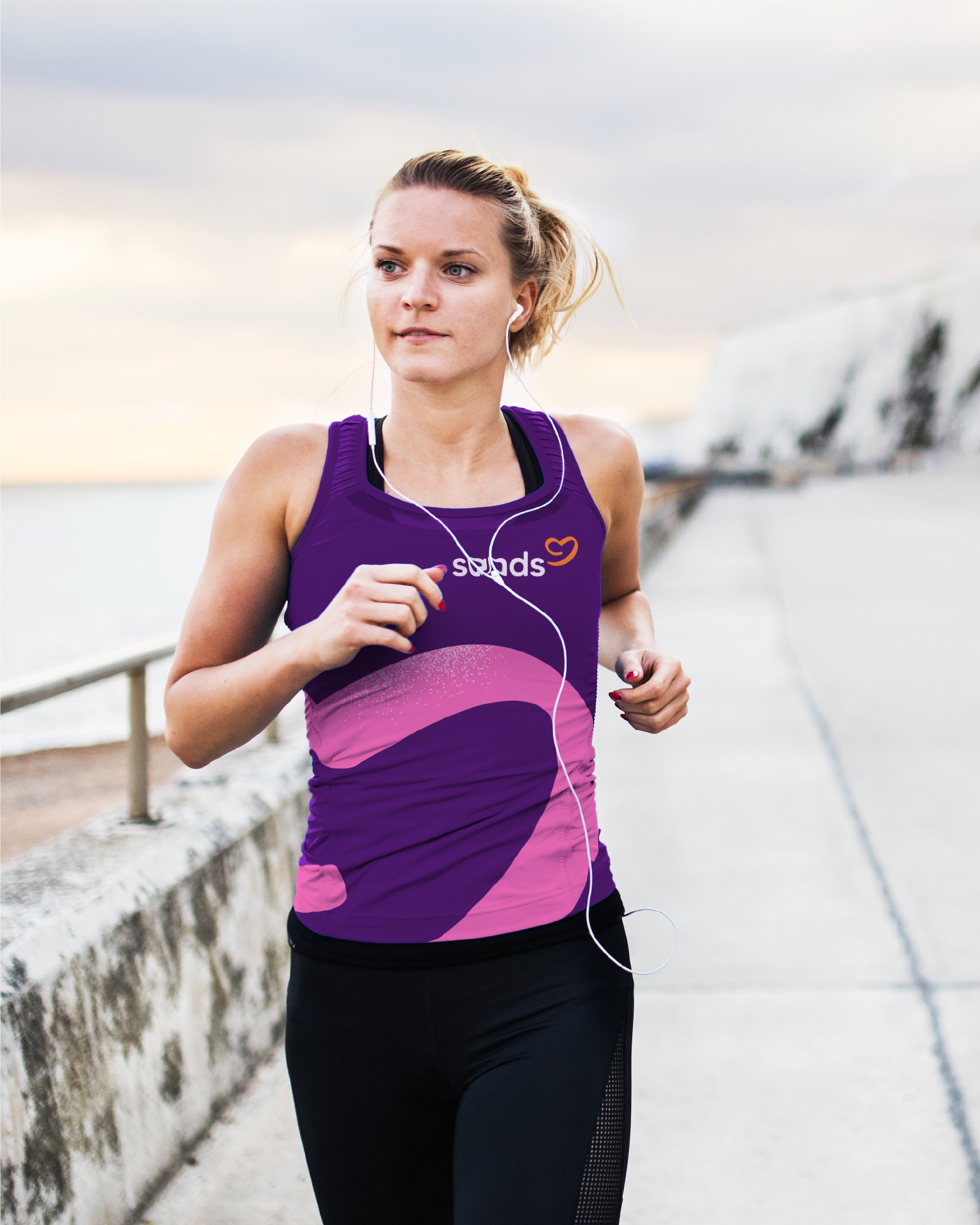
The Team’s new identity for Sands

While making the required changes, they also needed to bring people with them for whom the old brand still meant a great deal. Internally, they referred to the work as a “brand strengthening” exercise, rather than a brand refresh, because they found this resonated more strongly with internal stakeholders.

The previous logo, showing a foetus with a teardrop, was found to be “quite divisive” but it “had acquired a huge amount of emotional cachet, because of its longevity,” Miller explains.

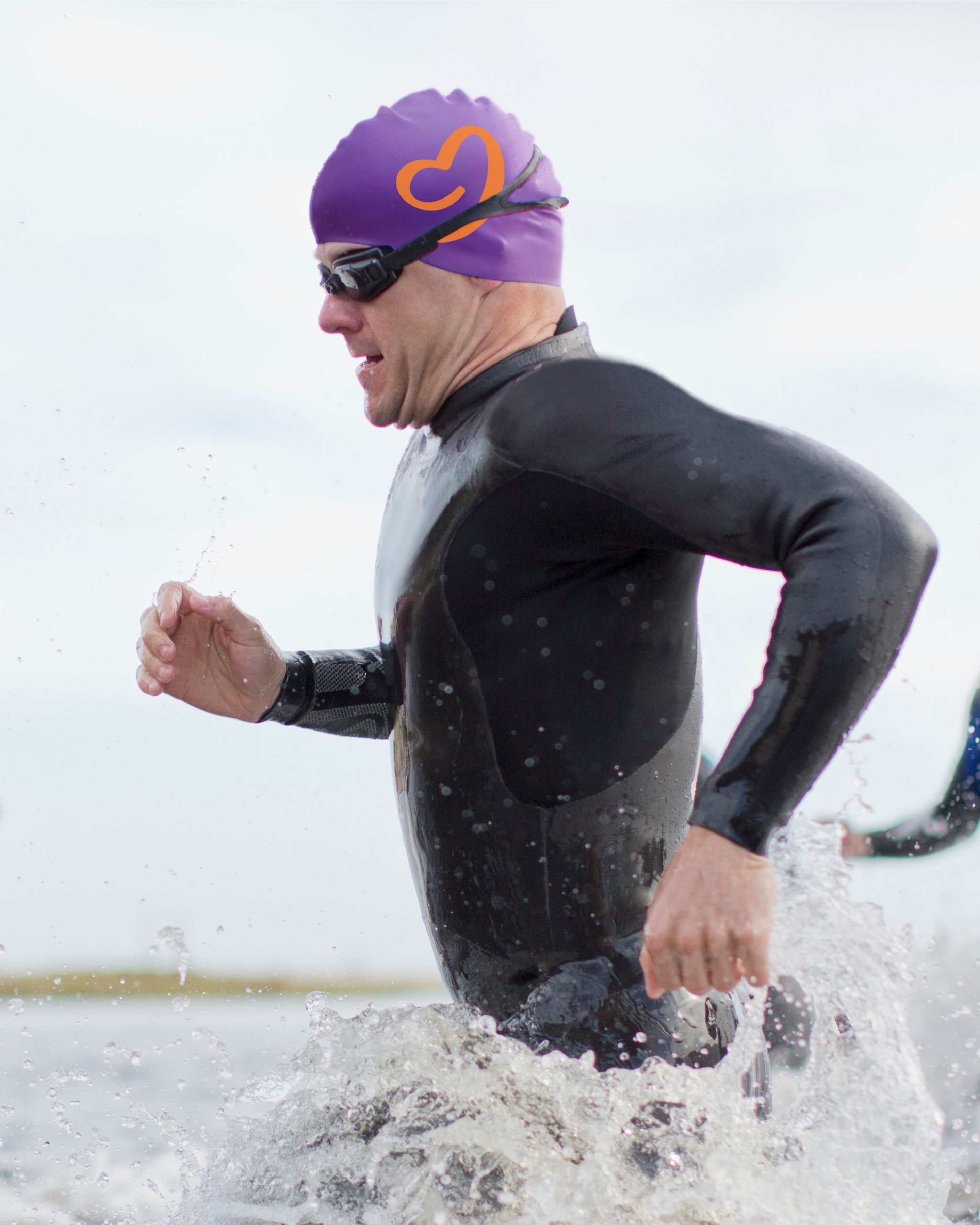
The new symbol is more abstract – some people see a heart, some see the outline of a baby in the negative space, others see a speech bubble.

“The ambiguity of the mark is its strength,” Miller says. “In the testing phase, those audiences that needed to see the support tended to see the heart. The audiences who were wanting to be more vocal around baby loss, they see the speech bubble.”

The typeface used for the wordmark is a custom version of a MADE font, which Miller chose for its “natural geometry” and “softness in the detailing.”

The name is moved into lowercase, with the two bookending ‘s’ letterforms representing “saving” and “supporting,” the two main strands of Sands’ work.

The Team’s new identity for Sands

Miller says Aggett pushed The Team to ensure that warmth and humanity showed up across every visual touchpoint. The colour palette is bright and soft, most of the shapes have rounded edges, and texture is used to ground the identity.

They also did a lot of work on the tone of voice, to land on something that could engage both parents and policy-makers, medics and researchers.

“The primary focus was to make our language more relatable and make our mission, our values, and how we work clearer and more succinct,” Aggett says.

The new look has been rolled out across the Sands website and digital channels, but its print and other IRL components will be updated on a rolling basis, to make the changes as sustainable as possible and use the charity’s funds responsibly.

But, Aggett says, they are already seeing the impact of the new branding.

“We knew there was a lot we were doing right, but it wasn’t necessarily translating to who was talking about us and who was coming to us,” she says. “The wonderful thing is that those conversations have already started to happen.”

Aggett says that research has shown that half of the UK adult population have been affected, directly or indirectly, by pregnancy or baby loss. “This is not a niche subject, and so it’s important that we normalise conversations about it,” she says.

Miller agrees, and says they want to lessen the taboos in the same way mental health awareness has transformed over the past 15 years. “We want to get to a point where it’s a lot easier for anyone who’s affected to talk about it.”

The Team’s new website for Sands


Source

By

What is your earliest design memory?

When Design Week launched in 1986, it did so with a campaign which featured pictures of churches. The point was that design, unlike some professions, is a vocation for many people, who are drawn to it on an almost spiritual level.

And like many vocations, it can take hold early in people’s lives. So we asked a range of designers to share their first memory of being interested in the way something was designed…

Jamie Ellul – A toy-packaging secret

It was Easter 1986. I was nine years old and had a dairy intolerance that gave me asthma attacks. Which meant no Easter eggs for little Jamie. Ever.

Instead, my parents always let me choose a toy. And in 1986 the toy to have was a Transformers Dinobot. I still remember getting the Diplodocus (called Sludge as you’re asking) home and unboxing it REALLY carefully.

Because I loved the Transformers packaging almost as much as the toys inside. I’d keep the boxes in my wardrobe on the highest shelf so my little brother couldn’t get his greasy mitts on them.

As a kid who loved art, I swooned over the slick airbrushed bots that wrapped around the pack. But the thing I loved the most was the scale on the back that gave you the bot’s scores out of 10 for strength, intelligence, speed etc. The stats could only be seen when you put a red acetate sheet over the top. Little did I know that was a classic graphic designer’s print trick.

A few years later we moved house. I came home from school to find that my mum had cleared out my wardrobe and binned all the boxes. I never forgave her.

Jamie Ellul is founder of Supple Studio.

Chloe Templeman – A self-designed corporate logo

I didn’t know design or branding was a thing when I was seven – but looking back, I guess that’s when I created my first logo. I can still picture it perfectly to this day.

For context, my sister and I used to play a game called “Offices,” which basically meant sitting in our room with a dial-up phone, an old keyboard, and some blank paper, pretending we ran a global empire.

To me, it was obvious our fake company needed branding. So I hand-drew a logo, made letterheads, and even designed a sign for the door.

The logo? A large X with small W, F, and C in three quadrants, and a dot in the fourth. We named the company World Fuji Cowa – reflecting our global reach and, of course, “Cowa” from “Cowabunga!” – a nod to our deep Teenage Mutant Ninja Turtles obsession at the time.

I may not have known the word for it then, but that was the moment I discovered my love for design.

Chloe Templeman is executive creative director at Pearlfisher.

Benjamin Hubert – A formative school trip

My earliest memory of being interested in how something was designed was when I was about 15. Our design and technology teacher took my class on a school trip to London – which I hadn’t visited much at that age – and we went to the Royal College of Art.

We visited the graduate show for the MA Vehicle Design, and it was really eye-opening. I didn’t even realise people studied that kind of thing at the time. The work was speculative, futuristic, highly creative and extremely varied.

I vividly remember exploring the RCA building itself – seeing the studios, the workshops, the prototypes being produced. The physicality of so many future forward visions was really inspiring.

At that point, I wasn’t using the internet that much – I was mostly using books as reference – so it was one of the first opportunities I had to see people creating design work in real life and bringing ideas to fruition.

That trip made me want to become an automotive designer and it inspired me to start building things – walking robots and tourist submarines – throughout my GCSE and A-Level years.

Later, when I studied design at Loughborough, I started to understand and focus on more of a holistic sense of human-centred design, and that paved the way for what is now LAYER.

Benjamin Hubert is an industrial designer and founder of LAYER.

Mary Hemingway – Pop-ups and paper sculptures

I remember being fascinated by pop-up books from a very young age and spending hours trying to decipher the mechanisms by carefully peering into the gaps to see how it all worked. 

My favourite was Haunted House by Jan Pienkowski (which I still have a copy of, and which I read to my son when he was little). 

This led to me being given books throughout childhood containing things that could be constructed from the pages – I have memories of a 3D paper Edwardian house and a theatre based on The Nutcracker ballet with moving parts and stage scenery. 

This fascination with how a flat piece of paper can be used in so many different ways to create imaginative worlds sparked my interest in how things are designed.

Mary Hemingway is a graphic designer and founder of Design by Women

Terry Stephens – The visual joys of multi-pack cereal

When Kellogg’s reintroduced the variety cereal multipack in 1989, eight-year-old Terry was hooked.

In our house, it was very much a “summer holidays treat” – I can still hear my mum saying those words – and while most kids cared about the sugar and/or the hidden toy, I was fascinated by the packaging.

Those tiny, cellophane-wrapped boxes were a riot of colour, bold typography, and playful mascots – a true assault on the eyeballs.

I became so obsessed that I’d redraw the covers one by one. I’m not sure why the multipack fascinated me more than single boxes, but there was magic in seeing them together – clearly part of a set, yet each bursting with its own individual personality.

A miniature house of brands, wrapped in cellophane. What’s not to love?

Not only was it the start of my interest in design but quite possibly the start of my fascination with Mass Fantastic® branding…

Terry Stephens is founder and executive creative director of Nomad.

Yas Banks – Fashion doodles and over-the-top cards

Honestly, it probably started with a notebook I took everywhere as a kid – packed with doodles of people and my own little fashion designs. I was convinced I’d be a fashion designer.

What fascinated me most was the process – layering textures, mixing fabrics, experimenting with shapes, and deciding how something should look and feel. I work in a different practice now, but that early love of process still shapes where I find inspiration today.

There was also a family friend with a full-on card-making set-up in their living room: textured paper, 3D flowers, buttons, glitter glue, the works. I’d spend hours making the most over-the-top greeting cards.

At the time, I thought I was just having fun, but looking back, I was quietly falling in love with lay-out, typography, and the calm satisfaction of bringing visual elements into balance.

Yas Banks is a freelance graphic designer.

Isaac Sodipo – Cars that looked fast

As a child, I was always drawing. I’d sketch anything I saw, from cartoons on TV like Sonic the Hedgehog, to cars I spotted in real life.

Fast cars in particular fascinated me. I was obsessed with the sharp, angular lines of Lamborghinis, the wedge shapes, bold spoilers, speed vents, and the magic of pop-up headlights. I didn’t know it at the time, but I was beginning to notice the design details that made these cars feel so different from the Ford Escort my parents drove.

They weren’t just fast, they looked fast.

Eventually, I started adding those features to my own car drawings, making up designs that blended what I saw with what I imagined. While I didn’t go on to design cars, that early fascination with form and feeling has stayed with me.

Today, working in graphic design, I still think about how subtle details like shape, colour and typography can shift how something is perceived. Looking back, I realise I’ve always been drawn to the way design can express personality and intent, even in something as simple as a sketch of a car.

Isaac Sodipo is design director at Coley Porter Bell.

Anna Burles – A hideous self-made dress

My earliest memory of getting intrigued by how things were actually made was through dabbling in dressmaking. My mum remembers me buying a sewing pattern and some lemon and pale blue fabric at the age of 11 and making an 80s batwing sleeve dress from it.

It was quite hideous, unflattering and very amateurish (much harder than I thought!).

But I loved the process and became obsessed with having my own room, not just to get some space from my brother and sister, who I shared a room with, but so I could decorate it the way I wanted.

I was in the Toyah Willcox fan club at the time and had dyed my fringe with an orange/pink flash, so I remember draping neon bright scarves from the walls and ceiling around my bed to create what I thought was a punk rock four poster.

Anna Burles is creative director and co-founder of Run for the Hills.

Greig Anderson – The logos that defined my life

Looking back, I’ve always been drawn to design – I just didn’t know it had a name.

As a kid, I was fascinated by how things worked and why they looked the way they did. My dad, a mechanical engineer, would take things apart and rebuild them, and I’d watch, amazed by how he seemed to understand it all.

I was more drawn to logos – tracing them, redrawing them on my school bag, skateboard, and jotters. I remember drawing the Chicago Bulls logo over and over until I could do it from memory. It’s funny how it always comes up as one of those logos that when flipped, it looks like an alien reading a book.

The Vans logo, Nike logo variations, and Oasis wordmark filled the rest of the space – icons of the things I loved most as a teenager.

One day in fifth year, a careers advisor saw my sketches and asked, “Have you ever thought about being a graphic designer?” I hadn’t even heard of the job before.

That simple question planted a seed that’s shaped everything since. Funny how the things we do for fun as kids often hold the clearest clues about where we’re meant to go.

Greig Anderson is creative director at Freytag Anderson and AND Golf.

Source

By

Ministers won’t release research behind GOV.UK brand refresh

The UK Government has refused to release any research or work-in-progress designs related to the recent brand refresh of GOV.UK.

The Department for Science, Innovation and Technology (DSIT) has rejected a Freedom of Information (FOI) request from designer Matt Eason, who was curious to see how the new branding was developed.

He asked to see audience and user research, initial concepts, in-progress designs, and, “any documents, reports or presentations showing the progress of the rebrand, including the GOV.UK logo and wider design language.”

In March last year, the Government Digital Service (GDS) which oversees GOV.UK, awarded a £100,000 contract to user-experience firm Lnet, to provide “research and insight that will inform the development of a new brand identity for GOV.UK.”

It then worked with ad agency M+C Saatchi on the brand refresh, which was tasked with appealing to “the broadest possible audience” across the website, the new GOV.UK app and social media channels.

The project was reported to cost £532,000 and the DSIT published new brand guidelines for GOV.UK in June.

”As we increase the number of places that people meet GOV.UK… we need our brand identity to do more,” the new guidelines explain.

“It needs to be able to compete for attention in busy environments like social media, be equipped to come to life when used in formats including video, while remaining approachable and welcoming for all the people we serve.”

As part of the new identity, the dot in the wordmark moved up off the baseline to make the name look less like a web address, and it was used more broadly as a graphic device across different channels, as a “guiding hand.”

The new guidelines also confirmed the use of primary blue and accent teal as the “core brand colours.”

While the brand refresh – and its cost – received predictable mockery in the right-wing media, Eason’s FOI request is about professional interest.

“It’s not meant to be a gotcha, I’m genuinely curious,” he explains.

Eason is head of design at Fivium, a software company that works with GOV.UK services, and he has implemented some of the new branding across various projects.

“I am really interested to see what the process was from a user-sensitive design point of view,” he says.

“What was the research that pointed to the existing brand not working well for some people? Why did they think that it had room for improvement? What were the different iterations and did they go a bit more wild and wacky with it, because obviously the new logo is fairly similar to the old logo?”

“Is it effective in solving the problems that it was designed to solve? That’s why I want to see the research.”

Eason says he thought it was “a fairly uncontroversial request.” But the DSIT disagreed.

In its reasons for withholding the information, it cites the risks of “premature disclosure” whereby people might, “misinterpret incomplete or preliminary information, leading to unnecessary speculation and concern.”

It also said that, “Ministers and officials require a safe space to discuss and consider strategies that may lead to formal policies without external pressure. Disclosure could inhibit free and frank discussions, leading to less effective policymaking.”

Finally the ministry said some information was already in the public domain, referring to the brand guidelines.

Eason believes the refusal to share the documentation is a missed opportunity to understand how this ambitious government design project played out as a process.

“It’s a very unique brand because it’s meant for almost everyone,” Eason says. “There’s obviously some research that shows it wasn’t trusted enough amongst some areas of the population. It would be really interesting to see why that was, so it could feed into other areas.”

And he thinks that showing “all the thought and care that went into it” might blunt some of the criticism of the project.

But above all, he is frustrated that the decision goes against one of the GDS’ Government Design Principles, which states, “Make things open: it makes things better.”

“We should share what we’re doing whenever we can,” the principles say. “With colleagues, with users, with the world. Share code, share designs, share ideas, share intentions, share failures.”

This idea is re-iterated on the official Design in government blog, whose boilerplate reads, “We believe working in the open makes things better.” Its newsletter is called Open Notes.

Writing on LinkedIn, strategist Adrie van der Luijt was one of several people who echoed Eason’s dismay at the decision.

“The GDS has a long track record of publishing design decisions, user research, even rejected concepts,” he wrote. “That openness has earned trust. It also clearly informs the work of anyone who contributes to GOV.UK and GOV.UK-inspired services.

“If there’s research backing it, let’s see it. If not, we deserve to ask why public money was spent on something so user-facing, with so little transparency.”

The most in-depth context around the brand refresh was published by a frontend developer on the GOV.UK Design System team, who blogs as beeps.

It explains that user research found that many younger people saw GOV.UK as “monolithic, unfriendly, and even intimidating” and points out that the new logo was “just square one of a process that’s going to continue for many more months.”

The article also mounts a robust defence of the money spent on the project, in response to headlines like that in The Daily Mail, which screamed, “Absolutely dotty! Government blows over half a million on ‘vanity’ makeover for website which involved moving a full stop.”

“This perspective only focuses on the logo, and completely ignores the other additions to the brand that are being introduced over time,” beeps writes.

“It ignores that everything was tested, prototyped, refined, and tested again dozens of times with members of the public. It might not be obvious from a single side-by-side graphic, but a lot of time went into interrogating what we had and experimenting with what could be added.

“It was the full-time salaried efforts of dozens of design, development, and delivery specialists for more than a year. By that metric, it’s actually quite cheap.”

Eason plans to appeal the DSIT decision. He says he’s got used to the new designs, although he doesn’t actually think that’s important.

“Personally I like the blue, but I’m not keen on the dot,” he says. “But overall, I don’t really care what my personal feeling about it is. Is it effective in solving the problems that it was designed to solve? That’s why I want to see the research.”

The DSIT did not respond to a request for comment.

Source

By

Range Rover “recodes DNA” with new wordmark and motif

Range Rover has introduced a new visual motif and a redrawn wordmark as part of Jaguar Land Rover’s strategy to build a “house of brands.”

Owned by Tata and based in Warwickshire, JLR’s portfolio comprises Range Rover, Defender, Discovery and Jaguar. It wants to create four distinct brands, each with its own positioning and marketing strategy.

“We don’t have any brands, they’re just four names at the moment,” JLR’s design director Richard Stevens told us last year. “Range Rover is the closest thing we have to a brand.”

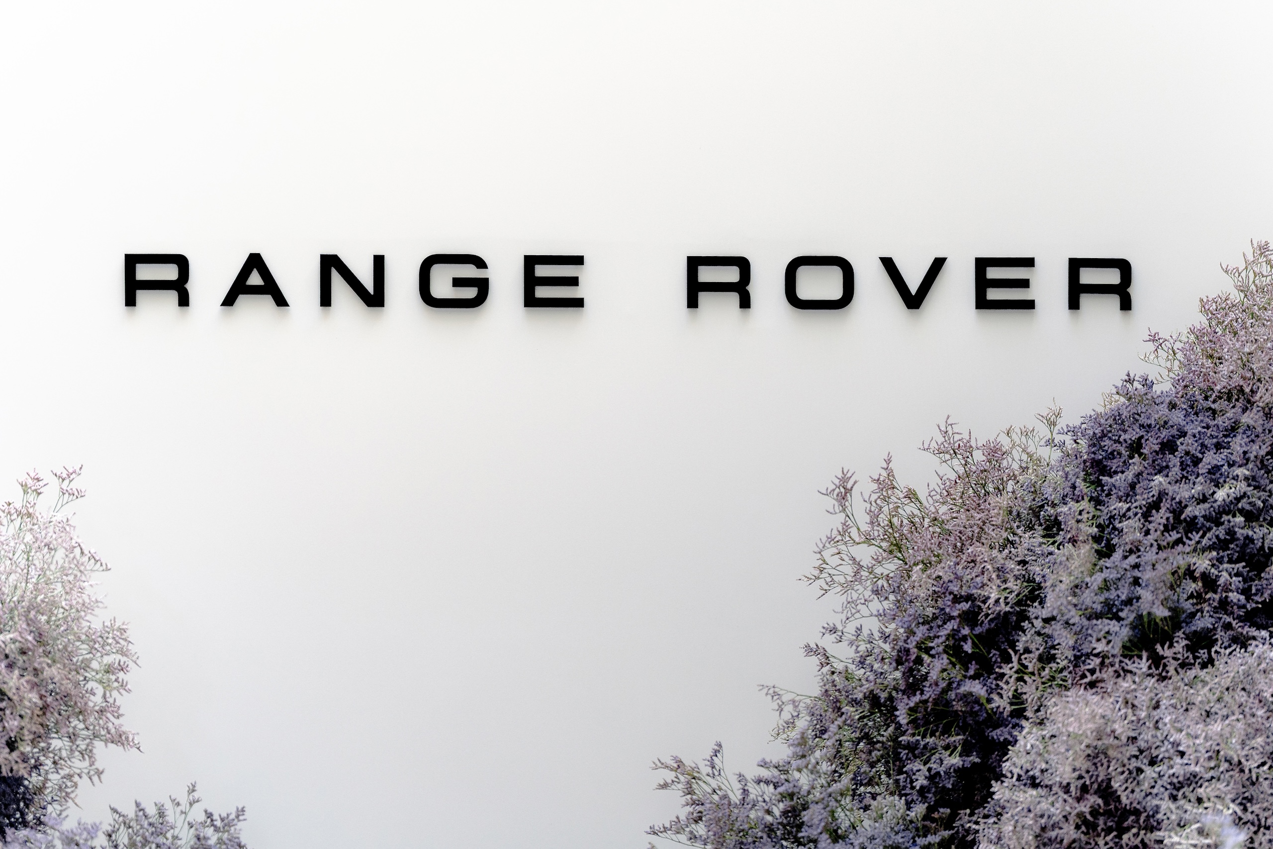
The old Range Rover wordmark (left) next to the new one

The new work for Range Rover began two years ago, well before the launch of the much-talked about Jaguar rebrand, explains brand design chief Will Verity.

He and his team have been “decoding and recoding Range Rover’s existing DNA into a set of guidelines that support modern luxury communication.”

The aim is to celebrate the fact that Range Rover, which was launched in 1970 by British Leyland, was the first automotive brand to combine utility and luxury.

Verity, who joined Range Rover from Map Project Office last October, called Range Rover’s original mark “bold, confident and quite elegant,” but he said that, “bits of it were quite weird.”

Every letter of that original mark has been recrafted for the new wordmark.

“We’re trying to revive the character of the 1970s mark, while translating it into a more confident, contemporary expression of the brand,” he says.

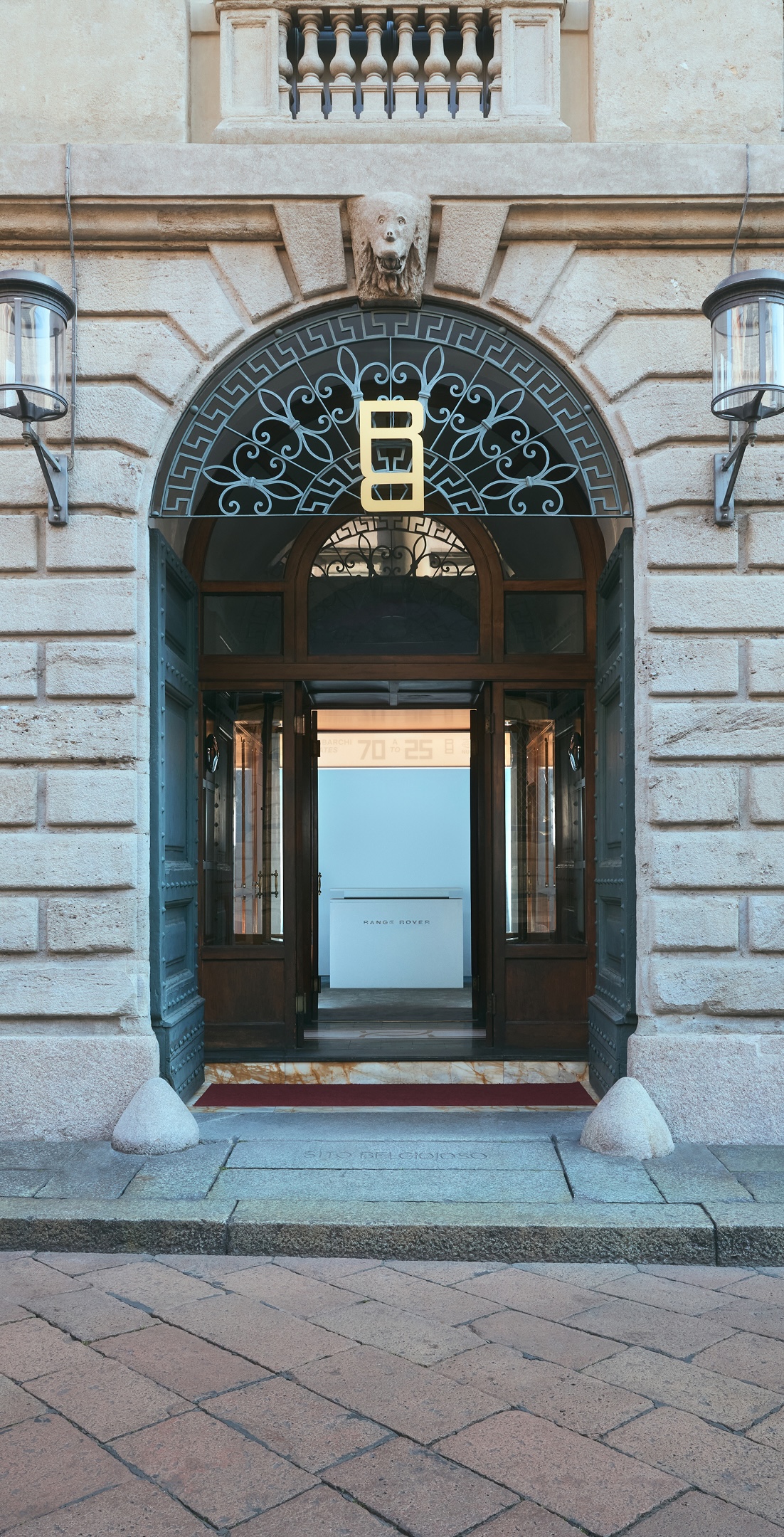
A label on the Range Rover London collection

Verity and his team have also introduced a new visual device that acts as a shorthand for the brand, to be used in small spaces like a label or a social media image.

It comprises two connected Rs – one upside down – playing on the letter’s tension between a sharp corner and a radius edge. Verity suggests this could work in retail signage and on apparel, and could be extrapolated into a pattern.

“It’s not revolutionarily different from where we were, but hopefully it just feels a little bit more sophisticated, more elegant and a more consistent, coherent approach to where we’re moving to, in terms of luxury positioning,” he says.


Range Rover is just the latest in a swathe of brand changes among high-end car manufacturers.

Most recently, Bentley revealed a simplified logo. Before that came Jaguar’s audacious repositioning, and Rolls-Royce, Lamborghini, Porsche, Lexus, Aston Martin, BMW and Audi have refreshed their identities in recent years.

Middle-of-the-road brands have got in on the act too – Toyota, Peugeot, Kia, Volvo and Nissan all introduced new or tweaked visual identities in the early years of this decade.

All of these companies are responding to a host of challenges, most pressingly the rise of electric vehicles – often produced by new makes such as Polestar, Rivian and Rimac – which has blown apart the old rules.

The new Jaguar logo, by Jaguar Land Rover’s in-house design team

In June, 47,354 EVs were registered in the UK, just under one in four of all new car sales (24.8%). That’s up more than a third compared with June last year, although sales haven’t yet hit the government’s target of 28%.

The glut of new EV brands has fundamentally changed the car-buying landscape.

“It has posed a question to the existing brands,” Verity explains. “What is your unique positioning in the world? What is your heritage? Where have you come from, and why?”

Couple that with the fact most car brands were not designed to work on digital touchpoints, and “change needed to happen,” says Pentagram partner Marina Willer.

Luxury models in particular needed to rethink their digital expression, because “they offer more sophisticated UI experiences and need the brand tools to do so,” Willer says.

Pentagram’s new identity for Rolls-Royce in 2020

She saw this first-hand when her team rebranded Rolls-Royce in 2020.

“We worked to give the brand the simplicity needed for the digital world, combined with texture, depth and sophistication,” she explains.

Then there’s the audience shift. Many luxury care brands want – and need – to attract younger audiences, and diversify the sort of people who see themselves behind the steering wheel.

As part of their work, Willer says they wanted to shift Rolls-Royce, “from a masculine world into a much more inclusive brand.”

And as the target customers change, so too do the visual codes that have long underpinned the high-end car brands.

“The signals of luxury that once worked – power, prestige, design purity – don’t really land the same way today,” says Will Bosanko, UK & Europe CEO at brand consultancy Brandpie. “A new generation won’t buy the badge unless it means something, or fits how they live.”

That’s what seemed to be lost in the Jaguar furore when it unveiled its new identity last autumn. A common criticism – that it didn’t look anything like Jaguar – was, the company insisted, sort of the point.

But it’s a complicated balance to strike.

These brands need to work out how to look future-focused and relevant while wondering how – maybe even if – to accommodate the heritage they’ve spent decades trumpeting.

“These brands are standing at a crossroads – legacy equity on one side, future irrelevance on the other,” Bosanko says.

Pentagram’s new identity for Rolls-Royce in 2020

Many find a solution in a similar visual approach – “more direct, simple and digital-first,” as Willer puts it. But, she warns, this can start to feel samey.

Bosanko goes further. “It’s all starting to blur. Flat, soft, sanitised,” he says.

“In chasing modernity, these brands are erasing the very things that made them distinctive. Somewhere along the way, ‘minimal’ became shorthand for ‘strip it all away’.”

Not every brand though has gone all-in on a new look. Sebastian Conran, chair of Conran and Partners, points out that Ferrari hasn’t been touched – yet. “Perhaps because the prancing horse has got so much invested in it,” he says.

The luxury car brand pivot

A couple of weeks ago,  Bentley unveiled a simplified logo, based on a concept by one of its interior designers, Young Nam. Bentley called this latest iteration “the biggest change to the instantly recognisable mark in more than a century of history.”

The new Winged B emblem designed to channel the spirit of the 1919 original

Last year, Jaguar’s new in-house branding aimed to radically reposition the make, whose future vehicles will be 100% electric and around twice as expensive as current models. Due to the outcry, it was one of those rare design stories that crashes the mainstream news bulletins. But recent reports that its sales had tanked as a result of the rebrand were wrong –  JLR had stopped selling cars in preparation for the new models.

Earlier last year, Lamborghini’s redesign featured a tweaked wordmark and the introduction of gold as an accent colour. The charging bull at the centre of the logo now exists on its own on the company’s digital touchpoints, separated from the black shield. The redesign also includes a new set of icons, developed in collaboration with Lamborghini Centro Stile.

The redrawn Lamborghini logo

Porsche modernised its crest for its 75th anniversary in 2023. “We have reinterpreted historical characteristics and combined them with innovative design elements such as a honeycomb structure and brushed metal,” its chief designer Michael Mauer said at the time. “The result is an aesthetically ambitious arc that bridges the history and the future of the brand.”

Peter Saville refreshed Aston Martin’s logo in 2022. “The Aston Martin wings update is a classic example of the necessary evolution of logotypes of provenance,” Saville told Dezeen.

That same year, Lexus announced that its vehicles would now sport a simple Lexus wordmark on the back, instead of its angled L in a roundel.

In 2020, Pentagram created a new identity for Rolls-Royce, in an effort to modernise the brand and appeal to a more diverse audience.

Pentagram’s work included a new wordmark and typeface, and a refined version of the brand’s Spirit of Ecstasy symbol.

Also in 2020, BMW reworked its metallic emblem with a black outer ring in favour of a transparent, flat, minimal version with help from Munich studio BECC Agency.

And in 2017, Audi – perhaps ahead of the game – was given a new visual identity by German design consultancy Strichpunkt, which aimed to make it a digital-first brand, and help it function better across online platforms, including in-car interfaces.

Source

By

design/leader: TEMPLO co-founder Pali Palavathanan

Pali Palavathanan is co-founder and creative director of London-based TEMPLO. The cause-led branding and comms agency works with clients like GF Smith, the British Council and the United Nations.

Design

What would your monograph be called?

The Red Box. I grew up as a refugee in Canada, and every year we got our Christmas presents from welfare – a red box full of gloves, woolly hat, scarf as well as some small toys.

One year the boxes for both me and my sister didn’t arrive, which was obviously a sad moment. A month later, my sister and I were building snowmen and my hand hit something hard in the snow. The Christmas boxes had been delivered, but placed behind the house as no-one was in.

It was one of my happiest moments and still stays with me today – as proof of humans’ need to care for others more than ever, and the belief that governments have a duty to help families get back on their feet. You can look back at TEMPLO’s body of work and trace it all back to these moments I experienced growing up.

What recent design work made you a bit jealous?

Being a massive Liverpool fan, I’d love to have tackled the recent rebrand. Knowing what it means to the people of Liverpool and the club’s social responsibility, it would be a fantastic privilege. And the fact they’ve just become Premier League champions again would be the icing on the cake.

Bulletproof’s newly refreshed brand for Liverpool FC

What’s an unusual place you get inspiration from?

Ideas come from all sorts of places – you just have to be open to them. Everything from lucid dreams and that half-state before waking to listening to intense political commentary can trigger a new creative path to explore.

Often, I find that my meandering walk to the studio, which has no pre-determined route, exposes me to enough of the ever-changing environment and the accidental collisions of everyday life to dislodge creative blocks, and activate new ways of thinking.

Name something that is brilliantly designed, but overlooked.

The Universal Declaration of Human Rights (1948).

What object in your studio best sums up your taste?

My collection of puzzles and Rubik’s cubes. I am obsessed with problem-solving – I always carry some on me.

Some of Pali Palavathanan’s puzzles

Leadership
What feedback felt brutal at the time, but turned out to be useful?

I remember coming home from school, proud of getting 96% on a test. My mother looked at me and, without blinking, and asked where the other 4% was. I love that immigrant mindset – the fierce work ethic, the constant pursuit of better. It has definitely helped me push myself forward in my career.

What’s an under-appreciated skill that design leaders need?

The willingness to create an environment where other people can have better ideas than you.

A good design leader should avoid smothering the creatives, allowing space for other designers to develop and gain confidence – to express themselves and not feel the need to show me something I was already expecting. I enjoy it when others show me a better, newer way.

I would hate to be stuck within my own ideas, knowing only what I already know.

What keeps you up at night?

Injustice.
The future.
Black holes.

What trait is non-negotiable in new hires?

The one thing I cannot help nurture or teach is fire in your belly. That thirst and hunger to keep pushing, to not accept mediocrity – to find that missing 4%.

Complete this sentence, “I wish more clients…”

… didn’t treat design agencies as suppliers and, instead viewed them as partners in the creation of real, meaningful change.

At TEMPLO, we do our best work when there is a strong mutual trust, and a genuine co-creation process rather than a transactional relationship.

Source

By

“Design thinking isn’t dead – it’s more crucial than ever”

Every now and then, business magazines, especially Fast Company, announce that design, and especially design thinking, is dead.

In Andrew Thompson and Mark Wilson’s most recent article, they investigate the drop in mentions of design thinking from US employers who are looking for UX, product or graphic designers.

They go on to state that the steps incorporated in the design thinking process are irrelevant – essentially  not any different from a simple hypothesis-and-test scientific model. Worse than that, they claim design thinking has polluted and diluted the value of design.

From a European perspective, the US obsession with – and then rejection of – design thinking is puzzling. The term is not particularly loved, but it has led to a more strategic view of what design is, and that has become more naturally embedded, with great success, in both the commercial and public sectors.

As a young designer, I was all too aware that most of the decisions around the product I was designing had already been made. Usually by people who were looking inward – to the efficiency of their organisation, or the ease of production.

They didn’t know, and in many cases still don’t know, anything about their customers.

They saw, and still see, innovation as jumping onto each new technology wave, without ever asking what problem it was solving.

Design thinking helped me understand how to find about the people I was designing for, see where and how things weren’t working, and develop, prototype and iterate better solutions. It helped me move on from putting lipstick on a pig, move upstream, and show how design can really add value to business. I mean, what’s wrong with that?

Unfortunately, we still live in a world where agile working, measured by the velocity of delivery, and siloed design, is somehow seen as better than understanding the problems you are solving.

The macho, tech-led approach to progress costs us millions in reworking solutions that don’t connect to customers, or their real problems and needs. In the worst cases this causes real damage, as with the initial Medicare roll-out in the US, and the Post Office Horizon scandal here in the UK.

Design thinking ,and methods such as the Design Council Double Diamond, that differ from science in that they search for human insight before they hypothesise, are fundamentally risk-reduction processes.

The Design Council Double Diamond

What the article describes as unwieldly processes are there to check the ridiculous and poorly-articulated assumptions of leaders, managers and designers, and to replace them with insights that identify not just the problems that need to be solved, but also where real customer value and opportunities lie.

When we don’t think about design, we mess up.

Take the “world class” track and trace system, announced by the UK government in response to the Covid pandemic. They believed they had all the right ingredients in place – but they didn’t think to understand who they were designing for.

People thought they were being scammed and those working in the call centres seemed to have limited training and partial, if any, information. The elements of the system were in place, but there was no overall system design. Or rather there was design – there is never no design – just unconscious and accidental. It cost them £36 billion to fail spectacularly.

On the other hand, global companies such as Bosch have integrated design thinking into their corporate strategy. Its approach is to design for AI as a customer benefit, design for inclusivity and accessibility, design new service models for a more sustainable world, and use service design thinking to understand customer journeys, as well as the product. They apply design excellence to them both.

Unfortunately, many businesses still compartmentalise design as an end-of-the-process activity to make previous decisions palatable.

Companies cut design first in hard times, and jettison the very talent that will produce future success. And the corporate world has been slow to see the strategic value of design.

Businesses liked the fad of design thinking as it seemed cool, but great design thinking leads to great design outputs, not replace them.

We are seeing design more alive than ever as it morphs into new areas beyond the screen, or the product, and finds the levers for change in business, policy making, social impact and humanising technology.

In my book I call it Redesigning Thinking, helping everyone embrace the desire to find the problem before we create meaningless solutions without insight or with data-free hunches.

Now more than ever, business needs to redesign its thinking, embrace a younger, purpose-led generation of smart and creative people to make better decisions, and work with brilliant young designers to deliver real, future-proofed and sustainable value.

Design, and the methods of design, applied beyond the object or interface, is very much alive. It is business that is at risk of not rising to the challenges, both now and in the future.

Clive Grinyer is a service designer who has led global teams at Samsung, Cisco, Orange and Barclays. His book, Redesigning Thinking, is out now.

Source

By

The Lionesses have guts, swagger, and a brilliant brand

Last week, I took my son to London for a couple of days’ sightseeing.

There was an uncomplicated joy in seeing the city through his eyes, because he was awestruck by everything, from the genuinely impressive (Big Ben) to the objectively crappy (glittery keyrings with Princess Diana’s face on them).

The Tube provoked a giddy rush of questions, exclamations, and more questions. He read every ad, every sign and every poster, thrilled when he recognised a word in this noisy, alien, underground world.

“Lioness” was a big one, spotted on the list of London Overground lines. I explained that it was the nickname for the England women’s football team, that they had a line named after them because they won a trophy, and that they were playing a semi-final the very next night.

“Daddy,” he said. “If they win again, will people care as much as they do about the men’s team? Or is that too much to hope for, given the stubborn inflexibility of our patriarchal culture?”

Course he didn’t. He’s five, and I’m not a mendacious LinkedIn influencer.

In reality he spotted a picture of Super Mario on a nearby film poster, which immediately snaffled his complete attention.

But as I tried to ignore questions I couldn’t answer about the adventure-hungry (read, unprofessional) Italian plumber, I did marvel at how well the Lioness brand has infiltrated our sporting, and then wider national, identity.

A low-key start

Reflecting on the last Euros triumph in 2022, journalist Jacob Whitehead noted how ubiquitous the brand had become.

“There were Lionesses on jerseys, Lionesses on hoardings, Lionesses on pub signs and in newspaper headlines,” he wrote. “It has become one of the most powerful sporting brands in the UK. In a landscape filled with marketing spiel, it has truly been taken to heart by the team.”

But the initial adoption of the Lioness name was low-key, and gradual. A writer called Glenn Lavery was hired by the Football Association (FA) for the 2007 World Cup, and he started using it in his copy as an alternative to repeating “England.”

In 2012, an FA marketing manager called Leigh Moore used it as a Twitter hashtag before a match against the Netherlands, motivated in part by frustration that the game was being overshadowed by the England men’s team’s dismal showing in that summer’s Euros.

The name grew in popularity, both inside and outside the England camp.

It was memorable and evocative, and gave the team its own identity. Previously they were usually referred to as the England Women’s team (the men were always just England) and this extra word seemed to act as a caveat, making the team feel lesser.

At first, the Lionesses was more a name than a brand, but that changed when the FA commissioned Matta to look at the identity for the women’s team. The brief called for a unique brand that the women’s team could own. Matta’s strategists pointed out they already had one – they just needed to build on it.

The brand grew, through the 2015 World Cup, the 2017 Euros, and the 2019 World Cup, where Nike weaved the name into the England kit for the first time, which Moore has called “a tipping point.”

That’s when, he says, the media started using it automatically when referring to the team.

Then came the COVID-delayed 2021 Euros, played in 2022, with the Lionesses winning the trophy on home soil.

Chloe Kelly whipping off her shirt to celebrate the winning goal at Wembley; the heroically hungover team karaoke-ing through a victory party in Trafalgar Square; and among many other plaudits, the decision to name the Lioness Line.

Like all great brands, its success seems inevitable in hindsight. But of course it wasn’t.

Some players worried it was gimmicky and childish. But most embraced it, and Moore persuaded the doubters by pointing out how well respected sporting brands like the All Blacks and the Springboks are.

And like all great brands, the messaging and the product go hand-in-hand. The team’s success has galvanised the brand, imbuing it with cachet and credibility.

Now it’s much more than a name; it’s multi-dimensional.

A brand built on every interaction

Speaking on the Uncensored CMO podcast last week, Kraft Heinz CMO Todd Kaplan compared branding to pointillism, the artistic style where small daubs of paint cohere into a picture when you stand the right distance away.

“Every time someone has a brand interaction, it puts a little point in someone’s brain,” Kaplan explained. And when “those points cluster over time,” it creates brand perception.

That’s how I feel about the Lionesses brand. It’s not just every kit launch or social media graphic. It’s every press conference and post-match interview, every visual, verbal and mental cue. It’s every dot.

When the Lionesses win, there is a tendency in some quarters to use their success as a stick to beat the men’s team. Unflattering comparisons are drawn, based on performance and personality.

This overlooks the huge strides made in recent years recasting the England men’s team, particularly under Gareth Southgate’s intelligent and empathetic leadership.

But forget the men’s team for a moment. The Lioness brand is one of the great creative success stories of the past 20 years.

It has navigated two challenges we write about a lot on Design Week – the need for older brands to marry past, present and future, and the need for brands which have a strong associated brand to differentiate itself, without abandoning all of the shared DNA.

But it has also succeeded in a very specific context. It’s created a brand of England and Englishness which feels modern, inclusive and exciting, at a time when living in England, and being English, can sometimes feel anything but.

Source

By

In design we trust – the chief design officers reshaping the public sector

When asked to name a chief design officer, a few names likely come to mind. Sir Jony Ive at Apple, John Hoke III at Nike, or perhaps Mauro Porcini, who, after nearly 13 years as PepsiCo’s longstanding CDO, departed earlier this year – only to re-emerge days later as Samsung’s first.

But commercial businesses aren’t the only ones taking design seriously, or, as in Samsung’s case, competitively.

Governmental interest in design is gaining momentum, at a time when trust in representative institutions is at its lowest in decades. Design thinking – an iterative, human-centred approach to creative problem-solving – has long been praised for its focus on innovation through empathy.

And while authorities – and the people represented by them – seem to be growing further apart, designers are stepping in to rebuild trust and shape better, more reflective policy.

A new wave of chief design officers is bringing the voice of democracy back into design.

Design first, policy second

Not every authority will find its own Jony Ive, explains Professor Emma Hunt, chief executive of Cornwall’s creative university, Falmouth. But designers are great at clarifying complex systems, and they’re especially skilled at “extracting from non-designers exactly what the real problem is.”

Cornwall itself has a storied appreciation of design – one of the first representative authorities to appoint a chief design officer, Professor Andrea Siodmok, in 2011. That legacy still resonates in the region today, according to Hunt.

She commends the council’s early and progressive stance on bringing creatives to the table, and praises Siodmok as a catalyst. In her own words, Siodmok’s mission was to reject the legislative “business as usual” approach.

Acknowledging that 90% of design decisions are not made by designers themselves, she set out to elevate the importance of design to the elected board and its key stakeholders – championing a new approach that placed “local people’s needs at the heart of decision-making.”

Mauro Porcini, Samsung’s first chief design officer

As co-founder of the All-Party Parliamentary Group for Design and Innovation, Professor Hunt is an advocate for the application of design thinking across broad societal issues of education, housing, or health – and importantly, quality of life.

For example, the county launched a five-year research programme exploring the impact of design and creativity on mental health that responds to a government report on the health inequalities facing underserved coastal communities.

Wrapping up in Falmouth next month, the project has brought together a team of psychiatrists, psychologists, and youth workers with artists, film-makers, and game-developers to re-examine the future of mental health care.

Working closely with Cornwall Council more than a decade on from Siodmok, Hunt praises the region’s Fairness Commission, which still puts design first and policy second. “When people complain about bad design, it’s usually because design hasn’t been involved,” she explains.

It’s perhaps no surprise that she often looks north, to Scandinavia, for examples of best practice.

Happy by design

Finland has just topped the UN World Happiness Report for an unprecedented eighth successive year – and close behind are Denmark, Iceland, Norway, and Sweden. Is design linked to happiness? Many Nordics, including Hanna Harris, Helsinki’s chief design officer, think so.

Happiness will be a focal theme for September’s Helsinki Design Week, which celebrates its 20th iteration this year. Harris cites “belonging” and “dignity” as vital to happy, healthy communities, and sees design as a tool for delivering them at scale.

And happiness, she explains, starts early.

Helsinki’s new computer-themed playground. Photo courtesy of Monstrum.

Helsinki – which often puts the wellbeing of its youngest citizens first – was recently recognised by UNICEF as a “Child Friendly City,” and just last year opened the world’s first screen-free computer playground. A major investment in the digital literacy of future generations, the project is a prime example of putting design thinking into practice.

Its brief, unconventionally, asks – What if the tools of technology could be learned through climbing and crawling?

Harris reflects on a conversation with children at a local school, who when asked to explain the value of design thinking, gave answers that centred on one word – “together.”

Whether it be ideating together, testing together, or even failing together, Harris thinks they’re right. “If we can enable this, across society at large, then there’s hope yet,” she says with a smile.

It’s an optimism that Kaarina Gould, former programme director of Helsinki’s year as 2012 World Design Capital, certainly shares.

She’s leading the development of a new Finnish Museum of Architecture and Design, scheduled to open in 2030. Its mission lies in “democratising the tools of design,” which, Gould explains, lays the groundwork for “a strategic approach to governance and civic life.”

Democratising design

The Scottish Government has been equally forward-looking and had a chief design officer in post since 2018 – the same year as the landmark opening of its first design museum, the V&A Dundee.

Just last year, Dundee, a small but ambitious creative capital, celebrated a decade since its status as the UK’s only UNESCO City of Design.

Union Street’s retail unit – a place for co-design – where the project team engaged with local community. Photo by Grant Anderson.

Dr Stacey Hunter, creative director of the Dundee Design Festival, praises the Government for embracing design, but makes it clear that there is still much work left to do.

“Design needs to become a serious priority at a strategic level,” she says, and points to projects co-designed with communities that are local success stories but still need greater investment to scale.

She references the pedestrianisation of Union Street in Dundee, which, in its early stages, based a design team out of a former retail unit on the street itself.

The shopfront formed a pivotal location for meeting local businesses and residents, and established a proximity to the community that put policymakers and the people impacted on an equal footing.

What designers working in policy do best, Hunter suggests, is ensuring that “citizens are empowered” and that local people have a voice in shaping the ways in which they live, work, and play.

In designers we trust

This year marks a quarter century since another cultural capital, Berlin, was designated a UNESCO city of design, and just this month it hosted a Design for Policy conference.

Citing declining trust in government and low levels of satisfaction with public services, the event convened policy designers of all kinds to figure out what comes next.

They certainly have a task on their hands.

Research published by the British Journal of Political Science earlier this year finds that trust in representative institutions – parliaments, governments, and political parties – has declined globally by nine per cent since 1990. Only six countries buck the trend – unsurprisingly, a handful of Nordics are amongst them.

“Designers are uniquely able to gather people in a room, away from their desks, and with their lap-tops closed,” explains David Martens, designer at the EU Policy Lab and one of the conference’s organisers.

“And they have an ability, particularly at a local level, to connect with people on the ground too, bringing evidence and insights back into policy.”

The Design for Policy Conference convened 2,000 members of government, politics, civil society, and creative industries. Photo by Anne Barth.

The designer’s role, he says, is to become an advocate and gatherer of people and ideas, both inside institutions and with the people they’re serving. Martens suggests we’re seeing more designers in policy because they’re so well placed “at the interface between government and public,” becoming the translator, the mediator, the great convener, and the able communicator.

In terms of best practice, he praises the French Government which just last year launched a Public Transformation Campus. An educational initiative that rejects traditional or formal training, it’s designed to equip public servants with the skills needed to drive meaningful change within government.

Embracing a “learning-by-doing approach,” the programme harnesses the application of design thinking to deliver better policies and services.

At the very core of this process is empathy, Martens explains. And with empathy, trust is likely to follow.

Coalition of creatives

Many leaders in the field, like Hanna Harris, agree with David Martens’ suggestion that creatives can become the “glue,” bringing disparate – and often divided – communities back together.

We live in an increasingly complex world where challenges are ever-changing, interconnected, and deeply human. But if only 30% of citizens feel they have a voice in the decisions of their government, then perhaps it’s time for change.

Designers, it turns out – as practiced unifiers and empathic problem-solvers – are well equipped to deliver that.

Source

By

Without creates new brand for Sleepover airport nap pods

Without has created the visual and verbal identity for Sleepover – a new airport service that offers stressed travellers a place to nap and relax.

In 2020, Airport Dimensions bought ONGROUND Hospitality, a company that ran Sleep ‘n Fly pods in the Middle East.

Airport Dimensions, which has previously focused on more traditional airport lounges, has ambitious plans to roll out the sleep stations across the world, but it felt the existing brand wouldn’t scale in the way it needed.

“These sleep stations are a huge growth brand proposition for us, that we want to take across the globe ultimately,” says Lauren Burrill, Airport Dimensions’ global marketing director. “But if we really want to be seen as a disruptor, we’ve got to get people to look up and ask, ‘What is this thing?’”

That’s where the new name, Sleepover, and the new visual identity comes in. London-based Without was appointed through a pitching process, and Burrill says it was a challenging brief because they needed to introduce this new type of space to travellers.

“We were trying to give better language to this new category,” she explains. “Is it a lounge? Is it a hotel? No, we don’t want to use any of those words. It’s a transient, ethereal place, where people can recharge and refresh.”

There are 30,000 delayed flights every day around the world, and the problem is getting worse. And there were 55,000 flight cancellations in May this year, so that leaves a lot of people who could make use of a Sleepover.

They offer travellers a choice of spaces, from a nap pod to something which resembles a hotel room, and a flexi-cabin which is modelled on a first-class airline seat.

The company estimates around half of its users will pre-book, because they have a few hours to kill on a planned lay-over, and half will seek them out because of a delay or cancellation.

Without’s new identity for Sleepover airport relaxation pods

Without design director Adam Evans said the fact the brand had to create a new category made it a challenging, but exciting brief.

He says in the strategy phase they identified three things the new identity had to do – it had to be clear, to explain what this new sort of airport offering was, it had to stand out in the visually “hectic” airport environment, and it needed to work for international customers across many different languages.

“We needed visual cues that didn’t rely on words,” Evans explains.

And Burrill points out that it also had to work for people who might be feeling stressed or overwhelmed in the airport.

“Very few people like airports. And I think people underestimate that when people travel, they aren’t their normal selves,” she says. “You have all these heightened emotions and you need to make sure that the brand feels really accessible.”

The name was a big part of the puzzle, Evans says. While Sleep n’ Fly was quite functional, Sleepover is designed to be more playful, and “maybe turn a negative experience into a positive.”

Burrill admits that there were internal concerns over focusing so much on sleep – which is only one of several benefits travellers can enjoy at these stations. But she says, the Without team pushed them to focus on one benefit as a way of introducing the spaces. “That focus will pique people’s interest, and we hugely valued that part of the process,” she says.

In digital applications, the ‘e’s of the name are used in blinking form.

The visual identity is built around illustrated animal mascots, including a sloth, a bear and a cat.

“These animals are all known for being sleepy,” Evans says. “And they work for all audiences. If you’re running through an airport, they will really stand out in the signage, almost like a beacon.”

The colour palette is built around purples, which has connotations of sleep and calm in many different cultures, and the typefaces were all chosen for their combinations of legibility and laidback personality – a modified version of Redonda for the logotype, Degular for headlines and Inter for body copy.

The first of the newly branded Sleepovers just opened in Lima airport in Peru, and a new one is set to open in Doha in December.

Without’s new identity for Sleepover airport relaxation pods

Burrill says that the new identity has already proved very popular, both within the company – “We have some pretty difficult stakeholders in our business” – and with the airports. “Originally at Lima we pitched them Sleep n’ Fly, so when we showed them this new branding, they said it was a huge improvement.”

And she says the process of working with Without was enhanced by the studio’s willingness to question everything. “I love that they challenge us,” Burrill says. “I know not to undervalue that in a client-agency relationship.”

Without’s new identity for Sleepover airport relaxation pods

Source