By

Smart refrigerator turns your groceries into curated lifestyle showcase

Imagine opening your kitchen to a refrigerator that not only stores your food but also puts your personal taste on display. Kollect is a new kind of fridge designed for the generation that values self-expression and curated living. Rather than hiding away ingredients behind an opaque door, Kollect lets you showcase your favorite foods and arrange them just how you like. Thanks to its transparent door, powered by adjustable PDLC film, you can flip between see-through and privacy mode with a tap—keeping things cool and protected when needed, but always ready to show off your style.

Kollect was created for today’s “preference generation.” This group doesn’t fit into neat demographic boxes, but instead sees their unique interests and tastes as the real markers of identity. With Kollect, even something as ordinary as grocery shopping becomes a chance to express who you are. The inside of the fridge is customizable, so you can move trays and ingredients around based on your mood, the season, or even to impress guests. No more one-size-fits-all compartments as Kollect adapts to you.

Designers: Junseo Oh, Yulin Jeong, Zay Kim, Jeseok Poong, Minwoo Kim

Research shows that people get the most satisfaction from visually encountering food, even more than from tasting or smelling it. Kollect taps into this “visual anchoring effect,” turning your fridge into a gallery for everything from specialty cheeses to the apples you picked up at the market. It’s about making the everyday act of opening the fridge a little more joyful and a lot more personal.

Of course, Kollect is smart as well as stylish. Four built-in cameras track what’s inside and sync with a companion app. You can check your fridge from anywhere, manage temperature and energy use, and even get recipe suggestions based on what you already have. The app also lets you shop for curated ingredients and connects you to a community where you can share your favorite finds and see what others are collecting.

Kollect reflects broader changes in how people shop and live. Today’s consumers mix practicality and indulgence—they might save on everyday meals to splurge on that perfect omakase dinner. Kollect supports this hybrid lifestyle, giving you the freedom to store everyday groceries and luxury treats side by side, with both getting the spotlight they deserve. Special occasions become even more memorable when you use Kollect to display foods for a party or show off a dessert you waited in line to get. Even on an ordinary day, the look of fresh produce behind that sleek glass can brighten your mood and maybe inspire a new recipe.

Since personalization and self-expression matter more than ever now, Kollect is able to transform food storage into a statement. It’s not just about keeping things cold. It’s about making your tastes visible, your routines smarter, and your home a true reflection of who you are. Kollect isn’t just a refrigerator. It’s a canvas for your lifestyle.

The post Smart refrigerator turns your groceries into curated lifestyle showcase first appeared on Yanko Design.

By

vivo Vision Mixed Reality Headset Teasers Reveal Sleek Design, Familiar Appeal

Mixed reality feels like it’s been perpetually “almost here” for years now. Apple finally made it real with Vision Pro, Meta keeps pushing Quest forward, but most headsets still feel like wearing a computer on your face rather than stepping into the future. That might be changing soon.

vivo just dropped two teaser videos for their upcoming Vision mixed reality headset, set to launch August 21. These aren’t your typical spec-heavy reveals but something more intriguing: glimpses of what spatial computing might look like when a company known for elegant smartphone design tackles the challenge.

Designer: vivo

The first teaser is all atmosphere and anticipation. Abstract visuals of light bending through glass, digital overlays seamlessly merging with reality, and that brief silhouette of the headset itself. What catches your attention isn’t flashy tech demos but the restraint and sophistication of the presentation.

That glimpse of the actual device suggests vivo learned from everyone else’s mistakes. The headset appears remarkably slim with a single, wide visor and what looks like a properly balanced headband. No bulky battery packs or awkward controller tracking rings cluttering the design.

The second video gets more specific about capabilities, showing users manipulating floating interfaces with natural hand gestures. People swipe, pinch, and select digital objects like they’re handling physical items. The interaction looks effortless rather than the careful, deliberate movements most VR systems still require.

What’s particularly compelling is how seamlessly the teaser shows transitions between augmented reality overlays and full virtual environments. Users collaborate in shared spaces, manipulate 3D models, and watch movies without any visible controllers or complex setup procedures. It’s the controller-free future everyone keeps promising.

The technical specs remain mysterious, but the visuals suggest high-resolution displays with impressive color accuracy and wide field of view. vivo’s smartphone cameras are already excellent, so expect advanced environmental mapping and hand tracking powered by multiple outward-facing sensors.

Integration with vivo’s existing ecosystem seems inevitable. The company has built impressive AI and imaging capabilities into their phones, and those technologies could translate beautifully to mixed reality applications. Imagine seamless handoff between your phone and headset, or using familiar vivo interfaces in three-dimensional space.

The timing feels strategic too. Apple Vision Pro proved there’s demand for premium mixed reality, but the $3,500 price tag keeps it niche. vivo could position Vision as the more accessible alternative without sacrificing design quality or user experience sophistication.

Competition in this space benefits everyone. Apple pushed the industry forward with Vision Pro, Meta keeps iterating on Quest, and now vivo brings their design sensibility and manufacturing expertise to mixed reality. Each company’s approach pushes the others to improve.

The post vivo Vision Mixed Reality Headset Teasers Reveal Sleek Design, Familiar Appeal first appeared on Yanko Design.

By

Teenage Engineering’s semi-transparent computer-2 PC case is absolutely free

Teenage Engineering has carved out its unique niche in the audio gear and electronics equipment market with stunning products that are every geek’s dream. Now, the Swedish consumer electronics and design company has revealed a computer case that is the cheapest in the world for one good reason. That is, it is absolutely free!

As a follow-up to the computer-1 flat pack PC case for the mini-ITX motherboard, the computer-2 is made out of translucent plastic. The housing is ultra-lightweight and highlighted by a simple design that solves the intended purpose. As opposed to the robust aluminum housing of the Computer-1 that originally came in the signature TE color theme. The TE team was tasked with designing “the cheapest computer case in the world… engineered all the way down to a cost of zero.”

Designer: Teenage Engineering

The PC case is sold free just to demonstrate that PC cases need not require complicated manufacturing processes, and therefore, can be on the other end of being expensive. According to the Teenage Engineering tech community, consumers and billionaires are in shock at this prospect. Obviously, Computer-1 quickly went out of stock as soon as it was released, given that the previous PC cases were sold for anywhere between $99-$149. The minimalist character consequently means the PC case is limited when it comes to the choice of SFX power supply, and a dual slot graphics card of maximum 180mm size can only be mounted. The PC case is most likely the same size as the Computer-1, which is 17 cm wide, 19 cm deep, and 28.5 cm high. No official specifications are mentioned, though the form factor suggests that conclusion.

On closer inspection of the sample build, there is an 80mm front case fan, and the CPU cooler can only be a low-profile model. Also, there are no front panel I/O buttons, so keep that in mind. The power button is a basic rocker switch with the accompanying power LED on the left. The case is suited for small form factor PCs (SFF) without the need to screw up any parts. In fact, the Computer-2 PC case is a molded-in-one plastic sheet that has snap hooks for easy assembly via a downloadable PDF. The instructions mention the piece to be put together with an 18-step building process.

As of now, the PC case is sold out, and we don’t know yet if it’ll be available again. But logically, it should be made in more units, as the website says you can sign up to be notified when the case is available, hopefully for a $0 price tag.

The post Teenage Engineering’s semi-transparent computer-2 PC case is absolutely free first appeared on Yanko Design.

By

alterstudio’s falcon ledge residence climbs a steep ravine outside austin, texas

falcon ledge: A Tower in the Trees


The Falcon Ledge Residence by Alterstudio Architecture rises from a steep ravine in Austin, Texas, just beyond the edge of a typical suburban neighborhood. Built for a newly married couple planning to start a family, the house responds to a complex topography with a design that is efficient and spatially generous.


Designed as a vertical residence that climbs up from the wooded terrain, the project takes advantage of a site long dismissed as undevelopable. A narrow access point from the street opens into a constructed platform that first served as a staging ground for construction before becoming the home’s garage and bridge entry. From this raised threshold, the house extends into a compact, upright volume that places living spaces on the upper level and private areas below, aligning domestic life with views and natural light.

images © Casey Dunn


Living Above the Canopy in austin


The 3,813-square-foot Falcon Ledge House is immersed in dense foliage and oriented by Alterstudio Architecture to embrace its setting. While adjacent to conventional suburban housing, the residence is shielded by the topography and vegetation, offering its occupants a continuous relationship with the outdoors. The clients move through daily routines without the need for drawn curtains, as the home’s height and orientation provide privacy through elevation and placement rather than enclosure.


The architects approached the Falcon Ledge project with a focus on minimizing site disturbance. The structure rises with the terrain rather than imposing upon it, threading the house into the landscape through calibrated interventions. This sequencing dictated much of the project’s form and rhythm: each phase of construction was planned around the constraints of a tight site with limited access, resulting in a form that is as much shaped by necessity as it is by intention.

the Falcon Ledge Residence is located in a steep ravine on the edge of suburban Austin


alterstudio prioritizes environmental performance


The exterior of the Falcon Ledge Residence is wrapped in vertical steel panels that Alterstudio employs to resist weathering and change tonally with time and light. These are punctuated by deep, strategic recesses that frame specific views while shading openings. The envelope is restrained but deliberate, revealing itself through precise alignments, narrow apertures, and transitions in material texture. Light enters from multiple orientations, shifting the atmosphere throughout the day and contributing to passive cooling through cross-ventilation.


Environmental performance is addressed through a combination of passive and active strategies. Glazing placement considers both heat gain and daylight, and operable windows promote natural airflow. The compact footprint and tight envelope enhance thermal performance, while indoor air is filtered and managed to provide consistent comfort. The building is oriented to maximize solar efficiency, and its recessed openings help to moderate interior temperatures without compromising access to light or views.

the home adapts to a challenging site, long considered unbuildable


While the final outcome appears tailored to its site, much of the Falcon Ledge Residence is built using conventional construction methods. Traditional wood framing and trusses form the structure, keeping costs within the median range for the region. Alterstudio reserved custom detailing for areas where spatial impact or environmental exposure called for greater attention. In these moments, the house steps away from the ordinary, revealing the careful calibration of materials and edges that elevate its character.


The project stands as an example of how design ambition can coexist with constraint. By adapting to difficult conditions and making the most of standard building techniques, Alterstudio produced a residence that quietly asserts its presence in the landscape. The Falcon Ledge Residence provides a model for building in overlooked places, showing how thoughtful design and intelligent sequencing can uncover new ways to live closely with nature.

the house is wrapped in vertical steel panels that weather naturally

living spaces are located along the upper levels, with bedrooms below

deep recesses carve into the facade to frame views and manage solar exposure

interior spaces are passively cooled through cross-ventilation

the home uses standard framing and wood trusses to stay within typical construction budgets


project info:


name: Falcon Ledge Residence

architect: Alterstudio Architecture | @alterstudio

location: Austin, Texas

photography: © Casey Dunn | @caseycdunn


design team (Alterstudio): Kevin Alter, Ernesto Cragnolino, Tim Whitehill, Haifa Hammami (director of interiors), Matt Slusarek (project architect), Elizabeth Sydnor (project architect)
contractor: Matt Sitra Custom Homes
landscape: Aleman Design Build
structural engineer: MJ Structures
mechanical engineer: Positive Energy
geotechnical engineer: Capital Geotechnical Services PLLC

The post alterstudio’s falcon ledge residence climbs a steep ravine outside austin, texas appeared first on designboom | architecture & design magazine.

By

The JENZ Hackthor: A German Biomass-Producing Truck with an Elevating Cab

Here’s an example of how the different needs of different countries prompt the design of entirely different vehicles.

As Germany tries to move away from coal, biomass has become a core part of the country’s renewable energy mix. Organic material is pelletized and burned in biomass plants to generate heat and electricity. Wood chips are a prime feedstock.

Which raises the question: What’s the most efficient way to turn forests into wood chips that are burned at the plants? You might think it makes sense to cut the trees down, haul the logs to the plant, and chip them there. But in fact, that’s the most wasteful way to do it. You’d need to haul a crane out to the site, and a series of trucks to transport the logs. Those things burn lots of fuel.

The far better solution, as German manufacturers like JENZ have realized, is to create mobile chipper units and send those to the sites of the felled trees. These truck-like vehicles are equipped with both a crane arm and a chipper. By chipping the material on-site, you save on transportation costs, because wood chips are denser and easier to pack into a truck than logs are. You can fill up virtually every square inch (er, centimeter) of a container with wood chips, without any voids.

JENZ’s top-of-the-line mobile wood chipper is this Hackthor.

The Hackthor is a truck containing a large chipper, a crane arm with a grapple and a crazy Skyview elevating cab. This latter feature uses hydraulics to elevate the cab so that the operator’s eye level is at 4.5m (nearly 15′) off of the ground, providing superior visibility for working on tall piles of logs and aiming the chute with precision.

The cab, with its panoramic views, is actually designed for three tasks: Driving to the site; operating the grapple and chipper; and waiting. That last one is an underappreciated part of the operator’s job. Workers outside the truck may need to move material around; a sudden bout of inclement weather may temporarily halt the work; trucks hauling the chips off need to be loaded and new hauler trucks moved into place. The job comes with a lot of downtime.

To keep the operator happy when waiting, JENZ’s designers have outfitted the cab with some cushy amenities: In addition to the ergonomic seat there’s a refrigerator, a built-in microwave, a pod-style espresso machine, a stereo and infotainment system and of course, automatic heat and air conditioning.

Here’s a look at the vehicle in action:

By

Architect Develops a Passive Cooling System Inspired by Anthills

CoolAnt is a passive cooling system for buildings, developed by New-Delhi-based architect Monish Siripurapu. The name isn’t just a twist on refrigerant; Siripurapu was inspired by anthills, which are passively cooled. Air circulates through the tunnels and vents of an anthill, reaching moisture-laden mud. Hot air escapes through upper vents, and the air that remains behind is cooler thanks to the mud.

Because it’s not practical to introduce mud into workplaces and homes, Siripurapu use terracotta objects instead. Matrices of terracotta tiles or tubes are built as facades or screens placed in front of windows.

These matrices are equipped with sensors, and as the temperature rises, a low-power pump connected to a nearby tank drips water onto the terracotta.

When heat hits the moist terracotta, it causes the water to evaporate. This process essentially occupies a chunk of heat, lessening the amount of it that reaches the building’s occupants. Water that hasn’t evaporated is collected at the bottom of the façade, and recirculated into the system.

The terra cotta also provides shade and, with spaces in between, promotes airflow.

Because the terracotta objects don’t have to have any particular shape, it allows for a good measure of aesthetic flexibility.

Here’s Siripurapu explaining the system:

By

Industrial Design Case Study: Designing NFL-Level Shoulder Pads

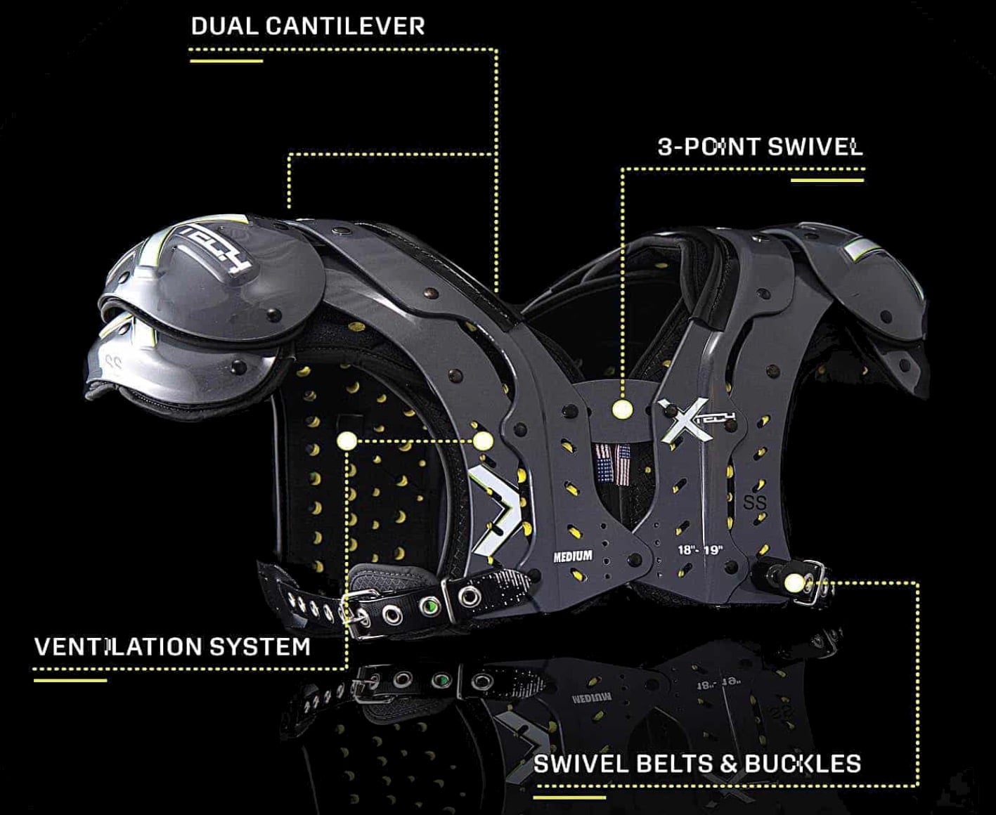
Wrapping high-net-worth NFL players in protective gear is serious business. When XTECH Protective Equipment wanted to level up their line of shoulder pads, targeting elite NFL and collegiate players, they collaborated with ID firm Studio RedEye.

X2 Protective Football Shoulder Pads

Built around a patented swivel pivot system, the shoulder pads feature an innovative design that allows the upper shell to expand, making them easier to put on while maintaining a locked-in, secure fit during gameplay.

Designing for Strength, Fit, and Durability

Our role focused on developing the detailed 3D CAD for the shoulder pad, carefully integrating the patented pivot system while maximizing ergonomic fit and shell strength. Through simulation modeling and ergonomic studies, we ensured the shoulder pads could withstand forces up to 1,500 pounds while conforming comfortably to the human form. The final CAD model balanced structure, flexibility, and manufacturability to meet the extreme demands of the modern game.

Proven Performance on the Field

Designed for the realities of high-impact play, the pads have been widely adopted by NFL players and top college programs, trusted for their combination of mobility, protection, and custom fit.

Trusted at the Collegiate Level

The design supports athletes at every level of high-performance football, helping maintain protection through repeated high-force impacts without sacrificing range of motion.

You can see more of Studio RedEye’s work here.

By

Nike sneakers get a golf makeover with Air Jordan 14 G

Unless you’ve been living under a proverbial rock, you probably know that the Nike Air Jordans are among the most iconic basketball sneakers ever created. For decades, these sneakers have reigned supreme both on and off the court, beloved by athletes, sneakerheads, and casual shoe collectors. Among the many legendary releases, the Air Jordan XIV holds a special place in the hearts of die-hard Michael Jordan fans as it was the last Air Jordans worn by Michael Jordan during his time with the Chicago Bulls.

Now, in a move that’s making waves in both the basketball and golfing communities, Nike is bringing a fresh twist to the classic: the Air Jordan 14 G. The worlds of basketball and golf are colliding, and the result is a stylish, performance-driven golf shoe that’s ready to turn heads on the fairway. The Nike Air Jordan 14 G takes some of the most beloved features of the original basketball silhouette and reimagines them for the modern golfer who wants to make a statement while chasing that elusive hole-in-one.

Designer: Nike

Nike hasn’t forgotten about comfort as it retains some of the beloved features of the original. The shoe includes the signature Air Zoom units in both the forefoot and heel, ensuring you get the same plush, responsive cushioning you’d expect from a top-tier sneaker. Whether you’re power-walking across the greens or lining up that crucial putt, your feet stay supported and comfortable.

But Nike knows that golf comes with its own set of challenges, so they’ve made some clever adjustments to fit the golfing lifestyle. The midsole has been stabilized to provide the support you need for those long hours on the course. And, most importantly for the serious golfer, the outsole now features seven removable spikes, along with secondary traction elements. This combo gives you a reliable, steady grip, whether you’re playing on dry grass or tackling a dewy morning round.

Comfort doesn’t stop at cushioning and traction. The designers have added a soft foam around the collar, cradling your ankle for all-day play. No more worries about blisters or discomfort, even if your game takes longer than expected! The upper is made from genuine leather, giving the shoe an elevated, luxurious look that’s perfect for those who appreciate style as much as performance. And, for those unpredictable weather days, the closed seams keep water out, so you can stay dry even if you encounter a little rain or step into a wet patch. The midsole is crafted from soft foam, while the insole boasts special memory foam that molds to your foot over time. This dual-layered approach means your feet are pampered every step of the way, whether you’re a seasoned golfer or just starting out.

With its blend of heritage style, modern comfort, and functional golf technology, it’s perfect for those who want to stand out on the green without sacrificing performance. Whether you’re a golfer, a sneaker enthusiast, or simply someone who loves unique footwear, the Air Jordan 14 G is a hole-in-one in every sense.

The post Nike sneakers get a golf makeover with Air Jordan 14 G first appeared on Yanko Design.

By

10 Best Apple Accessories Of August 2025

Apple’s ecosystem keeps spawning these unique and impressive third-party innovations, and August 2025 might be the strongest month yet for accessories that don’t suck. We’re talking about gear that solves problems you didn’t realize you had, stuff that makes your daily tech routine genuinely better rather than just prettier.

These ten accessories aren’t just the usual suspects with slightly different colors. All the products handle something specific about how we use our devices, whether that’s finally making your Apple Watch useful as a bedside clock or turning your ancient Lightning iPhone into something that doesn’t feel stuck in 2012. If you want to upgrade your Apple devices even further, then you’ve reached the right place!

1. NightWatch

Your Apple Watch makes a terrible bedside clock. Those tiny numbers disappear the moment you’re more than arm’s reach away, and the speaker barely whispers your morning alarm. The NightWatch fixes both problems with what’s a giant magnifying glass made of solid Lucite. Drop your watch inside this clear orb, and those minuscule digits suddenly become readable from across the room. The whole thing works like a lens, making your watch face enormous without any electronics or batteries.

Touch anywhere on the surface to wake the display, which feels oddly magical at 3 AM when you’re wondering what time it is. The audio amplification happens through clever channels carved into the lucite that work exactly like cupping your hands around your mouth. Your alarm goes from barely audible whisper to actually-wake-you-up volume. No components, no complexity, just smart geometry doing all the work.

What we like

Makes the watch display readable from bed.
Amplifies alarms enough to wake heavy sleepers.

What we dislike

Pretty much useless during daylight hours.
Takes up real estate on your nightstand.

2. Battery-free Amplifying iSpeakers

The best tech often uses zero technology. These metal speakers prove that point by amplifying your phone’s audio using nothing but clever acoustic design and aircraft-grade aluminum. No charging, no pairing, no dead batteries when you need music. The golden ratio design isn’t just Instagram bait – those proportions optimize sound projection. Drop your phone in the slot and the metal construction channels audio waves more effectively than most Bluetooth speakers.

The Duralumin material (the same stuff they use in aircraft) prevents vibrations that muddy the sound. You can enhance directional control with add-on mods, but honestly, the basic version works great for filling a room with whatever your phone can produce. It is perfect for hotel rooms, outdoor spaces, or anywhere electrical outlets feel like a luxury.

Click Here to Buy Now: $179.00

What we like

Works anywhere without power or setup.
Improves audio quality through physics.

What we dislike

Can’t overcome your phone’s speaker limitations.
Directional mods cost extra.

3. Spigen Classic C1 Charger

This charging stand nails the iMac G3 aesthetic so perfectly you’ll want one even if you don’t own an Apple Watch. The translucent shell comes in those original candy colors that made computing fun again back in 1998. But beyond the nostalgia trip, the angled front makes checking time while charging comfortable. You supply your charging puck, threading the cable through the body and positioning the magnetic disc up front.

The silicone base grips tables perfectly while the polycarbonate shell feels substantial enough to last. It works with newer Apple Watches and even charges AirPods Pro 2 if you position them right. The viewing angle eliminates that awkward neck crane you do with flat charging pads. Your watch sits at the perfect tilt for glancing at notifications or using it as a desk clock.

What we like

Perfect viewing angle for checking the time while charging.
Handles multiple Apple devices beyond just watches.

What we dislike

Charging puck not included (you use your own).
Only works with Series 4 and newer watches.

4. PopSockets Suck-Up Grip and Mount

PopSockets figured out that creators need more than just a phone grip – they need the ability to stick their phone anywhere for hands-free filming. The Suck-Up combines its classic pop grip with serious suction power that holds your iPhone on smooth surfaces for hours. MagSafe attachment means you’re not committing to permanent phone modification. The suction cup grips glass, mirrors, whiteboards, basically any smooth surface you can find.

It is great for filming workouts, following tutorials, or setting up shots where traditional mounts won’t work. The three-in-one functionality (grip, stand, mount) covers most phone-holding scenarios without carrying multiple accessories. Content creation becomes spontaneous when you can turn any smooth surface into a tripod alternative.

What we like

MagSafe means easy removal without residue.
Suction holds reliably for extended filming sessions.

What we dislike

Only works on smooth, clean surfaces.
Suction strength depends on surface quality.

5. Universal USB-C iPhone Case

Ken Pillonel solved a problem Apple created and refuses to fix. His USB-C case gives Lightning iPhones proper modern connectivity without sacrificing functionality. The internal routing handles everything from basic charging to fast charging protocols and data transfer. The engineering is impressive. A 90-degree flex PCB navigates around the speaker while keeping the case reasonably slim.

The USB-C port placement in the right corner avoids the awkward chin effect while maintaining comfortable handling. CarPlay works perfectly, making this feel like Apple should have done it themselves. MagSafe compatibility exceeds naked iPhone performance, which proves that thoughtful third-party engineering can improve on original designs. Your older iPhone suddenly feels current again, and you can finally use the same cables for everything.

What we like

Full USB-C functionality, including fast charging.
MagSafe works better without the case.

What we dislike

Adds noticeable bulk to your phone.
Limited availability and premium pricing.

6. AirPods IV Drip Case

This case turns your AirPods into a saline bag hanging from an IV stand, which sounds ridiculous until you see how well it works. The two-part design creates a convincing fluid-filled bag effect, while the metal hanger lets you display your earbuds like actual medical equipment. The hanging stand solves real organizational problems.

Your AirPods become visible desk accessories instead of disappearing into drawer chaos. The pillow shape still fits pockets for travel, but the display option keeps them accessible when working. The medical aesthetic creates an unexpectedly endearing relationship with your earbuds. Instead of boring white dental floss cases, your AirPods become conversation pieces that inject personality into sterile desk setups.

What we like

Unique design makes AirPods impossible to lose.
Hanging stand keeps earbuds organized and accessible.

What we dislike

Medical theme might not fly in conservative workplaces.
Slightly bulkier than standard cases.

7. Logitech Flip Folio iPad Case

The Flip Folio acknowledges that modern iPad use jumps between productivity and entertainment without warning. The detachable Bluetooth keyboard snaps out for typing sessions, then stores magnetically on the back when Netflix calls. Both orientations work perfectly, supporting vertical video calls and horizontal binge-watching.

Logitech’s research shows 80% of tablet users consume entertainment while 30% work productively, with massive overlap between modes. This case embraces that chaos instead of forcing you to choose productivity or leisure. The keyboard positioning flexibility accommodates different typing preferences and surfaces. Transitions between work and play become seamless. Your iPad adapts to whatever you need without compromise in either direction.

What we like

Seamless mode switching between work and entertainment.
Portrait and landscape support without wrestling.

What we dislike

More complex than single-purpose alternatives.
The magnetic keyboard adds back thickness.

8. Wooden MacBook Stand

This wooden stand brings natural warmth to tech-heavy desks while fixing ergonomics that laptop screens destroy. Crafted from responsibly sourced oak or walnut, each piece features unique grain patterns that develop character over time. Swiss precision meets traditional craftsmanship for furniture-quality construction. The substantial weight anchors your workspace while elevating screen height to reduce neck strain.

Natural wood responds to daily use, developing a personal patina that reflects your interaction patterns. Environmental consciousness meets aesthetic excellence as the stand ages gracefully. Premium materials create a desk presence that typical aluminum stands can’t match. Your MacBook setup becomes an investment in both comfort and environmental responsibility.

What we like

Sustainable materials with unique character development.
Ergonomic benefits for neck comfort and airflow.

What we dislike

Premium pricing compared to metal alternatives.
Wood requires occasional maintenance.

9. Triple Boost 14 Pro

The Triple Boost transforms any MacBook into a four-screen productivity monster that makes multitasking feel effortless. Three 14-inch 1080p panels extend from the sides and top, creating a panoramic workspace for managing the digital chaos of modern work life. Each IPS panel delivers 300 nits of brightness with a matte finish that prevents reflections during long work sessions.

You get room for spreadsheets, communication tools, code editors, entertainment, and whatever else needs to stay visible. Window switching becomes unnecessary when everything fits on the screen. Setup requires one USB connection and positioning, making the dramatic workspace expansion surprisingly accessible. Your laptop becomes a multi-monitor workstation without desk real estate penalties. Complex projects become manageable through expanded visual space.

What we like

Three additional 1080p displays dramatically boost productivity.
Single USB connection simplifies setup.

What we dislike

Significant bulk eliminates mobile use scenarios.
Limited color accuracy rules out creative applications.

10. Defender+ AirPods Case

The Defender+ proves that protective cases can multitask. Beyond safeguarding your AirPods from 10-foot drops, the metal front plate doubles as an iPhone kickstand that works in both orientations. Your AirPods case becomes a phone dock you’re already carrying. The TPU construction absorbs impacts while the metal clasp prevents accidental opening.

The kickstand handles regular-sized phones comfortably, making video calls or media consumption more comfortable wherever you’re working. One less thing to remember when packing your bag. White glossy finishes usually show every scuff, but the shock-absorbing design keeps this case looking clean. The dual functionality justifies the extra bulk, especially when hotel rooms don’t provide phone stands.

What we like

iPhone kickstand works in portrait and landscape.
Serious drop protection with a 10-foot rating.

What we dislike

The metal plate makes this bulkier than minimal cases.
Kickstand is limited to standard phone sizes.

The Real Deal

These accessories prove that the best add-ons solve problems you didn’t realize you had while maintaining the design standards that make Apple products feel cohesive. From touch-sensitive magnification to workspace transformation, each product enhances daily routines in meaningful ways.

The shift toward multi-functional design reflects increasingly complex digital lives where single-purpose tools feel limiting. Whether you’re drawn to nostalgic charging solutions or cutting-edge connectivity fixes, these accessories expand what’s possible without compromising aesthetics.

The post 10 Best Apple Accessories Of August 2025 first appeared on Yanko Design.
By

heimat architects shapes curved, elevated structure for USTC learning center in china

USTC Learning Center Bridges Campus and Urban Space


The Learning Center at the University of Science and Technology of China (USTC) by Heimat Architects occupies a constrained corner site defined by campus walls, urban roads, and an existing tunnel underpass. Positioned directly above three box culvert segments, the structure rests on the tunnel’s soldier piles to avoid interference with waterproof joints. The elevated configuration maintains ground-level circulation, creates open public space, and introduces a flexible, light-filled environment for learning and community use.


Located at the eastern edge of USTC’s Central Campus, the site is bordered by a commercial building to the south, a residential block to the north, and a major urban arterial road with an elevated expressway to the east. Beneath the plot, a tunnel underpass connects the East and Central Campuses, fragmenting the area’s surface use. Since the tunnel’s completion in 2013, the plot remained fenced off until this project redefined its role. The design removes the perimeter fence and repositions the campus boundary, transforming the corner into a public-facing gateway that connects the campus to the city. The new circulation pattern provides a pedestrian link between the eastern road and the central campus axis. Landscaped areas create a pocket park accessible to students and nearby residents.

the USTC Learning Center occupies a constrained corner site | all images by Schranimage unless stated otherwise


Heimat Architects Creates Flexible, Light-Filled Learning Hub


The USTC Learning Center building’s curved footprint responds to the irregular site, generating active edge conditions. By elevating the structure, the ground plane remains open, functioning as a continuous pedestrian route and an informal gathering area. Landscaped surroundings and a pavilion-like form promote permeability between urban and campus spaces.


To safeguard the existing tunnel infrastructure, the design team at Heimat Architects employed the tunnel’s soldier piles as foundation supports, reducing earthwork and avoiding disturbance to the waterproof joints. Compact service spaces and capsule study rooms occupy the ground level, while the primary indoor program is located on the second floor. This upper level is supported by four large steel I-beams spanning over 18 meters, with slender columns maintaining spatial openness. Two vertical light wells supply daylight and natural ventilation while serving as smoke exhaust routes. The continuous second-floor glass facade, without operable windows, mitigates external noise from surrounding traffic and buildings. The second floor contains a flexible learning space with panoramic views of campus greenery and the surrounding cityscape. At night, interior illumination makes the structure a visible marker along the campus axis.

campus walls, urban roads, and a tunnel define the plot

the building is positioned above three box culvert segments


vertical light wells bring daylight and ventilation to interior spaces

soldier piles support the structure without disturbing waterproof joints

open public space is created beneath the structure

the Learning Center offers a flexible, light-filled environment | image by Weiwei

elevating the structure keeps the ground plane open for pedestrians | image by Weiwei

landscaped areas form a pocket park accessible to all | image by Weiwei

the elevated design preserves ground-level circulation


project info:


name: Learning Center, Central Campus of University of Science and Technology of China
architect: Heimat Architects

lead architects: Zhang Dong Guang, Liu Wenjuan

location: Central Campus of the University of Science and Technology of China, Shushan District, Hefei, Anhui Province, China

area: 1100 sqm

photographers: Schranimage, Weiwei


designboom has received this project from our DIY submissions feature, where we welcome our readers to submit their own work for publication. see more project submissions from our readers here.


edited by: christina vergopoulou | designboom

The post heimat architects shapes curved, elevated structure for USTC learning center in china appeared first on designboom | architecture & design magazine.